delvh
91c8261e2c
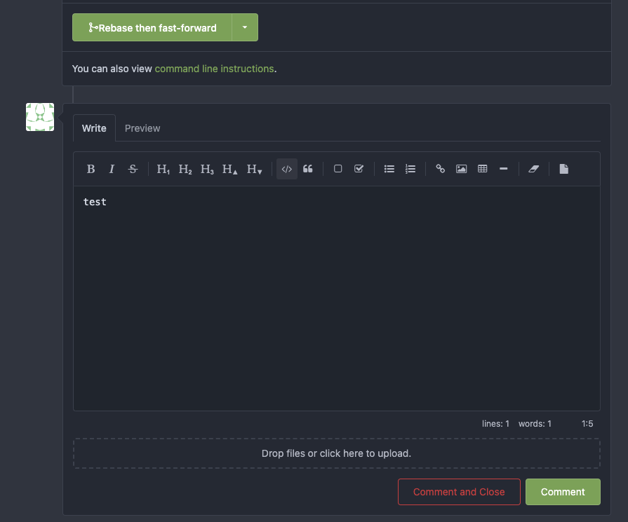
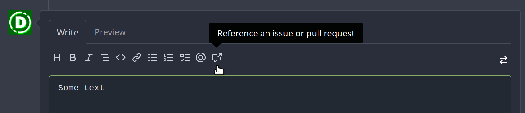
Add tooltips for MD editor buttons and add muted class for buttons ( #23896 )
...
Followup of #23876 according to my unreleased review demanding tooltips.
Additionally
- add a `muted` equivalent for buttons
- convert `switch to legacy` to an actual button
- enroll `switch to legacy` in the builtin pseudo focus cycle
- remove spaces between the buttons
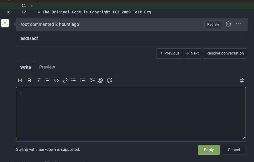
The effect of the `muted` class is what you would expect: The button
loses all of its normal styling, and is defined only by its content instead.
This will help reduce a11y infractions in the future, as that was one of
the major points why people didn't use `<button>` tags and decided on a
bad fix (i.e. through `<div>`s) instead.
## Appearance

---------
Co-authored-by: silverwind <me@silverwind.io>
2023-04-11 15:26:18 +08:00
silverwind
9f6bc7c6f4
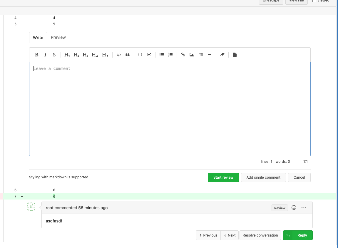
Replace tribute with text-expander-element for textarea ( #23985 )
...
The completion popup now behaves now much more as expected than before
for the raw textarea:
- You can press <kbd>Tab</kbd> or <kbd>Enter</kbd> once the completion
popup is open to accept the selected item
- The menu does not close automatically when moving the cursor
- When you delete text, previously correct suggestions are shown again
- If you delete all text until the opening char (`@` or `:`) after
applying a suggestion, the popup reappears again
- Menu UI has been improved
<img width="278" alt="Screenshot 2023-04-07 at 19 43 42"
src="https://user-images.githubusercontent.com/115237/230653601-d6517b9f-0988-445e-aa57-5ebfaf5039f3.png ">
2023-04-09 12:18:45 -04:00
sillyguodong
bedad23f9e
Expand/Collapse all changed files ( #23639 )
...
close #23628

Now in `...` dropdown, you can expand or collapse all diff files that
have loaded.

https://user-images.githubusercontent.com/33891828/227749688-2d406916-3347-49f6-93a5-4092a00e8809.mov

Co-authored-by: silverwind <me@silverwind.io>
2023-04-09 21:11:02 +08:00
silverwind
f2b98d8259
Show errors for KaTeX and mermaid on the preview tab ( #24009 )
...
There is a conflicting fomantic rule that hid the error messages inside
the markdown preview tab for things like mermaid or katex.
Overruled it to always show these errors.
<img width="774" alt="image"
src="https://user-images.githubusercontent.com/115237/230738528-322814c1-8994-495e-b901-bbb79b924ccb.png ">
2023-04-09 08:07:43 -04:00
Hester Gong
a519aac6d5
Show protected branch rule names again ( #23907 )
...
`!important`s for one of the primary label selectors are removed by
#23774 , so the repository branch protection settings ui will not have
the demanding css. This PR modifies `.ui.primary.label` to fix it.
Before:
<img width="1408" alt="飞书20230404-115410"
src="https://user-images.githubusercontent.com/17645053/229683221-ef9c7d5c-68a8-42b0-ba19-ef2d5dfce5f9.png ">
After:
<img width="1419" alt="截屏2023-04-04 11 56 32"
src="https://user-images.githubusercontent.com/17645053/229683469-70cfc92d-d7ef-4323-a7f5-2247810fabce.png ">
---------
Co-authored-by: delvh <dev.lh@web.de>
Co-authored-by: Lunny Xiao <xiaolunwen@gmail.com>
2023-04-09 06:15:43 -04:00
silverwind
cf5a281fdc
Adjust sticky pr header to cover background ( #23956 )
...
Very minor CSS tweak: Adjust sticky PR header to cover the box-shadow of
selected files.
Before:
<img width="1250" alt="Screenshot 2023-04-06 at 22 54 59"
src="https://user-images.githubusercontent.com/115237/230492218-4d71da48-a362-4c52-a7f7-01daf4ffa458.png ">
After:
<img width="1255" alt="Screenshot 2023-04-06 at 22 54 46"
src="https://user-images.githubusercontent.com/115237/230492227-c7142210-e535-4da8-b610-37d33dcbb549.png ">
2023-04-08 20:43:15 +08:00
silverwind
c0246677a6
Fix markup background, improve wiki rendering ( #23750 )
...
Fix regression from https://github.com/go-gitea/gitea/pull/23578 . Only
visible on arc-green.
Before:
<img width="997" alt="Screenshot 2023-03-27 at 19 14 21"
src="https://user-images.githubusercontent.com/115237/228016589-e7cabfb9-bfd0-45fd-9407-6b76c665ed1a.png ">
After:
<img width="1000" alt="Screenshot 2023-03-27 at 19 14 05"
src="https://user-images.githubusercontent.com/115237/228016600-db2e6002-4e2c-4d18-8393-9d7e1f525acb.png ">
Fixes: https://github.com/go-gitea/gitea/issues/20625
Fixes: https://github.com/go-gitea/gitea/issues/23718
2023-04-07 17:30:04 -04:00
wxiaoguang
93eb914438
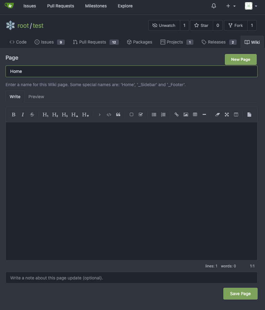
Improve markdown editor: width, height, preferred ( #23895 )
...
Follow #23876
1. Fine tune the heights of the editors (like before)
* Auto expand the editor (increase/decrease the height) when editing
2. Remember user's last used editor (textarea/easymde) in LocalStorage,
then next time the editor will be switched automatically
* No need to introduce extra config option, it satisfies all users,
including who prefer EasyMDE
3. Also fix the width problem of Review Panel
Screenshot:
<details>


</details>
---------
Co-authored-by: silverwind <me@silverwind.io>
2023-04-07 13:03:29 -04:00
Hester Gong
6eb678374b
Refactor authors dropdown (send get request from frontend to avoid long wait time) ( #23890 )
...
Right now the authors search dropdown might take a long time to load if
amount of authors is huge.
Example: (In the video below, there are about 10000 authors, and it
takes about 10 seconds to open the author dropdown)

https://user-images.githubusercontent.com/17645053/229422229-98aa9656-3439-4f8c-9f4e-83bd8e2a2557.mov

Possible improvements can be made, which will take 2 steps (Thanks to
@wolfogre for advice):

Step 1:
Backend: Add a new api, which returns a limit of 30 posters with matched
prefix.
Frontend: Change the search behavior from frontend search(fomantic
search) to backend search(when input is changed, send a request to get
authors matching the current search prefix)

Step 2:
Backend: Optimize the api in step 1 using indexer to support fuzzy
search.

This PR is implements the first step. The main changes:
1. Added api: `GET /{type:issues|pulls}/posters` , which return a limit
of 30 users with matched prefix (prefix sent as query). If
`DEFAULT_SHOW_FULL_NAME` in `custom/conf/app.ini` is set to true, will
also include fullnames fuzzy search.
2. Added a tooltip saying "Shows a maximum of 30 users" to the author
search dropdown
3. Change the search behavior from frontend search to backend search

After:

https://user-images.githubusercontent.com/17645053/229430960-f88fafd8-fd5d-4f84-9df2-2677539d5d08.mov

Fixes: https://github.com/go-gitea/gitea/issues/22586

---------

Co-authored-by: wxiaoguang <wxiaoguang@gmail.com>
Co-authored-by: silverwind <me@silverwind.io>
2023-04-07 08:11:02 +08:00
Yoan Blanc
9b416b2e36
Use graceful editorconfig loader to reduce errors when loading malformed editorconfigs ( #21257 )
...
The _graceful_ should fail less when the `.editorconfig` file isn't
properly written, e.g. boolean values from YAML or unparseable numbers
(when a number is expected). As is... information is lost as the
_warning_ (a go-multierror.Error) is ignored. If anybody knows how to
send them to the UI as warning; any help is appreciated.

Closes #20694

Signed-off-by: Yoan Blanc <yoan@dosimple.ch>
2023-04-06 16:01:20 -04:00
wxiaoguang
376396a088
Fix image border-radius ( #23886 )
...
1. Instead of polluting the `border-radius` style globally, each "img"
usage should declare their own styles.
2. There were some bugs in code, I believe the `.img` selector was done
by mistake.
After:


2023-04-05 02:44:52 +02:00
Jimmy Praet
54197b67f9
Scroll collapsed file into view ( #23702 )
2023-04-05 07:51:42 +08:00
wxiaoguang
d149093ce3
Fix code view (diff) broken layout ( #23096 )
...
Close #22911
I think it's ready for review now, feel free to test it, welcome to help
to improve.
### Before
### After

2023-04-04 19:05:07 +08:00
silverwind
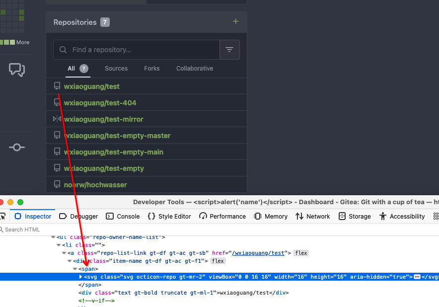
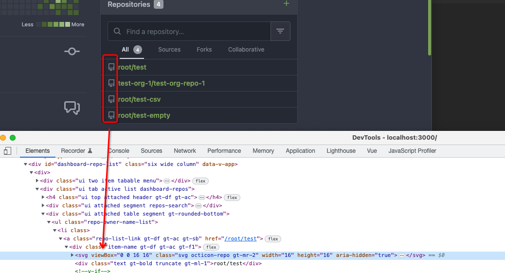
62a9052075
Org pages style fixes ( #23901 )
...
Few fixes/enhancements around org pages:
Use flexbox for member and repo lists and tweak rendering of tabs and
list:
<img width="765" alt="Screenshot 2023-04-03 at 22 54 24"
src="https://user-images.githubusercontent.com/115237/229625716-92a834c3-9121-4729-8b9b-3a3973cf9a91.png ">
<img width="771" alt="Screenshot 2023-04-03 at 22 55 15"
src="https://user-images.githubusercontent.com/115237/229625719-acc08ce8-4489-44a6-a9b9-e36755c55b1d.png ">
Vertically center remove/leave buttons, add link to avatar:
<img width="1223" alt="Screenshot 2023-04-03 at 21 51 20"
src="https://user-images.githubusercontent.com/115237/229612616-b662b795-e754-41a1-a77a-381c267e6104.png ">
2023-04-04 06:49:09 +02:00
wxiaoguang
5115ffa90c
Remove fomantic ".link" selector and styles ( #23888 )
...
It's difficult to play with Fomantic's ".link" selector&styles, and it
doesn't bring any real benefit.
Instead, it sometimes introduces regressions (because of the `:not`
selector, really difficult to fine-tune).
Regression:
<details>

</details>
After this PR, there is no ".link" in code anymore. We do not need to
play the overwriting and `:not()` game anymore.


2023-04-03 20:47:23 -04:00
wxiaoguang
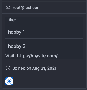
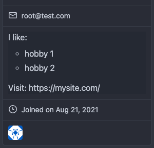
5ab1c7acec
Fix user profile description rendering ( #23882 )
...
The `ul li` styles were polluted.
Before:

After:

2023-04-03 16:11:16 -04:00
silverwind
d0c406a86f
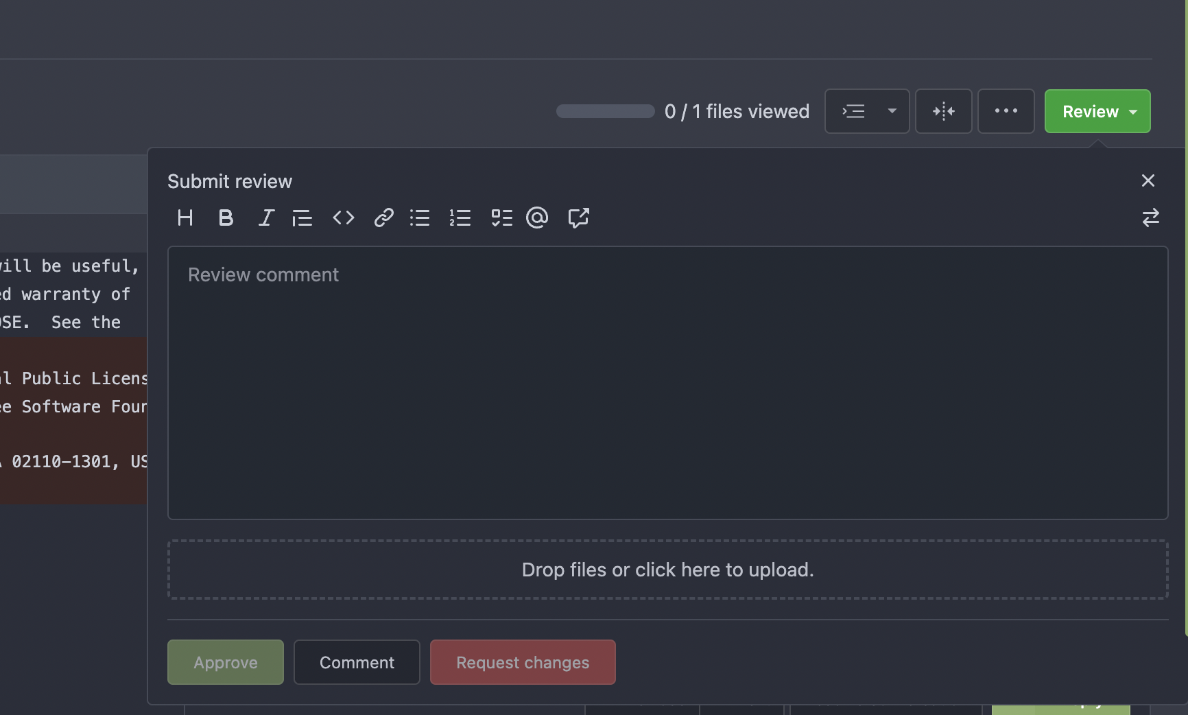
Fix review box viewport overflow issue ( #23800 )
...
Fix regression that came likely from
https://github.com/go-gitea/gitea/pull/23271 :
Long lines of text currently cause the review box's CodeMirror element
to resize which apparently is not recognized by [popper's resize
detection](https://popper.js.org/docs/v2/modifiers/event-listeners/ ) and
which causes the element to go partially out of viewport until a reflow
happens:

Fix this by setting the element to a static width derived from viewport
width and remove the previously clumsy media queries.
2023-04-03 11:11:34 -04:00
wxiaoguang
5cc0801de9
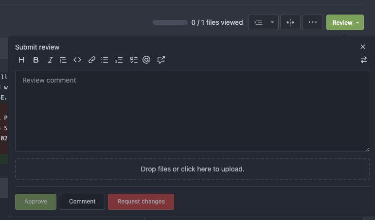
Introduce GitHub markdown editor, keep EasyMDE as fallback ( #23876 )
...
The first step of the plan
* #23290
Thanks to @silverwind for the first try in #15394 . Close #10729 and a
lot of related issues.
The EasyMDE is not removed, now it works as a fallback, users can switch
between these two editors.
Editor list:
* Issue / PR comment
* Issue / PR comment edit
* Issue / PR comment quote reply
* PR diff view, inline comment
* PR diff view, inline comment edit
* PR diff view, inline comment quote reply
* Release editor
* Wiki editor
Some editors have attached dropzone
Screenshots:
<details>


</details>
---------
Co-authored-by: silverwind <me@silverwind.io>
2023-04-03 18:06:57 +08:00
silverwind
ca03ca9e6e
CSS color tweaks ( #23828 )
...
Change grey shades in arc-green to match the theme more:
<img width="661" alt="Screenshot 2023-03-30 at 21 42 34"
src="https://user-images.githubusercontent.com/115237/228957952-8e099e56-6923-4aa6-8ce9-3c1cd898b73e.png ">
Adjusted grey shade in light theme:
<img width="652" alt="image"
src="https://user-images.githubusercontent.com/115237/228963876-3bde6181-8397-4dc2-be72-33982e6c7acb.png ">
Increase contrast in arc-green, change background to slightly darker
shade, change forgeground to slightly brighter colors:
<img width="283" alt="Screenshot 2023-03-30 at 22 33 20"
src="https://user-images.githubusercontent.com/115237/228957957-272c24a5-dd0b-427a-b6b7-e62836bdd73c.png ">
Increase contrast of grey text in light theme as well by making them
darker:
<img width="273" alt="Screenshot 2023-03-30 at 22 33 35"
src="https://user-images.githubusercontent.com/115237/228957959-283139c7-6fa7-4b68-9fdd-16c668ad1301.png ">
Add color rule for border multiple select items:
<img width="183" alt="Screenshot 2023-03-30 at 22 29 31"
src="https://user-images.githubusercontent.com/115237/228957954-6b5a752d-bbb0-4519-ab35-d02c0804d955.png ">
<img width="181" alt="Screenshot 2023-03-30 at 22 29 46"
src="https://user-images.githubusercontent.com/115237/228957956-fca9790a-d6c9-4f31-8d1b-d183ab3ac669.png ">
Added color rule for red `*` on required form fields:
<img width="97" alt="image"
src="https://user-images.githubusercontent.com/115237/228958760-517ad9ef-565d-4349-b734-9b559ab42429.png ">
2023-03-31 16:24:47 +08:00
silverwind
525b7382d3
Convert issue list checkboxes to native ( #23596 )
...
Use native instead of fomantic checkboxes in issue list. Benefits
include no more JS pop-in on load and perfect a11y.
Before, with JS pop-in:
<img width="92" alt="Screenshot 2023-03-20 at 17 02 02"
src="https://user-images.githubusercontent.com/115237/226398955-99029a1c-1150-449c-821b-e4165e7446a8.png ">
After, Firefox on macOS:
<img width="126" alt="Screenshot 2023-03-20 at 17 01 26"
src="https://user-images.githubusercontent.com/115237/226399018-58df2c32-c2b2-4c78-b7df-7b76523abe21.png ">
After, Chrome on macOS:
<img width="79" alt="Screenshot 2023-03-20 at 17 01 42"
src="https://user-images.githubusercontent.com/115237/226399074-947e6279-8dc3-42c2-90b5-b106c471b23d.png ">
I opted to not do styling yet but I see that the inconsistency between
browsers may already be reason enough on doing it. I think if we style
them, there should be one global style, including markdown ones which
currently have custom styling.
2023-03-30 11:02:47 -04:00
silverwind
aa4d1d94f7
Diff improvements ( #23553 )
...
- Avoid flash of wrong tree toggle icon on page load by setting icon
based on sync state
- Avoid "pop-in" of tree on page load by leaving space based on sync
state
- Use the same border/box-shadow combo used on comment `:target` also
for file `:target`.
- Refactor `DiffFileTree.vue` to use `toggleElem` instead of hardcoded
class name.
- Left-align inline comment boxes and make them fit the same amount of
markup content on a line as GitHub.
- Fix height of `diff-file-list`
Fixes: https://github.com/go-gitea/gitea/issues/23593
<img width="1250" alt="Screenshot 2023-03-18 at 00 52 04"
src="https://user-images.githubusercontent.com/115237/226071392-6789a644-aead-4756-a77e-aba3642150a0.png ">
<img width="1246" alt="Screenshot 2023-03-18 at 00 59 43"
src="https://user-images.githubusercontent.com/115237/226071443-8bcba924-458b-48bd-b2f0-0de59cb180ac.png ">
<img width="1250" alt="Screenshot 2023-03-18 at 01 27 14"
src="https://user-images.githubusercontent.com/115237/226073121-ccb99f9a-d3ac-40b7-9589-43580c4a01c9.png ">
<img width="1231" alt="Screenshot 2023-03-19 at 21 44 16"
src="https://user-images.githubusercontent.com/115237/226207951-81bcae1b-6b41-4e39-83a7-0f37951df6be.png ">
(Yes I'm aware the border-radius in bottom corners is suboptimal, but
this would be notorously hard to fix without relying on `overflow:
hidden`).
2023-03-30 20:06:10 +08:00
silverwind
79e7a6ec1e
Add CSS rules for basic colored labels ( #23774 )
...
Before:
<img width="164" alt="Screenshot 2023-03-28 at 23 35 46"
src="https://user-images.githubusercontent.com/115237/228372437-663111b9-7285-4fa2-9125-fb5e1cad21d7.png ">
After:
<img width="166" alt="Screenshot 2023-03-28 at 23 35 54"
src="https://user-images.githubusercontent.com/115237/228372441-49430517-6b2d-4389-b11c-c30a724f6de7.png ">
Also I removed the `!important` on the primary label as it's very likely
unnecessary with the amount of specificity the selector already has.
2023-03-28 22:58:31 -04:00
wxiaoguang
12fff36d05
Fine tune more downdrop settings, use SVG for labels, improve Repo Topic Edit form ( #23626 )
...
Although it seems that some different purposes are mixed in this PR,
however, they are all related, and can be tested together, so I put them
together to save everyone's time.
Diff: `+79 −84`, everything becomes much better.
### Improve the dropdown settings.
Move all fomantic-init related code into our `fomantic.js`
Fine-tune some dropdown global settings, see the comments.
Also help to fix the first problem in #23625 , cc: @yp05327
The "language" menu has been simplified, and it works with small-height
window better.
### Use SVG instead of `<i class="delete icon">`
It's also done by `$.fn.dropdown.settings.templates.label` , cc:
@silverwind
### Remove incorrect `tabable` CSS class
It doesn't have CSS styles, and it was only in Vue. So it's totally
unnecessary, remove it by the way.
### Improve the Repo Topic Edit form
* Simplify the code
* Add a "Cancel" button
* Align elements
Before:
<details>

</details>
After:

2023-03-26 19:31:26 +08:00
John Olheiser
73b4010fcd
Remove row clicking from notification table ( #22695 )
...
Resolves #22692

I don't think there's a need for this entire row to be clickable (and
even different links depending on which segment you click)
The links still point to the same spot, so no information is lost here.

---------

Signed-off-by: jolheiser <john.olheiser@gmail.com>
Co-authored-by: wxiaoguang <wxiaoguang@gmail.com>
2023-03-25 14:37:34 -05:00
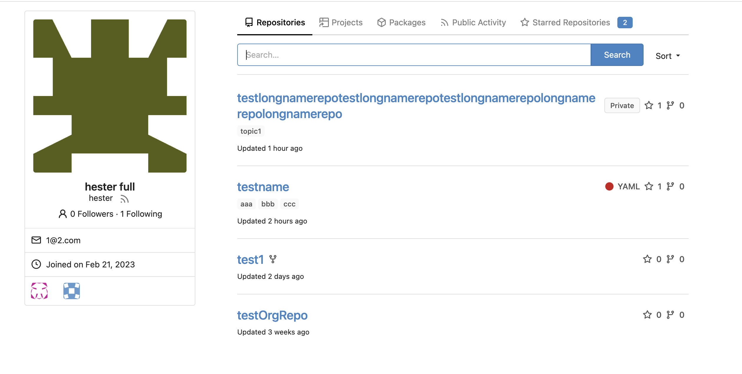
Hester Gong
a9cceb0597
Fix long project name display in issue list and in related dropdown ( #23653 )
...
This PR is to fix the second problem mentioned in #23625 , along with the
long texts problem in `issue-item-bottom-row` of `issuelist.tmpl`
Main changes are:
1. Add `max-width` to the search dropdowns in issue list and make the
possible long texts inside to show ellipsis if texts are long
2. Adjust the conditions in
[issuelist.tmpl](1d35fa0e78/templates/shared/issuelist.tmpl (L146-L167)https://github.com/go-gitea/gitea/issues/23625#issuecomment-1479281060 )
3. Use `word-break: break-word;` in `issue-item-bottom-row` to break the
possible long texts.
After the PR
issuelist in repo (similar for pr list):
<img width="366" alt="截屏2023-03-23 17 42 40"
src="https://user-images.githubusercontent.com/17645053/227163953-93e9adbd-5785-4c16-b538-9db901787775.png ">
dropdowns with long name (Here take reference from github to deal with
the long names cases: show ellipsis with no title, because all these
options are clickable, and it might not be necessary to add titles to
them ):
<img width="370" alt="截屏2023-03-23 17 43 50"
src="https://user-images.githubusercontent.com/17645053/227164215-df6fcaaa-9fee-4256-a57c-053fbcffafbb.png ">
<img width="365" alt="截屏2023-03-23 17 43 56"
src="https://user-images.githubusercontent.com/17645053/227164227-9c99abcd-f410-4e07-b5b8-cbce764eedcd.png ">
issue page (similar for pr page):
<img width="374" alt="截屏2023-03-23 17 45 37"
src="https://user-images.githubusercontent.com/17645053/227164668-654a8188-dac8-4bbf-a6e3-f3768a644a1b.png ">
on PC:
<img width="1412" alt="截屏2023-03-23 17 47 20"
src="https://user-images.githubusercontent.com/17645053/227166694-e7bcc6e5-9667-4cef-9fbf-db85640a2c6c.png ">
<img width="1433" alt="截屏2023-03-23 17 46 40"
src="https://user-images.githubusercontent.com/17645053/227165182-4e2a5d19-74bc-4c66-b73c-23cbca176ffe.png ">
2023-03-24 15:11:23 +08:00
Hester Gong
9cefb7be73
Fix new issue/pull request btn margin when it is next to sort ( #23647 )
...
Close #23627
Added margin left to the button when it is next to the svg, which has a
margin-right of `-0.5rem`
And here it might be better if `white-space: nowrap;` is added because
otherwise it might look like below on pull requests page on smaller
screen
<img width="945" alt="截屏2023-03-23 09 57 41"
src="https://user-images.githubusercontent.com/17645053/227079613-71c696ab-55ec-4641-acb9-622a8baebb31.png ">
After:
<img width="936" alt="截屏2023-03-23 10 08 27"
src="https://user-images.githubusercontent.com/17645053/227080971-6bf2588e-40dd-4770-b0d1-45d7c63e0f48.png ">
Pull Request on smaller screen
<img width="922" alt="截屏2023-03-23 10 25 16"
src="https://user-images.githubusercontent.com/17645053/227084144-0c2ed3e6-5c11-4252-bba2-b5f971b70f4a.png ">
2023-03-23 14:07:04 -04:00
wxiaoguang
389e83f7eb
Improve <SvgIcon> to make it output svg node and optimize performance ( #23570 )
...
Before, the Vue `<SvgIcon>` always outputs DOM nodes like:
```html
<span class="outer-class">
<svg class="class-name-defined" ...></svg>
</span>
```
The `span` is redundant and I guess such layout and the inconsistent
`class/class-name` attributes would cause bugs sooner or later.
This PR makes the `<SvgIcon>` clear, and it's faster than before,
because it doesn't need to parse the whole SVG string.
Before:
<details>

</details>
After:

---------
Co-authored-by: silverwind <me@silverwind.io>
2023-03-23 11:24:16 +08:00
silverwind
ca0ce9feb0
Set opaque background on markup and images ( #23578 )
...
- Set opaque background on markup images so they can visually break
`<hr>`
- Change padding of comment box so `padding` is provided by the
`.markup` element instead of its parent, matching the file rendering
view which does the same.
Before:
<img width="243" alt="Screenshot 2023-03-19 at 19 22 03"
src="https://user-images.githubusercontent.com/115237/226198663-8ff4d940-6a15-452d-ac58-14485b37fbc7.png ">
After:
<img width="261" alt="Screenshot 2023-03-19 at 19 23 26"
src="https://user-images.githubusercontent.com/115237/226198689-1bf56561-4726-46dc-b583-423d65e1e13a.png ">
<img width="263" alt="image"
src="https://user-images.githubusercontent.com/115237/226199002-e93c817d-6d9c-4b98-bad8-0aa0bd45b62f.png ">
Example documents:
https://try.gitea.io/silverwind/symlink-test/src/branch/master/test-page.md
https://github.com/silverwind/symlink-test/blob/master/test-page.md
2023-03-21 17:38:04 -04:00
silverwind
253a00aaac
Remove conflicting CSS rules on notifications, improve notifications table ( #23565 )
...
Dropdowns on `/notifications/subscriptions` before and after:
<img width="157" alt="Screenshot 2023-03-18 at 20 37 12"
src="https://user-images.githubusercontent.com/115237/226133906-e4ad6a0a-de24-4324-8e1d-94081d23fe85.png ">
<img width="152" alt="Screenshot 2023-03-18 at 20 41 29"
src="https://user-images.githubusercontent.com/115237/226134038-c3946c32-a424-4b92-ad15-890e1036cafe.png ">
These selectors are meant to target the notification list which I
improved:
<img width="1145" alt="Screenshot 2023-03-19 at 01 52 11"
src="https://user-images.githubusercontent.com/115237/226147907-1c35736a-4bc9-4698-9813-21a20a1d2106.png ">
<img width="1148" alt="Screenshot 2023-03-19 at 01 54 17"
src="https://user-images.githubusercontent.com/115237/226147920-626dbd84-11d3-48db-a177-6d808e3212c0.png ">
2023-03-21 15:11:25 -04:00
wxiaoguang
30668e0047
Fix dropdown icon misalignment when using fomantic icon ( #23558 )
...
There are still many dropdowns using fomantic icon. For example: new
issue with issue template.
Avoid polluting the fomantic styles.
Before:

After:

2023-03-18 22:24:26 -04:00
silverwind
9efcce563b
Fix sticky header in diff view ( #23554 )
...
Ressurection of #23549 .
Fix regression https://github.com/go-gitea/gitea/pull/23513#issuecomment-1474356817 from #23271 .
The previous sticky CSS did assume the content is always 2 rows, but since that PR, it's single-row above 993px width.
Adjust the sticky offset to match and add a small tweak that hides content behind the `border-radius`.
Single row:
<img width="1264" alt="Screenshot 2023-03-17 at 21 33 05"
src="https://user-images.githubusercontent.com/115237/226034050-a04b131d-fd3f-45c0-bc72-413738a59825.png ">
Double row:
<img width="1243" alt="Screenshot 2023-03-17 at 21 32 53"
src="https://user-images.githubusercontent.com/115237/226034163-2f1c6aa9-fc72-432f-bc46-9a7119da8677.png ">
2023-03-18 18:51:00 -04:00
wxiaoguang
27fcfae6d9
Fix some broken css ( #23560 )
...
1. The "close" inside "modal" are likely broken for long time
    * There is no var called `--body-color`
    * There is no `fullscreen modal`
* The `.ui.modal > .close.inside` doesn't seem to match most icons. It
only matches a few like "fork-repo-modal" or "adopt repo". Other places
are just buggy code copied again and again.
2. Convert the legacy `&:hover` LESS syntax to CSS syntax
2023-03-18 17:53:12 -04:00
Hester Gong
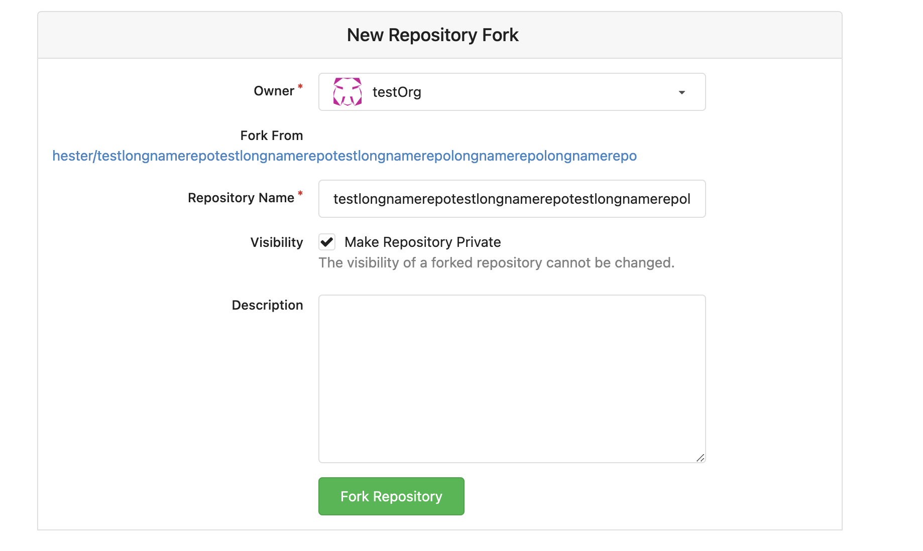
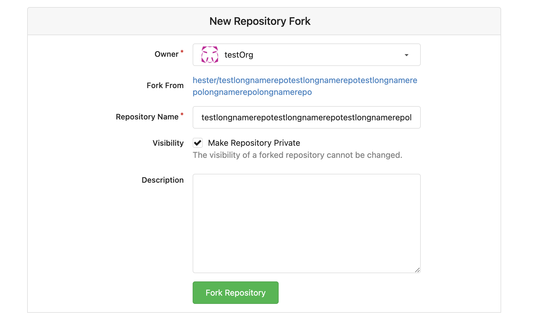
d42015e6eb
Fix long name ui issues and label ui issue ( #23541 )
...
This PR fixes some ui problems as mentioned in the two issues below.
1. Long file path has no word break
## Before
<img width="1357" alt="截屏2023-03-17 17 49 43"
src="https://user-images.githubusercontent.com/17645053/225873491-27c7bf9a-d5d5-4065-9e4a-ff228e935abf.png ">
## After
<img width="1248" alt="截屏2023-03-17 17 51 22"
src="https://user-images.githubusercontent.com/17645053/225873562-93b87af7-9c83-43f8-aa0d-36a9174d25ac.png ">
on mobile
<img width="408" alt="截屏2023-03-17 17 51 15"
src="https://user-images.githubusercontent.com/17645053/225873554-1b8c8999-1dfc-4251-a7fc-20ecd3444cb0.png ">
2. Texts in labels
## Before
<img width="1219" alt="截屏2023-03-17 17 49 24"
src="https://user-images.githubusercontent.com/17645053/225873369-812b1b52-c104-4e32-988f-c3e55ad2f844.png ">
## After
<img width="1259" alt="截屏2023-03-17 17 51 31"
src="https://user-images.githubusercontent.com/17645053/225873317-9717fd2c-e9e1-4a00-a27d-6bdc5933c3ca.png ">
with two labels
<img width="1258" alt="截屏2023-03-17 17 51 53"
src="https://user-images.githubusercontent.com/17645053/225873323-13198192-71de-472d-8e78-6fd86ddba3d9.png ">
In explore and star pages
<img width="896" alt="截屏2023-03-17 18 25 00"
src="https://user-images.githubusercontent.com/17645053/225878962-9e26e3aa-cff0-451c-9133-19f4ad1507a4.png ">
<img width="913" alt="截屏2023-03-17 18 25 09"
src="https://user-images.githubusercontent.com/17645053/225878967-6adaa414-136e-43c2-87d0-7e46a0da112e.png ">
3. Long name repository on creating new fork page
## Before
<img width="919" alt="截屏2023-03-17 17 50 01"
src="https://user-images.githubusercontent.com/17645053/225873723-5c4ea137-3b51-4074-a458-ef442e330ddf.png ">
## After
<img width="907" alt="截屏2023-03-17 17 50 37"
src="https://user-images.githubusercontent.com/17645053/225873772-fc4a52c3-49c6-4ca6-903d-a13707f2a98b.png ">
<img width="383" alt="截屏2023-03-17 17 50 48"
src="https://user-images.githubusercontent.com/17645053/225873779-6de1dfde-5c05-4ae9-89e1-85c25b3a1682.png ">
Closes #23535
Closes #23534
2023-03-18 17:07:59 +01:00
silverwind
d0f48187f9
Fix diff detail buttons wrapping, use tippy for review box ( #23271 )
...
Fix visual regression introduced by
https://github.com/go-gitea/gitea/pull/22986 .
Before:
<img width="1277" alt="image"
src="https://user-images.githubusercontent.com/115237/222792814-d70c2173-0c7c-4db2-8839-95be63cdc8ee.png ">
<img width="649" alt="image"
src="https://user-images.githubusercontent.com/115237/222792989-9b1f5e12-becd-40cc-b02c-e9f59a8e72a4.png ">
After:
<img width="1274" alt="image"
src="https://user-images.githubusercontent.com/115237/222792769-e7a9702f-4b6a-46c4-9385-da103ed4dff0.png ">
<img width="565" alt="image"
src="https://user-images.githubusercontent.com/115237/222793084-6de6482b-11dc-4d38-b514-15884d20e140.png ">
2023-03-17 12:24:00 -05:00
silverwind
6aca9287a2
Increase horizontal page padding ( #23507 )
...
Add a bit more empty space on left and right side of page content for a
more pleasant viewing experience. Also tweaked the mobile navbar to
match.
Before:
<img width="1276" alt="Screenshot 2023-03-16 at 00 58 23"
src="https://user-images.githubusercontent.com/115237/225473942-f544106f-1b61-456a-99fb-3ba136cabc8d.png ">
After:
<img width="1270" alt="Screenshot 2023-03-16 at 00 58 37"
src="https://user-images.githubusercontent.com/115237/225473959-8b555359-a08d-48e1-9476-2710aabb1166.png ">
Mobile Navbar:
<img width="673" alt="Screenshot 2023-03-16 at 01 05 12"
src="https://user-images.githubusercontent.com/115237/225473966-adccef2b-4d34-44ed-8c75-d4ca46d96cf3.png ">
2023-03-17 02:23:23 -04:00
silverwind
4b72206805
Update mini-css-extract-plugin, remove postcss ( #23520 )
...
Follow-up and proper fix for
https://github.com/go-gitea/gitea/pull/23504
Update to
[mini-css-extract-plugin@2.7.4](https://github.com/webpack-contrib/mini-css-extract-plugin/releases/tag/v2.7.4 )
which fixes our specific issue described in
https://github.com/webpack-contrib/css-loader/issues/1503 and which
allows us to again drop the postcss dependency.
Backport of this is not necessary as I have included it in
https://github.com/go-gitea/gitea/pull/23508 .
Co-authored-by: techknowlogick <techknowlogick@gitea.io>
2023-03-16 15:06:53 -04:00
wxiaoguang
6bad0fb24f
Fix review comment context menu clipped bug ( #23523 )
...
This is another regression of #22959 (the first regression has been
fixed by the Image Diff fix)
Close #23517
This is a quick fix. Luckily, there is no "dropdown menu" for image/csv
view, so we could only add the "overflow-x: scroll" to the image/csv
view.
After fix:


Co-authored-by: KN4CK3R <admin@oldschoolhack.me>
2023-03-16 14:25:04 -04:00
Hester Gong
661e78bed5
Allow both fullname and username search when DEFAULT_SHOW_FULL_NAME is true ( #23463 )
...
This PR adds the ability to search both fullname and username for
assignees, reviewers and author search boxes when the config
[`DEFAULT_SHOW_FULL_NAME`](6ff5400af9/custom/conf/app.example.ini (L1238)https://projects.blender.org/infrastructure/blender-projects-platform/issues/14 )
And if `DEFAULT_SHOW_FULL_NAME` is set to `false`(default value), these
search boxes will only show username.
Example:
When `DEFAULT_SHOW_FULL_NAME = true`
<img width="1220" alt="截屏2023-03-14 14 28 06"
src="https://user-images.githubusercontent.com/17645053/224914546-80ef2837-ab72-4d66-9f00-6eb77ed4baaa.png ">
When `DEFAULT_SHOW_FULL_NAME = false` (default value)
<img width="1243" alt="截屏2023-03-14 14 29 37"
src="https://user-images.githubusercontent.com/17645053/224914798-f69ec8a2-0929-4330-827c-3e30188f9b47.png ">
The specific search boxes that adapts these changes include:
1. Author, Assignee search boxes in pull requests tab and issues tab in
repository
<img width="1283" alt="截屏2023-03-14 14 35 01"
src="https://user-images.githubusercontent.com/17645053/224916250-8e452525-71d6-4b48-bf1c-bf7a176abaaa.png ">
2. Assigee and Author on milestones issue page (Added missing search box
for author here)
<img width="1261" alt="截屏2023-03-14 14 38 20"
src="https://user-images.githubusercontent.com/17645053/224916569-d3105619-7824-4bb8-a6d0-1a600eaa9963.png ">
3. Assignee on issues and PR Sidebar, Reviewer on PR Sidebar
<img width="976" alt="截屏2023-03-14 14 41 06"
src="https://user-images.githubusercontent.com/17645053/224917431-c45d821e-9660-4f58-a196-5979a0bb64ce.png ">
<img width="1027" alt="截屏2023-03-14 14 41 58"
src="https://user-images.githubusercontent.com/17645053/224917290-ad4dbc52-0c20-45c4-9fce-9dcd59ad7d47.png ">
4. Assignee when creating new issue
<img width="961" alt="截屏2023-03-14 14 44 33"
src="https://user-images.githubusercontent.com/17645053/224917694-34bee5a7-e975-4f37-8862-56ebc2556808.png ">
5. Whitelisted users for pushing, Whitelisted users for merging and
Whitelisted reviewers in Protected branch settings
<img width="920" alt="截屏2023-03-14 14 48 56"
src="https://user-images.githubusercontent.com/17645053/224918551-9b46b44e-b075-4895-8d33-1aafc7d3c8e5.png ">
<img width="901" alt="截屏2023-03-14 14 49 02"
src="https://user-images.githubusercontent.com/17645053/224918584-efa66f23-a593-4e26-a3eb-bb1fbc5516ae.png ">
<img width="944" alt="截屏2023-03-14 14 49 21"
src="https://user-images.githubusercontent.com/17645053/224918591-be60455d-0513-4f66-84f6-b5e1bc40ff91.png ">
6. "Allowed users" in tags settings
<img width="935" alt="截屏2023-03-14 14 50 11"
src="https://user-images.githubusercontent.com/17645053/224918701-797699aa-c7e5-4290-b3fe-27dcead1c6c7.png ">
2023-03-16 11:32:25 -05:00
silverwind
19cbd5c3d9
Fix theme-auto loading ( #23504 )
...
Fix regression from https://github.com/go-gitea/gitea/pull/23481 .
The conditional on the CSS import was being stripped away by webpack's
`css-loader`, resulting in the dark theme always loading. The old syntax
with `@import` nested inside `@media` also did not work as `css-loader`
(rightfully) ignores such non-standard `@import` syntax that was
previously supported by Less.
Unfortunately, we have to re-introduce postcss to the CSS pipeline to
fix this and I loaded only the minimal plugins to make it work.
There is one variant of the fix that does work without postcss, which is
to exclude the file from transpilation but I did not consider it as it
would have meant the `@import` was being done without a version suffix
in the URL, which would have caused cache issue.
Related: https://github.com/webpack-contrib/css-loader/issues/1503
---------
Co-authored-by: John Olheiser <john.olheiser@gmail.com>
2023-03-15 17:15:12 -04:00
silverwind
202803fc69
Replace Less with CSS ( #23481 )
...
Ran most of the Less files through the Less compiler and Prettier and
then followed up with a round of manual fixes.

The Less compiler had unfortunately stripped all `//` style comments
that I had to restore (It did preserve `/* */` comments). Other fixes
include duplicate selector removal which were revealed after the
transpilation and which weren't caught by stylelint before but now are.

Fixes: https://github.com/go-gitea/gitea/issues/15565
2023-03-14 22:20:19 -04:00
silverwind
fdf6d25915
Reorganize frontend files and tooling ( #10168 )
...
- move "vendor" files to js/vendor and less/vendor
- move swagger to js/standalone (meant for standalone pages)
- move gitgraph to features and streamline its loading
- add linting configs to webpack dependencies in make
- set ignored files for eslint/stylelint directly in their configs

Co-authored-by: Lunny Xiao <xiaolunwen@gmail.com>
Co-authored-by: zeripath <art27@cantab.net>
Co-authored-by: Antoine GIRARD <sapk@users.noreply.github.com>
2020-02-07 18:09:30 +01:00
silverwind
7bc8c6b180
move semantic.dropdown.custom.js to webpack ( #9064 )
...
* move semantic.dropdown.custom.js to webpack

Also disabled a annoying linter rule which insisted that imports can not
contain a file extension.

Fixes: https://github.com/go-gitea/gitea/issues/8971

* reorganize web_src files and rebuild

* restart ci
2019-11-21 18:30:14 -05:00