0352b99221
Rewrite and restyle reaction selector and enable no-sizzle eslint rule ( #30453 ) ( #30473 )
...
Backport #30453 by @silverwind
Enable `no-sizzle` lint rule, there was only one use in
`initCompReactionSelector` which I have rewritten as follows:
- Remove all jQuery except the necessary fomantic dropdown init
- Remove the recursion, instead bind event listeners to common parent
container nodes
Did various tests, works with our without attachments, in diff view and
in diff comments inside comment list.
Additionally the style of reactions now matches between code comments
and issue comments:
<img width="275" alt="Screenshot 2024-04-13 at 14 58 10"
src="https://github.com/go-gitea/gitea/assets/115237/9d08f188-8661-4dd9-bff4-cad6d6d09cab ">
Co-authored-by: silverwind <me@silverwind.io >
Co-authored-by: wxiaoguang <wxiaoguang@gmail.com >
2024-04-14 11:58:48 +00:00
6c5b088aa4
Various improvements for long file and commit names ( #30374 ) ( #30386 )
...
Backport #30374 by @silverwind
Fixes: https://github.com/go-gitea/gitea/issues/29438
This contains numerous enhancements for how large commit messages and
large filenames render. Another notable change is that the file path is
no longer cut off by backend at 30 chars, but rendered in full with
wrapping.
<img width="1329" alt="Screenshot 2024-04-09 at 21 53 57"
src="https://github.com/go-gitea/gitea/assets/115237/5ccbb3d6-643a-4f60-ba79-3572b36d5182 ">
<hr>
<img width="711" alt="Screenshot 2024-04-09 at 21 44 24"
src="https://github.com/go-gitea/gitea/assets/115237/6ffe8fbb-407c-4aa7-b591-3d80daea7d57 ">
<hr>
<img width="439" alt="Screenshot 2024-04-09 at 21 19 03"
src="https://github.com/go-gitea/gitea/assets/115237/1ec7f6e9-2fd8-4841-87eb-6ca02ab9cd61 ">
<hr>
<img width="444" alt="Screenshot 2024-04-09 at 21 18 52"
src="https://github.com/go-gitea/gitea/assets/115237/70931b9e-5841-477e-b3bc-98f8d2662964 ">
Co-authored-by: silverwind <me@silverwind.io >
2024-04-10 08:56:21 +02:00
4c8c10b3df
Reduce checkbox size to 15px ( #30346 ) ( #30347 )
...
Backport #30346 by @silverwind
16 seems to big, 14 too small. Let's do 15. Alignment:
<img width="181" alt="image"
src="https://github.com/go-gitea/gitea/assets/115237/f2988611-dee2-492e-a18f-dc5ab3a1cd6c ">
Co-authored-by: silverwind <me@silverwind.io >
2024-04-09 08:06:39 +02:00
db370c47a6
Add --page-spacing variable, fix admin dashboard notice ( #30302 ) ( #30323 )
...
Backport #30302 by @silverwind
Fixes https://github.com/go-gitea/gitea/issues/30293 and introduce the
`--page-spacing` variable which holds the spacing between the elements
on the page. This is working vertically for all pages, including ones
that have fomantic grid, and horizontally for all that use
`flex-container`.
The `.page-content > :first-child:not(.secondary-nav)` selector uses
margin which in some cases enables to adjacent margins to overlap, which
is nice.
<img width="1320" alt="Screenshot 2024-04-06 at 01 35 19"
src="https://github.com/go-gitea/gitea/assets/115237/3e81e707-e9ff-4b7f-a211-3d98f4f85353 ">
---
<img width="1327" alt="Screenshot 2024-04-06 at 01 35 45"
src="https://github.com/go-gitea/gitea/assets/115237/aad196c0-9e21-4c06-ae59-7e33a76c61e1 ">
---
<img width="1321" alt="Screenshot 2024-04-06 at 01 35 31"
src="https://github.com/go-gitea/gitea/assets/115237/785f6c5d-08b6-4e66-aa16-aeca7cfed3ad ">
Co-authored-by: silverwind <me@silverwind.io >
2024-04-08 02:04:24 +00:00
39322d9fc4
Fix spacing in issue navbar ( #30238 ) ( #30242 )
...
Backport #30238 by @silverwind
Create a new `issue-navbar` class specifically for this bar, previous
class used in many places and I thought I had them all removed, but not
this one.
Fixes: https://github.com/go-gitea/gitea/issues/30226
Co-authored-by: silverwind <me@silverwind.io >
2024-04-02 12:15:50 +00:00
3ff4a6936b
Prevent flash of dropdown menu on labels list ( #30215 ) ( #30216 )
...
Backport #30215 by @silverwind
On the labels list, This `left` class caused the dropdown content to
flash on page load until JS had hidden it. Remove it as I see no purpose
to it.
<img width="215" alt="image"
src="https://github.com/go-gitea/gitea/assets/115237/9e1de97f-dd89-41e0-9229-5c4a786ba762 ">
Co-authored-by: silverwind <me@silverwind.io >
Co-authored-by: wxiaoguang <wxiaoguang@gmail.com >
2024-04-01 06:16:55 +00:00
9d38c4d60e
Fix unclickable checkboxes ( #30195 ) ( #30199 )
...
Backport #30195 by @silverwind
Fix https://github.com/go-gitea/gitea/issues/30185 , regression from
https://github.com/go-gitea/gitea/pull/30162 .
The checkboxes were unclickable because the label was positioned over
the checkbox with `padding`. Now it uses `margin` so the checkbox itself
will be clickable in all cases.
Secondly, I changed the for/id linking to also add missing `for`
attributes when `id` is present. The other way around (only `for`
present) is currently not handled and I think there are likey no
occurences in the code and introducing new non-generated `id`s might
cause problems elsewhere if we do, so I skipped on that.
Co-authored-by: silverwind <me@silverwind.io >
2024-03-31 00:05:52 +00:00
591759fdfa
Remove fomantic checkbox module ( #30162 ) ( #30168 )
...
Backport #30162 by @silverwind
CSS is pretty slim already and the `.ui.toggle.checkbox` sliders on
admin page also still work. The only necessary JS is the one that links
`input` and `label` so that it can be toggled via label. All checkboxes
except the markdown ones render at `--checkbox-size: 16px` now.
<img width="174" alt="Screenshot 2024-03-28 at 22 15 10"
src="https://github.com/go-gitea/gitea/assets/115237/3455c1bb-166b-47e4-9847-2d20dd1f04db ">
<img width="499" alt="Screenshot 2024-03-28 at 21 00 07"
src="https://github.com/go-gitea/gitea/assets/115237/412be2b3-d5a0-478a-b17b-43e6bc12e8ce ">
<img width="83" alt="Screenshot 2024-03-28 at 22 14 34"
src="https://github.com/go-gitea/gitea/assets/115237/d8c89838-a420-4723-8c49-89405bb39474 ">
Co-authored-by: silverwind <me@silverwind.io >
Co-authored-by: delvh <dev.lh@web.de >
2024-03-29 17:44:22 +00:00
05766d065b
Fix:the rounded corners of the folded file are not displayed correctly ( #29953 ) ( #30177 )
...
Backport #29953 by @HEREYUA
Fix: [#29933 ](https://github.com/go-gitea/gitea/issues/29933 )
**Before**

**After**

Co-authored-by: HEREYUA <37935145+HEREYUA@users.noreply.github.com >
Co-authored-by: silverwind <me@silverwind.io >
2024-03-29 17:16:40 +00:00
b08c7afe5f
Fix table alignment classes ( #30144 )
...
Fixes https://github.com/go-gitea/gitea/issues/30142 , regression from
https://github.com/go-gitea/gitea/pull/30047 . I searched the codebase
and only `bottom aligned` was definitely not in use so I removed it.
2024-03-27 21:47:40 +00:00
c85619b82d
Fix download buttons on branches page ( #30147 )
...
Fixes https://github.com/go-gitea/gitea/issues/30143 , regression from
https://github.com/go-gitea/gitea/pull/29920 .
We have `.button` on the repo page, but on the branch page it's a
`.btn`. Eventually we should find a solution to have a single button
class but until then this solution should be acceptable.
2024-03-27 21:05:49 +01:00
643e6b0958
Remove fomantic label module ( #30081 )
...
Of note is the CSS has references to "floating label" and "transparent
label" but I could not find those anywhere in the code. They are related
to https://github.com/go-gitea/gitea/pull/3939 , but I think these have
long been removed.
---------
Co-authored-by: delvh <dev.lh@web.de >
Co-authored-by: Giteabot <teabot@gitea.io >
2024-03-27 09:58:02 +00:00
30a561ce56
Restore aligned grid column CSS ( #30106 )
...
Fixes #30097 , regression from #29894 .
2024-03-26 15:37:14 +00:00
dd75237c34
Fix table header text-align ( #30084 )
...
Fix regression from https://github.com/go-gitea/gitea/pull/30047 .
Apparently tables have certain user-agent styles that center inside
`<th>` etc. Restored the original fomantic rules for these.
Before:
<img width="1332" alt="Screenshot 2024-03-25 at 21 59 33"
src="https://github.com/go-gitea/gitea/assets/115237/e06a5509-b505-4752-9b6e-91d5ed49f61d ">
After:
<img width="1330" alt="Screenshot 2024-03-25 at 21 59 40"
src="https://github.com/go-gitea/gitea/assets/115237/6444817f-dd61-4a1e-a8b3-959c2780148d ">
2024-03-26 06:50:04 +00:00
f73d891fc4
Remove fomantic table module ( #30047 )
...
Big CSS module. I tested basic functionality on admin and commits table.
---------
Co-authored-by: Giteabot <teabot@gitea.io >
2024-03-25 16:40:50 +01:00
bbaf62589f
Fix button hover border ( #30048 )
...
Fix regression from https://github.com/go-gitea/gitea/pull/30014 . The
rule was to broad and affecting things like `primary` button
unintentionally.
2024-03-25 10:14:43 +00:00
ec3d467f15
Migrate gt-hidden to tw-hidden ( #30046 )
...
We have to define this one in helpers.css because tailwind only
generates a single class but certain things rely on this being
double-class. Command ran:
```sh
perl -p -i -e 's#gt-hidden#tw-hidden#g' web_src/js/**/* templates/**/* models/**/* web_src/css/**/*
---------
Co-authored-by: wxiaoguang <wxiaoguang@gmail.com >
2024-03-24 18:23:38 +00:00
8d93cea296
Remove fomantic segment module ( #30042 )
...
Another CSS-only module. Also, I re-ordered the imports based on
[original fomantic
order](https://github.com/fomantic/Fomantic-UI/blob/2.8.7/src/semantic.less ).
2024-03-24 16:48:06 +00:00
2d281704de
Remove fomantic container module ( #30036 )
...
Small CSS module. There was a ordering conflict between `.ui.menu` and
`.ui.container` which I've solved by adding the `.ui.menu` rule into
base.
---------
Co-authored-by: Giteabot <teabot@gitea.io >
2024-03-24 14:04:18 +00:00
f22fe4e194
Remove fomantic header module ( #30033 )
...
Likely still a few useless classes left, but I think I at least don't
have missed any.
---------
Co-authored-by: delvh <dev.lh@web.de >
Co-authored-by: Giteabot <teabot@gitea.io >
2024-03-24 14:32:19 +01:00
db01bf6cc8
Various code view improvements ( #30014 )
...
1. Restore missing styles for message close icon
2. Move `code-line-button` so that it does not go off-screen on small
viewports
3. Make `code-line-button` look and behave like other buttons
4. Make `code-line-button` work in blame
5. Make the active selection span the whole line, not just the code part
6. Tweak colors, make dark theme code bg darker, make line numbers same
color in diff and file view.
7. Move code background to parent, fixing border radius and other
problems
8. Enable code wrap in blame
9. Improve blame responsiveness
10. Remove `--color-code-sidebar-bg` in blame, now it uses same
background as code
11. Rename `--color-active-line` to `--color-highlight-bg`
12. Add `--color-highlight-bg`
13. Fix button group borders on hover and border-right on last button.
<img width="1343" alt="Screenshot 2024-03-23 at 22 34 13"
src="https://github.com/go-gitea/gitea/assets/115237/fcbb919f-5dc3-43f0-97f6-870d6f412554 ">
<img width="1334" alt="Screenshot 2024-03-23 at 22 34 26"
src="https://github.com/go-gitea/gitea/assets/115237/ca44c3b7-4328-4645-ba49-b0dc6a5ac06d ">
<img width="1338" alt="Screenshot 2024-03-23 at 22 34 57"
src="https://github.com/go-gitea/gitea/assets/115237/00eb0b5a-1ec7-4669-a94a-4602b9d1c1ac ">
<img width="1337" alt="Screenshot 2024-03-23 at 22 34 42"
src="https://github.com/go-gitea/gitea/assets/115237/752edc4a-064f-413c-9dff-c086187fcd85 ">
Fixes: https://github.com/go-gitea/gitea/issues/18074
2024-03-24 12:14:03 +00:00
3ccda41a53
Introduce .secondary-nav and handle .page-content spacing universally ( #29982 )
...
Fixes: https://github.com/go-gitea/gitea/issues/29981 . Introduce
`.secondary-nav` as a universal way for styling and margin adjustments
inside `.page-content`.
If the first child of `.page-content` is `.secondary-nav`, we add margin
below it, otherwise we add padding to the first child. Notable changes:
- `--color-header-wrapper` is replaced with `--color-secondary-nav-bg`.
- `navbar` class is removed.
---------
Co-authored-by: Giteabot <teabot@gitea.io >
Co-authored-by: wxiaoguang <wxiaoguang@gmail.com >
2024-03-22 23:54:09 +00:00
bfa160fc98
Refactor repo header/list ( #29969 )
...
1. Use general "mobile-only" and "not-mobile" CSS styles, remove some`@media (max-width: 767.98px)` tricks
2. Use `CountFmt` for repo list, just like the repo header (and it matches GitHub, to avoid big numbers bloat the page)
2024-03-21 17:04:03 +00:00
286268c915
Remove fomantic grid module ( #29894 )
...
Removed the grid module and moved the used parts it into our own CSS,
eliminating around 75% unused CSS in turn.
2024-03-20 22:05:24 +00:00
4b1c88628a
Load citation JS only when needed ( #29855 )
...
Previously, the citation js would load every time when opening a citable
repo. Now it only loads when the user clicks the button for it. The
loading state is representend with a spinner on the button:
<img width="83" alt="Screenshot 2024-03-17 at 00 25 13"
src="https://github.com/go-gitea/gitea/assets/115237/29649089-13f3-4974-ab81-e12c0f8e651f ">
Diff ist best viewed with whitespace hidden.
---------
Co-authored-by: Giteabot <teabot@gitea.io >
2024-03-17 11:04:59 +01:00
4e547822f3
Remove fomantic message module ( #29856 )
...
Remove this CSS-only module, which gives a nice reduction in CSS size.
Should look exactly like before.
2024-03-17 11:21:14 +08:00
256a1eeb9a
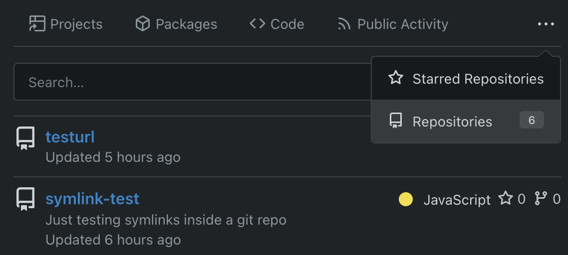
Add <overflow-menu>, rename webcomponents ( #29400 )
...
1. Add `<overflow-menu>` web component
2. Rename `<gitea-origin-url>` to `<origin-url>` and make filenames
match.
<img width="439" alt="image"
src="https://github.com/go-gitea/gitea/assets/115237/2fbe4ca4-110b-4ad2-8e17-c1e116ccbd74 ">
<img width="444" alt="Screenshot 2024-03-02 at 21 36 52"
src="https://github.com/go-gitea/gitea/assets/115237/aa8f786e-dc8c-4030-b12d-7cfb74bdfd6e ">
<img width="537" alt="Screenshot 2024-03-03 at 03 05 06"
src="https://github.com/go-gitea/gitea/assets/115237/fddd50aa-adf1-4b4b-bd7f-caf30c7b2245 ">

TODO:
- [x] Check if removal of `requestAnimationFrame` is possible to avoid
flash of content. Likely needs a `MutationObserver`.
- [x] Hide tippy when button is removed from DOM.
- [x] ~~Implement right-aligned items
(https://github.com/go-gitea/gitea/pull/28976 )~~. Not going to do it.
- [x] Clean up CSS so base element has no background and add background
via tailwind instead.
- [x] Use it for org and user page.
---------
Co-authored-by: Giteabot <teabot@gitea.io >
Co-authored-by: wxiaoguang <wxiaoguang@gmail.com >
2024-03-15 02:05:31 +00:00
35def319fd
Fix Safari spinner rendering ( #29801 )
...
Fixes: https://github.com/go-gitea/gitea/issues/29041
Fixes: https://github.com/go-gitea/gitea/pull/29713

Any of the `width: *-content` properties seem to workaround this Webkit
bug, this one seemed most suitable.
2024-03-14 22:04:33 +00:00
850fc2516e
Apply compact padding to small buttons with svg icons ( #29471 )
...
The buttons on the repo release tab were larger in height than on other
tabs because one of them contained the RSS icon which stretched the
button height by 3px. Workaround this problem by applying the "compact"
padding to any such button. They are within 0.4px in height now to
non-icon buttons.
Before:
<img width="406" alt="Screenshot 2024-02-28 at 15 30 23"
src="https://github.com/go-gitea/gitea/assets/115237/805bb93a-6fe4-40a0-82d1-03001bee8ecf ">
After:
<img width="407" alt="Screenshot 2024-02-28 at 15 38 43"
src="https://github.com/go-gitea/gitea/assets/115237/27707588-890f-4852-ab08-105a57eda880 ">
For comparison, button on issue tab:
<img width="452" alt="Screenshot 2024-02-28 at 15 31 46"
src="https://github.com/go-gitea/gitea/assets/115237/74ac13d5-d016-49ba-9dd9-40ed32a748e9 ">
2024-02-28 21:26:12 +01:00
0e650dca30
Make loading animation less aggressive ( #28955 )
...
The current animation loops in a very fast manner, causing a slight
feeling of uncomfortableness. This change slows it a bit for a smoother
experience.
# Before
# After

Signed-off-by: Yarden Shoham <git@yardenshoham.com >
2024-01-27 20:27:37 +08:00
8989d466ed
Fix flex container width ( #28603 )
...
Fix #28489
2023-12-24 22:39:02 +08:00
10a6ebb3fd
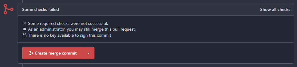
Fix the overflow style for "Hide all checks" ( #27932 )
...
Fix #27928
---------
Co-authored-by: silverwind <me@silverwind.io >
2023-11-07 18:53:35 +00:00
dcb648ee71
Add Hide/Show all checks button to commit status check ( #26284 )
...
Step one for a GitHub like commit status check ui:
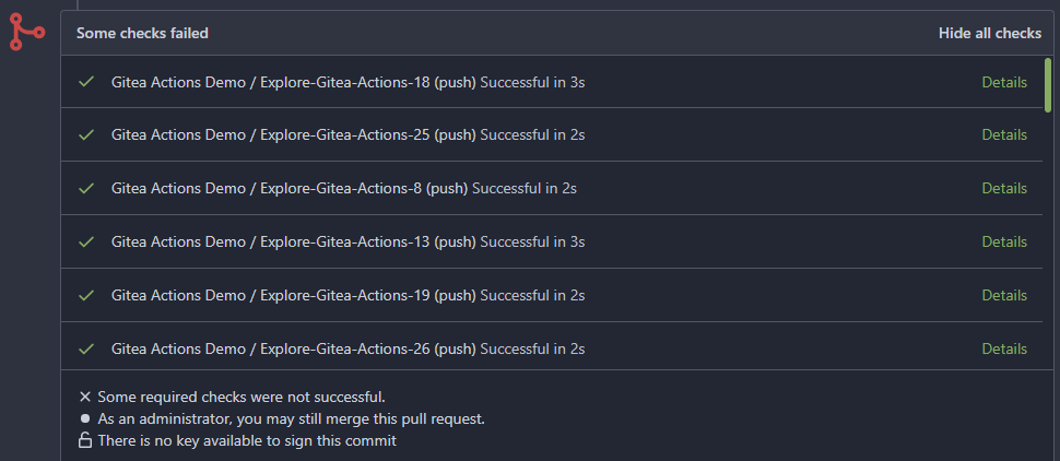
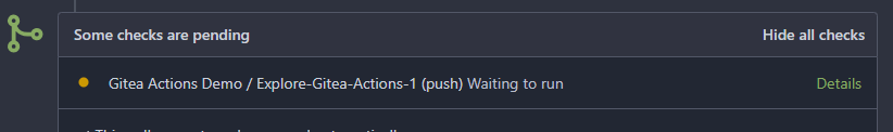
Step two:


The design now will list all commit status checks which takes too much
space.
This is a pre-improve for #26247
---------
Co-authored-by: delvh <dev.lh@web.de >
Co-authored-by: silverwind <me@silverwind.io >
Co-authored-by: wxiaoguang <wxiaoguang@gmail.com >
2023-11-02 14:49:02 +00:00
dc52f26d46
Reduce margin/padding on flex-list items and divider ( #27872 )
...
Small CSS tweak, reduces margin/padding from 14px to 10px, which I think
looks better
2023-11-02 12:30:38 +08:00
6c501b1498
Improve dropdown button alignment and fix hover bug ( #27632 )
...
1. fix #27631 , and add samples to devtest page
2. fix incorrect color for "ui dropdown button" when hover
2023-10-16 07:26:08 +00:00
72c68177ab
Improve issue history dialog and make poster can delete their own history ( #27323 )
...
Fix #27313 (see the comment)
And some UI improvements:
### Before

### After


2023-09-28 08:43:20 +00:00
7ea2a910ce
Improve branch list UI ( #27319 )
...
1. Put the `"octicon-shield-lock"` into the flex container, then it
doesn't need a separate flex box
2. Remove some unnecessary `gt-df` helpers
3. Make `btn` button has the same flex behavior as `ui button`

2023-09-28 04:04:32 +00:00
8099238618
Change green buttons to primary color ( #27099 )
...
I think it's better if the primary actions have primary color instead of
green which fits better into the overall single-color UI design. This PR
currently replaces every green button with primary:
<img width="141" alt="Screenshot 2023-09-16 at 14 07 59"
src="https://github.com/go-gitea/gitea/assets/115237/843c1e50-4fb2-4ec6-84ba-0efb9472dcbe ">
<img width="161" alt="Screenshot 2023-09-16 at 14 07 51"
src="https://github.com/go-gitea/gitea/assets/115237/9442195a-a3b2-4a42-b262-8377d6f5c0d1 ">
Modal actions now use uncolored/primary instead of previous green/red
colors. I also removed the box-shadow on all basic buttons:
<img width="259" alt="Screenshot 2023-09-16 at 14 16 39"
src="https://github.com/go-gitea/gitea/assets/115237/5beea529-127a-44b0-8d4c-afa7b034a490 ">
<img width="261" alt="Screenshot 2023-09-16 at 14 17 42"
src="https://github.com/go-gitea/gitea/assets/115237/4757f7b2-4d46-49bc-a797-38bb28437b88 ">
The change currently includes the "Merge PR" button, for which we might
want to make an exception to match the icon color there:
<img width="442" alt="Screenshot 2023-09-16 at 14 33 53"
src="https://github.com/go-gitea/gitea/assets/115237/993ac1a5-c94d-4895-b76c-0d872181a70b ">
2023-09-18 22:05:31 +00:00
a1b2a11812
Ui correction in mobile view nav bar left aligned items. ( #27046 )
...
As title
From the long time I was looking for this UI, Now its the time to fix
it.
Before
<img width="252" alt="image"
src="https://github.com/go-gitea/gitea/assets/80308335/963f2cb4-5cfd-4a14-ab85-88e25c3daef5 ">
<img width="502" alt="image"
src="https://github.com/go-gitea/gitea/assets/80308335/58453ef1-2555-4568-95d0-5293055b33b8 ">
---------
Co-authored-by: wxiaoguang <wxiaoguang@gmail.com >
Co-authored-by: Giteabot <teabot@gitea.io >
2023-09-16 16:09:25 +02:00
1875362383
Fix "delete" modal dialog for issue/PR ( #27015 )
...
Close #27012
By the way, rename the single-word ID to a long ID.
2023-09-11 17:06:05 +00:00
51cfe0e7de
Remove CSS has selector and improve various styles ( #26891 )
...
Replace #26850
Major changes:
1. Remove all `has` selectors, it is still not supported by firefox.
Actually there could be some more general and clearer approaches
2. Remove `two-toggle-buttons`, the `.ui.buttons` just works well
3. Rewrite the `.ui.buttons` border styles, see the screenshots
4. Remove the "fine-tuning" paddings from the the flex children, they
could layout themselves well.


2023-09-04 18:22:46 +08:00
79f7329971
Make it posible to customize nav text color via css var ( #26807 )
...
---
*Sponsored by Kithara Software GmbH*
2023-09-02 05:10:41 +02:00
fcb4941d47
Remove some unused CSS styles ( #26852 )
...
1. `icons`: globally searched, no use in templates.
2. toast's `display: inline-block;`: there is a `display: flex` below.
2023-09-01 08:59:38 +02:00
96ba747ff2
Fix notification circle (border-radius) ( #26794 )
...
`border-radius` means `radius`, not `diameter`, so it should be `50%` and `boxHeight / 2`
2023-08-29 14:03:34 +00:00
0ab70d4f2f
Improve modal dialog UI ( #26764 )
...
1. Fine tune the CSS styles, and add more examples
2. Add necessary "dimmer" animation for modal dialogs, otherwise the UI
seems flicking (follow #26469 )
2023-08-28 23:49:21 +00:00
dca2f9371d
Unify border-radius behavior ( #26770 )
...
## Changes
- no more hardcoded `border-radius`es (apart from `0`)
- no more value inconsistencies
- no more guessing what pixel value you should use
- two new variables:
- `--border-radius-medium` (for elements where the normal border radius
does not suffice)
- `--border-radius-circle` (for displaying circles)
---------
Co-authored-by: silverwind <me@silverwind.io >
2023-08-28 19:43:59 +00:00
8ac83043f5
Use "small-loading-icon" insead of "btn-octicon is-loading" ( #26710 )
...
The "btn-octicon is-loading" was introduced by #21842 , it is only used
by the "Copy Content" button, but the "btn-octicon" selector would
affect too many uncertain elements.

Now there is a general "small-loading-icon" class, so the "btn-octicon
is-loading" could be removed.
2023-08-24 10:21:41 -04:00
8f2e2878e5
Use line-height: normal by default ( #26635 )
...
Fix #26537 again because 1.15 is too small for some fonts.
2023-08-22 10:19:15 +00:00
376c0e25f7
Remove fomantic transition module ( #26469 )
...
Removes all dropdown and dimmer animations. Works everywhere as far as I
can tell, but need to give this thorough testing. Removes around 70kb
JS/CSS.

Note, I'm not 100% sure regarding the various callbacks, those will need
more investigation, but it appears to work nonetheless.

Fixes: https://github.com/go-gitea/gitea/issues/15709
2023-08-16 22:12:40 +00:00
3e044d2c9f
Use unique class for breadcrumb divider ( #26524 )
...
Fix regression from https://github.com/go-gitea/gitea/pull/25539 :
https://github.com/go-gitea/gitea/pull/26519#issuecomment-1678825200 .
Before:
<img width="429" alt="Screenshot 2023-08-15 at 15 46 12"
src="https://github.com/go-gitea/gitea/assets/115237/a818f60a-77a2-48fe-8e6f-363d152ccb1e ">
After:
<img width="424" alt="Screenshot 2023-08-15 at 15 46 19"
src="https://github.com/go-gitea/gitea/assets/115237/c90159e2-ced2-4a74-8a0f-a1b2b5d0b565 ">
<img width="605" alt="Screenshot 2023-08-15 at 15 56 11"
src="https://github.com/go-gitea/gitea/assets/115237/3ded6f57-86f4-422a-86cb-56dd2c216dee ">
2023-08-16 00:08:23 +00:00