1
1
mirror of https://github.com/go-gitea/gitea synced 2024-11-05 01:34:25 +00:00
Commit Graph

4480 Commits

Author SHA1 Message Date
Lunny Xiao
6375419468
Newly pushed branches hints on repository home page (#25715)
This PR will display a pull request creation hint on the repository home
page when there are newly created branches with no pull request. Only
the recent 6 hours and 2 updated branches will be displayed.

Inspired by #14003 
Replace #14003 
Resolves #311
Resolves #13196
Resolves #23743

co-authored by @kolaente
2023-07-08 05:19:00 +02:00
Maxim Slipenko
e0a780d75b
Translate untranslated string in issues list (#25759) 2023-07-07 22:36:39 +00:00
wxiaoguang
3780795b93
Reformat some templates (#25756)
Only: indent/dedent/newline
2023-07-07 18:06:49 +00:00
wxiaoguang
128d77a3a0
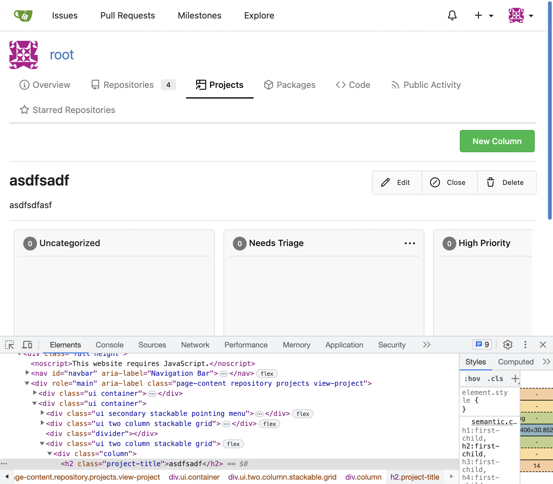
Following up fixes for "Fix inconsistent user profile layout across tabs" (#25739)
Follow
https://github.com/go-gitea/gitea/pull/25625#issuecomment-1621577816

1. Fix the incorrect "project view" layout
2. Fix the "follow/unfollow" link on "packages" and "projects" tab


Before:


![image](https://github.com/go-gitea/gitea/assets/2114189/3b071235-c186-4097-8a19-dd90dcb2a344)


After:


![image](https://github.com/go-gitea/gitea/assets/2114189/d1d23cd7-28d8-43e3-9f68-03e8a34a9b97)

---------

Co-authored-by: Giteabot <teabot@gitea.io>
2023-07-07 17:27:12 +02:00
hiifong
a6a9389c70
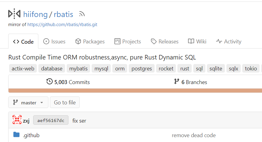
Hide add file button for pull mirrors (#25748)
I think hiding the add file button for mirror repositories that can keep the ui clean.

Before:

![image](https://github.com/go-gitea/gitea/assets/89133723/84ecf1a5-1a92-4bb1-b472-b4988a4441a9)

After:

![image](https://github.com/go-gitea/gitea/assets/89133723/95382e73-286b-4114-9997-456ed77e07ca)
2023-07-07 13:36:14 +00:00
wxiaoguang
98088befae
Fix broken translations for package documantion (#25742)
The code was just copied&pasted, it causes problems now.

There are a lot (for every package) broken translations. eg:

```
# en-US
conda.documentation = For more information on the Conda registry, see 
<a target="_blank" rel="noopener noreferrer" href="%s">the documentation</a>.

# fr-FR (and many languages)
conda.documentation=Pour plus d'informations sur le registre Conda, voir 
<a target="_blank" rel="noopener noreferrer" href="https://docs.gitea.io/fr-fr/packages/conda/">la documentation</a>.
```


To resolve the problem fundamentally, use a general string, and trigger
the re-translating on Crowdin side.


And, it should really really really avoid introducing too much
copied&pasted code .......
2023-07-07 10:47:26 +02:00
puni9869
2af30f715e
Fix inconsistent user profile layout across tabs (#25625)
Fix ::User Profile Page  Project Tab Have Inconsistent Layout and Style
Added the big_avator for consistency in the all header_items tabs.
Fixes: #24871
> ### Description
> in the user profile page the `Packages` and `Projects` tab have small
icons for user but other tabs have bigger profile picture with user
info:
> 
> ### Screenshots
> ### **For Packages And Projects:**
>
![image](https://user-images.githubusercontent.com/25511175/240148601-2420d77b-ba25-4718-9ccb-c5d0d95e3079.png)
> 
> ### **For Other Tabs:**
>
![image](https://user-images.githubusercontent.com/25511175/240148461-ce9636b3-fe11-4c46-a230-30d83eee5947.png)
> 

## Before

![image](https://github.com/go-gitea/gitea/assets/80308335/975ad038-07ca-4b10-b75d-ccf259be7b9d)


 ## After changes
Project View 
<img width="1394" alt="image"
src="https://github.com/go-gitea/gitea/assets/80308335/95d181d7-8e61-496d-9899-7b825c91ad56">


Packages View
<img width="1378" alt="image"
src="https://github.com/go-gitea/gitea/assets/80308335/7f5fd60f-6b18-4fa8-8c56-7b0d45d1a610">


## Org view for projects page
<img width="1385" alt="image"
src="https://github.com/go-gitea/gitea/assets/80308335/6400dc89-a5ae-4f0a-831b-5b6efa020d89">

## Org view for packages page
<img width="1387" alt="image"
src="https://github.com/go-gitea/gitea/assets/80308335/4e1e9ffe-1e4b-4334-8657-de11b5fd31d0">

---------

Co-authored-by: wxiaoguang <wxiaoguang@gmail.com>
Co-authored-by: Giteabot <teabot@gitea.io>
Co-authored-by: silverwind <me@silverwind.io>
2023-07-06 18:59:24 +00:00
sebastian-sauer
f03d95f0a9
Allow/fix review (approve/reject) of empty PRs (#25690)
gitea allows to create empty PRs.

Currently when you need approvals for a merge, you have to manually add
/files to the url to get to the files tab to approve / reject the PR.

This PR allows to open the files tab via the normal tab / link and then
fixes the layout of the files tab.

**Screenshots:**

Before:

![image](https://github.com/go-gitea/gitea/assets/1135157/b5082e5e-8c32-4412-993e-b854905e96d3)

After:

![image](https://github.com/go-gitea/gitea/assets/1135157/1f5e056e-396f-4dfb-8d14-e17a2f6495d9)

---------

Co-authored-by: silverwind <me@silverwind.io>
Co-authored-by: Giteabot <teabot@gitea.io>
2023-07-06 15:33:04 +00:00
Lunny Xiao
d17a848fe2
Disable run user change in installation page (#22499)
The run user should not be changed on the installation page because it
will not be any effect to Gitea.

This PR disabled the input box of run user.
2023-07-06 10:14:51 +08:00
Earl Warren
e1edd7a8e9
Show correct naming for 1 comment (#25704)
- Resolves https://codeberg.org/forgejo/forgejo/issues/948

Co-authored-by: Gusted <postmaster@gusted.xyz>
Co-authored-by: Giteabot <teabot@gitea.io>
2023-07-05 19:53:38 +00:00
Lunny Xiao
90b3b3dbf8
Fix tags header and pretty format numbers (#25624)
This caused by #23465
2023-07-05 04:11:42 +00:00
Denys Konovalov
00dbba7f42
Several fixes for mobile UI (#25634)
Resolves #25622 

<details>
<summary>Screenshots</summary>

![Bildschirmfoto vom 2023-07-02
20-47-34](https://github.com/go-gitea/gitea/assets/47871822/a8a0bff6-9ae3-48f3-b008-00c196a3f8fd)
![Bildschirmfoto vom 2023-07-02
20-47-45](https://github.com/go-gitea/gitea/assets/47871822/172a0021-af74-4690-aa67-0e66688ce733)
![Bildschirmfoto vom 2023-07-02
20-48-37](https://github.com/go-gitea/gitea/assets/47871822/14572ebd-0106-4c8a-ba27-b6b631375ee6)
![Bildschirmfoto vom 2023-07-02
20-49-08](https://github.com/go-gitea/gitea/assets/47871822/7c0ba3aa-1712-482c-aae9-13394dbdaf8a)
![Bildschirmfoto vom 2023-07-02
20-50-28](https://github.com/go-gitea/gitea/assets/47871822/8bd68e26-099a-4abd-8817-16d52af13167)
![Bildschirmfoto vom 2023-07-02
20-51-46](https://github.com/go-gitea/gitea/assets/47871822/3beab8c6-3747-4829-be50-bafaed11000c)
![Bildschirmfoto vom 2023-07-02
20-54-12](https://github.com/go-gitea/gitea/assets/47871822/51f82ef3-a32c-4c27-9056-e8711ed469cc)


</details>

---------

Co-authored-by: wxiaoguang <wxiaoguang@gmail.com>
Co-authored-by: silverwind <me@silverwind.io>
2023-07-04 17:45:45 +00:00
silverwind
0006169f38
Actions list enhancements (#25601)
Various small enhancements to the actions list. Before and after:

<img width="1264" alt="Screenshot 2023-06-30 at 00 11 40"
src="https://github.com/go-gitea/gitea/assets/115237/bb4162ee-cdcf-4a73-b05e-f9521562edbb">
<img width="1264" alt="Screenshot 2023-06-30 at 00 09 51"
src="https://github.com/go-gitea/gitea/assets/115237/52a70ea9-4bb3-406e-904b-0fdaafde9582">

---------

Co-authored-by: Giteabot <teabot@gitea.io>
2023-07-04 09:59:47 +00:00
wxiaoguang
eea58a5d55
Fix UI misalignment on user setting page (#25629)
Fix #25628

Diff with ignoring space:
https://github.com/go-gitea/gitea/pull/25629/files?diff=unified&w=1

The "modal" shouldn't appear between "ui attached segment", otherwise
these segments lose margin-top.

After the fix:

<details>


![image](https://github.com/go-gitea/gitea/assets/2114189/ac15e73d-4ca8-416a-950d-ffc912c6ab61)


![image](https://github.com/go-gitea/gitea/assets/2114189/eb431336-4d21-4e44-8beb-8919595a83c8)


![image](https://github.com/go-gitea/gitea/assets/2114189/dffaed88-5ba2-419d-a241-24cb200f757c)


![image](https://github.com/go-gitea/gitea/assets/2114189/e8c5a03e-e16a-4c94-a1a5-7845d4e1a824)

</details>
2023-07-03 20:38:06 +00:00
wxiaoguang
45bc180a15
Make "cancel" buttons have proper type in modal forms (#25618)
Replace #25446, fix #25438

All "cancel" buttons which do not have "type" should not submit the
form, should not be triggered by "Enter".

This is a complete fix for all modal dialogs.

The major change is "modules/aria/modal.js", "devtest" related code is
for demo/test purpose.
2023-07-03 14:04:50 +08:00
Lunny Xiao
7735da1c66
Display branch commit status (#25608)
Fix #10388

This PR adds a status icon for every branch which has a status check for
the latest commit on branch list page.

<img width="1313" alt="图片"
src="https://github.com/go-gitea/gitea/assets/81045/727cd540-d03a-40c6-a7dd-e87c118af0ac">
2023-07-03 03:32:21 +00:00
derelm
5b79eeabd1
use css on labels (#25626)
Changes html to use CSS label class similar to
`templates/shared/actions/runner_list.tmpl`
2023-07-03 02:33:28 +00:00
hiifong
36f1fa7792
Support displaying diff stats in PR tab bar (#25387)
Fix #25326

---------

Co-authored-by: silverwind <me@silverwind.io>
2023-07-03 01:00:28 +00:00
Lunny Xiao
de981c39e6
Fix bug of branches API with tests (#25578)
Fix #25558
Extract from #22743

This PR added a repository's check when creating/deleting branches via
API. Mirror repository and archive repository cannot do that.
2023-07-01 10:52:52 +08:00
puni9869
4583cbd615
Adding branch-name copy to clipboard branches screen. (#25596)
Adding  branch-name copy  to clipboard and button in branches screen

Replaces #25569
Fixes #25120


New mocks:
<img width="876" alt="Screenshot 2023-06-30 at 12 01 41 AM"
src="https://github.com/go-gitea/gitea/assets/80308335/a34ab00f-5625-4529-ba17-f2bf7af58e2a">
<img width="822" alt="Screenshot 2023-06-30 at 12 03 59 AM"
src="https://github.com/go-gitea/gitea/assets/80308335/3a32dffc-52cd-49e1-a437-6d11d58d0939">

<img width="476" alt="image"
src="https://github.com/go-gitea/gitea/assets/80308335/85e8f361-5cb7-45d4-aced-ad2523d54ab0">
2023-06-30 18:16:17 +00:00
sebastian-sauer
ed8a8af99f
Use AfterCommitId to get commit for Viewed functionality (#25529)
the PullHeadCommitID is not always available when the PR is merged.

Not sure if this is the best solution but in my simple tests it looks
like this fixes the problem - happy to get any feedback.

hopefully fixes https://github.com/go-gitea/gitea/issues/24813
2023-07-01 00:08:18 +08:00
JakobDev
254a82842a
Add API for changing Avatars (#25369)
This adds an API for uploading and Deleting Avatars for of Users, Repos
and Organisations. I'm not sure, if this should also be added to the
Admin API.

Resolves #25344

---------

Co-authored-by: silverwind <me@silverwind.io>
Co-authored-by: Giteabot <teabot@gitea.io>
2023-06-29 23:22:55 +00:00
Ed Silkworth
9fd63aaad1
read-only checkboxes don't appear and don't entirely act the way one might expect (#25573)
This pull request fades read-only checkboxes and checkmark, and it makes
the checkboxes act more read-only/disabled by not changing the
border-color when clicked.

Examples using light mode:
 
| Before | After |
| - | - |
| ![Kapture 2023-06-28 at 00 20
45](https://github.com/go-gitea/gitea/assets/63764270/0899fd5c-18a9-4290-9ba9-d3cf71033cf8)
| ![Kapture 2023-06-28 at 00 23
12](https://github.com/go-gitea/gitea/assets/63764270/0db9be14-e16c-42ed-8fb1-999928fd1d25)
|
| ![Kapture 2023-06-28 at 00 25
22](https://github.com/go-gitea/gitea/assets/63764270/65c6c380-b928-4e6c-b403-3655d3565896)
| ![Kapture 2023-06-28 at 00 27
28](https://github.com/go-gitea/gitea/assets/63764270/d8c2a019-e07c-43a1-a7fa-93c0d4e01900)
|
| | read-only checkboxes and checkmark are faded<br>and the checkboxes
act more read-only/disabled |

Fixes/Closes/Resolves #25076

---------

Co-authored-by: silverwind <me@silverwind.io>
Co-authored-by: wxiaoguang <wxiaoguang@gmail.com>
2023-06-30 00:16:53 +02:00
KN4CK3R
cf2356062f
Redirect to package after version deletion (#25594)
Related #25559

Current behaviour:
1. Deletion of a package version
2. Redirect to the owners package list

New behaviour:
1. Deletion of a package version
2.1. If there are more versions available, redirect to the package again
2.2. If there are no versions available, redirect to the owners package
list
2023-06-29 17:01:14 +00:00
silverwind
64f2d70262
Replace fomantic divider module with our own (#25539)
Should look exactly like before for normal dividers. "Horizontal" ones
look better because they no longer use image backgrounds.

<img width="917" alt="Screenshot 2023-06-27 at 19 07 56"
src="https://github.com/go-gitea/gitea/assets/115237/d97d8dec-6859-44a8-85ba-e4549b4dd9df">

<img width="914" alt="Screenshot 2023-06-27 at 19 05 58"
src="https://github.com/go-gitea/gitea/assets/115237/8bf98544-2d82-4ebf-ac68-d6dc237bd6b2">

<img width="1246" alt="Screenshot 2023-06-27 at 19 00 42"
src="https://github.com/go-gitea/gitea/assets/115237/36a6bb21-6029-4f53-8bee-535f55c66fed">

<img width="344" alt="Screenshot 2023-06-27 at 18 58 15"
src="https://github.com/go-gitea/gitea/assets/115237/a9e70aee-8e6b-4ea1-9e93-19c9f96aec6e">
<img width="823" alt="Screenshot 2023-06-27 at 18 56 22"
src="https://github.com/go-gitea/gitea/assets/115237/e7a497cd-f262-4683-8872-23c3c8cce32f">

<img width="330" alt="Screenshot 2023-06-27 at 19 21 11"
src="https://github.com/go-gitea/gitea/assets/115237/42f24149-a655-4c7e-bd26-8ab52db6446b">
2023-06-29 20:24:22 +08:00
Lunny Xiao
6e19484f4d
Sync branches into databases (#22743)
Related #14180
Related #25233 
Related #22639
Close #19786
Related #12763 

This PR will change all the branches retrieve method from reading git
data to read database to reduce git read operations.

- [x] Sync git branches information into database when push git data
- [x] Create a new table `Branch`, merge some columns of `DeletedBranch`
into `Branch` table and drop the table `DeletedBranch`.
- [x] Read `Branch` table when visit `code` -> `branch` page
- [x] Read `Branch` table when list branch names in `code` page dropdown
- [x] Read `Branch` table when list git ref compare page
- [x] Provide a button in admin page to manually sync all branches.
- [x] Sync branches if repository is not empty but database branches are
empty when visiting pages with branches list
- [x] Use `commit_time desc` as the default FindBranch order by to keep
consistent as before and deleted branches will be always at the end.

---------

Co-authored-by: Jason Song <i@wolfogre.com>
2023-06-29 10:03:20 +00:00
HesterG
5a871932f0
Fix milestones deletion (#25583)
Close #25557 
Fix regression from #25315

`data-id` is still needed for deleting milestone.
2023-06-29 10:17:18 +02:00
HesterG
c6f1fb1c6d
Use fetch form action for lock/unlock/pin/unpin on sidebar (#25380)
Before:

<img width="364" alt="Screen Shot 2023-06-20 at 11 59 11"
src="https://github.com/go-gitea/gitea/assets/17645053/ad284b7e-8d21-43be-b178-bbcfd37cb5bd">

Might trigger many posts when keep clicking the buttons above.

<img width="448" alt="Screen Shot 2023-06-20 at 11 52 28"
src="https://github.com/go-gitea/gitea/assets/17645053/a60aa6ac-af74-45e4-b13a-512b436b81b0">
<img width="678" alt="Screen Shot 2023-06-20 at 11 52 37"
src="https://github.com/go-gitea/gitea/assets/17645053/d6662700-3643-4cc7-a2ec-64e1c0f5fbdb">

After (PR sidebar, Same for issue):


https://github.com/go-gitea/gitea/assets/17645053/9df3ad1f-e29c-439b-8bde-e6b917d63cc6

For delete, it is using `base/modal_actions_confirm` subtemplate, and we
might need another general solution for this (maybe add another
attribute to the subtemplate or something)

---------

Co-authored-by: silverwind <me@silverwind.io>
Co-authored-by: Giteabot <teabot@gitea.io>
Co-authored-by: wxiaoguang <wxiaoguang@gmail.com>
2023-06-29 04:16:04 +00:00
Vitaliy Filippov
f0b773e0ce
Support downloading raw task logs (#24451)
Hi!
This pull request adds support for downloading raw task logs for Gitea
Actions, similar to Github Actions
It looks like the following:

![image](https://user-images.githubusercontent.com/945339/235376746-405d5019-710b-468b-8113-9e82eab8e752.png)
2023-06-29 10:58:56 +08:00
a1012112796
4aba8a6a5f
Split lfs size from repository size (#22900)
releated to #21820

- Split `Size` in repository table as two new colunms, one is `GitSize`
for git size, the other is `LFSSize` for lfs data. still store full size
in `Size` colunm.
- Show full size on ui, but show each of them by a `title`;  example:

![image](https://user-images.githubusercontent.com/25342410/218636251-e200f085-d7e7-4a25-9ff1-b586a63e07a9.png)

- Return full size in api response.

---------

Signed-off-by: a1012112796 <1012112796@qq.com>
Co-authored-by: Lunny Xiao <xiaolunwen@gmail.com>
Co-authored-by: silverwind <me@silverwind.io>
Co-authored-by: DmitryFrolovTri <23313323+DmitryFrolovTri@users.noreply.github.com>
Co-authored-by: Giteabot <teabot@gitea.io>
2023-06-28 22:41:02 +00:00
Georg Dangl
9538842364
Use correct response code in push mirror creation response in v1_json.tmpl (#25476)
In the process of doing a bit of automation via the API, we've
discovered a _small_ issue in the Swagger definition. We tried to create
a push mirror for a repository, but our generated client raised an
exception due to an unexpected status code.

When looking at this function:

3c7f5ed7b5/routers/api/v1/repo/mirror.go (L236-L240)

We see it defines `201 - Created` as response:

3c7f5ed7b5/routers/api/v1/repo/mirror.go (L260-L262)

But it actually returns `200 - OK`:

3c7f5ed7b5/routers/api/v1/repo/mirror.go (L373)

So I've just updated the Swagger definitions to match the code😀

---------

Co-authored-by: Giteabot <teabot@gitea.io>
2023-06-28 22:00:19 +00:00
wxiaoguang
b6693a2c9a
Align language menu icon and fit the footer area (#25556)
Close #25551
2023-06-28 14:57:50 +00:00
HesterG
c082689471
Use flex instead of float for sort button and search input (#25519)
Right now some sort buttons beside search input are unclickable because
#25338 removed `max-width` and the sort button is using float, sort
button is then covered by the `input`.

The way to fix this in this PR is changing the layout to `flex` and put
`input form` and sort `button` into `secondary menu`.

After:

<img width="1411" alt="Screen Shot 2023-06-26 at 16 40 52"
src="https://github.com/go-gitea/gitea/assets/17645053/63c12b17-793a-4ae7-bbda-f67b13b87212">

<img width="1428" alt="Screen Shot 2023-06-26 at 16 34 06"
src="https://github.com/go-gitea/gitea/assets/17645053/cb7d967e-355d-4cb0-955c-6139580fc17a">
<img width="716" alt="Screen Shot 2023-06-26 at 16 34 22"
src="https://github.com/go-gitea/gitea/assets/17645053/c74b5ef2-d46e-4487-8794-28bec984bb36">
<img width="1424" alt="Screen Shot 2023-06-26 at 16 34 32"
src="https://github.com/go-gitea/gitea/assets/17645053/8a5fdc05-a2c5-4ec4-979d-15a21501fe14">
<img width="1425" alt="Screen Shot 2023-06-26 at 16 35 21"
src="https://github.com/go-gitea/gitea/assets/17645053/eb73cd31-3914-4bc9-92ab-aba56f25128b">
<img width="1437" alt="Screen Shot 2023-06-26 at 16 36 14"
src="https://github.com/go-gitea/gitea/assets/17645053/1c3b4595-bb26-491f-aa68-60dc9ab22b84">
2023-06-28 20:10:36 +08:00
KN4CK3R
426a49d481
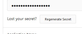
Change Regenerate Secret button display (#25534)
Fixes #25527

Preview:

![grafik](https://github.com/go-gitea/gitea/assets/1666336/a84ad1ba-43e6-42e5-a0e2-585fb226875d)
2023-06-27 15:20:52 +00:00
wxiaoguang
6dbcf6fbc5
Fix admin-dl-horizontal (#25512)
![image](https://github.com/go-gitea/gitea/assets/2114189/fb731e07-da30-4470-8200-73b5ca8b78f1)


![image](https://github.com/go-gitea/gitea/assets/2114189/85930b6f-5df7-437f-863f-423f3b81dd26)

---------

Co-authored-by: HesterG <hestergong@gmail.com>
Co-authored-by: silverwind <me@silverwind.io>
2023-06-27 09:14:45 +00:00
silverwind
c71e8abbc3
Add toasts to UI (#25449)
Fixes https://github.com/go-gitea/gitea/issues/24353

In some case like async success/error, it is useful to show toasts in UI.
2023-06-27 02:45:24 +00:00
wxiaoguang
ddf96f68cc
Use JSON response for "user/logout" (#25522)
The request sent to "user/logout" is from "link-action", it expects to
get JSON response.
2023-06-26 21:36:10 +02:00
silverwind
da6df0d063
Fix migrate page layout on mobile (#25507)
Fixes: https://github.com/go-gitea/gitea/issues/25462

On supporting browsers, text in description is [wrapped
equally](https://caniuse.com/css-text-wrap-balance).

<img width="488" alt="Screenshot 2023-06-26 at 00 17 21"
src="https://github.com/go-gitea/gitea/assets/115237/cb8e3a50-6225-4a8c-a6c0-f35a17d2af76">

<img width="1254" alt="Screenshot 2023-06-26 at 00 14 51"
src="https://github.com/go-gitea/gitea/assets/115237/0885404e-973e-45ce-b41e-5cb265a4cd1e">
2023-06-26 09:57:36 +00:00
wxiaoguang
d5f007539a
Clarify the reason why the user can't add a new email if there is a pending activation (#25509)
![image](https://github.com/go-gitea/gitea/assets/2114189/cff20df0-ad0c-4140-b8e2-5782cad8a53a)
2023-06-26 04:52:49 +00:00
sebastian-sauer
7609f2f27e
Link to existing PR when trying to open a new PR on the same branches (#25494)
when trying to create a PR for an existing PRs branch combination link
to the PR directly and not just to the repo.

Before:

![image](https://github.com/go-gitea/gitea/assets/1135157/b6c71323-29c8-4024-afa5-420eed145e91)

After:

![image](https://github.com/go-gitea/gitea/assets/1135157/837665f5-7459-46c6-86d4-c2dbedabc262)
2023-06-25 10:03:36 +00:00
wxiaoguang
323c6cba20
Fine tune "dropdown button" icon (#25442)
![image](https://github.com/go-gitea/gitea/assets/2114189/143e043d-85c9-43a4-85ae-ca55f507f738)

----

![image](https://github.com/go-gitea/gitea/assets/2114189/bcba03a5-732e-4139-bc35-96a7f8bfcb88)
2023-06-25 02:40:41 +00:00
sebastian-sauer
77e449f0be
Highlight viewed files differently in the PR filetree (#24956)
![image](https://github.com/go-gitea/gitea/assets/1135157/009d8026-15a1-4d18-8548-1c3642978f57)

fixes #24566

---------

Co-authored-by: wxiaoguang <wxiaoguang@gmail.com>
2023-06-25 08:46:30 +08:00
Lunny Xiao
083818cb85
Improve loadprojects for issue list (#25468) 2023-06-24 15:31:28 +00:00
Panagiotis "Ivory" Vasilopoulos
5eeddfde10
Only show 'Manage Account Links' when necessary (#25311)
If it is not possible to add or manage an account link, the menu
will not be shown to the user.
2023-06-24 13:00:52 +00:00
hiifong
8e6a114317
fix tags line no margin see #25255 (#25280)
This is my first pr, there are many things I don't understand very well,
I am very sorry, I rearranged the code and opened this new pr.
Now:

![image](https://github.com/go-gitea/gitea/assets/89133723/5acd9d81-2152-4966-9372-1fbf902ed073)
2023-06-24 20:30:46 +08:00
silverwind
be47015229
Navbar fixes (#25402)
Fixes: https://github.com/go-gitea/gitea/issues/25444

Followup for some regressions from
https://github.com/go-gitea/gitea/pull/25343. Before and after:

<img width="219" alt="Screenshot 2023-06-21 at 00 25 20"
src="https://github.com/go-gitea/gitea/assets/115237/08fe8e01-0a16-4cdf-ad4d-0a9048408e9e">
<img width="220" alt="Screenshot 2023-06-21 at 00 25 32"
src="https://github.com/go-gitea/gitea/assets/115237/be25ae69-6ed0-4af5-8eeb-d7b210e7c124">

Fixes mobile button background and margins:

<img width="836" alt="Screenshot 2023-06-21 at 00 39 58"
src="https://github.com/go-gitea/gitea/assets/115237/d76ac1e9-747f-477c-9a42-b73e129b72ee">
2023-06-24 04:31:39 +00:00
wxiaoguang
62ab55bacc
Improve wiki sidebar and TOC (#25460)
Close #20976
Close #20975

1. Fix the bug: the TOC in footer was incorrectly rendered as main
content's TOC
2. Fix the layout: on mobile, the TOC is put above the main content,
while the sidebar is put below the main content
3. Auto collapse the TOC on mobile

ps: many styles of "wiki.css" are moved from old css files, so leave
nits to following PRs.
2023-06-23 15:51:43 -04:00
Lunny Xiao
fab63cf565
Fix repo search broken because of profile page added (#25455)
Fix #25433 
Caused by #23260
2023-06-23 13:11:12 +00:00
6543
b0215c40cd
Store and use seconds for timeline time comments (#25392)
this will allow us to fully localize it later

PS: we can not migrate back as the old value was a one-way conversion


prepare for  #25213

---
*Sponsored by Kithara Software GmbH*
2023-06-23 12:12:39 +00:00
wxiaoguang
17965c8e79
Make "dismiss" content shown correctly (#25461)
Close #25127


![image](https://github.com/go-gitea/gitea/assets/2114189/7d6be811-8e4a-4982-a5e4-857d171758d4)

Co-authored-by: Giteabot <teabot@gitea.io>
2023-06-23 12:33:20 +02:00
Denys Konovalov
bb31f36415
Remove test string (#25447)
Remove test string on delete project button, I overlooked it in a
previous PR 😄
2023-06-22 10:29:57 -05:00
silverwind
7fb539677b
Diff page enhancements (#25398)
Two small tweaks:

1. Vertically center arrow here when editing a PR:

<img width="405" alt="Screenshot 2023-06-20 at 19 48 49"
src="https://github.com/go-gitea/gitea/assets/115237/1d63764d-9fd9-467e-8a8e-9258c06475eb">

2. Use 2-row layout on diff viewed status and show it again on mobile:

<img width="142" alt="Screenshot 2023-06-20 at 19 51 21"
src="https://github.com/go-gitea/gitea/assets/115237/3046e782-163c-4f87-910c-a22066de8f1b">

Mobile view:

<img width="370" alt="Screenshot 2023-06-20 at 19 44 40"
src="https://github.com/go-gitea/gitea/assets/115237/9cf56347-7323-4d05-99a5-17ad215ee44d">
2023-06-22 11:05:22 +00:00
silverwind
af094fbb6c
Introduce shared template for search inputs (#25338)
- Set
[type=search](https://developer.mozilla.org/en-US/docs/Web/HTML/Element/input/search)
- Disable spellcheck
- Set maxLength 255 that I found in `templates/repo/issue/search.tmpl`
- Remove unnecessary `max-width`, it does nothing

---------

Co-authored-by: delvh <dev.lh@web.de>
Co-authored-by: Giteabot <teabot@gitea.io>
2023-06-22 10:27:35 +00:00
Panagiotis "Ivory" Vasilopoulos
ff90c87c87
Improve 'Privacy' section in profile settings (#25309)
- Improve "Hide the activity from the profile page" label
- E-Mail privacy icon in user profile now redirects to Privacy section
- E-Mail privacy settings moved to Privacy section

Previously, the user was redirected to the setting itself, however,
that is not a good design choice because the setting itself would
be at the very top of the user's browser window. This fix doesn't
fix the problem entirely, but it is definitely an improvement
compared to its previous iteration.
2023-06-22 08:58:16 +00:00
silverwind
656d3cc719
Various UI fixes (#25264)
Numerous small UI fixes:

- Fix double border in collaborator list
- Fix system notice table background
- Mute links in repo and org lists
- Downsize projects edit buttons
- Improve milestones and project list rendering
- Condense milestone list entry to a single line of "metas"
- Mute ".." button in repo files list
2023-06-21 21:59:49 -04:00
sebastian-sauer
25455bc670
Show outdated comments in files changed tab (#24936)
If enabled show a clickable label in the comment. A click on the label
opens the Conversation tab with the comment focussed - there you're able
to view the old diff (or original diff the comment was created on).

**Screenshots**


![image](https://github.com/go-gitea/gitea/assets/1135157/63ab9571-a9ee-4900-9f02-94ab0095f9e7)

![image](https://github.com/go-gitea/gitea/assets/1135157/78f7c225-8d76-46f5-acfd-9b8aab988a6c)


When resolved and outdated:

![image](https://github.com/go-gitea/gitea/assets/1135157/6ece9ebd-c792-4aa5-9c35-628694e9d093)

Option to enable/disable this (stored in user settings - default is
disabled):

![image](https://github.com/go-gitea/gitea/assets/1135157/ed99dfe4-76dc-4c12-bd96-e7e62da50ab5)

![image](https://github.com/go-gitea/gitea/assets/1135157/e837a052-e92e-4a28-906d-9db5bacf93a6)


fixes #24913

---------

Co-authored-by: silverwind <me@silverwind.io>
2023-06-21 16:08:12 +00:00
wxiaoguang
ce46834b93
Remove "CHARSET" config option for MySQL, always use "utf8mb4" (#25413)
In modern days, there is no reason to make users set "charset" anymore.

Close #25378

## ⚠️ BREAKING

The key `[database].CHARSET` was removed completely as every newer
(>10years) MySQL database supports `utf8mb4` already.
There is a (deliberately) undocumented new fallback option if anyone
still needs to use it, but we don't recommend using it as it simply
causes problems.
2023-06-21 10:49:25 +00:00
wxiaoguang
2cdf260f42
Refactor path & config system (#25330)
# The problem

There were many "path tricks":

* By default, Gitea uses its program directory as its work path
* Gitea tries to use the "work path" to guess its "custom path" and
"custom conf (app.ini)"
* Users might want to use other directories as work path
* The non-default work path should be passed to Gitea by GITEA_WORK_DIR
or "--work-path"
* But some Gitea processes are started without these values
    * The "serv" process started by OpenSSH server
    * The CLI sub-commands started by site admin
* The paths are guessed by SetCustomPathAndConf again and again
* The default values of "work path / custom path / custom conf" can be
changed when compiling

# The solution

* Use `InitWorkPathAndCommonConfig` to handle these path tricks, and use
test code to cover its behaviors.
* When Gitea's web server runs, write the WORK_PATH to "app.ini", this
value must be the most correct one, because if this value is not right,
users would find that the web UI doesn't work and then they should be
able to fix it.
* Then all other sub-commands can use the WORK_PATH in app.ini to
initialize their paths.
* By the way, when Gitea starts for git protocol, it shouldn't output
any log, otherwise the git protocol gets broken and client blocks
forever.

The "work path" priority is: WORK_PATH in app.ini > cmd arg --work-path
> env var GITEA_WORK_DIR > builtin default

The "app.ini" searching order is: cmd arg --config > cmd arg "work path
/ custom path" > env var "work path / custom path" > builtin default


## ⚠️ BREAKING

If your instance's "work path / custom path / custom conf" doesn't meet
the requirements (eg: work path must be absolute), Gitea will report a
fatal error and exit. You need to set these values according to the
error log.


----

Close #24818
Close #24222
Close #21606
Close #21498
Close #25107
Close #24981
Maybe close #24503

Replace #23301
Replace #22754

And maybe more
2023-06-21 13:50:26 +08:00
HesterG
1454f9dafc
Add actor and status dropdowns to run list (#25118)
Part of #25042

1. Added actor and status dropdowns first in case something is offtrack
and PR is too large.

2. Also added "No results matched." and "The workflow has no runs yet.",
and "No results matched." will show if there is no filter results and
there is no workflows (with [reference to github
action](https://github.com/go-gitea/gitea/actions/workflows/files-changed.yml?query=actor%3AGiteaBot))

Demo:


https://github.com/go-gitea/gitea/assets/17645053/6e76292c-4c1f-450d-8b48-99944cfc920c


TODOs:

- [x] Get available status (same as those in `aggregateJobStatus`)
instead of getting from database
- [x] Use `JOIN` to get actors, actors order by name
- [x] Make self on top
2023-06-21 04:25:14 +00:00
wxiaoguang
831db53c21
Fix dropdown icon layout on diff page (#25397)
Address
https://github.com/go-gitea/gitea/pull/25163#issuecomment-1599207916

Remove the unused  "icon-button".

And fix the layout:

Without the dropdown icon:

```
	{{svg "gitea-whitespace"}}
```


![image](https://github.com/go-gitea/gitea/assets/2114189/58a524ba-f289-4982-aea2-6f9f9f9cbdcf)


With the dropdown icon:

```
	{{svg "gitea-whitespace" 16 "gt-mr-3"}}
	{{svg "octicon-triangle-down" 14 "dropdown icon"}}
```


![image](https://github.com/go-gitea/gitea/assets/2114189/eb99168b-5d49-40a7-8665-5296cbb4e486)
2023-06-20 23:22:48 +00:00
sillyguodong
35a653d7ed
Support configuration variables on Gitea Actions (#24724)
Co-Author: @silverwind @wxiaoguang 
Replace: #24404

See:
- [defining configuration variables for multiple
workflows](https://docs.github.com/en/actions/learn-github-actions/variables#defining-configuration-variables-for-multiple-workflows)
- [vars
context](https://docs.github.com/en/actions/learn-github-actions/contexts#vars-context)

Related to:
- [x] protocol: https://gitea.com/gitea/actions-proto-def/pulls/7
- [x] act_runner: https://gitea.com/gitea/act_runner/pulls/157
- [x] act: https://gitea.com/gitea/act/pulls/43

#### Screenshoot
Create Variable:

![image](https://user-images.githubusercontent.com/33891828/236758288-032b7f64-44e7-48ea-b07d-de8b8b0e3729.png)


![image](https://user-images.githubusercontent.com/33891828/236758174-5203f64c-1d0e-4737-a5b0-62061dee86f8.png)

Workflow:
```yaml
  test_vars:
    runs-on: ubuntu-latest
    steps:
      - name: Print Custom Variables
        run: echo "${{ vars.test_key }}"
      - name: Try to print a non-exist var
        run: echo "${{ vars.NON_EXIST_VAR }}"
```

Actions Log:

![image](https://user-images.githubusercontent.com/33891828/236759075-af0c5950-368d-4758-a8ac-47a96e43b6e2.png)

---
This PR just implement the org / user (depends on the owner of the
current repository) and repo level variables, The Environment level
variables have not been implemented.
Because
[Environment](https://docs.github.com/en/actions/deployment/targeting-different-environments/using-environments-for-deployment#about-environments)
is a module separate from `Actions`. Maybe it would be better to create
a new PR to do it.

---------

Co-authored-by: silverwind <me@silverwind.io>
Co-authored-by: wxiaoguang <wxiaoguang@gmail.com>
Co-authored-by: Giteabot <teabot@gitea.io>
2023-06-20 22:54:15 +00:00
silverwind
e50c3e8431
Navbar styling rework (#25343)
- Extract navbar CSS to own file
- Reduce height from 52px to 50px
- Give every item a hover effect of of 36px, including the logo and on
mobile
- Consistent horizontal padding of 10px left and right

<img width="549" alt="Screenshot 2023-06-18 at 13 41 16"
src="https://github.com/go-gitea/gitea/assets/115237/0b00d101-253e-4b1f-9ee2-322d60fb2e26">

<img width="98" alt="Screenshot 2023-06-18 at 14 03 43"
src="https://github.com/go-gitea/gitea/assets/115237/4ef5d98b-4d1e-45de-822e-c2c844e19876">
<img width="234" alt="Screenshot 2023-06-18 at 14 03 18"
src="https://github.com/go-gitea/gitea/assets/115237/a4d9b04b-83de-42aa-a9ce-f010a9690688">

<img width="873" alt="Screenshot 2023-06-18 at 13 58 28"
src="https://github.com/go-gitea/gitea/assets/115237/8cb8e31e-2adf-40c8-ae3f-d00d011b4d1b">

---------

Co-authored-by: wxiaoguang <wxiaoguang@gmail.com>
Co-authored-by: Giteabot <teabot@gitea.io>
2023-06-20 20:35:25 +00:00
silverwind
ef6f5f0124
rename tributeValues to mentionValues (#25375)
Very simple change, just rename this variable so it does not feature the
name of the module.
2023-06-20 03:32:49 +00:00
Denys Konovalov
7f38cf71fe
Fix issue filters on mobile view (#25368)
Fix #24846 applying the solution proposed by @silverwind 

<details>
<summary>Screenshots</summary>


![Bildschirmfoto vom 2023-06-19
12-20-54](https://github.com/go-gitea/gitea/assets/47871822/3f4e4536-38c4-451b-bfc0-a7c39acd37f0)
![Bildschirmfoto vom 2023-06-19
12-21-02](https://github.com/go-gitea/gitea/assets/47871822/3403ecc2-4d7f-4acd-b0c0-1b7a10228ff7)
![Bildschirmfoto vom 2023-06-19
12-21-16](https://github.com/go-gitea/gitea/assets/47871822/ef28a2bf-b7cc-4aec-b54b-99d2cc46a1f6)
![Bildschirmfoto vom 2023-06-19
12-21-21](https://github.com/go-gitea/gitea/assets/47871822/f8cd72a5-379e-410b-b0ef-d58895719370)
![Bildschirmfoto vom 2023-06-19
12-21-28](https://github.com/go-gitea/gitea/assets/47871822/34c78301-820c-4106-a086-ae81dc97eb91)
![Bildschirmfoto vom 2023-06-19
12-21-48](https://github.com/go-gitea/gitea/assets/47871822/b677adf1-3a48-42c8-befe-fa9d2679f0a3)
</details>


Replaces #25335
2023-06-19 17:12:15 +00:00
6543
749802c922
Refactor: TotalTimest return seconds (#25370)
so template/browser can deal with string format

---
*Sponsored by Kithara Software GmbH*
2023-06-19 18:40:06 +02:00
wxiaoguang
a1c5057fe8
Batch delete issue and improve tippy opts (#25253)
1. Add "batch delete" button for selected issues, close #22273
2. Address the review in
https://github.com/go-gitea/gitea/pull/25219#discussion_r1229266083
2023-06-19 15:46:50 +08:00
wxiaoguang
bfab129fb9
Fix label list divider (#25312)
We only needs 2 lines to hide the dividers.

```
  $dropdownLabelFilter.dropdown('setting', {'hideDividers': 'empty'});
  $dropdownLabelFilter.dropdown('refreshItems');
```

Other code blocks are refactored by the way.


![image](https://github.com/go-gitea/gitea/assets/2114189/74989996-fcea-4df4-b534-b06f7957939a)


![image](https://github.com/go-gitea/gitea/assets/2114189/ee3b3761-b96e-4fb5-b646-e9d3117e5f40)
2023-06-18 17:33:12 +00:00
Denys Konovalov
9e74063498
Fix UI on mobile view (#25315)
Various fixes to pages or elements which were looking ugly on mobile.
<details>
<summary>Screenshots</summary>

![Bildschirmfoto vom 2023-06-17
20-38-41](https://github.com/go-gitea/gitea/assets/47871822/30b5d3ce-df3b-43eb-a4c2-c3790667fb9d)
![Bildschirmfoto vom 2023-06-17
20-39-27](https://github.com/go-gitea/gitea/assets/47871822/27c07b25-3602-4fb2-b34d-d5e875e054e9)
![Bildschirmfoto vom 2023-06-17
20-41-27](https://github.com/go-gitea/gitea/assets/47871822/dacdbb4e-e3dd-4b94-abf0-c68e3d64bd3b)
![Bildschirmfoto vom 2023-06-17
20-41-48](https://github.com/go-gitea/gitea/assets/47871822/72432c35-7c4a-4c7f-a767-3562f26a5c14)
![Bildschirmfoto vom 2023-06-17
20-42-37](https://github.com/go-gitea/gitea/assets/47871822/737c26ed-1910-4467-98ef-e8769bbbe6f0)
![Bildschirmfoto vom 2023-06-17
20-42-52](https://github.com/go-gitea/gitea/assets/47871822/1813b4bc-43c0-4912-8acb-5d799c090bf3)
![Bildschirmfoto vom 2023-06-17
20-43-06](https://github.com/go-gitea/gitea/assets/47871822/136466e8-34e5-419d-97ec-5202ff819fd2)
![Bildschirmfoto vom 2023-06-17
20-43-42](https://github.com/go-gitea/gitea/assets/47871822/59270bb2-d661-4a84-8504-3e50f771f767)
![Bildschirmfoto vom 2023-06-17
20-44-44](https://github.com/go-gitea/gitea/assets/47871822/494e274d-3771-4141-9419-0a4bbd8b7f64)

</details>

Co-authored by @silverwind

---------

Co-authored-by: silverwind <me@silverwind.io>
2023-06-18 10:31:42 +00:00
hiifong
57120d9969
When viewing a file, hide the add button (#25320)
Fix #25281
When viewing a file, hide the add button

![image](https://github.com/go-gitea/gitea/assets/89133723/839babaf-6b67-46e1-a103-677306fb8503)

![image](https://github.com/go-gitea/gitea/assets/89133723/32a8aeca-31f4-4ce1-a0fa-7656e16b66d3)
2023-06-18 09:21:50 +00:00
silverwind
f47744c3f1
Update JS dependencies, remove space after emoji completion (#25266)
- Update all JS dependencies
- Enable stylint
[`media-feature-name-value-no-unknown`](https://stylelint.io/user-guide/rules/media-feature-name-value-no-unknown)
- Make use of new features in webpack and text-expander-element
- Tested Swagger and Mermaid

To explain the `text-expander-element` change: Before this version, the
element added a unavoidable space after emoji completion. Now that
https://github.com/github/text-expander-element/pull/36 is in, we gain
control over this space and I opted to remove it for emoji completion
and retain it for `@` mentions.

---------

Co-authored-by: Giteabot <teabot@gitea.io>
2023-06-18 08:38:47 +00:00
KN4CK3R
86d019682f
Fix displayed RPM repo url (#25310)
Fixes #25302
2023-06-16 11:56:49 -04:00
wxiaoguang
b71cb7acdc
Use fetch to send requests to create issues/comments (#25258)
Follow #23290

Network error won't make content lost. And this is a much better
approach than "loading-button".

The UI is not perfect and there are still some TODOs, they can be done
in following PRs, not a must in this PR's scope.

<details>


![image](https://github.com/go-gitea/gitea/assets/2114189/c94ba958-aa46-4747-8ddf-6584deeed25c)

</details>
2023-06-16 06:32:43 +00:00
JakobDev
a305c37e62
Show if File is Executable (#25287)
This simply shows if a File has the executable Permission


![grafik](https://github.com/go-gitea/gitea/assets/15185051/1d50c105-6d55-4ecc-808a-c9cd5559d238)

---------

Co-authored-by: silverwind <me@silverwind.io>
Co-authored-by: Giteabot <teabot@gitea.io>
2023-06-16 07:46:12 +02:00
wxiaoguang
6db66d8ca4
Fix some UI alignments (#25277)
Fixes: https://github.com/go-gitea/gitea/issues/25282

Fix the problems:

1. The `repo-button-row` had various patches before, this PR makes it
consistent
2. The "Add File" has wrong CSS class "icon", remove it
3. The "Add File" padding was overridden by "!important", fix it by
`.repo-button-row .button.dropdown` with comment
4. The selector `.ui.segments ~ .ui.top.attached.header` is incorrect,
it should use `+`
2023-06-15 15:12:08 +00:00
wxiaoguang
73ae71824d
Show OAuth2 errors to end users (#25261)
Partially fix #23936


![image](https://github.com/go-gitea/gitea/assets/2114189/8aa7f3ad-a5f0-42ce-a478-289a03bd08a3)


![image](https://github.com/go-gitea/gitea/assets/2114189/bb901e7d-485a-47a5-b68d-9ebe7013a6b2)


![image](https://github.com/go-gitea/gitea/assets/2114189/9a1ce0f3-f011-4baf-8e2f-cc6304bc9703)
2023-06-15 01:12:50 +00:00
silverwind
5440d37c70
Fix variable in template (#25267)
Fix regression from https://github.com/go-gitea/gitea/pull/25212.
2023-06-14 20:42:52 +00:00
silverwind
e24f651c86
Add template linting via djlint (#25212)
So I found this [linter](https://github.com/Riverside-Healthcare/djlint)
which features a mode for go templates, so I gave it a try and it did
find a number of valid issue, like unbalanced tags etc. It also has a
number of bugs, I had to disable/workaround many issues.

Given that this linter is written in python, this does add a dependency
on `python` >= 3.8 and `poetry` to the development environment to be
able to run this linter locally.

- `e.g.` prefixes on placeholders are removed because the linter had a
false-positive on `placeholder="e.g. cn=Search"` for the `attr=value`
syntax and it's not ideal anyways to write `e.g.` into a placeholder
because a placeholder is meant to hold a sample value.
- In `templates/repo/settings/options.tmpl` I simplified the logic to
not conditionally create opening tags without closing tags because this
stuff confuses the linter (and possibly the reader as well).
2023-06-14 18:17:58 +00:00
Denys Konovalov
a0eaf08812
Fix edit OAuth application width (#25262)
The `<div class="ui container">` broke the width of this section - fix
by removing it.
2023-06-14 17:45:13 +00:00
wxiaoguang
46c17c8029
Use flex to align SVG and text (#25163)
The code can be as simple as:

```html
<div class="flex-text-block">{{svg "octicon-alert"}} {{svg "octicon-x"}} text (block)</div>
<div><div class="flex-text-inline">{{svg "octicon-alert"}} {{svg "octicon-x"}} text</div> (inline)</div>
<div><button class="ui red button">{{svg "octicon-alert" 24}} {{svg "octicon-x" 24}} text</button></div>
```


![image](https://github.com/go-gitea/gitea/assets/2114189/1d3c10f1-0bc7-4c26-b236-bad537d5c465)

---------

Co-authored-by: Giteabot <teabot@gitea.io>
2023-06-14 16:40:15 +00:00
HesterG
a43ea22479
Change form actions to fetch for submit review box (#25219)
Co-author: @wxiaoguang 

Close #25096 

The way to fix it in this PR is to change form submit to fetch using
formData, and add flags to avoid post repeatedly.
Should be able to apply to more forms that have the same issue after
this PR.

In the demo below, 'approve' is clicked several times, and then
'comment' is clicked several time after 'request changes' clicked.

After:


https://github.com/go-gitea/gitea/assets/17645053/beabeb1d-fe66-4b76-b048-4f022b4e83a0


Update: screenshots from /devtest

>
![image](https://user-images.githubusercontent.com/2114189/245680011-ee4231e0-a53d-4c2a-a9c2-71ccd98005cc.png)
> 
>
![image](https://user-images.githubusercontent.com/2114189/245680057-9215d348-63d8-406d-8828-17e171163aaa.png)
> 
>
![image](https://user-images.githubusercontent.com/2114189/245680148-89d7b3d1-d7b6-442f-b69e-eadaee112482.png)

---------

Co-authored-by: wxiaoguang <wxiaoguang@gmail.com>
2023-06-14 16:01:37 +08:00
Lunny Xiao
d6dd6d641b
Fix all possible setting error related storages and added some tests (#23911)
Follow up #22405

Fix #20703 

This PR rewrites storage configuration read sequences with some breaks
and tests. It becomes more strict than before and also fixed some
inherit problems.

- Move storage's MinioConfig struct into setting, so after the
configuration loading, the values will be stored into the struct but not
still on some section.
- All storages configurations should be stored on one section,
configuration items cannot be overrided by multiple sections. The
prioioty of configuration is `[attachment]` > `[storage.attachments]` |
`[storage.customized]` > `[storage]` > `default`
- For extra override configuration items, currently are `SERVE_DIRECT`,
`MINIO_BASE_PATH`, `MINIO_BUCKET`, which could be configured in another
section. The prioioty of the override configuration is `[attachment]` >
`[storage.attachments]` > `default`.
- Add more tests for storages configurations.
- Update the storage documentations.

---------

Co-authored-by: wxiaoguang <wxiaoguang@gmail.com>
2023-06-14 11:42:38 +08:00
sillyguodong
8228751c55
Support changing labels of Actions runner without re-registration (#24806)
close #24540

related:
- Protocol: https://gitea.com/gitea/actions-proto-def/pulls/9
- Runner side: https://gitea.com/gitea/act_runner/pulls/201

changes:
- Add column of `labels` to table `action_runner`, and combine the value
of `agent_labels` and `custom_labels` column to `labels` column.
- Store `labels` when registering `act_runner`.
- Update `labels` when `act_runner` starting and calling `Declare`.
- Users cannot modify the `custom labels` in edit page any more.

other changes:
- Store `version` when registering `act_runner`.
- If runner is latest version, parse version from `Declare`. But older
version runner still parse version from request header.
2023-06-13 22:28:31 +08:00
wxiaoguang
6bbccdd177
Improve AJAX link and modal confirm dialog (#25210)
Clarify the "link-action" behavior:

>  // A "link-action" can post AJAX request to its "data-url"
> // Then the browser is redirect to: the "redirect" in response, or
"data-redirect" attribute, or current URL by reloading.

And enhance the "link-action" to support showing a modal dialog for
confirm. A similar general approach could also help PRs like
https://github.com/go-gitea/gitea/pull/22344#discussion_r1062883436

> // If the "link-action" has "data-modal-confirm(-html)" attribute, a
confirm modal dialog will be shown before taking action.


And a lot of duplicate code can be removed now. A good framework design
can help to avoid code copying&pasting.

---------

Co-authored-by: silverwind <me@silverwind.io>
2023-06-13 12:10:10 +00:00
silverwind
a51b115b0a
Use inline SVG for built-in OAuth providers (#25171)
The plan is that all built-in auth providers use inline SVG for more
flexibility in styling and to get the GitHub icon to follow
`currentcolor`. This only removes the `public/img/auth` directory and
adds the missing svgs to our svg build.

It should map the built-in providers to these SVGs and render them. If
the user has set a Icon URL, it should render that as an `img` tag
instead.

```
gitea-azure-ad
gitea-bitbucket
gitea-discord
gitea-dropbox
gitea-facebook
gitea-gitea
gitea-gitlab
gitea-google
gitea-mastodon
gitea-microsoftonline
gitea-nextcloud
gitea-twitter
gitea-yandex
octicon-mark-github
```

GitHub logo is now white again on dark theme:

<img width="431" alt="Screenshot 2023-06-12 at 21 45 34"
src="https://github.com/go-gitea/gitea/assets/115237/27a43504-d60a-4132-a502-336b25883e4d">

---------

Co-authored-by: wxiaoguang <wxiaoguang@gmail.com>
2023-06-13 10:51:02 +00:00
Punit Inani
2ad2d5a6ce
Disable Create column button while the column name is empty (#25192)
![Jun-10-2023
18-43-04](https://github.com/go-gitea/gitea/assets/80308335/4796c9be-d161-43a0-a3e3-d9cd6a19cda4)

Fixes #25116
2023-06-13 09:57:03 +00:00
Jonathan Tran
a583c56306
Change access token UI to select dropdowns (#25109)
The current UI to create API access tokens uses checkboxes that have a
complicated relationship where some need to be checked and/or disabled
in certain states. It also requires that a user interact with it to
understand what their options really are.

This branch changes to use `<select>`s. It better fits the available
options, and it's closer to [GitHub's
UI](https://github.com/settings/personal-access-tokens/new), which is
good, in my opinion. It's more mobile friendly since the tap-areas are
larger. If we ever add more permissions, like Maintainer, there's a
natural place that doesn't take up more screen real-estate.

This branch also fixes a few minor issues:

- Hide the error about selecting at least one permission after second
submission
- Fix help description to call it "authorization" since that's what
permissions are about (not authentication)

Related: #24767.

<img width="883" alt="Screenshot 2023-06-07 at 5 07 34 PM"
src="https://github.com/go-gitea/gitea/assets/10803/6b63d807-c9be-4a4b-8e53-ecab6cbb8f76">

---

When it's open:

<img width="881" alt="Screenshot 2023-06-07 at 5 07 59 PM"
src="https://github.com/go-gitea/gitea/assets/10803/2432c6d0-39c2-4ca4-820e-c878ffdbfb69">
2023-06-13 15:55:48 +08:00
HesterG
06557a75db
Adjust style for action run list (align icons, adjust padding) (#25170)
Main changes:

- Moved the icon into `action-item-main`, and make it `position:
absolute` to allow add margin it to align with `issue-item-top-row`.
- Adjusted padding and color of texts.


# Before

<img width="721" alt="Screen Shot 2023-06-09 at 17 04 38"
src="https://github.com/go-gitea/gitea/assets/17645053/3fc00e94-bcd4-4e06-b1d8-93be0576dbc3">


# After

<img width="1421" alt="Screen Shot 2023-06-09 at 18 32 47"
src="https://github.com/go-gitea/gitea/assets/17645053/c2a0f9df-cac4-4197-9cbd-6c16dfef215b">

On hover:

<img width="1431" alt="Screen Shot 2023-06-09 at 18 32 54"
src="https://github.com/go-gitea/gitea/assets/17645053/d0ab6fde-9722-4d76-831b-163fd6a1f560">
2023-06-12 09:36:08 +00:00
yp05327
81211db077
Fix #25133 (#25162)
Fix #25133

Thanks @wxiaoguang @silverwind.
I'm sorry I made a mistake, it will be fixed in this PR.

---------

Co-authored-by: Giteabot <teabot@gitea.io>
Co-authored-by: silverwind <me@silverwind.io>
2023-06-09 10:27:10 +00:00
silverwind
6a075589bf
Fix mobile navbar and misc cleanups (#25134)
- Fix and improve mobile navbar layout
- Apply all cleanups suggested in
https://github.com/go-gitea/gitea/pull/25111
- Make media query breakpoints match Fomantic's exactly
- Clean up whitespace in class on navbar items

Mobile navbar before and after:
<img width="745" alt="Screenshot 2023-06-08 at 08 40 56"
src="https://github.com/go-gitea/gitea/assets/115237/ca84b239-b10f-41db-8c06-dcf2b6dd9d28">
<img width="739" alt="Screenshot 2023-06-08 at 08 41 23"
src="https://github.com/go-gitea/gitea/assets/115237/09133c54-eb7e-4110-858c-ead23c3b7521">

---------

Co-authored-by: wxiaoguang <wxiaoguang@gmail.com>
Co-authored-by: Giteabot <teabot@gitea.io>
2023-06-09 09:10:51 +00:00
silverwind
623b3b590e
Button and color enhancements (#24989)
- Various corrections to button styles, especially secondary
- Remove focus highlight, it's annoying when it stays on button after
press
- Clearly define ghost and link buttons with demos in devtest
- Remove black, grey and tertiary buttons, they should not be used
- Make `arc-green` slightly darker

<img width="1226" alt="image"
src="https://github.com/go-gitea/gitea/assets/115237/8d89786a-01ab-40f8-ae5a-e17f40e35084">
<img width="1249" alt="image"
src="https://github.com/go-gitea/gitea/assets/115237/83651e6d-3c27-46ff-b8bd-ff344d70e949">

---------

Co-authored-by: wxiaoguang <wxiaoguang@gmail.com>
Co-authored-by: Giteabot <teabot@gitea.io>
2023-06-09 08:37:47 +00:00
HesterG
63a429581c
Modify OAuth login ui and fix display name, iconurl related logic (#25030)
Close #24808 

Co-Authour @wxiaoguang @silverwind 

1. Most svgs are found from https://worldvectorlogo.com/ , and some are
from conversion of png to svg. (facebook and nextcloud). And also
changed `templates/user/settings/security/accountlinks.tmpl`.

2. Fixed display name and iconurl related logic

# After

<img width="1436" alt="Screen Shot 2023-06-05 at 14 09 05"
src="https://github.com/go-gitea/gitea/assets/17645053/a5db39d8-1ab0-4676-82a4-fba60a1d1f84">

On mobile

<img width="378" alt="Screen Shot 2023-06-05 at 14 09 46"
src="https://github.com/go-gitea/gitea/assets/17645053/71d0f51b-baac-4f48-8ca2-ae0e013bd62e">


user/settings/security/accountlinks (The dropdown might be improved
later)

<img width="973" alt="Screen Shot 2023-06-01 at 10 01 44"
src="https://github.com/go-gitea/gitea/assets/17645053/27010e7e-2785-4fc5-8c49-b06621898f37">

---------

Co-authored-by: silverwind <me@silverwind.io>
Co-authored-by: wxiaoguang <wxiaoguang@gmail.com>
2023-06-08 16:35:29 +00:00
yp05327
b5a2bb9ab3
Fix strange UI behavior of cancelling dismiss review modal (#25133)
Fixes https://github.com/go-gitea/gitea/issues/25130

The old code uses `$(this).next()` to get `dismiss-review-modal`.
At first, it will get `$(#dismiss-review-modal)`, but the next time it
will get `$(#dismiss-review-modal).next();`
and then `$(#dismiss-review-modal).next().next();`.
Because div `dismiss-review-modal` will be removed when
`dismiss-review-btn` clicked.

Maybe the right usage is adding `show-modal` class and `data-modal`
attribute.
2023-06-08 08:52:35 +00:00
wxiaoguang
3d020b57f8
Remove incorrect element ID on "post-install" page (#25104)
That ID is a "copy&paste" error, it conflicts with the
`initRepoMigrationStatusChecker` logic, which is the right function for
a real `#repo_migrating` element. That wrong ID causes incorrect page
navigation after installation.
2023-06-08 12:23:39 +08:00
silverwind
b6bcb79987
Improve notification icon and navbar (#25111)
Improvements to the notification icon and `<nav>`:

- Add a opaque color for header hover and use it, allowing the border to
be the right color on hover (sadly, not otherwise possible with CSS, not
even `color-mix`).
- Increase font size by 1px
- Use flexbox for slightly better text centering
- Reduce padding of user and add repo button, add margin on right side
of user menu
- Remove the `following bar` wrapper on navbar

<img width="176" alt="Screenshot 2023-06-07 at 00 07 08"
src="https://github.com/go-gitea/gitea/assets/115237/23cdc3d6-7f63-49df-bec3-f2e75e32a304">
<img width="63" alt="Screenshot 2023-06-07 at 00 07 14"
src="https://github.com/go-gitea/gitea/assets/115237/fae602c2-4467-4d50-b1ec-56317843f9a2">
<img width="84" alt="Screenshot 2023-06-07 at 00 07 36"
src="https://github.com/go-gitea/gitea/assets/115237/c48141b8-0b3c-48cc-846a-3a272524dbdb">
<img width="329" alt="Screenshot 2023-06-07 at 00 25 10"
src="https://github.com/go-gitea/gitea/assets/115237/cda612f1-426e-466b-a351-fc992bfd18fd">
<img width="186" alt="Screenshot 2023-06-07 at 00 35 45"
src="https://github.com/go-gitea/gitea/assets/115237/04484a2e-9bbf-493c-aa26-8e936da008fa">
<img width="797" alt="Screenshot 2023-06-07 at 16 57 40"
src="https://github.com/go-gitea/gitea/assets/115237/e7ccb672-5807-4cb6-b306-b18ae0c7e321">
2023-06-07 22:21:57 +00:00
Denys Konovalov
eac1bddb8d
fix swagger documentation for multiple files API endpoint (#25110)
Fixes some issues with the swagger documentation for the new multiple
files API endpoint (#24887) which were overlooked when submitting the
original PR:

1. add some missing parameter descriptions
2. set correct `required` option for required parameters
3. change endpoint description to match it full functionality (every
kind of file modification is supported, not just creating and updating)
2023-06-07 23:49:58 +08:00
wxiaoguang
027014d7de
Fix webauthn regression and improve code (#25113)
Follow:

* #22697

There are some bugs in #22697:

* https://github.com/go-gitea/gitea/pull/22697#issuecomment-1577957966
* the webauthn failure message is never shown and causes console error
* The `document.getElementById('register-button')` and
`document.getElementById('login-button')` is wrong
    * there is no such element in code
    * it causes JS error when a browser doesn't provide webauthn
    * the end user can't see the real error message

These bugs are fixed in this PR.

Other changes:

* Use simple HTML/CSS layouts, no need to use too many `gt-` patches
* Make the webauthn page have correct "page-content" layout
* The "data-webauthn-error-msg" elements are only used to provide locale
texts, so move them into a single "gt-hidden", then no need to repeat a
lot of "gt-hidden" in code
* The `{{.CsrfTokenHtml}}`  is a no-op because there is no form
* Many `hideElem('#webauthn-error')` in code is no-op because the
`webauthn-error` already has "gt-hidden" by default
* Make the tests for "URLEncodedBase64" really test with concrete cases.


Screenshots:

* Error message when webauthn fails (before, there is no error message):

<details>


![image](https://github.com/go-gitea/gitea/assets/2114189/93cf9559-d93b-4f06-9d98-0f7032d9c65b)

</details>

* Error message when webauthn is unavailable 

<details>


![image](https://github.com/go-gitea/gitea/assets/2114189/ffc0fcd9-b93b-4418-979c-c89bb627aaf2)

</details>
2023-06-07 19:20:18 +08:00
HesterG
58536093b3
Add details summary for vertical menus in settings to allow toggling (#25098)
Close #25051
[referenced
answer](https://stackoverflow.com/questions/10813581/can-i-replace-the-expand-icon-of-the-details-element/69722686#69722686)
for marker overwrite. One limitation is that fomantic does not have
hover and active effects for the vertical submenu
([reference](https://fomantic-ui.com/collections/menu.html#sub-menu)).
And we might need to overwrite some styles if hover and active effects
are needed.

Update:
Used `data:image/svg` instead of `marker` content. And adjusted styles
for hover effect.

Take admin settings as an example:

https://github.com/go-gitea/gitea/assets/17645053/63f69823-ef43-47d5-a518-544b5ea35ba6

---------

Co-authored-by: silverwind <me@silverwind.io>
2023-06-07 10:49:48 +08:00
Jason Song
379ec13030
Fix 500 error caused by notifications without an issue such as repo transfers (#25101) 2023-06-06 23:17:56 +08:00
zeripath
036fb7861f
Clean up WebAuthn javascript code and remove JQuery code (#22697)
There were several issues with the WebAuthn registration and testing
code and the style
was very old javascript with jquery callbacks.

This PR uses async and fetch to replace the JQuery code.

Ref #22651

Signed-off-by: Andrew Thornton <art27@cantab.net>

---------

Signed-off-by: Andrew Thornton <art27@cantab.net>
Co-authored-by: delvh <dev.lh@web.de>
Co-authored-by: silverwind <me@silverwind.io>
2023-06-06 13:29:37 +08:00
Yevhen Pavlov
8d7893e817
Don't display select all issues checkbox when no issues are available (#25086)
Before:

![image](https://github.com/go-gitea/gitea/assets/1969460/8830c077-89d4-4897-a6e0-f5dba6830ff7)

After:

![image](https://github.com/go-gitea/gitea/assets/1969460/8fa06878-496b-4f65-87eb-04e1f94d4a3c)
2023-06-06 08:19:24 +08:00
6543
395a6fabf3
fix "Remove stars when repo goes private #19904" (#25084)
https://github.com/go-gitea/gitea/pull/19904#discussion_r1218111682
2023-06-05 15:23:09 +00:00
Wim
62ac3251fa
Remove stars when repo goes private (#19904)
Fixes #18600
2023-06-05 13:25:43 +00:00
Denys Konovalov
ca35dec18b
Add ability to set multiple redirect URIs in OAuth application UI (#25072)
OAuth applications can already have multiple redirect URIs if
created/edited over API.

This change allows for setting multiple redirect URIs through the UI as
a comma-separated list (e. g.
`https://example.org/redirect,https://redirect.example.org`)

<details>
<summary>Screenshots</summary>

![Bildschirmfoto vom 2023-06-04
17-14-40](https://github.com/go-gitea/gitea/assets/47871822/2206dc32-e7e4-4953-9ecb-e098890b3f54)
![Bildschirmfoto vom 2023-06-04
17-14-50](https://github.com/go-gitea/gitea/assets/47871822/cd97c73c-9310-44ee-a83a-b927a1ef94da)

</details>

Closes #25068
2023-06-05 15:00:12 +08:00
JakobDev
7d192cb674
Add Progressbar to Milestone Page (#25050)
This is adds the progress bar, which is already on the Milestone List,
also to the Page of a Single Milestone.


![grafik](https://github.com/go-gitea/gitea/assets/15185051/24e0fa28-369b-4bb9-807a-ee823b46ba81)

---------

Co-authored-by: silverwind <me@silverwind.io>
2023-06-05 14:25:46 +08:00
Jack Hay
18de83b2a3
Redesign Scoped Access Tokens (#24767)
## Changes
- Adds the following high level access scopes, each with `read` and
`write` levels:
    - `activitypub`
    - `admin` (hidden if user is not a site admin)
    - `misc`
    - `notification`
    - `organization`
    - `package`
    - `issue`
    - `repository`
    - `user`
- Adds new middleware function `tokenRequiresScopes()` in addition to
`reqToken()`
  -  `tokenRequiresScopes()` is used for each high-level api section
- _if_ a scoped token is present, checks that the required scope is
included based on the section and HTTP method
  - `reqToken()` is used for individual routes
- checks that required authentication is present (but does not check
scope levels as this will already have been handled by
`tokenRequiresScopes()`
- Adds migration to convert old scoped access tokens to the new set of
scopes
- Updates the user interface for scope selection

### User interface example
<img width="903" alt="Screen Shot 2023-05-31 at 1 56 55 PM"
src="https://github.com/go-gitea/gitea/assets/23248839/654766ec-2143-4f59-9037-3b51600e32f3">
<img width="917" alt="Screen Shot 2023-05-31 at 1 56 43 PM"
src="https://github.com/go-gitea/gitea/assets/23248839/1ad64081-012c-4a73-b393-66b30352654c">

## tokenRequiresScopes  Design Decision
- `tokenRequiresScopes()` was added to more reliably cover api routes.
For an incoming request, this function uses the given scope category
(say `AccessTokenScopeCategoryOrganization`) and the HTTP method (say
`DELETE`) and verifies that any scoped tokens in use include
`delete:organization`.
- `reqToken()` is used to enforce auth for individual routes that
require it. If a scoped token is not present for a request,
`tokenRequiresScopes()` will not return an error

## TODO
- [x] Alphabetize scope categories
- [x] Change 'public repos only' to a radio button (private vs public).
Also expand this to organizations
- [X] Disable token creation if no scopes selected. Alternatively, show
warning
- [x] `reqToken()` is missing from many `POST/DELETE` routes in the api.
`tokenRequiresScopes()` only checks that a given token has the correct
scope, `reqToken()` must be used to check that a token (or some other
auth) is present.
   -  _This should be addressed in this PR_
- [x] The migration should be reviewed very carefully in order to
minimize access changes to existing user tokens.
   - _This should be addressed in this PR_
- [x] Link to api to swagger documentation, clarify what
read/write/delete levels correspond to
- [x] Review cases where more than one scope is needed as this directly
deviates from the api definition.
   - _This should be addressed in this PR_
   - For example: 
   ```go
	m.Group("/users/{username}/orgs", func() {
		m.Get("", reqToken(), org.ListUserOrgs)
		m.Get("/{org}/permissions", reqToken(), org.GetUserOrgsPermissions)
}, tokenRequiresScopes(auth_model.AccessTokenScopeCategoryUser,
auth_model.AccessTokenScopeCategoryOrganization),
context_service.UserAssignmentAPI())
   ```

## Future improvements
- [ ] Add required scopes to swagger documentation
- [ ] Redesign `reqToken()` to be opt-out rather than opt-in
- [ ] Subdivide scopes like `repository`
- [ ] Once a token is created, if it has no scopes, we should display
text instead of an empty bullet point
- [ ] If the 'public repos only' option is selected, should read
categories be selected by default

Closes #24501
Closes #24799

Co-authored-by: Jonathan Tran <jon@allspice.io>
Co-authored-by: Kyle D <kdumontnu@gmail.com>
Co-authored-by: silverwind <me@silverwind.io>
2023-06-04 20:57:16 +02:00
wxiaoguang
520eb57d76
Use a separate admin page to show global stats, remove actions stat (#25062)
Before, Gitea shows the database table stats on the `admin dashboard`
page.

It has some problems:

* `count(*)` is quite heavy. If tables have many records, this blocks
loading the admin page blocks for a long time
* Some users had even reported issues that they can't visit their admin
page because this page causes blocking or `50x error (reverse proxy
timeout)`
* The `actions` stat is not useful. The table is simply too large. Does
it really matter if it contains 1,000,000 rows or 9,999,999 rows?
* The translation `admin.dashboard.statistic_info` is difficult to
maintain.

So, this PR uses a separate page to show the stats and removes the
`actions` stat.


![image](https://github.com/go-gitea/gitea/assets/2114189/babf7c61-b93b-4a62-bfaa-22983636427e)

## ⚠️ BREAKING

The `actions` Prometheus metrics collector has been removed for the
reasons mentioned beforehand.
Please do not rely on its output anymore.
2023-06-03 22:03:41 +08:00
Yarden Shoham
4486dd39e7
Remove cancel button from branch protection form (#25063)
It caused bugs. To cancel, just navigate away.

- Follows #21381 and #21872
- Resolves #25038 

## Before

![image](https://github.com/go-gitea/gitea/assets/20454870/068c8d96-fc50-4725-8af2-d953e9f39024)

## After

![image](https://github.com/go-gitea/gitea/assets/20454870/105d5c50-e490-456a-a253-269b174c09ab)

Signed-off-by: Yarden Shoham <git@yardenshoham.com>
2023-06-03 20:06:09 +08:00
Kyle D
72eedfb915
Show file tree by default (#25052)
Feel free to close this if there isn't interest.

The tree view looks amazing, and all of our users are really enjoying it
(major kudos to developers!), but only IF I tell them it exists!

Essentially, the file tree view as it is effectively undiscoverable.  

This PR changes the default state for the tree view to open, which
should significantly help with discoverability.

An alternative could be to reserve more horizontal space, as a typical
accordion panel would look (eg. VS Code), eg.

![image](https://github.com/go-gitea/gitea/assets/12700993/505ea40c-42b1-4111-b306-48e51e8e2130)
2023-06-02 23:39:01 +08:00
wxiaoguang
e3897148f9
Minor UI improvements: logo alignment, auth map editor, auth name display (#25043)
Some minor UI improvements together (then no need to review 3 small PRs)

# The Map for auth sources

Close #24826

Now the LDAP and OAuth2 both have multiple line editor for the map (and
it can be resized by the handler)

<details>


![image](https://github.com/go-gitea/gitea/assets/2114189/7eed1618-0d71-4df2-84bd-ca20a06c02db)


![image](https://github.com/go-gitea/gitea/assets/2114189/a94dc6dc-0e3b-4185-bac1-8d16561b8e62)

</details>


# The account link display

Before, the UI is misaligned

This PR fixes the misalignment, remove "float right", and show the auth
source name and auth type (in the tooltip).

And the "active" color is changed from dark red to primary color.

Before:

<details>


![image](https://github.com/go-gitea/gitea/assets/2114189/3bb4a8f2-2f66-4d62-ac96-096f14aeb819)

</details>

After:

<details>


![image](https://github.com/go-gitea/gitea/assets/2114189/05ca46ae-7769-422d-a52a-b7402679cd05)

</details>

# The UI logo alignment

Changed file: `css/base.css`.

Before, there were some "fine tunes", these "fine tunes" only causes
misalignment.

<details>


![image](https://github.com/go-gitea/gitea/assets/2114189/395b03c2-6e8c-4742-abf9-8d548dab908d)

</details>

After this PR:

<details>


![image](https://github.com/go-gitea/gitea/assets/2114189/3339acdc-7391-45bc-b6ec-a5b3bc7830a6)


![image](https://github.com/go-gitea/gitea/assets/2114189/656a7bee-cdfb-4232-aee9-25b76cae8e00)

</details>
2023-06-02 18:02:20 +08:00
silverwind
c5ede35124
Add button on diff header to copy file name, misc diff header tweaks (#24986)
1. Add this button:

<img width="232" alt="Screenshot 2023-05-29 at 15 21 47"
src="https://github.com/go-gitea/gitea/assets/115237/5eaf6bd1-83db-4ffc-9503-eda0c59807d2">
<img width="297" alt="Screenshot 2023-05-29 at 15 20 22"
src="https://github.com/go-gitea/gitea/assets/115237/708a344f-f6d7-4229-bfda-76e1571b42c8">

2. Correct `button-link` styles to not have a background hover effect.
3. Tweak `.ui.container` padding to be the same for fluid and non-fluid.

4. Misc enhancements to diff header:

Before:
<img width="984" alt="Screenshot 2023-05-29 at 15 38 53"
src="https://github.com/go-gitea/gitea/assets/115237/c7926f6a-bd0a-4b05-97ad-c91fc25c62d5">

After:
<img width="987" alt="Screenshot 2023-05-29 at 15 43 10"
src="https://github.com/go-gitea/gitea/assets/115237/0149f545-45f8-42cf-b443-e1c76bd5cdeb">
2023-06-01 10:47:28 +00:00
wxiaoguang
48bfea6705
Fix incorrect issuel filter menu style (#25018)
Before:

<details>


![image](https://github.com/go-gitea/gitea/assets/2114189/b67b3a83-ebe4-4dac-b4b2-de93401d7ab2)

</details>

After:

<details>


![image](https://github.com/go-gitea/gitea/assets/2114189/fbf34418-2ddf-4d47-82da-155823501d31)


![image](https://github.com/go-gitea/gitea/assets/2114189/1b275de3-8c16-4873-b056-0df430c882f0)

</details>
2023-05-31 12:44:28 +02:00
delvh
bf27fc3596
Merge new project templates into one (#24985)
Additionally simplify the `new project` template slightly.

Review hint: Disable whitespace changes.

<details><summary>Before</summary>

## New repo project

![grafik](https://github.com/go-gitea/gitea/assets/51889757/4de977e8-3688-45cd-8832-49b001e6f249)

## Edit repo project

![grafik](https://github.com/go-gitea/gitea/assets/51889757/daaf353f-6c99-48bd-b37a-a3bc64459079)

## New user/org project

![grafik](https://github.com/go-gitea/gitea/assets/51889757/6a5a3be5-f51a-4599-b75c-7adb9710d2fa)

## Edit user/org project

![grafik](https://github.com/go-gitea/gitea/assets/51889757/a4768f49-cf46-4773-8a0f-54dfdcc1c1b8)
</details>

<details><summary>After</summary>

## New repo project

![grafik](https://github.com/go-gitea/gitea/assets/51889757/3d0ac8a0-850a-4743-963c-71c66ef38d07)

## Edit repo project

![grafik](https://github.com/go-gitea/gitea/assets/51889757/6b86a1cd-e360-4a9b-aaf7-af032d0d991a)

## New user/org project

![grafik](https://github.com/go-gitea/gitea/assets/51889757/a7b0964c-e4c7-4924-842a-52a58499bc36)

## Edit user/org project

![grafik](https://github.com/go-gitea/gitea/assets/51889757/0fbc5605-afee-49bd-a44a-8646f8c55681)
</details>

---------

Co-authored-by: Giteabot <teabot@gitea.io>
2023-05-31 08:50:18 +02:00
silverwind
50bd7d0b24
Remove the service worker (#25010)
It's been disabled by default since 1.17
(https://github.com/go-gitea/gitea/pull/18914), and it never really
delivered any benefit except being another cache layer that has its own
unsolved invalidation issues. HTTP cache works, we don't need two cache
layers at the browser for assets.

## ⚠️ BREAKING

You can remove the config `[ui].USE_SERVICE_WORKER` from your `app.ini`
now.
2023-05-31 02:07:04 +00:00
HesterG
28a89e360f
Add user level action runners (#24995)
Used similar logic to organization.

<img width="1437" alt="Screen Shot 2023-05-30 at 10 18 06"
src="https://github.com/go-gitea/gitea/assets/17645053/49f3800a-44ae-4188-b1e6-91d49e3d7868">

<img width="1331" alt="Screen Shot 2023-05-30 at 10 31 18"
src="https://github.com/go-gitea/gitea/assets/17645053/221b2068-e9b9-4e34-bb4a-d390594b2f35">
2023-05-31 09:39:54 +08:00
Denys Konovalov
0c79a655d4
various style fixes (#25008)
- fixing various style issues (border color/radius, margin)
- added indent at some radio input blocks
---
### Before:
![Bildschirmfoto vom 2023-05-30
17-14-15](https://github.com/go-gitea/gitea/assets/47871822/59963646-d34f-4032-bd02-dbb48747b96d)

![Bildschirmfoto vom 2023-05-30
17-13-21](https://github.com/go-gitea/gitea/assets/47871822/87b67a35-8fbf-47ad-9903-499403dcebb5)

![Bildschirmfoto vom 2023-05-30
17-12-54](https://github.com/go-gitea/gitea/assets/47871822/6c92b427-ee54-42b1-b206-400e33d705ed)

![Bildschirmfoto vom 2023-05-30
17-05-29](https://github.com/go-gitea/gitea/assets/47871822/bd8d201d-bbc3-4c71-84fb-fb393d3c36bb)

![Bildschirmfoto vom 2023-05-30
17-04-36](https://github.com/go-gitea/gitea/assets/47871822/5f7a4e2a-f140-4162-8f3e-294356b42dee)

![Bildschirmfoto vom 2023-05-30
17-06-05](https://github.com/go-gitea/gitea/assets/47871822/d09e46b5-5e8f-41f1-af4b-24bc8cc12c21)

![Bildschirmfoto vom 2023-05-30
17-09-35](https://github.com/go-gitea/gitea/assets/47871822/179dd3f5-914d-4593-8698-46fdffd02d54)

### After:

![Bildschirmfoto vom 2023-05-30
17-14-03](https://github.com/go-gitea/gitea/assets/47871822/a404c53e-cd25-41bb-aece-bedf90c2e8ed)

![Bildschirmfoto vom 2023-05-30
17-13-35](https://github.com/go-gitea/gitea/assets/47871822/2ea8779c-9d13-44e7-8ad6-ebac10fac465)

![Bildschirmfoto vom 2023-05-30
17-12-45](https://github.com/go-gitea/gitea/assets/47871822/b34ffeb9-a7e8-4900-97ee-1894f91e189c)

![Bildschirmfoto vom 2023-05-30
17-05-18](https://github.com/go-gitea/gitea/assets/47871822/f8d18360-db3e-472a-9e86-575e6dcb4f36)

![Bildschirmfoto vom 2023-05-30
17-04-49](https://github.com/go-gitea/gitea/assets/47871822/12fc20d6-4fa5-4ac4-b788-a1506647ef47)

![Bildschirmfoto vom 2023-05-30
17-06-23](https://github.com/go-gitea/gitea/assets/47871822/2a82f8e9-3455-4619-9a2e-352c40c4e0b6)

![Bildschirmfoto vom 2023-05-30
17-11-26](https://github.com/go-gitea/gitea/assets/47871822/ab408878-45fb-4713-84c4-5777705a98ab)

---------

Co-authored-by: silverwind <me@silverwind.io>
2023-05-30 22:28:25 +00:00
HesterG
1ea5c8b0ff
Add show timestamp/seconds and fullscreen options to action page (#24876)
Part of #24728

- The timestamp shows local time and is parsed by `date.toLocaleString`;
- "show seconds" and "show timestamps" are mutually exclusive, and they
can be both hidden.


https://github.com/go-gitea/gitea/assets/17645053/89531e54-37b7-4400-a6a0-bb3cc69eb6f5

Update for timestamp format:

<img width="306" alt="Screen Shot 2023-05-25 at 09 07 47"
src="https://github.com/go-gitea/gitea/assets/17645053/2d99768d-d39c-4c9e-81a2-7bc7470399dd">

---------

Co-authored-by: silverwind <me@silverwind.io>
Co-authored-by: wxiaoguang <wxiaoguang@gmail.com>
2023-05-30 20:38:55 +00:00
JakobDev
1b115296d3
Followup to pinned Issues (#24945)
This addressees some things from #24406 that came up after the PR was
merged. Mostly from @delvh.

---------

Co-authored-by: silverwind <me@silverwind.io>
Co-authored-by: delvh <dev.lh@web.de>
2023-05-30 15:26:51 +00:00
wxiaoguang
ee99cf6313
Refactor diffFileInfo / DiffTreeStore (#24998)
Follow  #21012, #22399

Replace #24983, fix #24938

Help #24956

Now, the `window.config.pageData.diffFileInfo` itself is a reactive
store, so it's quite easy to sync values/states by it, no need to do
"doLoadMoreFiles" or "callback".

Screenshot: these two buttons both work. After complete loading, the UI
is also right.

<details>


![image](https://github.com/go-gitea/gitea/assets/2114189/cc6310fd-7f27-45ea-ab4f-24952a87b421)


![image](https://github.com/go-gitea/gitea/assets/2114189/4c11dd67-ac03-4568-8541-91204d27a4e3)


![image](https://github.com/go-gitea/gitea/assets/2114189/38a22cec-41be-41e6-a209-f347b7a4c1de)

</details>
2023-05-30 18:53:15 +08:00
HesterG
32185efc14
Fix delete user account modal (#25004)
Before:

<img width="953" alt="Screen Shot 2023-05-30 at 17 08 57"
src="https://github.com/go-gitea/gitea/assets/17645053/f379b2c9-7d9a-492e-b0e4-5a8be1c3a025">

After:

<img width="875" alt="Screen Shot 2023-05-30 at 17 06 17"
src="https://github.com/go-gitea/gitea/assets/17645053/75d3c9b5-201b-4001-a27e-64c932e2e34a">
2023-05-30 18:08:09 +08:00
Yevhen Pavlov
a36c620583
Display file mode for new file and file mode changes (#24966)
This MR introduces the addition of file mode display support for both
new file creation and file mode changes, following a similar approach as
GitLab.

GitLab:

![изображение](https://github.com/go-gitea/gitea/assets/1969460/4c0d0d74-30b2-486c-ac12-ef2355b04c96)


Gitea:

![изображение](https://github.com/go-gitea/gitea/assets/1969460/8237fe99-2507-42c0-a40c-cd52ad355ab7)

Replaces: https://github.com/go-gitea/gitea/pull/23159
Closes: https://github.com/go-gitea/gitea/issues/23021

---------

Co-authored-by: silverwind <me@silverwind.io>
Co-authored-by: delvh <dev.lh@web.de>
Co-authored-by: Giteabot <teabot@gitea.io>
2023-05-29 19:56:08 +02:00
HesterG
085a8857f9
Fix repo level project - edit column (#24982)
Right now edit column of repo level project is not working, because edit
button does not have the `edit-column-button` class, which is used in
the [js
selector](28077e66c0/web_src/js/features/repo-projects.js (L106))

After:


https://github.com/go-gitea/gitea/assets/17645053/e1fba190-477d-4814-87f2-0fd979376840

Co-authored-by: Giteabot <teabot@gitea.io>
2023-05-29 16:32:15 +00:00
wxiaoguang
ca5f302876
Fix admin config page error, use tests to cover the admin config and 500 error page (#24965)
The admin config page has been broken for many many times, a little
refactoring would make this page panic.

So, add a test for it, and add another test to cover the 500 error page.

Co-authored-by: Giteabot <teabot@gitea.io>
2023-05-29 15:00:21 +00:00
silverwind
73b57c2992
Improve dropdown menus, remove inline styles (#24954)
Before:

<img width="190" alt="Screenshot 2023-05-27 at 10 46 43"
src="https://github.com/go-gitea/gitea/assets/115237/b9331fcd-db1d-476e-87f0-f79bae48b1a5">

After:

<img width="154" alt="Screenshot 2023-05-28 at 19 29 03"
src="https://github.com/go-gitea/gitea/assets/115237/8b7f99a2-01a8-4665-9342-a6201b51d30f">

---------

Co-authored-by: Giteabot <teabot@gitea.io>
2023-05-29 14:10:06 +00:00
silverwind
79a4c80f8d
Rework button coloring, add focus and active colors (#24507)
We were missing overrides for `:focus` and `:active` styles which I've
added here along with two new color variants `dark-1` and `dark-2` for
them. Fomantic UI has 4 different colors but I think 3 are sufficient. I
also changed it on arc-green so button goes darker when pressed.

<img width="129" alt="Screenshot 2023-05-04 at 01 21 43"
src="https://user-images.githubusercontent.com/115237/236072060-7389276a-275b-4d3e-aa52-20b37c6e6d92.png">
<img width="130" alt="Screenshot 2023-05-04 at 01 17 59"
src="https://user-images.githubusercontent.com/115237/236071818-0e46414a-33db-4bb2-a3bd-35b514a8a2d0.png">
<img width="129" alt="Screenshot 2023-05-04 at 01 18 07"
src="https://user-images.githubusercontent.com/115237/236071819-562b1e38-541f-432b-b3b6-48e6d7594d00.png">
<img width="131" alt="Screenshot 2023-05-04 at 01 18 13"
src="https://user-images.githubusercontent.com/115237/236071820-89b7dba9-ce6c-48e5-a075-9053063e6ad3.png">
<img width="133" alt="Screenshot 2023-05-04 at 01 18 30"
src="https://user-images.githubusercontent.com/115237/236071823-b6fe2df4-b3f0-4dc8-97a8-f90ba6d19bec.png">
<img width="133" alt="Screenshot 2023-05-04 at 01 18 40"
src="https://user-images.githubusercontent.com/115237/236071824-b02ce61a-2367-4c29-8a25-45f231f5e5ee.png">

One misc change includes some fixes to editor and slightly darker
selection.

<img width="1245" alt="Screenshot 2023-05-28 at 19 16 19"
src="https://github.com/go-gitea/gitea/assets/115237/1ea4a4b6-26ba-45af-9cbc-5b8c476c2338">
2023-05-29 12:45:22 +00:00
silverwind
e4e98979ff
Add PDF rendering via PDFObject (#24086)
Use [PDFObject](https://pdfobject.com/) to embed PDFs, replacing our
outdated PDF.js copy we vendor (the last non-webpack vendoring).

[Commit
1](673e0263da)
is the PDFObject integration
[Commit
2](9336f5769d)
is the removal of PDF.js

<img width="1251" alt="Screenshot 2023-05-27 at 09 57 52"
src="https://github.com/go-gitea/gitea/assets/115237/169ce50c-bd1d-4bb0-86e5-1710bd0400a9">
<img width="1257" alt="Screenshot 2023-05-27 at 10 12 50"
src="https://github.com/go-gitea/gitea/assets/115237/318f7ee9-fb11-4093-83e7-17475aa70629">


Fallback for unsupporting browsers (most mobile ones, except Firefox
Mobile):

<img width="358" alt="Screenshot 2023-05-27 at 09 43 34"
src="https://github.com/go-gitea/gitea/assets/115237/8c12d7ba-57d6-4228-89a0-5fef9fad0cbb">

---------

Co-authored-by: Giteabot <teabot@gitea.io>
2023-05-29 12:10:00 +00:00
Panagiotis "Ivory" Vasilopoulos
35ce7ca25b
Hide 'Mirror Settings' when unneeded, improve hints (#24433)
Co-authored-by: silverwind <me@silverwind.io>
Co-authored-by: Giteabot <teabot@gitea.io>
2023-05-29 11:32:52 +00:00
silverwind
a70d853d06
Consolidate the two review boxes into one (#24738)
View diff:
https://github.com/go-gitea/gitea/pull/24738/files?diff=unified&w=1

Improve layout and functionality in review area:

<img width="439" alt="Screenshot 2023-05-15 at 20 10 01"
src="https://github.com/go-gitea/gitea/assets/115237/be10452b-5829-4927-8801-7b26a57b3dbd">

Remove the "Reviewers" timeline box that appears before the merge box.
it's a duplicate of the top-right review area and all functionality of
it has been moved to the other box:

<img width="868" alt="Screenshot 2023-05-15 at 19 39 31"
src="https://github.com/go-gitea/gitea/assets/115237/35489445-e54b-40d3-b3cf-38d029478f96">

Increase timeline item vertical padding from 12px to 16px:

<img width="449" alt="Screenshot 2023-05-15 at 19 43 50"
src="https://github.com/go-gitea/gitea/assets/115237/919c4f9d-a485-4f51-b08c-2c0fc714a413">

---------

Co-authored-by: Giteabot <teabot@gitea.io>
2023-05-29 12:44:03 +02:00
Denys Konovalov
275d4b7e3f
API endpoint for changing/creating/deleting multiple files (#24887)
This PR creates an API endpoint for creating/updating/deleting multiple
files in one API call similar to the solution provided by
[GitLab](https://docs.gitlab.com/ee/api/commits.html#create-a-commit-with-multiple-files-and-actions).

To archive this, the CreateOrUpdateRepoFile and DeleteRepoFIle functions
in files service are unified into one function supporting multiple files
and actions.

Resolves #14619
2023-05-29 17:41:35 +08:00
silverwind
c7612d178c
Remove meta tags theme-color and default-theme (#24960)
As discussed in
https://github.com/go-gitea/gitea/pull/24953#issuecomment-1565630156.

## ⚠️ BREAKING ⚠️

1. The `ui.THEME_COLOR_META_TAG` setting has been removed. If you still
need to set the `theme-color` meta tag, add it via
`$GITEA_CUSTOM/templates/custom/header.tmpl` instead.

2. The non-standard `default-theme` meta-tag added in
https://github.com/go-gitea/gitea/pull/13809 has been removed. Third
party code that needs to obtain the currently loaded theme should use
the `theme-<name>` class on the `<html>` node instead, which reflect the
currently active theme.
2023-05-28 22:33:17 +00:00
silverwind
595e8abd68
Improve and fix bugs surrounding reactions (#24760)
- Slightly decrease size of reaction buttons
- Remove tooltip inside menu, it's obvious by the picture alone
- Fix top menu triangle
- Use `display: grid` to align icons in menu
- Use regular tooltip for reaction users
- Fix bug that deleted the reaction bar on clicking already reacted
reaction in dropdown

<img width="490" alt="Screenshot 2023-05-17 at 00 03 42"
src="https://github.com/go-gitea/gitea/assets/115237/61588b37-facb-4829-b75b-e1cb5dda8ca4">

<img width="67" alt="Screenshot 2023-05-17 at 00 11 14"
src="https://github.com/go-gitea/gitea/assets/115237/29605589-3b5f-40c6-8ad4-09923094bb8e">

<img width="211" alt="Screenshot 2023-05-17 at 00 29 30"
src="https://github.com/go-gitea/gitea/assets/115237/7d2725da-6a3d-4e42-a351-53647f79f762">
<img width="210" alt="Screenshot 2023-05-17 at 00 29 54"
src="https://github.com/go-gitea/gitea/assets/115237/b50f8364-033c-4445-ba25-61a814bb2d92">


<img width="892" alt="Screenshot 2023-05-17 at 00 12 20"
src="https://github.com/go-gitea/gitea/assets/115237/30a46424-406a-46e5-b4de-47172eb8679d">

---------

Co-authored-by: wxiaoguang <wxiaoguang@gmail.com>
Co-authored-by: Giteabot <teabot@gitea.io>
2023-05-28 01:34:18 +00:00
silverwind
4a58a8ca31
Make the 500 page load themes (#24953)
The 500 page was not loading theme CSS, so always appeared in light
theme. This extracts the stylesheets into a shared template used by all
pages.

<img width="1262" alt="image"
src="https://github.com/go-gitea/gitea/assets/115237/72222b8d-a523-40d0-aa91-b9db32e5625d">

Small related rant: I think there should only be one `<head>` in all of
the templates, but I see it was deliberatly done that the 500 page has
its own `<head>` because "it should only depend the minimal template
functions", but I disagree because we are missing a lot of things that
are in the regular `<head>`.
2023-05-27 12:06:08 +02:00
Yarden Shoham
abccb86b36
Show bot label next to username when rendering autor link if the user is a bot (#24943)
If the user is a bot, we'll add a label next to the author link that
says `bot`. I didn't localize `bot` because passing `locale` into the
`autorlink` template would require changing all calls.

# Example
`yardenshoham` is a bot.
## Before

![image](https://github.com/go-gitea/gitea/assets/20454870/77390780-b763-4f0f-b358-bbccdbf17a5d)

## After

![image](https://github.com/go-gitea/gitea/assets/20454870/72af342f-ee76-4337-95ad-4ecaba853fed)

---------

Signed-off-by: Yarden Shoham <git@yardenshoham.com>
2023-05-26 18:58:11 +02:00
JakobDev
85fa954a38
Improve some Forms (#24878)
Don't really know a better name for this. I've gone through some Forms
and added missing HTML attributes (mostly `maxlength`). I tried to fill
the Forms with dummy Data and see if Gitea throws a Error (e.g. maximum
length). If yes, I added the missing HTML attribute.

While working on this, I discovered that the Form to add OAuth2 Apps
just silently fails when filled with invalid data, so I fixed that too.
2023-05-26 09:42:54 +00:00
JakobDev
1ef0fda635
Add Link to Stars and Forks Page to Repo List (#24931)
The Repolist contains the Number of Stars and Forks. Now these Numbers
are a Link to the corresponding pages of the Repo.

Co-authored-by: Giteabot <teabot@gitea.io>
2023-05-25 16:57:49 +00:00
JakobDev
aaa1094663
Add the ability to pin Issues (#24406)
This adds the ability to pin important Issues and Pull Requests. You can
also move pinned Issues around to change their Position. Resolves #2175.

## Screenshots

![grafik](https://user-images.githubusercontent.com/15185051/235123207-0aa39869-bb48-45c3-abe2-ba1e836046ec.png)

![grafik](https://user-images.githubusercontent.com/15185051/235123297-152a16ea-a857-451d-9a42-61f2cd54dd75.png)

![grafik](https://user-images.githubusercontent.com/15185051/235640782-cbfe25ec-6254-479a-a3de-133e585d7a2d.png)

The Design was mostly copied from the Projects Board.

## Implementation
This uses a new `pin_order` Column in the `issue` table. If the value is
set to 0, the Issue is not pinned. If it's set to a bigger value, the
value is the Position. 1 means it's the first pinned Issue, 2 means it's
the second one etc. This is dived into Issues and Pull requests for each
Repo.

## TODO
- [x] You can currently pin as many Issues as you want. Maybe we should
add a Limit, which is configurable. GitHub uses 3, but I prefer 6, as
this is better for bigger Projects, but I'm open for suggestions.
- [x] Pin and Unpin events need to be added to the Issue history.
- [x] Tests
- [x] Migration

**The feature itself is currently fully working, so tester who may find
weird edge cases are very welcome!**

---------

Co-authored-by: silverwind <me@silverwind.io>
Co-authored-by: Giteabot <teabot@gitea.io>
2023-05-25 15:17:19 +02:00
silverwind
79087bdb26
Use shared/issueicon template in projects (#24922)
We can reuse the recently created subtemplate here. I also checked the
whole templates for similar constructs, these appear to be the only one.

Co-authored-by: Giteabot <teabot@gitea.io>
2023-05-25 14:25:31 +02:00
silverwind
27c221aa5d
Rework notifications list (#24812)
- Replace `<table>` with flexbox
- Add issue modification time and issue number
- Remove big title
- Replace tabs with menu items
- Add clicked item deletion on back button cache restoration

---------

Co-authored-by: wxiaoguang <wxiaoguang@gmail.com>
2023-05-25 02:31:26 +00:00
谈笑风生间
309354c70e
New webhook trigger for receiving Pull Request review requests (#24481)
close https://github.com/go-gitea/gitea/issues/16321

Provided a webhook trigger for requesting someone to review the Pull
Request.

Some modifications have been made to the returned `PullRequestPayload`
based on the GitHub webhook settings, including:
- add a description of the current reviewer object as
`RequestedReviewer` .
- setting the action to either **review_requested** or
**review_request_removed** based on the operation.
- adding the `RequestedReviewers` field to the issues_model.PullRequest.
This field will be loaded into the PullRequest through
`LoadRequestedReviewers()` when `ToAPIPullRequest` is called.

After the Pull Request is merged, I will supplement the relevant
documentation.
2023-05-24 22:06:27 -04:00
Brecht Van Lommel
1bfa37ada2
Create pull request for base after editing file, if not enabled on fork (#24841)
Currently if pull requests are disabled on a fork but enabled on a base
repo, creating/editing/deleting files does not offer the option to
create a pull request. This change enables creating a pull request for
the base repo in that case.

---------

Co-authored-by: wxiaoguang <wxiaoguang@gmail.com>
Co-authored-by: Giteabot <teabot@gitea.io>
2023-05-24 21:36:02 +00:00
yp05327
fd1967c3a4
Fix can’t move anymore items in repo project boards (#24892)
Fix #24879
Related to #24589

In #24589, I changed the css, but didn't reflect the changes in
repo-level projects template.
2023-05-24 14:05:50 +08:00
HesterG
0e84bd2514
Fix double border and adjust width for user profile page (#24870)
Close #24848
2023-05-23 17:55:51 +00:00
JakobDev
25dc1556cd
Add API for Label templates (#24602)
This adds API that allows getting the Label templates of the Gitea
Instance
2023-05-23 18:10:23 +08:00
yp05327
5c0745c034
Add validations.required check to dropdown field (#24849)
If dropdown is marked as required, we should not provide the `remove`
button.
This will cause user may post empty value which seems like a bug.

Definition:

![image](https://github.com/go-gitea/gitea/assets/18380374/cf48b478-244e-44e0-9a0e-7a0f02bc471a)
Post request form:

![image](https://github.com/go-gitea/gitea/assets/18380374/31d6f823-835f-422a-879c-3b1e18950ac8)
Result:

![image](https://github.com/go-gitea/gitea/assets/18380374/a9944fe9-24d0-4776-9eec-d31b70144eb4)
2023-05-22 21:26:48 +00:00
yp05327
922c83eea3
Remove In your repositories link in milestones dashboard (#24853)
It is unnecessary to it.
2023-05-22 11:42:57 +00:00
yp05327
f4ef7eed00
Fix missing yes/no in delete time log modal (#24851)
Before:

![image](https://github.com/go-gitea/gitea/assets/18380374/bcbcddcc-b328-4751-92fe-6e55b7a84671)

After:

![image](https://github.com/go-gitea/gitea/assets/18380374/571ef27a-2411-472e-819d-f694e7be3697)

Co-authored-by: Giteabot <teabot@gitea.io>
2023-05-22 09:46:50 +00:00
Brecht Van Lommel
32ec2540cc
Show new pull request button also on subdirectories and files (#24842)
Instead of only on the repository home page. Saves a click and makes
this functionality a bit easier to find when editing files in a
subdirectory.
2023-05-22 07:57:00 +00:00
HesterG
da461b5a08
Improvements for action detail page (#24718)
Close #24625 

Main changes:

1. For the left panel, show rerun icon only on hover, and add style when
the job is selected, and removed icon on the "rerun all" button and
modify the text on the button


https://github.com/go-gitea/gitea/assets/17645053/cc437a17-d2e9-4f1b-a8cf-f56e53962767

2. Adjust fonts, and add on hover effects to the log lines. And add
loading effect when the job is done and the job step log is expanded for
the first time. (With reference to github)


https://github.com/go-gitea/gitea/assets/17645053/2808d77d-f402-4fb0-8819-7aa0a018cf0c

3. Add `gt-ellipsis` to `step-summary-msg` and `job-brief-name`

<img width="898" alt="ellipsis"
src="https://github.com/go-gitea/gitea/assets/17645053/e2fb7049-3125-4252-970d-15b0751febc7">

4. Fixed
https://github.com/go-gitea/gitea/issues/24625#issuecomment-1541380010
by adding explicit conditions to `ActionRunStatus.vue` and `status.tmpl`

5. Adjust some css styles

---------

Co-authored-by: silverwind <me@silverwind.io>
2023-05-22 12:17:24 +08:00
KN4CK3R
cdb088cec2
Add CRAN package registry (#22331)
This PR adds a [CRAN](https://cran.r-project.org/) package registry.

![grafik](https://user-images.githubusercontent.com/1666336/210450039-d6fa6f77-20cd-4741-89a8-1624def267f7.png)
2023-05-22 10:57:49 +08:00
silverwind
19993d8814
Change --font-weight-bold to --font-weight-semibold and 600 value, introduce new font weight variables (#24827)
There was some recent discussion about this in Discord `ui-design`
channel and the conclusion was that
https://github.com/go-gitea/gitea/issues/24305 should have fixed their
OS font installation to have semibold weights.

I have now tested this 601 weight on a Windows 10 machine on Firefox
myself, and I immediately noticed that bold was excessivly bold and
rendering as 700 because browsers are biased towards bolder fonts. So
revert this back to the previous value.
2023-05-21 23:37:32 +00:00
wxiaoguang
4647660776
Rewrite logger system (#24726)
## ⚠️ Breaking

The `log.<mode>.<logger>` style config has been dropped. If you used it,
please check the new config manual & app.example.ini to make your
instance output logs as expected.

Although many legacy options still work, it's encouraged to upgrade to
the new options.

The SMTP logger is deleted because SMTP is not suitable to collect logs.

If you have manually configured Gitea log options, please confirm the
logger system works as expected after upgrading.

## Description

Close #12082 and maybe more log-related issues, resolve some related
FIXMEs in old code (which seems unfixable before)

Just like rewriting queue #24505 : make code maintainable, clear legacy
bugs, and add the ability to support more writers (eg: JSON, structured
log)

There is a new document (with examples): `logging-config.en-us.md`

This PR is safer than the queue rewriting, because it's just for
logging, it won't break other logic.

## The old problems

The logging system is quite old and difficult to maintain:
* Unclear concepts: Logger, NamedLogger, MultiChannelledLogger,
SubLogger, EventLogger, WriterLogger etc
* Some code is diffuclt to konw whether it is right:
`log.DelNamedLogger("console")` vs `log.DelNamedLogger(log.DEFAULT)` vs
`log.DelLogger("console")`
* The old system heavily depends on ini config system, it's difficult to
create new logger for different purpose, and it's very fragile.
* The "color" trick is difficult to use and read, many colors are
unnecessary, and in the future structured log could help
* It's difficult to add other log formats, eg: JSON format
* The log outputer doesn't have full control of its goroutine, it's
difficult to make outputer have advanced behaviors
* The logs could be lost in some cases: eg: no Fatal error when using
CLI.
* Config options are passed by JSON, which is quite fragile.
* INI package makes the KEY in `[log]` section visible in `[log.sub1]`
and `[log.sub1.subA]`, this behavior is quite fragile and would cause
more unclear problems, and there is no strong requirement to support
`log.<mode>.<logger>` syntax.


## The new design

See `logger.go` for documents.


## Screenshot

<details>


![image](https://github.com/go-gitea/gitea/assets/2114189/4462d713-ba39-41f5-bb08-de912e67e1ff)


![image](https://github.com/go-gitea/gitea/assets/2114189/b188035e-f691-428b-8b2d-ff7b2199b2f9)


![image](https://github.com/go-gitea/gitea/assets/2114189/132e9745-1c3b-4e00-9e0d-15eaea495dee)

</details>

## TODO

* [x] add some new tests
* [x] fix some tests
* [x] test some sub-commands (manually ....)

---------

Co-authored-by: Jason Song <i@wolfogre.com>
Co-authored-by: delvh <dev.lh@web.de>
Co-authored-by: Giteabot <teabot@gitea.io>
2023-05-21 22:35:11 +00:00
delvh
e95b42e187
Improve accessibility when (re-)viewing files (#24817)
Visually, nothing should have changed.
Changes include
- Convert most `<a [no href]>` to `<button>` when (re-)viewing files:
- `<a [no href]>` are, by HTML definition, not a link and hence cannot
be focused
- `<a class="ui button">` can now be clicked (again?) using
<kbd>Enter</kbd>
- Previously, the installed keypress handler on `.ui.button` elements
disabled it for links somehow
- The `(un)escape file`, the `expand section` and the `expand/collapse
file` buttons can now be focused (and subsequently clicked using only
the keyboard)
- You can now press <kbd>Space</kbd> on a focused `View file` checkbox
to mark the file as viewed.
- previously, this was impossible as this checkbox listened on the wrong
event listener

The `add code comment` button has been left inaccessible for now as it
requires quite a bit of extra logic so that it is unhidden when it is
focused (you can otherwise focus it without seeing it as you are not
hovering on the corresponding line).

---------

Co-authored-by: silverwind <me@silverwind.io>
2023-05-21 20:47:41 +00:00
FuXiaoHei
c757765a9e
Implement actions artifacts (#22738)
Implement action artifacts server api.

This change is used for supporting
https://github.com/actions/upload-artifact and
https://github.com/actions/download-artifact in gitea actions. It can
run sample workflow from doc
https://docs.github.com/en/actions/using-workflows/storing-workflow-data-as-artifacts.
The api design is inspired by
https://github.com/nektos/act/blob/master/pkg/artifacts/server.go and
includes some changes from gitea internal structs and methods.

Actions artifacts contains two parts:

- Gitea server api and storage (this pr implement basic design without
some complex cases supports)
- Runner communicate with gitea server api (in comming)

Old pr https://github.com/go-gitea/gitea/pull/22345 is outdated after
actions merged. I create new pr from main branch.


![897f7694-3e0f-4f7c-bb4b-9936624ead45](https://user-images.githubusercontent.com/2142787/219382371-eb3cf810-e4e0-456b-a8ff-aecc2b1a1032.jpeg)

Add artifacts list in actions workflow page.
2023-05-19 21:37:57 +08:00
Zettat123
3eecde3f33
Change add_on in keys_ssh.tmpl (#24803)
Follow #24562
2023-05-19 11:20:18 +02:00
silverwind
1e1e8b5d43
Fix OAuth loading state (#24788)
Fix regression from https://github.com/go-gitea/gitea/pull/24740 where
the loading state was not showing because the `oauth-login-image` class
was removed. Replaced the Fomantic loader with a pure CSS loader and
cleaned up the HTML.

Diff:
https://github.com/go-gitea/gitea/pull/24788/files?diff=unified&w=1


![](https://github.com/go-gitea/gitea/assets/115237/b5b4137f-9821-464b-9777-858fe85d9e03)

Co-authored-by: Giteabot <teabot@gitea.io>
2023-05-18 11:50:11 +00:00
silverwind
6a3a54cf48
Remove background on user dashboard filter bar (#24779)
Was only an issue on arc-green:

### Before
<img width="313" alt="Screenshot 2023-05-17 at 23 33 15"
src="https://github.com/go-gitea/gitea/assets/115237/0f6916c6-c6c3-43c8-84cc-24b0a9800a43">

### After
<img width="310" alt="Screenshot 2023-05-17 at 23 32 52"
src="https://github.com/go-gitea/gitea/assets/115237/207d3d7f-ce6f-4170-b426-e743be760185">

Co-authored-by: Giteabot <teabot@gitea.io>
2023-05-18 09:27:29 +02:00
Lunny Xiao
b807d2f620
Support no label/assignee filter and batch clearing labels/assignees (#24707)
Since milestones has been implemented, this PR will fix #3407

---------

Co-authored-by: Jason Song <i@wolfogre.com>
2023-05-17 17:21:35 +08:00
Zettat123
e7c2231dee
Support for status check pattern (#24633)
This PR is to allow users to specify status checks by patterns. Users
can enter patterns in the "Status Check Pattern" `textarea` to match
status checks and each line specifies a pattern. If "Status Check" is
enabled, patterns cannot be empty and user must enter at least one
pattern.
Users will no longer be able to choose status checks from the table. But
a __*`Matched`*__ mark will be added to the matched checks to help users
enter patterns.

Benefits:
- Even if no status checks have been completed, users can specify
necessary status checks in advance.
- More flexible. Users can specify a series of status checks by one
pattern.

Before:

![image](https://github.com/go-gitea/gitea/assets/15528715/635738ad-580c-49cd-941d-c721e5b99be4)

After:

![image](https://github.com/go-gitea/gitea/assets/15528715/16aa7b1b-abf1-4170-9bfa-ae6fc9803a82)

---------

Co-authored-by: silverwind <me@silverwind.io>
2023-05-17 16:11:13 +08:00
silverwind
30d9222267
Remove meta charset from HTML5 documents (#24744)
When `<!DOCTYPE html>` is present, the default (and only valid) charset
it `utf-8` so it does not need to be specified.

Also we do serve with HTML with `Content-Type: text/html;
charset=utf-8`, so it is duplicate info anyways.
2023-05-16 05:13:23 +00:00
silverwind
a7e18b9fb7
Rework Oauth login buttons, swap github logo to monocolor (#24740)
Diff without whitespace:
https://github.com/go-gitea/gitea/pull/24740/files?diff=unified&w=1

- Use SVGs for GitHub and GitLab oauth providers
- Replace section wrapping with a divider
- Rework icon rendering, increase size from 32px to 40px

Before:

<img width="853" alt="Screenshot 2023-05-15 at 21 54 23"
src="https://github.com/go-gitea/gitea/assets/115237/6ab5cfb4-46ff-469a-bd1f-06780d4a6a0b">

After (more providers):

<img width="849" alt="Screenshot 2023-05-15 at 21 51 21"
src="https://github.com/go-gitea/gitea/assets/115237/fa84f92f-98e0-4aed-9357-5d62ddd98195">

<img width="856" alt="Screenshot 2023-05-15 at 21 56 45"
src="https://github.com/go-gitea/gitea/assets/115237/d3edd7ed-dadd-4302-aca7-08f20adc220e">


Ref: https://codeberg.org/Codeberg/Community/issues/1023

---------

Co-authored-by: Giteabot <teabot@gitea.io>
2023-05-15 22:46:51 +00:00
wxiaoguang
99283415bc
Refactor Pull Mirror and fix out-of-sync bugs (#24732)
The "mirror" table and "repository" table might be out-of-sync in some
cases.

It means that "IsMirror=true" but "Mirror=nil"

This PR removes unnecessary "Mirror" field, rename "Mirror" to
"PullMirror" and fix nil panic bug.


Screenshot of changed templates:


![image](https://github.com/go-gitea/gitea/assets/2114189/c0f2bdfc-5911-43ea-b989-b19619de4235)


![image](https://github.com/go-gitea/gitea/assets/2114189/1078b41a-484f-4c06-8c2f-edb9e658275d)
2023-05-15 19:02:10 +00:00
Yevhen Pavlov
b9fad73e9f
Unification of registration fields order (#24737)
Place email filed in same order on all user creation pages.

Registration on installation page (before):

![image](https://github.com/go-gitea/gitea/assets/1969460/b0e6c8e5-4f6f-4225-b365-946036aa6490)

Registration on main page:

![image](https://github.com/go-gitea/gitea/assets/1969460/8bd43ab7-e706-4088-8f64-a61ca5c90d1b)

Create user account on site administration page:  

![image](https://github.com/go-gitea/gitea/assets/1969460/ab0a90c4-748d-43aa-b267-432d529888f0)

Registration on installation page (after):

![image](https://github.com/go-gitea/gitea/assets/1969460/1f5e29c2-988c-46d2-960b-11b12789d7a7)
2023-05-15 20:29:39 +02:00
Yarden Shoham
6d2c63f6ff
Don't filter action runs based on state (#24711)
We should just show all runs. This removes the filtering altogether.

- Replaces https://github.com/go-gitea/gitea/pull/24553

# Before

![image](https://github.com/go-gitea/gitea/assets/20454870/be4fb69a-ea84-44bb-9606-65a0626be721)

![image](https://github.com/go-gitea/gitea/assets/20454870/68942224-e519-43f1-87fe-f3cffef5879a)

# After

![image](https://github.com/go-gitea/gitea/assets/20454870/b3c3b200-ad44-4163-86ec-44a76362eae6)

---------

Signed-off-by: Yarden Shoham <git@yardenshoham.com>
2023-05-14 16:04:24 +00:00
KN4CK3R
5968c63a11
Add Go package registry (#24687)
Fixes #7608

This PR adds a Go package registry usable with the Go proxy protocol.

![grafik](https://github.com/go-gitea/gitea/assets/1666336/328feb5c-3df2-4f9d-8eae-fe3126d14c37)
2023-05-14 23:38:40 +08:00
silverwind
b92c142c97
Clean up various avatar dimensions (#24701)
Clean up a few cases where avatar dimensions were overwritten via CSS,
which were no longer needed or were possible to set via HTML width.

Also included are two small fixes:

- Fix one more case of incorrect avatar offset on review timeline
- Vertically center avatars in review sidebar

There is more to be done here, but some of the work depends on Fomantic
`comment` module removal, or in the case of org member lists, a refactor
of the `avatarlink` template to accept a size.

<img width="371" alt="image"
src="https://github.com/go-gitea/gitea/assets/115237/9c5902fb-2b89-4a7d-a152-60e74c3b2c56">
<img width="306" alt="image"
src="https://github.com/go-gitea/gitea/assets/115237/c8d92e2a-91c9-4f4a-a7de-6ae1a6bc0479">

---------

Co-authored-by: Giteabot <teabot@gitea.io>
2023-05-14 14:15:59 +00:00
wxiaoguang
8a8b753647
Improve button-ghost, remove tertiary button (#24692)
<img width="474" alt="image"
src="https://github.com/go-gitea/gitea/assets/2114189/7fd231f9-71c3-4769-ba96-37a5b77cf224">

<img width="557" alt="image"
src="https://github.com/go-gitea/gitea/assets/2114189/c9945f61-39b4-4711-aea8-c34ef1d714c5">

<img width="641" alt="image"
src="https://github.com/go-gitea/gitea/assets/2114189/691be76e-74fd-420d-9b9e-ba1f3b08e0b4">

And a page to test buttons:

<details>

<img width="451" alt="image"
src="https://github.com/go-gitea/gitea/assets/2114189/5f61da24-2f36-40ad-a9bb-2205da5f5f04">

</details>

---------

Co-authored-by: Giteabot <teabot@gitea.io>
Co-authored-by: silverwind <me@silverwind.io>
2023-05-13 20:38:22 +00:00
wxiaoguang
82224c54e0
Improve avatar uploading / resizing / compressing, remove Fomantic card module (#24653)
Fixes: #8972
Fixes: #24263

And I think it also (partially) fix #24263 (no need to convert) ,
because users could upload any supported image format if it isn't larger
than AVATAR_MAX_ORIGIN_SIZE


The main idea: 

* if the uploaded file size is not larger than AVATAR_MAX_ORIGIN_SIZE,
use the origin
* if the resized size is larger than the origin, use the origin

Screenshots:

JPG:

<details>


![image](https://github.com/go-gitea/gitea/assets/2114189/70e98bb0-ecb9-4c4e-a89f-4a37d4e37f8e)

</details>

APNG:

<details>


![image](https://github.com/go-gitea/gitea/assets/2114189/9055135b-5e2d-4152-bd72-596fcb7c6671)


![image](https://github.com/go-gitea/gitea/assets/2114189/50364caf-f7f6-4241-a289-e485fe4cd582)

</details>

WebP (animated)

<details>


![image](https://github.com/go-gitea/gitea/assets/2114189/f642eb85-498a-49a5-86bf-0a7b04089ae0)

</details>

The only exception: if a WebP image is larger than MaxOriginSize and it
is animated, then current `webp` package can't decode it, so only in
this case it isn't supported. IMO no need to support such case: why a
user would upload a 1MB animated webp as avatar? crazy .....

---------

Co-authored-by: silverwind <me@silverwind.io>
2023-05-13 20:59:11 +02:00
KN4CK3R
9173e079ae
Add Alpine package registry (#23714)
This PR adds an Alpine package registry. You can follow [this
tutorial](https://wiki.alpinelinux.org/wiki/Creating_an_Alpine_package)
to build a *.apk package for testing.

This functionality is similar to the Debian registry (#22854) and
therefore shares some methods. I marked this PR as blocked because it
should be merged after #22854.


![grafik](https://user-images.githubusercontent.com/1666336/227779595-b76163aa-eea1-4a79-9583-775c24ad74e8.png)

---------

Co-authored-by: techknowlogick <techknowlogick@gitea.io>
Co-authored-by: silverwind <me@silverwind.io>
Co-authored-by: Giteabot <teabot@gitea.io>
2023-05-12 17:27:50 +00:00
wxiaoguang
ec8ea58dbe
Rename ".button-link" to ".button-ghost" (#24670)
Mainstream frameworks:

* https://getbootstrap.com/docs/5.0/components/buttons/
* https://primer.style/css/components/buttons#link-button
* https://nextui.org/docs/components/button#light
* https://coreui.io/react/docs/components/button/
* https://design-system.hpe.design/components/button
* https://chakra-ui.com/docs/components/button/usage#button-variants
* https://mui.com/material-ui/react-button/

All (at least most?) of them make "link" button have "underline" when
hovering.

So, a "link" is a "link", when it's hovered, it should have the
underline by default. To be strict, Gitea's "button-link" is not
link-style, so it needs a better name.

Actually, for the "plain" button, there are some different approaches:

* Some frameworks just make "default" button as no style (not feasible
in Gitea/Fomantic UI)
* Primer uses "btn-invisible", which is not a proper word
* NextUI uses "light", which is not a proper word, either ...
* CoreUI / ChakraUI uses "ghost", I think this name is acceptable.


Welcome to suggest better name for such button.

Or, we just call it ".button-plain" or ".button-simple", in fact I
prefer such simple and clear name.
2023-05-12 14:58:44 +00:00
yp05327
b5c26fa825
Add markdown preview to Submit Review Textarea (#24672)
Before:

![image](https://github.com/go-gitea/gitea/assets/18380374/2909352c-b2ab-4d77-b410-9f08c2f5a154)

After:

![image](https://github.com/go-gitea/gitea/assets/18380374/9448fa75-e29b-4f95-a30f-03c73c083a83)

---------

Co-authored-by: wxiaoguang <wxiaoguang@gmail.com>
Co-authored-by: Giteabot <teabot@gitea.io>
2023-05-12 10:53:41 +00:00
silverwind
a96c73f979
Remove svg.svg class, restore .rss-icon (#24667)
Fix regression from https://github.com/go-gitea/gitea/pull/24476 where
the `svg.svg` class misaligns SVG icons across the site and streched
buttons unintentionally in vertical height.

Before (button 30.3px):
<img width="157" alt="Screenshot 2023-05-11 at 22 09 42"
src="https://github.com/go-gitea/gitea/assets/115237/0fd137ab-ab52-4cf8-afca-c45776d526d0">

After (button 30px):
<img width="160" alt="Screenshot 2023-05-11 at 22 09 59"
src="https://github.com/go-gitea/gitea/assets/115237/4b741f4b-0fd2-4fae-9bee-16a7deb098e8">

[vertical-align:
middle](https://developer.mozilla.org/en-US/docs/Web/CSS/vertical-align)
is not suitable to align icons to text because

> Aligns the middle of the element with the baseline plus half the
x-height of the parent.

Example of `vertical-align: middle` from MDN:

<img width="232" alt="Screenshot 2023-05-11 at 22 29 28"
src="https://github.com/go-gitea/gitea/assets/115237/179fb756-85a1-4cab-8219-1a4958f333e2">

So I think the
[existing](365bb77a54/web_src/css/svg.css (L3))
`vertical-align: text-top` is generally still the best bet:

<img width="241" alt="Screenshot 2023-05-11 at 22 34 24"
src="https://github.com/go-gitea/gitea/assets/115237/0cd6edf5-12c0-4bdb-8771-a900f5ba2d35">

Co-authored-by: Giteabot <teabot@gitea.io>
2023-05-12 10:23:53 +00:00
yp05327
49808136c5
Display owner of a runner as a tooltip instead of static text (#24377)
Before:

![image](https://user-images.githubusercontent.com/18380374/234779250-8bbd325c-190e-4a30-ac3e-766498d17df5.png)

After:

![image](https://user-images.githubusercontent.com/18380374/234779094-e232ecba-d9f4-4d62-a702-6d5e4a522782.png)

![image](https://user-images.githubusercontent.com/18380374/234779120-0293af17-a566-4b69-b454-af4e95844e3b.png)

---------

Co-authored-by: silverwind <me@silverwind.io>
Co-authored-by: Giteabot <teabot@gitea.io>
Co-authored-by: wxiaoguang <wxiaoguang@gmail.com>
Co-authored-by: Lunny Xiao <xiaolunwen@gmail.com>
2023-05-12 08:43:27 +00:00
yp05327
bc719f549e
Update pin and add pin-slash (#24669)
Continue #23531
Thanks for the update in https://github.com/primer/octicons/issues/940,
@CameronFoxly

![image](https://github.com/go-gitea/gitea/assets/18380374/bc512b20-b656-4bd7-8e70-3a2b7eca9d65)

![image](https://github.com/go-gitea/gitea/assets/18380374/a3863267-6a7a-48d5-8157-9f361fec3fed)
2023-05-12 14:38:59 +08:00
silverwind
8251b317f7
Improve empty notifications display (#24668)
- Add icon and padding to empty notification list, center it
- Add icon to header
- Remove border below header

#### Before
<img width="1250" alt="Screenshot 2023-05-11 at 23 34 53"
src="https://github.com/go-gitea/gitea/assets/115237/7c1990a1-e48d-40e5-8762-462d8c3ac0ea">

#### After
			
<img width="1249" alt="Screenshot 2023-05-12 at 00 24 02"
src="https://github.com/go-gitea/gitea/assets/115237/e0bcdf81-8468-4047-b92c-6625f00a22aa">
2023-05-12 12:06:23 +08:00
Lunny Xiao
365bb77a54
Fix issues list page multiple selection update milestones (#24660)
Fix #24651
2023-05-11 21:19:42 +08:00
wxiaoguang
f6e029e6c7
Make repo migration cancelable and fix various bugs (#24605)
Replace #12917

Close #24601
Close #12845


![image](https://github.com/go-gitea/gitea/assets/2114189/39378118-064d-40fb-8396-4579ebf33917)


![image](https://github.com/go-gitea/gitea/assets/2114189/faf37418-191c-46a6-90a8-353141e00e2d)


![image](https://github.com/go-gitea/gitea/assets/2114189/fdc8ee4d-125f-4737-9990-89bcdf9eb388)


![image](https://github.com/go-gitea/gitea/assets/2114189/9a3bd2c2-fe20-4011-81f0-990ed869d139)

---------

Co-authored-by: Yarden Shoham <git@yardenshoham.com>
Co-authored-by: silverwind <me@silverwind.io>
Co-authored-by: Giteabot <teabot@gitea.io>
2023-05-11 08:25:46 +00:00
wxiaoguang
58dfaf3a75
Improve queue & process & stacktrace (#24636)
Although some features are mixed together in this PR, this PR is not
that large, and these features are all related.

Actually there are more than 70 lines are for a toy "test queue", so
this PR is quite simple.

Major features:

1. Allow site admin to clear a queue (remove all items in a queue)
* Because there is no transaction, the "unique queue" could be corrupted
in rare cases, that's unfixable.
* eg: the item is in the "set" but not in the "list", so the item would
never be able to be pushed into the queue.
* Now site admin could simply clear the queue, then everything becomes
correct, the lost items could be re-pushed into queue by future
operations.
3. Split the "admin/monitor" to separate pages
4. Allow to download diagnosis report
* In history, there were many users reporting that Gitea queue gets
stuck, or Gitea's CPU is 100%
    * With diagnosis report, maintainers could know what happens clearly

The diagnosis report sample:
[gitea-diagnosis-20230510-192913.zip](https://github.com/go-gitea/gitea/files/11441346/gitea-diagnosis-20230510-192913.zip)
, use "go tool pprof profile.dat" to view the report.


Screenshots:


![image](https://github.com/go-gitea/gitea/assets/2114189/320659b4-2eda-4def-8dc0-5ea08d578063)


![image](https://github.com/go-gitea/gitea/assets/2114189/c5c46fae-9dc0-44ca-8cd3-57beedc5035e)


![image](https://github.com/go-gitea/gitea/assets/2114189/6168a811-42a1-4e64-a263-0617a6c8c4fe)

---------

Co-authored-by: Jason Song <i@wolfogre.com>
Co-authored-by: Giteabot <teabot@gitea.io>
2023-05-11 07:45:47 +00:00
silverwind
67db6b6976
RSS icon fixes (#24476)
Fix regression from https://github.com/go-gitea/gitea/pull/24471 where
CSS rules for `.icon.grey` were removed which were in use by the RSS
icons.

Gave them their own class instead, removed a wrapper and also fixed
vertical alignment on them. Additionally, did a few related fixes on the
org header for alignment.

Fixes: https://github.com/go-gitea/gitea/issues/24584

<img width="196" alt="Screenshot 2023-05-01 at 22 39 40"
src="https://user-images.githubusercontent.com/115237/235528228-959e2385-c1d2-4d5c-baec-e3784d459653.png">
<img width="216" alt="Screenshot 2023-05-01 at 22 44 20"
src="https://user-images.githubusercontent.com/115237/235528231-95cbff86-5672-48eb-b214-8bdcefa1612c.png">
<img width="120" alt="Screenshot 2023-05-01 at 22 56 36"
src="https://user-images.githubusercontent.com/115237/235529844-b94ab554-3259-4d0c-b040-82aed7d1a111.png">


<img width="372" alt="Screenshot 2023-05-01 at 22 54 25"
src="https://user-images.githubusercontent.com/115237/235529744-1a9c201b-5692-4122-9765-2f201a322a9e.png">
<img width="477" alt="Screenshot 2023-05-01 at 22 55 28"
src="https://user-images.githubusercontent.com/115237/235529748-62188554-9927-42ef-bc94-7052bce266e2.png">

---------

Co-authored-by: wxiaoguang <wxiaoguang@gmail.com>
2023-05-10 22:27:02 +00:00
silverwind
f7ede92f82
Notification list enhancements, fix striped tables on dark theme (#24639)
- Make code block rendering via backticks work
- Remove link color unless hovered
- Remove table stripes and fix stripes rendering on dark theme for other
tables
- Introduce new `button-link` class discussed previously for buttons
that look and act like links and apply it to the two right-side buttons
- Reduce box padding by 8px on each side
- Fix "Mark all read" button margin-right
- brighten `--color-markup-code-block` on arc-green

### Before
<img width="1216" alt="Screenshot 2023-05-10 at 20 00 30"
src="https://github.com/go-gitea/gitea/assets/115237/66da9ec2-dd09-4ef0-8f1d-1822a18b6b43">
<img width="1211" alt="Screenshot 2023-05-10 at 20 00 48"
src="https://github.com/go-gitea/gitea/assets/115237/f48e30a2-9a00-4723-93aa-79b97ca0ba0c">

### After
<img width="1222" alt="Screenshot 2023-05-10 at 20 09 59"
src="https://github.com/go-gitea/gitea/assets/115237/c956e0d0-b3d9-42a4-a3ed-f0431c22bf3f">
<img width="1218" alt="Screenshot 2023-05-10 at 20 05 34"
src="https://github.com/go-gitea/gitea/assets/115237/f72c1628-3961-4c28-9263-07cdf7531316">
2023-05-10 21:59:58 +00:00
wxiaoguang
23ae939ef3
Improve "goto issue by number" button (#24577)
Follow #24479


![image](https://user-images.githubusercontent.com/2114189/236694114-c5cb42ff-456d-465a-bcb9-89ed5959d346.png)


![image](https://user-images.githubusercontent.com/2114189/236694119-052e689c-6264-4468-9ab3-0e5c97521bec.png)


![image](https://user-images.githubusercontent.com/2114189/236694139-f8940765-42ce-462d-b49e-50a416cc6f85.png)


![image](https://user-images.githubusercontent.com/2114189/236694154-6d8a000c-9ef3-4d07-af1c-59b0cf8f4d33.png)


![image](https://user-images.githubusercontent.com/2114189/236694166-3bc3e585-7955-44aa-af34-b33ae91e132f.png)

---------

Co-authored-by: silverwind <me@silverwind.io>
Co-authored-by: Giteabot <teabot@gitea.io>
2023-05-10 15:50:58 +00:00
silverwind
ae0fa64ef6
Review fixes and enhancements (#24526)
- Fix regression with icons wrapping from
https://github.com/go-gitea/gitea/pull/24459
- Fix box misalignment on small screen
- Fix avatar misalignment on review comment
- Fix incorrect underline hover effect on review icons
- Move status icon to left side in review box
- Enhance review icon colors, add helper function for it
- Add missing inline avatars in review comments
- Tweak icon sizes because some octicons have inconsistent sizing

### Before
<img width="655" alt="Screenshot 2023-05-04 at 20 50 28"
src="https://user-images.githubusercontent.com/115237/236301230-92325507-6e03-47ac-bfb4-c9ddde310571.png">
<img width="260" alt="Screenshot 2023-05-04 at 20 50 42"
src="https://user-images.githubusercontent.com/115237/236301236-0dfa50e7-b8fc-4179-ae68-d872bc90f1f3.png">

### After
<img width="498" alt="Screenshot 2023-05-04 at 20 55 08"
src="https://user-images.githubusercontent.com/115237/236301810-23862c2c-c0a9-43a4-a3eb-ee611c14a7f4.png">
<img width="219" alt="Screenshot 2023-05-04 at 20 55 16"
src="https://user-images.githubusercontent.com/115237/236301817-d0de02ea-6ab5-43e1-9183-6b3848b72995.png">

---------

Co-authored-by: Giteabot <teabot@gitea.io>
2023-05-10 09:16:44 +00:00
Hester Gong
8bbbf7e6b8
Remove fluid on compare diff page (#24627)
As discuessed in
https://github.com/go-gitea/gitea/pull/24598/files#r1189290462

After:

Diff Page
<img width="1426" alt="Screen Shot 2023-05-10 at 10 44 48"
src="https://github.com/go-gitea/gitea/assets/17645053/bc1a5f78-ec17-4ac2-8390-081a5fc059d1">

New PR Page
<img width="1428" alt="Screen Shot 2023-05-10 at 10 45 17"
src="https://github.com/go-gitea/gitea/assets/17645053/ce94a28e-39d5-4534-9e78-c0edd4c7a339">

<img width="1432" alt="Screen Shot 2023-05-10 at 10 45 27"
src="https://github.com/go-gitea/gitea/assets/17645053/047809e1-abb2-4c16-ae62-63b71094c1c7">
2023-05-10 08:46:17 +00:00
oliverpool
8030614386
fix: release page for empty or non-existing target (#24470)
Fixes #24145

To solve the bug, I added a "computed" `TargetBehind` field to the
`Release` model, which indicates the target branch of a release.
This is particularly useful if the target branch was deleted in the
meantime (or is empty).

I also did a micro-optimization in `calReleaseNumCommitsBehind`. Instead
of checking that a branch exists and then call `GetBranchCommit`, I
immediately call `GetBranchCommit` and handle the `git.ErrNotExist`
error.

This optimization is covered by the added unit test.
2023-05-10 11:43:55 +08:00
Matthew Walowski
5930ab5fdf
Filter get single commit (#24613)
Pretty much the same thing as #24568 but for getting a single commit
instead of getting a list of commits
2023-05-10 09:34:07 +08:00
Yarden Shoham
9a0652f0b2
Attach a tooltip to the action status icon (#24614)
To clearly communicate the current state of the action

![image](https://github.com/go-gitea/gitea/assets/20454870/5d6de6b9-f34f-417d-b08e-fcd1b99b3079)
![image](https://github.com/go-gitea/gitea/assets/20454870/b976676a-4525-43e7-866f-8933be1a5dfd)
![image](https://github.com/go-gitea/gitea/assets/20454870/2e0a55fe-658f-4242-83de-b857a8b55f31)
![image](https://github.com/go-gitea/gitea/assets/20454870/6b42bcd1-c499-41ac-8419-1c4e60085d47)
![image](https://github.com/go-gitea/gitea/assets/20454870/363fcff8-fe61-4363-a04b-2db93cfc4fa3)
![image](https://github.com/go-gitea/gitea/assets/20454870/f8f59b68-93de-4f31-b9b0-24d94990d1d0)

---------

Signed-off-by: Yarden Shoham <git@yardenshoham.com>
2023-05-09 21:39:16 +02:00
来自村里的小螃蟹
cd9a13ebb4
Create a branch directly from commit on the create branch API (#22956)
#### Added
- API: Create a branch directly from commit on the create branch API
- Added `old_ref_name` parameter to allow creating a new branch from a
specific commit, tag, or branch.
- Deprecated `old_branch_name` parameter in favor of the new
`old_ref_name` parameter.

---------

Co-authored-by: silverwind <me@silverwind.io>
Co-authored-by: Lunny Xiao <xiaolunwen@gmail.com>
2023-05-09 18:22:32 +08:00
Nicholas Pease
c090f87a8d
Add Gitea Profile Readmes (#23260)
Implements displaying a README.md file present in a users ```.profile```
repository on the users profile page. If no such repository/file is
present, the user's profile page remains unchanged.

Example of user with ```.profile/README.md```

![image](https://user-images.githubusercontent.com/34464552/222757202-5d53ac62-60d9-432f-b9e3-2537ffa91041.png)

Example of user without ```.profile/README.md```

![image](https://user-images.githubusercontent.com/34464552/222759972-576e058b-acd4-47ac-be33-38a7cb58cc81.png)

This pull request closes the feature request in #12233 

Special thanks to @techknowlogick for the help in the Gitea discord!

---------

Co-authored-by: techknowlogick <techknowlogick@gitea.io>
Co-authored-by: Yarden Shoham <hrsi88@gmail.com>
Co-authored-by: Lunny Xiao <xiaolunwen@gmail.com>
Co-authored-by: yp05327 <576951401@qq.com>
Co-authored-by: Yarden Shoham <git@yardenshoham.com>
2023-05-09 05:57:24 +00:00
wxiaoguang
b6fc2cdf82
Make diff view full width again (#24598)
Regression of #24459 , [the related
line](https://github.com/go-gitea/gitea/pull/24459/files#diff-f255004de8d715ff40852710390429bf2a06e7e33a4e3f8ad568af636557ac71L8)

The PR file diff view needs to be full-screen width.
2023-05-09 05:21:03 +00:00
yp05327
2ee72d011f
Add permission check for moving issue action in project view page (#24589)
Fix #22954
Only users who have write permission can move issues in the project view page.
2023-05-09 00:50:16 -04:00
Matthew Walowski
1dd83dbb91
Filters for GetAllCommits (#24568)
The `GetAllCommits` endpoint can be pretty slow, especially in repos
with a lot of commits. The issue is that it spends a lot of time
calculating information that may not be useful/needed by the user.

The `stat` param was previously added in #21337 to address this, by
allowing the user to disable the calculating stats for each commit. But
this has two issues:
1. The name `stat` is rather misleading, because disabling `stat`
disables the Stat **and** Files. This should be separated out into two
different params, because getting a list of affected files is much less
expensive than calculating the stats
2. There's still other costly information provided that the user may not
need, such as `Verification`

This PR, adds two parameters to the endpoint, `files` and `verification`
to allow the user to explicitly disable this information when listing
commits. The default behavior is true.
2023-05-09 09:06:05 +08:00
Yarden Shoham
46e97986f5
Attach a tooltip to the action control button (#24595)
The first time I saw the big red X button I thought something failed but
apparently, it was just a "Cancel" button

# Before

![image](https://user-images.githubusercontent.com/20454870/236889564-3729926a-cfb3-4e47-a8ed-51389c4f193f.png)

![image](https://user-images.githubusercontent.com/20454870/236886259-b0ab0d55-28c3-41f5-8709-8cfc6819423f.png)

![image](https://user-images.githubusercontent.com/20454870/236886081-b7a97f01-6108-4c18-9adb-11cbafd8c19c.png)

# After

![image](https://user-images.githubusercontent.com/20454870/236889690-d1dfd74d-ad7d-4571-b712-69f0dc630c6e.png)

![image](https://user-images.githubusercontent.com/20454870/236885823-0734216d-b450-4a43-bfe3-e88525a8822a.png)

![image](https://user-images.githubusercontent.com/20454870/236903320-3b415619-8aff-4e5d-994e-6faa671990db.png)

---------

Signed-off-by: Yarden Shoham <git@yardenshoham.com>
Co-authored-by: Giteabot <teabot@gitea.io>
Co-authored-by: silverwind <me@silverwind.io>
2023-05-08 23:59:59 +00:00
yp05327
c4303efc23
Support markdown editor for issue template (#24400)
Fixes #24398

Task:
- [x] Reusing "textarea" like GitHub seems more friendly to users.
- [x] ^V image pasting and file uploading handling.

<details><summary>screenshots</summary>


![image](https://user-images.githubusercontent.com/18380374/235418877-00090552-ebda-411c-8e39-b47246bc8746.png)

![image](https://user-images.githubusercontent.com/18380374/235419073-dc33cad7-7626-4bce-9161-eb205c7384b5.png)
Display only one markdown editor:

![image](https://user-images.githubusercontent.com/18380374/235419098-ee21386d-2b2d-432e-bdb2-18646cc031e7.png)
Support file upload and ^V image pasting

![image](https://user-images.githubusercontent.com/18380374/235419364-7b390fa4-da56-437d-b55e-3847fbc049e7.png)

</details>

---------

Co-authored-by: wxiaoguang <wxiaoguang@gmail.com>
Co-authored-by: silverwind <me@silverwind.io>
2023-05-08 22:22:52 +00:00
wxiaoguang
6f9c278559
Rewrite queue (#24505)
# ⚠️ Breaking

Many deprecated queue config options are removed (actually, they should
have been removed in 1.18/1.19).

If you see the fatal message when starting Gitea: "Please update your
app.ini to remove deprecated config options", please follow the error
messages to remove these options from your app.ini.

Example:

```
2023/05/06 19:39:22 [E] Removed queue option: `[indexer].ISSUE_INDEXER_QUEUE_TYPE`. Use new options in `[queue.issue_indexer]`
2023/05/06 19:39:22 [E] Removed queue option: `[indexer].UPDATE_BUFFER_LEN`. Use new options in `[queue.issue_indexer]`
2023/05/06 19:39:22 [F] Please update your app.ini to remove deprecated config options
```

Many options in `[queue]` are are dropped, including:
`WRAP_IF_NECESSARY`, `MAX_ATTEMPTS`, `TIMEOUT`, `WORKERS`,
`BLOCK_TIMEOUT`, `BOOST_TIMEOUT`, `BOOST_WORKERS`, they can be removed
from app.ini.

# The problem

The old queue package has some legacy problems:

* complexity: I doubt few people could tell how it works.
* maintainability: Too many channels and mutex/cond are mixed together,
too many different structs/interfaces depends each other.
* stability: due to the complexity & maintainability, sometimes there
are strange bugs and difficult to debug, and some code doesn't have test
(indeed some code is difficult to test because a lot of things are mixed
together).
* general applicability: although it is called "queue", its behavior is
not a well-known queue.
* scalability: it doesn't seem easy to make it work with a cluster
without breaking its behaviors.

It came from some very old code to "avoid breaking", however, its
technical debt is too heavy now. It's a good time to introduce a better
"queue" package.

# The new queue package

It keeps using old config and concept as much as possible.

* It only contains two major kinds of concepts:
    * The "base queue": channel, levelqueue, redis
* They have the same abstraction, the same interface, and they are
tested by the same testing code.
* The "WokerPoolQueue", it uses the "base queue" to provide "worker
pool" function, calls the "handler" to process the data in the base
queue.
* The new code doesn't do "PushBack"
* Think about a queue with many workers, the "PushBack" can't guarantee
the order for re-queued unhandled items, so in new code it just does
"normal push"
* The new code doesn't do "pause/resume"
* The "pause/resume" was designed to handle some handler's failure: eg:
document indexer (elasticsearch) is down
* If a queue is paused for long time, either the producers blocks or the
new items are dropped.
* The new code doesn't do such "pause/resume" trick, it's not a common
queue's behavior and it doesn't help much.
* If there are unhandled items, the "push" function just blocks for a
few seconds and then re-queue them and retry.
* The new code doesn't do "worker booster"
* Gitea's queue's handlers are light functions, the cost is only the
go-routine, so it doesn't make sense to "boost" them.
* The new code only use "max worker number" to limit the concurrent
workers.
* The new "Push" never blocks forever
* Instead of creating more and more blocking goroutines, return an error
is more friendly to the server and to the end user.

There are more details in code comments: eg: the "Flush" problem, the
strange "code.index" hanging problem, the "immediate" queue problem.

Almost ready for review.

TODO:

* [x] add some necessary comments during review
* [x] add some more tests if necessary
* [x] update documents and config options
* [x] test max worker / active worker
* [x] re-run the CI tasks to see whether any test is flaky
* [x] improve the `handleOldLengthConfiguration` to provide more
friendly messages
* [x] fine tune default config values (eg: length?)

## Code coverage:

![image](https://user-images.githubusercontent.com/2114189/236620635-55576955-f95d-4810-b12f-879026a3afdf.png)
2023-05-08 19:49:59 +08:00
Tyrone Yeh
1144b1d129
Add goto issue id function (#24479)
for
https://github.com/go-gitea/gitea/issues/4109#issuecomment-1527104992

Supports format:
`#1234`
`Org/Repo#1234`

---------

Co-authored-by: techknowlogick <techknowlogick@gitea.io>
2023-05-07 23:44:16 +08:00
wxiaoguang
56ae853ca0
Simplify template helper functions (#24570)
To avoid bloating the template helper functions, some functions could be
provided by type methods.

And the new code `data-line-type="{{.GetHTMLDiffLineType}}"` reads
better than `data-line-type="{{DiffLineTypeToStr .GetType}}"`


After the fix, screenshots (the same as before):

<details>


![image](https://user-images.githubusercontent.com/2114189/236657918-20ce01e0-1192-443e-aeb4-6b3fe1aa2102.png)


![image](https://user-images.githubusercontent.com/2114189/236657950-ee19727f-a1fc-4133-afc7-e5d1a8c1783f.png)

</details>
2023-05-07 09:49:46 +00:00
Hester Gong
97b70a0cd4
Add org visibility label to non-organization's dashboard (#24558) 2023-05-07 08:33:43 +08:00
Yarden Shoham
46679554d0
Change add_on translation to added_on and include placeholder for the date (#24562)
- Very similar to #24550

The correct thing to do is to translate the entire phrase into a single
string. The previous translation assumed all languages have a space
between the "added on" and the date (and that "added on" comes before
the date).

Some languages, like Hebrew, have no space between the "added on" and
the date. For example:
```ini
added_on=נוסף ב-%s
```
("added" becomes נוסף, "on" is ב and when paired with a date we use a
dash to connect ב with the date)

---------

Signed-off-by: Yarden Shoham <git@yardenshoham.com>
Co-authored-by: delvh <dev.lh@web.de>
2023-05-06 21:11:27 +08:00
Yarden Shoham
95e2e3aa30
Change valid_until translation to valid_until_date and include placeholder for the date (#24563)
- Similar to #24550
- Similar to #24562 

The correct thing to do is to translate the entire phrase into a single
string. The previous translation assumed all languages have a space
between the "valid until" and the date (and that "valid until" comes
before the date).

Signed-off-by: Yarden Shoham <git@yardenshoham.com>
2023-05-06 12:37:02 +00:00
Zettat123
bc888e5f92
Fix incorrect user visibility (#24557)
Fix #24555
2023-05-06 10:54:26 +00:00
Yarden Shoham
291c868046
Change join_on translation to joined_on and include placeholder for the date (#24550)
The correct thing to do is to translate the entire phrase into a single
string. The previous translation assumed all languages have a space
between the "joined on" and the date (and that "joined on" comes before
the date).

Some languages, like Hebrew, have no space between the "joined on" and
the date. For example:
```ini
joined_on=נרשם ב-%s
```
("joined" becomes נרשם, "on" is ב and when paired with a date we use a
dash to connect ב with the date)
2023-05-06 18:10:30 +08:00
Lunny Xiao
e5a8ebc0ed
Require at least one unit to be enabled (#24189)
Don't remember why the previous decision that `Code` and `Release` are
non-disable units globally. Since now every unit include `Code` could be
disabled, maybe we should have a new rule that the repo should have at
least one unit. So any unit could be disabled.

Fixes #20960
Fixes #7525

---------

Co-authored-by: delvh <dev.lh@web.de>
Co-authored-by: yp05327 <576951401@qq.com>
2023-05-06 17:39:06 +08:00
KN4CK3R
05209f0d1d
Add RPM registry (#23380)
Fixes #20751

This PR adds a RPM package registry. You can follow [this
tutorial](https://opensource.com/article/18/9/how-build-rpm-packages) to
build a *.rpm package for testing.

This functionality is similar to the Debian registry (#22854) and
therefore shares some methods. I marked this PR as blocked because it
should be merged after #22854.


![grafik](https://user-images.githubusercontent.com/1666336/223806549-d8784fd9-9d79-46a2-9ae2-f038594f636a.png)
2023-05-05 20:33:37 +00:00
Gary Moon
b8c19e7a11
Update LDAP filters to include both username and email address (#24547)
Since the login form label for user_name unconditionally displays
`Username or Email Address` for the `user_name` field, bring matching
LDAP filters to more prominence in the documentation/placeholders.

Signed-off-by: Gary Moon <gary@garymoon.net>
2023-05-05 14:18:53 -04:00
Kyle D
09dd4b42c7
Temporarily disable PATs until next release (#24527)
This might be a bit contentious, but I think we should try to limit the
impact of deprecating scoped PATs with the rewrite proposed here we're
working on for v1.20: https://github.com/go-gitea/gitea/issues/24501

We should have a PR opened shortly to re-scope the routes.
2023-05-05 11:41:44 -04:00
Lunny Xiao
f17a4358f4
Fix mirrors repository disapeared on user dashboard (#24520)
Fix regression from #23405
2023-05-05 16:41:21 +08:00
Lunny Xiao
3ee7f27341
Revert "Prevent a user with a different email from accepting the team invite" (#24531)
Reverts go-gitea/gitea#24491
2023-05-05 15:59:12 +08:00
wxiaoguang
421840486f
Fix form method/class (#24535)
Fix #24534
2023-05-05 05:14:22 +00:00
sillyguodong
81d6007055
Fix typo in rename branch dialog (#24537)
Fix https://github.com/go-gitea/gitea/pull/24512#discussion_r1185664695
2023-05-05 12:44:59 +08:00
sillyguodong
0c657112a3
Display warning when user try to rename default branch (#24512)
Follow #24380

It's better to warn users when they try to rename the default branch.


![image](https://user-images.githubusercontent.com/33891828/236107929-c8ac2854-dd0f-4500-a0a7-800c8fe48861.png)

---------

Co-authored-by: techknowlogick <matti@mdranta.net>
Co-authored-by: Jason Song <i@wolfogre.com>
Co-authored-by: silverwind <me@silverwind.io>
Co-authored-by: Giteabot <teabot@gitea.io>
2023-05-04 22:54:38 +00:00
Hester Gong
7abe958f5b
Fix color for transfer related buttons when having no permission to act (#24510)
Before:

<img width="1410" alt="Screen Shot 2023-05-04 at 09 28 23"
src="https://user-images.githubusercontent.com/17645053/236100146-2b64d274-2d79-4b4c-827c-3906a2a9dbb7.png">
<img width="1413" alt="Screen Shot 2023-05-04 at 09 28 30"
src="https://user-images.githubusercontent.com/17645053/236100157-15c12e83-a4f5-4b4e-b26b-73a8ce8bc0db.png">

After:

With no permission:

<img width="1409" alt="Screen Shot 2023-05-04 at 12 17 12"
src="https://user-images.githubusercontent.com/17645053/236144666-c2bb6ca2-59e1-45ae-93cd-d43545500d06.png">
<img width="1402" alt="Screen Shot 2023-05-04 at 12 17 17"
src="https://user-images.githubusercontent.com/17645053/236144677-c51a65cf-8aef-4566-b265-14b2ebb46d0b.png">


With permission:

<img width="1412" alt="Screen Shot 2023-05-04 at 12 16 45"
src="https://user-images.githubusercontent.com/17645053/236144565-9c5aa9a6-1424-49e3-a2b2-a129fecb856c.png">
<img width="1420" alt="Screen Shot 2023-05-04 at 12 16 51"
src="https://user-images.githubusercontent.com/17645053/236144573-a4064136-80d9-4c41-8f98-f51b4352bdf7.png">

---------

Co-authored-by: Giteabot <teabot@gitea.io>
2023-05-04 13:21:30 +00:00
Lunny Xiao
b1cee3fa3b
Don't display creating page button in a mirror wiki repository (#24395)
A mirror repository with wiki is also a mirror. So creating page from UI
should be disabled. This PR hides the button like other places.
2023-05-04 15:27:15 +08:00
wxiaoguang
5d77691d42
Improve template system and panic recovery (#24461)
Partially for #24457

Major changes:

1. The old `signedUserNameStringPointerKey` is quite hacky, use
`ctx.Data[SignedUser]` instead
2. Move duplicate code from `Contexter` to `CommonTemplateContextData`
3. Remove incorrect copying&pasting code `ctx.Data["Err_Password"] =
true` in API handlers
4. Use one unique `RenderPanicErrorPage` for panic error page rendering
5. Move `stripSlashesMiddleware` to be the first middleware
6. Install global panic recovery handler, it works for both `install`
and `web`
7. Make `500.tmpl` only depend minimal template functions/variables,
avoid triggering new panics

Screenshot:

<details>

![image](https://user-images.githubusercontent.com/2114189/235444895-cecbabb8-e7dc-4360-a31c-b982d11946a7.png)

</details>
2023-05-04 14:36:34 +08:00
Jack Hay
402df1d6b4
Prevent a user with a different email from accepting the team invite (#24491)
## Changes
- Fixes the case where a logged in user can accept an email invitation
even if their email address does not match the address in the invitation
2023-05-03 21:21:58 -04:00
yp05327
dbb3736785
Fix incorrect webhook time and use relative-time to display it (#24477)
Fixes #24414
After click replay this webhook, it will display `now`

![image](https://user-images.githubusercontent.com/18380374/235559399-05a23927-13f5-442d-8f10-2c7cd24022a0.png)

---------

Co-authored-by: wxiaoguang <wxiaoguang@gmail.com>
Co-authored-by: Giteabot <teabot@gitea.io>
2023-05-03 19:53:43 -04:00
silverwind
4a722c9a45
Make Issue/PR/projects more compact, misc CSS tweaks (#24459)
- Remove various horizontal dividers on repo pages that didn't provide
visual benefit
- Remove label/milestone pills on single issue/pr page
- Remove issue-related pill buttons on projects page
- Increase contrast of color-secondary on arc-green
- Improve notifications icon, make circle bigger
- Remove some inline styles
- Fix focus in issue/pr title edit and select all text on button click

### Issue and PR before and after

<img width="1249" alt="Screenshot 2023-05-01 at 11 44 22"
src="https://user-images.githubusercontent.com/115237/235436662-a708288e-84fb-4b2e-a5a2-3a1c17d28f6c.png">
<img width="1248" alt="Screenshot 2023-05-01 at 11 58 51"
src="https://user-images.githubusercontent.com/115237/235437992-f863e483-f3cc-4cc1-8204-fd223647a0c9.png">


### Projects before and after

<img width="1255" alt="Screenshot 2023-05-01 at 11 41 02"
src="https://user-images.githubusercontent.com/115237/235436433-0deb85d6-4e7d-4e74-847f-254cc70a0cf9.png">
<img width="1267" alt="Screenshot 2023-05-01 at 11 40 03"
src="https://user-images.githubusercontent.com/115237/235436431-715b13cb-f78c-4d86-b27a-9229f9738c5b.png">


### Releases before and after

<img width="1243" alt="Screenshot 2023-05-01 at 11 41 12"
src="https://user-images.githubusercontent.com/115237/235436457-b655ee6f-03b8-4595-8d8c-b15ea469e988.png">
<img width="1240" alt="Screenshot 2023-05-01 at 11 40 10"
src="https://user-images.githubusercontent.com/115237/235436456-05a2a0dd-7cbb-4f26-b0d3-4f667df4bb95.png">

### Misc

<img width="58" alt="Screenshot 2023-05-01 at 10 49 13"
src="https://user-images.githubusercontent.com/115237/235432494-936ce995-6e22-47bc-ab2d-c9e93d31987d.png">
<img width="57" alt="Screenshot 2023-05-01 at 18 57 08"
src="https://user-images.githubusercontent.com/115237/235492430-1d32cfe0-0f2c-467c-b2fa-925b27e30e0e.png">


Issue title edit and wrap:

<img width="1238" alt="Screenshot 2023-05-01 at 12 34 40"
src="https://user-images.githubusercontent.com/115237/235441407-d5067a57-e586-4865-a652-282e5944abb4.png">
<img width="1232" alt="Screenshot 2023-05-01 at 12 06 24"
src="https://user-images.githubusercontent.com/115237/235438710-1a543dda-220f-4d87-8f93-f1710c0695f0.png">

---------

Co-authored-by: wxiaoguang <wxiaoguang@gmail.com>
2023-05-03 17:58:59 -04:00
wxiaoguang
48e3e38ee0
Clean up polluted styles and remove dead CSS code (#24497)
Follow #24393


The funny history:

* At the beginning, `.ui.message` was polluted by `text-align: center`
* Then people do `<div class="ui ... message text left">`
* But `.ui.left` is polluted by `float: left`
* Then people do `#xxx .ui.message { width: 100% !important;}`

The code just becomes more and more hacky.

After removing the pollution,  everything becomes clear and straight.


And, this PR also does:

1. Remove the `package.css`, its styles could be provided by `top
aligned`
2. Remove `#avatar-arrow`, dead code


Screenshot:


![image](https://user-images.githubusercontent.com/2114189/235862130-a9eb5d8f-7d01-457c-99f7-21d0abc3075e.png)


![image](https://user-images.githubusercontent.com/2114189/235862222-139709a7-95c2-4f89-a40f-100b2d76d9bb.png)

Co-authored-by: Giteabot <teabot@gitea.io>
2023-05-03 14:32:10 -04:00
Lunny Xiao
e9b39250b2
Improve pull request merge box when pull request merged and branch deleted. (#24397)
This PR hide the pull request merge box totally if it's merged and branch deleted.

It's also add a bold for merge base commit id in merged message comment

Before:

<img width="989" alt="图片"
src="https://user-images.githubusercontent.com/81045/235066590-28deb506-e824-4a42-a9a2-791cd136756e.png">

After:

<img width="1030" alt="图片"
src="https://user-images.githubusercontent.com/81045/235080749-11d5efe8-a06e-4528-a75f-f6c6d191db50.png">

---------

Co-authored-by: silverwind <me@silverwind.io>
Co-authored-by: wxiaoguang <wxiaoguang@gmail.com>
2023-05-03 21:52:19 +08:00
yp05327
bcdd3c30af
Fix test delivery button in repo webhook settings page (#24478)
Caused by
https://github.com/go-gitea/gitea/pull/24246/files#diff-2bfe41d93dbb409583a4f945902e46bb513f60f1c9301649c1689200c4f1466eR1

Class `new` was removed in #24246, but in function
`initCompWebHookEditor`, it will check `.new.webhook`.
So in repo webhook settings page, `initCompWebHookEditor` will init
nothing, and no response after click the test delivery button.

da65b7ad47/web_src/js/features/comp/WebHookEditor.js (L6-L9)

Co-authored-by: Giteabot <teabot@gitea.io>
2023-05-02 21:58:18 +02:00
KN4CK3R
bf999e4069
Add Debian package registry (#24426)
Co-authored-by: @awkwardbunny

This PR adds a Debian package registry.
You can follow [this
tutorial](https://www.baeldung.com/linux/create-debian-package) to build
a *.deb package for testing.
Source packages are not supported at the moment and I did not find
documentation of the architecture "all" and how these packages should be
treated.


![grafik](https://user-images.githubusercontent.com/1666336/218126879-eb80a866-775c-4c8e-8529-5797203a64e6.png)

Part of #20751.

Revised copy of #22854.

---------

Co-authored-by: Brian Hong <brian@hongs.me>
Co-authored-by: techknowlogick <techknowlogick@gitea.io>
Co-authored-by: Giteabot <teabot@gitea.io>
2023-05-02 12:31:35 -04:00
silverwind
d6f8238492
Replace N/A with - everywhere (#24474)
Followup to https://github.com/go-gitea/gitea/pull/24427.

Reasoning is that `N/A` is specific to english while `-` is
language-neutral and does not need translation.

Before:
<img width="891" alt="Screenshot 2023-05-01 at 20 58 20"
src="https://user-images.githubusercontent.com/115237/235511592-8a36d0f2-34ff-4dbe-b642-67c0ade644fe.png">

After:
<img width="901" alt="Screenshot 2023-05-01 at 20 59 59"
src="https://user-images.githubusercontent.com/115237/235511594-d49f6d09-92e8-4e99-be7b-2a37f5d24129.png">
2023-05-02 05:54:29 -04:00
KN4CK3R
df00ccacc9
Fix invite display (#24447)
Regression of #23901

Before

![grafik](https://user-images.githubusercontent.com/1666336/235371271-f4d06df5-97a0-43bc-b905-5fcdc5666b29.png)

After

![grafik](https://user-images.githubusercontent.com/1666336/235371311-5c03003e-b628-4721-93a6-4e2b1ada4d87.png)

---------

Co-authored-by: Giteabot <teabot@gitea.io>
2023-05-02 09:59:31 +02:00
silverwind
fa506cd571
Remove font-awesome and fomantic icon module (#24471)
Fixes https://github.com/go-gitea/gitea/issues/10410.
This PR removes around 120kB of CSS.
2023-05-01 13:25:54 -04:00
wxiaoguang
3e7101dd64
Improve "new-menu" (#24465)
I am not sure what "new-menu" means, but I think we need to fix these
problems:

1. it shouldn't have "stackable", which makes the items stacked when
width is small. the `new-menu` already has `overflow: auto`
2. `justify-content: center` doesn't work with `overflow: auto` (for
small width), so use `margin: auto`
*
https://bhch.github.io/posts/2021/04/centring-flex-items-and-allowing-overflow-scroll/
3. `runner-new-menu` is dead code (copying & pasting ?)
2023-05-01 12:08:37 -04:00
silverwind
5adf32b48e
Remove fomantic breadcrumb module (#24463)
### File path before/after

<img width="522" alt="Screenshot 2023-05-01 at 13 23 33"
src="https://user-images.githubusercontent.com/115237/235445636-57776038-c98e-4cab-8abe-045138a76958.png">
<img width="522" alt="Screenshot 2023-05-01 at 13 24 08"
src="https://user-images.githubusercontent.com/115237/235445638-70bef62a-1b70-41f8-ba51-728db4d54402.png">


### File edit before/after

<img width="499" alt="Screenshot 2023-05-01 at 13 24 46"
src="https://user-images.githubusercontent.com/115237/235445676-7b3cc23e-289b-40a6-8d4f-0d7fb2efb55e.png">
<img width="497" alt="Screenshot 2023-05-01 at 13 24 52"
src="https://user-images.githubusercontent.com/115237/235445677-db9f3974-8456-46de-a32b-9198110c0540.png">

### Cherry-pick before/after

<img width="590" alt="Screenshot 2023-05-01 at 13 25 30"
src="https://user-images.githubusercontent.com/115237/235445717-99445024-1bb2-46d4-9bd8-8086bad57d34.png">
<img width="582" alt="Screenshot 2023-05-01 at 13 25 37"
src="https://user-images.githubusercontent.com/115237/235445720-9c1dc497-eb23-4e10-a727-27f4d6df69e6.png">
2023-05-01 11:40:02 -04:00
wxiaoguang
ce16ff6219
Remove unnecessary g-menu-stackable-scrollable (#24462)
Fix #24460

That's a mistake but ..... no idea why I wrote so ... remove it.
2023-05-01 12:51:14 +02:00
silverwind
1bd2772235
Replace remaining fontawesome dropdown icons with SVG (#24455)
- Replace leftover dropdown triangles with SVG
- Replace remove icon with SVG and add styling for it:

<img width="817" alt="Screenshot 2023-05-01 at 00 40 05"
src="https://user-images.githubusercontent.com/115237/235379271-4674d4f7-b11e-4d6d-90f9-1478325443ca.png">
<img width="816" alt="Screenshot 2023-05-01 at 00 46 56"
src="https://user-images.githubusercontent.com/115237/235379451-b515afb3-9773-4f6f-a259-e7048235bcba.png">
2023-05-01 05:35:02 -04:00
KN4CK3R
00d998a513
Move links out of translation (#24446)
Addition to
https://github.com/go-gitea/gitea/pull/24426#discussion_r1181261215

I updated all existing translations too because otherwise they would
show something like

> For more information on the Container registry, see [the
documentation](#).%!(EXTRA
string=https://docs.gitea.io/en-us/packages/container/)

---------

Co-authored-by: Giteabot <teabot@gitea.io>
2023-05-01 09:17:27 +02:00
wxiaoguang
14c142b0bc
Improve issue list filter (#24425)
Partial regression of #24393, not only regression, but broken for long
time, 24393 didn't really improve it but used wrong `overflow: scroll`.

Actually, that "ui secondary filter menu labels" shouldn't be set as
scrollable (I missed that at that time), the problem is: if a "ui menu"
has "dropdown" items, then it should not be scrollable. Otherwise the
dropdown menu can't be shown correctly.

And there are more problems:

* The "issue-filters" shouldn't be used anywhere else (copying&pasting
problem again ....)
* There is also an "issue-actions" container, it should also be fixed.
* There are similar problems on the milestone page.
* The old comment in code: "grid column" doesn't work well.

The major changes of this PR are: use "flex: 1" instead of "ui grid
column".

After this PR, not 100% perfect but much better than before.
2023-04-30 11:51:20 -04:00
sillyguodong
e8173c2c33
Move Rename branch from repo settings page to the page of branches list (#24380)
Co-Author: @wxiaoguang

It is more convenient that user just need to enter a new branch name after he selects the branch which he want to rename.
So this PR move the function of renaming branch to the page of branches list.

This PR also restyle the button of `new branch`, `download`, `delete`....

https://user-images.githubusercontent.com/33891828/235277997-413060bb-759f-430a-b5c4-df5e40ffcd28.mov

---------

Co-authored-by: wxiaoguang <wxiaoguang@gmail.com>
2023-04-30 23:08:51 +08:00
Lunny Xiao
3f0651d4d6
Improve milestone filter on issues page (#22423)
Now we have `All milestones`, `No milestones`, `Open milestones` and
`Closed milestones`.
Fix #11924
Fix #22411 

<img width="1166" alt="image"
src="https://user-images.githubusercontent.com/81045/212243375-95eea035-a972-44b8-8088-53db614cb07e.png">
2023-04-30 09:12:49 -04:00
silverwind
8f4dafcd4e
Rework header bar on issue, pull requests and milestone (#24420)
- Make search bar dynamic full width via flexbox
- Make all buttons `small` so font size is the same for all elements in
the header
- Remove primary color from search field, add SVG icon like on Code tab
- Fix button vertical padding being enlarged by SVG icons

[View diff without
whitespace](https://github.com/go-gitea/gitea/pull/24420/files?diff=unified&w=1)

<img width="1226" alt="Screenshot 2023-04-29 at 11 58 53"
src="https://user-images.githubusercontent.com/115237/235296851-74848267-664f-4c1f-b94c-a1b94196ff75.png">
<img width="1219" alt="Screenshot 2023-04-29 at 11 59 39"
src="https://user-images.githubusercontent.com/115237/235296852-bcfde5ed-8658-43c2-b7e5-3ad84611e76f.png">

Mobile:
<img width="437" alt="Screenshot 2023-04-29 at 11 59 52"
src="https://user-images.githubusercontent.com/115237/235296860-99263373-7b27-4540-868c-a93e70f281ca.png">
<img width="433" alt="Screenshot 2023-04-29 at 12 00 00"
src="https://user-images.githubusercontent.com/115237/235296862-6cf64317-a864-405a-a00f-b5ab620349f5.png">
2023-04-29 23:33:25 -04:00
KN4CK3R
a18919bba6
Fix user-cards format (#24428)
Fixes #24418
2023-04-29 15:43:01 -04:00
yp05327
cc64a92560
Add follow organization and fix the logic of following page (#24345)
![image](https://user-images.githubusercontent.com/18380374/234740589-066f2e5c-30c7-4fc3-a539-066100e1f138.png)

![image](https://user-images.githubusercontent.com/18380374/234740605-88efe55d-7eaa-422e-ab86-0b5a402ca11c.png)

Maybe we can fix user card tmpl in #24319?
Or maybe a list is better here

![image](https://user-images.githubusercontent.com/18380374/234451417-7f93df20-4b19-4abb-a62d-4c67e1aa2220.png)

---------

Co-authored-by: silverwind <me@silverwind.io>
Co-authored-by: Giteabot <teabot@gitea.io>
2023-04-29 15:13:58 -04:00
Yarden Shoham
94d6b5b09d
Add "Updated" column for admin repositories list (#24429)
- Closes #12454

# Before

![image](https://user-images.githubusercontent.com/20454870/235314351-82f5a414-7827-4029-8779-a837283a5a05.png)
# After

![image](https://user-images.githubusercontent.com/20454870/235314376-ccf4bb95-6823-4fce-9b9a-a23da2351769.png)

Signed-off-by: Yarden Shoham <git@yardenshoham.com>
2023-04-29 20:40:10 +02:00
Matthew Walowski
f766b00293
Add ability to specify '--not' from GetAllCommits (#24409)
For my specific use case, I'd like to get all commits that are on one
branch but NOT on the other branch.

For instance, I'd like to get all the commits on `Branch1` that are not
also on `master` (I.e. all commits that were made after `Branch1` was
created).

This PR adds a `not` query param that gets passed down to the `git log`
command to allow the user to exclude items from `GetAllCommits`.

See [git
documentation](https://git-scm.com/docs/git-log#Documentation/git-log.txt---not)

---------

Co-authored-by: Giteabot <teabot@gitea.io>
2023-04-29 08:34:14 -04:00
wxiaoguang
241b74f6c5
Improve template helper (#24417)
It seems that we really need the "context function" soon. So we should
clean up the helper functions first.

Major changes:

* Improve StringUtils and add JsonUtils
* Remove one-time-use helper functions like CompareLink
* Move other code (no change) to util_avatar/util_render/util_misc (no
need to propose changes for them)

I have tested the changed templates:


![image](https://user-images.githubusercontent.com/2114189/235283862-608dbf6b-2da3-4d06-8157-b523ca93edb4.png)


![image](https://user-images.githubusercontent.com/2114189/235283888-1dfc0471-e622-4d64-9d76-7859819580d3.png)


![image](https://user-images.githubusercontent.com/2114189/235283903-d559f14d-4abb-4a50-915f-2b9cbc381a7a.png)


![image](https://user-images.githubusercontent.com/2114189/235283955-b7b5adea-aca3-4758-b38a-3aae3f7c6048.png)

---------

Co-authored-by: Giteabot <teabot@gitea.io>
2023-04-29 08:02:29 -04:00
wxiaoguang
5a5ab8ef5a
Start cleaning the messy ".ui.left / .ui.right", improve label list page, fix stackable menu (#24393)
Since 2015/2016, there is a global pollution: ".ui.left" / ".ui.right".

Fomantic UI doesn't work this way, it just conflicts with many Fomantic
definitions.

This PR starts the cleaning work of such techinical debts.

And, the "label list" page has been quite messy for long time, for
example, why "li" appears in "div" ......

And fix #24296

<details>


![image](https://user-images.githubusercontent.com/2114189/235051281-54c5374c-b5fd-4b5f-9aa2-02d4bb2d9112.png)


![image](https://user-images.githubusercontent.com/2114189/235055703-2ba042e0-4db7-4e63-8646-02f390d496b5.png)


![image](https://user-images.githubusercontent.com/2114189/235056310-4f6ffdc2-5758-4927-8fb8-314d9fb72a6b.png)


![image](https://user-images.githubusercontent.com/2114189/235058400-dab1c9ec-3325-4671-8345-aee6b0b68042.png)


![image](https://user-images.githubusercontent.com/2114189/235058424-85509532-b9bc-43ad-b00f-a87184c60f22.png)

</details>
2023-04-29 07:35:59 -04:00
Hester Gong
72e956b79a
Improve protected branch setting page (#24379)
Main changes:

1. Change html structure of protected branch page, use [`grouped
fields`](https://fomantic-ui.com/collections/form.html#grouped-fields)
instead of `fields` for better margin, and wrap `grouped fields` around
related `field`s, remove unnecessary `<div id="protection_box"
class="fields">` outer div

2. Changed some order of field to make them more categorized, used `ui
dividing header` for categorization and fine tune css.

Before:

<img width="1907" alt="Screen Shot 2023-04-27 at 14 56 19"
src="https://user-images.githubusercontent.com/17645053/234783731-bce8a7ce-dfc9-4d47-a3a8-b962ebea9467.png">
<img width="1849" alt="Screen Shot 2023-04-27 at 14 56 30"
src="https://user-images.githubusercontent.com/17645053/234783740-c47d314e-5e2d-4854-98fd-c88f85ef3584.png">
<img width="1872" alt="Screen Shot 2023-04-27 at 14 56 36"
src="https://user-images.githubusercontent.com/17645053/234783745-18e35a75-07e8-451d-b001-f9bcf16fcab5.png">

After:


https://user-images.githubusercontent.com/17645053/235114568-da010aad-7654-4410-ab8c-5d0fce7edadb.mov


3. Changed "Enable Merge Whitelist" to radio checkbox, and added "Enable
Merge" radio checkbox, which are exclusive

Before:

<img width="926" alt="Screen Shot 2023-04-28 at 13 08 29"
src="https://user-images.githubusercontent.com/17645053/235059233-75790f7a-e5ea-4e1c-82c6-509fef8b84b3.png">

After:

<img width="942" alt="Screen Shot 2023-04-28 at 13 09 28"
src="https://user-images.githubusercontent.com/17645053/235059367-852d1f61-8407-4126-8c79-315b9c1ffada.png">


4. Add a link to set default branch on branch list page (with reference
to github)


https://user-images.githubusercontent.com/17645053/234787404-61c1c7b6-aabf-429f-a109-5b690e4e0b5a.mov

5. Removed dead codes.

---------

Co-authored-by: wxiaoguang <wxiaoguang@gmail.com>
Co-authored-by: silverwind <me@silverwind.io>
Co-authored-by: Giteabot <teabot@gitea.io>
2023-04-29 06:44:52 -04:00
Yarden Shoham
c0ddec8a2a
Revert "Add Debian package registry" (#24412)
Reverts go-gitea/gitea#22854
2023-04-28 18:06:41 -04:00
KN4CK3R
bf77e2163b
Add Debian package registry (#22854)
Co-authored-by: @awkwardbunny

This PR adds a Debian package registry. You can follow [this
tutorial](https://www.baeldung.com/linux/create-debian-package) to build
a *.deb package for testing. Source packages are not supported at the
moment and I did not find documentation of the architecture "all" and
how these packages should be treated.

---------

Co-authored-by: Brian Hong <brian@hongs.me>
Co-authored-by: techknowlogick <techknowlogick@gitea.io>
2023-04-28 17:51:36 -04:00
wxiaoguang
bc4e06109d
Make repo size style matches others (commits/branches/tags) (#24408)
The "unit" part shouldn't have bold style.
2023-04-28 17:23:19 -04:00
yp05327
5bc9f7fcf9
Improve commit date in commit graph (#24399)
The commit date time is based on server's time zone not user's local
time zone.

Before:

![image](https://user-images.githubusercontent.com/18380374/235074112-cc1e032f-6b43-4876-a1bc-dd48b393866b.png)

After:

![image](https://user-images.githubusercontent.com/18380374/235074056-329811e8-3e81-4b55-b5a1-580ac22b6d72.png)
2023-04-28 14:58:59 -04:00
wxiaoguang
83022013c8
Fix layouts of admin table / adapt repo / email test (#24370)
Ref:
https://github.com/go-gitea/gitea/pull/24315#pullrequestreview-1403034993

And fix the incorrect layout for "dasbboard", the "form" shouldn't
follow `<h4 class="ui top attached header">`, so move it to inner.

Diff with ignoring spaces:
https://github.com/go-gitea/gitea/pull/24370/files?diff=unified&w=1

A known bug: the adapt/delete button doesn't work due to a historical
messy logic, will fix it in next PR (#24374)

![image](https://user-images.githubusercontent.com/2114189/234754656-d160b098-b8d4-4783-962a-27d5c764863c.png)

![image](https://user-images.githubusercontent.com/2114189/234762327-3e77e2e4-a156-4498-8a8b-092e14cf9204.png)

![image](https://user-images.githubusercontent.com/2114189/234767811-74b7272c-e40c-4850-8e3c-499e3b53b827.png)

![image](https://user-images.githubusercontent.com/2114189/234761247-e6aad889-dcad-443c-948f-2d44df68725b.png)
2023-04-28 09:48:41 +08:00
Hester Gong
63a401ac40
Move secrets and runners settings to actions settings (#24200)
This PR moves the secrets and runners settings to actions settings on
all settings(repo,org,user,admin) levels.

After this PR, if
[ENABLED](5e7543fcf4/custom/conf/app.example.ini (L2604))
inside `app.ini` under `[actions]` is set to `false`, the "Actions" tab
(including runners management and secrets management) will not be shown.

After, the settings under actions settings for each level:

1. Admin Level
"Runners Management"
<img width="1437" alt="Screen Shot 2023-04-26 at 14 34 20"
src="https://user-images.githubusercontent.com/17645053/234489731-15822d21-38e1-4560-8bbe-69f122376abc.png">

2. User Level
"Secrets Management"
<img width="1427" alt="Screen Shot 2023-04-26 at 14 34 30"
src="https://user-images.githubusercontent.com/17645053/234489795-68c9c0cb-24f8-4f09-95c6-458ab914c313.png">

3. Repo and Organization Levels
"Runners Management" and "Secrets Management" 
   Org:
<img width="1437" alt="Screen Shot 2023-04-26 at 14 35 07"
src="https://user-images.githubusercontent.com/17645053/234489996-f3af5ebb-d354-46ca-9087-a0b586845281.png">

<img width="1433" alt="Screen Shot 2023-04-26 at 14 35 14"
src="https://user-images.githubusercontent.com/17645053/234490004-3abf8fed-81fd-4ce2-837a-935dade1793d.png">

    Repo:
<img width="1419" alt="Screen Shot 2023-04-26 at 14 34 50"
src="https://user-images.githubusercontent.com/17645053/234489904-80c11038-4b58-462c-9d0b-8b7cf70bc2b3.png">
    
<img width="1430" alt="Screen Shot 2023-04-26 at 14 34 57"
src="https://user-images.githubusercontent.com/17645053/234489918-4e8d1fe2-9bcd-4d8a-96c1-238a8088d92e.png">

It also finished these tasks :

- [x] rename routers function "runners" to "actions", and refactor
related file names
- [x] check and modify part of the runners related functions to match
their name
- [x] Fix backend check caused by fmt check

---------

Co-authored-by: wxiaoguang <wxiaoguang@gmail.com>
2023-04-27 20:08:47 -04:00
yp05327
5141bbd9ba
Display 'Unknown' when runner.version is empty (#24378)
Before:

![image](https://user-images.githubusercontent.com/18380374/234782197-43d8f86d-afe2-4626-8e46-b621d7cde8f9.png)
After:

![image](https://user-images.githubusercontent.com/18380374/234782064-6828ae3b-5957-451f-82bb-22ab60b6c2a8.png)
2023-04-27 16:44:38 +08:00
yp05327
62ca5825f7
Fix incorrect last online time in runner_edit.tmpl (#24376)
Before:

![image](https://user-images.githubusercontent.com/18380374/234772748-7f4b416f-4056-4a5e-89f0-727d2fa14a41.png)

After:

![image](https://user-images.githubusercontent.com/18380374/234772682-8b076054-d0be-4f5f-892d-8d0427275493.png)
2023-04-27 15:56:49 +08:00
Vladimir Smagin
1c875ef5be
Add custom helm repo name generated from url (#24363)
Fresh version of "Add custom helm repo name generated from url #21024"
https://github.com/go-gitea/gitea/pull/21024

Co-authored-by: Giteabot <teabot@gitea.io>
2023-04-27 07:40:00 +02:00
JakobDev
36a5d4c2f3
Add API for gitignore templates (#22783)
This implements the [Gitignores template API of GitHub](https://docs.github.com/en/rest/gitignore?apiVersion=2022-11-28) in Gitea
2023-04-27 11:51:20 +08:00
Hester Gong
f1a4330306
Modify width of ui container, fine tune css for settings pages and org header (#24315)
Close #24302 
Part of #24229, Follows #24246
This PR focused on CSS style fine-tune, main changes:

1. Give `.ui.ui.ui.container` a width of `1280px` with a max-width of
`calc(100vw - 64px)`, so the main contents looks better on large
devices.

2. Share styles for table elements in all levels settings pages to fix
overflow of runners table on mobile and for consistency (The headers on
mobile can be further improved, but haven't found a proper way yet).

3. Use [stackable
grid](https://fomantic-ui.com/collections/grid.html#stackable) and
[device column width](https://fomantic-ui.com/examples/responsive.html)
for responsiveness for some pages (repo/org collaborators settings
pages, org teams related page)

4. Fixed #24302 by sharing label related CSS in reporg.css

5. Fine tune repo tags settings page

---------

Co-authored-by: wxiaoguang <wxiaoguang@gmail.com>
2023-04-26 11:59:08 -04:00
JakobDev
c41bc4f127
Display when a repo was archived (#22664)
This adds the date a repo is archived to Gitea and shows it in the UI
and API. A feature, that GitHub has been [introduced
recently](https://github.blog/changelog/2022-11-23-repository-archive-date-now-shown-in-ui/).

I currently don't know how to correctly deal with the Date in the
template, as different languages have different ways of writing a date.


![grafik](https://user-images.githubusercontent.com/15185051/234315187-7db5763e-d96e-4080-b894-9be178bfb6e1.png)

---------

Co-authored-by: silverwind <me@silverwind.io>
Co-authored-by: Lunny Xiao <xiaolunwen@gmail.com>
2023-04-26 10:46:26 -04:00
yp05327
62eafea3f9
Add missed column title in runner management page (#24328)
![image](https://user-images.githubusercontent.com/18380374/234214706-315a8465-8931-4693-8015-e50279db53ab.png)
2023-04-26 03:46:25 -04:00
Yarden Shoham
eea23bbc8e
Remove unnecessary helper function DateFmtLong (#24343)
After #24317 this function is only used in one place where it is not
needed. I confirmed the timestamp still renders correctly

Signed-off-by: Yarden Shoham <git@yardenshoham.com>
2023-04-26 02:52:50 -04:00
JakobDev
fb37eefa28
Add API for License templates (#23009)
This adds a API for getting License templates. This tries to be as close
to the [GitHub
API](https://docs.github.com/en/rest/licenses?apiVersion=2022-11-28) as
possible, but Gitea does not support all features that GitHub has. I
think they should been added, but this out f the scope of this PR. You
should merge #23006 before this PR for security reasons.
2023-04-26 02:08:28 -04:00
silverwind
517f9f5aa4
Don't set meta theme-color by default (#24340)
Fixes https://github.com/go-gitea/gitea/issues/24321. By not setting
this meta tag, Safari will use body color for chrome and out-of-viewport
areas, which looks much better then static mismatching green.

As per
[MDN](https://developer.mozilla.org/en-US/docs/Web/HTML/Element/meta/name/theme-color)
it's really only Apple browsers who still support this tag, most others
have dropped support.
2023-04-26 00:56:42 -04:00
silverwind
75e35fb03a
Fix runner button height (#24338)
Fixes https://github.com/go-gitea/gitea/issues/24326.

Set size class and downsize any such buttons that have a dropdown icon
because the dropdown icon increases button height artificially.

[`:has()`](https://developer.mozilla.org/en-US/docs/Web/CSS/:has) is not
supported in Firefox yet, but works fine with the experimental pref
enabled. I see this as a graceful degradation in unsupporting browsers.
2023-04-26 00:09:29 -04:00
Yarden Shoham
f2f0fb43e0
Fix broken clone script on an empty archived repo (#24339)
I made it render the script even if the repo is archived

- Fixes #24324

Signed-off-by: Yarden Shoham <git@yardenshoham.com>
2023-04-25 23:28:37 -04:00
wxiaoguang
59d060622d
Improve RSS (#24335)
Follow  #22719

### Major changes

1. `ServerError` doesn't do format, so remove the `%s`
2. Simplify `RenderBranchFeed` (slightly)
3. Remove unused `BranchFeedRSS`
4. Make `feed.RenderBranchFeed` respect `EnableFeed` config
5. Make `RepoBranchTagSelector.vue` respect `EnableFeed` setting,
otherwise there is always RSS icon
6. The `(branchURLPrefix + item.url).replace('src', 'rss')` doesn't seem
right for all cases, for example, the string `src` could appear in
`branchURLPrefix`, so we need a separate `rssURLPrefix`
7. The `<a>` in Vue menu needs `@click.stop`, otherwise the menu itself
would be triggered at the same time
8. Change `<a><button></button></a>` to `<a role=button>`
9. Use `{{PathEscapeSegments .TreePath}}` instead of `{{range $i, $v :=
.TreeNames}}/{{$v}}{{end}}`


Screenshot of changed parts:

<details>


![image](https://user-images.githubusercontent.com/2114189/234315538-66603694-9093-48a8-af33-83575fd7a018.png)


![image](https://user-images.githubusercontent.com/2114189/234315786-f1efa60b-012e-490b-8ce2-d448dc6fe5c9.png)


![image](https://user-images.githubusercontent.com/2114189/234334941-446941bc-1baa-4256-8850-ccc439476cda.png)

</details>


### Other thoughts

Should we remove the RSS icon from the branch dropdown list? It seems
too complex for a list UI, and users already have the chance to get the
RSS feed URL from "branches" page.

---------

Co-authored-by: 6543 <6543@obermui.de>
Co-authored-by: silverwind <me@silverwind.io>
2023-04-25 22:53:44 -04:00
yp05327
5f21e0f8eb
Automatically select the org when click create repo from org dashboard (#24325)
![image](https://user-images.githubusercontent.com/18380374/234209941-d661b07f-e963-427b-a673-78c46043a792.png)

In org dashboard, the create repo link will be `repo/create?org={orgId}`
2023-04-25 22:25:29 -04:00
wxiaoguang
0e8045d8ea
Fix template function DateTime (#24317)
Before, 500 error


![image](https://user-images.githubusercontent.com/2114189/234170176-403ffd1b-ec27-42be-bff9-86184dc8d74d.png)
2023-04-25 15:48:30 -04:00
Zettat123
30c1cd9775
Add tags list for repos whose release setting is disabled (#23465)
Close #23427 

Co-Author: @wxiaoguang 

If a repo's release setting is enabled, the logic has't changed.
Clicking the "Tags" button will jump to `/{user}/{repo}/tags` and
`templates/repo/release/list.tmpl` template will be used.

<img
src="https://user-images.githubusercontent.com/15528715/224939362-bd8974fd-08b0-4f79-a114-3389d15847ca.png"
width="600px" />

If the release setting is disabled, clicking the "Tags" button will
still jump to `/{user}/{repo}/tags` but a new template
`templates/repo/tag/list.tmpl` will be used.

<img
src="https://user-images.githubusercontent.com/15528715/233834564-74741e49-f4e9-47c8-ac12-e306642798dc.png"
width="600px" />

Since both templates above need to render the tags list, I moved the
tags list to a shared template located in
`templates/repo/tag/table.tmpl`.

---------

Co-authored-by: wxiaoguang <wxiaoguang@gmail.com>
Co-authored-by: Giteabot <teabot@gitea.io>
2023-04-25 18:29:00 +02:00
jladbrook
56d4893b2a
Add RSS Feeds for branches and files (#22719)
Fix #22228 adding RSS feeds for branches and files. 

RSS feeds are accessed through:

* [gitea]/src/branch/{branch}.rss
* [gitea]/src/branch/{branch}/{file_name}.rss

No changes have been made to the UI to expose the feed urls for branches
and files.
2023-04-25 22:08:29 +08:00
silverwind
fe007b65bd
Fix typo in API route (#24310)
Continuation of https://github.com/go-gitea/gitea/pull/23995

---------

Co-authored-by: bilogic <946010+bilogic@users.noreply.github.com>
2023-04-24 20:44:27 +02:00
JakobDev
d347208114
Improve External Wiki in Repo Header (#24304)
If you use a External Wiki, with Gitea, it brings currently 2 Problems
in the Header:

1. It always uses the Wiki Icon. When you use e.g. a External Issue
Tracker, it shows the External Link icon to Indicate, that the User will
send to a External Side. This helps preventing fishing.
2. If you use a External Wiki, the Link in the Header still goes to
`{repo}/wiki` which will redirect the user to the External Wiki. That
means, that if the users hovers with the Cursor over the link, it shows
`{repo}/wiki`, so the User does not know, where he will land.

This PR fixes both.


![grafik](https://user-images.githubusercontent.com/15185051/233964455-dbca9bbe-a224-44c5-b351-5649fd9b15fc.png)
2023-04-24 12:28:37 -04:00
JakobDev
61d0af0a21
Wrap too long push mirror addresses (#21120)
I noticed that it is possible to break the push mirror list by entering
a too long URL. This should fix it.

| Before         | After     | 
|--------------|-----------|

|![Before](https://user-images.githubusercontent.com/15185051/189294585-333965d1-0f0f-48e2-96d5-e04b84b55ae3.png)|![After](https://user-images.githubusercontent.com/15185051/189294619-301e271c-b89b-4bc0-9c11-9536bd0302be.png)|
2023-04-24 10:29:16 -04:00
wxiaoguang
75c62054a6
Improve some modal action buttons (#24289)
Follow #24097 and #24285

And add a devtest page for modal action button testing.
http://localhost:3000/devtest/fomantic-modal

Now the `modal_actions_confirm.tmpl` could support: green / blue /
yellow positive buttons, the negative button is "secondary".

ps: this PR is only a small improvement, there are still a lot of
buttons not having proper colors. In the future these buttons could be
improved by this approach.

These buttons could also be improved according to the conclusion of
#24285 in the future.


![image](https://user-images.githubusercontent.com/2114189/233847773-a6d6b29b-7b5c-490e-8425-40dfd0ad2529.png)


And add GitHub-like single danger button (context:
https://github.com/go-gitea/gitea/issues/24285#issuecomment-1519100312)


![image](https://user-images.githubusercontent.com/2114189/233891566-055d7611-894d-4d5a-baf5-f6369180bf8d.png)

---------

Co-authored-by: silverwind <me@silverwind.io>
2023-04-24 07:08:59 -04:00
yp05327
9c33cbd344
Fix no edit/close/delete button in org repo project view page (#24301)
Part of #23318.
2023-04-24 04:51:44 -04:00
silverwind
a319da0688
Replace whitespace inside template parens during make fmt (#24293)
Remove space/tab after `(` and before `)` in templates. Only two
violations it seems.
2023-04-24 02:48:43 -04:00
wxiaoguang
b2248d2553
Add comments for Manually Merged feature (#24291)
In case I would forget it again one day .....
2023-04-23 15:48:51 -04:00
Yarden Shoham
70bb4984cd
Allow using localized absolute date times within phrases with place holders and localize issue due date events (#24275)
This refactors the `shared/datetime/short|long|full` templates into a
template helper function, which allows us to render absolute date times
within translatable phrases.

- Follows #23988
- The first attempt was in #24055
- This should help #22664 

Changes:
1. Added the `DateTime` template helper that replaces the
`shared/datetime/short|long|full` templates
2. Used find-and-replace with varying regexes to replace the templates
from step 1 (for example, `\{\{template "shared/datetime/(\S+) \(dict
"Datetime" ([^"]+) "Fallback" ([^\)]+\)?) ?\)?\}\}` -> `{{DateTime "$1
$2 $3}}`)
3. Used the new `DateTime` helper in the issue due date timestamp
rendering

# Before

![image](https://user-images.githubusercontent.com/20454870/233791256-b454c455-aca0-4b76-b300-7866c7bd529e.png)

# After

![image](https://user-images.githubusercontent.com/20454870/233790809-c4913355-2822-4657-bb29-2298deb6d4b3.png)

---------

Signed-off-by: Yarden Shoham <git@yardenshoham.com>
Co-authored-by: wxiaoguang <wxiaoguang@gmail.com>
2023-04-23 15:12:33 -04:00
silverwind
774d1a0fbd
Tweak pull request branch delete ui (#23951)
- Move delete button to right and remove red color on it.
- Remove CLI instructions when PR has been merged.

Before:

<img width="855" alt="Screenshot 2023-04-06 at 20 21 47"
src="https://user-images.githubusercontent.com/115237/230463178-95735fc0-9632-4d51-bbd5-2131c40186c4.png">

After:

<img width="865" alt="Screenshot 2023-04-06 at 20 23 17"
src="https://user-images.githubusercontent.com/115237/230463347-8155cbf9-4e58-421a-93a8-56ce6188dab8.png">

After (deleted):

<img width="860" alt="Screenshot 2023-04-06 at 20 19 30"
src="https://user-images.githubusercontent.com/115237/230463442-f53d7500-191d-4d75-a097-d100a461672a.png">

---------

Co-authored-by: Giteabot <teabot@gitea.io>
2023-04-23 14:12:36 -04:00
Dan Church
67da4c1b25
Set type="password" on all auth_token fields (#22175)
Set `type="password"` on all `auth_token` fields

Seen when migrating from other hosting platforms.

1. Prevents exposing the token to screen capture/cameras/eyeballs.
2. Prevents the browser from saving the value in its autocomplete
dictionary, which often is not secure.

![exposed auth
token](https://user-images.githubusercontent.com/615684/208541005-e2c9c6b0-3c6c-4a56-95d9-357b987aa0c8.png)

Closes #22174

---------

Signed-off-by: Dan Church <amphetamachine@gmail.com>
Co-authored-by: silverwind <me@silverwind.io>
2023-04-23 10:28:27 -04:00
Hester Gong
44e0cfa96e
Change to vertical navbar layout for secondary navbar for repo/user/admin settings (#24246)
Co-Author: @wxiaoguang 

This is the first step of #24229. And this PR will only includes html
changes, and followed by other PRs that fine tune css and change to
submenus.

After:

Admin Level

<img width="1400" alt="Screen Shot 2023-04-21 at 10 07 16"
src="https://user-images.githubusercontent.com/17645053/233523870-f848b61d-056a-4b41-9760-a9a49fea1fe8.png">

User Level

<img width="1422" alt="Screen Shot 2023-04-21 at 10 07 23"
src="https://user-images.githubusercontent.com/17645053/233523878-979adb20-a657-43d9-99a6-ad414010c0ef.png">

Repo Level

<img width="1404" alt="Screen Shot 2023-04-21 at 10 07 07"
src="https://user-images.githubusercontent.com/17645053/233523863-337440bd-c03a-4dfd-87fa-cef40300bfe0.png">

---------

Co-authored-by: wxiaoguang <wxiaoguang@gmail.com>
2023-04-23 18:21:21 +08:00
Hester Gong
476a043a5f
Refactor delete_modal_actions template and use it for project column related actions (#24097)
Co-Author: @wxiaoguang 

This PR is to fix
https://github.com/go-gitea/gitea/issues/23318#issuecomment-1506275446 .
The way to fix this in this PR is to use `delete_modal_actions.tmpl`
here both to fix this issue and keep ui consistency (as suggested by
[TODO
here](4299c3b7db/templates/projects/view.tmpl (L161)))

And this PR also refactors `delete_modal_actions.tmpl` and its related
styles, and use the template for more modal actions:

1. Added template attributes:
* locale
* ModalButtonStyle: "yes" (default) or "confirm"
* ModalButtonCancelText
* ModalButtonOkText

2. Rename `delete_modal_actions.tmpl` template to
`modal_actions_confirm.tmpl` because it is not only used for action
modals deletion now.

3. Refactored css related to modals into `web_src/css/modules/modal.css`
and improved the styles.

4. Also use the template for PR deletion modal and remove issue
dependency modal.

5. Some modals should also use the template, but not sure how to open
them, so mark these modal actions by `{{/* TODO: Convert to
base/modal_actions_confirm */}}`

After (Also tested on arc green):

Hovering on the left buttons

<img width="711" alt="Screen Shot 2023-04-23 at 15 17 12"
src="https://user-images.githubusercontent.com/17645053/233825650-76307e65-9255-44bb-80e8-7062f58ead1b.png">

<img width="786" alt="Screen Shot 2023-04-23 at 15 17 21"
src="https://user-images.githubusercontent.com/17645053/233825652-4dc6f7d1-a180-49fb-a468-d60950eaee0d.png">

Test for functionalities:

https://user-images.githubusercontent.com/17645053/233826857-76376fda-022c-42d0-b0f3-339c17ca4e59.mov

---------

Co-authored-by: wxiaoguang <wxiaoguang@gmail.com>
2023-04-23 17:24:19 +08:00
Jakob
136d7492ff
Add missing badges in user profile for /projects and /packages (#24232)
- Implement fix for user and organization page
- Add necessary ctx.Data

When switching tabs on `user profile page` the badges are shown for
`/gitea_user?tab=stars`, `/gitea_user?tab=activity` and missing under
`gitea_user/-/projects` and `gitea_user/-/packages`

This was added for users and organizations.

Before:

![image](https://user-images.githubusercontent.com/72307968/233338877-f795fae3-b65a-4ea1-8784-dd2b0cd6618f.png)
After:

![image](https://user-images.githubusercontent.com/72307968/233339012-90adb6c4-4de2-432e-ae49-69611eb7aec3.png)

Co-authored-by: silverwind <me@silverwind.io>
Co-authored-by: Giteabot <teabot@gitea.io>
2023-04-22 21:32:40 -04:00
wxiaoguang
d44e1565da
Refactor setting.Other and remove unused SHOW_FOOTER_BRANDING (#24270)
The `SHOW_FOOTER_BRANDING` came from year 2015, and it seems nobody ever
uses it. It only shows an GitHub icon which seems unrelated to Gitea, it
doesn't do what document says. So, remove it.

## ⚠️ Breaking

Users can now remove the key `[other].SHOW_FOOTER_BRANDING` from their
app.ini.
2023-04-22 19:38:25 -04:00
wxiaoguang
8820191476
Improve template helper functions: string/slice (#24266)
Follow #23328

The improvements:

1. The `contains` functions are covered by tests
2. The inconsistent behavior of `containGeneric` is replaced by
`StringUtils.Contains` and `SliceUtils.Contains`
3. In the future we can move more help functions into XxxUtils to
simplify the `helper.go` and reduce unnecessary global functions.

FAQ:

1. Why it's called `StringUtils.Contains` but not `strings.Contains`
like Golang?

Because our `StringUtils` is not Golang's `strings` package. There will
be our own string functions.

---------

Co-authored-by: silverwind <me@silverwind.io>
2023-04-22 14:16:22 -04:00
wxiaoguang
7447b39de7
Fix footer display (#24251)
Fix #24249

Diff with ignoring spaces:
https://github.com/go-gitea/gitea/pull/24251/files?diff=split&w=1

Screenshots:

<details>

<img width="1440" alt="image"
src="https://user-images.githubusercontent.com/2114189/233592840-d9ef7296-64eb-4e48-a598-300807a7c2f9.png">

<img width="923" alt="image"
src="https://user-images.githubusercontent.com/2114189/233593015-16edc531-43c2-4ff0-b27e-ca75dbadce0c.png">

</details>

---------

Co-authored-by: silverwind <me@silverwind.io>
Co-authored-by: Giteabot <teabot@gitea.io>
2023-04-22 01:58:59 -04:00
JakobDev
02119ec95e
Limit avatar upload to valid image files (#24258)
This causes the browser to allow only valid images in the file picker by
default.

---------

Co-authored-by: silverwind <me@silverwind.io>
2023-04-21 17:58:59 -04:00
yp05327
20b6ae0e53
Add project type descriptions in issue badge and improve project icons (#23437)
Changes:

- ~~Add project icons to issue badge~~
~~After:~~

![image](https://user-images.githubusercontent.com/18380374/224633165-9d899176-03dc-4c36-94f8-b2fd9583856c.png)
Use `tooltip` to add a description of project type to the project name.

![image](https://user-images.githubusercontent.com/18380374/224923685-77201b5a-1c1f-4d37-b867-23299649df3f.png)

- improve project icons
we can use `project.icon` to get the svg name, which looks better and is
easy to change all of them in templates.

---------

Co-authored-by: wxiaoguang <wxiaoguang@gmail.com>
Co-authored-by: silverwind <me@silverwind.io>
2023-04-21 17:15:17 -04:00
wxiaoguang
70fc47a22a
Fix unclear "Owner" concept (#24233)
Some user/org pages use `Owner` variable. It's an incorrect concept
since year 2016: what is a user's owner?

Actually, new code is right: use `ContextUser`.

This PR cleans all legacy "Owner" variables.

## Screenshots for related pages and test results

All pages are as before:

### `web/org/home.go`


![image](https://user-images.githubusercontent.com/2114189/233366687-a3643025-1f78-474d-a901-deea35b72f4d.png)

### `web/user/profile.go`


![image](https://user-images.githubusercontent.com/2114189/233366812-2e5c2fbc-3f78-44e7-88c1-ec2f612c241e.png)

### `web/user/setting/profile.go`


![image](https://user-images.githubusercontent.com/2114189/233366928-7a1e52c9-b400-4379-a4be-af06a853c5fa.png)
2023-04-20 19:33:30 +02:00
Hester Gong
6793ef0069
Use secondary pointing menu for tabs on user/organization home page (#24162)
Close #24108

Use secondary pointing menu for tabs on user/organization home page so
the tabs look the same.
Main changes:
1. modified a part of dom structure in
`templates/user/overview/header.tmpl` to make it the same as
`templates/org/header.tmpl` in order to produce the same ui.
2. Move some css to `web_src/css/shared/repoorgshared.css` to make them
shareable between `templates/user/overview/header.tmpl` and
`templates/org/header.tmpl`

After:


https://user-images.githubusercontent.com/17645053/232400617-2add5bec-d483-4ab1-b48d-eaee157f7b09.mov

For further improvements. Need some thoughts: 

For [this
TODO](729ad294cb/templates/user/overview/header.tmpl (L1)),
it is viable to make it a shared template for [this
part](729ad294cb/templates/user/overview/header.tmpl (L2-L17))
and [this
part](729ad294cb/templates/org/header.tmpl (L1-L16))
because they are the same except for the variable. But for the menu
parts, they are quite different so might not be suitable to use a shared
template. So need some thoughts and advice about extracting the shared
template from these two headers.

---------

Co-authored-by: Giteabot <teabot@gitea.io>
2023-04-20 04:58:26 -04:00
wxiaoguang
de2268ffab
Fix issue attachment handling (#24202)
Close #24195

Some of the changes are taken from my another fix
f07b0de997
in #20147 (although that PR was discarded ....)


The bug is:

1. The old code doesn't handle `removedfile` event correctly
2. The old code doesn't provide attachments for type=CommentTypeReview


This PR doesn't intend to refactor the "upload" code to a perfect state
(to avoid making the review difficult), so some legacy styles are kept.

---------

Co-authored-by: silverwind <me@silverwind.io>
Co-authored-by: Giteabot <teabot@gitea.io>
2023-04-20 02:39:44 -04:00
sillyguodong
bfecf3bd89
Fix internal sever error when visiting a PR that bound to the deleted team (#24127)
Close: #23738

The actual cause of `500 Internal Server Error` in the issue is not what
is descirbed in the issue.

The actual cause is that after deleting team, if there is a PR which has
requested reivew from the deleted team, the comment could not match with
the deleted team by `assgin_team_id`. So the value of `.AssigneeTeam`
(see below code block) is `nil` which cause `500 error`.


1c8bc4081a/templates/repo/issue/view_content/comments.tmpl (L691-L695)

To fix this bug, there are the following problems to be resolved:

- [x] 1. ~~Stroe the name of the team in `content` column when inserting
`comment` into DB in case that we cannot get the name of team after it
is deleted. But for comments that already exist, just display "Unknown
Team"~~ Just display "Ghost Team" in the comment if the assgined team is
deleted.
- [x] 2. Delete the PR&team binding (the row of which `review_team_id =
${team_id} ` in table `review`) when deleting team.
- [x] 3.For already exist and undeleted binding rows in in table
`review`, ~~we can delete these rows when executing migrations.~~ they
do not affect the function, so won't delete them.
2023-04-19 19:50:00 -04:00
Jakob
52b17bfa07
Add repository counter badge to repository tab (#24205)
Add a new badge to the repository tab for users and organizations.
The badge is only visible if a repo exists.

Change the badge color of existing "Starred Repositories". (from primary to small)

Closes #24188
2023-04-19 14:58:36 -04:00
Brecht Van Lommel
eed6b28fc0
Fix template error in pull request with deleted head repo (#24192)
Rendering of Allow Edits from Maintainers did not check if the head repo
exists, while other parts of the page handle it gracefully.
2023-04-19 14:21:48 -04:00
wxiaoguang
b39a5bbbd6
Make wiki title supports dashes and improve wiki name related features (#24143)
Close #7570


1. Clearly define the wiki path behaviors, see
`services/wiki/wiki_path.go` and tests
2. Keep compatibility with old contents
3. Allow to use dashes in titles, eg: "2000-01-02 Meeting record"
4. Add a "Pages" link in the dropdown, otherwise users can't go to the
Pages page easily.
5. Add a "View original git file" link in the Pages list, even if some
file names are broken, users still have a chance to edit or remove it,
without cloning the wiki repo to local.
6. Fix 500 error when the name contains prefix spaces.


This PR also introduces the ability to support sub-directories, but it
can't be done at the moment due to there are a lot of legacy wiki data,
which use "%2F" in file names.


![image](https://user-images.githubusercontent.com/2114189/232239004-3359d7b9-7bf3-4ff3-8446-bfb0e79645dd.png)


![image](https://user-images.githubusercontent.com/2114189/232239020-74b92c72-bf73-4377-a319-1c85609f82b1.png)

Co-authored-by: Giteabot <teabot@gitea.io>
2023-04-19 13:50:10 -04:00
yp05327
f30cc9faa9
Add unset default project column (#23531)
Close: https://github.com/go-gitea/gitea/issues/23401
2023-04-19 10:28:28 -04:00
wxiaoguang
e422342eeb
Allow adding new files to an empty repo (#24164)
![image](https://user-images.githubusercontent.com/2114189/232561612-2bfcfd0a-fc04-47ba-965f-5d0bcea46c54.png)
2023-04-19 21:40:42 +08:00
yp05327
01214c8ada
Add runner check in repo action page (#24124)
![image](https://user-images.githubusercontent.com/18380374/232996647-13c2b9f1-c9e9-42d9-acbf-8a6e16b175a6.png)

Maybe we can also add online runner check? e.g. : Target runner is
offline.
2023-04-19 20:51:20 +08:00
Hester Gong
5e7543fcf4
Use same action status svg icons on actions list as on action page (#24178)
Close #24020 

After:

These icons are the same now:

<img width="1287" alt="截屏2023-04-18 13 52 11"
src="https://user-images.githubusercontent.com/17645053/232684252-05ddc101-dc5b-41b5-b374-132c3d853a41.png">

<img width="1141" alt="截屏2023-04-18 13 54 48"
src="https://user-images.githubusercontent.com/17645053/232684261-6ebd864a-a9aa-4982-af32-2cea91c35be8.png">


In this PR, didn't use `ActionRunStatus.vue` because the mounting of the
component will cause flash of the icons like below:

https://user-images.githubusercontent.com/17645053/232682646-713202dc-9023-4b9c-a849-c3a1ae6dd155.mov

Instead, modified and used `status.tmpl` to make it the same as
`ActionRunStatus.vue` to avoid the ui flash (Welcomed to show how to use
`ActionRunStatus.vue` without flashing if there is a way).
Added comments to both of them for reminding synchronization of these
two files.

---------

Co-authored-by: Jason Song <i@wolfogre.com>
2023-04-19 13:42:53 +08:00
Hester Gong
7ca7590c39
Fix duplicate modals when clicking on "remove all" repository button (#24129)
Under Team tab of an organization, click on "remove all" repositories
button will trigger two modals. Because `data-modal-id` is not proerly
added.

Before:

https://user-images.githubusercontent.com/17645053/231988545-ac690b86-e3fe-4bf5-81c6-5ef09302e849.mov

After:

https://user-images.githubusercontent.com/17645053/231989678-53be4f91-fdc9-4bc5-ba11-a08aa4548e37.mov
2023-04-19 00:49:49 +08:00
Hester Gong
6f3c162f48
Fix wrong scopes of locale.PrettyNumber (#24181) 2023-04-18 19:26:57 +08:00
wxiaoguang
1ab16e48cc
Improve Wiki TOC (#24137)
The old code has a lot of technical debts, eg: `repo/wiki/view.tmpl` /
`Iterate`

This PR improves the Wiki TOC display and improves the code.

---------

Co-authored-by: delvh <dev.lh@web.de>
2023-04-17 15:05:19 -04:00
Yarden Shoham
f045e58cc7
Localize activity heatmap (except tooltip) (#24131)
The calculation of the total sum is moved to the backend so a full HTML
string could be sent.


![image](https://user-images.githubusercontent.com/20454870/232112381-c11d896b-ba47-40f8-b2a3-71cf4b3208de.png)

- Closes #10669
- 2nd attempt (the first was in #21570)

---------

Signed-off-by: Yarden Shoham <git@yardenshoham.com>
Co-authored-by: Giteabot <teabot@gitea.io>
2023-04-17 14:26:01 -04:00
wxiaoguang
f20057271d
Fix Org edit page bugs: renaming detection, maxlength (#24161)
## Before

* The renaming detection is wrong (eg: pasting a new name into the input
doesn't trigger the detection)
* The renaming prompt layout is not good
* Some MaxSize/maxlength rules is missing


![image](https://user-images.githubusercontent.com/2114189/232379191-5d0f6d10-56ca-4cec-ac52-7f77b9cb4a8a.png)


![image](https://user-images.githubusercontent.com/2114189/232379234-3289373b-9ddb-4627-ae86-f4d74589fa0c.png)

## After

* Fix these problems


![image](https://user-images.githubusercontent.com/2114189/232379098-31c6fa21-c210-4e7f-a337-b38b99670835.png)
2023-04-17 11:35:57 -04:00
wxiaoguang
7681d582cd
Refactor locale number (#24134)
Before, the `GiteaLocaleNumber.js` was just written as a a drop-in
replacement for old `js-pretty-number`.

Actually, we can use Golang's `text` package to format.

This PR partially completes the TODOs in `GiteaLocaleNumber.js`:

> if we have complete backend locale support (eg: Golang "x/text"
package), we can drop this component.
> tooltip: only 2 usages of this, we can replace it with Golang's
"x/text/number" package in the future.

This PR also helps #24131

Screenshots:

<details>

![image](https://user-images.githubusercontent.com/2114189/232179420-b1b9974b-9d96-4408-b209-b80182c8b359.png)


![image](https://user-images.githubusercontent.com/2114189/232179416-14f36aa0-3f3e-4ac9-b366-7bd3a4464a11.png)

</details>
2023-04-17 11:37:23 +08:00
Yarden Shoham
b4e952545b
Remove untranslatable on_date key (#24106)
- Follows #23988 
- Fixes: #24074 by removing this key

GitHub's `relative-time` elements allow us to force their rendering to
`auto`, `past`, or `future` tense. We will never show an absolute date
`on ...` in `TimeSince`

## Before

![image](https://user-images.githubusercontent.com/20454870/231735872-048c7bf3-6aa1-4113-929d-75a985c9922c.png)

## After

![image](https://user-images.githubusercontent.com/20454870/231736116-6ad47b63-77f4-4d3f-82a2-ee9a46ba2bd1.png)

---------

Co-authored-by: wxiaoguang <wxiaoguang@gmail.com>
2023-04-15 13:01:54 +02:00
wxiaoguang
1c8bc4081a
Show friendly 500 error page to users and developers (#24110)
Close #24104

This also introduces many tests to cover many complex error handling
functions.

### Before

The details are never shown in production.

<details>

![image](https://user-images.githubusercontent.com/2114189/231805004-13214579-4fbe-465a-821c-be75c2749097.png)

</details>

### After

The details could be shown to site admin users. It is safe.

![image](https://user-images.githubusercontent.com/2114189/231803912-d5660994-416f-4b27-a4f1-a4cc962091d4.png)
2023-04-14 13:19:11 +08:00
yp05327
b7221bec34
Fix admin team access mode value in team_unit table (#24012)
Same as https://github.com/go-gitea/gitea/pull/23675
Feedback:
https://github.com/go-gitea/gitea/pull/23879#issuecomment-1500923636
2023-04-13 21:06:10 +02:00
silverwind
469dc4459b
Add monospace toggle button to textarea (#24034)
- Add new button to textarea to switch font. State is persisted in
localStorage.
- Change markdown-switch-easymde button from `<span>` to `<button>`
- Slightly increased monospace font globally by 5% as I think it fits
better.

For hover effect on these buttons I'm deferring to
https://github.com/go-gitea/gitea/pull/23896.


![](https://user-images.githubusercontent.com/115237/230948526-ecf8d730-0c69-4a8e-a1a5-1e5e079c754d.gif)

---------

Co-authored-by: delvh <dev.lh@web.de>
2023-04-13 15:05:06 -04:00
Lunny Xiao
622d549ba2
Fix difficult translation for other languages (#24070)
Fix https://github.com/go-gitea/gitea/pull/24051#discussion_r1163697643

---------

Co-authored-by: silverwind <me@silverwind.io>
2023-04-12 13:05:53 -04:00
delvh
58b36cc422
Add tooltips to Hide comment type settings where necessary (#21306)
Previously, this setting was pretty confusing for users, especially the
difference between "reference" and "issue reference".
Related: #21321.
2023-04-12 19:59:17 +08:00
Yarden Shoham
97176754be
Localize milestone related time strings (#24051)
- With #23988 in place, we can improve these timestamps

---------

Co-authored-by: silverwind <me@silverwind.io>
2023-04-12 02:29:49 -04:00
Hester Gong
6a4be2cb6a
Add cardtype to org/user level project on creation, edit and view (#24043)
Part of #23318

The way to fix the missing cardtype for user/org level projects in this
PR is to port the cardtype related part from #22112 to org/user level
projects' template and router functions.

Before:
<img width="1135" alt="截屏2023-04-11 13 55 49"
src="https://user-images.githubusercontent.com/17645053/231069068-ba897129-ae90-4aa0-9b0f-468bf5c65375.png">

<img width="1131" alt="截屏2023-04-11 13 55 59"
src="https://user-images.githubusercontent.com/17645053/231069084-279f6681-5a10-42da-b5a8-2b0ba47c7078.png">


After:
Create
<img width="835" alt="截屏2023-04-11 13 27 16"
src="https://user-images.githubusercontent.com/17645053/231064445-0d6e12bd-5725-48db-a102-80e7472757c2.png">

Edit
<img width="852" alt="截屏2023-04-11 13 27 05"
src="https://user-images.githubusercontent.com/17645053/231064503-c70525cd-1038-43ec-8d93-8b8d95d183d4.png">

View
<img width="1329" alt="截屏2023-04-11 13 26 56"
src="https://user-images.githubusercontent.com/17645053/231064529-26023c85-698b-4b2e-af02-45f9820c77ec.png">

Co-authored-by: Giteabot <teabot@gitea.io>
2023-04-11 14:28:40 -04:00
wxiaoguang
25faee3c5f
Fix date display bug (#24047)
Follow
https://github.com/go-gitea/gitea/pull/23988#pullrequestreview-1377696819

Many template helper functions are not good enough and cause various
problems, that's why I am cleaning them.

## Before


![image](https://user-images.githubusercontent.com/51889757/230930898-0c48150f-de85-461d-9455-efcfdc36b644.png)


![image](https://user-images.githubusercontent.com/2114189/231111676-b0da1392-5e47-4f89-a81e-85156aca5cfd.png)


## After


![image](https://user-images.githubusercontent.com/2114189/231111732-920f304d-dd44-4c54-9f5f-518e325006fc.png)
2023-04-11 17:48:13 +08:00
wxiaoguang
704f3aa91c
Fine tune markdown editor toolbar (#24046)
1. Remove unnecessary `btn-link` `muted` classes
* Link is link, button is button, I can't see a real requirement to make
a button like a link.
* If anyone insists, please help to show me real example from modern
frameworks / websites, how and why they do so.
    * No need to duplicate a lot of class names on similar elements
* Declare styles clearly, for example, `markdown-toolbar` itself should
have `display: flex`, but not use `gt-df` to overwrite the `display:
block`.
2. Remove unnecessary `role` attribute
    * https://github.com/github/markdown-toolbar-element/issues/70
* The `markdown-toolbar-element` does want to add `role=button`, but
there is a bug.
* So we do the similar thing as upstream does (add the role by JS),
until they fix their bugs.
3. Indent `markdown-switch-easymde` (before it doesn't have a proper
indent)

Screenshot:

![image](https://user-images.githubusercontent.com/2114189/231090912-f6ba01cb-d0eb-40ad-bf8c-ffc597d9a778.png)
2023-04-11 16:36:18 +08:00
delvh
91c8261e2c
Add tooltips for MD editor buttons and add muted class for buttons (#23896)
Followup of #23876 according to my unreleased review demanding tooltips.
Additionally
- add a `muted` equivalent for buttons
- convert `switch to legacy` to an actual button
- enroll `switch to legacy` in the builtin pseudo focus cycle
- remove spaces between the buttons

The effect of the `muted` class is what you would expect: The button
loses all of its normal styling, and is defined only by its content instead.
This will help reduce a11y infractions in the future, as that was one of
the major points why people didn't use `<button>` tags and decided on a
bad fix (i.e. through `<div>`s) instead.

## Appearance

![image](https://user-images.githubusercontent.com/51889757/229510842-337378e5-faa5-4886-a910-08614c0c233d.png)

---------

Co-authored-by: silverwind <me@silverwind.io>
2023-04-11 15:26:18 +08:00
Yarden Shoham
b7b5834831
Use auto-updating, natively hoverable, localized time elements (#23988)
- Added [GitHub's `relative-time` element](https://github.com/github/relative-time-element)
- Converted all formatted timestamps to use this element
- No more flashes of unstyled content around time elements
- These elements are localized using the `lang` property of the HTML file
- Relative (e.g. the activities in the dashboard) and duration (e.g.
server uptime in the admin page) time elements are auto-updated to keep
up with the current time without refreshing the page
- Code that is not needed anymore such as `formatting.js` and parts of `since.go` have been deleted

Replaces #21440
Follows #22861

## Screenshots

### Localized

![image](https://user-images.githubusercontent.com/20454870/230775041-f0af4fda-8f6b-46d3-b8e3-d340c791a50c.png)

![image](https://user-images.githubusercontent.com/20454870/230673393-931415a9-5729-4ac3-9a89-c0fb5fbeeeb7.png)

### Tooltips

#### Native for dates

![image](https://user-images.githubusercontent.com/20454870/230797525-1fa0a854-83e3-484c-9da5-9425ab6528a3.png)

#### Interactive for relative

![image](https://user-images.githubusercontent.com/115237/230796860-51e1d640-c820-4a34-ba2e-39087020626a.png)

### Auto-update

![rec](https://user-images.githubusercontent.com/20454870/230672159-37480d8f-435a-43e9-a2b0-44073351c805.gif)

---------

Signed-off-by: Yarden Shoham <git@yardenshoham.com>
Co-authored-by: wxiaoguang <wxiaoguang@gmail.com>
Co-authored-by: silverwind <me@silverwind.io>
Co-authored-by: delvh <dev.lh@web.de>
2023-04-11 01:01:20 +02:00
Dmitry Sharshakov
eb397c3e63
Allow adding SSH keys even if SSH server is disabled (#24025)
This is useful in case you want to use them for signature verification.

A notice is added to avoid confusion.
2023-04-10 13:22:51 -04:00
silverwind
d7552c27d3
Add placeholder and aria attributes to release and wiki edit page (#24031)
- Add placeholders and aria-label all input fields on these two pages
- Add margin before wiki change message
- Remove labels from release page, replacing them with aria-label
2023-04-10 11:56:57 -04:00
Hester Gong
f9d6092cfe
Remove "inverted" class on creating new label and cancel buttons (#24030)
"inverted" class might not be needed because background of these two
buttons is light color.

inverted related rule from `semantic.css`:
```css
.ui.inverted.green.basic.buttons .button,
.ui.inverted.green.buttons .basic.button,
.ui.inverted.green.basic.button {
  background-color: transparent;
  box-shadow: 0 0 0 2px rgba(255, 255, 255, 0.5) inset;
  color: #FFFFFF;
}
```

Before:
<img width="771" alt="截屏2023-04-10 17 21 22"
src="https://user-images.githubusercontent.com/17645053/230873878-cc64b3d6-ffa9-4cae-9280-07b06f7829b2.png">

After:
<img width="765" alt="截屏2023-04-10 17 22 14"
src="https://user-images.githubusercontent.com/17645053/230873956-9412054f-b739-4878-9ee9-57ff65eb7910.png">
2023-04-10 20:00:30 +08:00
wxiaoguang
4e33481357
Make label templates have consistent behavior and priority (#23749)
Fix https://github.com/go-gitea/gitea/issues/23715

Other related PRs:

* #23717
* #23716
* #23719

This PR is different from others, it tries to resolve the problem fundamentally (and brings more benefits)

Although it looks like some more lines are added, actually many new lines are for tests.

----

Before, the code was just "guessing" the file type and try to parse them.

<details>

![image](https://user-images.githubusercontent.com/2114189/228002245-57d58e27-1078-4da9-bf42-5bc0b264c6ce.png)

</details>

This PR:

* Always remember the original option file names, and always use correct parser for them.

* Another benefit is that we can sort the Label Templates now (before there was a map, its key order is undefined)

![image](https://user-images.githubusercontent.com/2114189/228002432-931b9f18-3908-484b-a36b-04760c9ad132.png)
2023-04-10 16:44:02 +08:00
silverwind
9f6bc7c6f4
Replace tribute with text-expander-element for textarea (#23985)
The completion popup now behaves now much more as expected than before
for the raw textarea:
- You can press <kbd>Tab</kbd> or <kbd>Enter</kbd> once the completion
popup is open to accept the selected item
- The menu does not close automatically when moving the cursor
- When you delete text, previously correct suggestions are shown again
- If you delete all text until the opening char (`@` or `:`) after
applying a suggestion, the popup reappears again
- Menu UI has been improved

<img width="278" alt="Screenshot 2023-04-07 at 19 43 42"
src="https://user-images.githubusercontent.com/115237/230653601-d6517b9f-0988-445e-aa57-5ebfaf5039f3.png">
2023-04-09 12:18:45 -04:00
sillyguodong
bedad23f9e
Expand/Collapse all changed files (#23639)
close #23628 

Now in `...` dropdown, you can expand or collapse all diff files that
have loaded.

https://user-images.githubusercontent.com/33891828/227749688-2d406916-3347-49f6-93a5-4092a00e8809.mov

Co-authored-by: silverwind <me@silverwind.io>
2023-04-09 21:11:02 +08:00
wxiaoguang
2f46838120
Re-add initial wiki page text when editing the page (#23984)
The `$content` was prepared above, but forgot to put it into the editor

Fix #23979
2023-04-09 15:51:32 +08:00
Daniel Gunzinger
31ae81fe70
fix: do not escape space between PyPI repository url and package name… (#23981)
…; add trailing slash to PyPI repository URL (in accordance to PEP-503)

This should solve Issue #23980, by moving the space in front of the
package name and the package name out of the `gitea-origin-url` block.
It also adds a trailing slash to the PyPI repository URL in accordance
to [Python PEP-503](https://peps.python.org/pep-0503/).

Co-authored-by: Lunny Xiao <xiaolunwen@gmail.com>
2023-04-08 14:57:00 -04:00
wxiaoguang
fdbd646113
Group template helper functions, remove Printf, improve template error messages (#23982)
Follow #23328 


Major changes:

* Group the function in `templates/help.go` by their purposes. It could
make future work easier.
* Remove the `Printf` helper function, there is already a builtin
`printf`.
* Remove `DiffStatsWidth`, replace with `Eval` in template
* Rename the `NewTextFuncMap` to `mailSubjectTextFuncMap`, it's for
subject text template only, no need to make it support HTML functions.


----

And fine tune template error messages, to make it more friendly to
developers and users.


![image](https://user-images.githubusercontent.com/2114189/230714245-4fd202d1-2b25-41b2-8be5-03c5fee45091.png)


![image](https://user-images.githubusercontent.com/2114189/230714277-66783577-2a03-49d5-8e8c-ceba5e07a2d4.png)

---------

Co-authored-by: silverwind <me@silverwind.io>
2023-04-08 21:15:22 +08:00
n0toose
5e1bd8af5f
Show visibility status of email in own profile (#23900)
I've heard many reports of users getting scared when they see their own
email address for their own profile, as they believe that the email
field is also visible to other users. Currently, using Incognito mode
or going over the Settings is the only "reasonable" way to verify this
from the perspective of the user.

A locked padlock should be enough to indicate that the email is not
visible to anyone apart from the user and the admins. An unlocked
padlock is used if the email address is only shown to authenticated
users.

Some additional string-related changes in the Settings were introduced
as well to ensure consistency, and the comments in the relevant tests
were improved so as to allow for easier modifications in the future.

---

#### Screenshot (EDIT: Scroll down for more up-to-date screenshots)

***Please remove this section before merging.***


![image](https://user-images.githubusercontent.com/30193966/229572425-909894aa-a7d5-4bf3-92d3-23b1921dcc90.png)

This lock should only appear if the email address is explicitly hidden
using the `Hide Email Address` setting. The change was originally tested
on top of and designed for the Forgejo fork, but I don't expect any
problems to arise from this and I don't think that a
documentation-related change is strictly necessary.

---------

Co-authored-by: silverwind <me@silverwind.io>
2023-04-08 06:05:21 -04:00
silverwind
c0246677a6
Fix markup background, improve wiki rendering (#23750)
Fix regression from https://github.com/go-gitea/gitea/pull/23578. Only
visible on arc-green.

Before:
<img width="997" alt="Screenshot 2023-03-27 at 19 14 21"
src="https://user-images.githubusercontent.com/115237/228016589-e7cabfb9-bfd0-45fd-9407-6b76c665ed1a.png">

After:
<img width="1000" alt="Screenshot 2023-03-27 at 19 14 05"
src="https://user-images.githubusercontent.com/115237/228016600-db2e6002-4e2c-4d18-8393-9d7e1f525acb.png">

Fixes: https://github.com/go-gitea/gitea/issues/20625
Fixes: https://github.com/go-gitea/gitea/issues/23718
2023-04-07 17:30:04 -04:00
silverwind
95b46c873b
Discolor pull request tab labels (#23950)
https://github.com/go-gitea/gitea/pull/22687 has discolored the repo tab
labels. This does the same for PR tabs for consistency. Value `0` is
still rendered like before.

Before:
<img width="502" alt="Screenshot 2023-04-06 at 19 35 24"
src="https://user-images.githubusercontent.com/115237/230454329-db6244ff-7d7e-4a2f-9240-f618a1c57f8c.png">

After:
<img width="497" alt="Screenshot 2023-04-06 at 19 35 07"
src="https://user-images.githubusercontent.com/115237/230454321-a0be6551-8c31-45e4-a1fb-ffc0d85d87bf.png">
<img width="497" alt="Screenshot 2023-04-06 at 19 38 37"
src="https://user-images.githubusercontent.com/115237/230454570-2fe2aa67-dfa7-4b2e-8c04-8dd40e6e99fc.png">
2023-04-07 15:12:45 -04:00
wxiaoguang
93eb914438
Improve markdown editor: width, height, preferred (#23895)
Follow #23876


1. Fine tune the heights of the editors (like before)
    * Auto expand the editor (increase/decrease the height) when editing
2. Remember user's last used editor (textarea/easymde) in LocalStorage,
then next time the editor will be switched automatically
* No need to introduce extra config option, it satisfies all users,
including who prefer EasyMDE
3. Also fix the width problem of Review Panel

Screenshot:

<details>


![image](https://user-images.githubusercontent.com/2114189/229518585-2e05827e-8355-48f3-a20c-2c8b9e60ce74.png)


![image](https://user-images.githubusercontent.com/2114189/229518173-4caa6da7-6ad9-40e9-bf1a-ceddfcd4b37f.png)


![image](https://user-images.githubusercontent.com/2114189/229507886-148e9b84-9b58-46d1-ba3f-727e1396f476.png)


![image](https://user-images.githubusercontent.com/2114189/229518258-9f522294-1e64-4b06-91ab-ab43b0353aaa.png)


![image](https://user-images.githubusercontent.com/2114189/229507752-6d540ac7-7748-4bb6-bc09-28acab32d31b.png)


![image](https://user-images.githubusercontent.com/2114189/229510899-de322af5-57e8-4dc5-9a61-771a3b1bee79.png)


</details>

---------

Co-authored-by: silverwind <me@silverwind.io>
2023-04-07 13:03:29 -04:00
wxiaoguang
36c0840cf1
Merge template functions "dict/Dict/mergeinto" (#23932)
One of the steps in #23328


Before there were 3 different but similar functions: dict/Dict/mergeinto

The code was just copied & pasted, no test.

This PR defines a new stable `dict` function, it covers all the 3 old
functions behaviors, only +160 -171


Future developers do not need to think about or guess the different dict
functions, just use one: `dict`

Why use `dict` but not `Dict`? Because there are far more `dict` than
`Dict` in code already ......
2023-04-07 09:39:08 -05:00
wxiaoguang
5b89670a31
Use a general Eval function for expressions in templates. (#23927)
One of the proposals in #23328

This PR introduces a simple expression calculator
(templates/eval/eval.go), it can do basic expression calculations.

Many untested template helper functions like `Mul` `Add` can be replaced
by this new approach.

Then these `Add` / `Mul` / `percentage` / `Subtract` / `DiffStatsWidth`
could all use this `Eval`.

And it provides enhancements for Golang templates, and improves
readability.

Some examples:

----

* Before: `{{Add (Mul $glyph.Row 12) 12}}`
* After: `{{Eval $glyph.Row "*" 12 "+" 12}}`

----

* Before: `{{if lt (Add $i 1) (len $.Topics)}}`
* After: `{{if Eval $i "+" 1 "<" (len $.Topics)}}`

## FAQ

### Why not use an existing expression package?

We need a highly customized expression engine:

* do the calculation on the fly, without pre-compiling
* deal with int/int64/float64 types, to make the result could be used in
Golang template.
* make the syntax could be used in the Golang template directly
* do not introduce too much complex or strange syntax, we just need a
simple calculator.
* it needs to strictly follow Golang template's behavior, for example,
Golang template treats all non-zero values as truth, but many 3rd
packages don't do so.

### What's the benefit?

* Developers don't need to add more `Add`/`Mul`/`Sub`-like functions,
they were getting more and more.
Now, only one `Eval` is enough for all cases.
* The new code reads better than old `{{Add (Mul $glyph.Row 12) 12}}`,
the old one isn't familiar to most procedural programming developers
(eg, the Golang expression syntax).
* The `Eval` is fully covered by tests, many old `Add`/`Mul`-like
functions were never tested.

### The performance?

It doesn't use `reflect`, it doesn't need to parse or compile when used
in Golang template, the performance is as fast as native Go template.

### Is it too complex? Could it be unstable?

The expression calculator program is a common homework for computer
science students, and it's widely used as a teaching and practicing
purpose for developers. The algorithm is pretty well-known.

The behavior can be clearly defined, it is stable.
2023-04-07 21:25:49 +08:00
wxiaoguang
ff2f479a4b
Clean template/helper.go (#23922)
The first step of #23328

This PR cleans:

1. Dead function like `SubStr`
2. Unnecessary function like `UseHTTPS`, it should be provided by
`window.origin`
3. Duplicate function like `IsShowFullName`, there was already a
`DeafultShowFullName`

I have searched these removed functions globally, no use in code.
2023-04-07 03:31:41 -04:00
Zettat123
ed7245f997
Title can be empty when creating tag only (#23917)
Fixes #23809

Make the title not required. If the title is empty when creating release
(not tag), an error message will be displayed.

![image](https://user-images.githubusercontent.com/15528715/229761056-c52e338b-5f25-4d7d-bb44-2cb0304abcee.png)
2023-04-06 21:44:52 -04:00
Hester Gong
6eb678374b
Refactor authors dropdown (send get request from frontend to avoid long wait time) (#23890)
Right now the authors search dropdown might take a long time to load if
amount of authors is huge.
Example: (In the video below, there are about 10000 authors, and it
takes about 10 seconds to open the author dropdown)

https://user-images.githubusercontent.com/17645053/229422229-98aa9656-3439-4f8c-9f4e-83bd8e2a2557.mov

Possible improvements can be made, which will take 2 steps (Thanks to
@wolfogre for advice):

Step 1:
Backend: Add a new api, which returns a limit of 30 posters with matched
prefix.
Frontend: Change the search behavior from frontend search(fomantic
search) to backend search(when input is changed, send a request to get
authors matching the current search prefix)

Step 2:
Backend: Optimize the api in step 1 using indexer to support fuzzy
search.

This PR is implements the first step. The main changes:
1. Added api: `GET /{type:issues|pulls}/posters` , which return a limit
of 30 users with matched prefix (prefix sent as query). If
`DEFAULT_SHOW_FULL_NAME` in `custom/conf/app.ini` is set to true, will
also include fullnames fuzzy search.
2. Added a tooltip saying "Shows a maximum of 30 users" to the author
search dropdown
3. Change the search behavior from frontend search to backend search

After:

https://user-images.githubusercontent.com/17645053/229430960-f88fafd8-fd5d-4f84-9df2-2677539d5d08.mov

Fixes: https://github.com/go-gitea/gitea/issues/22586

---------

Co-authored-by: wxiaoguang <wxiaoguang@gmail.com>
Co-authored-by: silverwind <me@silverwind.io>
2023-04-07 08:11:02 +08:00
Bob Vandevliet
6e346f84c1
More specific and unique feed name for NuGet install command template. (#23889)
The default command to setup a NuGet registry from the command line is:
```
dotnet nuget add source --name Gitea --username your_username --password your_token <gitea-origin-url/>
```
The feed name `Gitea` is hard-coded into the command template, so each
registry will by default have the same feed name. I know templates can
be overridden using the `custom` folder. But in my opinion, it's a good
practice to make a slight change in the default template to make the
feed name more context specific:
```
dotnet nuget add source --name {{.PackageDescriptor.Owner.Name}} --username your_username --password your_token <gitea-origin-url/>
```
2023-04-06 17:35:32 -04:00
Yoan Blanc
9b416b2e36
Use graceful editorconfig loader to reduce errors when loading malformed editorconfigs (#21257)
The _graceful_ should fail less when the `.editorconfig` file isn't
properly written, e.g. boolean values from YAML or unparseable numbers
(when a number is expected). As is... information is lost as the
_warning_ (a go-multierror.Error) is ignored. If anybody knows how to
send them to the UI as warning; any help is appreciated.

Closes #20694

Signed-off-by: Yoan Blanc <yoan@dosimple.ch>
2023-04-06 16:01:20 -04:00
Zettat123
6b0df6d8da
Add activity feeds API (#23494)
Close #5666

Add APIs for getting activity feeds.
2023-04-04 21:35:31 +08:00
wxiaoguang
d149093ce3
Fix code view (diff) broken layout (#23096)
Close #22911

I think it's ready for review now, feel free to test it, welcome to help
to improve.

### Before


![image](https://user-images.githubusercontent.com/2114189/220958734-06871615-b498-4143-8449-3d443f08ffaa.png)

### After


![image](https://user-images.githubusercontent.com/2114189/220958621-0dce2728-57b8-4a1f-ac5d-48c7c2d42f5c.png)
2023-04-04 19:05:07 +08:00
silverwind
62a9052075
Org pages style fixes (#23901)
Few fixes/enhancements around org pages:

Use flexbox for member and repo lists and tweak rendering of tabs and
list:

<img width="765" alt="Screenshot 2023-04-03 at 22 54 24"
src="https://user-images.githubusercontent.com/115237/229625716-92a834c3-9121-4729-8b9b-3a3973cf9a91.png">
<img width="771" alt="Screenshot 2023-04-03 at 22 55 15"
src="https://user-images.githubusercontent.com/115237/229625719-acc08ce8-4489-44a6-a9b9-e36755c55b1d.png">

Vertically center remove/leave buttons, add link to avatar:

<img width="1223" alt="Screenshot 2023-04-03 at 21 51 20"
src="https://user-images.githubusercontent.com/115237/229612616-b662b795-e754-41a1-a77a-381c267e6104.png">
2023-04-04 06:49:09 +02:00
wxiaoguang
17f23182ff
Use User.ID instead of User.Name in ActivityPub API for Person IRI (#23823)
Thanks to @trwnh

Close #23802

The ActivityPub id is an HTTPS URI that should remain constant, even if
the user changes their name.
2023-04-04 10:08:23 +08:00
wxiaoguang
5115ffa90c
Remove fomantic ".link" selector and styles (#23888)
It's difficult to play with Fomantic's ".link" selector&styles, and it
doesn't bring any real benefit.

Instead, it sometimes introduces regressions (because of the `:not`
selector, really difficult to fine-tune).

Regression:

<details>


![image](https://user-images.githubusercontent.com/2114189/229421849-b48fbcf6-2ae2-4264-b06b-2a06c12e1a4b.png)

</details>

After this PR, there is no ".link" in code anymore. We do not need to
play the overwriting and `:not()` game anymore.


![image](https://user-images.githubusercontent.com/2114189/229422058-476aa5e2-53db-402d-b507-a6063824f835.png)


![image](https://user-images.githubusercontent.com/2114189/229422435-34fde1bc-b2ec-48ec-8c4a-6d8c2610b249.png)


![image](https://user-images.githubusercontent.com/2114189/229422014-cb38c8c7-828f-4a49-a761-95ea824d46a7.png)


![image](https://user-images.githubusercontent.com/2114189/229422031-10f6b4a5-af76-40ee-8fa1-692112a9274f.png)
2023-04-03 20:47:23 -04:00
Zettat123
cb6ed84c4b
Disable editing tags (#23883)
Fixes #23865

In GitHub, users cannot edit a tag.

<img
src="https://user-images.githubusercontent.com/15528715/229409445-4233941b-3a37-4846-bc0c-efa94b90d9e0.png"
width="600px" />

So in this PR the edit button will not be shown if the release's `IsTag`
is `true`
2023-04-03 17:08:29 -04:00
wxiaoguang
19de52e0f4
Introduce GiteaLocaleNumber custom element to handle number localization on pages. (#23861)
Follow #21429 & #22861

Use `<gitea-locale-number>` instead of backend `PrettyNumber`. All old
`PrettyNumber` related functions are removed. A lot of code could be
simplified.

And some functions haven't been used for long time (dead code), so they
are also removed by the way (eg: `SplitStringAtRuneN`, `Dedent`)

This PR only tries to improve the `PrettyNumber` rendering problem, it
doesn't touch the "plural" problem.

Screenshot:


![image](https://user-images.githubusercontent.com/2114189/229290804-1f63db65-1e34-4a54-84ba-e00b44331b17.png)


![image](https://user-images.githubusercontent.com/2114189/229290911-c88dea00-b11d-48dd-accb-9f52edd73ce4.png)
2023-04-03 12:58:09 -04:00
yp05327
01d9466bfd
Convert .Source.SkipVerify to $cfg.SkipVerify (#23839)
`Source` doesn't have `SkipVerify`, it is defined in `cfg`
2023-04-03 12:06:16 -04:00
wxiaoguang
5cc0801de9
Introduce GitHub markdown editor, keep EasyMDE as fallback (#23876)
The first step of the plan

* #23290

Thanks to @silverwind for the first try in #15394 . Close #10729 and a
lot of related issues.

The EasyMDE is not removed, now it works as a fallback, users can switch
between these two editors.

Editor list:

* Issue / PR comment
* Issue / PR comment edit
* Issue / PR comment quote reply
* PR diff view, inline comment
* PR diff view, inline comment edit
* PR diff view, inline comment quote reply
* Release editor
* Wiki editor

Some editors have attached dropzone

Screenshots:

<details>


![image](https://user-images.githubusercontent.com/2114189/229363558-7e44dcd4-fb6d-48a0-92f8-bd12f57bb0a0.png)


![image](https://user-images.githubusercontent.com/2114189/229363566-781489c8-5306-4347-9714-d71af5d5b0b1.png)


![image](https://user-images.githubusercontent.com/2114189/229363771-1717bf5c-0f2a-4fc2-ba84-4f5b2a343a11.png)


![image](https://user-images.githubusercontent.com/2114189/229363793-ad362d0f-a045-47bd-8f9d-05a9a842bb39.png)

</details>

---------

Co-authored-by: silverwind <me@silverwind.io>
2023-04-03 18:06:57 +08:00
Bartlomiej Komendarczuk
d5d9c56ac2
Added close/open button to details page of milestone (#23877)
Depending on the current state, a close or open button appears.

Close https://github.com/go-gitea/gitea/issues/19083

---
![image](https://user-images.githubusercontent.com/11333925/229367898-844ff790-c725-440a-9cf7-242c7745d643.png)
![image](https://user-images.githubusercontent.com/11333925/229367873-6a77fceb-1627-41d4-9d76-1f10ba2b278b.png)
2023-04-03 00:40:43 +02:00
yp05327
0ed62db213
Prefill input values in oauth settings as intended (#23829) 2023-04-02 21:08:34 +08:00
KN4CK3R
fbd4eaceed
Display image size for multiarch container images (#23821)
Fixes #23771

Changes the display of different architectures for multiarch images to
show the image size:

![grafik](https://user-images.githubusercontent.com/1666336/228781477-cc76c4d1-4728-434f-8a27-fc008790d924.png)
2023-04-02 17:53:37 +08:00
wxiaoguang
9a30b2eafa
Fix review conversation reply (#23846)
Regression of #23245

Close #23843
2023-04-01 13:50:40 +08:00
wxiaoguang
e2165854a6
Improve home page template, fix Sort dropdown menu flash (#23856)
Follow #23854

Major changes:

1. The old `<div class="ui"><div class="six wide column ...">
</div></div>` doesn't have affect any more
    * So clean them, and remove other unnecessary elements/styles.
2. Add padding for narrow view.

Before

![image](https://user-images.githubusercontent.com/2114189/229262177-e8cf6c9b-b17b-482c-83fe-a84579e01e8e.png)

After:

![image](https://user-images.githubusercontent.com/2114189/229262166-d46134b0-2117-4d5c-a469-a2115cbd4b6c.png)
2023-04-01 13:47:54 +08:00
silverwind
053df150fe
Make first section on home page full width (#23854)
Before:
<img width="1272" alt="Screenshot 2023-03-31 at 19 56 16"
src="https://user-images.githubusercontent.com/115237/229195611-4570453c-26bf-4663-865b-7e7eb9115060.png">

After:
<img width="1270" alt="Screenshot 2023-03-31 at 20 00 14"
src="https://user-images.githubusercontent.com/115237/229195639-23841b62-38d8-4e43-8ee5-3f70cba5de6e.png">
2023-03-31 20:58:36 -04:00
Hester Gong
7df036f1a5
Use different SVG for pending and running actions (#23836)
Before:
<img width="641" alt="截屏2023-03-31 11 12 17"
src="https://user-images.githubusercontent.com/17645053/229013472-237701db-2c30-4477-a7b5-d40640361b14.png">
<img width="576" alt="截屏2023-03-31 11 10 48"
src="https://user-images.githubusercontent.com/17645053/229013535-571aa8be-8e58-4d93-8641-9b8b5fd90108.png">


After:
<img width="709" alt="截屏2023-03-31 11 05 44"
src="https://user-images.githubusercontent.com/17645053/229012963-ccd1e9a7-8bea-4197-aa36-865eafbf8858.png">
<img width="528" alt="截屏2023-03-31 11 06 56"
src="https://user-images.githubusercontent.com/17645053/229012971-a7313eb6-ecd2-4da3-89a7-c20be33f4611.png">
2023-03-31 17:24:39 +08:00
wxiaoguang
c20eb72285
Fix dropdown direction behavior (#23806)
Close #23803

More details in the comment.


![image](https://user-images.githubusercontent.com/2114189/228728786-7ec942b0-1f21-432d-93eb-575c77508b14.png)


![image](https://user-images.githubusercontent.com/2114189/228728825-62afb85e-7bfb-4702-a8bc-6c2160429978.png)
2023-03-30 13:53:51 -04:00
wxiaoguang
ffd22697ba
Fix "Updating branch by merge" bug in "update_branch_by_merge.tmpl" (#23790)
Fix regression of #22683 , it didn't pass all variables into
sub-template.

Close #23787

After the fix, all links and the form are correct.


![image](https://user-images.githubusercontent.com/2114189/228511037-580b5f5d-43e7-494f-9b66-89f9f908e208.png)


![image](https://user-images.githubusercontent.com/2114189/228510958-f960284a-101d-4b0e-b887-80033127898d.png)
2023-03-30 13:00:49 -04:00
silverwind
525b7382d3
Convert issue list checkboxes to native (#23596)
Use native instead of fomantic checkboxes in issue list. Benefits
include no more JS pop-in on load and perfect a11y.

Before, with JS pop-in:

<img width="92" alt="Screenshot 2023-03-20 at 17 02 02"
src="https://user-images.githubusercontent.com/115237/226398955-99029a1c-1150-449c-821b-e4165e7446a8.png">

After, Firefox on macOS:

<img width="126" alt="Screenshot 2023-03-20 at 17 01 26"
src="https://user-images.githubusercontent.com/115237/226399018-58df2c32-c2b2-4c78-b7df-7b76523abe21.png">

After, Chrome on macOS:

<img width="79" alt="Screenshot 2023-03-20 at 17 01 42"
src="https://user-images.githubusercontent.com/115237/226399074-947e6279-8dc3-42c2-90b5-b106c471b23d.png">

I opted to not do styling yet but I see that the inconsistency between
browsers may already be reason enough on doing it. I think if we style
them, there should be one global style, including markdown ones which
currently have custom styling.
2023-03-30 11:02:47 -04:00
silverwind
aa4d1d94f7
Diff improvements (#23553)
- Avoid flash of wrong tree toggle icon on page load by setting icon
based on sync state
- Avoid "pop-in" of tree on page load by leaving space based on sync
state
- Use the same border/box-shadow combo used on comment `:target` also
for file `:target`.
- Refactor `DiffFileTree.vue` to use `toggleElem` instead of hardcoded
class name.
- Left-align inline comment boxes and make them fit the same amount of
markup content on a line as GitHub.
- Fix height of `diff-file-list`

Fixes: https://github.com/go-gitea/gitea/issues/23593

<img width="1250" alt="Screenshot 2023-03-18 at 00 52 04"
src="https://user-images.githubusercontent.com/115237/226071392-6789a644-aead-4756-a77e-aba3642150a0.png">
<img width="1246" alt="Screenshot 2023-03-18 at 00 59 43"
src="https://user-images.githubusercontent.com/115237/226071443-8bcba924-458b-48bd-b2f0-0de59cb180ac.png">
<img width="1250" alt="Screenshot 2023-03-18 at 01 27 14"
src="https://user-images.githubusercontent.com/115237/226073121-ccb99f9a-d3ac-40b7-9589-43580c4a01c9.png">
<img width="1231" alt="Screenshot 2023-03-19 at 21 44 16"
src="https://user-images.githubusercontent.com/115237/226207951-81bcae1b-6b41-4e39-83a7-0f37951df6be.png">

(Yes I'm aware the border-radius in bottom corners is suboptimal, but
this would be notorously hard to fix without relying on `overflow:
hidden`).
2023-03-30 20:06:10 +08:00
wxiaoguang
e57e1144c5
Add ONLY_SHOW_RELEVANT_REPOS back, fix explore page bug, make code more strict (#23766)
Follow #21962

After I eat my own dogfood, I would say that
ONLY_SHOW_RELEVANT_REPOS=false is necessary for many private/enterprise
instances, because many private repositories do not have
"description/topic", users just want to search by their names.

This PR also adds `PageIsExploreRepositories` check, to make code more
strict, because the `search` template is shared for different purpose.

And during the test, I found a bug that the "Search" button didn't
respect the "relevant" parameter, so this PR fixes the bug by the way
together.

I think this PR needs to be backported.
2023-03-29 08:41:45 -05:00
JakobDev
f384b13f1c
Implement Issue Config (#20956)
Closes #20955

This PR adds the possibility to disable blank Issues, when the Repo has
templates. This can be done by creating the file
`.gitea/issue_config.yaml` with the content `blank_issues_enabled` in
the Repo.
2023-03-28 14:22:07 -04:00
qwerty287
3cab9c6b0c
Add API to manage issue dependencies (#17935)
Adds API endpoints to manage issue/PR dependencies
* `GET /repos/{owner}/{repo}/issues/{index}/blocks` List issues that are
blocked by this issue
* `POST /repos/{owner}/{repo}/issues/{index}/blocks` Block the issue
given in the body by the issue in path
* `DELETE /repos/{owner}/{repo}/issues/{index}/blocks` Unblock the issue
given in the body by the issue in path
* `GET /repos/{owner}/{repo}/issues/{index}/dependencies` List an
issue's dependencies
* `POST /repos/{owner}/{repo}/issues/{index}/dependencies` Create a new
issue dependencies
* `DELETE /repos/{owner}/{repo}/issues/{index}/dependencies` Remove an
issue dependency

Closes https://github.com/go-gitea/gitea/issues/15393
Closes #22115

Co-authored-by: Andrew Thornton <art27@cantab.net>
2023-03-28 13:23:25 -04:00