1
1
mirror of https://github.com/go-gitea/gitea synced 2024-11-08 19:24:25 +00:00
Commit Graph

817 Commits

Author SHA1 Message Date
silverwind
8099238618
Change green buttons to primary color (#27099)
I think it's better if the primary actions have primary color instead of
green which fits better into the overall single-color UI design. This PR
currently replaces every green button with primary:

<img width="141" alt="Screenshot 2023-09-16 at 14 07 59"
src="https://github.com/go-gitea/gitea/assets/115237/843c1e50-4fb2-4ec6-84ba-0efb9472dcbe">
<img width="161" alt="Screenshot 2023-09-16 at 14 07 51"
src="https://github.com/go-gitea/gitea/assets/115237/9442195a-a3b2-4a42-b262-8377d6f5c0d1">

Modal actions now use uncolored/primary instead of previous green/red
colors. I also removed the box-shadow on all basic buttons:

<img width="259" alt="Screenshot 2023-09-16 at 14 16 39"
src="https://github.com/go-gitea/gitea/assets/115237/5beea529-127a-44b0-8d4c-afa7b034a490">
<img width="261" alt="Screenshot 2023-09-16 at 14 17 42"
src="https://github.com/go-gitea/gitea/assets/115237/4757f7b2-4d46-49bc-a797-38bb28437b88">

The change currently includes the "Merge PR" button, for which we might
want to make an exception to match the icon color there:

<img width="442" alt="Screenshot 2023-09-16 at 14 33 53"
src="https://github.com/go-gitea/gitea/assets/115237/993ac1a5-c94d-4895-b76c-0d872181a70b">
2023-09-18 22:05:31 +00:00
puni9869
a50d9af876
Display archived labels specially when listing labels (#26820)
Follow up https://github.com/go-gitea/gitea/pull/26741

Changes:
Added archived label for org labels and added into issue filter list.


Part of https://github.com/go-gitea/gitea/issues/25237

---------

Signed-off-by: puni9869 <punitinani1@hotmail.com>
Co-authored-by: silverwind <me@silverwind.io>
2023-09-18 04:54:05 +00:00
wxiaoguang
1875362383
Fix "delete" modal dialog for issue/PR (#27015)
Close #27012

By the way, rename the single-word ID to a long ID.


![image](https://github.com/go-gitea/gitea/assets/2114189/9f05ecc3-0a3d-4612-85e0-da60f7a45d2e)


![image](https://github.com/go-gitea/gitea/assets/2114189/9133808c-bd89-4265-99c5-83b986bd266f)
2023-09-11 17:06:05 +00:00
silverwind
a625f3a761
Enable djlint H008 and fix issues (#26869)
Enable `H008 | Attributes should be double quoted` and fix issues.
2023-09-01 17:32:39 +00:00
wxiaoguang
d5703d4a1b
Remove "TODO" tasks from CSS file (#26835)
1. Use `gt-invisible` instead of `invisible`.
2. Use `gt-word-break` instead of `dont-break-out` (there is a slight
different "hyphens", but I think it won't affect too much since it is
only used for the "full name").
3. Remove `.small.button:has(svg)` , now our buttons could layout SVG
correctly, and actually I didn't see this CSS class is used in code.
2023-08-31 10:49:53 +00:00
wxiaoguang
19a1e1b20e
Remove polluted .ui.right (#26825)
Each change is tested manually line by line. There are too many changes
so I can't share dozens of screenshots.

In short:

1. `ui right` could be still used in `ui top attached header`, because
there is a special case.
2. A lot of `ui right` are just no-op, so they can be removed safely.
3. Some of the `ui right` should be replaced by `gt-float-right` (to
avoid breaking, leave them to the future).
4. A few of the `ui right` could be rewritten by flex.
2023-08-31 02:29:59 +00:00
wxiaoguang
4803766f7a
Refactor some CSS styles and simplify code (#26771)
Refactor some CSS styles and simplify code.

Some styles are not in use, remove them.
2023-08-28 22:14:51 +08:00
puni9869
e0a796a641
Adding hint Archived to archive label. (#26741)
Followup  https://github.com/go-gitea/gitea/pull/26478
## Archived labels UI

Changed:
* Enhanced the Filtered UI page to seamlessly incorporate a list of
archived labels.

Outsourced:
* Defer the implementation of specialized handling for archived labels
to upcoming pull requests. This step will be undertaken subsequent to
the successful merge of this pull request.

Screenshots

![image](https://github.com/go-gitea/gitea/assets/80308335/1f33cfb2-2bac-46f0-9103-9e62d235b1d2)

![image](https://github.com/go-gitea/gitea/assets/80308335/3609acd0-b1ba-4ee9-8c4e-1a34dbc37dd7)

![image](https://github.com/go-gitea/gitea/assets/80308335/9860196d-2391-409b-a9a0-1205ab4b412b)

---

Part of https://github.com/go-gitea/gitea/issues/25237

---------

Co-authored-by: Giteabot <teabot@gitea.io>
Co-authored-by: silverwind <me@silverwind.io>
2023-08-27 09:32:54 +00:00
wxiaoguang
4fdb09de58
Fix incorrect "tabindex" attributes (#26733)
Fix #26731

Almost all "tabindex" in code are incorrect.

1. All "input/button" by default are focusable, so no need to use "tabindex=0"
2. All "div/span" by default are not focusable, so no need to use "tabindex=-1"
3. All "dropdown" are focusable by framework, so no need to use "tabindex"
4. Some tabindex values are incorrect (eg: `new_form.tmpl`), so remove them

Co-authored-by: Giteabot <teabot@gitea.io>
2023-08-26 10:44:00 +08:00
wxiaoguang
576644d815
Simplify helper CSS classes and avoid abuse (#26728)
Removed CSS helper classes (some of them are not useful while some of
them are abused often)

* `gt-db`: in most cases it could be replaced by `gt-df` and the flex
layout should be encouraged. Other cases: either it does need the
`gt-df` (eg: by using `div` directly) or it is an abuse (eg: the warning
message in a form)
* `gt-di`: it doesn't seem useful, or it could be replaced by `gt-dib`
in most cases.
* `gt-dif`: not useful, it could be replaced by `flex-text-inline` or
`gt-df`
* `gt-js`: never used
* All `<i class="icon gt-df gt-ac gt-jc">` could be written as `<i
class="icon">`


## Some UI samples

### Admin Notice


![image](https://github.com/go-gitea/gitea/assets/2114189/d02010d4-dc7d-463f-bc99-dcc9b6e2e2ac)

### Admin Stacktrace


![image](https://github.com/go-gitea/gitea/assets/2114189/4045695c-a8c4-4e37-b720-e77a61b1e965)

### Org Home


![image](https://github.com/go-gitea/gitea/assets/2114189/069f02d0-76ad-4052-8a80-700d7e501d40)

### Org Team Repo


![image](https://github.com/go-gitea/gitea/assets/2114189/dc8d6106-bb6b-4f60-83ac-06cb28df3ab5)

### Release List


![image](https://github.com/go-gitea/gitea/assets/2114189/0845e8a5-d1a9-487a-9d25-3c200ad54c17)


### User Setting Application Token Scope


![image](https://github.com/go-gitea/gitea/assets/2114189/fffbde27-432b-49c6-827e-17b8cd3457ff)

Co-authored-by: Giteabot <teabot@gitea.io>
2023-08-26 01:35:10 +02:00
wxiaoguang
4de2244697
Make issue template field template access correct template data (#26698)
Regression of #23092, the `{{$field := .}}` was missing during that refactoring.
2023-08-24 11:09:36 +00:00
yp05327
d2e4039def
Add member, collaborator, contributor, and first-time contributor roles and tooltips (#26658)
GitHub like role descriptor

![image](https://github.com/go-gitea/gitea/assets/18380374/ceaed92c-6749-47b3-89e8-0e0e7ae65321)

![image](https://github.com/go-gitea/gitea/assets/18380374/8193ec34-cbf0-47f9-b0de-10dbddd66970)

![image](https://github.com/go-gitea/gitea/assets/18380374/56c7ed85-6177-425e-9f2f-926e99770782)

---------

Co-authored-by: delvh <dev.lh@web.de>
Co-authored-by: wxiaoguang <wxiaoguang@gmail.com>
Co-authored-by: Lunny Xiao <xiaolunwen@gmail.com>
2023-08-24 13:06:17 +08:00
yp05327
bd8a253220
Improve show role (#26621)
Add a general show role template.
2023-08-22 05:30:33 +00:00
CaiCandong
5bd63f83e3
Improve translation of milestone filters (#26569)
https://github.com/go-gitea/gitea/issues/26567#issue-1855312074
> The terms `closest` and `furthest` don't describe the actual sorting
behavior as these two are semantically relative to the current date.
> Could we switch to `earliest` and `latest` instead?

close #26567

---------

Co-authored-by: yp05327 <576951401@qq.com>
Co-authored-by: Giteabot <teabot@gitea.io>
2023-08-21 21:11:07 +08:00
yp05327
82f6e3d845
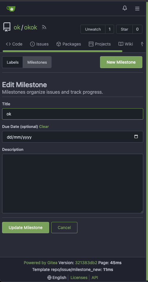
Improve deadline icon location in milestone list page (#26532) 2023-08-16 16:22:25 +08:00
puni9869
cafce3b4b5
Allow to archive labels (#26478)
## Archived labels 

This adds the structure to allow for archived labels.
Archived labels are, just like closed milestones or projects, a medium to hide information without deleting it.
It is especially useful if there are outdated labels that should no longer be used without deleting the label entirely.

## Changes

1. UI and API have been equipped with the support to mark a label as archived
2. The time when a label has been archived will be stored in the DB

## Outsourced for the future

There's no special handling for archived labels at the moment.
This will be done in the future.

## Screenshots
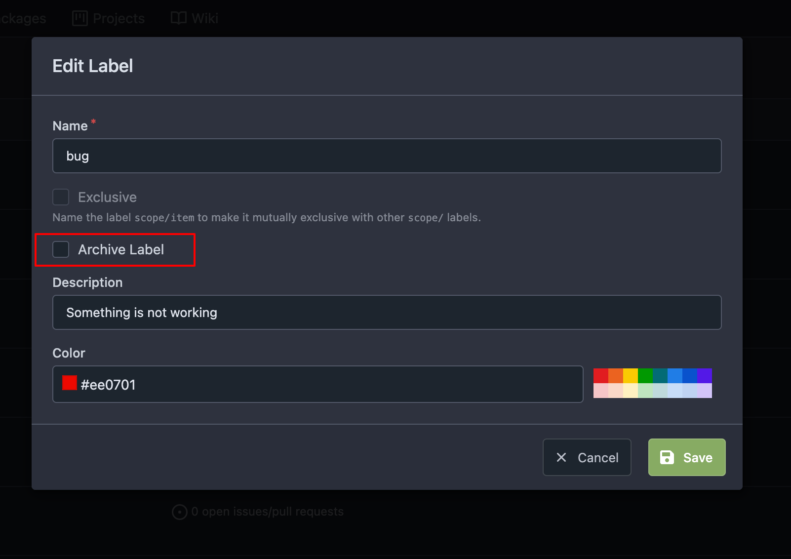
![image](https://github.com/go-gitea/gitea/assets/80308335/208f95cd-42e4-4ed7-9a1f-cd2050a645d4)

![image](https://github.com/go-gitea/gitea/assets/80308335/746428e0-40bb-45b3-b992-85602feb371d)

Part of https://github.com/go-gitea/gitea/issues/25237

---------

Co-authored-by: delvh <dev.lh@web.de>
Co-authored-by: wxiaoguang <wxiaoguang@gmail.com>
2023-08-14 11:56:14 +02:00
Denys Konovalov
ab78c39e41
Refactor project templates (#26448)
This PR refactors a bunch of projects-related code, mostly the
templates.
The following things were done:
  - rename boards to columns in frontend code
  - use the new `ctx.Locale.Tr` method
  - cleanup template, remove useless newlines, classes, comments
  - merge org-/user and repo level project template together
    - move "new column" button into project toolbar
- move issue card (shared by projects and pinned issues) to shared
template, remove useless duplicated styles
- add search function to projects (to make the layout more similar to
milestones list where it is inherited from 😆)
  - maybe more changes I forgot I've done 😆 

Closes #24893

After:
![Bildschirmfoto vom 2023-08-10
23-02-00](https://github.com/go-gitea/gitea/assets/47871822/cab61456-1d23-4373-8163-e567f1b3b5f9)
![Bildschirmfoto vom 2023-08-10
23-02-26](https://github.com/go-gitea/gitea/assets/47871822/94b55d60-5572-48eb-8111-538a52d8bcc6)
![Bildschirmfoto vom 2023-08-10
23-02-46](https://github.com/go-gitea/gitea/assets/47871822/a0358f4b-4e05-4194-a7bc-6e0ecba5a9b6)

---------

Co-authored-by: silverwind <me@silverwind.io>
2023-08-12 10:30:28 +00:00
CaiCandong
7a69d71733
Fix incorrect redirection in new issue using references (#26440)
fix #26427
related https://github.com/go-gitea/gitea/pull/25258

---

Before:

![gitea](https://github.com/go-gitea/gitea/assets/50507092/ed8d3a17-1f63-42f2-a698-3b684e70dc91)

--- 

After:

![After](https://github.com/go-gitea/gitea/assets/50507092/b8e1338f-c520-4abc-b0df-b812c021ac7e)
2023-08-10 20:04:08 +00:00
wxiaoguang
a370efc13f
Use template context function for avatar rendering (#26385)
Introduce `AvatarUtils`, no need to pass `$.Context` to every
sub-template, and simplify the template helper functions.
2023-08-10 11:19:39 +08:00
yp05327
30eae5a40c
Fix incorrect color of selected assignees when create issue (#26324)
Before:

![image](https://github.com/go-gitea/gitea/assets/18380374/75d610b2-3823-4366-be85-c77c9106feff)

After:

![image](https://github.com/go-gitea/gitea/assets/18380374/15afc6ac-f5ad-4e24-8983-fea8ace5921f)

Co-authored-by: Giteabot <teabot@gitea.io>
2023-08-04 14:14:30 +00:00
yp05327
d74c2228e3
Remove nonsense <a> for commit status check icon (#26287)
We are using `<a>` for commit status check icon with no link. So it is
clickable but this is no sense.
I think we can convert this to `div`.
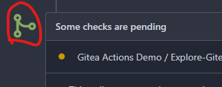
![image](https://github.com/go-gitea/gitea/assets/18380374/23db1a11-b0c7-4444-bfa6-fe68aeb1c682)

Co-authored-by: Giteabot <teabot@gitea.io>
2023-08-03 19:58:41 +02:00
Yarden Shoham
edd93fcfbc
Fix due date rendering the wrong date in issue (#26268)
Closes #26263

We have to pass the date without the time.

# Before

![image](https://github.com/go-gitea/gitea/assets/20454870/6b6cb43d-2b1c-4679-951d-20f48c94bfdd)

# After

![image](https://github.com/go-gitea/gitea/assets/20454870/50441baf-2c52-452b-bb0d-6034a407abde)

Signed-off-by: Yarden Shoham <git@yardenshoham.com>
2023-08-01 16:21:04 +02:00
silverwind
04d7ced063
De-emphasize issue sidebar buttons (#26171)
I find the colored buttons in the issue sidebar distracting, given that
they are not primary actions, I think we can de-colorize them.

Before:
<img width="285" alt="Screenshot 2023-07-26 at 19 42 22"
src="https://github.com/go-gitea/gitea/assets/115237/7e784805-4e01-4199-94bb-0538a0130264">
<img width="288" alt="Screenshot 2023-07-26 at 19 43 06"
src="https://github.com/go-gitea/gitea/assets/115237/3a89c661-e24a-4ebf-a585-d404d0a6a78a">
<img width="285" alt="Screenshot 2023-07-26 at 19 44 36"
src="https://github.com/go-gitea/gitea/assets/115237/c1aa8c13-6f41-4763-8149-d1c07cb4be5c">:

After:
<img width="286" alt="Screenshot 2023-07-26 at 19 42 04"
src="https://github.com/go-gitea/gitea/assets/115237/74d640c2-e0ab-4fef-87aa-9e788e9010e2">
<img width="285" alt="Screenshot 2023-07-26 at 19 42 51"
src="https://github.com/go-gitea/gitea/assets/115237/3b69976a-9aa4-4e1c-8df3-4168f4a9fcf9">
<img width="286" alt="Screenshot 2023-07-26 at 19 45 15"
src="https://github.com/go-gitea/gitea/assets/115237/897222fd-4df2-4d99-98eb-e5f8fb77c4d6">
2023-07-30 22:46:53 +00:00
yp05327
1c6c38fa6e
Improve display of Labels/Projects/Assignees sort options (#25886)
Labels:
Before: (no highlights)

![image](https://github.com/go-gitea/gitea/assets/18380374/88ffbff0-1b14-4d93-810d-f2ce2b2d7321)
After:

![image](https://github.com/go-gitea/gitea/assets/18380374/ab7b665b-d17c-4acd-a681-64cbb67ae460)

![image](https://github.com/go-gitea/gitea/assets/18380374/19f8a0d0-ad5f-4dbf-b45a-1001e60a8399)

Projects:
Before: (no highlights)

![image](https://github.com/go-gitea/gitea/assets/18380374/2079e6a8-8801-4662-acda-e248f115462f)

After:

![image](https://github.com/go-gitea/gitea/assets/18380374/7180a086-68be-49c4-bb29-3d05454fb41d)

![image](https://github.com/go-gitea/gitea/assets/18380374/3c5a791f-1852-4957-89b8-10940c672e10)

Assignee:
Before: (no highlights)

![image](https://github.com/go-gitea/gitea/assets/18380374/09273636-d9b1-4144-9533-2ce66cab8c49)
After:

![image](https://github.com/go-gitea/gitea/assets/18380374/24bd0cfe-b589-4c8a-be67-74f242dda6d3)

![image](https://github.com/go-gitea/gitea/assets/18380374/7476be73-5201-4330-82e2-44b0b5080f71)
2023-07-26 13:00:50 +00:00
caicandong
ab72f7ee4a
remove IsWarning in tmpl (#26120)
This problem occurs because in #25839, the warning status has been
removed, but there is something in the tmpl that hasn't been changed.
related #25839
close #26118
2023-07-25 12:09:01 +00:00
Lunny Xiao
a12a5f3652
Fix duplicated url prefix on issue context menu (#26066)
Fix #26060
2023-07-23 11:56:43 +02:00
Denys Konovalov
eec45b43db
move issue filters to shared template (#25729)
Issue filters are being used on repo list page and on milestone issues
page, and the code is mostly duplicated.

This PR does the following changes:
- move issue filters into a shared template
- allow filtering milestone issues by project, so no need to hide this
filter on milestone issues page
- remove some dead code (e. g. issue actions in milestone issues
template)
- fix label filter dropdown width

---------

Co-authored-by: 6543 <6543@obermui.de>
2023-07-13 20:00:38 +00:00
puni9869
4744cb32e2
Fix margin on the new/edit milestone page (#25801)
There is some distortion in desktop and mobile ui for new/edit milestone
page.
Fixing the new/edit milestone page for desktop and mobile ui

Design background
https://uxplanet.org/primary-secondary-action-buttons-c16df9b36150
https://balsamiq.com/learn/articles/button-design-best-practices/


<details>
  <summary>Screen shots</summary>
  
Before:

![image](https://github.com/go-gitea/gitea/assets/80308335/c8627679-da2d-465f-bc8f-978d7b836919)

![image](https://github.com/go-gitea/gitea/assets/80308335/43b54599-2856-440a-a13c-08bb3cedf35c)

After

![image](https://github.com/go-gitea/gitea/assets/80308335/85ca3d32-4842-41bc-8647-aa4222b9cc06)

![image](https://github.com/go-gitea/gitea/assets/80308335/c00e87c4-e64e-4b18-aa42-d26c3942a21b)

</details>

---------

Co-authored-by: Denys Konovalov <privat@denyskon.de>
Co-authored-by: Giteabot <teabot@gitea.io>
2023-07-12 10:36:56 +00:00
puni9869
2ff0c12a95
Repository Archived text title center align (#25767)
Archive text title center align

<details>
  <summary>Screen shots</summary>
  
 Before

![image](https://github.com/go-gitea/gitea/assets/80308335/90182367-4d06-4fc8-b7aa-21c21225d2bd)

After 

![image](https://github.com/go-gitea/gitea/assets/80308335/3dcc0d0d-75f4-415d-afbf-03921075b4db)


![image](https://github.com/go-gitea/gitea/assets/80308335/317d74f8-0ae9-4dc7-9508-1833d2d4f327)


BTW On github

![image](https://github.com/go-gitea/gitea/assets/80308335/1801fd2d-1803-4ee6-8856-ef2f623df2b4)

</details>

---------

Co-authored-by: Giteabot <teabot@gitea.io>
2023-07-08 10:57:17 +00:00
Earl Warren
e1edd7a8e9
Show correct naming for 1 comment (#25704)
- Resolves https://codeberg.org/forgejo/forgejo/issues/948

Co-authored-by: Gusted <postmaster@gusted.xyz>
Co-authored-by: Giteabot <teabot@gitea.io>
2023-07-05 19:53:38 +00:00
Denys Konovalov
00dbba7f42
Several fixes for mobile UI (#25634)
Resolves #25622 

<details>
<summary>Screenshots</summary>

![Bildschirmfoto vom 2023-07-02
20-47-34](https://github.com/go-gitea/gitea/assets/47871822/a8a0bff6-9ae3-48f3-b008-00c196a3f8fd)
![Bildschirmfoto vom 2023-07-02
20-47-45](https://github.com/go-gitea/gitea/assets/47871822/172a0021-af74-4690-aa67-0e66688ce733)
![Bildschirmfoto vom 2023-07-02
20-48-37](https://github.com/go-gitea/gitea/assets/47871822/14572ebd-0106-4c8a-ba27-b6b631375ee6)
![Bildschirmfoto vom 2023-07-02
20-49-08](https://github.com/go-gitea/gitea/assets/47871822/7c0ba3aa-1712-482c-aae9-13394dbdaf8a)
![Bildschirmfoto vom 2023-07-02
20-50-28](https://github.com/go-gitea/gitea/assets/47871822/8bd68e26-099a-4abd-8817-16d52af13167)
![Bildschirmfoto vom 2023-07-02
20-51-46](https://github.com/go-gitea/gitea/assets/47871822/3beab8c6-3747-4829-be50-bafaed11000c)
![Bildschirmfoto vom 2023-07-02
20-54-12](https://github.com/go-gitea/gitea/assets/47871822/51f82ef3-a32c-4c27-9056-e8711ed469cc)


</details>

---------

Co-authored-by: wxiaoguang <wxiaoguang@gmail.com>
Co-authored-by: silverwind <me@silverwind.io>
2023-07-04 17:45:45 +00:00
silverwind
64f2d70262
Replace fomantic divider module with our own (#25539)
Should look exactly like before for normal dividers. "Horizontal" ones
look better because they no longer use image backgrounds.

<img width="917" alt="Screenshot 2023-06-27 at 19 07 56"
src="https://github.com/go-gitea/gitea/assets/115237/d97d8dec-6859-44a8-85ba-e4549b4dd9df">

<img width="914" alt="Screenshot 2023-06-27 at 19 05 58"
src="https://github.com/go-gitea/gitea/assets/115237/8bf98544-2d82-4ebf-ac68-d6dc237bd6b2">

<img width="1246" alt="Screenshot 2023-06-27 at 19 00 42"
src="https://github.com/go-gitea/gitea/assets/115237/36a6bb21-6029-4f53-8bee-535f55c66fed">

<img width="344" alt="Screenshot 2023-06-27 at 18 58 15"
src="https://github.com/go-gitea/gitea/assets/115237/a9e70aee-8e6b-4ea1-9e93-19c9f96aec6e">
<img width="823" alt="Screenshot 2023-06-27 at 18 56 22"
src="https://github.com/go-gitea/gitea/assets/115237/e7a497cd-f262-4683-8872-23c3c8cce32f">

<img width="330" alt="Screenshot 2023-06-27 at 19 21 11"
src="https://github.com/go-gitea/gitea/assets/115237/42f24149-a655-4c7e-bd26-8ab52db6446b">
2023-06-29 20:24:22 +08:00
HesterG
5a871932f0
Fix milestones deletion (#25583)
Close #25557 
Fix regression from #25315

`data-id` is still needed for deleting milestone.
2023-06-29 10:17:18 +02:00
HesterG
c6f1fb1c6d
Use fetch form action for lock/unlock/pin/unpin on sidebar (#25380)
Before:

<img width="364" alt="Screen Shot 2023-06-20 at 11 59 11"
src="https://github.com/go-gitea/gitea/assets/17645053/ad284b7e-8d21-43be-b178-bbcfd37cb5bd">

Might trigger many posts when keep clicking the buttons above.

<img width="448" alt="Screen Shot 2023-06-20 at 11 52 28"
src="https://github.com/go-gitea/gitea/assets/17645053/a60aa6ac-af74-45e4-b13a-512b436b81b0">
<img width="678" alt="Screen Shot 2023-06-20 at 11 52 37"
src="https://github.com/go-gitea/gitea/assets/17645053/d6662700-3643-4cc7-a2ec-64e1c0f5fbdb">

After (PR sidebar, Same for issue):


https://github.com/go-gitea/gitea/assets/17645053/9df3ad1f-e29c-439b-8bde-e6b917d63cc6

For delete, it is using `base/modal_actions_confirm` subtemplate, and we
might need another general solution for this (maybe add another
attribute to the subtemplate or something)

---------

Co-authored-by: silverwind <me@silverwind.io>
Co-authored-by: Giteabot <teabot@gitea.io>
Co-authored-by: wxiaoguang <wxiaoguang@gmail.com>
2023-06-29 04:16:04 +00:00
Lunny Xiao
083818cb85
Improve loadprojects for issue list (#25468) 2023-06-24 15:31:28 +00:00
6543
b0215c40cd
Store and use seconds for timeline time comments (#25392)
this will allow us to fully localize it later

PS: we can not migrate back as the old value was a one-way conversion


prepare for  #25213

---
*Sponsored by Kithara Software GmbH*
2023-06-23 12:12:39 +00:00
wxiaoguang
17965c8e79
Make "dismiss" content shown correctly (#25461)
Close #25127


![image](https://github.com/go-gitea/gitea/assets/2114189/7d6be811-8e4a-4982-a5e4-857d171758d4)

Co-authored-by: Giteabot <teabot@gitea.io>
2023-06-23 12:33:20 +02:00
silverwind
7fb539677b
Diff page enhancements (#25398)
Two small tweaks:

1. Vertically center arrow here when editing a PR:

<img width="405" alt="Screenshot 2023-06-20 at 19 48 49"
src="https://github.com/go-gitea/gitea/assets/115237/1d63764d-9fd9-467e-8a8e-9258c06475eb">

2. Use 2-row layout on diff viewed status and show it again on mobile:

<img width="142" alt="Screenshot 2023-06-20 at 19 51 21"
src="https://github.com/go-gitea/gitea/assets/115237/3046e782-163c-4f87-910c-a22066de8f1b">

Mobile view:

<img width="370" alt="Screenshot 2023-06-20 at 19 44 40"
src="https://github.com/go-gitea/gitea/assets/115237/9cf56347-7323-4d05-99a5-17ad215ee44d">
2023-06-22 11:05:22 +00:00
silverwind
af094fbb6c
Introduce shared template for search inputs (#25338)
- Set
[type=search](https://developer.mozilla.org/en-US/docs/Web/HTML/Element/input/search)
- Disable spellcheck
- Set maxLength 255 that I found in `templates/repo/issue/search.tmpl`
- Remove unnecessary `max-width`, it does nothing

---------

Co-authored-by: delvh <dev.lh@web.de>
Co-authored-by: Giteabot <teabot@gitea.io>
2023-06-22 10:27:35 +00:00
silverwind
656d3cc719
Various UI fixes (#25264)
Numerous small UI fixes:

- Fix double border in collaborator list
- Fix system notice table background
- Mute links in repo and org lists
- Downsize projects edit buttons
- Improve milestones and project list rendering
- Condense milestone list entry to a single line of "metas"
- Mute ".." button in repo files list
2023-06-21 21:59:49 -04:00
sebastian-sauer
25455bc670
Show outdated comments in files changed tab (#24936)
If enabled show a clickable label in the comment. A click on the label
opens the Conversation tab with the comment focussed - there you're able
to view the old diff (or original diff the comment was created on).

**Screenshots**


![image](https://github.com/go-gitea/gitea/assets/1135157/63ab9571-a9ee-4900-9f02-94ab0095f9e7)

![image](https://github.com/go-gitea/gitea/assets/1135157/78f7c225-8d76-46f5-acfd-9b8aab988a6c)


When resolved and outdated:

![image](https://github.com/go-gitea/gitea/assets/1135157/6ece9ebd-c792-4aa5-9c35-628694e9d093)

Option to enable/disable this (stored in user settings - default is
disabled):

![image](https://github.com/go-gitea/gitea/assets/1135157/ed99dfe4-76dc-4c12-bd96-e7e62da50ab5)

![image](https://github.com/go-gitea/gitea/assets/1135157/e837a052-e92e-4a28-906d-9db5bacf93a6)


fixes #24913

---------

Co-authored-by: silverwind <me@silverwind.io>
2023-06-21 16:08:12 +00:00
Denys Konovalov
7f38cf71fe
Fix issue filters on mobile view (#25368)
Fix #24846 applying the solution proposed by @silverwind 

<details>
<summary>Screenshots</summary>


![Bildschirmfoto vom 2023-06-19
12-20-54](https://github.com/go-gitea/gitea/assets/47871822/3f4e4536-38c4-451b-bfc0-a7c39acd37f0)
![Bildschirmfoto vom 2023-06-19
12-21-02](https://github.com/go-gitea/gitea/assets/47871822/3403ecc2-4d7f-4acd-b0c0-1b7a10228ff7)
![Bildschirmfoto vom 2023-06-19
12-21-16](https://github.com/go-gitea/gitea/assets/47871822/ef28a2bf-b7cc-4aec-b54b-99d2cc46a1f6)
![Bildschirmfoto vom 2023-06-19
12-21-21](https://github.com/go-gitea/gitea/assets/47871822/f8cd72a5-379e-410b-b0ef-d58895719370)
![Bildschirmfoto vom 2023-06-19
12-21-28](https://github.com/go-gitea/gitea/assets/47871822/34c78301-820c-4106-a086-ae81dc97eb91)
![Bildschirmfoto vom 2023-06-19
12-21-48](https://github.com/go-gitea/gitea/assets/47871822/b677adf1-3a48-42c8-befe-fa9d2679f0a3)
</details>


Replaces #25335
2023-06-19 17:12:15 +00:00
6543
749802c922
Refactor: TotalTimest return seconds (#25370)
so template/browser can deal with string format

---
*Sponsored by Kithara Software GmbH*
2023-06-19 18:40:06 +02:00
wxiaoguang
a1c5057fe8
Batch delete issue and improve tippy opts (#25253)
1. Add "batch delete" button for selected issues, close #22273
2. Address the review in
https://github.com/go-gitea/gitea/pull/25219#discussion_r1229266083
2023-06-19 15:46:50 +08:00
wxiaoguang
bfab129fb9
Fix label list divider (#25312)
We only needs 2 lines to hide the dividers.

```
  $dropdownLabelFilter.dropdown('setting', {'hideDividers': 'empty'});
  $dropdownLabelFilter.dropdown('refreshItems');
```

Other code blocks are refactored by the way.


![image](https://github.com/go-gitea/gitea/assets/2114189/74989996-fcea-4df4-b534-b06f7957939a)


![image](https://github.com/go-gitea/gitea/assets/2114189/ee3b3761-b96e-4fb5-b646-e9d3117e5f40)
2023-06-18 17:33:12 +00:00
Denys Konovalov
9e74063498
Fix UI on mobile view (#25315)
Various fixes to pages or elements which were looking ugly on mobile.
<details>
<summary>Screenshots</summary>

![Bildschirmfoto vom 2023-06-17
20-38-41](https://github.com/go-gitea/gitea/assets/47871822/30b5d3ce-df3b-43eb-a4c2-c3790667fb9d)
![Bildschirmfoto vom 2023-06-17
20-39-27](https://github.com/go-gitea/gitea/assets/47871822/27c07b25-3602-4fb2-b34d-d5e875e054e9)
![Bildschirmfoto vom 2023-06-17
20-41-27](https://github.com/go-gitea/gitea/assets/47871822/dacdbb4e-e3dd-4b94-abf0-c68e3d64bd3b)
![Bildschirmfoto vom 2023-06-17
20-41-48](https://github.com/go-gitea/gitea/assets/47871822/72432c35-7c4a-4c7f-a767-3562f26a5c14)
![Bildschirmfoto vom 2023-06-17
20-42-37](https://github.com/go-gitea/gitea/assets/47871822/737c26ed-1910-4467-98ef-e8769bbbe6f0)
![Bildschirmfoto vom 2023-06-17
20-42-52](https://github.com/go-gitea/gitea/assets/47871822/1813b4bc-43c0-4912-8acb-5d799c090bf3)
![Bildschirmfoto vom 2023-06-17
20-43-06](https://github.com/go-gitea/gitea/assets/47871822/136466e8-34e5-419d-97ec-5202ff819fd2)
![Bildschirmfoto vom 2023-06-17
20-43-42](https://github.com/go-gitea/gitea/assets/47871822/59270bb2-d661-4a84-8504-3e50f771f767)
![Bildschirmfoto vom 2023-06-17
20-44-44](https://github.com/go-gitea/gitea/assets/47871822/494e274d-3771-4141-9419-0a4bbd8b7f64)

</details>

Co-authored by @silverwind

---------

Co-authored-by: silverwind <me@silverwind.io>
2023-06-18 10:31:42 +00:00
wxiaoguang
b71cb7acdc
Use fetch to send requests to create issues/comments (#25258)
Follow #23290

Network error won't make content lost. And this is a much better
approach than "loading-button".

The UI is not perfect and there are still some TODOs, they can be done
in following PRs, not a must in this PR's scope.

<details>
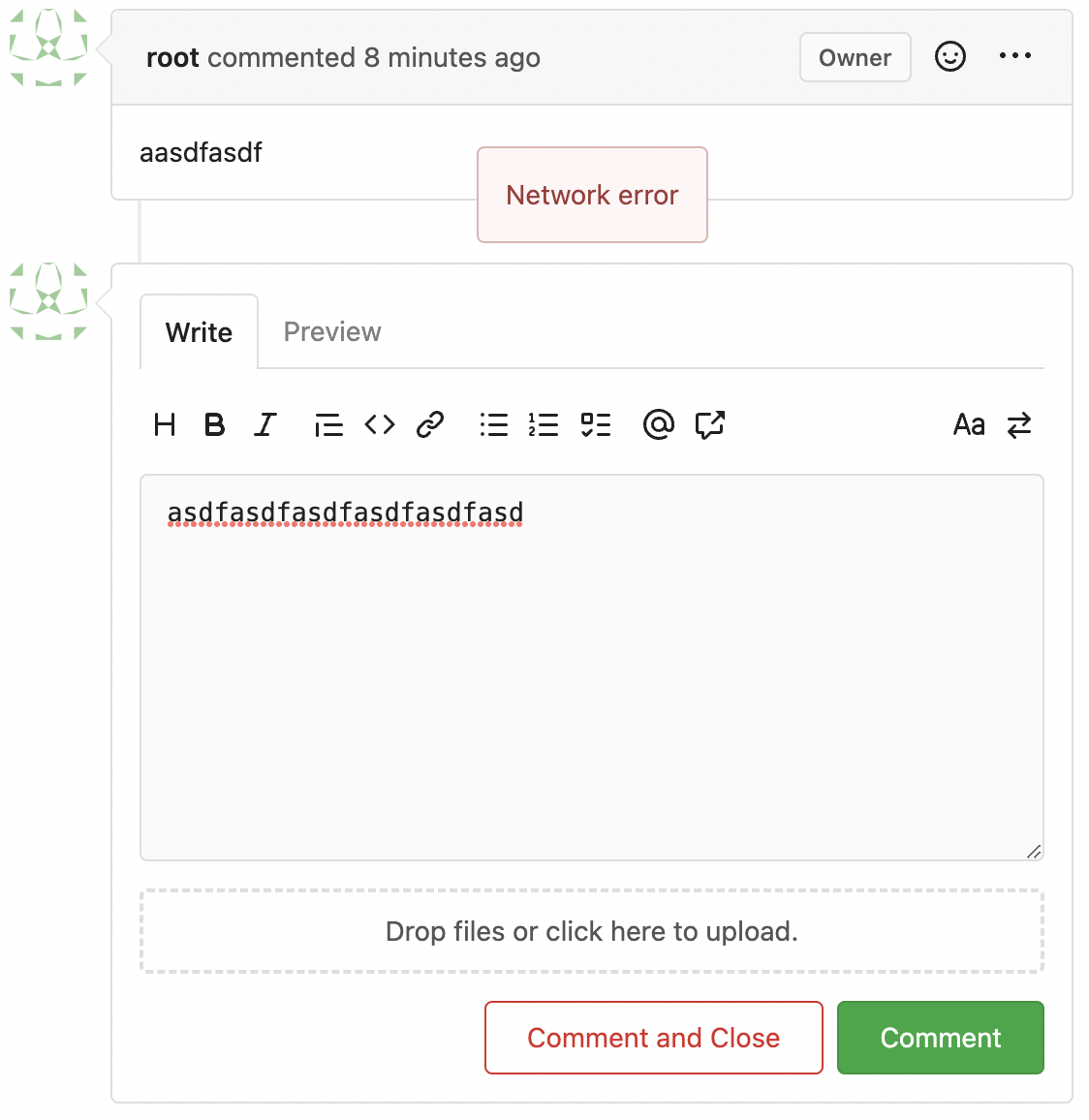

![image](https://github.com/go-gitea/gitea/assets/2114189/c94ba958-aa46-4747-8ddf-6584deeed25c)

</details>
2023-06-16 06:32:43 +00:00
silverwind
e24f651c86
Add template linting via djlint (#25212)
So I found this [linter](https://github.com/Riverside-Healthcare/djlint)
which features a mode for go templates, so I gave it a try and it did
find a number of valid issue, like unbalanced tags etc. It also has a
number of bugs, I had to disable/workaround many issues.

Given that this linter is written in python, this does add a dependency
on `python` >= 3.8 and `poetry` to the development environment to be
able to run this linter locally.

- `e.g.` prefixes on placeholders are removed because the linter had a
false-positive on `placeholder="e.g. cn=Search"` for the `attr=value`
syntax and it's not ideal anyways to write `e.g.` into a placeholder
because a placeholder is meant to hold a sample value.
- In `templates/repo/settings/options.tmpl` I simplified the logic to
not conditionally create opening tags without closing tags because this
stuff confuses the linter (and possibly the reader as well).
2023-06-14 18:17:58 +00:00
wxiaoguang
46c17c8029
Use flex to align SVG and text (#25163)
The code can be as simple as:

```html
<div class="flex-text-block">{{svg "octicon-alert"}} {{svg "octicon-x"}} text (block)</div>
<div><div class="flex-text-inline">{{svg "octicon-alert"}} {{svg "octicon-x"}} text</div> (inline)</div>
<div><button class="ui red button">{{svg "octicon-alert" 24}} {{svg "octicon-x" 24}} text</button></div>
```


![image](https://github.com/go-gitea/gitea/assets/2114189/1d3c10f1-0bc7-4c26-b236-bad537d5c465)

---------

Co-authored-by: Giteabot <teabot@gitea.io>
2023-06-14 16:40:15 +00:00
yp05327
81211db077
Fix #25133 (#25162)
Fix #25133

Thanks @wxiaoguang @silverwind.
I'm sorry I made a mistake, it will be fixed in this PR.

---------

Co-authored-by: Giteabot <teabot@gitea.io>
Co-authored-by: silverwind <me@silverwind.io>
2023-06-09 10:27:10 +00:00
silverwind
623b3b590e
Button and color enhancements (#24989)
- Various corrections to button styles, especially secondary
- Remove focus highlight, it's annoying when it stays on button after
press
- Clearly define ghost and link buttons with demos in devtest
- Remove black, grey and tertiary buttons, they should not be used
- Make `arc-green` slightly darker

<img width="1226" alt="image"
src="https://github.com/go-gitea/gitea/assets/115237/8d89786a-01ab-40f8-ae5a-e17f40e35084">
<img width="1249" alt="image"
src="https://github.com/go-gitea/gitea/assets/115237/83651e6d-3c27-46ff-b8bd-ff344d70e949">

---------

Co-authored-by: wxiaoguang <wxiaoguang@gmail.com>
Co-authored-by: Giteabot <teabot@gitea.io>
2023-06-09 08:37:47 +00:00
yp05327
b5a2bb9ab3
Fix strange UI behavior of cancelling dismiss review modal (#25133)
Fixes https://github.com/go-gitea/gitea/issues/25130

The old code uses `$(this).next()` to get `dismiss-review-modal`.
At first, it will get `$(#dismiss-review-modal)`, but the next time it
will get `$(#dismiss-review-modal).next();`
and then `$(#dismiss-review-modal).next().next();`.
Because div `dismiss-review-modal` will be removed when
`dismiss-review-btn` clicked.

Maybe the right usage is adding `show-modal` class and `data-modal`
attribute.
2023-06-08 08:52:35 +00:00
Yevhen Pavlov
8d7893e817
Don't display select all issues checkbox when no issues are available (#25086)
Before:

![image](https://github.com/go-gitea/gitea/assets/1969460/8830c077-89d4-4897-a6e0-f5dba6830ff7)

After:

![image](https://github.com/go-gitea/gitea/assets/1969460/8fa06878-496b-4f65-87eb-04e1f94d4a3c)
2023-06-06 08:19:24 +08:00
JakobDev
7d192cb674
Add Progressbar to Milestone Page (#25050)
This is adds the progress bar, which is already on the Milestone List,
also to the Page of a Single Milestone.


![grafik](https://github.com/go-gitea/gitea/assets/15185051/24e0fa28-369b-4bb9-807a-ee823b46ba81)

---------

Co-authored-by: silverwind <me@silverwind.io>
2023-06-05 14:25:46 +08:00
JakobDev
1b115296d3
Followup to pinned Issues (#24945)
This addressees some things from #24406 that came up after the PR was
merged. Mostly from @delvh.

---------

Co-authored-by: silverwind <me@silverwind.io>
Co-authored-by: delvh <dev.lh@web.de>
2023-05-30 15:26:51 +00:00
silverwind
73b57c2992
Improve dropdown menus, remove inline styles (#24954)
Before:

<img width="190" alt="Screenshot 2023-05-27 at 10 46 43"
src="https://github.com/go-gitea/gitea/assets/115237/b9331fcd-db1d-476e-87f0-f79bae48b1a5">

After:

<img width="154" alt="Screenshot 2023-05-28 at 19 29 03"
src="https://github.com/go-gitea/gitea/assets/115237/8b7f99a2-01a8-4665-9342-a6201b51d30f">

---------

Co-authored-by: Giteabot <teabot@gitea.io>
2023-05-29 14:10:06 +00:00
silverwind
a70d853d06
Consolidate the two review boxes into one (#24738)
View diff:
https://github.com/go-gitea/gitea/pull/24738/files?diff=unified&w=1

Improve layout and functionality in review area:

<img width="439" alt="Screenshot 2023-05-15 at 20 10 01"
src="https://github.com/go-gitea/gitea/assets/115237/be10452b-5829-4927-8801-7b26a57b3dbd">

Remove the "Reviewers" timeline box that appears before the merge box.
it's a duplicate of the top-right review area and all functionality of
it has been moved to the other box:

<img width="868" alt="Screenshot 2023-05-15 at 19 39 31"
src="https://github.com/go-gitea/gitea/assets/115237/35489445-e54b-40d3-b3cf-38d029478f96">

Increase timeline item vertical padding from 12px to 16px:

<img width="449" alt="Screenshot 2023-05-15 at 19 43 50"
src="https://github.com/go-gitea/gitea/assets/115237/919c4f9d-a485-4f51-b08c-2c0fc714a413">

---------

Co-authored-by: Giteabot <teabot@gitea.io>
2023-05-29 12:44:03 +02:00
silverwind
595e8abd68
Improve and fix bugs surrounding reactions (#24760)
- Slightly decrease size of reaction buttons
- Remove tooltip inside menu, it's obvious by the picture alone
- Fix top menu triangle
- Use `display: grid` to align icons in menu
- Use regular tooltip for reaction users
- Fix bug that deleted the reaction bar on clicking already reacted
reaction in dropdown

<img width="490" alt="Screenshot 2023-05-17 at 00 03 42"
src="https://github.com/go-gitea/gitea/assets/115237/61588b37-facb-4829-b75b-e1cb5dda8ca4">

<img width="67" alt="Screenshot 2023-05-17 at 00 11 14"
src="https://github.com/go-gitea/gitea/assets/115237/29605589-3b5f-40c6-8ad4-09923094bb8e">

<img width="211" alt="Screenshot 2023-05-17 at 00 29 30"
src="https://github.com/go-gitea/gitea/assets/115237/7d2725da-6a3d-4e42-a351-53647f79f762">
<img width="210" alt="Screenshot 2023-05-17 at 00 29 54"
src="https://github.com/go-gitea/gitea/assets/115237/b50f8364-033c-4445-ba25-61a814bb2d92">


<img width="892" alt="Screenshot 2023-05-17 at 00 12 20"
src="https://github.com/go-gitea/gitea/assets/115237/30a46424-406a-46e5-b4de-47172eb8679d">

---------

Co-authored-by: wxiaoguang <wxiaoguang@gmail.com>
Co-authored-by: Giteabot <teabot@gitea.io>
2023-05-28 01:34:18 +00:00
JakobDev
85fa954a38
Improve some Forms (#24878)
Don't really know a better name for this. I've gone through some Forms
and added missing HTML attributes (mostly `maxlength`). I tried to fill
the Forms with dummy Data and see if Gitea throws a Error (e.g. maximum
length). If yes, I added the missing HTML attribute.

While working on this, I discovered that the Form to add OAuth2 Apps
just silently fails when filled with invalid data, so I fixed that too.
2023-05-26 09:42:54 +00:00
JakobDev
aaa1094663
Add the ability to pin Issues (#24406)
This adds the ability to pin important Issues and Pull Requests. You can
also move pinned Issues around to change their Position. Resolves #2175.

## Screenshots

![grafik](https://user-images.githubusercontent.com/15185051/235123207-0aa39869-bb48-45c3-abe2-ba1e836046ec.png)

![grafik](https://user-images.githubusercontent.com/15185051/235123297-152a16ea-a857-451d-9a42-61f2cd54dd75.png)

![grafik](https://user-images.githubusercontent.com/15185051/235640782-cbfe25ec-6254-479a-a3de-133e585d7a2d.png)

The Design was mostly copied from the Projects Board.

## Implementation
This uses a new `pin_order` Column in the `issue` table. If the value is
set to 0, the Issue is not pinned. If it's set to a bigger value, the
value is the Position. 1 means it's the first pinned Issue, 2 means it's
the second one etc. This is dived into Issues and Pull requests for each
Repo.

## TODO
- [x] You can currently pin as many Issues as you want. Maybe we should
add a Limit, which is configurable. GitHub uses 3, but I prefer 6, as
this is better for bigger Projects, but I'm open for suggestions.
- [x] Pin and Unpin events need to be added to the Issue history.
- [x] Tests
- [x] Migration

**The feature itself is currently fully working, so tester who may find
weird edge cases are very welcome!**

---------

Co-authored-by: silverwind <me@silverwind.io>
Co-authored-by: Giteabot <teabot@gitea.io>
2023-05-25 15:17:19 +02:00
yp05327
5c0745c034
Add validations.required check to dropdown field (#24849)
If dropdown is marked as required, we should not provide the `remove`
button.
This will cause user may post empty value which seems like a bug.

Definition:

![image](https://github.com/go-gitea/gitea/assets/18380374/cf48b478-244e-44e0-9a0e-7a0f02bc471a)
Post request form:

![image](https://github.com/go-gitea/gitea/assets/18380374/31d6f823-835f-422a-879c-3b1e18950ac8)
Result:

![image](https://github.com/go-gitea/gitea/assets/18380374/a9944fe9-24d0-4776-9eec-d31b70144eb4)
2023-05-22 21:26:48 +00:00
yp05327
f4ef7eed00
Fix missing yes/no in delete time log modal (#24851)
Before:

![image](https://github.com/go-gitea/gitea/assets/18380374/bcbcddcc-b328-4751-92fe-6e55b7a84671)

After:

![image](https://github.com/go-gitea/gitea/assets/18380374/571ef27a-2411-472e-819d-f694e7be3697)

Co-authored-by: Giteabot <teabot@gitea.io>
2023-05-22 09:46:50 +00:00
silverwind
19993d8814
Change --font-weight-bold to --font-weight-semibold and 600 value, introduce new font weight variables (#24827)
There was some recent discussion about this in Discord `ui-design`
channel and the conclusion was that
https://github.com/go-gitea/gitea/issues/24305 should have fixed their
OS font installation to have semibold weights.

I have now tested this 601 weight on a Windows 10 machine on Firefox
myself, and I immediately noticed that bold was excessivly bold and
rendering as 700 because browsers are biased towards bolder fonts. So
revert this back to the previous value.
2023-05-21 23:37:32 +00:00
delvh
e95b42e187
Improve accessibility when (re-)viewing files (#24817)
Visually, nothing should have changed.
Changes include
- Convert most `<a [no href]>` to `<button>` when (re-)viewing files:
- `<a [no href]>` are, by HTML definition, not a link and hence cannot
be focused
- `<a class="ui button">` can now be clicked (again?) using
<kbd>Enter</kbd>
- Previously, the installed keypress handler on `.ui.button` elements
disabled it for links somehow
- The `(un)escape file`, the `expand section` and the `expand/collapse
file` buttons can now be focused (and subsequently clicked using only
the keyboard)
- You can now press <kbd>Space</kbd> on a focused `View file` checkbox
to mark the file as viewed.
- previously, this was impossible as this checkbox listened on the wrong
event listener

The `add code comment` button has been left inaccessible for now as it
requires quite a bit of extra logic so that it is unhidden when it is
focused (you can otherwise focus it without seeing it as you are not
hovering on the corresponding line).

---------

Co-authored-by: silverwind <me@silverwind.io>
2023-05-21 20:47:41 +00:00
Lunny Xiao
b807d2f620
Support no label/assignee filter and batch clearing labels/assignees (#24707)
Since milestones has been implemented, this PR will fix #3407

---------

Co-authored-by: Jason Song <i@wolfogre.com>
2023-05-17 17:21:35 +08:00
silverwind
b92c142c97
Clean up various avatar dimensions (#24701)
Clean up a few cases where avatar dimensions were overwritten via CSS,
which were no longer needed or were possible to set via HTML width.

Also included are two small fixes:

- Fix one more case of incorrect avatar offset on review timeline
- Vertically center avatars in review sidebar

There is more to be done here, but some of the work depends on Fomantic
`comment` module removal, or in the case of org member lists, a refactor
of the `avatarlink` template to accept a size.

<img width="371" alt="image"
src="https://github.com/go-gitea/gitea/assets/115237/9c5902fb-2b89-4a7d-a152-60e74c3b2c56">
<img width="306" alt="image"
src="https://github.com/go-gitea/gitea/assets/115237/c8d92e2a-91c9-4f4a-a7de-6ae1a6bc0479">

---------

Co-authored-by: Giteabot <teabot@gitea.io>
2023-05-14 14:15:59 +00:00
Lunny Xiao
365bb77a54
Fix issues list page multiple selection update milestones (#24660)
Fix #24651
2023-05-11 21:19:42 +08:00
silverwind
f7ede92f82
Notification list enhancements, fix striped tables on dark theme (#24639)
- Make code block rendering via backticks work
- Remove link color unless hovered
- Remove table stripes and fix stripes rendering on dark theme for other
tables
- Introduce new `button-link` class discussed previously for buttons
that look and act like links and apply it to the two right-side buttons
- Reduce box padding by 8px on each side
- Fix "Mark all read" button margin-right
- brighten `--color-markup-code-block` on arc-green

### Before
<img width="1216" alt="Screenshot 2023-05-10 at 20 00 30"
src="https://github.com/go-gitea/gitea/assets/115237/66da9ec2-dd09-4ef0-8f1d-1822a18b6b43">
<img width="1211" alt="Screenshot 2023-05-10 at 20 00 48"
src="https://github.com/go-gitea/gitea/assets/115237/f48e30a2-9a00-4723-93aa-79b97ca0ba0c">

### After
<img width="1222" alt="Screenshot 2023-05-10 at 20 09 59"
src="https://github.com/go-gitea/gitea/assets/115237/c956e0d0-b3d9-42a4-a3ed-f0431c22bf3f">
<img width="1218" alt="Screenshot 2023-05-10 at 20 05 34"
src="https://github.com/go-gitea/gitea/assets/115237/f72c1628-3961-4c28-9263-07cdf7531316">
2023-05-10 21:59:58 +00:00
wxiaoguang
23ae939ef3
Improve "goto issue by number" button (#24577)
Follow #24479


![image](https://user-images.githubusercontent.com/2114189/236694114-c5cb42ff-456d-465a-bcb9-89ed5959d346.png)


![image](https://user-images.githubusercontent.com/2114189/236694119-052e689c-6264-4468-9ab3-0e5c97521bec.png)


![image](https://user-images.githubusercontent.com/2114189/236694139-f8940765-42ce-462d-b49e-50a416cc6f85.png)


![image](https://user-images.githubusercontent.com/2114189/236694154-6d8a000c-9ef3-4d07-af1c-59b0cf8f4d33.png)


![image](https://user-images.githubusercontent.com/2114189/236694166-3bc3e585-7955-44aa-af34-b33ae91e132f.png)

---------

Co-authored-by: silverwind <me@silverwind.io>
Co-authored-by: Giteabot <teabot@gitea.io>
2023-05-10 15:50:58 +00:00
silverwind
ae0fa64ef6
Review fixes and enhancements (#24526)
- Fix regression with icons wrapping from
https://github.com/go-gitea/gitea/pull/24459
- Fix box misalignment on small screen
- Fix avatar misalignment on review comment
- Fix incorrect underline hover effect on review icons
- Move status icon to left side in review box
- Enhance review icon colors, add helper function for it
- Add missing inline avatars in review comments
- Tweak icon sizes because some octicons have inconsistent sizing

### Before
<img width="655" alt="Screenshot 2023-05-04 at 20 50 28"
src="https://user-images.githubusercontent.com/115237/236301230-92325507-6e03-47ac-bfb4-c9ddde310571.png">
<img width="260" alt="Screenshot 2023-05-04 at 20 50 42"
src="https://user-images.githubusercontent.com/115237/236301236-0dfa50e7-b8fc-4179-ae68-d872bc90f1f3.png">

### After
<img width="498" alt="Screenshot 2023-05-04 at 20 55 08"
src="https://user-images.githubusercontent.com/115237/236301810-23862c2c-c0a9-43a4-a3eb-ee611c14a7f4.png">
<img width="219" alt="Screenshot 2023-05-04 at 20 55 16"
src="https://user-images.githubusercontent.com/115237/236301817-d0de02ea-6ab5-43e1-9183-6b3848b72995.png">

---------

Co-authored-by: Giteabot <teabot@gitea.io>
2023-05-10 09:16:44 +00:00
yp05327
c4303efc23
Support markdown editor for issue template (#24400)
Fixes #24398

Task:
- [x] Reusing "textarea" like GitHub seems more friendly to users.
- [x] ^V image pasting and file uploading handling.

<details><summary>screenshots</summary>


![image](https://user-images.githubusercontent.com/18380374/235418877-00090552-ebda-411c-8e39-b47246bc8746.png)

![image](https://user-images.githubusercontent.com/18380374/235419073-dc33cad7-7626-4bce-9161-eb205c7384b5.png)
Display only one markdown editor:

![image](https://user-images.githubusercontent.com/18380374/235419098-ee21386d-2b2d-432e-bdb2-18646cc031e7.png)
Support file upload and ^V image pasting

![image](https://user-images.githubusercontent.com/18380374/235419364-7b390fa4-da56-437d-b55e-3847fbc049e7.png)

</details>

---------

Co-authored-by: wxiaoguang <wxiaoguang@gmail.com>
Co-authored-by: silverwind <me@silverwind.io>
2023-05-08 22:22:52 +00:00
Tyrone Yeh
1144b1d129
Add goto issue id function (#24479)
for
https://github.com/go-gitea/gitea/issues/4109#issuecomment-1527104992

Supports format:
`#1234`
`Org/Repo#1234`

---------

Co-authored-by: techknowlogick <techknowlogick@gitea.io>
2023-05-07 23:44:16 +08:00
silverwind
4a722c9a45
Make Issue/PR/projects more compact, misc CSS tweaks (#24459)
- Remove various horizontal dividers on repo pages that didn't provide
visual benefit
- Remove label/milestone pills on single issue/pr page
- Remove issue-related pill buttons on projects page
- Increase contrast of color-secondary on arc-green
- Improve notifications icon, make circle bigger
- Remove some inline styles
- Fix focus in issue/pr title edit and select all text on button click

### Issue and PR before and after

<img width="1249" alt="Screenshot 2023-05-01 at 11 44 22"
src="https://user-images.githubusercontent.com/115237/235436662-a708288e-84fb-4b2e-a5a2-3a1c17d28f6c.png">
<img width="1248" alt="Screenshot 2023-05-01 at 11 58 51"
src="https://user-images.githubusercontent.com/115237/235437992-f863e483-f3cc-4cc1-8204-fd223647a0c9.png">


### Projects before and after

<img width="1255" alt="Screenshot 2023-05-01 at 11 41 02"
src="https://user-images.githubusercontent.com/115237/235436433-0deb85d6-4e7d-4e74-847f-254cc70a0cf9.png">
<img width="1267" alt="Screenshot 2023-05-01 at 11 40 03"
src="https://user-images.githubusercontent.com/115237/235436431-715b13cb-f78c-4d86-b27a-9229f9738c5b.png">


### Releases before and after

<img width="1243" alt="Screenshot 2023-05-01 at 11 41 12"
src="https://user-images.githubusercontent.com/115237/235436457-b655ee6f-03b8-4595-8d8c-b15ea469e988.png">
<img width="1240" alt="Screenshot 2023-05-01 at 11 40 10"
src="https://user-images.githubusercontent.com/115237/235436456-05a2a0dd-7cbb-4f26-b0d3-4f667df4bb95.png">

### Misc

<img width="58" alt="Screenshot 2023-05-01 at 10 49 13"
src="https://user-images.githubusercontent.com/115237/235432494-936ce995-6e22-47bc-ab2d-c9e93d31987d.png">
<img width="57" alt="Screenshot 2023-05-01 at 18 57 08"
src="https://user-images.githubusercontent.com/115237/235492430-1d32cfe0-0f2c-467c-b2fa-925b27e30e0e.png">


Issue title edit and wrap:

<img width="1238" alt="Screenshot 2023-05-01 at 12 34 40"
src="https://user-images.githubusercontent.com/115237/235441407-d5067a57-e586-4865-a652-282e5944abb4.png">
<img width="1232" alt="Screenshot 2023-05-01 at 12 06 24"
src="https://user-images.githubusercontent.com/115237/235438710-1a543dda-220f-4d87-8f93-f1710c0695f0.png">

---------

Co-authored-by: wxiaoguang <wxiaoguang@gmail.com>
2023-05-03 17:58:59 -04:00
wxiaoguang
48e3e38ee0
Clean up polluted styles and remove dead CSS code (#24497)
Follow #24393


The funny history:

* At the beginning, `.ui.message` was polluted by `text-align: center`
* Then people do `<div class="ui ... message text left">`
* But `.ui.left` is polluted by `float: left`
* Then people do `#xxx .ui.message { width: 100% !important;}`

The code just becomes more and more hacky.

After removing the pollution,  everything becomes clear and straight.


And, this PR also does:

1. Remove the `package.css`, its styles could be provided by `top
aligned`
2. Remove `#avatar-arrow`, dead code


Screenshot:


![image](https://user-images.githubusercontent.com/2114189/235862130-a9eb5d8f-7d01-457c-99f7-21d0abc3075e.png)


![image](https://user-images.githubusercontent.com/2114189/235862222-139709a7-95c2-4f89-a40f-100b2d76d9bb.png)

Co-authored-by: Giteabot <teabot@gitea.io>
2023-05-03 14:32:10 -04:00
Lunny Xiao
e9b39250b2
Improve pull request merge box when pull request merged and branch deleted. (#24397)
This PR hide the pull request merge box totally if it's merged and branch deleted.

It's also add a bold for merge base commit id in merged message comment

Before:

<img width="989" alt="图片"
src="https://user-images.githubusercontent.com/81045/235066590-28deb506-e824-4a42-a9a2-791cd136756e.png">

After:

<img width="1030" alt="图片"
src="https://user-images.githubusercontent.com/81045/235080749-11d5efe8-a06e-4528-a75f-f6c6d191db50.png">

---------

Co-authored-by: silverwind <me@silverwind.io>
Co-authored-by: wxiaoguang <wxiaoguang@gmail.com>
2023-05-03 21:52:19 +08:00
silverwind
fa506cd571
Remove font-awesome and fomantic icon module (#24471)
Fixes https://github.com/go-gitea/gitea/issues/10410.
This PR removes around 120kB of CSS.
2023-05-01 13:25:54 -04:00
silverwind
1bd2772235
Replace remaining fontawesome dropdown icons with SVG (#24455)
- Replace leftover dropdown triangles with SVG
- Replace remove icon with SVG and add styling for it:

<img width="817" alt="Screenshot 2023-05-01 at 00 40 05"
src="https://user-images.githubusercontent.com/115237/235379271-4674d4f7-b11e-4d6d-90f9-1478325443ca.png">
<img width="816" alt="Screenshot 2023-05-01 at 00 46 56"
src="https://user-images.githubusercontent.com/115237/235379451-b515afb3-9773-4f6f-a259-e7048235bcba.png">
2023-05-01 05:35:02 -04:00
wxiaoguang
14c142b0bc
Improve issue list filter (#24425)
Partial regression of #24393, not only regression, but broken for long
time, 24393 didn't really improve it but used wrong `overflow: scroll`.

Actually, that "ui secondary filter menu labels" shouldn't be set as
scrollable (I missed that at that time), the problem is: if a "ui menu"
has "dropdown" items, then it should not be scrollable. Otherwise the
dropdown menu can't be shown correctly.

And there are more problems:

* The "issue-filters" shouldn't be used anywhere else (copying&pasting
problem again ....)
* There is also an "issue-actions" container, it should also be fixed.
* There are similar problems on the milestone page.
* The old comment in code: "grid column" doesn't work well.

The major changes of this PR are: use "flex: 1" instead of "ui grid
column".

After this PR, not 100% perfect but much better than before.
2023-04-30 11:51:20 -04:00
Lunny Xiao
3f0651d4d6
Improve milestone filter on issues page (#22423)
Now we have `All milestones`, `No milestones`, `Open milestones` and
`Closed milestones`.
Fix #11924
Fix #22411 

<img width="1166" alt="image"
src="https://user-images.githubusercontent.com/81045/212243375-95eea035-a972-44b8-8088-53db614cb07e.png">
2023-04-30 09:12:49 -04:00
silverwind
8f4dafcd4e
Rework header bar on issue, pull requests and milestone (#24420)
- Make search bar dynamic full width via flexbox
- Make all buttons `small` so font size is the same for all elements in
the header
- Remove primary color from search field, add SVG icon like on Code tab
- Fix button vertical padding being enlarged by SVG icons

[View diff without
whitespace](https://github.com/go-gitea/gitea/pull/24420/files?diff=unified&w=1)

<img width="1226" alt="Screenshot 2023-04-29 at 11 58 53"
src="https://user-images.githubusercontent.com/115237/235296851-74848267-664f-4c1f-b94c-a1b94196ff75.png">
<img width="1219" alt="Screenshot 2023-04-29 at 11 59 39"
src="https://user-images.githubusercontent.com/115237/235296852-bcfde5ed-8658-43c2-b7e5-3ad84611e76f.png">

Mobile:
<img width="437" alt="Screenshot 2023-04-29 at 11 59 52"
src="https://user-images.githubusercontent.com/115237/235296860-99263373-7b27-4540-868c-a93e70f281ca.png">
<img width="433" alt="Screenshot 2023-04-29 at 12 00 00"
src="https://user-images.githubusercontent.com/115237/235296862-6cf64317-a864-405a-a00f-b5ab620349f5.png">
2023-04-29 23:33:25 -04:00
wxiaoguang
241b74f6c5
Improve template helper (#24417)
It seems that we really need the "context function" soon. So we should
clean up the helper functions first.

Major changes:

* Improve StringUtils and add JsonUtils
* Remove one-time-use helper functions like CompareLink
* Move other code (no change) to util_avatar/util_render/util_misc (no
need to propose changes for them)

I have tested the changed templates:


![image](https://user-images.githubusercontent.com/2114189/235283862-608dbf6b-2da3-4d06-8157-b523ca93edb4.png)


![image](https://user-images.githubusercontent.com/2114189/235283888-1dfc0471-e622-4d64-9d76-7859819580d3.png)


![image](https://user-images.githubusercontent.com/2114189/235283903-d559f14d-4abb-4a50-915f-2b9cbc381a7a.png)


![image](https://user-images.githubusercontent.com/2114189/235283955-b7b5adea-aca3-4758-b38a-3aae3f7c6048.png)

---------

Co-authored-by: Giteabot <teabot@gitea.io>
2023-04-29 08:02:29 -04:00
wxiaoguang
5a5ab8ef5a
Start cleaning the messy ".ui.left / .ui.right", improve label list page, fix stackable menu (#24393)
Since 2015/2016, there is a global pollution: ".ui.left" / ".ui.right".

Fomantic UI doesn't work this way, it just conflicts with many Fomantic
definitions.

This PR starts the cleaning work of such techinical debts.

And, the "label list" page has been quite messy for long time, for
example, why "li" appears in "div" ......

And fix #24296

<details>


![image](https://user-images.githubusercontent.com/2114189/235051281-54c5374c-b5fd-4b5f-9aa2-02d4bb2d9112.png)


![image](https://user-images.githubusercontent.com/2114189/235055703-2ba042e0-4db7-4e63-8646-02f390d496b5.png)


![image](https://user-images.githubusercontent.com/2114189/235056310-4f6ffdc2-5758-4927-8fb8-314d9fb72a6b.png)


![image](https://user-images.githubusercontent.com/2114189/235058400-dab1c9ec-3325-4671-8345-aee6b0b68042.png)


![image](https://user-images.githubusercontent.com/2114189/235058424-85509532-b9bc-43ad-b00f-a87184c60f22.png)

</details>
2023-04-29 07:35:59 -04:00
Hester Gong
f1a4330306
Modify width of ui container, fine tune css for settings pages and org header (#24315)
Close #24302 
Part of #24229, Follows #24246
This PR focused on CSS style fine-tune, main changes:

1. Give `.ui.ui.ui.container` a width of `1280px` with a max-width of
`calc(100vw - 64px)`, so the main contents looks better on large
devices.

2. Share styles for table elements in all levels settings pages to fix
overflow of runners table on mobile and for consistency (The headers on
mobile can be further improved, but haven't found a proper way yet).

3. Use [stackable
grid](https://fomantic-ui.com/collections/grid.html#stackable) and
[device column width](https://fomantic-ui.com/examples/responsive.html)
for responsiveness for some pages (repo/org collaborators settings
pages, org teams related page)

4. Fixed #24302 by sharing label related CSS in reporg.css

5. Fine tune repo tags settings page

---------

Co-authored-by: wxiaoguang <wxiaoguang@gmail.com>
2023-04-26 11:59:08 -04:00
wxiaoguang
0e8045d8ea
Fix template function DateTime (#24317)
Before, 500 error


![image](https://user-images.githubusercontent.com/2114189/234170176-403ffd1b-ec27-42be-bff9-86184dc8d74d.png)
2023-04-25 15:48:30 -04:00
wxiaoguang
75c62054a6
Improve some modal action buttons (#24289)
Follow #24097 and #24285

And add a devtest page for modal action button testing.
http://localhost:3000/devtest/fomantic-modal

Now the `modal_actions_confirm.tmpl` could support: green / blue /
yellow positive buttons, the negative button is "secondary".

ps: this PR is only a small improvement, there are still a lot of
buttons not having proper colors. In the future these buttons could be
improved by this approach.

These buttons could also be improved according to the conclusion of
#24285 in the future.


![image](https://user-images.githubusercontent.com/2114189/233847773-a6d6b29b-7b5c-490e-8425-40dfd0ad2529.png)


And add GitHub-like single danger button (context:
https://github.com/go-gitea/gitea/issues/24285#issuecomment-1519100312)


![image](https://user-images.githubusercontent.com/2114189/233891566-055d7611-894d-4d5a-baf5-f6369180bf8d.png)

---------

Co-authored-by: silverwind <me@silverwind.io>
2023-04-24 07:08:59 -04:00
silverwind
a319da0688
Replace whitespace inside template parens during make fmt (#24293)
Remove space/tab after `(` and before `)` in templates. Only two
violations it seems.
2023-04-24 02:48:43 -04:00
wxiaoguang
b2248d2553
Add comments for Manually Merged feature (#24291)
In case I would forget it again one day .....
2023-04-23 15:48:51 -04:00
Yarden Shoham
70bb4984cd
Allow using localized absolute date times within phrases with place holders and localize issue due date events (#24275)
This refactors the `shared/datetime/short|long|full` templates into a
template helper function, which allows us to render absolute date times
within translatable phrases.

- Follows #23988
- The first attempt was in #24055
- This should help #22664 

Changes:
1. Added the `DateTime` template helper that replaces the
`shared/datetime/short|long|full` templates
2. Used find-and-replace with varying regexes to replace the templates
from step 1 (for example, `\{\{template "shared/datetime/(\S+) \(dict
"Datetime" ([^"]+) "Fallback" ([^\)]+\)?) ?\)?\}\}` -> `{{DateTime "$1
$2 $3}}`)
3. Used the new `DateTime` helper in the issue due date timestamp
rendering

# Before

![image](https://user-images.githubusercontent.com/20454870/233791256-b454c455-aca0-4b76-b300-7866c7bd529e.png)

# After

![image](https://user-images.githubusercontent.com/20454870/233790809-c4913355-2822-4657-bb29-2298deb6d4b3.png)

---------

Signed-off-by: Yarden Shoham <git@yardenshoham.com>
Co-authored-by: wxiaoguang <wxiaoguang@gmail.com>
2023-04-23 15:12:33 -04:00
silverwind
774d1a0fbd
Tweak pull request branch delete ui (#23951)
- Move delete button to right and remove red color on it.
- Remove CLI instructions when PR has been merged.

Before:

<img width="855" alt="Screenshot 2023-04-06 at 20 21 47"
src="https://user-images.githubusercontent.com/115237/230463178-95735fc0-9632-4d51-bbd5-2131c40186c4.png">

After:

<img width="865" alt="Screenshot 2023-04-06 at 20 23 17"
src="https://user-images.githubusercontent.com/115237/230463347-8155cbf9-4e58-421a-93a8-56ce6188dab8.png">

After (deleted):

<img width="860" alt="Screenshot 2023-04-06 at 20 19 30"
src="https://user-images.githubusercontent.com/115237/230463442-f53d7500-191d-4d75-a097-d100a461672a.png">

---------

Co-authored-by: Giteabot <teabot@gitea.io>
2023-04-23 14:12:36 -04:00
Hester Gong
476a043a5f
Refactor delete_modal_actions template and use it for project column related actions (#24097)
Co-Author: @wxiaoguang 

This PR is to fix
https://github.com/go-gitea/gitea/issues/23318#issuecomment-1506275446 .
The way to fix this in this PR is to use `delete_modal_actions.tmpl`
here both to fix this issue and keep ui consistency (as suggested by
[TODO
here](4299c3b7db/templates/projects/view.tmpl (L161)))

And this PR also refactors `delete_modal_actions.tmpl` and its related
styles, and use the template for more modal actions:

1. Added template attributes:
* locale
* ModalButtonStyle: "yes" (default) or "confirm"
* ModalButtonCancelText
* ModalButtonOkText

2. Rename `delete_modal_actions.tmpl` template to
`modal_actions_confirm.tmpl` because it is not only used for action
modals deletion now.

3. Refactored css related to modals into `web_src/css/modules/modal.css`
and improved the styles.

4. Also use the template for PR deletion modal and remove issue
dependency modal.

5. Some modals should also use the template, but not sure how to open
them, so mark these modal actions by `{{/* TODO: Convert to
base/modal_actions_confirm */}}`

After (Also tested on arc green):

Hovering on the left buttons

<img width="711" alt="Screen Shot 2023-04-23 at 15 17 12"
src="https://user-images.githubusercontent.com/17645053/233825650-76307e65-9255-44bb-80e8-7062f58ead1b.png">

<img width="786" alt="Screen Shot 2023-04-23 at 15 17 21"
src="https://user-images.githubusercontent.com/17645053/233825652-4dc6f7d1-a180-49fb-a468-d60950eaee0d.png">

Test for functionalities:

https://user-images.githubusercontent.com/17645053/233826857-76376fda-022c-42d0-b0f3-339c17ca4e59.mov

---------

Co-authored-by: wxiaoguang <wxiaoguang@gmail.com>
2023-04-23 17:24:19 +08:00
wxiaoguang
8820191476
Improve template helper functions: string/slice (#24266)
Follow #23328

The improvements:

1. The `contains` functions are covered by tests
2. The inconsistent behavior of `containGeneric` is replaced by
`StringUtils.Contains` and `SliceUtils.Contains`
3. In the future we can move more help functions into XxxUtils to
simplify the `helper.go` and reduce unnecessary global functions.

FAQ:

1. Why it's called `StringUtils.Contains` but not `strings.Contains`
like Golang?

Because our `StringUtils` is not Golang's `strings` package. There will
be our own string functions.

---------

Co-authored-by: silverwind <me@silverwind.io>
2023-04-22 14:16:22 -04:00
yp05327
20b6ae0e53
Add project type descriptions in issue badge and improve project icons (#23437)
Changes:

- ~~Add project icons to issue badge~~
~~After:~~

![image](https://user-images.githubusercontent.com/18380374/224633165-9d899176-03dc-4c36-94f8-b2fd9583856c.png)
Use `tooltip` to add a description of project type to the project name.

![image](https://user-images.githubusercontent.com/18380374/224923685-77201b5a-1c1f-4d37-b867-23299649df3f.png)

- improve project icons
we can use `project.icon` to get the svg name, which looks better and is
easy to change all of them in templates.

---------

Co-authored-by: wxiaoguang <wxiaoguang@gmail.com>
Co-authored-by: silverwind <me@silverwind.io>
2023-04-21 17:15:17 -04:00
wxiaoguang
de2268ffab
Fix issue attachment handling (#24202)
Close #24195

Some of the changes are taken from my another fix
f07b0de997
in #20147 (although that PR was discarded ....)


The bug is:

1. The old code doesn't handle `removedfile` event correctly
2. The old code doesn't provide attachments for type=CommentTypeReview


This PR doesn't intend to refactor the "upload" code to a perfect state
(to avoid making the review difficult), so some legacy styles are kept.

---------

Co-authored-by: silverwind <me@silverwind.io>
Co-authored-by: Giteabot <teabot@gitea.io>
2023-04-20 02:39:44 -04:00
sillyguodong
bfecf3bd89
Fix internal sever error when visiting a PR that bound to the deleted team (#24127)
Close: #23738

The actual cause of `500 Internal Server Error` in the issue is not what
is descirbed in the issue.

The actual cause is that after deleting team, if there is a PR which has
requested reivew from the deleted team, the comment could not match with
the deleted team by `assgin_team_id`. So the value of `.AssigneeTeam`
(see below code block) is `nil` which cause `500 error`.


1c8bc4081a/templates/repo/issue/view_content/comments.tmpl (L691-L695)

To fix this bug, there are the following problems to be resolved:

- [x] 1. ~~Stroe the name of the team in `content` column when inserting
`comment` into DB in case that we cannot get the name of team after it
is deleted. But for comments that already exist, just display "Unknown
Team"~~ Just display "Ghost Team" in the comment if the assgined team is
deleted.
- [x] 2. Delete the PR&team binding (the row of which `review_team_id =
${team_id} ` in table `review`) when deleting team.
- [x] 3.For already exist and undeleted binding rows in in table
`review`, ~~we can delete these rows when executing migrations.~~ they
do not affect the function, so won't delete them.
2023-04-19 19:50:00 -04:00
Brecht Van Lommel
eed6b28fc0
Fix template error in pull request with deleted head repo (#24192)
Rendering of Allow Edits from Maintainers did not check if the head repo
exists, while other parts of the page handle it gracefully.
2023-04-19 14:21:48 -04:00
wxiaoguang
7681d582cd
Refactor locale number (#24134)
Before, the `GiteaLocaleNumber.js` was just written as a a drop-in
replacement for old `js-pretty-number`.

Actually, we can use Golang's `text` package to format.

This PR partially completes the TODOs in `GiteaLocaleNumber.js`:

> if we have complete backend locale support (eg: Golang "x/text"
package), we can drop this component.
> tooltip: only 2 usages of this, we can replace it with Golang's
"x/text/number" package in the future.

This PR also helps #24131

Screenshots:

<details>

![image](https://user-images.githubusercontent.com/2114189/232179420-b1b9974b-9d96-4408-b209-b80182c8b359.png)


![image](https://user-images.githubusercontent.com/2114189/232179416-14f36aa0-3f3e-4ac9-b366-7bd3a4464a11.png)

</details>
2023-04-17 11:37:23 +08:00
Lunny Xiao
622d549ba2
Fix difficult translation for other languages (#24070)
Fix https://github.com/go-gitea/gitea/pull/24051#discussion_r1163697643

---------

Co-authored-by: silverwind <me@silverwind.io>
2023-04-12 13:05:53 -04:00
Yarden Shoham
97176754be
Localize milestone related time strings (#24051)
- With #23988 in place, we can improve these timestamps

---------

Co-authored-by: silverwind <me@silverwind.io>
2023-04-12 02:29:49 -04:00
wxiaoguang
25faee3c5f
Fix date display bug (#24047)
Follow
https://github.com/go-gitea/gitea/pull/23988#pullrequestreview-1377696819

Many template helper functions are not good enough and cause various
problems, that's why I am cleaning them.

## Before


![image](https://user-images.githubusercontent.com/51889757/230930898-0c48150f-de85-461d-9455-efcfdc36b644.png)


![image](https://user-images.githubusercontent.com/2114189/231111676-b0da1392-5e47-4f89-a81e-85156aca5cfd.png)


## After


![image](https://user-images.githubusercontent.com/2114189/231111732-920f304d-dd44-4c54-9f5f-518e325006fc.png)
2023-04-11 17:48:13 +08:00
Yarden Shoham
b7b5834831
Use auto-updating, natively hoverable, localized time elements (#23988)
- Added [GitHub's `relative-time` element](https://github.com/github/relative-time-element)
- Converted all formatted timestamps to use this element
- No more flashes of unstyled content around time elements
- These elements are localized using the `lang` property of the HTML file
- Relative (e.g. the activities in the dashboard) and duration (e.g.
server uptime in the admin page) time elements are auto-updated to keep
up with the current time without refreshing the page
- Code that is not needed anymore such as `formatting.js` and parts of `since.go` have been deleted

Replaces #21440
Follows #22861

## Screenshots

### Localized

![image](https://user-images.githubusercontent.com/20454870/230775041-f0af4fda-8f6b-46d3-b8e3-d340c791a50c.png)

![image](https://user-images.githubusercontent.com/20454870/230673393-931415a9-5729-4ac3-9a89-c0fb5fbeeeb7.png)

### Tooltips

#### Native for dates

![image](https://user-images.githubusercontent.com/20454870/230797525-1fa0a854-83e3-484c-9da5-9425ab6528a3.png)

#### Interactive for relative

![image](https://user-images.githubusercontent.com/115237/230796860-51e1d640-c820-4a34-ba2e-39087020626a.png)

### Auto-update

![rec](https://user-images.githubusercontent.com/20454870/230672159-37480d8f-435a-43e9-a2b0-44073351c805.gif)

---------

Signed-off-by: Yarden Shoham <git@yardenshoham.com>
Co-authored-by: wxiaoguang <wxiaoguang@gmail.com>
Co-authored-by: silverwind <me@silverwind.io>
Co-authored-by: delvh <dev.lh@web.de>
2023-04-11 01:01:20 +02:00
Hester Gong
f9d6092cfe
Remove "inverted" class on creating new label and cancel buttons (#24030)
"inverted" class might not be needed because background of these two
buttons is light color.

inverted related rule from `semantic.css`:
```css
.ui.inverted.green.basic.buttons .button,
.ui.inverted.green.buttons .basic.button,
.ui.inverted.green.basic.button {
  background-color: transparent;
  box-shadow: 0 0 0 2px rgba(255, 255, 255, 0.5) inset;
  color: #FFFFFF;
}
```

Before:
<img width="771" alt="截屏2023-04-10 17 21 22"
src="https://user-images.githubusercontent.com/17645053/230873878-cc64b3d6-ffa9-4cae-9280-07b06f7829b2.png">

After:
<img width="765" alt="截屏2023-04-10 17 22 14"
src="https://user-images.githubusercontent.com/17645053/230873956-9412054f-b739-4878-9ee9-57ff65eb7910.png">
2023-04-10 20:00:30 +08:00
wxiaoguang
4e33481357
Make label templates have consistent behavior and priority (#23749)
Fix https://github.com/go-gitea/gitea/issues/23715

Other related PRs:

* #23717
* #23716
* #23719

This PR is different from others, it tries to resolve the problem fundamentally (and brings more benefits)

Although it looks like some more lines are added, actually many new lines are for tests.

----

Before, the code was just "guessing" the file type and try to parse them.

<details>

![image](https://user-images.githubusercontent.com/2114189/228002245-57d58e27-1078-4da9-bf42-5bc0b264c6ce.png)

</details>

This PR:

* Always remember the original option file names, and always use correct parser for them.

* Another benefit is that we can sort the Label Templates now (before there was a map, its key order is undefined)

![image](https://user-images.githubusercontent.com/2114189/228002432-931b9f18-3908-484b-a36b-04760c9ad132.png)
2023-04-10 16:44:02 +08:00
wxiaoguang
fdbd646113
Group template helper functions, remove Printf, improve template error messages (#23982)
Follow #23328 


Major changes:

* Group the function in `templates/help.go` by their purposes. It could
make future work easier.
* Remove the `Printf` helper function, there is already a builtin
`printf`.
* Remove `DiffStatsWidth`, replace with `Eval` in template
* Rename the `NewTextFuncMap` to `mailSubjectTextFuncMap`, it's for
subject text template only, no need to make it support HTML functions.


----

And fine tune template error messages, to make it more friendly to
developers and users.


![image](https://user-images.githubusercontent.com/2114189/230714245-4fd202d1-2b25-41b2-8be5-03c5fee45091.png)


![image](https://user-images.githubusercontent.com/2114189/230714277-66783577-2a03-49d5-8e8c-ceba5e07a2d4.png)

---------

Co-authored-by: silverwind <me@silverwind.io>
2023-04-08 21:15:22 +08:00
wxiaoguang
93eb914438
Improve markdown editor: width, height, preferred (#23895)
Follow #23876


1. Fine tune the heights of the editors (like before)
    * Auto expand the editor (increase/decrease the height) when editing
2. Remember user's last used editor (textarea/easymde) in LocalStorage,
then next time the editor will be switched automatically
* No need to introduce extra config option, it satisfies all users,
including who prefer EasyMDE
3. Also fix the width problem of Review Panel

Screenshot:

<details>


![image](https://user-images.githubusercontent.com/2114189/229518585-2e05827e-8355-48f3-a20c-2c8b9e60ce74.png)


![image](https://user-images.githubusercontent.com/2114189/229518173-4caa6da7-6ad9-40e9-bf1a-ceddfcd4b37f.png)


![image](https://user-images.githubusercontent.com/2114189/229507886-148e9b84-9b58-46d1-ba3f-727e1396f476.png)


![image](https://user-images.githubusercontent.com/2114189/229518258-9f522294-1e64-4b06-91ab-ab43b0353aaa.png)


![image](https://user-images.githubusercontent.com/2114189/229507752-6d540ac7-7748-4bb6-bc09-28acab32d31b.png)


![image](https://user-images.githubusercontent.com/2114189/229510899-de322af5-57e8-4dc5-9a61-771a3b1bee79.png)


</details>

---------

Co-authored-by: silverwind <me@silverwind.io>
2023-04-07 13:03:29 -04:00
wxiaoguang
36c0840cf1
Merge template functions "dict/Dict/mergeinto" (#23932)
One of the steps in #23328


Before there were 3 different but similar functions: dict/Dict/mergeinto

The code was just copied & pasted, no test.

This PR defines a new stable `dict` function, it covers all the 3 old
functions behaviors, only +160 -171


Future developers do not need to think about or guess the different dict
functions, just use one: `dict`

Why use `dict` but not `Dict`? Because there are far more `dict` than
`Dict` in code already ......
2023-04-07 09:39:08 -05:00
Hester Gong
6eb678374b
Refactor authors dropdown (send get request from frontend to avoid long wait time) (#23890)
Right now the authors search dropdown might take a long time to load if
amount of authors is huge.
Example: (In the video below, there are about 10000 authors, and it
takes about 10 seconds to open the author dropdown)

https://user-images.githubusercontent.com/17645053/229422229-98aa9656-3439-4f8c-9f4e-83bd8e2a2557.mov

Possible improvements can be made, which will take 2 steps (Thanks to
@wolfogre for advice):

Step 1:
Backend: Add a new api, which returns a limit of 30 posters with matched
prefix.
Frontend: Change the search behavior from frontend search(fomantic
search) to backend search(when input is changed, send a request to get
authors matching the current search prefix)

Step 2:
Backend: Optimize the api in step 1 using indexer to support fuzzy
search.

This PR is implements the first step. The main changes:
1. Added api: `GET /{type:issues|pulls}/posters` , which return a limit
of 30 users with matched prefix (prefix sent as query). If
`DEFAULT_SHOW_FULL_NAME` in `custom/conf/app.ini` is set to true, will
also include fullnames fuzzy search.
2. Added a tooltip saying "Shows a maximum of 30 users" to the author
search dropdown
3. Change the search behavior from frontend search to backend search

After:

https://user-images.githubusercontent.com/17645053/229430960-f88fafd8-fd5d-4f84-9df2-2677539d5d08.mov

Fixes: https://github.com/go-gitea/gitea/issues/22586

---------

Co-authored-by: wxiaoguang <wxiaoguang@gmail.com>
Co-authored-by: silverwind <me@silverwind.io>
2023-04-07 08:11:02 +08:00
wxiaoguang
19de52e0f4
Introduce GiteaLocaleNumber custom element to handle number localization on pages. (#23861)
Follow #21429 & #22861

Use `<gitea-locale-number>` instead of backend `PrettyNumber`. All old
`PrettyNumber` related functions are removed. A lot of code could be
simplified.

And some functions haven't been used for long time (dead code), so they
are also removed by the way (eg: `SplitStringAtRuneN`, `Dedent`)

This PR only tries to improve the `PrettyNumber` rendering problem, it
doesn't touch the "plural" problem.

Screenshot:


![image](https://user-images.githubusercontent.com/2114189/229290804-1f63db65-1e34-4a54-84ba-e00b44331b17.png)


![image](https://user-images.githubusercontent.com/2114189/229290911-c88dea00-b11d-48dd-accb-9f52edd73ce4.png)
2023-04-03 12:58:09 -04:00
wxiaoguang
5cc0801de9
Introduce GitHub markdown editor, keep EasyMDE as fallback (#23876)
The first step of the plan

* #23290

Thanks to @silverwind for the first try in #15394 . Close #10729 and a
lot of related issues.

The EasyMDE is not removed, now it works as a fallback, users can switch
between these two editors.

Editor list:

* Issue / PR comment
* Issue / PR comment edit
* Issue / PR comment quote reply
* PR diff view, inline comment
* PR diff view, inline comment edit
* PR diff view, inline comment quote reply
* Release editor
* Wiki editor

Some editors have attached dropzone

Screenshots:

<details>


![image](https://user-images.githubusercontent.com/2114189/229363558-7e44dcd4-fb6d-48a0-92f8-bd12f57bb0a0.png)


![image](https://user-images.githubusercontent.com/2114189/229363566-781489c8-5306-4347-9714-d71af5d5b0b1.png)


![image](https://user-images.githubusercontent.com/2114189/229363771-1717bf5c-0f2a-4fc2-ba84-4f5b2a343a11.png)


![image](https://user-images.githubusercontent.com/2114189/229363793-ad362d0f-a045-47bd-8f9d-05a9a842bb39.png)

</details>

---------

Co-authored-by: silverwind <me@silverwind.io>
2023-04-03 18:06:57 +08:00
Bartlomiej Komendarczuk
d5d9c56ac2
Added close/open button to details page of milestone (#23877)
Depending on the current state, a close or open button appears.

Close https://github.com/go-gitea/gitea/issues/19083

---
![image](https://user-images.githubusercontent.com/11333925/229367898-844ff790-c725-440a-9cf7-242c7745d643.png)
![image](https://user-images.githubusercontent.com/11333925/229367873-6a77fceb-1627-41d4-9d76-1f10ba2b278b.png)
2023-04-03 00:40:43 +02:00
wxiaoguang
e2165854a6
Improve home page template, fix Sort dropdown menu flash (#23856)
Follow #23854

Major changes:

1. The old `<div class="ui"><div class="six wide column ...">
</div></div>` doesn't have affect any more
    * So clean them, and remove other unnecessary elements/styles.
2. Add padding for narrow view.

Before

![image](https://user-images.githubusercontent.com/2114189/229262177-e8cf6c9b-b17b-482c-83fe-a84579e01e8e.png)

After:

![image](https://user-images.githubusercontent.com/2114189/229262166-d46134b0-2117-4d5c-a469-a2115cbd4b6c.png)
2023-04-01 13:47:54 +08:00
wxiaoguang
c20eb72285
Fix dropdown direction behavior (#23806)
Close #23803

More details in the comment.


![image](https://user-images.githubusercontent.com/2114189/228728786-7ec942b0-1f21-432d-93eb-575c77508b14.png)


![image](https://user-images.githubusercontent.com/2114189/228728825-62afb85e-7bfb-4702-a8bc-6c2160429978.png)
2023-03-30 13:53:51 -04:00
wxiaoguang
ffd22697ba
Fix "Updating branch by merge" bug in "update_branch_by_merge.tmpl" (#23790)
Fix regression of #22683 , it didn't pass all variables into
sub-template.

Close #23787

After the fix, all links and the form are correct.


![image](https://user-images.githubusercontent.com/2114189/228511037-580b5f5d-43e7-494f-9b66-89f9f908e208.png)


![image](https://user-images.githubusercontent.com/2114189/228510958-f960284a-101d-4b0e-b887-80033127898d.png)
2023-03-30 13:00:49 -04:00
silverwind
525b7382d3
Convert issue list checkboxes to native (#23596)
Use native instead of fomantic checkboxes in issue list. Benefits
include no more JS pop-in on load and perfect a11y.

Before, with JS pop-in:

<img width="92" alt="Screenshot 2023-03-20 at 17 02 02"
src="https://user-images.githubusercontent.com/115237/226398955-99029a1c-1150-449c-821b-e4165e7446a8.png">

After, Firefox on macOS:

<img width="126" alt="Screenshot 2023-03-20 at 17 01 26"
src="https://user-images.githubusercontent.com/115237/226399018-58df2c32-c2b2-4c78-b7df-7b76523abe21.png">

After, Chrome on macOS:

<img width="79" alt="Screenshot 2023-03-20 at 17 01 42"
src="https://user-images.githubusercontent.com/115237/226399074-947e6279-8dc3-42c2-90b5-b106c471b23d.png">

I opted to not do styling yet but I see that the inconsistency between
browsers may already be reason enough on doing it. I think if we style
them, there should be one global style, including markdown ones which
currently have custom styling.
2023-03-30 11:02:47 -04:00
JakobDev
f384b13f1c
Implement Issue Config (#20956)
Closes #20955

This PR adds the possibility to disable blank Issues, when the Repo has
templates. This can be done by creating the file
`.gitea/issue_config.yaml` with the content `blank_issues_enabled` in
the Repo.
2023-03-28 14:22:07 -04:00
qwerty287
3cab9c6b0c
Add API to manage issue dependencies (#17935)
Adds API endpoints to manage issue/PR dependencies
* `GET /repos/{owner}/{repo}/issues/{index}/blocks` List issues that are
blocked by this issue
* `POST /repos/{owner}/{repo}/issues/{index}/blocks` Block the issue
given in the body by the issue in path
* `DELETE /repos/{owner}/{repo}/issues/{index}/blocks` Unblock the issue
given in the body by the issue in path
* `GET /repos/{owner}/{repo}/issues/{index}/dependencies` List an
issue's dependencies
* `POST /repos/{owner}/{repo}/issues/{index}/dependencies` Create a new
issue dependencies
* `DELETE /repos/{owner}/{repo}/issues/{index}/dependencies` Remove an
issue dependency

Closes https://github.com/go-gitea/gitea/issues/15393
Closes #22115

Co-authored-by: Andrew Thornton <art27@cantab.net>
2023-03-28 13:23:25 -04:00
wxiaoguang
31ab331b23
Remove incorrect HTML self close tag (#23748)
HTML is not XML.
2023-03-27 18:05:51 +02:00
wxiaoguang
8d5fbeb7a2
Use data-tooltip-content for tippy tooltip (#23649)
Follow:
* #23574
* Remove all ".tooltip[data-content=...]"

Major changes:

* Remove "tooltip" class, use "[data-tooltip-content=...]" instead of
".tooltip[data-content=...]"
* Remove legacy `data-position`, it's dead code since last Fomantic
Tooltip -> Tippy Tooltip refactoring
* Rename reaction attribute from `data-content` to
`data-reaction-content`
* Add comments for some `data-content`: `{{/* used by the form */}}`
* Remove empty "ui" class
* Use "text color" for SVG icons (a few)
2023-03-24 18:35:38 +08:00
Hester Gong
a9cceb0597
Fix long project name display in issue list and in related dropdown (#23653)
This PR is to fix the second problem mentioned in #23625, along with the
long texts problem in `issue-item-bottom-row` of `issuelist.tmpl`

Main changes are:
1. Add `max-width` to the search dropdowns in issue list and make the
possible long texts inside to show ellipsis if texts are long
2. Adjust the conditions in
[issuelist.tmpl](1d35fa0e78/templates/shared/issuelist.tmpl (L146-L167))
to fix the problem as mentioned by the
[comment](https://github.com/go-gitea/gitea/issues/23625#issuecomment-1479281060)
3. Use `word-break: break-word;` in `issue-item-bottom-row` to break the
possible long texts.

After the PR
issuelist in repo (similar for pr list):
<img width="366" alt="截屏2023-03-23 17 42 40"
src="https://user-images.githubusercontent.com/17645053/227163953-93e9adbd-5785-4c16-b538-9db901787775.png">

dropdowns with long name (Here take reference from github to deal with
the long names cases: show ellipsis with no title, because all these
options are clickable, and it might not be necessary to add titles to
them ):

<img width="370" alt="截屏2023-03-23 17 43 50"
src="https://user-images.githubusercontent.com/17645053/227164215-df6fcaaa-9fee-4256-a57c-053fbcffafbb.png">

<img width="365" alt="截屏2023-03-23 17 43 56"
src="https://user-images.githubusercontent.com/17645053/227164227-9c99abcd-f410-4e07-b5b8-cbce764eedcd.png">

issue page (similar for pr page):
<img width="374" alt="截屏2023-03-23 17 45 37"
src="https://user-images.githubusercontent.com/17645053/227164668-654a8188-dac8-4bbf-a6e3-f3768a644a1b.png">

on PC:
<img width="1412" alt="截屏2023-03-23 17 47 20"
src="https://user-images.githubusercontent.com/17645053/227166694-e7bcc6e5-9667-4cef-9fbf-db85640a2c6c.png">

<img width="1433" alt="截屏2023-03-23 17 46 40"
src="https://user-images.githubusercontent.com/17645053/227165182-4e2a5d19-74bc-4c66-b73c-23cbca176ffe.png">
2023-03-24 15:11:23 +08:00
Brecht Van Lommel
84daddc2fa
Editor preview support for external renderers (#23333)
Remove `[repository.editor] PREVIEWABLE_FILE_MODES` setting that seemed
like it was intended to support this but did not work. Instead, whenever
viewing a file shows a preview, also have a Preview tab in the file
editor.

Add new `/markup` web and API endpoints with `comment`, `gfm`,
`markdown` and new `file` mode that uses a file path to determine the
renderer.

Remove `/markdown` web endpoint but keep the API for backwards and
GitHub compatibility.

## ⚠️ BREAKING ⚠️

The `[repository.editor] PREVIEWABLE_FILE_MODES` setting was removed.
This setting served no practical purpose and was not working correctly.
Instead a preview tab is always shown in the file editor when supported.

---------

Co-authored-by: zeripath <art27@cantab.net>
Co-authored-by: Lunny Xiao <xiaolunwen@gmail.com>
2023-03-24 14:12:23 +08:00
wxiaoguang
9be90a5875
Use a general approach to show tooltip, fix temporary tooltip bug (#23574)
## TLDR

* Improve performance: lazy creating the tippy instances.
* Transparently support all "tooltip" elements, no need to call
`initTooltip` again and again.
* Fix a temporary tooltip re-entrance bug, which causes showing temp
content forever.
* Upgrade vue3-calendar-heatmap to 2.0.2 with lazy tippy init
(initHeatmap time decreases from 100ms to 50ms)

## Details

### The performance

Creating a lot of tippy tooltip instances is expensive. This PR doesn't
create all tippy tooltip instances, instead, it only adds "mouseover"
event listener to necessary elements, and then switches to the tippy
tooltip

### The general approach for all tooltips

Before, dynamically generated tooltips need to be called with
`initTooltip`.

After, use MutationObserver to:

* Attach the event listeners to newly created tooltip elements, work for
Vue (easier than before)
* Catch changed attributes and update the tooltip content (better than
before)

It does help a lot, eg:

1a4efa0ee9/web_src/js/components/PullRequestMergeForm.vue (L33-L36)

### Temporary tooltip re-entrance bug

To reproduce, on try.gitea.io, click the "copy clone url" quickly, then
the tooltip will be "Copied!" forever.

After this PR, with the help of `attachTippyTooltip`, the tooltip
content could be reset to the default correctly.

### Other changes

* `data-tooltip-content` is preferred from now on, the old
`data-content` may cause conflicts with other modules.
* `data-placement` was only used for tooltip, so it's renamed to
`data-tooltip-placement`, and removed from `createTippy`.
2023-03-23 17:56:15 +08:00
wxiaoguang
76a1edf74f
Decouple the issue-template code from comment_tab.tmpl (#23556)
It would help  #23290

The issue-template code is only useful for "new issue" or "new PR", so
it could only be put in the `new_form.tmpl`
2023-03-21 17:04:17 -04:00
wxiaoguang
9b0190884d
Remove id="comment-form" dead code, fix tag (#23555)
The code has been dead code since #5073 . `#5073` duplicated the code in
a new `if` block.

The dead code blocks 
* #23290
2023-03-21 16:35:02 -04:00
yp05327
1a4efa0ee9
Use project.IconName instead of repeated unreadable if-else chains (#23538)
The project type will be changed in
https://github.com/go-gitea/gitea/pull/23353, so the old fix
https://github.com/go-gitea/gitea/pull/23325 will not work as well.

And I also found that there were some problems in the old fix....

---------

Co-authored-by: Lauris BH <lauris@nix.lv>
2023-03-19 14:44:48 +02:00
wxiaoguang
345aa09756
Fix aria.js bugs: incorrect role element problem, mobile focus problem, tippy problem (#23450)
This PR is extracted from #23346 to address some unclear (I don't
understand) code-belonging concerns.

This PR needs to be backported, otherwise the `aria.js` is too buggy in
some cases. Since there would be two minor conflicts, I will do the
backport manually.

Before: the `aria.js` is still buggy in some cases.

After: tested with AppleVoice, Android TalkBack

* Fix incorrect dropdown init code
* Fix incorrect role element (the menu role should be on the `$menu`
element, but not on the `$focusable`)
* Fix the focus-show-click-hide problem on mobile. Now the language menu
works as expected
* Fix incorrect dropdown template function setting
* Clarify the logic in aria.js
* Hide item's tippy after menu gets hidden
* Fix incorrect tippy `setProps` after `destroy`
* Fix UI lag problem when page gets redirected during menu hiding
animation with screen reader
* Improve comments
* Implement the layout proposed by #19861

<details>


d74a7efb60/web_src/js/features/aria.md (L38-L47)

</details>
2023-03-17 11:08:05 +08:00
Hester Gong
661e78bed5
Allow both fullname and username search when DEFAULT_SHOW_FULL_NAME is true (#23463)
This PR adds the ability to search both fullname and username for
assignees, reviewers and author search boxes when the config
[`DEFAULT_SHOW_FULL_NAME`](6ff5400af9/custom/conf/app.example.ini (L1238))
in `app.ini` is set to `true`. Which is originally raised
[here](https://projects.blender.org/infrastructure/blender-projects-platform/issues/14)
And if `DEFAULT_SHOW_FULL_NAME` is set to `false`(default value), these
search boxes will only show username.

Example:
When `DEFAULT_SHOW_FULL_NAME = true`

<img width="1220" alt="截屏2023-03-14 14 28 06"
src="https://user-images.githubusercontent.com/17645053/224914546-80ef2837-ab72-4d66-9f00-6eb77ed4baaa.png">

When `DEFAULT_SHOW_FULL_NAME = false` (default value)

<img width="1243" alt="截屏2023-03-14 14 29 37"
src="https://user-images.githubusercontent.com/17645053/224914798-f69ec8a2-0929-4330-827c-3e30188f9b47.png">


The specific search boxes that adapts these changes include:
1. Author, Assignee search boxes in pull requests tab and issues tab in
repository
<img width="1283" alt="截屏2023-03-14 14 35 01"
src="https://user-images.githubusercontent.com/17645053/224916250-8e452525-71d6-4b48-bf1c-bf7a176abaaa.png">

2. Assigee and Author on milestones issue page (Added missing search box
for author here)
<img width="1261" alt="截屏2023-03-14 14 38 20"
src="https://user-images.githubusercontent.com/17645053/224916569-d3105619-7824-4bb8-a6d0-1a600eaa9963.png">

3. Assignee on issues and PR Sidebar, Reviewer on PR Sidebar
<img width="976" alt="截屏2023-03-14 14 41 06"
src="https://user-images.githubusercontent.com/17645053/224917431-c45d821e-9660-4f58-a196-5979a0bb64ce.png">

<img width="1027" alt="截屏2023-03-14 14 41 58"
src="https://user-images.githubusercontent.com/17645053/224917290-ad4dbc52-0c20-45c4-9fce-9dcd59ad7d47.png">

4. Assignee when creating new issue
<img width="961" alt="截屏2023-03-14 14 44 33"
src="https://user-images.githubusercontent.com/17645053/224917694-34bee5a7-e975-4f37-8862-56ebc2556808.png">

5. Whitelisted users for pushing, Whitelisted users for merging and
Whitelisted reviewers in Protected branch settings
<img width="920" alt="截屏2023-03-14 14 48 56"
src="https://user-images.githubusercontent.com/17645053/224918551-9b46b44e-b075-4895-8d33-1aafc7d3c8e5.png">
<img width="901" alt="截屏2023-03-14 14 49 02"
src="https://user-images.githubusercontent.com/17645053/224918584-efa66f23-a593-4e26-a3eb-bb1fbc5516ae.png">
<img width="944" alt="截屏2023-03-14 14 49 21"
src="https://user-images.githubusercontent.com/17645053/224918591-be60455d-0513-4f66-84f6-b5e1bc40ff91.png">


6.  "Allowed users" in tags settings
<img width="935" alt="截屏2023-03-14 14 50 11"
src="https://user-images.githubusercontent.com/17645053/224918701-797699aa-c7e5-4290-b3fe-27dcead1c6c7.png">
2023-03-16 11:32:25 -05:00
Yarden Shoham
39d3711f30
Change Close to either Close issue or Close pull request (#23506)
Following [a discord
discussion](https://discord.com/channels/322538954119184384/977026554909581334/1085560443919147138),
the close button in the issue comment box is more descriptive.

# Before
For both issue and pull request

![image](https://user-images.githubusercontent.com/20454870/225449237-20c3a036-4b0f-40ab-b2f9-e72eff213165.png)

# After
## Issue

![image](https://user-images.githubusercontent.com/20454870/225550855-aa138ee5-e620-4f8c-b17b-91281677ecab.png)

## Pull request

![image](https://user-images.githubusercontent.com/20454870/225550750-4dd0906d-39a9-4678-9aee-e97e5e8c302d.png)

---------

Signed-off-by: Yarden Shoham <hrsi88@gmail.com>
Co-authored-by: delvh <dev.lh@web.de>
2023-03-16 23:11:31 +08:00
delvh
81fe5d6185
Convert <div class="button"> to <button class="button"> (#23337)
This improves a lot of accessibility shortcomings.
Every possible instance of `<div class="button">` matching the command
`ag '<[^ab].*?class=.*?[" ]button[ "]' templates/ | grep -v 'dropdown'`
has been converted when possible.
divs with the `dropdown` class and their children were omitted as
1. more analysis must be conducted whether the dropdowns still work as
intended when they are a `button` instead of a `div`.
2. most dropdowns have `div`s as children. The HTML standard disallows
`div`s inside `button`s.
3. When a dropdown child that's part of the displayed text content is
converted to a `button`, the dropdown can be focused twice

Further changes include that all "gitea-managed" buttons with JS code
received an `e.preventDefault()` so that they don't accidentally submit
an underlying form, which would execute instead of cancel the action.
Lastly, some minor issues were fixed as well during the refactoring.

## Future improvements

As mentioned in
https://github.com/go-gitea/gitea/pull/23337#discussion_r1127277391,
`<a>`s without `href` attribute are not focusable.
They should later on be converted to `<button>`s.

---------

Co-authored-by: wxiaoguang <wxiaoguang@gmail.com>
Co-authored-by: silverwind <me@silverwind.io>
Co-authored-by: techknowlogick <techknowlogick@gitea.io>
Co-authored-by: Lunny Xiao <xiaolunwen@gmail.com>
2023-03-14 11:34:09 +08:00
Brecht Van Lommel
43c136200a
Deduplicate template code for label selection menu (#23431) 2023-03-12 22:39:56 +02:00
wxiaoguang
b70c7f8660
Fix incorrect display for comment context menu (#23343)
Replace #23342 

Fix a regression of #23014: the `a` couldn't be used here because
Fomantic UI has style conflicts: `.ui.comments .comment .actions a {
display: inline-block; }`


And complete one more of my TODOs: "in the future there could be a
special CSS class for it"
2023-03-08 11:26:37 +08:00
yp05327
3f547c7afb
Fix incorrect project links and use symlink icon for org-wide projects (#23325)
Fix displaying same projects icons between user/repo projects.
And fix incorrect projects links.
A part of https://github.com/go-gitea/gitea/pull/22865.


![image](https://user-images.githubusercontent.com/18380374/223044279-7b620ff1-d88a-4146-97e6-531bbf269761.png)

![image](https://user-images.githubusercontent.com/18380374/223044390-42911e3f-1f6b-439f-8441-4f3ebf99ea13.png)

![image](https://user-images.githubusercontent.com/18380374/223044437-5cad5391-0f95-4c8b-b0a3-32e263e2854f.png)
2023-03-06 10:32:56 -06:00
Jonathan Tran
4de80392bc
Add context when rendering labels or emojis (#23281)
This branch continues the work of #23092 and attempts to rid the
codebase of any `nil` contexts when using a `RenderContext`.

Anything that renders markdown or does post processing may call
`markup.sha1CurrentPatternProcessor()`, and this runs
`git.OpenRepository()`, which needs a context. It will panic if the
context is `nil`. This branch attempts to _always_ include a context
when creating a `RenderContext` to prevent future crashes.

Co-authored-by: Kyle D <kdumontnu@gmail.com>
2023-03-05 22:59:05 +01:00
Brecht Van Lommel
47bb5f11cb
Fix stray backticks appearing in pull request timeline (#23282)
Caused by #23189.
2023-03-03 23:48:05 -05:00
sillyguodong
2f49b55c19
Fix cannot reopen after pushing commits to a closed PR (#23189)
Close: #22784

1. On GH, we can reopen a PR which was closed before after pushing
commits. After reopening PR, we can see the commits that were pushed
after closing PR in the time line. So the case of
[issue](https://github.com/go-gitea/gitea/issues/22784) is a bug which
needs to be fixed.

2. After closing a PR and pushing commits, `headBranchSha` is not equal
to `sha`(which is the last commit ID string of reference). If the
judgement exists, the button of reopen will not display. So, skip the
judgement if the status of PR is closed.

![image](https://user-images.githubusercontent.com/33891828/222037529-651fccf9-0bba-433e-b2f0-79c17e0cc812.png)

3. Even if PR is already close, we should still insert comment record
into DB when we push commits.
So we should still call  function `CreatePushPullComment()`.

067b0c2664/services/pull/pull.go (L260-L282)
So, I add a switch(`includeClosed`) to the
`GetUnmergedPullRequestsByHeadInfo` func to control whether the status
of PR must be open. In this case, by setting `includeClosed` to `true`,
we can query the closed PR.

![image](https://user-images.githubusercontent.com/33891828/222621045-bb80987c-10c5-4eac-aa0c-1fb9c6aefb51.png)

4. In the loop of comments, I use the`latestCloseCommentID` variable to
record the last occurrence of the close comment.
In the go template, if the status of PR is closed, the comments whose
type is `CommentTypePullRequestPush(29)` after `latestCloseCommentID`
won't be rendered.

![image](https://user-images.githubusercontent.com/33891828/222058913-c91cf3e3-819b-40c5-8015-654b31eeccff.png)
e.g.
1). The initial status of the PR is opened.

![image](https://user-images.githubusercontent.com/33891828/222453617-33c5093e-f712-4cd6-8489-9f87e2075869.png)
2). Then I click the button of `Close`.  PR is closed now.

![image](https://user-images.githubusercontent.com/33891828/222453694-25c588a9-c121-4897-9ae5-0b13cf33d20b.png)
3). I try to push a commit to this PR, even though its current status is
closed.

![image](https://user-images.githubusercontent.com/33891828/222453916-361678fb-7321-410d-9e37-5a26e8095638.png)
But in comments list, this commit do not display.This is as expected :)

![image](https://user-images.githubusercontent.com/33891828/222454169-7617a791-78d2-404e-be5e-77d555f93313.png)
4). Click the `Reopen` button, the commit which is pushed after closing
PR display now.

![image](https://user-images.githubusercontent.com/33891828/222454533-897893b6-b96e-4701-b5cb-b1800f382b8f.png)

---------

Co-authored-by: Lunny Xiao <xiaolunwen@gmail.com>
2023-03-03 21:16:58 +08:00
wxiaoguang
ce73492d6f
Refactor ctx in templates (#23105)
Before, the `dict "ctx" ...` map is used to pass data between templates.

Now, more and more templates need to use real Go context:

* #22962
* #23092


`ctx` is a Go concept for `Context`, misusing it may cause problems, and
it makes it difficult to review or refactor.

This PR contains 2 major changes:

* In the top scope of a template, the `$` is the same as the `.`, so the
old labels_sidebar's `root` is the `ctx`. So this `ctx` could just be
removed.
bd7f218dce
* Rename all other `ctx` to `ctxData`, and it perfectly matches how it
comes from backend: `"ctxData": ctx.Data`.
7c01260e1d


From now on, there is no `ctx` in templates. There are only:

* `ctxData` for passing data
* `Context` for Go context
2023-03-02 11:44:06 -06:00
Brecht Van Lommel
545495dcb0
Pull Requests: add button to compare force pushed commits (#22857)
To quickly see what changed without having to re-read the whole diff.
2023-03-01 14:19:47 -05:00
Brecht Van Lommel
10cdcb9ea8
Add "Reviewed by you" filter for pull requests (#22927)
This includes pull requests that you approved, requested changes or
commented on. Currently such pull requests are not visible in any of the
filters on /pulls, while they may need further action like merging, or
prodding the author or reviewers.

Especially when working with a large team on a repository it's helpful
to get a full overview of pull requests that may need your attention,
without having to sift through the complete list.
2023-02-24 21:55:50 -05:00
Zettat123
a6175b01d9
Fix nil context in RenderMarkdownToHtml (#23092)
Fix #23082.

This bug is caused by a nil context in
https://github.com/go-gitea/gitea/issues/23082#issuecomment-1441276546 .

---------

Co-authored-by: Lunny Xiao <xiaolunwen@gmail.com>
2023-02-24 14:36:07 +08:00
wxiaoguang
0bc8bb3cc4
Make issue meta dropdown support Enter, confirm before reloading (#23014)
As the title. Label/assignee share the same code.

* Close #22607
* Close #20727

Also:

* partially fix for #21742, now the comment reaction and menu work with
keyboard.
* partially fix for #17705, in most cases the comment won't be lost.
* partially fix for #21539
* partially fix for #20347
* partially fix for #7329

### The `Enter` support

Before, if user presses Enter, the dropdown just disappears and nothing
happens or the window reloads.

After, Enter can be used to select/deselect labels, and press Esc to
hide the dropdown to update the labels (still no way to cancel ....
maybe you can do a Cmd+R or F5 to refresh the window to discard the
changes .....)


This is only a quick patch, the UX is still not perfect, but it's much
better than before.


### The `confirm` before reloading

And more fixes for the `reload` problem, the new behaviors:

* If nothing changes (just show/hide the dropdown), then the page won't
be reloaded.
* If there are draft comments, show a confirm dialog before reloading,
to avoid losing comments.

That's the best effect can be done at the moment, unless completely
refactor these dropdown related code.

Screenshot of the confirm dialog:

<details>


![image](https://user-images.githubusercontent.com/2114189/220538288-e2da8459-6a4e-43cb-8596-74057f8a03a2.png)

</details>

---------

Co-authored-by: Brecht Van Lommel <brecht@blender.org>
Co-authored-by: Lunny Xiao <xiaolunwen@gmail.com>
2023-02-24 09:26:27 +08:00
Andre Polykanine
6c35454654
Improve accessibility for issue comments (#22612)
Currently in Gitea issue comments are not marked up with headings. I'm
trying to fix this by adding an appropriate
[ARIA](https://www.w3.org/WAI/standards-guidelines/aria/) role for
comment header and also by enclosing the comment itself in a semantical
article element.

---------

Co-authored-by: Lunny Xiao <xiaolunwen@gmail.com>
Co-authored-by: John Olheiser <john.olheiser@gmail.com>
2023-02-23 10:24:24 +08:00
sillyguodong
09d7377090
display attachments of review comment when comment content is blank (#23035)
fix: #22647
2023-02-21 10:08:20 -06:00
wxiaoguang
e7b560f3fe
Fix the Manually Merged form (#23015)
Regression bug of #19650

Close #20983
Close #21912

### The "Manually Merged" form

![image](https://user-images.githubusercontent.com/2114189/220170503-32638994-b509-4251-8aa1-d8393dda7184.png)

### Mark a PR as Manually Merged and close it

![image](https://user-images.githubusercontent.com/2114189/220170537-25c91b2c-7a9a-44d1-9e6a-ebe3f1dfc26a.png)

---------

Co-authored-by: Jason Song <i@wolfogre.com>
Co-authored-by: Lunny Xiao <xiaolunwen@gmail.com>
2023-02-21 18:03:41 +08:00
Zettat123
7f790c70b9
Remove delete button for review comment (#23036)
Fix #23031.

Currently, only comments with type `CommentTypeComment` or
`CommentTypeCode` can be deleted. If user create a review comment, the
type of the comment will be `CommentTypeReview` so the comment cannot be
deleted.

e7be610d57/routers/web/repo/issue.go (L2860-L2868)

And in Github, user also cannot delete a review comment. There isn't a
delete button in the menu.

<img
src="https://user-images.githubusercontent.com/15528715/220275166-5ae2dc10-4003-4857-b14e-d7b02644345f.png"
width="640px" />

So we should remove the delete button from the menu when the comment's
type is `CommentTypeReview`.
2023-02-21 16:25:47 +08:00
Brecht Van Lommel
9aaf6998b7
Fix pull request branch selector visible without clicking Edit (#23012)
Caused by #22950
2023-02-21 00:08:32 +08:00
Zettat123
65fc2d1b83
Fix avatar misalignment (#22955)
Fix #22818.

|  Before   | After  |
|  ----  | ----  |
| <img
src="https://user-images.githubusercontent.com/15528715/219617504-d86e7a90-d4ac-4a92-bd8a-100dddc693d5.png"
width="200px" /> | <img
src="https://user-images.githubusercontent.com/15528715/219618645-a4045f65-bda6-49ce-a676-f03a9817bb70.png"
width="200px" />|
| <img
src="https://user-images.githubusercontent.com/15528715/219618013-844ef208-853b-44bd-a67c-36e360f0ffa7.png"
width="200px" /> | <img
src="https://user-images.githubusercontent.com/15528715/219618361-cb13c369-852e-47bf-ae30-e429d348823d.png"
width="200px" /> |

---------

Co-authored-by: Lunny Xiao <xiaolunwen@gmail.com>
2023-02-20 07:07:46 +08:00
wxiaoguang
d32af84a10
Refactor hiding-methods, remove jQuery show/hide, remove .hide class, remove inline style=display:none (#22950)
Close #22847

This PR:

* introduce Gitea's own `showElem` and related functions
* remove jQuery show/hide
* remove .hide class
* remove inline style=display:none 

From now on:

do not use:
* "[hidden]" attribute: it's too weak, can not be applied to an element
with "display: flex"
* ".hidden" class: it has been polluted by Fomantic UI in many cases
* inline style="display: none": it's difficult to tweak
* jQuery's show/hide/toggle: it can not show/hide elements with
"display: xxx !important"

only use:
* this ".gt-hidden" class
* showElem/hideElem/toggleElem functions in "utils/dom.js"

cc: @silverwind , this is the all-in-one PR
2023-02-19 12:06:14 +08:00
Brecht Van Lommel
6221a6fd54
Scoped labels (#22585)
Add a new "exclusive" option per label. This makes it so that when the
label is named `scope/name`, no other label with the same `scope/`
prefix can be set on an issue.

The scope is determined by the last occurence of `/`, so for example
`scope/alpha/name` and `scope/beta/name` are considered to be in
different scopes and can coexist.

Exclusive scopes are not enforced by any database rules, however they
are enforced when editing labels at the models level, automatically
removing any existing labels in the same scope when either attaching a
new label or replacing all labels.

In menus use a circle instead of checkbox to indicate they function as
radio buttons per scope. Issue filtering by label ensures that only a
single scoped label is selected at a time. Clicking with alt key can be
used to remove a scoped label, both when editing individual issues and
batch editing.

Label rendering refactor for consistency and code simplification:

* Labels now consistently have the same shape, emojis and tooltips
everywhere. This includes the label list and label assignment menus.
* In label list, show description below label same as label menus.
* Don't use exactly black/white text colors to look a bit nicer.
* Simplify text color computation. There is no point computing luminance
in linear color space, as this is a perceptual problem and sRGB is
closer to perceptually linear.
* Increase height of label assignment menus to show more labels. Showing
only 3-4 labels at a time leads to a lot of scrolling.
* Render all labels with a new RenderLabel template helper function.

Label creation and editing in multiline modal menu:

* Change label creation to open a modal menu like label editing.
* Change menu layout to place name, description and colors on separate
lines.
* Don't color cancel button red in label editing modal menu.
* Align text to the left in model menu for better readability and
consistent with settings layout elsewhere.

Custom exclusive scoped label rendering:

* Display scoped label prefix and suffix with slightly darker and
lighter background color respectively, and a slanted edge between them
similar to the `/` symbol.
* In menus exclusive labels are grouped with a divider line.

---------

Co-authored-by: Yarden Shoham <hrsi88@gmail.com>
Co-authored-by: Lauris BH <lauris@nix.lv>
2023-02-18 21:17:39 +02:00
wxiaoguang
e7ef94e00f
Introduce customized HTML elements, fix incorrect AppUrl usages in templates (#22861)
This PR follows:
* #21986
* #22831

This PR also introduce customized HTML elements, which would also help
problems like:
* #17760
* #21429
* #21440

With customized HTML elements, there won't be any load-search-replace
operations, and it can avoid page flicking (which @silverwind cares a
lot).

Browser support:
https://developer.mozilla.org/en-US/docs/Web/API/Window/customElements

# FAQ

## Why the component has the prefix?

As usual, I would strongly suggest to add prefixes for our own/private
names. The dedicated prefix will avoid conflicts in the future, and it
makes it easier to introduce various 3rd components, like GitHub's
`relative-time` component. If there is no prefix, it's impossible to
introduce another public component with the same name in the future.

## Why the `custcomp.js` is loaded before HTML body? The `index.js` is
after HTML body.

Customized components must be registered before the content loading.
Otherwise there would be still some flicking.

`custcomp.js` should have its own dependencies and should be very light,
so it won't affect the page loading time too much.

## Why use `data-url` attribute but not use the `textContent`?

According to the standard, the `connectedCallback` occurs on the
tag-opening moment. The element's children are not ready yet.

## Why not use `{{.GuessCurrentOrigin $.ctx ...}}` to let backend decide
the absolute URL?

It's difficult for backend to guess the correct protocol(scheme)
correctly with zero configuration. Generating the absolute URL from
frontend can guarantee that the URL is 100% correct -- since the user is
visiting it.

# Screenshot

<details>

![image](https://user-images.githubusercontent.com/2114189/218256757-a267c8ba-3108-4755-9ae5-329f1b08f615.png)

</details>
2023-02-17 22:02:20 +08:00
Lunny Xiao
f196da12db
Fix context bug (#22940)
Fix https://try.gitea.io/wxiaoguang/test/issues/19
2023-02-16 11:20:53 -06:00
wxiaoguang
2e97a77e12
First step to refactor the .hide to .gt-hidden (#22916)
A separate PR from #22884 (without touching the jQuery methods)
2023-02-16 20:07:21 +08:00
wxiaoguang
2c04595762
Always show the command line instructions button even if there are conflicts (#22909)
Always show the `command line instructions` button even if there are
conflicts.
2023-02-15 09:31:35 -06:00