1
1
mirror of https://github.com/go-gitea/gitea synced 2024-11-02 08:14:25 +00:00
Commit Graph

290 Commits

Author SHA1 Message Date
wxiaoguang
e650f64d81
Fix incorrect redirection when creating a PR fails (#29537)
This is only a quick fix to make it easier to backport.

After this PR gets merged, I will propose a new PR to fix the FIXME.

<details>

![image](https://github.com/go-gitea/gitea/assets/2114189/98d1d5c4-2e79-4a75-80e9-76fd898986e0)

</details>
2024-03-02 12:45:14 +00:00
wxiaoguang
c0c2cb933b
Fix incorrect subpath in links (#29535)
* `$referenceUrl`: it is constructed by "Issue.Link", which already has
the "AppSubURL"
* `window.location.href`: AppSubURL could be empty string, so it needs
the trailing slash
2024-03-02 12:02:34 +00:00
wxiaoguang
b8a598e6a4
Refactor the "attachments" sub-template data key to RenderedContent (#29517)
The value passed into "attachments" sub-template is from
"RedneredContent", so use the same name for consistent. And it makes
readers easy to know its data type.
2024-03-01 10:56:29 +00:00
wxiaoguang
e71eb8930a
Refactor some Str2html code (#29397)
This PR touches the most interesting part of the "template refactoring".

1. Unclear variable type. Especially for "web/feed/convert.go":
sometimes it uses text, sometimes it uses HTML.
2. Assign text content to "RenderedContent" field, for example: `
project.RenderedContent = project.Description` in web/org/projects.go
3. Assign rendered content to text field, for example: `r.Note =
rendered content` in web/repo/release.go
4. (possible) Incorrectly calling `{{Str2html
.PackageDescriptor.Metadata.ReleaseNotes}}` in
package/content/nuget.tmpl, I guess the name Str2html misleads
developers to use it to "render string to html", but it only sanitizes.
if ReleaseNotes really contains HTML, then this is not a problem.
2024-03-01 07:11:51 +00:00
Lunny Xiao
9a8c90ee18
Use tailwind instead of gt-[wh]- helper classes (#29423)
Follow #29357 
- Replace `gt-w-*` -> `tw-w-*` and remove `gt-w-*`
- Replace `gt-h-*` -> `tw-h-*` and remove `gt-h-*`
2024-02-27 14:31:41 +00:00
KN4CK3R
4ccf5ab330
Add missing space (#29393) 2024-02-25 15:42:36 +00:00
wxiaoguang
d2f6588b66
Remove incorrect and unnecessary Escape from templates (#29394)
Follow #29165

* some of them are incorrect, which would lead to double escaping (eg:
`(print (Escape $.RepoLink)`)
* other of them are not necessary, because `Tr` handles strings&HTML
automatically

Suggest to review by "unified view":
https://github.com/go-gitea/gitea/pull/29394/files?diff=unified&w=0
2024-02-25 14:02:20 +00:00
Jimmy Praet
2e33671f2c
Add attachment support for code review comments (#29220)
Fixes #27960, #24411, #12183

---------

Co-authored-by: wxiaoguang <wxiaoguang@gmail.com>
2024-02-25 06:00:55 +00:00
Yarden Shoham
4e3d81e44e
Remove jQuery from the code diff expansion buttons (#29385)
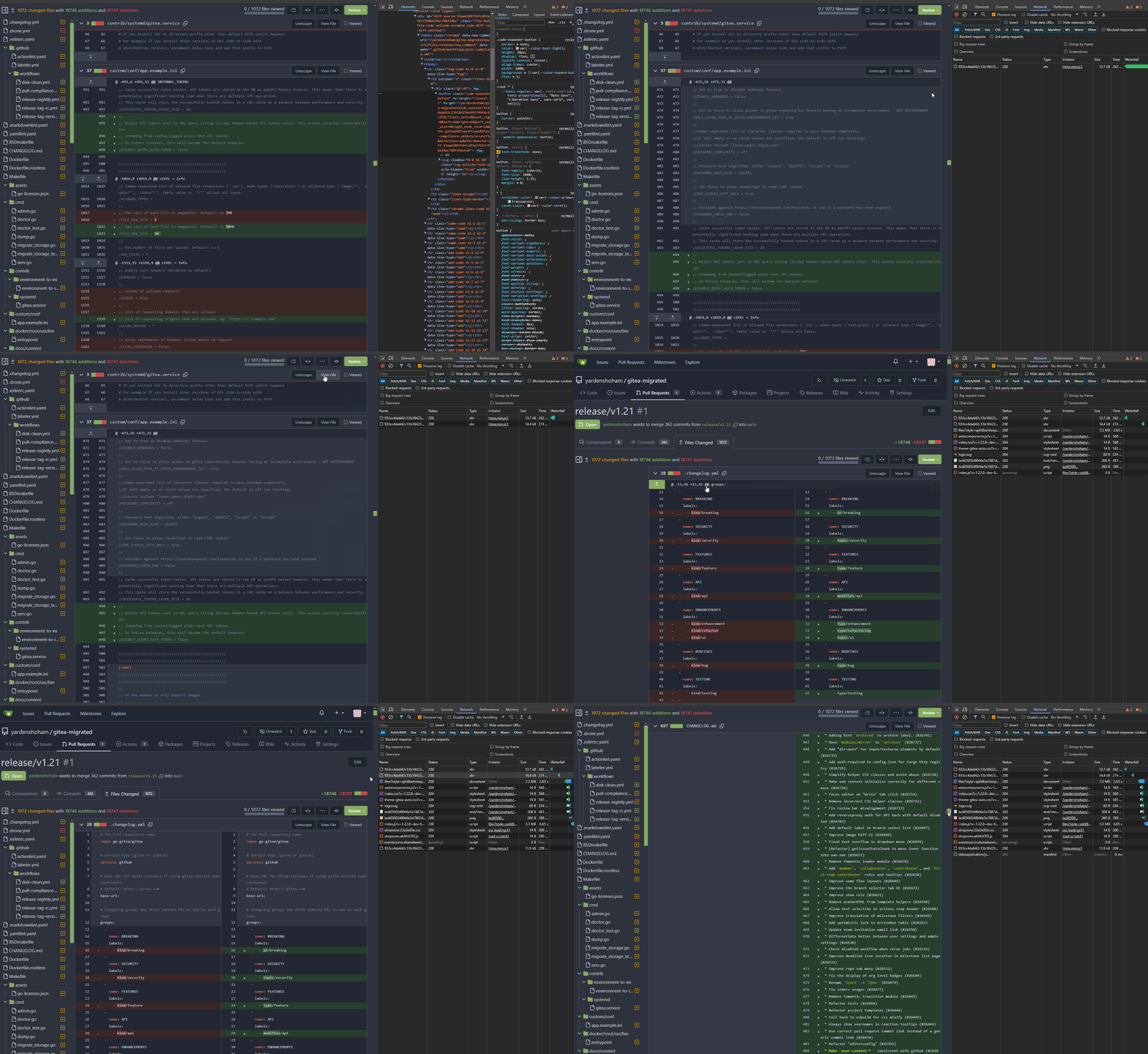
- Removed all jQuery AJAX calls and replaced with htmx
- Tested the code diff expansion buttons functionality and it works as
before plus a loading indicator

# Demo using `htmx` instead of jQuery AJAX
![action](https://github.com/go-gitea/gitea/assets/20454870/afba7442-ed56-4d39-b764-835d1f6c3a9c)

Signed-off-by: Yarden Shoham <git@yardenshoham.com>
2024-02-25 05:07:23 +00:00
wxiaoguang
c9d0e63c20
Remove unnecessary "Str2html" modifier from templates (#29319)
Follow #29165
2024-02-22 18:05:47 +00:00
wxiaoguang
7a1557d2cc
Remove unnecessary "Safe" modifier from templates (#29318)
Follow #29165
2024-02-22 17:02:33 +00:00
silverwind
39f8ab591c
Clean up diff header css and reduce global textarea min-height (#29232)
1. Tweak diff header and remove a numbe of unneeded CSS for it:

Before:
<img width="433" alt="Screenshot 2024-02-18 at 01 08 09"
src="https://github.com/go-gitea/gitea/assets/115237/d8b377c0-57bc-44d5-bb57-a582c7d4b3b4">

After:
<img width="463" alt="Screenshot 2024-02-18 at 01 07 56"
src="https://github.com/go-gitea/gitea/assets/115237/d08c17e7-5b86-4d07-81da-6371f4754325">

3. Reduce height of review textarea and also reduce fomantic's CSS from
12em to 8em. Now fits better on my screen:

<img width="1352" alt="image"
src="https://github.com/go-gitea/gitea/assets/115237/5c658d13-295e-4929-94da-13ade888020d">

---------

Co-authored-by: delvh <dev.lh@web.de>
2024-02-18 14:51:21 +00:00
wxiaoguang
a4859dcfea
Improve user experience for outdated comments (#29050)
Try to improve #28949

1. Make `ctx.Data["ShowOutdatedComments"] = true` by default: it brings
consistent user experience, and sometimes the "outdated (source
changed)" comments are still valuable.
2. Show a friendly message if the comment won't show, then the end users
won't fell that "the comment disappears" (it is the special case when
`ShowOutdatedComments = false`)
2024-02-08 01:50:48 +00:00
yp05327
3aed8ae034
Fix default avatar image size in PR diff page (#28971)
Fix #28941

ps: didn't test. The repo is too big to migrate.
2024-02-02 10:01:11 +00:00
yp05327
b693611b35
Don't show new pr button when page is not compare pull (#26431)
Before:

![image](https://github.com/go-gitea/gitea/assets/18380374/ba69252f-3582-414a-9d62-b2b78d7035dd)
After:

![image](https://github.com/go-gitea/gitea/assets/18380374/71b8587c-b96e-48fb-b3e5-1a2a8b5d06fa)
(TestOrg:test is a tag not branch)

Problem:
In the template, we will not add `compare pull` class when
`PageIsComparePull` is false.

a370efc13f/templates/repo/diff/compare.tmpl (L2)
But in the js, we are using `.repository.compare.pull` to find the
button:

a370efc13f/web_src/js/features/repo-legacy.js (L552-L563)
So, if `PageIsComparePull` is false, the `New Pull Request` button will
be there, but has no response when we click it.
2024-01-21 15:13:00 +00:00
KN4CK3R
637451a45e
Rework markup link rendering (#26745)
Fixes #26548

This PR refactors the rendering of markup links. The old code uses
`strings.Replace` to change some urls while the new code uses more
context to decide which link should be generated.

The added tests should ensure the same output for the old and new
behaviour (besides the bug).

We may need to refactor the rendering a bit more to make it clear how
the different helper methods render the input string. There are lots of
options (resolve links / images / mentions / git hashes / emojis / ...)
but you don't really know what helper uses which options. For example,
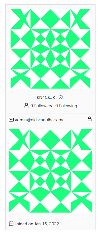
we currently support images in the user description which should not be
allowed I think:

<details>
  <summary>Profile</summary> 

https://try.gitea.io/KN4CK3R
![grafik](https://github.com/go-gitea/gitea/assets/1666336/109ae422-496d-4200-b52e-b3a528f553e5)

</details>

---------

Co-authored-by: wxiaoguang <wxiaoguang@gmail.com>
2024-01-15 08:49:24 +00:00
wxiaoguang
34a0684397
Improve CSS helper naming (#28769)
* `gt-w-100` => `gt-w-full` to match tailwind
* clarify `gt-hidden` priority
2024-01-12 20:28:01 +08:00
Kyle D
e522e774ca
Add merge arrow direction and update styling (#28523)
Close https://github.com/go-gitea/gitea/issues/28522

~Adds some [negative
margin](https://tailwindcss.com/docs/margin#using-negative-values)
helper css classes using tailwind's [prefix
syntax](https://tailwindcss.com/docs/configuration#prefix)~

### Before

![image](https://github.com/go-gitea/gitea/assets/12700993/5bdabf91-facd-41c8-8e36-e1535beb9409)

### After

![image](https://github.com/go-gitea/gitea/assets/12700993/a6f11f6f-9e64-45b6-b9d7-dfea53fbc6d7)
2024-01-05 17:38:56 +00:00
KN4CK3R
b3c258828f
Refactor template empty checks (#28351) 2023-12-04 15:48:42 -06:00
Nanguan Lin
7d1933717d
Use full width for PR comparison (#28182)
Follow-up #22844 
close #28142 
Before 

![ksnip_20231123-183906](https://github.com/go-gitea/gitea/assets/70063547/78428a22-b0a0-45f9-9458-7fd5ec73aa29)
After

![full](https://github.com/go-gitea/gitea/assets/70063547/047242cf-9d6c-4b3a-9f92-54102740c27e)

Co-authored-by: Giteabot <teabot@gitea.io>
2023-11-23 15:52:57 +00:00
sebastian-sauer
e31c6cfe6e
Fix Show/hide filetree button on small displays (#27881)
the gt-df's display:flex !important did override the display:none on small displays

---------

Co-authored-by: wxiaoguang <wxiaoguang@gmail.com>
2023-11-17 18:35:51 +00:00
sebastian-sauer
49dddd87b1
Improve PR diff view on mobile (#27883)
1. Show diff stats only on large screens

these are already shown in tabs, so no need for this duplicate
information on small screens


![image](https://github.com/go-gitea/gitea/assets/1135157/1287839d-7490-42eb-a17e-d526dc0bfd9e)

![image](https://github.com/go-gitea/gitea/assets/1135157/e9dcd89d-ed4d-4945-a7aa-4e6fc6d9c3a2)


2. Hide viewed files information on small screens

Github does the same and this gives us more free space on small screens


![image](https://github.com/go-gitea/gitea/assets/1135157/e90b042f-fffb-4f79-a5ae-cd480c9d8334)

![image](https://github.com/go-gitea/gitea/assets/1135157/d2480ffe-58f2-4694-8ae1-a2ab0aae14d4)


3. Review bar now doesn't wrap so we don't need the 77px even on very
small screens

(the sticky headers are still working)


![image](https://github.com/go-gitea/gitea/assets/1135157/42b19b2b-73ef-4b88-8680-c555879b363b)
2023-11-16 11:58:53 +08:00
sebastian-sauer
37a7c551d4
Show correct commit sha when viewing single commit diff (#27916)
Show the correct sha when viewing a single commit.


![image](https://github.com/go-gitea/gitea/assets/1135157/5f39a84e-11ed-4700-b40b-eb9da6e91bec)
2023-11-06 00:39:32 +01:00
Earl Warren
c46080bc9d
Remove "tabindex" from some form buttons (#27892)
Remove the "tabindex" from some form buttons on the "diff box" / "issue view content" page, let the browser use the default tab order.

---------

Co-authored-by: Gusted <postmaster@gusted.xyz>
Co-authored-by: wxiaoguang <wxiaoguang@gmail.com>
2023-11-03 14:40:48 +00:00
silverwind
572f0963ed
Only show diff file tree when more than one file changed (#27775)
When 0 or 1 files changed in a diff, we don't need to show a file tree.
This behaviour matches GitHub. Single-file diff after this change, note
absence of button:

<img width="1234" alt="image"
src="https://github.com/go-gitea/gitea/assets/115237/3618438b-e655-42a3-989f-f299267b2b8b">

Co-authored-by: Giteabot <teabot@gitea.io>
2023-10-25 05:09:18 +02:00
silverwind
73b63d9311
Replace ajax with fetch, improve image diff (#27267)
1. Dropzone attachment removal, pretty simple replacement
2. Image diff: The previous code fetched every image twice, once via
`img[src]` and once via `$.ajax`. Now it's only fetched once and a
second time only when necessary. The image diff code was partially
rewritten.

---------

Co-authored-by: Giteabot <teabot@gitea.io>
2023-10-11 12:34:21 +00:00
JakobDev
ebe803e514
Penultimate round of db.DefaultContext refactor (#27414)
Part of #27065

---------

Co-authored-by: Lunny Xiao <xiaolunwen@gmail.com>
2023-10-11 04:24:07 +00:00
wxiaoguang
1f00bc44b2
Fix review UI (#27322)
Close #26730


1. The `diff-detail-box` was abused, it shouldn't be used for
"DiffFileList/DiffFileTree".
2. Fix the sticky position for various screens.


![image](https://github.com/go-gitea/gitea/assets/2114189/558a5c06-c94c-4e5c-8395-d38473dd21c2)


![image](https://github.com/go-gitea/gitea/assets/2114189/3390fb0e-7dc7-457f-bd0c-398fdb6d24c0)


![image](https://github.com/go-gitea/gitea/assets/2114189/d19dd350-aecf-4909-8ef9-73b09d94560e)
2023-09-28 10:00:26 +00:00
wxiaoguang
93bd4351bf
Fix more "locale" usages (#27259) 2023-09-25 20:42:40 +08:00
delvh
7960ba7e2b
Always use ctx.Locale.Tr inside templates (#27231) 2023-09-25 08:56:50 +00:00
Denys Konovalov
2325fe777d
cleanup locale function usage (#27227) 2023-09-24 20:31:58 +00:00
silverwind
8099238618
Change green buttons to primary color (#27099)
I think it's better if the primary actions have primary color instead of
green which fits better into the overall single-color UI design. This PR
currently replaces every green button with primary:

<img width="141" alt="Screenshot 2023-09-16 at 14 07 59"
src="https://github.com/go-gitea/gitea/assets/115237/843c1e50-4fb2-4ec6-84ba-0efb9472dcbe">
<img width="161" alt="Screenshot 2023-09-16 at 14 07 51"
src="https://github.com/go-gitea/gitea/assets/115237/9442195a-a3b2-4a42-b262-8377d6f5c0d1">

Modal actions now use uncolored/primary instead of previous green/red
colors. I also removed the box-shadow on all basic buttons:

<img width="259" alt="Screenshot 2023-09-16 at 14 16 39"
src="https://github.com/go-gitea/gitea/assets/115237/5beea529-127a-44b0-8d4c-afa7b034a490">
<img width="261" alt="Screenshot 2023-09-16 at 14 17 42"
src="https://github.com/go-gitea/gitea/assets/115237/4757f7b2-4d46-49bc-a797-38bb28437b88">

The change currently includes the "Merge PR" button, for which we might
want to make an exception to match the icon color there:

<img width="442" alt="Screenshot 2023-09-16 at 14 33 53"
src="https://github.com/go-gitea/gitea/assets/115237/993ac1a5-c94d-4895-b76c-0d872181a70b">
2023-09-18 22:05:31 +00:00
wxiaoguang
d5703d4a1b
Remove "TODO" tasks from CSS file (#26835)
1. Use `gt-invisible` instead of `invisible`.
2. Use `gt-word-break` instead of `dont-break-out` (there is a slight
different "hyphens", but I think it won't affect too much since it is
only used for the "full name").
3. Remove `.small.button:has(svg)` , now our buttons could layout SVG
correctly, and actually I didn't see this CSS class is used in code.
2023-08-31 10:49:53 +00:00
wxiaoguang
19a1e1b20e
Remove polluted .ui.right (#26825)
Each change is tested manually line by line. There are too many changes
so I can't share dozens of screenshots.

In short:

1. `ui right` could be still used in `ui top attached header`, because
there is a special case.
2. A lot of `ui right` are just no-op, so they can be removed safely.
3. Some of the `ui right` should be replaced by `gt-float-right` (to
avoid breaking, leave them to the future).
4. A few of the `ui right` could be rewritten by flex.
2023-08-31 02:29:59 +00:00
CaiCandong
c576b50441
Fix being unable to use a repo that prohibits accepting PRs as a PR source. (#26785)
## Description 
Sometimes, we need to use an upstream mirror repository to update the
current development repository, but mirror repositories are prohibited
from PR. It should not appear in `merge to,` but it can appear in `pull
from.`
Fix #24585 #26193 #26781
Related #24183

Many thanks to @apnote  for assisting me in reproducing this bug!

## ScreenShot
---
### Before

<img
src="https://github.com/go-gitea/gitea/assets/50507092/3d76c376-1f54-45b9-80c9-6ba8319d6a9a"
width="400px">

<img
src="https://github.com/go-gitea/gitea/assets/50507092/fbfd9f7f-421f-4a2e-9a3e-f2958bbf3312"
width="400px">

### After

<img
src="https://github.com/go-gitea/gitea/assets/50507092/e6984524-4f61-4310-b795-4d8598bd8963"
width="400px">

<img
src="https://github.com/go-gitea/gitea/assets/50507092/04065b44-78d7-4721-bf31-0f1674150727"
width="400px">
2023-08-29 12:07:15 +03:00
wxiaoguang
ee9e83b230
Remove incorrect CSS helper classes (#26712) 2023-08-25 06:47:59 +00:00
wxiaoguang
390ec619f3
Fix review bar misalignment (#26711) 2023-08-24 23:46:30 +08:00
wxiaoguang
09faf43ef8
Improve Image Diff UI (#26696)
1. Use `is-loading` instead of `ui loader`
2. Introduce class name `image-diff-tabs`, instead of searching `gt-hidden`, which is fragile
3. Align the UI elements, see the screenshots.
2023-08-24 12:13:23 +00:00
silverwind
56b6b2b88e
Fix tooltip of commit select button (#26472)
Previously, the tooltip for this button was only shown after opening and
closing it once because it was only set after the server response, now
it shows before opening it.
2023-08-14 02:16:40 +00:00
wxiaoguang
a370efc13f
Use template context function for avatar rendering (#26385)
Introduce `AvatarUtils`, no need to pass `$.Context` to every
sub-template, and simplify the template helper functions.
2023-08-10 11:19:39 +08:00
delvh
8736b134bd
Display human-readable text instead of cryptic filemodes (#26352)
Now, you don't need to be a git expert anymore to know what these
numbers mean.

## Before

![grafik](https://github.com/go-gitea/gitea/assets/51889757/9a964bf6-10fd-40a6-aeb2-ac8f437f8c32)

## After

![grafik](https://github.com/go-gitea/gitea/assets/51889757/84573cb9-55b6-4dde-9866-95f71b657554)

or when the mode actually changed:

![grafik](https://github.com/go-gitea/gitea/assets/51889757/0f327538-ebdc-40e7-8c99-f9e21b67f638)
2023-08-06 21:52:34 +02:00
silverwind
aa723dea9b
Don't autosize textarea in diff view (#26233)
Resizing the comment editor can be a very expensive operation because it
triggers page reflows, which on large PRs can take upwards of seconds to
complete. Disable this mechanism on the diff page only where we know
that the page can get large.

Fixes https://github.com/go-gitea/gitea/issues/26201 for the textarea
editor.

I don't think this can be fixed for EasyMDE because as far as I can
tell, it exposes no option to disable this resizing.

---------

Co-authored-by: Giteabot <teabot@gitea.io>
2023-07-31 00:11:15 +02:00
sebastian-sauer
55532061c8
Add commits dropdown in PR files view and allow commit by commit review (#25528)
This PR adds a new dropdown to select a commit or a commit range
(shift-click like github) of a Pull Request.
After selection of a commit only the changes of this commit will be shown.
When selecting a range of commits the diff of this range is shown.

This allows to review a PR commit by commit or by viewing only commit ranges.
The "Show changes since your last review" mechanism github uses is implemented, too.
When reviewing a single commit or a commit range the "Viewed" functionality is disabled.

## Screenshots

### The commit dropdown

![image](https://github.com/go-gitea/gitea/assets/51889757/0db3ae62-1272-436c-be64-4730c5d611e3)

### Selecting a commit range

![image](https://github.com/go-gitea/gitea/assets/51889757/ad81eedb-8437-42b0-8073-2d940c25fe8f)

### Show changes of a single commit only

![image](https://github.com/go-gitea/gitea/assets/51889757/6b1a113b-73ef-4ecc-adf6-bc2340bb8f97)

### Show changes of a commit range

![image](https://github.com/go-gitea/gitea/assets/51889757/6401b358-cd66-4c09-8baa-6cf6177f23a7)


Fixes https://github.com/go-gitea/gitea/issues/20989
Fixes https://github.com/go-gitea/gitea/issues/19263

---------

Co-authored-by: silverwind <me@silverwind.io>
Co-authored-by: KN4CK3R <admin@oldschoolhack.me>
Co-authored-by: wxiaoguang <wxiaoguang@gmail.com>
Co-authored-by: delvh <dev.lh@web.de>
2023-07-28 21:18:12 +02:00
puni9869
1d8d90fd37
Fixing the align of commit stats in commit_page template. (#26161)
Fixing the align center to row and space around for commit_page
template.
2023-07-28 13:12:44 -04:00
sebastian-sauer
d473de0c2d
Make add line comment buttons focusable (#25894)
Use a real button and add an aria-label.
Additionally, show the button whenever it is focused.
See https://codeberg.org/forgejo/forgejo/issues/998 for explanation.

Our handling of this button is now equal to that of GitHub.
Nothing has changed visually.
2023-07-15 11:45:34 +02:00
silverwind
61e0d1a767
Enable H014 and H023 djlint rules (#25786)
Enable these rules:

- H014 | More than 2 blank lines.
- H023 | Do not use entity references.

There are more potential rules to enable but they are blocked by bugs in
the linter:

- https://github.com/Riverside-Healthcare/djLint/issues/711
- https://github.com/Riverside-Healthcare/djLint/issues/712
2023-07-09 20:33:25 +00:00
puni9869
2ff0c12a95
Repository Archived text title center align (#25767)
Archive text title center align

<details>
  <summary>Screen shots</summary>
  
 Before

![image](https://github.com/go-gitea/gitea/assets/80308335/90182367-4d06-4fc8-b7aa-21c21225d2bd)

After 

![image](https://github.com/go-gitea/gitea/assets/80308335/3dcc0d0d-75f4-415d-afbf-03921075b4db)


![image](https://github.com/go-gitea/gitea/assets/80308335/317d74f8-0ae9-4dc7-9508-1833d2d4f327)


BTW On github

![image](https://github.com/go-gitea/gitea/assets/80308335/1801fd2d-1803-4ee6-8856-ef2f623df2b4)

</details>

---------

Co-authored-by: Giteabot <teabot@gitea.io>
2023-07-08 10:57:17 +00:00
sebastian-sauer
f03d95f0a9
Allow/fix review (approve/reject) of empty PRs (#25690)
gitea allows to create empty PRs.

Currently when you need approvals for a merge, you have to manually add
/files to the url to get to the files tab to approve / reject the PR.

This PR allows to open the files tab via the normal tab / link and then
fixes the layout of the files tab.

**Screenshots:**

Before:

![image](https://github.com/go-gitea/gitea/assets/1135157/b5082e5e-8c32-4412-993e-b854905e96d3)

After:

![image](https://github.com/go-gitea/gitea/assets/1135157/1f5e056e-396f-4dfb-8d14-e17a2f6495d9)

---------

Co-authored-by: silverwind <me@silverwind.io>
Co-authored-by: Giteabot <teabot@gitea.io>
2023-07-06 15:33:04 +00:00
sebastian-sauer
ed8a8af99f
Use AfterCommitId to get commit for Viewed functionality (#25529)
the PullHeadCommitID is not always available when the PR is merged.

Not sure if this is the best solution but in my simple tests it looks
like this fixes the problem - happy to get any feedback.

hopefully fixes https://github.com/go-gitea/gitea/issues/24813
2023-07-01 00:08:18 +08:00
silverwind
64f2d70262
Replace fomantic divider module with our own (#25539)
Should look exactly like before for normal dividers. "Horizontal" ones
look better because they no longer use image backgrounds.

<img width="917" alt="Screenshot 2023-06-27 at 19 07 56"
src="https://github.com/go-gitea/gitea/assets/115237/d97d8dec-6859-44a8-85ba-e4549b4dd9df">

<img width="914" alt="Screenshot 2023-06-27 at 19 05 58"
src="https://github.com/go-gitea/gitea/assets/115237/8bf98544-2d82-4ebf-ac68-d6dc237bd6b2">

<img width="1246" alt="Screenshot 2023-06-27 at 19 00 42"
src="https://github.com/go-gitea/gitea/assets/115237/36a6bb21-6029-4f53-8bee-535f55c66fed">

<img width="344" alt="Screenshot 2023-06-27 at 18 58 15"
src="https://github.com/go-gitea/gitea/assets/115237/a9e70aee-8e6b-4ea1-9e93-19c9f96aec6e">
<img width="823" alt="Screenshot 2023-06-27 at 18 56 22"
src="https://github.com/go-gitea/gitea/assets/115237/e7a497cd-f262-4683-8872-23c3c8cce32f">

<img width="330" alt="Screenshot 2023-06-27 at 19 21 11"
src="https://github.com/go-gitea/gitea/assets/115237/42f24149-a655-4c7e-bd26-8ab52db6446b">
2023-06-29 20:24:22 +08:00