GitLab generates "system notes" whenever an event happens within the
platform. Unlike Gitea, those events are stored and retrieved as text
comments with no semantic details. The only way to tell whether a
comment was generated in this manner is the `system` flag on the note
type.

This PR adds detection for a new specific kind of event: Changing the
target branch of a PR. When detected, it is downloaded using Gitea's
type for this event, and eventually uploaded into Gitea in the expected
format, i.e. with no text content in the comment.

This PR also updates the template used to render comments to add support
for migrated comments of this type.

ref:
11bd6dc826/app/services/system_notes/merge_requests_service.rb (L102)
### Overview
This is the implementation of Code Frequency page. This feature was
mentioned on these issues: #18262, #7392.


It adds another tab to Activity page called Code Frequency. Code
Frequency tab shows additions and deletions over time since the
repository existed.


Before:
<img width="1296" alt="image"
src="https://github.com/go-gitea/gitea/assets/32161460/2603504f-aee7-4929-a8c4-fb3412a7a0f6">

After:
<img width="1296" alt="image"
src="https://github.com/go-gitea/gitea/assets/32161460/58c03721-729f-4536-a663-9f337f240963">

---


#### Features
- See additions deletions over time since repository existed
- Click on "Additions" or "Deletions" legend to show only one type of
contribution
- Use the same cache from Contributors page so that the loading of data
will be fast once it is cached by visiting either one of the pages

---------

Co-authored-by: Giteabot <teabot@gitea.io>
Extract from #20549

This PR added a new option on app.ini `[admin]USER_DISABLED_FEATURES` to
allow the site administrator to disable users visiting deletion user
interface or allow.
This options are also potentially allowed to define more features in
future PRs.

---------

Co-authored-by: wxiaoguang <wxiaoguang@gmail.com>
GitLab generates "system notes" whenever an event happens within the
platform. Unlike Gitea, those events are stored and retrieved as text
comments with no semantic details. The only way to tell whether a
comment was generated in this manner is the `system` flag on the note
type.

This PR adds detection for two specific kinds of events: Scheduling and
un-scheduling of automatic merges on a PR. When detected, they are
downloaded using Gitea's type for these events, and eventually uploaded
into Gitea in the expected format, i.e. with no text content in the
comment.

This PR also updates the template used to render comments to add support
for migrated comments of these two types.

ref:
11bd6dc826/app/services/system_notes/merge_requests_service.rb (L6-L17)

---------

Co-authored-by: silverwind <me@silverwind.io>
Co-authored-by: wxiaoguang <wxiaoguang@gmail.com>
Follow #29165.

* Introduce JSONTemplate to help to render JSON templates
* Introduce JSEscapeSafe for templates. Now only use `{{ ... |
JSEscape}}` instead of `{{ ... | JSEscape | Safe}}`
* Simplify "UserLocationMapURL" useage
2 instances of `for` with a wrong value and 1 `for` that had a reference
to a `name` instead of `id`.

---------

Signed-off-by: Yarden Shoham <git@yardenshoham.com>
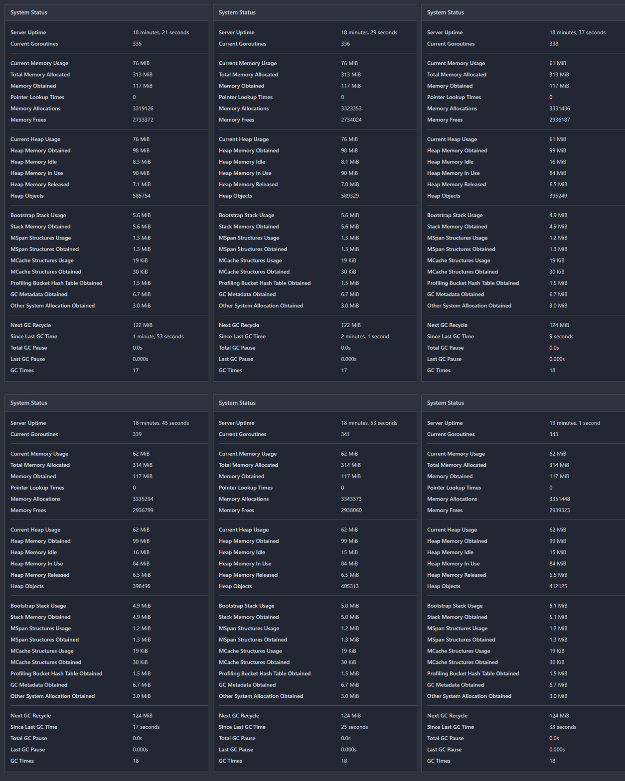
- Refactor the system status list into its own template
- Change the backend to return only the system status if htmx initiated
the request
- `hx-get="{{$.Link}}/system_status`: reuse the backend handler
- `hx-swap="innerHTML"`: replace the `<div>`'s innerHTML (essentially
the new template)
- `hx-trigger="every 5s"`: call every 5 seconds
- `hx-indicator=".divider"`: the `is-loading` class shouldn't be added
to the div during the request, so set it on an element it has no effect
on
- Render "Since Last GC Time" with `<relative-time>`, so we send a
timestamp
# Auto-update in action GIF
---------
Signed-off-by: Yarden Shoham <git@yardenshoham.com>
Co-authored-by: silverwind <me@silverwind.io>
Continuation of https://github.com/go-gitea/gitea/pull/25439. Fixes#847
Before:
<img width="1296" alt="image"
src="https://github.com/go-gitea/gitea/assets/32161460/24571ac8-b254-43c9-b178-97340f0dc8a9">
----
After:
<img width="1296" alt="image"
src="https://github.com/go-gitea/gitea/assets/32161460/c60b2459-9d10-4d42-8d83-d5ef0f45bf94">
---
#### Overview
This is the implementation of a requested feature: Contributors graph
(#847)
It makes Activity page a multi-tab page and adds a new tab called
Contributors. Contributors tab shows the contribution graphs over time
since the repository existed. It also shows per user contribution graphs
for top 100 contributors. Top 100 is calculated based on the selected
contribution type (commits, additions or deletions).
---
#### Demo
(The demo is a bit old but still a good example to show off the main
features)
<video src="https://github.com/go-gitea/gitea/assets/32161460/9f68103f-8145-4cc2-94bc-5546daae7014" controls width="320" height="240">
<a href="https://github.com/go-gitea/gitea/assets/32161460/9f68103f-8145-4cc2-94bc-5546daae7014">Download</a>
</video>
#### Features:
- Select contribution type (commits, additions or deletions)
- See overall and per user contribution graphs for the selected
contribution type
- Zoom and pan on graphs to see them in detail
- See top 100 contributors based on the selected contribution type and
selected time range
- Go directly to users' profile by clicking their name if they are
registered gitea users
- Cache the results so that when the same repository is visited again
fetching data will be faster
---------
Co-authored-by: silverwind <me@silverwind.io>
Co-authored-by: hiifong <i@hiif.ong>
Co-authored-by: delvh <dev.lh@web.de>
Co-authored-by: 6543 <6543@obermui.de>
Co-authored-by: yp05327 <576951401@qq.com>
Clarify when "string" should be used (and be escaped), and when
"template.HTML" should be used (no need to escape)

And help PRs like  #29059 , to render the error messages correctly.
With this option, it is possible to require a linear commit history with
the following benefits over the next best option `Rebase+fast-forward`:
The original commits continue existing, with the original signatures
continuing to stay valid instead of being rewritten, there is no merge
commit, and reverting commits becomes easier.
Closes#24906
- Use maintained fork https://github.com/golangci/misspell
- Rename `mispell-check` to `lint-spell`, add `lint-spell-fix`
- Run `lint-spell` in separate actions step
- Lint more files, fix discovered issues
- Remove inaccurate and outdated info in docs (we do not need GOPATH for
tools anymore)

Maybe later we can add more spellchecking tools, but I have not found
any good ones yet.
Try to improve #28949

1. Make `ctx.Data["ShowOutdatedComments"] = true` by default: it brings
consistent user experience, and sometimes the "outdated (source
changed)" comments are still valuable.
2. Show a friendly message if the comment won't show, then the end users
won't fell that "the comment disappears" (it is the special case when
`ShowOutdatedComments = false`)
- The watch/unwatch button and star/unstar get their own template
- The backend returns HTML instead of redirect

---------

Signed-off-by: Yarden Shoham <git@yardenshoham.com>
Co-authored-by: John Olheiser <john.olheiser@gmail.com>
- Closes https://github.com/go-gitea/gitea/issues/28880
This change introduces htmx with the hope we could use it to make Gitea
more reactive while keeping our "HTML rendered on the server" approach.
- Add `htmx.js` that imports `htmx.org` and initializes error toasts
- Place `hx-headers='{"x-csrf-token": "{{.CsrfToken}}"}'` on the
`<body>` tag so every request that htmx sends is authenticated
- Place `hx-swap="outerHTML"` on the `<body>` tag so the response of
each htmx request replaces the tag it targets (as opposed to its inner
content)
- Place `hx-push-url="false"` on the `<body>` tag so no changes to the
URL happen in `<form>` tags
- Add the `is-loading` class during request
### Error toasts in action

## Don't do a full page load when clicking the subscribe button
- Refactor the form around the subscribe button into its own template
- Use htmx to perform the form submission
- `hx-boost="true"` to prevent the default form submission behavior of a
full page load
- `hx-sync="this:replace"` to replace the current request (in case the
button is clicked again before the response is returned)
- `hx-target="this"` to replace the form tag with the new form tag
- Change the backend response to return a `<form>` tag instead of a
redirect to the issue page
### Before
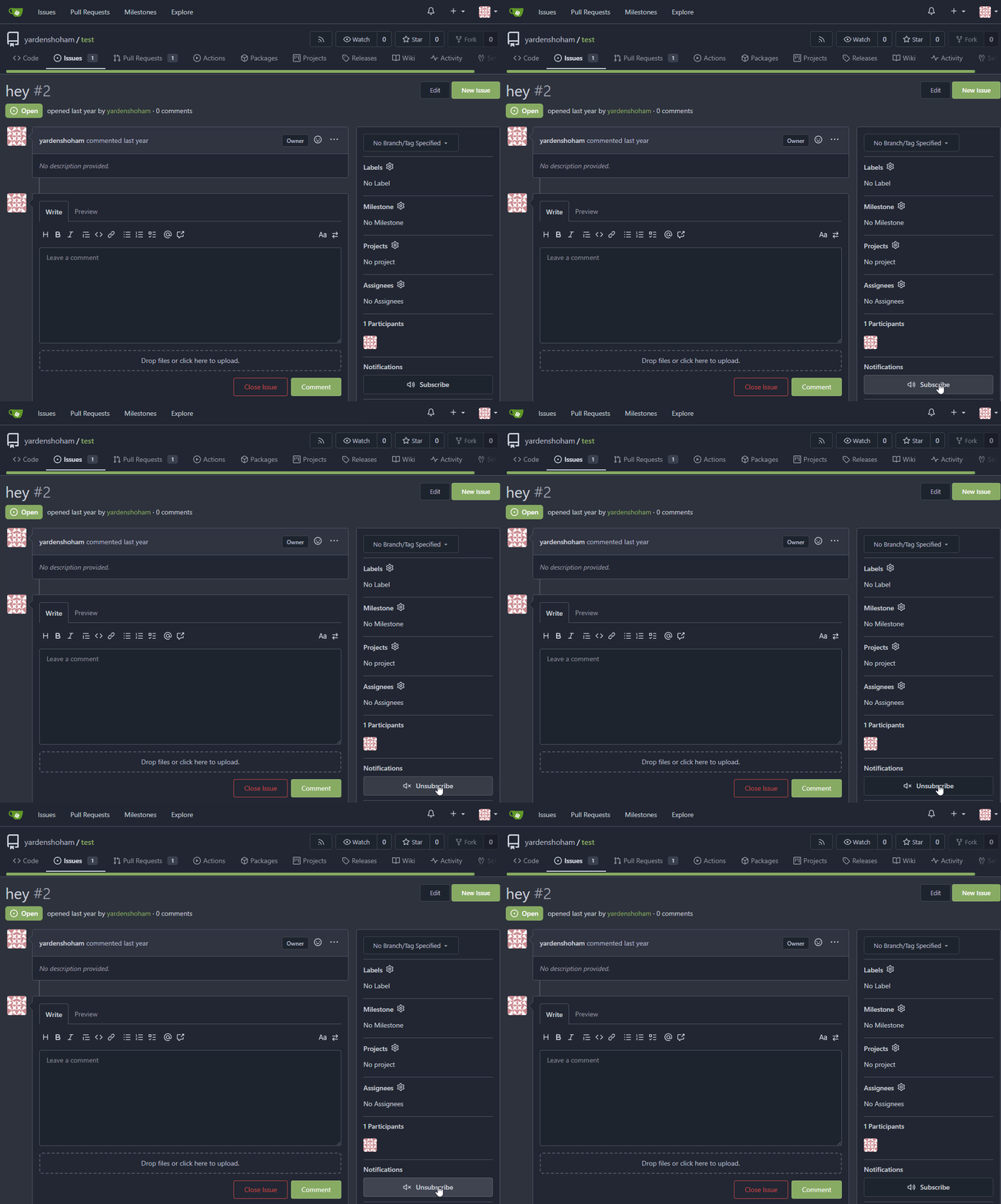
### After

## Don't do a full page load when clicking the follow button
- Use htmx to perform the button request
- `hx-post="{{.ContextUser.HomeLink}}?action=follow"` to send a POST
request to follow the user
- `hx-target="#profile-avatar-card"` to target the card div for
replacement
- `hx-indicator="#profile-avatar-card"` to place the loading indicator
on the card
- Change the backend response to return a `<div>` tag (the card) instead
of a redirect to the user page
### Before
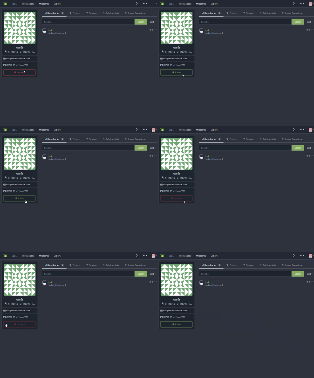
### After

---------
Signed-off-by: Yarden Shoham <git@yardenshoham.com>
Co-authored-by: 6543 <m.huber@kithara.com>
Co-authored-by: Giteabot <teabot@gitea.io>
The `ToUTF8*` functions were stripping BOM, while BOM is actually valid
in UTF8, so the stripping must be optional depending on use case. This
does:

- Add a options struct to all `ToUTF8*` functions, that by default will
strip BOM to preserve existing behaviour
- Remove `ToUTF8` function, it was dead code
- Rename `ToUTF8WithErr` to `ToUTF8`
- Preserve BOM in Monaco Editor
- Remove a unnecessary newline in the textarea value. Browsers did
ignore it, it seems but it's better not to rely on this behaviour.

Fixes: https://github.com/go-gitea/gitea/issues/28743
Related: https://github.com/go-gitea/gitea/issues/6716 which seems to
have once introduced a mechanism that strips and re-adds the BOM, but
from what I can tell, this mechanism was removed at some point after
that PR.
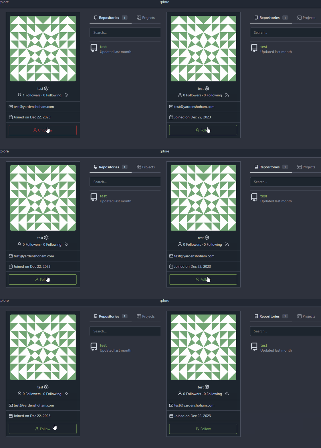
- Use htmx to perform the button request
- `hx-headers='{"x-csrf-token": "{{.CsrfToken}}"}'` to authenticate (we
should probably learn to reuse this)
- `hx-post="{{.ContextUser.HomeLink}}?action=follow"` to send a POST
request to follow the user
- `hx-target="#profile-avatar-card"` to target the card div for
replacement
- `hx-swap="outerHTML"` to replace the card (as opposed to its inner
content) with the new card that shows the new follower count and button
color
- Change the backend response to return a `<div>` tag (the card) instead
of a redirect to the user page
# Before
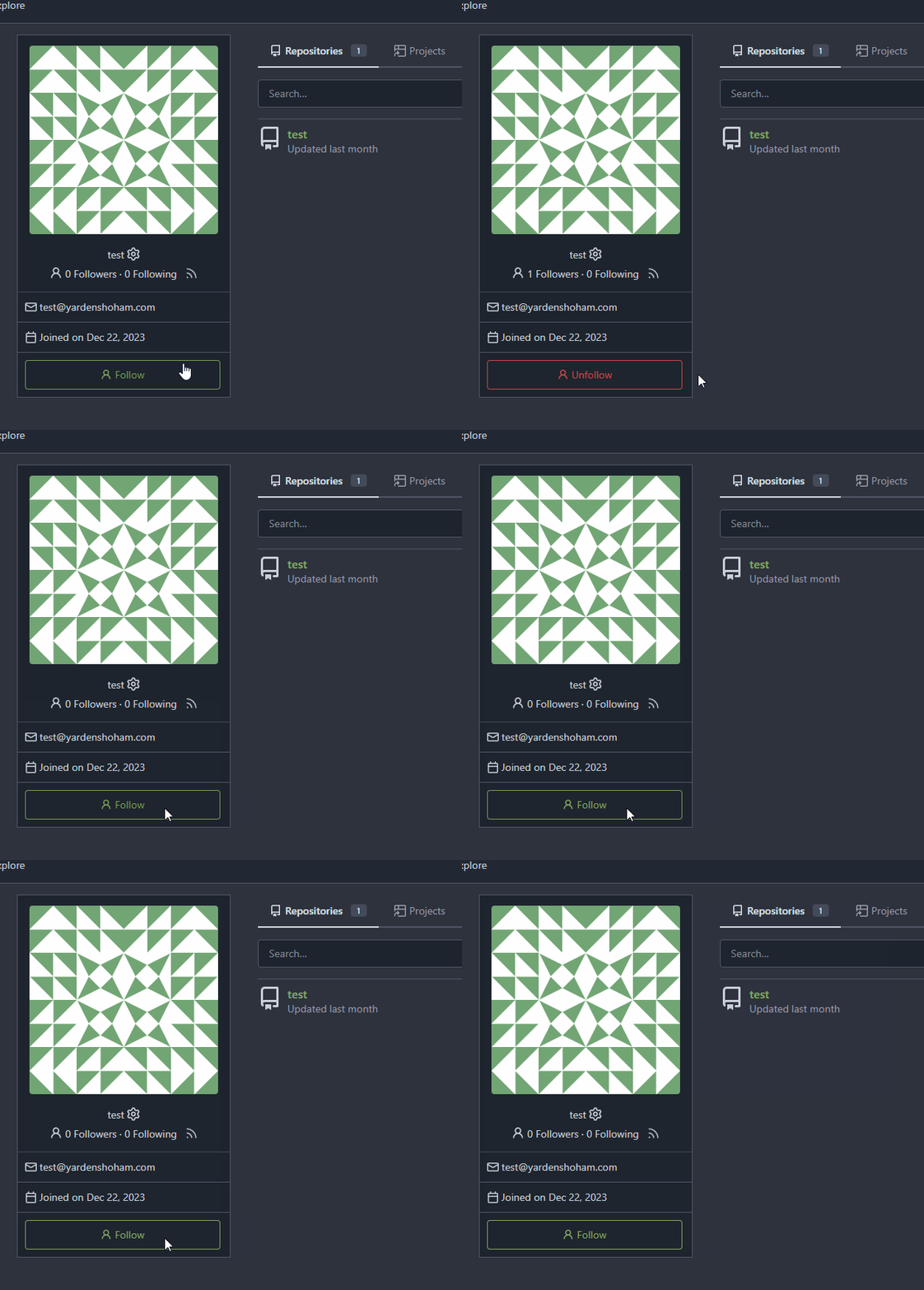
# After
Signed-off-by: Yarden Shoham <git@yardenshoham.com>
- Refactor the form around the subscribe button into its own template
- Use htmx to perform the form submission
- `hx-boost="true"` to prevent the default form submission behavior of a
full page load
- `hx-sync="this:replace"` to replace the current request (in case the
button is clicked again before the response is returned)
- `hx-target="this"` to replace the form tag with the new form tag
- `hx-push-url="false"` to disable a change to the URL
- `hx-swap="show:no-scroll"` to preserve the scroll position
- Change the backend response to return a `<form>` tag instead of a
redirect to the issue page
- Include `htmx.org` in javascript imports
This change introduces htmx with the hope we could use it to make Gitea
more reactive while keeping our "HTML rendered on the server" approach.
# Before

# After

---------
Signed-off-by: Yarden Shoham <git@yardenshoham.com>
As more and more options can be set for creating the repository, I don't
think we should put all of them into the creation web page which will
make things look complicated and confusing.

And I think we need some rules about how to decide which should/should
not be put in creating a repository page. One rule I can imagine is if
this option can be changed later and it's not a MUST on the creation,
then it can be removed on the page. So I found trust model is the first
one.

This PR removed the trust model selections on creating a repository web
page and kept others as before.
This is also a preparation for #23894 which will add a choice about SHA1
or SHA256 that cannot be changed once the repository created.
By clicking the currently active "Open" or "Closed" filter button in the
issue list, the user can toggle that filter off in order to see all
issues regardless of state. The URL "state" parameter will be set to
"all" and the "Open"/"Closed" button will not show as active.
Fixes#26548
This PR refactors the rendering of markup links. The old code uses
`strings.Replace` to change some urls while the new code uses more
context to decide which link should be generated.
The added tests should ensure the same output for the old and new
behaviour (besides the bug).
We may need to refactor the rendering a bit more to make it clear how
the different helper methods render the input string. There are lots of
options (resolve links / images / mentions / git hashes / emojis / ...)
but you don't really know what helper uses which options. For example,
we currently support images in the user description which should not be
allowed I think:
<details>
<summary>Profile</summary>
https://try.gitea.io/KN4CK3R
</details>
---------
Co-authored-by: wxiaoguang <wxiaoguang@gmail.com>
Fixes#27114.
* In Gitea 1.12 (#9532), a "dismiss stale approvals" branch protection
setting was introduced, for ignoring stale reviews when verifying the
approval count of a pull request.
* In Gitea 1.14 (#12674), the "dismiss review" feature was added.
* This caused confusion with users (#25858), as "dismiss" now means 2
different things.
* In Gitea 1.20 (#25882), the behavior of the "dismiss stale approvals"
branch protection was modified to actually dismiss the stale review.
For some users this new behavior of dismissing the stale reviews is not
desirable.
So this PR reintroduces the old behavior as a new "ignore stale
approvals" branch protection setting.
---------
Co-authored-by: delvh <dev.lh@web.de>
When JavaScript is not loaded, fall back to displaying reaction tooltips
with the default browser `title` attribute. An element with a present
but empty `data-tooltip-content` will use the `title` attribute for its
tippy.js tooltip content, so when JavaScript is enabled, this functions
the same as the current behavior.
Mainly for MySQL/MSSQL.
It is important for Gitea to use case-sensitive database charset
collation. If the database is using a case-insensitive collation, Gitea
will show startup error/warning messages, and show the errors/warnings
on the admin panel's Self-Check page.
Make `gitea doctor convert` work for MySQL to convert the collations of
database & tables & columns.
* Fix#28131
## ⚠️ BREAKING ⚠️
It is not quite breaking, but it's highly recommended to convert the
database&table&column to a consistent and case-sensitive collation.
In #26851, it assumed that `Commit` always exists when
`PageIsDiff==true`.

But for a 404 page, the `Commit` doesn't exist, so the following code
would cause panic because nil value can't be passed as string parameter
to `IsMultilineCommitMessage(string)` (or the StringUtils.Cut in later
PRs)
According to [Debian
docs](https://wiki.debian.org/DebianRepository/UseThirdParty):

> The certificate MUST NOT be placed in /etc/apt/trusted.gpg.d or loaded
by apt-key add.
> ...
> If future updates to the certificate will be managed by an apt/dpkg
package as recommended below, then it SHOULD be downloaded into
/usr/share/keyrings using the same filename that will be provided by the
package. If it will be managed locally , it SHOULD be downloaded into
/etc/apt/keyrings instead.
> ...
> A sources.list entry SHOULD have the signed-by option set.
There is an accessibility issue in the interface when attempting to
delete a repository. When I click on "Delete repository," a dialog box
appears, requiring confirmation to proceed with the repository deletion.
However, when I press the "Repo name" label, the wrong input field gains
focus. The focused field is located behind the dialog and is intended
for renaming the repository.
- Modify the `Password` field in `CreateUserOption` struct to remove the
`Required` tag
- Update the `v1_json.tmpl` template to include the `email` field and
remove the `password` field

---------

Signed-off-by: Bo-Yi Wu <appleboy.tw@gmail.com>
Resolves https://github.com/go-gitea/gitea/issues/28451.

This change follows the recommendation by wxiaoguang to remove the
"Disable Minimum Key Size Check" from the "Service Configuration"
section of the UI, because this option belongs to the "SSH
Configuration" section of the administration menu and already has a
functioning indicator in that section of the UI.

---------

Co-authored-by: wxiaoguang <wxiaoguang@gmail.com>
## Changes
- Add deprecation warning to `Token` and `AccessToken` authentication
methods in swagger.
- Add deprecation warning header to API response. Example:
  ```
  HTTP/1.1 200 OK
  ...
  Warning: token and access_token API authentication is deprecated
  ...
  ```
- Add setting `DISABLE_QUERY_AUTH_TOKEN` to reject query string auth
tokens entirely. Default is `false`

## Next steps
- `DISABLE_QUERY_AUTH_TOKEN` should be true in a subsequent release and
the methods should be removed in swagger
- `DISABLE_QUERY_AUTH_TOKEN` should be removed and the implementation of
the auth methods in question should be removed

## Open questions
- Should there be further changes to the swagger documentation?
Deprecation is not yet supported for security definitions (coming in
[OpenAPI Spec version
3.2.0](https://github.com/OAI/OpenAPI-Specification/issues/2506))
- Should the API router logger sanitize urls that use `token` or
`access_token`? (This is obviously an insufficient solution on its own)

---------

Co-authored-by: delvh <dev.lh@web.de>
It will fix#28268 .
<img width="1313" alt="image"
src="https://github.com/go-gitea/gitea/assets/9418365/cb1e07d5-7a12-4691-a054-8278ba255bfc">
<img width="1318" alt="image"
src="https://github.com/go-gitea/gitea/assets/9418365/4fd60820-97f1-4c2c-a233-d3671a5039e9">
## ⚠️ BREAKING ⚠️
But need to give up some features:
<img width="1312" alt="image"
src="https://github.com/go-gitea/gitea/assets/9418365/281c0d51-0e7d-473f-bbed-216e2f645610">
However, such abandonment may fix#28055 .
## Backgroud
When the user switches the dashboard context to an org, it means they
want to search issues in the repos that belong to the org. However, when
they switch to themselves, it means all repos they can access because
they may have created an issue in a public repo that they don't own.
<img width="286" alt="image"
src="https://github.com/go-gitea/gitea/assets/9418365/182dcd5b-1c20-4725-93af-96e8dfae5b97">
It's a confusing design. Think about this: What does "In your
repositories" mean when the user switches to an org? Repos belong to the
user or the org?
Whatever, it has been broken by #26012 and its following PRs. After the
PR, it searches for issues in repos that the dashboard context user owns
or has been explicitly granted access to, so it causes #28268.
## How to fix it
It's not really difficult to fix it. Just extend the repo scope to
search issues when the dashboard context user is the doer. Since the
user may create issues or be mentioned in any public repo, we can just
set `AllPublic` to true, which is already supported by indexers. The DB
condition will also support it in this PR.
But the real difficulty is how to count the search results grouped by
repos. It's something like "search issues with this keyword and those
filters, and return the total number and the top results. **Then, group
all of them by repo and return the counts of each group.**"
<img width="314" alt="image"
src="https://github.com/go-gitea/gitea/assets/9418365/5206eb20-f8f5-49b9-b45a-1be2fcf679f4">
Before #26012, it was being done in the DB, but it caused the results to
be incomplete (see the description of #26012).
And to keep this, #26012 implement it in an inefficient way, just count
the issues by repo one by one, so it cannot work when `AllPublic` is
true because it's almost impossible to do this for all public repos.
1bfcdeef4c/modules/indexer/issues/indexer.go (L318-L338)
## Give up unnecessary features
We may can resovle `TODO: use "group by" of the indexer engines to
implement it`, I'm sure it can be done with Elasticsearch, but IIRC,
Bleve and Meilisearch don't support "group by".
And the real question is, does it worth it? Why should we need to know
the counts grouped by repos?
Let me show you my search dashboard on gitea.com.
<img width="1304" alt="image"
src="https://github.com/go-gitea/gitea/assets/9418365/2bca2d46-6c71-4de1-94cb-0c9af27c62ff">
I never think the long repo list helps anything.
And if we agree to abandon it, things will be much easier. That is this
PR.
## TODO
I know it's important to filter by repos when searching issues. However,
it shouldn't be the way we have it now. It could be implemented like
this.
<img width="1316" alt="image"
src="https://github.com/go-gitea/gitea/assets/9418365/99ee5f21-cbb5-4dfe-914d-cb796cb79fbe">
The indexers support it well now, but it requires some frontend work,
which I'm not good at. So, I think someone could help do that in another
PR and merge this one to fix the bug first.
Or please block this PR and help to complete it.
Finally, "Switch dashboard context" is also a design that needs
improvement. In my opinion, it can be accomplished by adding filtering
conditions instead of "switching".
- The RSS Feed icons were placed in a proper button, so that it does
  not look "inconsistent". This also makes the problem of the button
  being improperly aligned go away.
- The icon that shows on user profiles has not been modified because
  of a lack of better implementation ideas.
- Where applicable, the RSS Feed icon was put directly next to the
  Follow button (right menu), as both functionalities effectively
  share the same purpose.
- Despite the attempt at achieving less inconsistency, a conscious
  decision to not add any text to those buttons was made, opting for
  tooltips instead. "Make it present, but not too annoying."
- A special exception was made for the Releases pages (which contains
  text, not a tooltip), where an RSS feed would be particularly
  beneficial to users.

The fact that the RSS functionality is explicitly optional was taken
into account, and these improvements were made with public-facing
instances (where the feature works best) in mind.
Fixes https://codeberg.org/forgejo/forgejo/issues/1759

If you are bowing another branch than the default branch and click n the
Code tab, it will take you to the root of the branch. The `BranchName`
variable is also set when viewing a Wiki commit, so we also need to
check if we are on a Wiki.
When an assignee changed event comment is rendered, most of it is
guarded behind the assignee ID not being 0. However, if it is 0, that
results in quite broken rendering for that comment and the next one.
This can happen, for example, when repository data imported from outside
of Gitea is incomplete.
This PR makes sure comments with an assignee ID of 0 are not rendered at
all.
---
Screenshot before:
<img width="272" alt="Bildschirmfoto 2023-11-05 um 20 12 18"
src="https://github.com/go-gitea/gitea/assets/42910/7d629d76-fee4-4fe5-9e3a-bf524050cead">
The comments in this screenshot are:
1. A regular text comment
2. A user being unassigned
3. A user being assigned
4. The title of the PR being changed
Comments 2 and 3 are rendered without any text, which indents the next
comment and does not leave enough vertical space.
Co-authored-by: Giteabot <teabot@gitea.io>
Remove the "tabindex" from some form buttons on the "diff box" / "issue view content" page, let the browser use the default tab order.

---------

Co-authored-by: Gusted <postmaster@gusted.xyz>
Co-authored-by: wxiaoguang <wxiaoguang@gmail.com>
The steps to reproduce it.

First, create a new oauth2 source.
Then, a user login with this oauth2 source.
Disable the oauth2 source.
Visit users -> settings -> security, 500 will be displayed.
This is because this page only load active Oauth2 sources but not all
Oauth2 sources.
After many refactoring PRs for the "locale" and "template context
function", now the ".locale" is not needed for web templates any more.

This PR does a clean up for:

1. Remove `ctx.Data["locale"]` for web context.
2. Use `ctx.Locale` in `500.tmpl`, for consistency.
3. Add a test check for `500 page` locale usage.
4. Remove the `Str2html` and `DotEscape` from mail template context
data, they are copy&paste errors introduced by #19169 and #16200 . These
functions are template functions (provided by the common renderer), but
not template data variables.
5. Make email `SendAsync` function mockable (I was planning to add more
tests but it would make this PR much too complex, so the tests could be
done in another PR)
Currently this feature is only available to admins, but there is no
clear reason why. If a user can actually merge pull requests, then this
seems fine as well.

This is useful in situations where direct pushes to the repository are
commonly done by developers.

---------

Co-authored-by: delvh <dev.lh@web.de>
Some translations are duplicated for the same package fields; it should
be possible to use the same approach. Checked packages to use the same
forms in templates.

1. Removed repeated translations for the same fields
2. Linked template files to the same translation fields
3. Added repository site link for nuget packages
* Show checkout instructions also when there is no permission to push,
for anyone who wants to locally test the changes.
* First checkout the branch exactly as is, without immediately having to
solve merge conflicts. Leave this to the merge step, since it's often
convenient to test a change without worrying about this.
* Use `git fetch -u`, so an existing local branch is updated when
re-testing the same pull request. But not the more risky `git fetch -f`
in to handle force pushes, as we don't want to accidentally overwrite
important local changes.
* Show different merge command depending on the chosen merge style,
interactively updated.
This PR will show the _noreply_ address in the privacy popup
_keep_email_private_popup_.

I had to look into the source code to figure out which E-Mail Adress I
had to use on gitea.com to hide it from public access.

According to the contribution guidelines I only updated the en-US
translation file.

Co-authored-by: Hakito <hakito@git.example.com>
Per the discussion on #22054, the flow for adding a new team member to
an org is not intuitive for new Gitea users.

The ideal solution would be to add a new button on the Org > Members
index view (see the screenshot mockup in the issue description).
However, this would require a refactor of the UX for the flow. The
current flow has an implicit context of which team within the org the
new member is being added to ('Owners' by default). From the Members
index, there is no implicit context; the flow would have to add a picker
for which team the new member should be added to.

So, as a stopgap, this change simply adds a button to the Teams index
page that performs the same action as clicking on the title of the team
(a behavior that is currently too obscure as indicated in the comments
on the issue). This should reduce support burden and serve as a decent
temporary measure until the Add Member flow is refactored.

---------

Co-authored-by: tomholford <tomholford@users.noreply.github.com>
If you set a checkbox as required in a issue form at the moment, the
checkbox is checked and read only, what does not make much sense. With
this PR, the Checkbox actually needs to be checked. The label supports
now also Markdown. This matches GitHub's behaviour.
And yes, I know the CSS is a ugly workaround. It looks like the given
CSS code is part Fomantic and I don't know how to change that. The
Maintainers are free to change that.

- The review type '22' is a general comment type that is attached to
single codecomments, reviews with multiple comments or to simple approve
and request changes comment. This comment can be used to create a link
towards this action on an pull request.
- Adds an anchor to the review comment type, so that when its getting
linked to it, it actually jumps towards that event.
- This also now fixes the behavior that after you created a review you
will be redirected to that review and because this is an general comment
type other mails will also be 'fixed' such as the approved or request
changes.
- Resolves https://codeberg.org/forgejo/forgejo/issues/1248

(cherry picked from commit 1741a5f1fe6adc68bb5f87bdd1c5bdc5bfaa45c7)

---------

Co-authored-by: Gusted <postmaster@gusted.xyz>
Co-authored-by: Caesar Schinas <caesar@caesarschinas.com>
1. Dropzone attachment removal, pretty simple replacement
2. Image diff: The previous code fetched every image twice, once via
`img[src]` and once via `$.ajax`. Now it's only fetched once and a
second time only when necessary. The image diff code was partially
rewritten.

---------

Co-authored-by: Giteabot <teabot@gitea.io>
Follow #27354
Major changes:
1. The `right aligned` in `<th class="one wide right aligned">` is a
no-op because it doesn't have any content
2. The `gt-df` in `<td class="sha gt-df">` was wrong, it causes UI
misalignment, a table cell shouldn't be "flex"
3. Use `gt-py-0` for `gt-pt-0 gt-pb-0`
4. Simplify the layout for buttons, because the `text right aligned` is
widely used and good enough, it doesn't make sense to introduce the
`<div class="gt-df gt-je">`
5. Escape the `$.FileName` correctly
Before:

After:

- Update all JS and PY dependencies
- Enable eslint `prefer-object-has-own` and autofix issue
- Fix styling on citation buttons
- Tested citation, mermaid, monaco, swagger, katex

Citation button issue was that these buttons were not filled:

<img width="136" alt="Screenshot 2023-10-07 at 14 05 08"
src="https://github.com/go-gitea/gitea/assets/115237/435f0c91-28ac-46b3-bae4-dad768b29c05">

Co-authored-by: techknowlogick <techknowlogick@gitea.com>
Part of https://github.com/go-gitea/gitea/issues/27097:

- `gitea` theme is renamed to `gitea-light`
- `arc-green` theme is renamed to `gitea-dark`
- `auto` theme is renamed to `gitea-auto`

I put both themes in separate CSS files, removing all colors from the
base CSS. Existing users will be migrated to the new theme names. The
dark theme recolor will follow in a separate PR.

## ⚠️ BREAKING ⚠️

1. If there are existing custom themes with the names `gitea-light` or
`gitea-dark`, rename them before this upgrade and update the `theme`
column in the `user` table for each affected user.
2. The theme in `<html>` has moved from `class="theme-name"` to
`data-theme="name"`, existing customizations that depend on should be
updated.

---------

Co-authored-by: Lunny Xiao <xiaolunwen@gmail.com>
Co-authored-by: Giteabot <teabot@gitea.io>
This PR reduces the complexity of the system setting system.

It only needs one line to introduce a new option, and the option can be
used anywhere out-of-box.

It is still high-performant (and more performant) because the config
values are cached in the config system.
Hello, it seems that one my previous PR (adding the sparse index to the
cargo package content page), did not worked as expected: the
gitea-origin-url does not add the AppURL because of the `sparse+` prefix
in the url.
Currently the rendered page gives the following:
```toml
[registry]
default = "gitea"

[registries.gitea]
index = "sparse+/api/packages/ownername/cargo/" # Sparse index
# index = "https://git.example.com/ownername/_cargo-index.git" # Git

[net]
git-fetch-with-cli = true
```
Part of #27065

This PR touches functions used in templates. As templates are not static
typed, errors are harder to find, but I hope I catch it all. I think
some tests from other persons do not hurt.
The `.new-menu` was using a pseudo-element based fade-out effect.
Replace this with a more modern mask-based effect which in this case
required a child element to avoid fading out the background as well, so
I applied it to child `new-menu-inner` which was present on all these
menus except explore where I added it.

There is no visual difference except that the items on the explore page
have no `gap` between them any longer, making it consistent with other
menus. Before and after:

<img width="221" alt="Screenshot 2023-09-21 at 21 13 19"
src="https://github.com/go-gitea/gitea/assets/115237/b4a38ce2-cee1-4c54-84a5-e1d0bfd79e29">
<img width="222" alt="Screenshot 2023-09-21 at 21 32 36"
src="https://github.com/go-gitea/gitea/assets/115237/bb6b1335-d935-4ad4-bb85-3b0fc3027c2b">

Also, this cleans up the related CSS vars:

- `--color-header-wrapper-transparent` is removed, no longer needed
- `--color-header-wrapper` is defined in base theme as well, was
previously unset and therefor transparent.

[no whitespace
diff](https://github.com/go-gitea/gitea/pull/27181/files?diff=unified&w=1)
[demo of mask fade](https://jsfiddle.net/silverwind/tsfadb3u/)
Fixes https://github.com/go-gitea/gitea/issues/27136.

This does the following for Monaco's EOL setting:

1. Use editorconfig setting if present
2. Use the file's dominant line ending as detected by monaco, which uses
LF for empty file
- switch from some weird status badge to label
- translate untranslated `Reset registration token` string
- change documentation link from act_runner README to Gitea Docs site
- fix "No runners available" message width
- use `ctx.Locale.Tr` where possible

I noticed, that the push mirrors endpoint, is the only endpoint which
returns the times in long format rather than as time.Time().

I think the behavior should be consistent across the project.

----

## ⚠️ BREAKING ⚠️

This PR changes the time format used in API responses for all
push_mirror endpoints which return a push mirror.

---------

Co-authored-by: Giteabot <teabot@gitea.io>
Closes#26329
This PR adds the ability to ignore revisions specified in the
`.git-blame-ignore-revs` file in the root of the repository.

The banner is displayed in this case. I intentionally did not add a UI
way to bypass the ignore file (same behaviour as Github) but you can add
`?bypass-blame-ignore=true` to the url manually.
---------
Co-authored-by: wxiaoguang <wxiaoguang@gmail.com>
This PR adds a new field `RemoteAddress` to both mirror types which
contains the sanitized remote address for easier (database) access to
that information. Will be used in the audit PR if merged.
Hello,

The current package guide for cargo gives you only the git index, with
the HTTP Index stabilized being used as default for crates.io and being
better for most use-cases.

However, it's not documented that gitea supports the sparse spec, and it
does not require the _crates-index git repo for the sparse api.

I personally think we should push users to use the sparse instead of the
git repository. (Even let users disable crates-index repos if they only
want to use sparse)
Most middleware throw a 404 in case something is not found e.g. a Repo
that is not existing. But most API endpoints don't include the 404
response in their documentation. This PR changes this.
Before:

* The layout is quite complex
* The UI flickers when switch the stats (https://try.gitea.io/)

After:

* Simplify the code
* The UI doesn't flicker
Align everything with a new layout.

* Use "baseline" for some special elements, the "flex-item-icon" is for
the issue list only at the moment and I think it should be general
enough now (but not using "flex-item-leading" anymore in this case).
* Make the labels stretch themselves.
1. There is already `gt-ac`, so no need to introduce `flex-item-center`
2. The `flex-item-baseline` and `.flex-item-icon svg { margin-top: 1px
}` seem to be a tricky patch, they don't resolve the root problem, and
still cause misalignment in some cases.
* The root problem is: the "icon" needs to align with the sibling
"title"
* So, make the "icon" and the "title" both have the same height
3. `flex-text-inline` could only be used if the element is really
"inline", otherwise its `vertical-align` would make the box size change.
In most cases, `flex-text-block` is good enough.

---------
Co-authored-by: silverwind <me@silverwind.io>
Co-authored-by: Giteabot <teabot@gitea.io>
1. In many cases, the `flex-list` has previous and next `gt-hidden`
siblings, so relax the CSS selector to remove all ".segument .flex-list"
paddings.
2. Make the "Add key" button can toggle
3. Move help message into the related segment(panel). Otherwise users
would misread the message, eg: the SSH help seemed for GPG because they
are so near
4. Move modal element into the segment element, otherwise it affects the
layout
- Add routes for creating or updating a user's actions secrets in
`routers/api/v1/api.go`
- Add a new file `routers/api/v1/user/action.go` with functions for
creating or updating a user's secrets and deleting a user's secret
- Modify the `templates/swagger/v1_json.tmpl` file to include the routes
for creating or updating a user's secrets and deleting a user's secret
---------
Signed-off-by: Bo-Yi Wu <appleboy.tw@gmail.com>
Co-authored-by: KN4CK3R <admin@oldschoolhack.me>
I noticed that the code of several new webhook pages is highly
repetitive, so I pulled out the common parts to a new template, unified
reference, unified maintenance
---------
Co-authored-by: KN4CK3R <admin@oldschoolhack.me>
The changes for "commit-body" in #26877 are not ideal.
The reason is: the "commit-body" is usually a `<pre>`, it has default
margins. In most cases, we do not need that large margin. So, this PR
introduces a general but small margin for all "commit-body" elements.
Then these `gt-m-0` could be removed.
The `:not` selector is not needed, because the `.timeline-item` selector
is already clear enough.
1. The `og:description` should be "a one to two sentence description of
your object"
* It shouldn't output all the user inputted content -- it would be
pretty huge.
* Maybe it only needs at most 300 bytes.
2. Do not render commit message as HTML