Yarden Shoham
cdc33b29a0
Add global setting how timestamps should be rendered ( #28657 )
...
- Resolves https://github.com/go-gitea/gitea/issues/22493
- Related to https://github.com/go-gitea/gitea/issues/4520
Some admins prefer all timestamps to display the full date instead of
relative time. They can do that now by setting
```ini
[ui]
PREFERRED_TIMESTAMP_TENSE = absolute
```
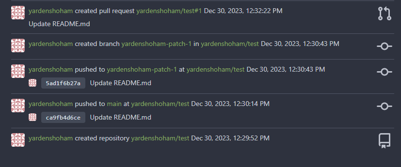
This setting is set to `mixed` by default, allowing dates to render as
"5 hours ago". Here are some screenshots of the UI with this setting set
to `absolute`:


---------
Signed-off-by: Yarden Shoham <git@yardenshoham.com>
Co-authored-by: delvh <dev.lh@web.de>
2024-01-02 09:25:30 +08:00
silverwind
abd79ddebf
Update JS dependencies ( #27922 )
...
- Update all JS dependencies minus @mcaptcha/vanilla-glue (unsolved
error, see https://github.com/mCaptcha/glue/issues/65 )
- Migrate deprecated eslint rules to `@stylistic/eslint-plugin-js`
- Enable and autofix `@stylistic/js/no-multiple-empty-lines`
- Regenerate poetry.lock with latest poetry
- Tested Mermaid, Swagger, Citation, Vue
2023-11-06 21:14:32 +00:00
delvh
1f501dae9e
Fix JS NPE when viewing specific range of PR commits ( #27912 )
...
This should be the easiest fix.
While other solutions might be possible that exterminate the root cause,
they will not be as trivial.
2023-11-06 02:05:24 +00:00
Brecht Van Lommel
7a286e4753
Improve pull request command line instructions ( #27778 )
...
* Show checkout instructions also when there is no permission to push,
for anyone who wants to locally test the changes.
* First checkout the branch exactly as is, without immediately having to
solve merge conflicts. Leave this to the merge step, since it's often
convenient to test a change without worrying about this.
* Use `git fetch -u`, so an existing local branch is updated when
re-testing the same pull request. But not the more risky `git fetch -f`
in to handle force pushes, as we don't want to accidentally overwrite
important local changes.
* Show different merge command depending on the chosen merge style,
interactively updated.
2023-10-25 15:01:31 +00:00
Nanguan Lin
3602a1987d
Add border to file tree 'sub-items' and add padding to 'item-file' ( #27593 )
...
## Add border to file tree 'sub-items'
close #24766
view in `gitea-light`
<img width="275" alt="image"
src="https://github.com/go-gitea/gitea/assets/70063547/f1bf8736-2db3-454f-86f5-d050a2fae3eb ">
view in `gitea-dark`
<img width="296" alt="image"
src="https://github.com/go-gitea/gitea/assets/70063547/053e2e6e-28f7-41d2-a139-1dae4df45929 ">
## Change the 'item-file' padding
Before that the 'item-file' only have padding when they in
'item-directory', which is too compact when 'item-file' after
'item-directory'
<details>

---------
Co-authored-by: silverwind <me@silverwind.io>
2023-10-25 18:00:53 +08:00
silverwind
b39bb958cc
Improve diff tree spacing ( #27714 )
...
1. Un-indent top-level items, matching GitHub rendering
2. Increase item padding and add 1px gap between items
Before and After:
<img width="247" alt="Screenshot 2023-10-20 at 18 37 32"
src="https://github.com/go-gitea/gitea/assets/115237/43c1ce86-1814-4a8a-9dd2-0c4a82a2be7c ">
<img width="241" alt="Screenshot 2023-10-20 at 18 40 46"
src="https://github.com/go-gitea/gitea/assets/115237/b541b85b-c428-4903-becd-773ae5807495 ">
---------
Co-authored-by: 6543 <m.huber@kithara.com>
2023-10-21 10:38:19 +00:00
silverwind
5bf367f904
Restore warning commit status ( #27504 )
...
Partial revert of https://github.com/go-gitea/gitea/pull/25839 . This
commit status is used by a number of external integrations, so I think
we should not remove it (See
https://github.com/go-gitea/gitea/pull/25839#issuecomment-1729002077 ).
This is a rare case where an existing migration needed to be alterted to
avoid data loss.
---------
Co-authored-by: delvh <dev.lh@web.de>
Co-authored-by: Giteabot <teabot@gitea.io>
2023-10-08 22:16:06 +00:00
wxiaoguang
1f00bc44b2
Fix review UI ( #27322 )
...
Close #26730
1. The `diff-detail-box` was abused, it shouldn't be used for
"DiffFileList/DiffFileTree".
2. Fix the sticky position for various screens.


2023-09-28 10:00:26 +00:00
silverwind
709c2fad8a
Add missed return to actions view fetch ( #27289 )
...
Should fix : #27213
2023-09-27 08:34:52 +08:00
silverwind
ae8e8f055e
Use fetch helpers instead of fetch ( #27026 )
...
WIP because:

- [x] Some calls set a `content-type` but send no body, can likely
remove the header
- [x] Need to check whether `charset=utf-8` has any significance on the
webauthn calls, I assume not as it is the default for json content.
- [x] Maybe `no-restricted-globals` is better for eslint, but will
require a lot of duplication in the yaml or moving eslint config to a
`.js` extension.
- [x] Maybe export `request` as `fetch`, shadowing the global.
2023-09-19 00:50:30 +00:00
silverwind
8099238618
Change green buttons to primary color ( #27099 )
...
I think it's better if the primary actions have primary color instead of
green which fits better into the overall single-color UI design. This PR
currently replaces every green button with primary:
<img width="141" alt="Screenshot 2023-09-16 at 14 07 59"
src="https://github.com/go-gitea/gitea/assets/115237/843c1e50-4fb2-4ec6-84ba-0efb9472dcbe ">
<img width="161" alt="Screenshot 2023-09-16 at 14 07 51"
src="https://github.com/go-gitea/gitea/assets/115237/9442195a-a3b2-4a42-b262-8377d6f5c0d1 ">
Modal actions now use uncolored/primary instead of previous green/red
colors. I also removed the box-shadow on all basic buttons:
<img width="259" alt="Screenshot 2023-09-16 at 14 16 39"
src="https://github.com/go-gitea/gitea/assets/115237/5beea529-127a-44b0-8d4c-afa7b034a490 ">
<img width="261" alt="Screenshot 2023-09-16 at 14 17 42"
src="https://github.com/go-gitea/gitea/assets/115237/4757f7b2-4d46-49bc-a797-38bb28437b88 ">
The change currently includes the "Merge PR" button, for which we might
want to make an exception to match the icon color there:
<img width="442" alt="Screenshot 2023-09-16 at 14 33 53"
src="https://github.com/go-gitea/gitea/assets/115237/993ac1a5-c94d-4895-b76c-0d872181a70b ">
2023-09-18 22:05:31 +00:00
yp05327
076eca8158
Fix incorrect default branch label while switching between branches ( #27053 )
...
Fix #27008
2023-09-14 03:54:25 +00:00
silverwind
6d96f0b0d1
Add fetch wrappers, ignore network errors in actions view ( #26985 )
...
1. Introduce lightweight `fetch` wrapper functions that automatically
sets csfr token, content-type and use it in `RepoActionView.vue`.
2. Fix a specific issue on `RepoActionView.vue` where a fetch network
error is shortly visible during page reload sometimes. It can be
reproduced by F5-in in quick succession on the actions view page and was
also producing a red error box on the page.

Once approved, we can replace all current `fetch` uses in UI with this
in another PR.

---------

Co-authored-by: Giteabot <teabot@gitea.io>
2023-09-11 10:25:10 +02:00
silverwind
9a3de436f4
Reorder blocks in vue SFCs ( #26874 )
...
The [recommended order](https://vuejs.org/guide/scaling-up/sfc.html ) for
SFC blocks is script -> template -> style, which we were violating
because template and script were swapped. I do find script first also
easier to read because the imports are on top, letting me immideatly see
a component's dependencies.
This is a pure cut-paste refactor with some removal of some empty lines.
---------
Co-authored-by: Lauris BH <lauris@nix.lv>
2023-09-02 14:59:07 +00:00
wxiaoguang
19a1e1b20e
Remove polluted .ui.right ( #26825 )
...
Each change is tested manually line by line. There are too many changes
so I can't share dozens of screenshots.

In short:

1. `ui right` could be still used in `ui top attached header`, because
there is a special case.
2. A lot of `ui right` are just no-op, so they can be removed safely.
3. Some of the `ui right` should be replaced by `gt-float-right` (to
avoid breaking, leave them to the future).
4. A few of the `ui right` could be rewritten by flex.
2023-08-31 02:29:59 +00:00
wxiaoguang
1bb9b1c4d9
Remove polluted ".ui.left" style ( #26809 )
2023-08-30 21:46:24 +08:00
yp05327
008f5d8cf1
Add default label in branch select list ( #26697 )
2023-08-29 12:15:19 +00:00
wxiaoguang
4fdb09de58
Fix incorrect "tabindex" attributes ( #26733 )
...
Fix #26731

Almost all "tabindex" in code are incorrect.

1. All "input/button" by default are focusable, so no need to use "tabindex=0"
2. All "div/span" by default are not focusable, so no need to use "tabindex=-1"
3. All "dropdown" are focusable by framework, so no need to use "tabindex"
4. Some tabindex values are incorrect (eg: `new_form.tmpl`), so remove them

Co-authored-by: Giteabot <teabot@gitea.io>
2023-08-26 10:44:00 +08:00
wxiaoguang
576644d815
Simplify helper CSS classes and avoid abuse ( #26728 )
...
Removed CSS helper classes (some of them are not useful while some of
them are abused often)
* `gt-db`: in most cases it could be replaced by `gt-df` and the flex
layout should be encouraged. Other cases: either it does need the
`gt-df` (eg: by using `div` directly) or it is an abuse (eg: the warning
message in a form)
* `gt-di`: it doesn't seem useful, or it could be replaced by `gt-dib`
in most cases.
* `gt-dif`: not useful, it could be replaced by `flex-text-inline` or
`gt-df`
* `gt-js`: never used
* All `<i class="icon gt-df gt-ac gt-jc">` could be written as `<i
class="icon">`
## Some UI samples
### Admin Notice

### Admin Stacktrace

### Org Home

### Org Team Repo

### Release List

### User Setting Application Token Scope

Co-authored-by: Giteabot <teabot@gitea.io>
2023-08-26 01:35:10 +02:00
silverwind
8b5c081d76
Remove fomantic loader module ( #26670 )
...
Replace Fomantic `loader` CSS module with our existing `is-loading`
spinner. Only three places in the UI used this module, which are
pictured here:
imagediff:
<img width="1237" alt="Screenshot 2023-08-22 at 22 18 01"
src="https://github.com/go-gitea/gitea/assets/115237/b0d82531-f05e-43c6-9e5b-1bfc268c056d ">
webauthn:
<img width="894" alt="Screenshot 2023-08-22 at 22 05 05"
src="https://github.com/go-gitea/gitea/assets/115237/7b583425-d944-474a-a57a-22a65bbd8b29 ">
heatmap (I removed the previous loading text, it was unreadable because
it was tiny and on fast machines only visible for a fraction of a
second):
<img width="764" alt="Screenshot 2023-08-22 at 22 18 44"
src="https://github.com/go-gitea/gitea/assets/115237/1c7472d6-3e17-4224-a992-d8c0b380cc73 ">
Also, heatmap container does not resize any more after loading now and
previous duplicate id `user-heatmap` is gone.
---------
Co-authored-by: wxiaoguang <wxiaoguang@gmail.com>
2023-08-25 16:03:14 +00:00
silverwind
21b8ec29aa
Add eslint-plugin-vue-scoped-css ( #26720 )
...
Adds
[eslint-plugin-vue-scoped-css](https://github.com/future-architect/eslint-plugin-vue-scoped-css )
and fixes discovered issues which are:
- 1 unused selector
- 3 selectors with `.full.height` parent in a `<style scoped>` block so
the rule could not find the parent. Move these into the unscoped block
instead. They worked before and after.
2023-08-25 13:47:27 +00:00
wxiaoguang
af33a1187b
Fix doubled box-shadow in branch dropdown menu ( #26678 )
2023-08-23 08:13:04 +00:00
yp05327
c052f76266
Fix organization list in dashboard ( #26650 )
...
Fix ui problem comes from #26326
Before:

After:

2023-08-22 08:49:00 +00:00
yp05327
a4a567f29f
Check disabled workflow when rerun jobs ( #26535 )
...
In GitHub, we can not rerun jobs if the workflow is disabled.

---------

Co-authored-by: silverwind <me@silverwind.io>
Co-authored-by: wxiaoguang <wxiaoguang@gmail.com>
2023-08-22 10:30:02 +08:00
wxiaoguang
42cbe6005a
Improve the branch selector tab UI ( #26631 )
2023-08-21 13:35:02 +00:00
yp05327
f6e7798405
Add link to job details and tooltip to commit status in repo list in dashboard ( #26326 )
...
Tooltip:

Link to the target job:

2023-08-21 15:26:10 +08:00
wxiaoguang
48c4a7e75c
Rewrite the DiffFileTreeItem and fix misalignment ( #26565 )
...
Fix some layout / user-interaction problems and close #25650 , the code
has been simplified (+46 −108)
<details>

</details>
---------
Co-authored-by: delvh <dev.lh@web.de>
2023-08-18 19:55:56 +00:00
silverwind
30e5278d1b
Allow text selection in actions step header ( #26588 )
2023-08-18 18:38:29 +00:00
yp05327
8703b6c954
Improve clickable area in repo action view page ( #26115 )
...
Before:

After:

In current design, the clickable area is too small, and it is hard to
find the correct clickable area as the area with background color (div
with class name `job-brief-item selected`) is bigger than it.
---------
Co-authored-by: Giteabot <teabot@gitea.io>
2023-08-16 00:44:43 +02:00
silverwind
56b6b2b88e
Fix tooltip of commit select button ( #26472 )
...
Previously, the tooltip for this button was only shown after opening and
closing it once because it was only set after the server response, now
it shows before opening it.
2023-08-14 02:16:40 +00:00
silverwind
2fc0eb913c
Tweak actions menu ( #26278 )
...
Ressurect lost changes from
https://github.com/go-gitea/gitea/pull/24451 .
- Always show icons for each entry in the menu
- Make all checkboxes toggle only their feature, e.g. "seconds" and
"timestamps" can now be toggled on together.
- Reorder the items
<img width="845" alt="Screenshot 2023-08-01 at 19 19 27"
src="https://github.com/go-gitea/gitea/assets/115237/8a76e9bf-7966-42a6-87c9-e88cdddaec82 ">
---------
Co-authored-by: Giteabot <teabot@gitea.io>
2023-08-12 08:26:53 +00:00
sebastian-sauer
55532061c8
Add commits dropdown in PR files view and allow commit by commit review ( #25528 )
...
This PR adds a new dropdown to select a commit or a commit range
(shift-click like github) of a Pull Request.
After selection of a commit only the changes of this commit will be shown.
When selecting a range of commits the diff of this range is shown.
This allows to review a PR commit by commit or by viewing only commit ranges.
The "Show changes since your last review" mechanism github uses is implemented, too.
When reviewing a single commit or a commit range the "Viewed" functionality is disabled.
## Screenshots
### The commit dropdown

### Selecting a commit range

### Show changes of a single commit only

### Show changes of a commit range

Fixes https://github.com/go-gitea/gitea/issues/20989
Fixes https://github.com/go-gitea/gitea/issues/19263
---------
Co-authored-by: silverwind <me@silverwind.io>
Co-authored-by: KN4CK3R <admin@oldschoolhack.me>
Co-authored-by: wxiaoguang <wxiaoguang@gmail.com>
Co-authored-by: delvh <dev.lh@web.de>
2023-07-28 21:18:12 +02:00
yp05327
36732005b4
Disable download action logs button when there's no logs ( #26114 )
...
If there's no logs, you can also click the download button, then you
will get `job is not started` page

https://gitea.com/yp05327/testrepo/actions/runs/38
After:
If there's no steps displayed, the download button will be disabled.

2023-07-26 20:51:26 +02:00
HesterG
2f0e79e639
Use frontend fetch for branch dropdown component ( #25719 )
...
- Send request to get branch/tag list, use loading icon when waiting for
response.
- Only fetch when the first time branch/tag list shows.
- For backend, removed assignment to `ctx.Data["Branches"]` and
`ctx.Data["Tags"]` from `context/repo.go` and passed these data wherever
needed.
- Changed some `v-if` to `v-show` and used native `svg` as mentioned in
https://github.com/go-gitea/gitea/pull/25719#issuecomment-1631712757 to
improve perfomance when there are a lot of branches.
- Places Used the dropdown component:
Repo Home Page
<img width="1429" alt="Screen Shot 2023-07-06 at 12 17 51"
src="https://github.com/go-gitea/gitea/assets/17645053/6accc7b6-8d37-4e88-ae1a-bd2b3b927ea0 ">
Commits Page
<img width="1431" alt="Screen Shot 2023-07-06 at 12 18 34"
src="https://github.com/go-gitea/gitea/assets/17645053/2d0bf306-d1e2-45a8-a784-bc424879f537 ">
Specific commit -> operations -> cherry-pick
<img width="758" alt="Screen Shot 2023-07-06 at 12 23 28"
src="https://github.com/go-gitea/gitea/assets/17645053/1e557948-3881-4e45-a625-8ef36d45ae2d ">
Release Page
<img width="1433" alt="Screen Shot 2023-07-06 at 12 25 05"
src="https://github.com/go-gitea/gitea/assets/17645053/3ec82af1-15a4-4162-a50b-04a9502161bb ">
- Demo
https://github.com/go-gitea/gitea/assets/17645053/d45d266b-3eb0-465a-82f9-57f78dc5f9f3
- Note:
UI of dropdown menu could be improved in another PR as it should apply
to more dropdown menus.
Fix #14180
---------
Co-authored-by: silverwind <me@silverwind.io>
Co-authored-by: wxiaoguang <wxiaoguang@gmail.com>
2023-07-21 11:20:04 +00:00
Yarden Shoham
dbbae67f44
Remove commit status running and warning from the dashboard repo list ( #26036 )
...
Also added comments so the next time the dashboard repo list won't be
forgotten

Follows #25839

Signed-off-by: Yarden Shoham <git@yardenshoham.com>
2023-07-21 10:32:25 +00:00
yp05327
d57e55cd47
Fix escape problems in the branch selector ( #25875 )
...
Fix #25865
2023-07-21 06:18:40 +00:00
FuXiaoHei
f3d293d2bb
Actions Artifacts support uploading multiple files and directories ( #24874 )
...
current actions artifacts implementation only support single file
artifact. To support multiple files uploading, it needs:

- save each file to each db record with same run-id, same artifact-name
and proper artifact-path
- need change artifact uploading url without artifact-id, multiple files
creates multiple artifact-ids
- support `path` in download-artifact action. artifact should download
to `{path}/{artifact-path}`.
- in repo action view, it provides zip download link in artifacts list
in summary page, no matter this artifact contains single or multiple
files.
2023-07-21 10:42:01 +08:00
silverwind
36010243f7
Fix commit status color on dashboard repolist ( #25993 )
...
Followup to https://github.com/go-gitea/gitea/pull/25935 which has
missed to change the icon on the repolist because the logic is not
shared with templates.

Co-authored-by: Giteabot <teabot@gitea.io>
2023-07-20 01:04:41 +02:00
silverwind
38844e0869
Always pass 6-digit hex color to monaco ( #25780 )
...
Monaco can not deal with color formats other than 6-digit hex, so we
convert the colors for it via new
[`tinycolor2`](https://github.com/bgrins/TinyColor ) dependency (5kB
minzipped).
Also, with the addition of the module, we can replace the existing
`hexToRGBColor` usage, I verified it is compatible with the current
tests before removing the function.
Fixes: https://github.com/go-gitea/gitea/issues/25770
2023-07-09 12:17:22 +02:00
Denys Konovalov
00dbba7f42
Several fixes for mobile UI ( #25634 )
...
Resolves #25622
<details>
<summary>Screenshots</summary>


</details>
---------
Co-authored-by: wxiaoguang <wxiaoguang@gmail.com>
Co-authored-by: silverwind <me@silverwind.io>
2023-07-04 17:45:45 +00:00
silverwind
0006169f38
Actions list enhancements ( #25601 )
...
Various small enhancements to the actions list. Before and after:
<img width="1264" alt="Screenshot 2023-06-30 at 00 11 40"
src="https://github.com/go-gitea/gitea/assets/115237/bb4162ee-cdcf-4a73-b05e-f9521562edbb ">
<img width="1264" alt="Screenshot 2023-06-30 at 00 09 51"
src="https://github.com/go-gitea/gitea/assets/115237/52a70ea9-4bb3-406e-904b-0fdaafde9582 ">
---------
Co-authored-by: Giteabot <teabot@gitea.io>
2023-07-04 09:59:47 +00:00
HesterG
640a88fa09
Add log line anchor for action logs ( #25532 )
...
Close #24593

Some behavior:

- If log step line in hash exists, expand the step and scroll to the log
line.
- If step exists but line not exists, the step will be expanded.
- If step not exists, stays on the job's page.

Some Notes:

- Changed mounted to async because need to await for first `loadJob` so
`currentJobStepsStates` can be initialized and used in
`hashChangeListener `.

---------

Co-authored-by: silverwind <me@silverwind.io>
Co-authored-by: wxiaoguang <wxiaoguang@gmail.com>
2023-07-03 01:08:49 +00:00
Vitaliy Filippov
f0b773e0ce
Support downloading raw task logs ( #24451 )
...
Hi!
This pull request adds support for downloading raw task logs for Gitea
Actions, similar to Github Actions
It looks like the following:

2023-06-29 10:58:56 +08:00
HesterG
00b98bc8e0
Fix rerun icon on action view component ( #25531 )
...
Right now rerun icon on action view component will not be seen when
duration text length is long, because the wrapper `job-brief-info` has a
fixed width, and the svg is squeezed. The way to fix this in this PR is
to change width to `fit-content` and exchange position of duration text
and rerun svg.
Before (rerun svg not shown on hover):
<img width="1401" alt="Screen Shot 2023-06-27 at 12 53 41"
src="https://github.com/go-gitea/gitea/assets/17645053/bb3f62ec-8c56-4dbc-96f1-718b50426d91 ">
After:
<img width="1409" alt="Screen Shot 2023-06-27 at 12 50 59"
src="https://github.com/go-gitea/gitea/assets/17645053/620aa02c-2326-408d-a763-453f48f42c40 ">
2023-06-27 16:34:33 +02:00
sebastian-sauer
77e449f0be
Highlight viewed files differently in the PR filetree ( #24956 )
...

fixes #24566
---------
Co-authored-by: wxiaoguang <wxiaoguang@gmail.com>
2023-06-25 08:46:30 +08:00
silverwind
af094fbb6c
Introduce shared template for search inputs ( #25338 )
...
- Set
[type=search](https://developer.mozilla.org/en-US/docs/Web/HTML/Element/input/search )
- Disable spellcheck
- Set maxLength 255 that I found in `templates/repo/issue/search.tmpl`
- Remove unnecessary `max-width`, it does nothing
---------
Co-authored-by: delvh <dev.lh@web.de>
Co-authored-by: Giteabot <teabot@gitea.io>
2023-06-22 10:27:35 +00:00
silverwind
93cd579269
Switch to ansi_up for ansi rendering in actions ( #25401 )
...
Fixes: https://github.com/go-gitea/gitea/issues/24777
2023-06-22 02:15:19 +00:00
silverwind
69b1e2f103
Remove more unused Fomantic variants ( #25292 )
...
Save another 50KB of CSS by removing unused and useless Fomantic
variants.
Removed the last instance if a `tertiary` button and fixed a TODO:
<img width="509" alt="Screenshot 2023-06-15 at 22 34 36"
src="https://github.com/go-gitea/gitea/assets/115237/8a16ae7b-2b17-439b-a096-60a52724e3d6 ">
2023-06-17 08:15:33 +00:00
wxiaoguang
46c17c8029
Use flex to align SVG and text ( #25163 )
...
The code can be as simple as:
```html
<div class="flex-text-block">{{svg "octicon-alert"}} {{svg "octicon-x"}} text (block)</div>
<div><div class="flex-text-inline">{{svg "octicon-alert"}} {{svg "octicon-x"}} text</div> (inline)</div>
<div><button class="ui red button">{{svg "octicon-alert" 24}} {{svg "octicon-x" 24}} text</button></div>
```

---------
Co-authored-by: Giteabot <teabot@gitea.io>
2023-06-14 16:40:15 +00:00
Jonathan Tran
a583c56306
Change access token UI to select dropdowns ( #25109 )
...
The current UI to create API access tokens uses checkboxes that have a
complicated relationship where some need to be checked and/or disabled
in certain states. It also requires that a user interact with it to
understand what their options really are.
This branch changes to use `<select>`s. It better fits the available
options, and it's closer to [GitHub's
UI](https://github.com/settings/personal-access-tokens/new ), which is
good, in my opinion. It's more mobile friendly since the tap-areas are
larger. If we ever add more permissions, like Maintainer, there's a
natural place that doesn't take up more screen real-estate.
This branch also fixes a few minor issues:
- Hide the error about selecting at least one permission after second
submission
- Fix help description to call it "authorization" since that's what
permissions are about (not authentication)
Related: #24767 .
<img width="883" alt="Screenshot 2023-06-07 at 5 07 34 PM"
src="https://github.com/go-gitea/gitea/assets/10803/6b63d807-c9be-4a4b-8e53-ecab6cbb8f76 ">
---
When it's open:
<img width="881" alt="Screenshot 2023-06-07 at 5 07 59 PM"
src="https://github.com/go-gitea/gitea/assets/10803/2432c6d0-39c2-4ca4-820e-c878ffdbfb69 ">
2023-06-13 15:55:48 +08:00
HesterG
3318001880
Fix fullscreen for action ( #25200 )
...
An error occurs when clicking on `show full screen` on action page.
<img width="1440" alt="Screen Shot 2023-06-12 at 13 06 52"
src="https://github.com/go-gitea/gitea/assets/17645053/1d4ded3c-fb77-4dd8-9201-24d0696f96eb ">
class name has changed in #25134 , so the selector is not working.
Enhance the selectors to fix this.
2023-06-12 10:18:01 +00:00
silverwind
6a075589bf
Fix mobile navbar and misc cleanups ( #25134 )
...
- Fix and improve mobile navbar layout
- Apply all cleanups suggested in
https://github.com/go-gitea/gitea/pull/25111
- Make media query breakpoints match Fomantic's exactly
- Clean up whitespace in class on navbar items
Mobile navbar before and after:
<img width="745" alt="Screenshot 2023-06-08 at 08 40 56"
src="https://github.com/go-gitea/gitea/assets/115237/ca84b239-b10f-41db-8c06-dcf2b6dd9d28 ">
<img width="739" alt="Screenshot 2023-06-08 at 08 41 23"
src="https://github.com/go-gitea/gitea/assets/115237/09133c54-eb7e-4110-858c-ead23c3b7521 ">
---------
Co-authored-by: wxiaoguang <wxiaoguang@gmail.com>
Co-authored-by: Giteabot <teabot@gitea.io>
2023-06-09 09:10:51 +00:00
silverwind
623b3b590e
Button and color enhancements ( #24989 )
...
- Various corrections to button styles, especially secondary
- Remove focus highlight, it's annoying when it stays on button after
press
- Clearly define ghost and link buttons with demos in devtest
- Remove black, grey and tertiary buttons, they should not be used
- Make `arc-green` slightly darker
<img width="1226" alt="image"
src="https://github.com/go-gitea/gitea/assets/115237/8d89786a-01ab-40f8-ae5a-e17f40e35084 ">
<img width="1249" alt="image"
src="https://github.com/go-gitea/gitea/assets/115237/83651e6d-3c27-46ff-b8bd-ff344d70e949 ">
---------
Co-authored-by: wxiaoguang <wxiaoguang@gmail.com>
Co-authored-by: Giteabot <teabot@gitea.io>
2023-06-09 08:37:47 +00:00
wxiaoguang
8e63373c01
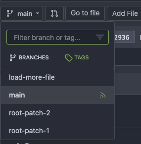
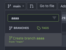
Use correct selector for hiding RSS icon link in the branch selector dropdown ( #25080 )
...
Fix #25079


2023-06-05 12:34:25 +00:00
Jack Hay
18de83b2a3
Redesign Scoped Access Tokens ( #24767 )
...
## Changes
- Adds the following high level access scopes, each with `read` and
`write` levels:
- `activitypub`
- `admin` (hidden if user is not a site admin)
- `misc`
- `notification`
- `organization`
- `package`
- `issue`
- `repository`
- `user`
- Adds new middleware function `tokenRequiresScopes()` in addition to
`reqToken()`
- `tokenRequiresScopes()` is used for each high-level api section
- _if_ a scoped token is present, checks that the required scope is
included based on the section and HTTP method
- `reqToken()` is used for individual routes
- checks that required authentication is present (but does not check
scope levels as this will already have been handled by
`tokenRequiresScopes()`
- Adds migration to convert old scoped access tokens to the new set of
scopes
- Updates the user interface for scope selection
### User interface example
<img width="903" alt="Screen Shot 2023-05-31 at 1 56 55 PM"
src="https://github.com/go-gitea/gitea/assets/23248839/654766ec-2143-4f59-9037-3b51600e32f3 ">
<img width="917" alt="Screen Shot 2023-05-31 at 1 56 43 PM"
src="https://github.com/go-gitea/gitea/assets/23248839/1ad64081-012c-4a73-b393-66b30352654c ">
## tokenRequiresScopes Design Decision
- `tokenRequiresScopes()` was added to more reliably cover api routes.
For an incoming request, this function uses the given scope category
(say `AccessTokenScopeCategoryOrganization`) and the HTTP method (say
`DELETE`) and verifies that any scoped tokens in use include
`delete:organization`.
- `reqToken()` is used to enforce auth for individual routes that
require it. If a scoped token is not present for a request,
`tokenRequiresScopes()` will not return an error
## TODO
- [x] Alphabetize scope categories
- [x] Change 'public repos only' to a radio button (private vs public).
Also expand this to organizations
- [X] Disable token creation if no scopes selected. Alternatively, show
warning
- [x] `reqToken()` is missing from many `POST/DELETE` routes in the api.
`tokenRequiresScopes()` only checks that a given token has the correct
scope, `reqToken()` must be used to check that a token (or some other
auth) is present.
- _This should be addressed in this PR_
- [x] The migration should be reviewed very carefully in order to
minimize access changes to existing user tokens.
- _This should be addressed in this PR_
- [x] Link to api to swagger documentation, clarify what
read/write/delete levels correspond to
- [x] Review cases where more than one scope is needed as this directly
deviates from the api definition.
- _This should be addressed in this PR_
- For example:
```go
m.Group("/users/{username}/orgs", func() {
m.Get("", reqToken(), org.ListUserOrgs)
m.Get("/{org}/permissions", reqToken(), org.GetUserOrgsPermissions)
}, tokenRequiresScopes(auth_model.AccessTokenScopeCategoryUser,
auth_model.AccessTokenScopeCategoryOrganization),
context_service.UserAssignmentAPI())
```
## Future improvements
- [ ] Add required scopes to swagger documentation
- [ ] Redesign `reqToken()` to be opt-out rather than opt-in
- [ ] Subdivide scopes like `repository`
- [ ] Once a token is created, if it has no scopes, we should display
text instead of an empty bullet point
- [ ] If the 'public repos only' option is selected, should read
categories be selected by default
Closes #24501
Closes #24799
Co-authored-by: Jonathan Tran <jon@allspice.io>
Co-authored-by: Kyle D <kdumontnu@gmail.com>
Co-authored-by: silverwind <me@silverwind.io>
2023-06-04 20:57:16 +02:00
Tyrone Yeh
b6d8d695da
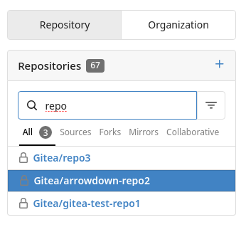
Add up and down arrows to selected lookup repositories ( #24727 )
...
Use up and down arrow key to select repositories
---------
Co-authored-by: silverwind <me@silverwind.io>
2023-06-02 18:39:07 +00:00
Kyle D
72eedfb915
Show file tree by default ( #25052 )
...
Feel free to close this if there isn't interest.
The tree view looks amazing, and all of our users are really enjoying it
(major kudos to developers!), but only IF I tell them it exists!
Essentially, the file tree view as it is effectively undiscoverable.
This PR changes the default state for the tree view to open, which
should significantly help with discoverability.
An alternative could be to reserve more horizontal space, as a typical
accordion panel would look (eg. VS Code), eg.

2023-06-02 23:39:01 +08:00
HesterG
1ea5c8b0ff
Add show timestamp/seconds and fullscreen options to action page ( #24876 )
...
Part of #24728
- The timestamp shows local time and is parsed by `date.toLocaleString`;
- "show seconds" and "show timestamps" are mutually exclusive, and they
can be both hidden.
https://github.com/go-gitea/gitea/assets/17645053/89531e54-37b7-4400-a6a0-bb3cc69eb6f5
Update for timestamp format:
<img width="306" alt="Screen Shot 2023-05-25 at 09 07 47"
src="https://github.com/go-gitea/gitea/assets/17645053/2d99768d-d39c-4c9e-81a2-7bc7470399dd ">
---------
Co-authored-by: silverwind <me@silverwind.io>
Co-authored-by: wxiaoguang <wxiaoguang@gmail.com>
2023-05-30 20:38:55 +00:00
wxiaoguang
ee99cf6313
Refactor diffFileInfo / DiffTreeStore ( #24998 )
...
Follow #21012 , #22399
Replace #24983 , fix #24938
Help #24956
Now, the `window.config.pageData.diffFileInfo` itself is a reactive
store, so it's quite easy to sync values/states by it, no need to do
"doLoadMoreFiles" or "callback".
Screenshot: these two buttons both work. After complete loading, the UI
is also right.
<details>


</details>
2023-05-30 18:53:15 +08:00
silverwind
e06f3d2ee5
Enable vue/html-closing-bracket-spacing eslint rule ( #24987 )
...
Enable
[`vue/html-closing-bracket-spacing`](https://eslint.vuejs.org/rules/html-closing-bracket-spacing.html )
and set it to never add any useless spaces inside tags. All issues were
fixed automatically with `make lint-js-fix`.
2023-05-29 16:58:53 +00:00
silverwind
245f2c08db
Repo list improvements, fix bold helper classes ( #24935 )
...
- Fix bold helper classes that were broken because of CSS syntax error
- Refined the repo list CSS and layout
- Removing bold
- Downsize the mirror icon to fit
- Fix icon positions
- Adapted the org list to match
- Center the '+' icon and mute it
<img width="385" alt="Screenshot 2023-05-25 at 18 38 31"
src="https://github.com/go-gitea/gitea/assets/115237/ac8d6efb-5751-4845-a4ab-db1ddaf36ec3 ">
<img width="384" alt="Screenshot 2023-05-25 at 18 30 29"
src="https://github.com/go-gitea/gitea/assets/115237/bbd39ae7-da9d-4c6f-bfe3-42f28b7a74c3 ">
2023-05-29 16:55:23 +08:00
silverwind
1fd7e3d6be
Improve Actions CSS ( #24864 )
...
- Various color tweaks
- Add sticky positioning to left sidebar, right header and right step
header
- Adjust margins and border radiuses
<img width="1235" alt="Screenshot 2023-05-23 at 11 18 06"
src="https://github.com/go-gitea/gitea/assets/115237/f601b00d-c7f2-43de-89f2-3ac55f2d9cdc ">
<img width="1239" alt="Screenshot 2023-05-23 at 11 18 18"
src="https://github.com/go-gitea/gitea/assets/115237/a2d24cc9-29fa-4c17-906b-84feea14b889 ">


---------
Co-authored-by: yp05327 <576951401@qq.com>
2023-05-24 09:00:29 +00:00
silverwind
a9d417341c
Run stylelint on .vue files ( #24865 )
...
- Run stylelint on .vue files
- Fix discovered issues
- Suppress warning spam from `declaration-strict-value` rule

Co-authored-by: Giteabot <teabot@gitea.io>
2023-05-23 13:54:21 +00:00
HesterG
da461b5a08
Improvements for action detail page ( #24718 )
...
Close #24625
Main changes:
1. For the left panel, show rerun icon only on hover, and add style when
the job is selected, and removed icon on the "rerun all" button and
modify the text on the button
https://github.com/go-gitea/gitea/assets/17645053/cc437a17-d2e9-4f1b-a8cf-f56e53962767
2. Adjust fonts, and add on hover effects to the log lines. And add
loading effect when the job is done and the job step log is expanded for
the first time. (With reference to github)
https://github.com/go-gitea/gitea/assets/17645053/2808d77d-f402-4fb0-8819-7aa0a018cf0c
3. Add `gt-ellipsis` to `step-summary-msg` and `job-brief-name`
<img width="898" alt="ellipsis"
src="https://github.com/go-gitea/gitea/assets/17645053/e2fb7049-3125-4252-970d-15b0751febc7 ">
4. Fixed
https://github.com/go-gitea/gitea/issues/24625#issuecomment-1541380010
by adding explicit conditions to `ActionRunStatus.vue` and `status.tmpl`
5. Adjust some css styles
---------
Co-authored-by: silverwind <me@silverwind.io>
2023-05-22 12:17:24 +08:00
silverwind
19993d8814
Change --font-weight-bold to --font-weight-semibold and 600 value, introduce new font weight variables ( #24827 )
...
There was some recent discussion about this in Discord `ui-design`
channel and the conclusion was that
https://github.com/go-gitea/gitea/issues/24305 should have fixed their
OS font installation to have semibold weights.

I have now tested this 601 weight on a Windows 10 machine on Firefox
myself, and I immediately noticed that bold was excessivly bold and
rendering as 700 because browsers are biased towards bolder fonts. So
revert this back to the previous value.
2023-05-21 23:37:32 +00:00
Yarden Shoham
c641a22f2a
Mute repo names in dashboard repo list ( #24811 )
...
# Before
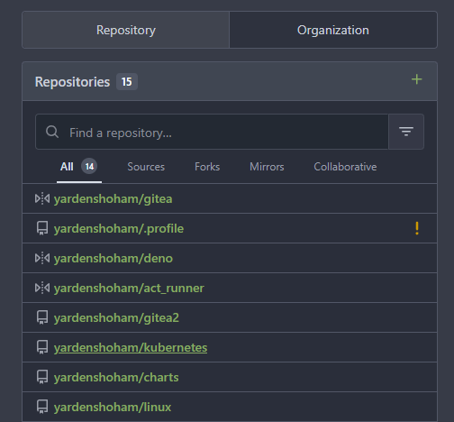
# After

Signed-off-by: Yarden Shoham <git@yardenshoham.com>
Co-authored-by: Giteabot <teabot@gitea.io>
2023-05-19 17:03:09 +00:00
FuXiaoHei
c757765a9e
Implement actions artifacts ( #22738 )
...
Implement action artifacts server api.
This change is used for supporting
https://github.com/actions/upload-artifact and
https://github.com/actions/download-artifact in gitea actions. It can
run sample workflow from doc
https://docs.github.com/en/actions/using-workflows/storing-workflow-data-as-artifacts .
The api design is inspired by
https://github.com/nektos/act/blob/master/pkg/artifacts/server.go and
includes some changes from gitea internal structs and methods.
Actions artifacts contains two parts:
- Gitea server api and storage (this pr implement basic design without
some complex cases supports)
- Runner communicate with gitea server api (in comming)
Old pr https://github.com/go-gitea/gitea/pull/22345 is outdated after
actions merged. I create new pr from main branch.

Add artifacts list in actions workflow page.
2023-05-19 21:37:57 +08:00
silverwind
040970c320
Enable two vue eslint rules ( #24780 )
...
These two rules are no longer violated, so we can enable them again.
2023-05-17 22:00:34 -04:00
Evur
29096d8ef5
Make the color of zero-contribution-squares in the activity heatmap more subtle ( #24758 )
...
The previous color had a too high contrast with the background.

---------

Co-authored-by: silverwind <me@silverwind.io>
2023-05-17 10:55:34 +00:00
Yarden Shoham
53a00017bb
Fix flash of unstyled content in action view page ( #24712 )
...
# Before

# After

Ref: https://github.com/go-gitea/gitea/issues/24625
Signed-off-by: Yarden Shoham <git@yardenshoham.com>
Co-authored-by: Giteabot <teabot@gitea.io>
2023-05-14 14:58:59 +00:00
Yarden Shoham
4810fe55e3
Add status indicator on main home screen for each repo ( #24638 )
...
It will show the calculated commit status state of the latest commit on
the default branch for each repository in the dashboard repo list
- Closes #15620
# Before
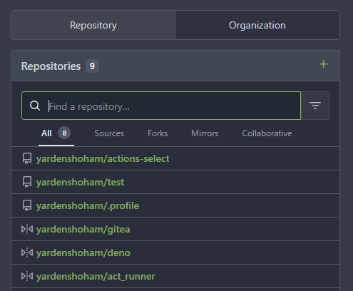
# After

---------
Signed-off-by: Yarden Shoham <git@yardenshoham.com>
Co-authored-by: delvh <dev.lh@web.de>
Co-authored-by: Giteabot <teabot@gitea.io>
2023-05-13 21:59:01 +00:00
silverwind
a96c73f979
Remove svg.svg class, restore .rss-icon ( #24667 )
...
Fix regression from https://github.com/go-gitea/gitea/pull/24476 where
the `svg.svg` class misaligns SVG icons across the site and streched
buttons unintentionally in vertical height.
Before (button 30.3px):
<img width="157" alt="Screenshot 2023-05-11 at 22 09 42"
src="https://github.com/go-gitea/gitea/assets/115237/0fd137ab-ab52-4cf8-afca-c45776d526d0 ">
After (button 30px):
<img width="160" alt="Screenshot 2023-05-11 at 22 09 59"
src="https://github.com/go-gitea/gitea/assets/115237/4b741f4b-0fd2-4fae-9bee-16a7deb098e8 ">
[vertical-align:
middle](https://developer.mozilla.org/en-US/docs/Web/CSS/vertical-align )
is not suitable to align icons to text because
> Aligns the middle of the element with the baseline plus half the
x-height of the parent.
Example of `vertical-align: middle` from MDN:
<img width="232" alt="Screenshot 2023-05-11 at 22 29 28"
src="https://github.com/go-gitea/gitea/assets/115237/179fb756-85a1-4cab-8219-1a4958f333e2 ">
So I think the
[existing](365bb77a54/web_src/css/svg.css (L3)https://github.com/go-gitea/gitea/assets/115237/0cd6edf5-12c0-4bdb-8771-a900f5ba2d35 ">
Co-authored-by: Giteabot <teabot@gitea.io>
2023-05-12 10:23:53 +00:00
yp05327
4aec1f87a4
Remove highlight in repo list ( #24675 )
...
Before:

After:

private or internal repos have `lock` icon, no need to add highlights to
them.
2023-05-12 10:00:17 +02:00
silverwind
67db6b6976
RSS icon fixes ( #24476 )
...
Fix regression from https://github.com/go-gitea/gitea/pull/24471 where
CSS rules for `.icon.grey` were removed which were in use by the RSS
icons.
Gave them their own class instead, removed a wrapper and also fixed
vertical alignment on them. Additionally, did a few related fixes on the
org header for alignment.
Fixes: https://github.com/go-gitea/gitea/issues/24584
<img width="196" alt="Screenshot 2023-05-01 at 22 39 40"
src="https://user-images.githubusercontent.com/115237/235528228-959e2385-c1d2-4d5c-baec-e3784d459653.png ">
<img width="216" alt="Screenshot 2023-05-01 at 22 44 20"
src="https://user-images.githubusercontent.com/115237/235528231-95cbff86-5672-48eb-b214-8bdcefa1612c.png ">
<img width="120" alt="Screenshot 2023-05-01 at 22 56 36"
src="https://user-images.githubusercontent.com/115237/235529844-b94ab554-3259-4d0c-b040-82aed7d1a111.png ">
<img width="372" alt="Screenshot 2023-05-01 at 22 54 25"
src="https://user-images.githubusercontent.com/115237/235529744-1a9c201b-5692-4122-9765-2f201a322a9e.png ">
<img width="477" alt="Screenshot 2023-05-01 at 22 55 28"
src="https://user-images.githubusercontent.com/115237/235529748-62188554-9927-42ef-bc94-7052bce266e2.png ">
---------
Co-authored-by: wxiaoguang <wxiaoguang@gmail.com>
2023-05-10 22:27:02 +00:00
Hester Gong
ea7954f069
Modify luminance calculation and extract related functions into single files ( #24586 )
...
Close #24508
Main changes:
As discussed in the issue
1. Change luminance calculation function to use [Relative
Luminance](https://www.w3.org/WAI/GL/wiki/Relative_luminance )
2. Move the luminance related functions into color.go/color.js
3. Add tests for both the files (Not sure if test cases are too many
now)
Before (tests included by `UseLightTextOnBackground` are labels started
with `##`):
https://try.gitea.io/HesterG/testrepo/labels
After:
<img width="1307" alt="Screen Shot 2023-05-08 at 13 37 55"
src="https://user-images.githubusercontent.com/17645053/236742562-fdfc3a4d-2fab-466b-9613-96f2bf96b4bc.png ">
<img width="1289" alt="Screen Shot 2023-05-08 at 13 38 06"
src="https://user-images.githubusercontent.com/17645053/236742570-022db68e-cec0-43bb-888a-fc54f5332cc3.png ">
<img width="1299" alt="Screen Shot 2023-05-08 at 13 38 20"
src="https://user-images.githubusercontent.com/17645053/236742572-9af1de45-fb7f-460b-828d-ba25fae20f51.png ">
---------
Co-authored-by: silverwind <me@silverwind.io>
Co-authored-by: Giteabot <teabot@gitea.io>
2023-05-10 11:19:03 +00:00
Yarden Shoham
ae9ac50072
Make the actions control button look like an actual button ( #24611 )
...
- Follows #24595
# Before


# After


---------
Signed-off-by: Yarden Shoham <git@yardenshoham.com>
Co-authored-by: Giteabot <teabot@gitea.io>
Co-authored-by: silverwind <me@silverwind.io>
Co-authored-by: wxiaoguang <wxiaoguang@gmail.com>
2023-05-10 08:09:23 +00:00
Yarden Shoham
de7dcc7cd9
Add a tooltip to the job rerun button ( #24617 )
...
This one doesn't look very good as a real button (at least not in the
ways I tried), so I've opted to simply add a tooltip for it.
# Before
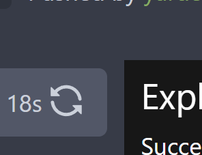
# After

Signed-off-by: Yarden Shoham <git@yardenshoham.com>
2023-05-10 07:37:10 +00:00
Yarden Shoham
9a0652f0b2
Attach a tooltip to the action status icon ( #24614 )
...
To clearly communicate the current state of the action


---------
Signed-off-by: Yarden Shoham <git@yardenshoham.com>
2023-05-09 21:39:16 +02:00
silverwind
d5b2bf9044
Update JS dependencies, add new eslint rules ( #24597 )
...
- Update all JS dependencies
- Enable new eslint rules, fix issue (some via autofix)
- Fix some missed eslint rule renames from [unicorn
v25](https://github.com/sindresorhus/eslint-plugin-unicorn/releases/tag/v25.0.0 )
- Tested Monaco, Katex, Swagger UI
---------
Co-authored-by: 6543 <6543@obermui.de>
Co-authored-by: Giteabot <teabot@gitea.io>
2023-05-09 02:35:49 +00:00
Yarden Shoham
46e97986f5
Attach a tooltip to the action control button ( #24595 )
...
The first time I saw the big red X button I thought something failed but
apparently, it was just a "Cancel" button
# Before


# After


---------
Signed-off-by: Yarden Shoham <git@yardenshoham.com>
Co-authored-by: Giteabot <teabot@gitea.io>
Co-authored-by: silverwind <me@silverwind.io>
2023-05-08 23:59:59 +00:00
Yarden Shoham
9ad5b59cd9
Do not select line numbers when selecting text from the action run logs ( #24594 )
...
- Fixes #24578
# Before

# After

Signed-off-by: Yarden Shoham <git@yardenshoham.com>
2023-05-08 20:50:05 +02:00
Hester Gong
97b70a0cd4
Add org visibility label to non-organization's dashboard ( #24558 )
2023-05-07 08:33:43 +08:00
silverwind
4a722c9a45
Make Issue/PR/projects more compact, misc CSS tweaks ( #24459 )
...
- Remove various horizontal dividers on repo pages that didn't provide
visual benefit
- Remove label/milestone pills on single issue/pr page
- Remove issue-related pill buttons on projects page
- Increase contrast of color-secondary on arc-green
- Improve notifications icon, make circle bigger
- Remove some inline styles
- Fix focus in issue/pr title edit and select all text on button click
### Issue and PR before and after
<img width="1249" alt="Screenshot 2023-05-01 at 11 44 22"
src="https://user-images.githubusercontent.com/115237/235436662-a708288e-84fb-4b2e-a5a2-3a1c17d28f6c.png ">
<img width="1248" alt="Screenshot 2023-05-01 at 11 58 51"
src="https://user-images.githubusercontent.com/115237/235437992-f863e483-f3cc-4cc1-8204-fd223647a0c9.png ">
### Projects before and after
<img width="1255" alt="Screenshot 2023-05-01 at 11 41 02"
src="https://user-images.githubusercontent.com/115237/235436433-0deb85d6-4e7d-4e74-847f-254cc70a0cf9.png ">
<img width="1267" alt="Screenshot 2023-05-01 at 11 40 03"
src="https://user-images.githubusercontent.com/115237/235436431-715b13cb-f78c-4d86-b27a-9229f9738c5b.png ">
### Releases before and after
<img width="1243" alt="Screenshot 2023-05-01 at 11 41 12"
src="https://user-images.githubusercontent.com/115237/235436457-b655ee6f-03b8-4595-8d8c-b15ea469e988.png ">
<img width="1240" alt="Screenshot 2023-05-01 at 11 40 10"
src="https://user-images.githubusercontent.com/115237/235436456-05a2a0dd-7cbb-4f26-b0d3-4f667df4bb95.png ">
### Misc
<img width="58" alt="Screenshot 2023-05-01 at 10 49 13"
src="https://user-images.githubusercontent.com/115237/235432494-936ce995-6e22-47bc-ab2d-c9e93d31987d.png ">
<img width="57" alt="Screenshot 2023-05-01 at 18 57 08"
src="https://user-images.githubusercontent.com/115237/235492430-1d32cfe0-0f2c-467c-b2fa-925b27e30e0e.png ">
Issue title edit and wrap:
<img width="1238" alt="Screenshot 2023-05-01 at 12 34 40"
src="https://user-images.githubusercontent.com/115237/235441407-d5067a57-e586-4865-a652-282e5944abb4.png ">
<img width="1232" alt="Screenshot 2023-05-01 at 12 06 24"
src="https://user-images.githubusercontent.com/115237/235438710-1a543dda-220f-4d87-8f93-f1710c0695f0.png ">
---------
Co-authored-by: wxiaoguang <wxiaoguang@gmail.com>
2023-05-03 17:58:59 -04:00
yp05327
5987f00523
Add rerun workflow button and refactor to use SVG octicons ( #24350 )
...
Changes:
- Add rerun workflow button. Then users can rerun the whole workflow by
only one-click.
- Refactor to use SVG octicons in RepoActionView.vue


---------
Co-authored-by: silverwind <me@silverwind.io>
Co-authored-by: wxiaoguang <wxiaoguang@gmail.com>
2023-05-01 22:14:20 +08:00
wxiaoguang
59d060622d
Improve RSS ( #24335 )
...
Follow #22719
### Major changes
1. `ServerError` doesn't do format, so remove the `%s`
2. Simplify `RenderBranchFeed` (slightly)
3. Remove unused `BranchFeedRSS`
4. Make `feed.RenderBranchFeed` respect `EnableFeed` config
5. Make `RepoBranchTagSelector.vue` respect `EnableFeed` setting,
otherwise there is always RSS icon
6. The `(branchURLPrefix + item.url).replace('src', 'rss')` doesn't seem
right for all cases, for example, the string `src` could appear in
`branchURLPrefix`, so we need a separate `rssURLPrefix`
7. The `<a>` in Vue menu needs `@click.stop`, otherwise the menu itself
would be triggered at the same time
8. Change `<a><button></button></a>` to `<a role=button>`
9. Use `{{PathEscapeSegments .TreePath}}` instead of `{{range $i, $v :=
.TreeNames}}/{{$v}}{{end}}`
Screenshot of changed parts:
<details>


</details>
### Other thoughts
Should we remove the RSS icon from the branch dropdown list? It seems
too complex for a list UI, and users already have the chance to get the
RSS feed URL from "branches" page.
---------
Co-authored-by: 6543 <6543@obermui.de>
Co-authored-by: silverwind <me@silverwind.io>
2023-04-25 22:53:44 -04:00
yp05327
5f21e0f8eb
Automatically select the org when click create repo from org dashboard ( #24325 )
...

In org dashboard, the create repo link will be `repo/create?org={orgId}`
2023-04-25 22:25:29 -04:00
silverwind
ee6fa8d633
Restore bold on repolist ( #24337 )
...
Looking at it again, it does look a bit "odd" without bold, so revert
the repolist change done in
https://github.com/go-gitea/gitea/pull/24307 .
<img width="141" alt="image"
src="https://user-images.githubusercontent.com/115237/234331813-c6e2402f-e099-43b3-aed6-46a0e24e3899.png ">
2023-04-25 17:19:22 -04:00
jladbrook
56d4893b2a
Add RSS Feeds for branches and files ( #22719 )
...
Fix #22228 adding RSS feeds for branches and files.

RSS feeds are accessed through:

* [gitea]/src/branch/{branch}.rss
* [gitea]/src/branch/{branch}/{file_name}.rss

No changes have been made to the UI to expose the feed urls for branches
and files.
2023-04-25 22:08:29 +08:00
wxiaoguang
20a3b03fe5
Add --font-weight-bold and set previous bold to 601 ( #24307 )
...
Fix #24305

According to MDN, "bold" starts from 700, some fonts do not provide
"bolding" for weight 600

https://developer.mozilla.org/en-US/docs/Web/CSS/font-weight

---------

Co-authored-by: silverwind <me@silverwind.io>
Co-authored-by: Giteabot <teabot@gitea.io>
2023-04-24 13:46:00 -04:00
Hester Gong
5e7543fcf4
Use same action status svg icons on actions list as on action page ( #24178 )
...
Close #24020
After:
These icons are the same now:
<img width="1287" alt="截屏2023-04-18 13 52 11"
src="https://user-images.githubusercontent.com/17645053/232684252-05ddc101-dc5b-41b5-b374-132c3d853a41.png ">
<img width="1141" alt="截屏2023-04-18 13 54 48"
src="https://user-images.githubusercontent.com/17645053/232684261-6ebd864a-a9aa-4982-af32-2cea91c35be8.png ">
In this PR, didn't use `ActionRunStatus.vue` because the mounting of the
component will cause flash of the icons like below:
https://user-images.githubusercontent.com/17645053/232682646-713202dc-9023-4b9c-a849-c3a1ae6dd155.mov
Instead, modified and used `status.tmpl` to make it the same as
`ActionRunStatus.vue` to avoid the ui flash (Welcomed to show how to use
`ActionRunStatus.vue` without flashing if there is a way).
Added comments to both of them for reminding synchronization of these
two files.
---------
Co-authored-by: Jason Song <i@wolfogre.com>
2023-04-19 13:42:53 +08:00
Yarden Shoham
f045e58cc7
Localize activity heatmap (except tooltip) ( #24131 )
...
The calculation of the total sum is moved to the backend so a full HTML
string could be sent.

- Closes #10669
- 2nd attempt (the first was in #21570 )
---------
Signed-off-by: Yarden Shoham <git@yardenshoham.com>
Co-authored-by: Giteabot <teabot@gitea.io>
2023-04-17 14:26:01 -04:00
sillyguodong
3753ecd583
Update the value of the diffEnd when click Show More btn in the DiffFileTree ( #24069 )
...
In the component `DiffFileTree`,if don't update the value of the
`diffEnd` in the callback of ajax request, click `Show More` btn will
always return the same response, duplicate files are appended to the
file list.


Before:


https://user-images.githubusercontent.com/33891828/231371188-82d169af-10bb-47e2-8aca-83ced2597f2d.mov


After:


https://user-images.githubusercontent.com/33891828/231369805-39a5a4d0-662c-4f08-bc5a-7d31e8782453.mov

---------

Co-authored-by: Giteabot <teabot@gitea.io>
Co-authored-by: Lunny Xiao <xiaolunwen@gmail.com>
2023-04-12 15:11:23 +02:00
sillyguodong
e03e827dcb
Expand selected file when clicking file tree ( #24041 )
...
Auto expand the selected file when clicking the file item of the file
tree.
This is consistent with Github's behavior.

https://user-images.githubusercontent.com/33891828/231048124-61f180af-adba-42d7-9ffa-626e1de04aed.mov
2023-04-12 15:06:39 +08:00
wxiaoguang
6892e2b8ef
Use reactive store to share data between components ( #23996 )
...
Follow #23947
* Use reactive store to share data between components
* Remove no-op `this.hashListener = window.addEventListener()` because
`addEventListener` returns void/undefined.
Reference:
https://vuejs.org/guide/scaling-up/state-management.html#simple-state-management-with-reactivity-api
Screenshot (the same as before):
<details>
<img width="565" alt="image"
src="https://user-images.githubusercontent.com/2114189/230701282-bd61bfa3-7786-433b-9ad8-a88591112a02.png ">
</details>
---------
Co-authored-by: silverwind <me@silverwind.io>
2023-04-11 20:44:26 -04:00
yp05327
68aac691c1
Add job.duration in web ui ( #23963 )
...


Maybe we can change the location of it.
2023-04-07 18:20:50 -04:00
yusifeng
395c716735
Highlight selected file in the PR file tree ( #23947 )
...
before

after

2023-04-07 14:27:10 -04:00
Jonathan Tran
8c3cee7a72
Update eslints for Vue 3 ( #23935 )
...
I found that some lint warnings in my editor are conflicting, and I
believe the root cause is using lints designed for Vue 2 instead of Vue
3. We moved to Vue 3 in #20044 .
I verified that the explicitly disabled rules in the changed file are
still part of the `vue/vue3-recommended` set.
See [Available rules -
eslint-plugin-vue](https://eslint.vuejs.org/rules/ ) for a full list of
lints.
2023-04-05 16:59:40 -04:00
wxiaoguang
aa9c920980
Improve action log display with control chars ( #23820 )
...
Close #23680

Some CLI programs use "\r" and control chars to print new content in
current line.

So, the strings in one line are actually from
`\rReading...1%\rReading...5%\rReading...100%`

This PR tries to make the output better.
2023-04-01 20:57:05 +08:00
Jason Song
964a057a76
Fix checks for needs in Actions ( #23789 )
...
Fix:
- https://gitea.com/gitea/act_runner/issues/77
- https://gitea.com/gitea/act_runner/issues/81
Before:
<img width="1489" alt="image"
src="https://user-images.githubusercontent.com/9418365/228501567-f752cf87-a7ed-42c6-8f3d-ba741795c1fe.png ">
Highlights:
- Upgrade act to make things doable, related to
- https://gitea.com/gitea/act/pulls/32
- https://gitea.com/gitea/act/pulls/33
- https://gitea.com/gitea/act/pulls/35
- Make `needs` works
- Sort jobs in the original order in the workflow files
2023-03-30 22:33:17 +08:00
silverwind
aa4d1d94f7
Diff improvements ( #23553 )
...
- Avoid flash of wrong tree toggle icon on page load by setting icon
based on sync state
- Avoid "pop-in" of tree on page load by leaving space based on sync
state
- Use the same border/box-shadow combo used on comment `:target` also
for file `:target`.
- Refactor `DiffFileTree.vue` to use `toggleElem` instead of hardcoded
class name.
- Left-align inline comment boxes and make them fit the same amount of
markup content on a line as GitHub.
- Fix height of `diff-file-list`
Fixes: https://github.com/go-gitea/gitea/issues/23593
<img width="1250" alt="Screenshot 2023-03-18 at 00 52 04"
src="https://user-images.githubusercontent.com/115237/226071392-6789a644-aead-4756-a77e-aba3642150a0.png ">
<img width="1246" alt="Screenshot 2023-03-18 at 00 59 43"
src="https://user-images.githubusercontent.com/115237/226071443-8bcba924-458b-48bd-b2f0-0de59cb180ac.png ">
<img width="1250" alt="Screenshot 2023-03-18 at 01 27 14"
src="https://user-images.githubusercontent.com/115237/226073121-ccb99f9a-d3ac-40b7-9589-43580c4a01c9.png ">
<img width="1231" alt="Screenshot 2023-03-19 at 21 44 16"
src="https://user-images.githubusercontent.com/115237/226207951-81bcae1b-6b41-4e39-83a7-0f37951df6be.png ">
(Yes I'm aware the border-radius in bottom corners is suboptimal, but
this would be notorously hard to fix without relying on `overflow:
hidden`).
2023-03-30 20:06:10 +08:00