Nanguan Lin
7d1933717d
Use full width for PR comparison ( #28182 )
...
Follow-up #22844
close #28142
Before

After

Co-authored-by: Giteabot <teabot@gitea.io>
2023-11-23 15:52:57 +00:00
Nanguan Lin
778d604346
Fix missing buttons ( #28179 )
...
fix #28173
regression #25948
That PR is supposed to only change the style but somehow delete a code
snippet. See the
diff(https://github.com/go-gitea/gitea/pull/25948/files#diff-7c36d66fe058f4ff9f2beaac73cf710dca45b350d0dd98daf806828a4745fe62L125-L129 )
for details.
---------
Co-authored-by: wxiaoguang <wxiaoguang@gmail.com>
2023-11-23 11:36:52 +01:00
Nanguan Lin
37ed92d6fd
Revert "Fix EOL handling in web editor" ( #28101 )
...
Reverts go-gitea/gitea#27141
close #28097
2023-11-22 09:14:16 +00:00
yp05327
4d0eba8e0a
Fix swagger title ( #28164 )
...

Don't know why there's a `.` behind. 🤔
2023-11-22 08:09:19 +00:00
yp05327
d1acd7e9de
Do not display search box when there's no packages yet ( #28146 )
...
Before:

After:


2023-11-21 20:03:19 +00:00
yp05327
a6a674e26a
Add guide page to actions when there's no workflows ( #28145 )
...
Before:
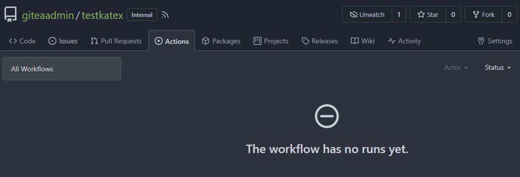
After:

2023-11-21 08:27:33 +00:00
Lunny Xiao
0c0d17f17e
Fix empty action run title ( #28113 )
...
Fix #27901
2023-11-21 03:00:59 +00:00
JakobDev
08552f0076
Add edit option for README.md ( #28071 )
...
Fix #28059

2023-11-20 11:47:55 +00:00
yp05327
eae555ff23
Remove autofocus in search box ( #28033 )
...
Mentioned here:
https://github.com/go-gitea/gitea/pull/27982#issuecomment-1807923026
2023-11-20 08:57:46 +00:00
yp05327
e88377470a
Fix project counter in organization/individual profile ( #28068 )
...
Fix #28052
Before:

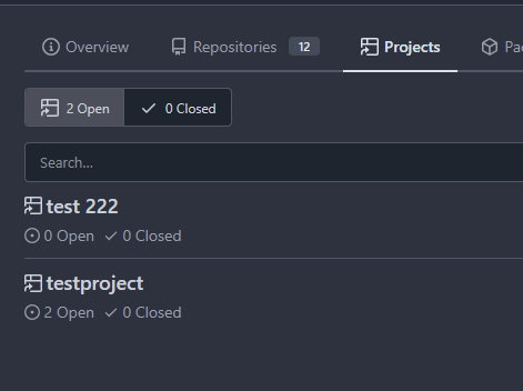
After:


2023-11-18 11:02:42 +08:00
sebastian-sauer
e31c6cfe6e
Fix Show/hide filetree button on small displays ( #27881 )
...
the gt-df's display:flex !important did override the display:none on small displays

---------

Co-authored-by: wxiaoguang <wxiaoguang@gmail.com>
2023-11-17 18:35:51 +00:00
sebastian-sauer
49dddd87b1
Improve PR diff view on mobile ( #27883 )
...
1. Show diff stats only on large screens
these are already shown in tabs, so no need for this duplicate
information on small screens


2. Hide viewed files information on small screens
Github does the same and this gives us more free space on small screens


3. Review bar now doesn't wrap so we don't need the 77px even on very
small screens
(the sticky headers are still working)

2023-11-16 11:58:53 +08:00
yp05327
83c30634a4
Add word break to the repo list in admin settings page ( #28034 )
...
Before:

After:

2023-11-14 04:58:01 +00:00
yp05327
089ac06969
Improve profile for Organizations ( #27982 )
...
Fixes some problems in #27955 :
- autofocus of the search box
before:
if access the home page will jump to the search box

after:
will not jump to the search box

- incorrect display of overview tab
before:

after:

- improve the permission check to the private profile repo
In #26295 , we simply added access control to the private profile.
But if user have access to the private profile repo , we should also
display the profile.
- add a button which can jump to the repo list?
I agree @wxiaoguang 's opinion here:
https://github.com/go-gitea/gitea/pull/27955#issuecomment-1803178239
But it seems that this feature is sponsored.
So can we add a button which can quickly jump to the repo list or just
move profile to the `overview` page?
---------
Co-authored-by: silverwind <me@silverwind.io>
2023-11-13 15:33:22 +01:00
Lunny Xiao
61ff91f960
Fix the wrong oauth2 name ( #27993 )
...
Fix #27989
Regression #27798
2023-11-11 11:27:02 +01:00
6543
603573366a
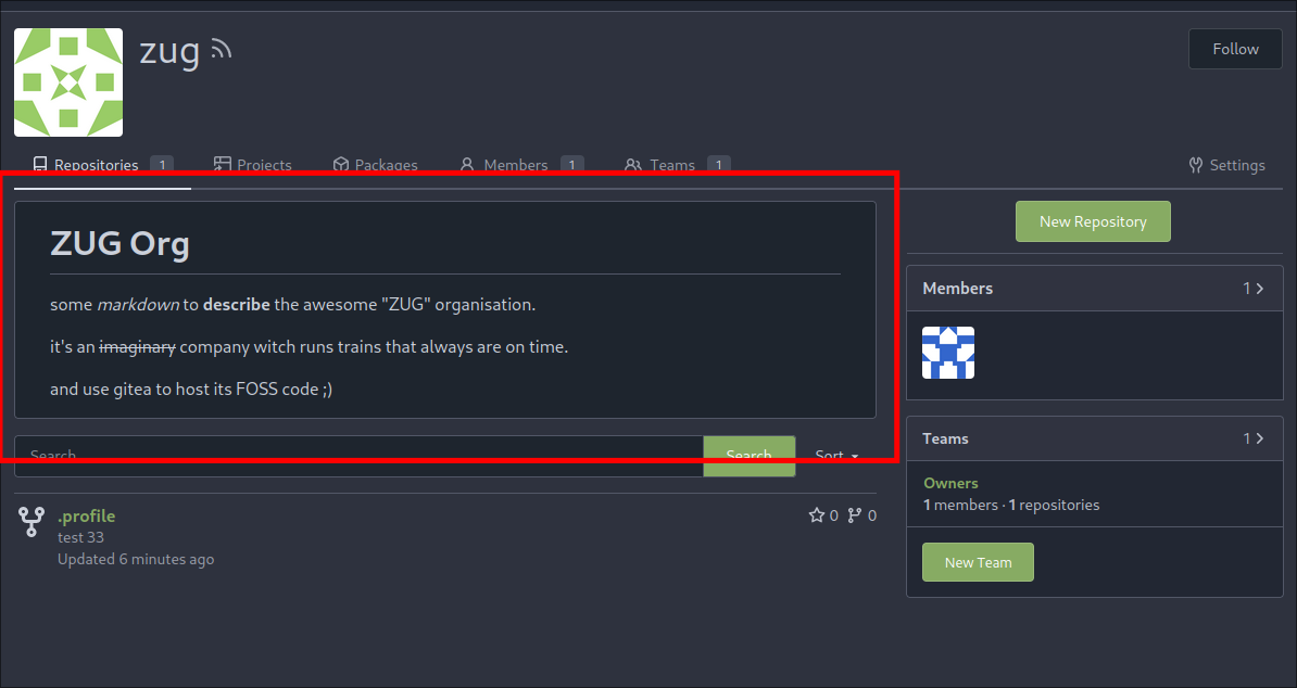
Add Profile Readme for Organisations ( #27955 )
...
https://blog.gitea.com/release-of-1.20.0/#-user-profile-readme-23260
(#23260 ) did introduce Profile Readme for Users.
This makes it usable for Organisations:
---
*Sponsored by Kithara Software GmbH*
---------
Co-authored-by: silverwind <me@silverwind.io>
Co-authored-by: KN4CK3R <admin@oldschoolhack.me>
2023-11-09 14:05:52 +00:00
silverwind
6447b3e6b2
Use flex-container on user dashboard ( #27956 )
...
Same as https://github.com/go-gitea/gitea/pull/26046 but for user
dashboard, the sidebar got a bit smaller and there is less padding
between sections.
<img width="1265" alt="image"
src="https://github.com/go-gitea/gitea/assets/115237/0c8d2faa-03ec-4515-a4f2-0a106ef2a928 ">
2023-11-08 02:30:39 +00:00
yp05327
4a0103fa29
Add word-break to repo description in home page ( #27924 )
...
In #25315 , @denyskon fixed UI on mobile view.
But for the repo description, on desktop view there's no word-break.
So maybe we can just add `gt-word-break` to fix it on both mobile view
and desktop view.
Before:
desktop view:

mobile view:

After:
desktop view:

mobile view(almost same?)

---------
Co-authored-by: silverwind <me@silverwind.io>
2023-11-07 23:52:08 +00:00
Sebastian Brückner
e80f446d3a
Fix rendering assignee changed comments without assignee ( #27927 )
...
When an assignee changed event comment is rendered, most of it is
guarded behind the assignee ID not being 0. However, if it is 0, that
results in quite broken rendering for that comment and the next one.
This can happen, for example, when repository data imported from outside
of Gitea is incomplete.
This PR makes sure comments with an assignee ID of 0 are not rendered at
all.
---
Screenshot before:
<img width="272" alt="Bildschirmfoto 2023-11-05 um 20 12 18"
src="https://github.com/go-gitea/gitea/assets/42910/7d629d76-fee4-4fe5-9e3a-bf524050cead ">
The comments in this screenshot are:
1. A regular text comment
2. A user being unassigned
3. A user being assigned
4. The title of the PR being changed
Comments 2 and 3 are rendered without any text, which indents the next
comment and does not leave enough vertical space.
Co-authored-by: Giteabot <teabot@gitea.io>
2023-11-07 19:45:06 +01:00
yp05327
3a924fdc83
Add word break to release title ( #27942 )
...
Before:

After:

2023-11-07 10:53:04 +00:00
yp05327
7a2ff6c162
Fix edit topic UI ( #27925 )
...
Before:
desktop view:

mobile view:

after click `Save` btn:


refresh the page, you will see that `gt-m-0` is missing after save
topic:

After:
desktop view:

mobile view:

after click `Save` btn:

2023-11-06 09:23:50 +00:00
sebastian-sauer
37a7c551d4
Show correct commit sha when viewing single commit diff ( #27916 )
...
Show the correct sha when viewing a single commit.

2023-11-06 00:39:32 +01:00
Earl Warren
c46080bc9d
Remove "tabindex" from some form buttons ( #27892 )
...
Remove the "tabindex" from some form buttons on the "diff box" / "issue view content" page, let the browser use the default tab order.

---------

Co-authored-by: Gusted <postmaster@gusted.xyz>
Co-authored-by: wxiaoguang <wxiaoguang@gmail.com>
2023-11-03 14:40:48 +00:00
Lunny Xiao
1bf5527eac
Refactor Find Sources and fix bug when view a user who belongs to an unactive auth source ( #27798 )
...
The steps to reproduce it.

First, create a new oauth2 source.
Then, a user login with this oauth2 source.
Disable the oauth2 source.
Visit users -> settings -> security, 500 will be displayed.
This is because this page only load active Oauth2 sources but not all
Oauth2 sources.
2023-11-03 01:41:00 +00:00
yp05327
dcb648ee71
Add Hide/Show all checks button to commit status check ( #26284 )
...
Step one for a GitHub like commit status check ui:


Step two:


The design now will list all commit status checks which takes too much
space.
This is a pre-improve for #26247
---------
Co-authored-by: delvh <dev.lh@web.de>
Co-authored-by: silverwind <me@silverwind.io>
Co-authored-by: wxiaoguang <wxiaoguang@gmail.com>
2023-11-02 14:49:02 +00:00
KN4CK3R
4776fde9e1
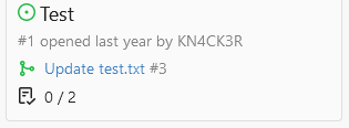
Display issue task list on project cards ( #27865 )
...
Display the issue task list on project cards.
Co-authored-by: Giteabot <teabot@gitea.io>
2023-11-02 11:42:02 +01:00
wxiaoguang
a4b242ae7a
Clean up template locale usage ( #27856 )
...
After many refactoring PRs for the "locale" and "template context
function", now the ".locale" is not needed for web templates any more.

This PR does a clean up for:

1. Remove `ctx.Data["locale"]` for web context.
2. Use `ctx.Locale` in `500.tmpl`, for consistency.
3. Add a test check for `500 page` locale usage.
4. Remove the `Str2html` and `DotEscape` from mail template context
data, they are copy&paste errors introduced by #19169 and #16200 . These
functions are template functions (provided by the common renderer), but
not template data variables.
5. Make email `SendAsync` function mockable (I was planning to add more
tests but it would make this PR much too complex, so the tests could be
done in another PR)
2023-10-31 22:11:48 +08:00
Lunny Xiao
16d15ce087
Fix package webhook ( #27839 )
...
Fix #23742

---------

Co-authored-by: KN4CK3R <admin@oldschoolhack.me>
2023-10-31 04:43:38 +00:00
Denys Konovalov
e5f19dd317
Always use whole user name as link ( #27815 )
...
Starting from #25790 this shared template only linked the username of
the user if both display name and username were shown. I experienced
myself always trying to click on the display name - I think it is
annoying for others too.
After:


2023-10-30 09:53:16 +00:00
yp05327
0e021cd33e
Fix display member unit in the menu bar if there are no hidden members in public org ( #27795 )
...
Follow #26363 .
I missed that org templates also using
`templates/user/overview/header.tmpl`.
You can confirm this problem in https://gitea.com/gitea/-/projects with
anonymous access.
Before: (no login)
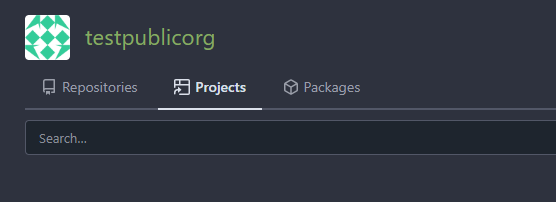
After:

2023-10-30 09:11:16 +00:00
Brecht Van Lommel
1756e30e10
Allow pull requests Manually Merged option to be used by non-admins ( #27780 )
...
Currently this feature is only available to admins, but there is no
clear reason why. If a user can actually merge pull requests, then this
seems fine as well.

This is useful in situations where direct pushes to the repository are
commonly done by developers.

---------

Co-authored-by: delvh <dev.lh@web.de>
2023-10-30 11:13:06 +08:00
Danila Fominykh
0c21af3728
Package repository/documentation link unification ( #27804 )
...
Some translations are duplicated for the same package fields; it should
be possible to use the same approach. Checked packages to use the same
forms in templates.

1. Removed repeated translations for the same fields
2. Linked template files to the same translation fields
3. Added repository site link for nuget packages
2023-10-27 00:16:12 +00:00
853
4f4ddcf3c5
Add link to members and repositories at teams page ( #27744 )
...
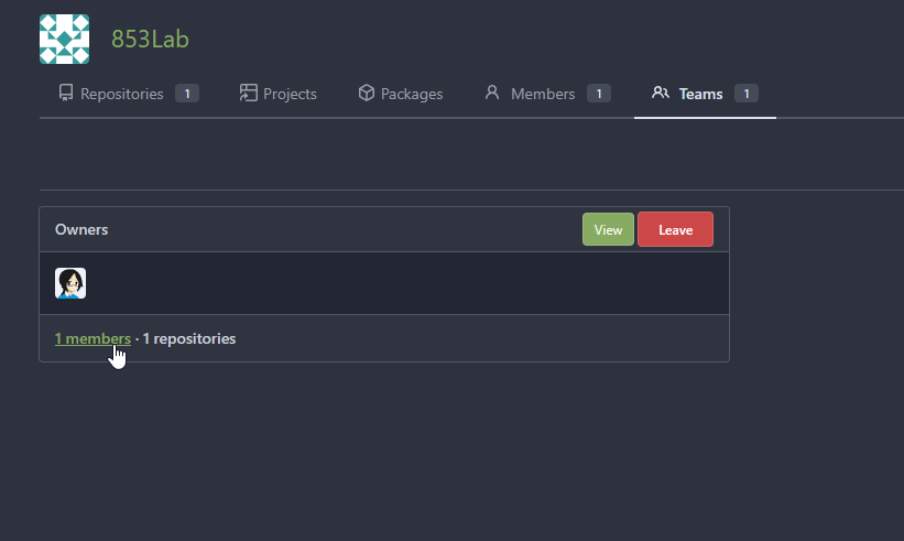
The members and repositories text now can be click.
like Org home page:
cab7b7f59c/templates/org/home.tmpl (L81-L82)
2023-10-26 02:50:43 +00:00
silverwind
05aa91e6da
Add dedicated class for empty placeholders ( #27788 )
...
Fixes: https://github.com/go-gitea/gitea/issues/27784
<img width="1033" alt="Screenshot 2023-10-25 at 19 07 15"
src="https://github.com/go-gitea/gitea/assets/115237/1a363851-1a86-48cb-99ec-0a573371bb6e ">
<img width="1051" alt="Screenshot 2023-10-25 at 19 07 41"
src="https://github.com/go-gitea/gitea/assets/115237/add4b606-2264-430a-af35-249ef005817f ">
Co-authored-by: KN4CK3R <admin@oldschoolhack.me>
2023-10-25 23:42:14 +02:00
Brecht Van Lommel
7a286e4753
Improve pull request command line instructions ( #27778 )
...
* Show checkout instructions also when there is no permission to push,
for anyone who wants to locally test the changes.
* First checkout the branch exactly as is, without immediately having to
solve merge conflicts. Leave this to the merge step, since it's often
convenient to test a change without worrying about this.
* Use `git fetch -u`, so an existing local branch is updated when
re-testing the same pull request. But not the more risky `git fetch -f`
in to handle force pushes, as we don't want to accidentally overwrite
important local changes.
* Show different merge command depending on the chosen merge style,
interactively updated.
2023-10-25 15:01:31 +00:00
Gerd Katzenbeisser
31f8880bc2
Show placeholder email in privacy popup ( #27770 )
...
This PR will show the _noreply_ address in the privacy popup
_keep_email_private_popup_.

I had to look into the source code to figure out which E-Mail Adress I
had to use on gitea.com to hide it from public access.

According to the contribution guidelines I only updated the en-US
translation file.

Co-authored-by: Hakito <hakito@git.example.com>
2023-10-25 11:12:36 +00:00
yp05327
f39256f035
Add word-break to organization name and description ( #26624 )
...
Fix #24318
Before:


After:


2023-10-25 10:40:39 +00:00
silverwind
572f0963ed
Only show diff file tree when more than one file changed ( #27775 )
...
When 0 or 1 files changed in a diff, we don't need to show a file tree.
This behaviour matches GitHub. Single-file diff after this change, note
absence of button:
<img width="1234" alt="image"
src="https://github.com/go-gitea/gitea/assets/115237/3618438b-e655-42a3-989f-f299267b2b8b ">
Co-authored-by: Giteabot <teabot@gitea.io>
2023-10-25 05:09:18 +02:00
wxiaoguang
def907de7b
Fix incorrect "tab" parameter for repo search sub-template ( #27755 )
...
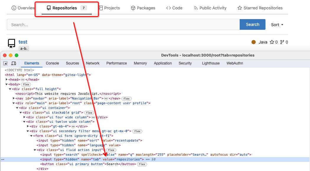
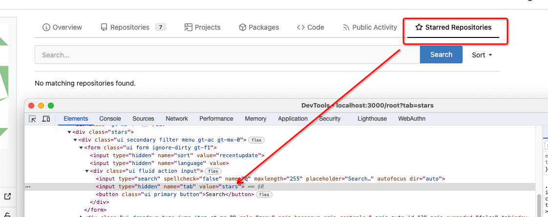
2023-10-24 02:00:06 +00:00
silverwind
d8c09c25d1
Enable followCursor for language stats bar ( #27713 )
...
Fixes: https://github.com/go-gitea/gitea/issues/27600

Also tested together with https://github.com/go-gitea/gitea/pull/27704 ,
works well.
2023-10-22 13:06:04 +00:00
tomholford
e3afe4a248
teams: new View button ( #27685 )
...
Per the discussion on #22054 , the flow for adding a new team member to
an org is not intuitive for new Gitea users.
The ideal solution would be to add a new button on the Org > Members
index view (see the screenshot mockup in the issue description).
However, this would require a refactor of the UX for the flow. The
current flow has an implicit context of which team within the org the
new member is being added to ('Owners' by default). From the Members
index, there is no implicit context; the flow would have to add a picker
for which team the new member should be added to.
So, as a stopgap, this change simply adds a button to the Teams index
page that performs the same action as clicking on the title of the team
(a behavior that is currently too obscure as indicated in the comments
on the issue). This should reduce support burden and serve as a decent
temporary measure until the Add Member flow is refactored.
---------
Co-authored-by: tomholford <tomholford@users.noreply.github.com>
2023-10-22 12:34:16 +00:00
6543
adbc995c34
Show total TrackedTime on issue/pull/milestone lists ( #26672 )
...
TODOs:
- [x] write test for `GetIssueTotalTrackedTime`
- [x] frontport kitharas template changes and make them mobile-friendly
---


---
*Sponsored by Kithara Software GmbH*
2023-10-19 14:08:31 +00:00
JakobDev
398eccb322
Fix required checkboxes in issue forms ( #27592 )
...
If you set a checkbox as required in a issue form at the moment, the
checkbox is checked and read only, what does not make much sense. With
this PR, the Checkbox actually needs to be checked. The label supports
now also Markdown. This matches GitHub's behaviour.
And yes, I know the CSS is a ugly workaround. It looks like the given
CSS code is part Fomantic and I don't know how to change that. The
Maintainers are free to change that.

2023-10-19 11:43:15 +00:00
sebastian-sauer
7210f23fa0
Add link for repositories README file ( #27684 )
...
this allows to deep link to the readme section of a repository.
fixes #27641
Screenshots:
No changes on initial display:
On hover the link is shown:

2023-10-18 17:59:46 -05:00
yp05327
8abc1aae4a
Improve the list header in milestone page ( #27302 )
...
The ui of list header in milestone page is not same as issue and pr list
page.
And they are using different template codes which can be merged into
one.
Before:


After:


---------
Co-authored-by: puni9869 <80308335+puni9869@users.noreply.github.com>
2023-10-18 00:03:42 +00:00
puni9869
4adc2a828d
Hide archived labels by default from the suggestions when assigning labels for an issue ( #27451 )
...
Followup of #27115
Finally closes #25237
## Screenshots
### Issue Sidebar
<img width="513" alt="image"
src="https://github.com/go-gitea/gitea/assets/80308335/9f7fda2f-5a03-4684-8619-fd3498a95b41 ">
### PR sidebar
<img width="367" alt="image"
src="https://github.com/go-gitea/gitea/assets/80308335/53db9b64-faec-4a67-91d6-76945596a469 ">
### PR sidebar with archived labels shown
<img width="352" alt="image"
src="https://github.com/go-gitea/gitea/assets/80308335/9dc5050f-4e69-4f76-bb83-582480a2281e ">
---------
Signed-off-by: puni9869 <punitinani1@hotmail.com>
Co-authored-by: silverwind <me@silverwind.io>
2023-10-17 16:10:45 +02:00
Denys Konovalov
0271114e64
cleanup repo details icons/labels ( #27644 )
...
Fix #27596
Change confusing behavior when showing information about a repo via
labels and icons. Implement changes proposed by @lng2020 in
https://github.com/go-gitea/gitea/pull/27627#pullrequestreview-1678787673 .
2023-10-16 23:06:15 +02:00
wxiaoguang
6c501b1498
Improve dropdown button alignment and fix hover bug ( #27632 )
...
1. fix #27631 , and add samples to devtest page
2. fix incorrect color for "ui dropdown button" when hover
2023-10-16 07:26:08 +00:00
Earl Warren
89c9a498fd
Add anchor to review types ( #26894 )
...
- The review type '22' is a general comment type that is attached to
single codecomments, reviews with multiple comments or to simple approve
and request changes comment. This comment can be used to create a link
towards this action on an pull request.
- Adds an anchor to the review comment type, so that when its getting
linked to it, it actually jumps towards that event.
- This also now fixes the behavior that after you created a review you
will be redirected to that review and because this is an general comment
type other mails will also be 'fixed' such as the approved or request
changes.
- Resolves https://codeberg.org/forgejo/forgejo/issues/1248

(cherry picked from commit 1741a5f1fe6adc68bb5f87bdd1c5bdc5bfaa45c7)

---------

Co-authored-by: Gusted <postmaster@gusted.xyz>
Co-authored-by: Caesar Schinas <caesar@caesarschinas.com>
2023-10-14 16:13:59 -05:00
JakobDev
bf24852b20
Keep filter when showing unfiltered results on explore page ( #27192 )
...
Fixes https://codeberg.org/Codeberg/Community/issues/1302

---------

Co-authored-by: wxiaoguang <wxiaoguang@gmail.com>
2023-10-11 22:10:51 +00:00