wxiaoguang
4c476fa41d
Remove unnecessary ".Link" usages ( #29909 )
...
In HTML, `?key=val` already means "use the current link with new query parameters"
2024-03-20 13:56:42 +08:00
wxiaoguang
df60dbfb99
Fix incorrect locale Tr for gpg command ( #29754 )
2024-03-13 16:24:34 +00:00
KN4CK3R
c337ff0ec7
Add user blocking ( #29028 )
...
Fixes #17453
This PR adds the abbility to block a user from a personal account or
organization to restrict how the blocked user can interact with the
blocker. The docs explain what's the consequence of blocking a user.
Screenshots:


---------
Co-authored-by: Lauris BH <lauris@nix.lv>
2024-03-04 08:16:03 +00:00
Lunny Xiao
8e12ba34ba
Allow options to disable user ssh keys configuration from the interface on app.ini ( #29447 )
...
Follow #29275
Extract from #20549
Fix #24716

---------

Co-authored-by: delvh <dev.lh@web.de>
2024-03-04 07:50:21 +00:00
silverwind
a2e90014ec
Replace some gt- classes with tw- ( #29570 )
...
Replace 18 `gt-` prefixes with `tw-` with perl replacement. I manually
checked them all with `rg` afterwards.
2024-03-04 03:33:20 +00:00
Lunny Xiao
9de5e39e25
Allow options to disable user gpg keys configuration from the interface on app.ini ( #29486 )
...
Follow #29447
Fix #29454
Extract from #20549
2024-03-02 01:21:01 +00:00
wxiaoguang
f9207b0947
Refactor Safe modifier ( #29392 )
...
After this PR: no need to play with the Safe/Escape tricks anymore. See
the changes for more details.
2024-02-25 10:45:56 +00:00
Lunny Xiao
3ef6252e06
Allow options to disable user deletion from the interface on app.ini ( #29275 )
...
Extract from #20549

This PR added a new option on app.ini `[admin]USER_DISABLED_FEATURES` to
allow the site administrator to disable users visiting deletion user
interface or allow.
This options are also potentially allowed to define more features in
future PRs.

---------

Co-authored-by: wxiaoguang <wxiaoguang@gmail.com>
2024-02-23 07:24:04 +00:00
wxiaoguang
c9d0e63c20
Remove unnecessary "Str2html" modifier from templates ( #29319 )
...
Follow #29165
2024-02-22 18:05:47 +00:00
wxiaoguang
7a1557d2cc
Remove unnecessary "Safe" modifier from templates ( #29318 )
...
Follow #29165
2024-02-22 17:02:33 +00:00
wxiaoguang
a784ed3d6c
Use "Safe" modifier for manually constructed safe HTML strings in templates ( #29227 )
...
Follow #29165 . These HTML strings are safe to be rendered directly, to
avoid double-escaping.
2024-02-18 01:48:59 +00:00
Yarden Shoham
1d275c1748
Fix labels referencing the wrong ID in the user profile settings ( #29199 )
...
2 instances of `for` with a wrong value and 1 `for` that had a reference
to a `name` instead of `id`.

---------

Signed-off-by: Yarden Shoham <git@yardenshoham.com>
2024-02-17 15:01:25 +00:00
Yarden Shoham
7132a0ba75
Reference labels by IDs instead of names in keys settings ( #29194 )
...
Here's the spec for the `for` attribute:
https://html.spec.whatwg.org/multipage/forms.html#attr-label-for

Signed-off-by: Yarden Shoham <git@yardenshoham.com>
2024-02-16 13:59:48 +00:00
wxiaoguang
91aa263225
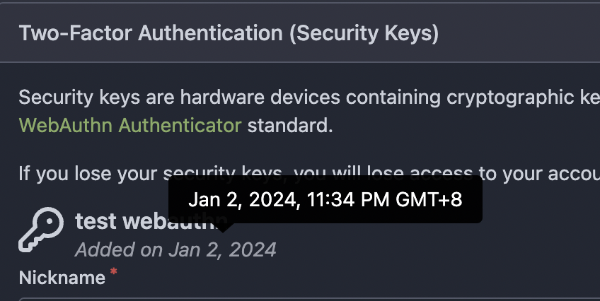
Make template DateTime show proper tooltip ( #28677 )
...
There was a question about "how to improve the datetime display for
SSH/PGP/WebAuthn"
https://github.com/go-gitea/gitea/pull/28262#issuecomment-1831141611
The root problem is that `DateTime` misses the "data-tooltip-content"
attribute, which should be used to make the tooltip popup smoothly.
Now the UI is consistent and the end users could see the detailed
hour/minute/second easily by hovering the element.


2024-01-02 20:09:18 +01:00
wxiaoguang
bf8b082c40
Improve the prompt for "ssh-keygen sign" ( #28509 )
...
Close #28505 , ref:
* https://github.com/go-gitea/gitea/pull/20112#issuecomment-1165423026
* https://github.com/go-gitea/gitea/issues/28505#issuecomment-1860048116
2023-12-18 22:53:04 +08:00
yp05327
3849fd2ac2
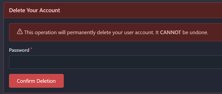
Remove unnecessary forgot password link in delete user section ( #28355 )
...
Before:
<img width="458" alt="image"
src="https://github.com/go-gitea/gitea/assets/18380374/92815496-38cc-4bb9-9182-1509a72b07f6 ">
After:

2023-12-15 14:13:55 +00:00
Panagiotis "Ivory" Vasilopoulos
18ba1c6d00
Improve text in Security settings ( #28393 )
...
- en-US: Rename "Scratch Tokens" to "single-use recovery keys".
  Longer, but clearer.
- Improve titles
- TOTP: Improve description
- TOTP: Inform user about Scratch Tokens to encourage TOTP usage
- WebAuthn: Add loss of access warning
2023-12-08 00:38:55 +02:00
KN4CK3R
b3c258828f
Refactor template empty checks ( #28351 )
2023-12-04 15:48:42 -06:00
Gerd Katzenbeisser
31f8880bc2
Show placeholder email in privacy popup ( #27770 )
...
This PR will show the _noreply_ address in the privacy popup
_keep_email_private_popup_.

I had to look into the source code to figure out which E-Mail Adress I
had to use on gitea.com to hide it from public access.

According to the contribution guidelines I only updated the en-US
translation file.

Co-authored-by: Hakito <hakito@git.example.com>
2023-10-25 11:12:36 +00:00
wxiaoguang
939d410a93
Add missing IconHTML size ( #27269 )
...
Fix #27223

Regression of #27122
2023-09-26 19:59:04 +08:00
wxiaoguang
93bd4351bf
Fix more "locale" usages ( #27259 )
2023-09-25 20:42:40 +08:00
delvh
7960ba7e2b
Always use ctx.Locale.Tr inside templates ( #27231 )
2023-09-25 08:56:50 +00:00
Denys Konovalov
2325fe777d
cleanup locale function usage ( #27227 )
2023-09-24 20:31:58 +00:00
silverwind
1b1c55f73f
Increase auth provider icon size on login page ( #27122 )
...
Before, 20px:
<img width="474" alt="Screenshot 2023-09-19 at 00 10 05"
src="https://github.com/go-gitea/gitea/assets/115237/4bed4edb-219d-4844-9d3c-0d747033b09f ">
After, 28px:
<img width="576" alt="Screenshot 2023-09-19 at 00 20 40"
src="https://github.com/go-gitea/gitea/assets/115237/f482ac09-38ae-4c84-80d9-0bd39b7f9772 ">
Dropdown in account settings is unchanged at 20px:
<img width="157" alt="Screenshot 2023-09-19 at 00 09 11"
src="https://github.com/go-gitea/gitea/assets/115237/9c998cdf-eeed-4118-9262-664faaa56092 ">
---------
Co-authored-by: Giteabot <teabot@gitea.io>
2023-09-19 21:47:13 +00:00
silverwind
8099238618
Change green buttons to primary color ( #27099 )
...
I think it's better if the primary actions have primary color instead of
green which fits better into the overall single-color UI design. This PR
currently replaces every green button with primary:
<img width="141" alt="Screenshot 2023-09-16 at 14 07 59"
src="https://github.com/go-gitea/gitea/assets/115237/843c1e50-4fb2-4ec6-84ba-0efb9472dcbe ">
<img width="161" alt="Screenshot 2023-09-16 at 14 07 51"
src="https://github.com/go-gitea/gitea/assets/115237/9442195a-a3b2-4a42-b262-8377d6f5c0d1 ">
Modal actions now use uncolored/primary instead of previous green/red
colors. I also removed the box-shadow on all basic buttons:
<img width="259" alt="Screenshot 2023-09-16 at 14 16 39"
src="https://github.com/go-gitea/gitea/assets/115237/5beea529-127a-44b0-8d4c-afa7b034a490 ">
<img width="261" alt="Screenshot 2023-09-16 at 14 17 42"
src="https://github.com/go-gitea/gitea/assets/115237/4757f7b2-4d46-49bc-a797-38bb28437b88 ">
The change currently includes the "Merge PR" button, for which we might
want to make an exception to match the icon color there:
<img width="442" alt="Screenshot 2023-09-16 at 14 33 53"
src="https://github.com/go-gitea/gitea/assets/115237/993ac1a5-c94d-4895-b76c-0d872181a70b ">
2023-09-18 22:05:31 +00:00
wxiaoguang
ffa4949eaa
Improve flex list UI ( #26970 )
...
1. There is already `gt-ac`, so no need to introduce `flex-item-center`
2. The `flex-item-baseline` and `.flex-item-icon svg { margin-top: 1px
}` seem to be a tricky patch, they don't resolve the root problem, and
still cause misalignment in some cases.
* The root problem is: the "icon" needs to align with the sibling
"title"
* So, make the "icon" and the "title" both have the same height
3. `flex-text-inline` could only be used if the element is really
"inline", otherwise its `vertical-align` would make the box size change.
In most cases, `flex-text-block` is good enough.

---------
Co-authored-by: silverwind <me@silverwind.io>
Co-authored-by: Giteabot <teabot@gitea.io>
2023-09-08 13:57:18 +00:00
wxiaoguang
419003adb2
Improve SSH Key / GPG Key / Deploy Key UI ( #26949 )
...
1. In many cases, the `flex-list` has previous and next `gt-hidden`
siblings, so relax the CSS selector to remove all ".segument .flex-list"
paddings.
2. Make the "Add key" button can toggle
3. Move help message into the related segment(panel). Otherwise users
would misread the message, eg: the SSH help seemed for GPG because they
are so near
4. Move modal element into the segment element, otherwise it affects the
layout
2023-09-07 01:13:11 +00:00
Kerwin Bryant
9b0743ae33
Extract common code to new template ( #26933 )
...
Same as #26903
2023-09-06 10:11:06 +00:00
Kerwin Bryant
65588b732c
Extract common code to new template ( #26903 )
...
I noticed that the code of several new webhook pages is highly
repetitive, so I pulled out the common parts to a new template, unified
reference, unified maintenance

---------

Co-authored-by: KN4CK3R <admin@oldschoolhack.me>
2023-09-05 12:00:28 +00:00
silverwind
9b76df53dc
Minor dashboard tweaks, fix flex-list margins ( #26829 )
...
Some small dashboard tweaks:
- Remove margin-bottom from divider so first item does not appear to
have un-equal margins
- Restore previous icon color
- Add slight margin-right to icon
Before:
<img width="783" alt="Screenshot 2023-08-31 at 00 10 28"
src="https://github.com/go-gitea/gitea/assets/115237/b75f70d7-8704-4afb-866d-fea0484c52d4 ">
After:
<img width="783" alt="Screenshot 2023-08-31 at 00 10 08"
src="https://github.com/go-gitea/gitea/assets/115237/50ed0c47-6f7c-449e-a054-13091369d43f ">
---------
Co-authored-by: wxiaoguang <wxiaoguang@gmail.com>
2023-08-31 21:28:45 +00:00
wxiaoguang
19a1e1b20e
Remove polluted .ui.right ( #26825 )
...
Each change is tested manually line by line. There are too many changes
so I can't share dozens of screenshots.

In short:

1. `ui right` could be still used in `ui top attached header`, because
there is a special case.
2. A lot of `ui right` are just no-op, so they can be removed safely.
3. Some of the `ui right` should be replaced by `gt-float-right` (to
avoid breaking, leave them to the future).
4. A few of the `ui right` could be rewritten by flex.
2023-08-31 02:29:59 +00:00
Lunny Xiao
476b9d1589
Use docs.gitea.com instead of docs.gitea.io ( #26739 )
2023-08-27 11:59:12 +00:00
wxiaoguang
576644d815
Simplify helper CSS classes and avoid abuse ( #26728 )
...
Removed CSS helper classes (some of them are not useful while some of
them are abused often)
* `gt-db`: in most cases it could be replaced by `gt-df` and the flex
layout should be encouraged. Other cases: either it does need the
`gt-df` (eg: by using `div` directly) or it is an abuse (eg: the warning
message in a form)
* `gt-di`: it doesn't seem useful, or it could be replaced by `gt-dib`
in most cases.
* `gt-dif`: not useful, it could be replaced by `flex-text-inline` or
`gt-df`
* `gt-js`: never used
* All `<i class="icon gt-df gt-ac gt-jc">` could be written as `<i
class="icon">`
## Some UI samples
### Admin Notice

### Admin Stacktrace

### Org Home

### Org Team Repo

### Release List

### User Setting Application Token Scope

Co-authored-by: Giteabot <teabot@gitea.io>
2023-08-26 01:35:10 +02:00
wxiaoguang
e8b990999f
Make "link-action" backend code respond correct JSON content ( #26680 )
...
Otherwise the `link-action` JS code couldn't parse the response.

Co-authored-by: Giteabot <teabot@gitea.io>
2023-08-23 17:36:57 +08:00
yp05327
9665622378
Differentiate better between user settings and admin settings ( #26538 )
...
User settings page and admin settings page are too similar. I thinlk
this will be better of using `User Settings` and `Admin Settings` as the
navbar's title.
Before:


After:


2023-08-16 10:12:03 +00:00
wxiaoguang
a370efc13f
Use template context function for avatar rendering ( #26385 )
...
Introduce `AvatarUtils`, no need to pass `$.Context` to every
sub-template, and simplify the template helper functions.
2023-08-10 11:19:39 +08:00
Denys Konovalov
63ab92d797
Pre-register OAuth2 applications for git credential helpers ( #26291 )
...
This PR is an extended implementation of #25189 and builds upon the
proposal by @hickford in #25653 , utilizing some ideas proposed
internally by @wxiaoguang.
Mainly, this PR consists of a mechanism to pre-register OAuth2
applications on startup, which can be enabled or disabled by modifying
the `[oauth2].DEFAULT_APPLICATIONS` parameter in app.ini. The OAuth2
applications registered this way are being marked as "locked" and
neither be deleted nor edited over UI to prevent confusing/unexpected
behavior. Instead, they're being removed if no longer enabled in config.

The implemented mechanism can also be used to pre-register other OAuth2
applications in the future, if wanted.
Co-authored-by: hickford <mirth.hickford@gmail.com>
Co-authored-by: wxiaoguang <wxiaoguang@gmail.com>
---------
Co-authored-by: M Hickford <mirth.hickford@gmail.com>
Co-authored-by: wxiaoguang <wxiaoguang@gmail.com>
2023-08-09 14:24:07 +02:00
wxiaoguang
71d253f42e
Remove unnecessary template helper DisableGravatar ( #26386 )
...
And one "AllowedUserVisibilityModes" was missing, add it.

Co-authored-by: Giteabot <teabot@gitea.io>
2023-08-08 08:29:14 +00:00
Denys Konovalov
b9baed2c74
Introduce flex-list & flex-item elements for Gitea UI ( #25790 )
...
This PR introduces a new UI element type for Gitea called `flex-item`.
It consists of a horizontal card with a leading, main and trailing part:

The idea behind it is that in Gitea UI, we have many cases where we use
this kind of layout, but it is achieved in many different ways:
- grid layout
- `.ui.list` with additional hacky flexbox
- `.ui.key.list` - looks to me like a style set originally created for
ssh/gpg key list, was used in many other places
- `.issue.list` - created for issue cards, used in many other places
- ...
This new style is based on `.issue.list`, specifically the refactoring
of it done in #25750 .
In this PR, the new element is introduced and lots of templates are
being refactored to use that style. This allows to remove a lot of
page-specific css, makes many of the elements responsive or simply
provides a cleaner/better-looking way to present information.
A devtest section with the new style is also available.
<details>
<summary>Screenshots (left: before, right: after)</summary>


</details>
---------
Co-authored-by: Giteabot <teabot@gitea.io>
2023-08-01 00:13:42 +02:00
Panagiotis "Ivory" Vasilopoulos
d58c542579
Add 'Show on a map' button to Location in profile, fix layout ( #26214 )
...
Not too important, but I think that it'd be a pretty neat touch.

Also fixes some layout bugs introduced by a previous PR.

---------

Co-authored-by: Gusted <postmaster@gusted.xyz>
Co-authored-by: Caesar Schinas <caesar@caesarschinas.com>
Co-authored-by: wxiaoguang <wxiaoguang@gmail.com>
2023-07-31 08:44:45 +00:00
silverwind
72363be7ca
Use shared template for webhook icons ( #26242 )
...
Fixes: https://github.com/go-gitea/gitea/issues/26241
2023-07-31 08:00:52 +00:00
silverwind
7e160f8824
Reduce margins on user settings page, introduce flex-container ( #26046 )
...
Same as https://github.com/go-gitea/gitea/pull/26026 but for the user
settings page. It introduces a new `flex-container` class and shares it
across both pages.
Before and After:
<img width="1264" alt="Screenshot 2023-07-21 at 19 35 57"
src="https://github.com/go-gitea/gitea/assets/115237/1358dab4-55c0-40ce-a4d5-673099304f3d ">
<img width="1269" alt="Screenshot 2023-07-21 at 19 35 42"
src="https://github.com/go-gitea/gitea/assets/115237/34812f6d-dc65-4009-b977-90e03efdc6d1 ">
2023-07-31 07:16:03 +00:00
Kerwin Bryant
05d0b7ca91
Fixed incorrect locale references ( #26218 )
...
Fixed two incorrect headers for setting the page navigation bar:
* User settings page, should not use the title "`org.settings`"
* Repo settings page, should not use the title "`org.settings`"
2023-07-29 21:34:22 +08:00
wxiaoguang
98088befae
Fix broken translations for package documantion ( #25742 )
...
The code was just copied&pasted, it causes problems now.
There are a lot (for every package) broken translations. eg:
```
# en-US
conda.documentation = For more information on the Conda registry, see
<a target="_blank" rel="noopener noreferrer" href="%s">the documentation</a>.
# fr-FR (and many languages)
conda.documentation=Pour plus d'informations sur le registre Conda, voir
<a target="_blank" rel="noopener noreferrer" href="https://docs.gitea.io/fr-fr/packages/conda/ ">la documentation</a>.
```
To resolve the problem fundamentally, use a general string, and trigger
the re-translating on Crowdin side.
And, it should really really really avoid introducing too much
copied&pasted code .......
2023-07-07 10:47:26 +02:00
wxiaoguang
eea58a5d55
Fix UI misalignment on user setting page ( #25629 )
...
Fix #25628
Diff with ignoring space:
https://github.com/go-gitea/gitea/pull/25629/files?diff=unified&w=1
The "modal" shouldn't appear between "ui attached segment", otherwise
these segments lose margin-top.
After the fix:
<details>


</details>
2023-07-03 20:38:06 +00:00
silverwind
64f2d70262
Replace fomantic divider module with our own ( #25539 )
...
Should look exactly like before for normal dividers. "Horizontal" ones
look better because they no longer use image backgrounds.
<img width="917" alt="Screenshot 2023-06-27 at 19 07 56"
src="https://github.com/go-gitea/gitea/assets/115237/d97d8dec-6859-44a8-85ba-e4549b4dd9df ">
<img width="914" alt="Screenshot 2023-06-27 at 19 05 58"
src="https://github.com/go-gitea/gitea/assets/115237/8bf98544-2d82-4ebf-ac68-d6dc237bd6b2 ">
<img width="1246" alt="Screenshot 2023-06-27 at 19 00 42"
src="https://github.com/go-gitea/gitea/assets/115237/36a6bb21-6029-4f53-8bee-535f55c66fed ">
<img width="344" alt="Screenshot 2023-06-27 at 18 58 15"
src="https://github.com/go-gitea/gitea/assets/115237/a9e70aee-8e6b-4ea1-9e93-19c9f96aec6e ">
<img width="823" alt="Screenshot 2023-06-27 at 18 56 22"
src="https://github.com/go-gitea/gitea/assets/115237/e7a497cd-f262-4683-8872-23c3c8cce32f ">
<img width="330" alt="Screenshot 2023-06-27 at 19 21 11"
src="https://github.com/go-gitea/gitea/assets/115237/42f24149-a655-4c7e-bd26-8ab52db6446b ">
2023-06-29 20:24:22 +08:00
a1012112796
4aba8a6a5f
Split lfs size from repository size ( #22900 )
...
releated to #21820
- Split `Size` in repository table as two new colunms, one is `GitSize`
for git size, the other is `LFSSize` for lfs data. still store full size
in `Size` colunm.
- Show full size on ui, but show each of them by a `title`; example:

- Return full size in api response.
---------
Signed-off-by: a1012112796 <1012112796@qq.com>
Co-authored-by: Lunny Xiao <xiaolunwen@gmail.com>
Co-authored-by: silverwind <me@silverwind.io>
Co-authored-by: DmitryFrolovTri <23313323+DmitryFrolovTri@users.noreply.github.com>
Co-authored-by: Giteabot <teabot@gitea.io>
2023-06-28 22:41:02 +00:00
KN4CK3R
426a49d481
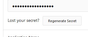
Change Regenerate Secret button display ( #25534 )
...
Fixes #25527
Preview:

2023-06-27 15:20:52 +00:00
wxiaoguang
d5f007539a
Clarify the reason why the user can't add a new email if there is a pending activation ( #25509 )
...

2023-06-26 04:52:49 +00:00
Panagiotis "Ivory" Vasilopoulos
5eeddfde10
Only show 'Manage Account Links' when necessary ( #25311 )
...
If it is not possible to add or manage an account link, the menu
will not be shown to the user.
2023-06-24 13:00:52 +00:00