Giteabot
bf76216de1
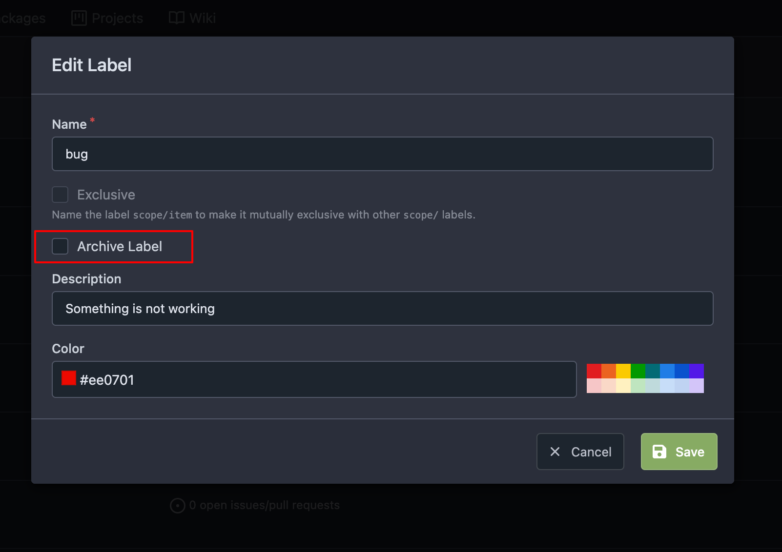
Hide archived labels by default from the suggestions when assigning labels for an issue ( #27451 ) ( #27661 )
...
Backport #27451 by @puni9869
Followup of #27115
Finally closes #25237
## Screenshots
### Issue Sidebar
<img width="513" alt="image"
src="https://github.com/go-gitea/gitea/assets/80308335/9f7fda2f-5a03-4684-8619-fd3498a95b41 ">
### PR sidebar
<img width="367" alt="image"
src="https://github.com/go-gitea/gitea/assets/80308335/53db9b64-faec-4a67-91d6-76945596a469 ">
### PR sidebar with archived labels shown
<img width="352" alt="image"
src="https://github.com/go-gitea/gitea/assets/80308335/9dc5050f-4e69-4f76-bb83-582480a2281e ">
Signed-off-by: puni9869 <punitinani1@hotmail.com >
Co-authored-by: puni9869 <80308335+puni9869@users.noreply.github.com >
Co-authored-by: silverwind <me@silverwind.io >
2023-10-17 14:46:35 +00:00
Nanguan Lin
fa6941cf8c
Backport manually for a tmpl issue in v1.21 ( #27612 )
...
backport #27514
close #27607
2023-10-14 11:51:58 +00:00
Nanguan Lin
f19feb0f47
Revert "Fix pr template ( #27436 )" ( #27567 )
...
Reverts backport go-gitea/gitea#27440
Fix #27564
2023-10-11 03:11:04 +00:00
Giteabot
71f091ef97
Remove max-width and add hide text overflow ( #27359 ) ( #27550 )
...
Backport #27359 by @kdumontnu
Closes https://github.com/go-gitea/gitea/issues/27358
Co-authored-by: Kyle D <kdumontnu@gmail.com >
2023-10-09 22:02:26 -04:00
Giteabot
fb5ae2ab94
Restore warning commit status ( #27504 ) ( #27529 )
...
Backport #27504 by @silverwind
Partial revert of https://github.com/go-gitea/gitea/pull/25839 . This
commit status is used by a number of external integrations, so I think
we should not remove it (See
https://github.com/go-gitea/gitea/pull/25839#issuecomment-1729002077 ).
This is a rare case where an existing migration needed to be alterted to
avoid data loss.
Co-authored-by: silverwind <me@silverwind.io >
Co-authored-by: delvh <dev.lh@web.de >
2023-10-09 11:56:02 +08:00
Giteabot
51001d9ffe
Fix pr template ( #27436 ) ( #27440 )
...
Backport #27436 by @lunny
Fix #27431
Co-authored-by: Lunny Xiao <xiaolunwen@gmail.com >
2023-10-04 12:56:02 +00:00
Giteabot
1ff6b7783c
Fix missing ctx in new_form.tmpl ( #27434 ) ( #27438 )
...
Backport #27434 by @CaiCandong
Fix #27432
Regression of #27265
Co-authored-by: CaiCandong <50507092+CaiCandong@users.noreply.github.com >
2023-10-04 12:12:06 +00:00
Giteabot
28d970e4a6
Hide archived labels when filtering by labels on the issue list ( #27115 ) ( #27381 )
...
Backport #27115 by @puni9869
Followup https://github.com/go-gitea/gitea/pull/26820
## Archived labels UI for issue filter and issue filter actions for
issues/pull request pages.
Changed:
* Enhanced the Issue filter and Issue filter actions UI page to
seamlessly incorporate a list of archived labels.
* Pagination functionality is same as before. If archived label checkbox
is checked then we are adding a query string`archived=true` in the url
to save the state of page.
* Issue filter actions menu is separated into different template.
* Adding the archived flag in issue url labels.
* Pull Request page is also work the same.
Outsourced:
* Defer the implementation of specialized handling for archived labels
to upcoming pull requests. This step will be undertaken subsequent to
the successful merge of this pull request.
Screenshots
### Issue page
<img width="1360" alt="image"
src="https://github.com/go-gitea/gitea/assets/80308335/d7efb2ef-5b2b-449d-83f0-d430a32ec432 ">
### Issue page with label filter on archived label checkbox when not
checked --> No archived label is there in list
<img width="1249" alt="image"
src="https://github.com/go-gitea/gitea/assets/80308335/ceea68ef-91f2-4693-910f-2e25e236bfc9 ">
### Issue page with label filter on archived label checkbox when checked
--> Show archived label in the list.
<img width="710" alt="image"
src="https://github.com/go-gitea/gitea/assets/80308335/2414d26b-2079-4c3c-bd9e-f2f5411bcabf ">
### Issue page with label filter on issue action menu on archived label
checkbox when checked --> Show archived label in the list.
<img width="409" alt="image"
src="https://github.com/go-gitea/gitea/assets/80308335/259cac87-3e21-4778-99a2-a6a0b8c81178 ">
### Applied the archived=true in Issue labels when archived checkbox is
checked.
<img width="984" alt="image"
src="https://github.com/go-gitea/gitea/assets/80308335/657ce3db-c0ae-402e-b12d-3b580d3c2ed0 ">
---
Part of https://github.com/go-gitea/gitea/issues/25237
Signed-off-by: puni9869 <punitinani1@hotmail.com >
Co-authored-by: puni9869 <80308335+puni9869@users.noreply.github.com >
Co-authored-by: delvh <dev.lh@web.de >
2023-10-01 22:56:48 -04:00
Giteabot
f13a294b47
More db.DefaultContext refactor ( #27265 ) ( #27347 )
...
Backport #27265 by @JakobDev
Part of #27065
This PR touches functions used in templates. As templates are not static
typed, errors are harder to find, but I hope I catch it all. I think
some tests from other persons do not hurt.
Co-authored-by: JakobDev <jakobdev@gmx.de >
2023-09-29 13:35:01 +00:00
wxiaoguang
597b04fe2f
Backport ctx locale refactoring manually ( #27231 ) ( #27259 ) ( #27260 )
...
Backport #27231 #27259 manually
---------
Co-authored-by: delvh <dev.lh@web.de >
2023-09-25 13:15:51 +00:00
Giteabot
daaf0ad473
cleanup locale function usage ( #27227 ) ( #27240 )
...
Backport #27227 by @denyskon
Throughout the Gitea codebase, you can meet some weird constructions to
make `locale.Tr` work in subtemplates.
Since we now have `ctx.Locale.Tr` which solves that problem, clean up
various templates which pass `locale` through `dict` or use some weird
constructions like `$.root.locale`
Going on, it would be great to replace every case of `$.locale.Tr` and
`.locale.Tr` with `ctx.Locale.Tr`, but that needs to be done with
patience.
Co-authored-by: Denys Konovalov <kontakt@denyskon.de >
2023-09-25 00:21:38 +00:00
Giteabot
88271167d6
Allow copying issue comment link on archived repos and when not logged in ( #27193 ) ( #27210 )
...
Backport #27193 by @JakobDev
Fixes https://codeberg.org/Codeberg/Community/issues/1303
Co-authored-by: JakobDev <jakobdev@gmx.de >
2023-09-24 19:25:09 +00:00
Giteabot
b6dab855f5
fix: text decorator on issue sidebar menu label ( #27206 ) ( #27209 )
...
Backport #27206 by @metiftikci
fix underline for label on issue sidebar
Co-authored-by: metiftikci <metiftikci@hotmail.com >
2023-09-23 20:47:40 +08:00
Giteabot
2e49a4da48
Fix dropdown icon position ( #27175 ) ( #27177 )
...
Backport #27175 by @wxiaoguang
According to https://fomantic-ui.com/modules/dropdown.html and our
"devtest" page, many dropdown elements has incorrect "icon" position.
This PR fixes all of them. Fix #27173
Co-authored-by: wxiaoguang <wxiaoguang@gmail.com >
2023-09-21 16:24:07 +00:00
silverwind
8099238618
Change green buttons to primary color ( #27099 )
...
I think it's better if the primary actions have primary color instead of
green which fits better into the overall single-color UI design. This PR
currently replaces every green button with primary:
<img width="141" alt="Screenshot 2023-09-16 at 14 07 59"
src="https://github.com/go-gitea/gitea/assets/115237/843c1e50-4fb2-4ec6-84ba-0efb9472dcbe ">
<img width="161" alt="Screenshot 2023-09-16 at 14 07 51"
src="https://github.com/go-gitea/gitea/assets/115237/9442195a-a3b2-4a42-b262-8377d6f5c0d1 ">
Modal actions now use uncolored/primary instead of previous green/red
colors. I also removed the box-shadow on all basic buttons:
<img width="259" alt="Screenshot 2023-09-16 at 14 16 39"
src="https://github.com/go-gitea/gitea/assets/115237/5beea529-127a-44b0-8d4c-afa7b034a490 ">
<img width="261" alt="Screenshot 2023-09-16 at 14 17 42"
src="https://github.com/go-gitea/gitea/assets/115237/4757f7b2-4d46-49bc-a797-38bb28437b88 ">
The change currently includes the "Merge PR" button, for which we might
want to make an exception to match the icon color there:
<img width="442" alt="Screenshot 2023-09-16 at 14 33 53"
src="https://github.com/go-gitea/gitea/assets/115237/993ac1a5-c94d-4895-b76c-0d872181a70b ">
2023-09-18 22:05:31 +00:00
puni9869
a50d9af876
Display archived labels specially when listing labels ( #26820 )
...
Follow up https://github.com/go-gitea/gitea/pull/26741
Changes:
Added archived label for org labels and added into issue filter list.
Part of https://github.com/go-gitea/gitea/issues/25237
---------
Signed-off-by: puni9869 <punitinani1@hotmail.com >
Co-authored-by: silverwind <me@silverwind.io >
2023-09-18 04:54:05 +00:00
wxiaoguang
1875362383
Fix "delete" modal dialog for issue/PR ( #27015 )
...
Close #27012
By the way, rename the single-word ID to a long ID.


2023-09-11 17:06:05 +00:00
silverwind
a625f3a761
Enable djlint H008 and fix issues ( #26869 )
...
Enable `H008 | Attributes should be double quoted` and fix issues.
2023-09-01 17:32:39 +00:00
wxiaoguang
d5703d4a1b
Remove "TODO" tasks from CSS file ( #26835 )
...
1. Use `gt-invisible` instead of `invisible`.
2. Use `gt-word-break` instead of `dont-break-out` (there is a slight
different "hyphens", but I think it won't affect too much since it is
only used for the "full name").
3. Remove `.small.button:has(svg)` , now our buttons could layout SVG
correctly, and actually I didn't see this CSS class is used in code.
2023-08-31 10:49:53 +00:00
wxiaoguang
19a1e1b20e
Remove polluted .ui.right ( #26825 )
...
Each change is tested manually line by line. There are too many changes
so I can't share dozens of screenshots.

In short:

1. `ui right` could be still used in `ui top attached header`, because
there is a special case.
2. A lot of `ui right` are just no-op, so they can be removed safely.
3. Some of the `ui right` should be replaced by `gt-float-right` (to
avoid breaking, leave them to the future).
4. A few of the `ui right` could be rewritten by flex.
2023-08-31 02:29:59 +00:00
wxiaoguang
4803766f7a
Refactor some CSS styles and simplify code ( #26771 )
...
Refactor some CSS styles and simplify code.

Some styles are not in use, remove them.
2023-08-28 22:14:51 +08:00
puni9869
e0a796a641
Adding hint Archived to archive label. ( #26741 )
...
Followup https://github.com/go-gitea/gitea/pull/26478
## Archived labels UI
Changed:
* Enhanced the Filtered UI page to seamlessly incorporate a list of
archived labels.
Outsourced:
* Defer the implementation of specialized handling for archived labels
to upcoming pull requests. This step will be undertaken subsequent to
the successful merge of this pull request.
Screenshots


---
Part of https://github.com/go-gitea/gitea/issues/25237
---------
Co-authored-by: Giteabot <teabot@gitea.io >
Co-authored-by: silverwind <me@silverwind.io >
2023-08-27 09:32:54 +00:00
wxiaoguang
4fdb09de58
Fix incorrect "tabindex" attributes ( #26733 )
...
Fix #26731
Almost all "tabindex" in code are incorrect.
1. All "input/button" by default are focusable, so no need to use "tabindex=0"
2. All "div/span" by default are not focusable, so no need to use "tabindex=-1"
3. All "dropdown" are focusable by framework, so no need to use "tabindex"
4. Some tabindex values are incorrect (eg: `new_form.tmpl`), so remove them
Co-authored-by: Giteabot <teabot@gitea.io >
2023-08-26 10:44:00 +08:00
wxiaoguang
576644d815
Simplify helper CSS classes and avoid abuse ( #26728 )
...
Removed CSS helper classes (some of them are not useful while some of
them are abused often)
* `gt-db`: in most cases it could be replaced by `gt-df` and the flex
layout should be encouraged. Other cases: either it does need the
`gt-df` (eg: by using `div` directly) or it is an abuse (eg: the warning
message in a form)
* `gt-di`: it doesn't seem useful, or it could be replaced by `gt-dib`
in most cases.
* `gt-dif`: not useful, it could be replaced by `flex-text-inline` or
`gt-df`
* `gt-js`: never used
* All `<i class="icon gt-df gt-ac gt-jc">` could be written as `<i
class="icon">`
## Some UI samples
### Admin Notice

### Admin Stacktrace

### Org Home

### Org Team Repo

### Release List

### User Setting Application Token Scope

Co-authored-by: Giteabot <teabot@gitea.io >
2023-08-26 01:35:10 +02:00
wxiaoguang
4de2244697
Make issue template field template access correct template data ( #26698 )
...
Regression of #23092 , the `{{$field := .}}` was missing during that refactoring.
2023-08-24 11:09:36 +00:00
yp05327
d2e4039def
Add member, collaborator, contributor, and first-time contributor roles and tooltips ( #26658 )
...
GitHub like role descriptor


---------
Co-authored-by: delvh <dev.lh@web.de >
Co-authored-by: wxiaoguang <wxiaoguang@gmail.com >
Co-authored-by: Lunny Xiao <xiaolunwen@gmail.com >
2023-08-24 13:06:17 +08:00
yp05327
bd8a253220
Improve show role ( #26621 )
...
Add a general show role template.
2023-08-22 05:30:33 +00:00
CaiCandong
5bd63f83e3
Improve translation of milestone filters ( #26569 )
...
https://github.com/go-gitea/gitea/issues/26567#issue-1855312074
> The terms `closest` and `furthest` don't describe the actual sorting
behavior as these two are semantically relative to the current date.
> Could we switch to `earliest` and `latest` instead?
close #26567
---------
Co-authored-by: yp05327 <576951401@qq.com >
Co-authored-by: Giteabot <teabot@gitea.io >
2023-08-21 21:11:07 +08:00
yp05327
82f6e3d845
Improve deadline icon location in milestone list page ( #26532 )
2023-08-16 16:22:25 +08:00
puni9869
cafce3b4b5
Allow to archive labels ( #26478 )
...
## Archived labels
This adds the structure to allow for archived labels.
Archived labels are, just like closed milestones or projects, a medium to hide information without deleting it.
It is especially useful if there are outdated labels that should no longer be used without deleting the label entirely.
## Changes
1. UI and API have been equipped with the support to mark a label as archived
2. The time when a label has been archived will be stored in the DB
## Outsourced for the future
There's no special handling for archived labels at the moment.
This will be done in the future.
## Screenshots


Part of https://github.com/go-gitea/gitea/issues/25237
---------
Co-authored-by: delvh <dev.lh@web.de >
Co-authored-by: wxiaoguang <wxiaoguang@gmail.com >
2023-08-14 11:56:14 +02:00
Denys Konovalov
ab78c39e41
Refactor project templates ( #26448 )
...
This PR refactors a bunch of projects-related code, mostly the
templates.
The following things were done:
- rename boards to columns in frontend code
- use the new `ctx.Locale.Tr` method
- cleanup template, remove useless newlines, classes, comments
- merge org-/user and repo level project template together
- move "new column" button into project toolbar
- move issue card (shared by projects and pinned issues) to shared
template, remove useless duplicated styles
- add search function to projects (to make the layout more similar to
milestones list where it is inherited from 😆 )
- maybe more changes I forgot I've done 😆
Closes #24893
After:


---------
Co-authored-by: silverwind <me@silverwind.io >
2023-08-12 10:30:28 +00:00
CaiCandong
7a69d71733
Fix incorrect redirection in new issue using references ( #26440 )
...
fix #26427
related https://github.com/go-gitea/gitea/pull/25258
---
Before:

---
After:

2023-08-10 20:04:08 +00:00
wxiaoguang
a370efc13f
Use template context function for avatar rendering ( #26385 )
...
Introduce `AvatarUtils`, no need to pass `$.Context` to every
sub-template, and simplify the template helper functions.
2023-08-10 11:19:39 +08:00
yp05327
30eae5a40c
Fix incorrect color of selected assignees when create issue ( #26324 )
...
Before:

After:

Co-authored-by: Giteabot <teabot@gitea.io >
2023-08-04 14:14:30 +00:00
yp05327
d74c2228e3
Remove nonsense <a> for commit status check icon ( #26287 )
...
We are using `<a>` for commit status check icon with no link. So it is
clickable but this is no sense.
I think we can convert this to `div`.

Co-authored-by: Giteabot <teabot@gitea.io >
2023-08-03 19:58:41 +02:00
Yarden Shoham
edd93fcfbc
Fix due date rendering the wrong date in issue ( #26268 )
...
Closes #26263
We have to pass the date without the time.
# Before

# After

Signed-off-by: Yarden Shoham <git@yardenshoham.com >
2023-08-01 16:21:04 +02:00
silverwind
04d7ced063
De-emphasize issue sidebar buttons ( #26171 )
...
I find the colored buttons in the issue sidebar distracting, given that
they are not primary actions, I think we can de-colorize them.
Before:
<img width="285" alt="Screenshot 2023-07-26 at 19 42 22"
src="https://github.com/go-gitea/gitea/assets/115237/7e784805-4e01-4199-94bb-0538a0130264 ">
<img width="288" alt="Screenshot 2023-07-26 at 19 43 06"
src="https://github.com/go-gitea/gitea/assets/115237/3a89c661-e24a-4ebf-a585-d404d0a6a78a ">
<img width="285" alt="Screenshot 2023-07-26 at 19 44 36"
src="https://github.com/go-gitea/gitea/assets/115237/c1aa8c13-6f41-4763-8149-d1c07cb4be5c ">:
After:
<img width="286" alt="Screenshot 2023-07-26 at 19 42 04"
src="https://github.com/go-gitea/gitea/assets/115237/74d640c2-e0ab-4fef-87aa-9e788e9010e2 ">
<img width="285" alt="Screenshot 2023-07-26 at 19 42 51"
src="https://github.com/go-gitea/gitea/assets/115237/3b69976a-9aa4-4e1c-8df3-4168f4a9fcf9 ">
<img width="286" alt="Screenshot 2023-07-26 at 19 45 15"
src="https://github.com/go-gitea/gitea/assets/115237/897222fd-4df2-4d99-98eb-e5f8fb77c4d6 ">
2023-07-30 22:46:53 +00:00
yp05327
1c6c38fa6e
Improve display of Labels/Projects/Assignees sort options ( #25886 )
...
Labels:
Before: (no highlights)

After:


Projects:
Before: (no highlights)

After:


Assignee:
Before: (no highlights)

After:


2023-07-26 13:00:50 +00:00
caicandong
ab72f7ee4a
remove IsWarning in tmpl ( #26120 )
...
This problem occurs because in #25839 , the warning status has been
removed, but there is something in the tmpl that hasn't been changed.
related #25839
close #26118
2023-07-25 12:09:01 +00:00
Lunny Xiao
a12a5f3652
Fix duplicated url prefix on issue context menu ( #26066 )
...
Fix #26060
2023-07-23 11:56:43 +02:00
Denys Konovalov
eec45b43db
move issue filters to shared template ( #25729 )
...
Issue filters are being used on repo list page and on milestone issues
page, and the code is mostly duplicated.
This PR does the following changes:
- move issue filters into a shared template
- allow filtering milestone issues by project, so no need to hide this
filter on milestone issues page
- remove some dead code (e. g. issue actions in milestone issues
template)
- fix label filter dropdown width
---------
Co-authored-by: 6543 <6543@obermui.de >
2023-07-13 20:00:38 +00:00
puni9869
4744cb32e2
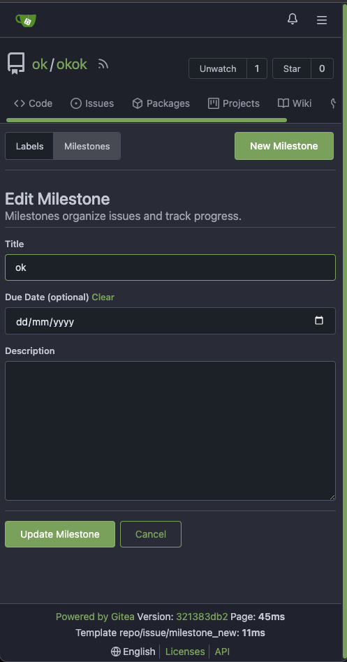
Fix margin on the new/edit milestone page ( #25801 )
...
There is some distortion in desktop and mobile ui for new/edit milestone
page.
Fixing the new/edit milestone page for desktop and mobile ui
Design background
https://uxplanet.org/primary-secondary-action-buttons-c16df9b36150
https://balsamiq.com/learn/articles/button-design-best-practices/
<details>
<summary>Screen shots</summary>
Before:


After


</details>
---------
Co-authored-by: Denys Konovalov <privat@denyskon.de >
Co-authored-by: Giteabot <teabot@gitea.io >
2023-07-12 10:36:56 +00:00
puni9869
2ff0c12a95
Repository Archived text title center align ( #25767 )
...
Archive text title center align
<details>
<summary>Screen shots</summary>
Before

After


BTW On github

</details>
---------
Co-authored-by: Giteabot <teabot@gitea.io >
2023-07-08 10:57:17 +00:00
Earl Warren
e1edd7a8e9
Show correct naming for 1 comment ( #25704 )
...
- Resolves https://codeberg.org/forgejo/forgejo/issues/948
Co-authored-by: Gusted <postmaster@gusted.xyz >
Co-authored-by: Giteabot <teabot@gitea.io >
2023-07-05 19:53:38 +00:00
Denys Konovalov
00dbba7f42
Several fixes for mobile UI ( #25634 )
...
Resolves #25622
<details>
<summary>Screenshots</summary>


</details>
---------
Co-authored-by: wxiaoguang <wxiaoguang@gmail.com >
Co-authored-by: silverwind <me@silverwind.io >
2023-07-04 17:45:45 +00:00
silverwind
64f2d70262
Replace fomantic divider module with our own ( #25539 )
...
Should look exactly like before for normal dividers. "Horizontal" ones
look better because they no longer use image backgrounds.
<img width="917" alt="Screenshot 2023-06-27 at 19 07 56"
src="https://github.com/go-gitea/gitea/assets/115237/d97d8dec-6859-44a8-85ba-e4549b4dd9df ">
<img width="914" alt="Screenshot 2023-06-27 at 19 05 58"
src="https://github.com/go-gitea/gitea/assets/115237/8bf98544-2d82-4ebf-ac68-d6dc237bd6b2 ">
<img width="1246" alt="Screenshot 2023-06-27 at 19 00 42"
src="https://github.com/go-gitea/gitea/assets/115237/36a6bb21-6029-4f53-8bee-535f55c66fed ">
<img width="344" alt="Screenshot 2023-06-27 at 18 58 15"
src="https://github.com/go-gitea/gitea/assets/115237/a9e70aee-8e6b-4ea1-9e93-19c9f96aec6e ">
<img width="823" alt="Screenshot 2023-06-27 at 18 56 22"
src="https://github.com/go-gitea/gitea/assets/115237/e7a497cd-f262-4683-8872-23c3c8cce32f ">
<img width="330" alt="Screenshot 2023-06-27 at 19 21 11"
src="https://github.com/go-gitea/gitea/assets/115237/42f24149-a655-4c7e-bd26-8ab52db6446b ">
2023-06-29 20:24:22 +08:00
HesterG
5a871932f0
Fix milestones deletion ( #25583 )
...
Close #25557
Fix regression from #25315

`data-id` is still needed for deleting milestone.
2023-06-29 10:17:18 +02:00
HesterG
c6f1fb1c6d
Use fetch form action for lock/unlock/pin/unpin on sidebar ( #25380 )
...
Before:
<img width="364" alt="Screen Shot 2023-06-20 at 11 59 11"
src="https://github.com/go-gitea/gitea/assets/17645053/ad284b7e-8d21-43be-b178-bbcfd37cb5bd ">
Might trigger many posts when keep clicking the buttons above.
<img width="448" alt="Screen Shot 2023-06-20 at 11 52 28"
src="https://github.com/go-gitea/gitea/assets/17645053/a60aa6ac-af74-45e4-b13a-512b436b81b0 ">
<img width="678" alt="Screen Shot 2023-06-20 at 11 52 37"
src="https://github.com/go-gitea/gitea/assets/17645053/d6662700-3643-4cc7-a2ec-64e1c0f5fbdb ">
After (PR sidebar, Same for issue):
https://github.com/go-gitea/gitea/assets/17645053/9df3ad1f-e29c-439b-8bde-e6b917d63cc6
For delete, it is using `base/modal_actions_confirm` subtemplate, and we
might need another general solution for this (maybe add another
attribute to the subtemplate or something)
---------
Co-authored-by: silverwind <me@silverwind.io >
Co-authored-by: Giteabot <teabot@gitea.io >
Co-authored-by: wxiaoguang <wxiaoguang@gmail.com >
2023-06-29 04:16:04 +00:00
Lunny Xiao
083818cb85
Improve loadprojects for issue list ( #25468 )
2023-06-24 15:31:28 +00:00
6543
b0215c40cd
Store and use seconds for timeline time comments ( #25392 )
...
this will allow us to fully localize it later

PS: we can not migrate back as the old value was a one-way conversion


prepare for  #25213

---
*Sponsored by Kithara Software GmbH*
2023-06-23 12:12:39 +00:00