- Closes https://github.com/go-gitea/gitea/issues/28880
This change introduces htmx with the hope we could use it to make Gitea
more reactive while keeping our "HTML rendered on the server" approach.
- Add `htmx.js` that imports `htmx.org` and initializes error toasts
- Place `hx-headers='{"x-csrf-token": "{{.CsrfToken}}"}'` on the
`<body>` tag so every request that htmx sends is authenticated
- Place `hx-swap="outerHTML"` on the `<body>` tag so the response of
each htmx request replaces the tag it targets (as opposed to its inner
content)
- Place `hx-push-url="false"` on the `<body>` tag so no changes to the
URL happen in `<form>` tags
- Add the `is-loading` class during request
### Error toasts in action

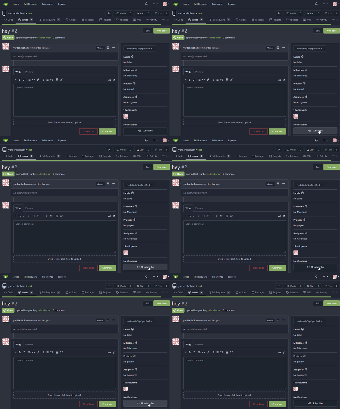
## Don't do a full page load when clicking the subscribe button
- Refactor the form around the subscribe button into its own template
- Use htmx to perform the form submission
- `hx-boost="true"` to prevent the default form submission behavior of a
full page load
- `hx-sync="this:replace"` to replace the current request (in case the
button is clicked again before the response is returned)
- `hx-target="this"` to replace the form tag with the new form tag
- Change the backend response to return a `<form>` tag instead of a
redirect to the issue page
### Before

### After

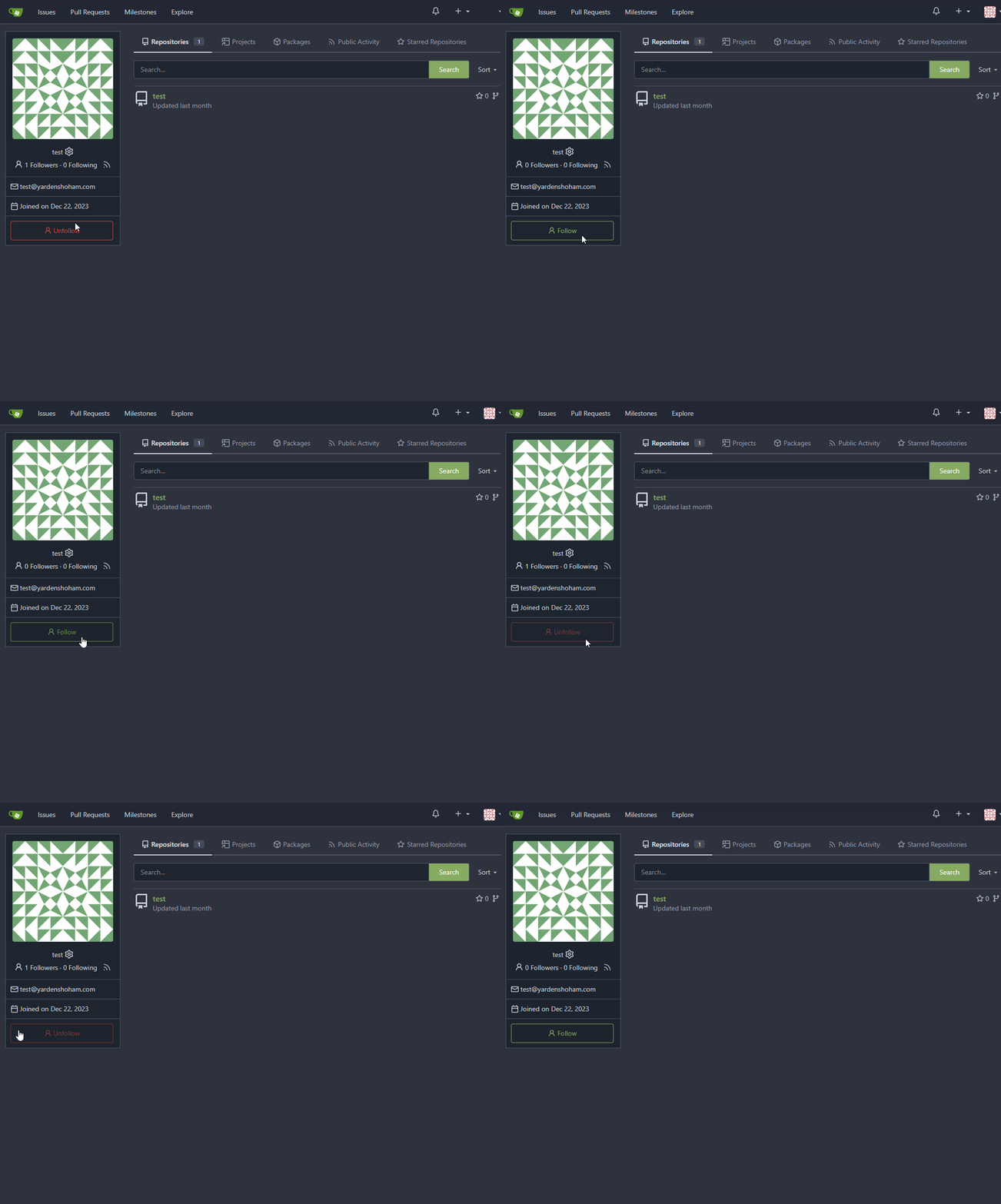
## Don't do a full page load when clicking the follow button
- Use htmx to perform the button request
- `hx-post="{{.ContextUser.HomeLink}}?action=follow"` to send a POST
request to follow the user
- `hx-target="#profile-avatar-card"` to target the card div for
replacement
- `hx-indicator="#profile-avatar-card"` to place the loading indicator
on the card
- Change the backend response to return a `<div>` tag (the card) instead
of a redirect to the user page
### Before

### After

---------
Signed-off-by: Yarden Shoham <git@yardenshoham.com>
Co-authored-by: 6543 <m.huber@kithara.com>
Co-authored-by: Giteabot <teabot@gitea.io>
- Refactor the form around the subscribe button into its own template
- Use htmx to perform the form submission
- `hx-boost="true"` to prevent the default form submission behavior of a
full page load
- `hx-sync="this:replace"` to replace the current request (in case the
button is clicked again before the response is returned)
- `hx-target="this"` to replace the form tag with the new form tag
- `hx-push-url="false"` to disable a change to the URL
- `hx-swap="show:no-scroll"` to preserve the scroll position
- Change the backend response to return a `<form>` tag instead of a
redirect to the issue page
- Include `htmx.org` in javascript imports
This change introduces htmx with the hope we could use it to make Gitea
more reactive while keeping our "HTML rendered on the server" approach.
# Before

# After

---------
Signed-off-by: Yarden Shoham <git@yardenshoham.com>
By clicking the currently active "Open" or "Closed" filter button in the
issue list, the user can toggle that filter off in order to see all
issues regardless of state. The URL "state" parameter will be set to
"all" and the "Open"/"Closed" button will not show as active.
Fixes#26548
This PR refactors the rendering of markup links. The old code uses
`strings.Replace` to change some urls while the new code uses more
context to decide which link should be generated.
The added tests should ensure the same output for the old and new
behaviour (besides the bug).
We may need to refactor the rendering a bit more to make it clear how
the different helper methods render the input string. There are lots of
options (resolve links / images / mentions / git hashes / emojis / ...)
but you don't really know what helper uses which options. For example,
we currently support images in the user description which should not be
allowed I think:
<details>
<summary>Profile</summary>
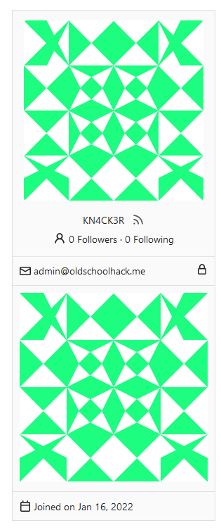
https://try.gitea.io/KN4CK3R

</details>
---------
Co-authored-by: wxiaoguang <wxiaoguang@gmail.com>
When JavaScript is not loaded, fall back to displaying reaction tooltips
with the default browser `title` attribute. An element with a present
but empty `data-tooltip-content` will use the `title` attribute for its
tippy.js tooltip content, so when JavaScript is enabled, this functions
the same as the current behavior.
When an assignee changed event comment is rendered, most of it is
guarded behind the assignee ID not being 0. However, if it is 0, that
results in quite broken rendering for that comment and the next one.
This can happen, for example, when repository data imported from outside
of Gitea is incomplete.
This PR makes sure comments with an assignee ID of 0 are not rendered at
all.
---
Screenshot before:
<img width="272" alt="Bildschirmfoto 2023-11-05 um 20 12 18"
src="https://github.com/go-gitea/gitea/assets/42910/7d629d76-fee4-4fe5-9e3a-bf524050cead">
The comments in this screenshot are:
1. A regular text comment
2. A user being unassigned
3. A user being assigned
4. The title of the PR being changed
Comments 2 and 3 are rendered without any text, which indents the next
comment and does not leave enough vertical space.
Co-authored-by: Giteabot <teabot@gitea.io>
Remove the "tabindex" from some form buttons on the "diff box" / "issue view content" page, let the browser use the default tab order.

---------

Co-authored-by: Gusted <postmaster@gusted.xyz>
Co-authored-by: wxiaoguang <wxiaoguang@gmail.com>
Currently this feature is only available to admins, but there is no
clear reason why. If a user can actually merge pull requests, then this
seems fine as well.

This is useful in situations where direct pushes to the repository are
commonly done by developers.

---------

Co-authored-by: delvh <dev.lh@web.de>
* Show checkout instructions also when there is no permission to push,
for anyone who wants to locally test the changes.
* First checkout the branch exactly as is, without immediately having to
solve merge conflicts. Leave this to the merge step, since it's often
convenient to test a change without worrying about this.
* Use `git fetch -u`, so an existing local branch is updated when
re-testing the same pull request. But not the more risky `git fetch -f`
in to handle force pushes, as we don't want to accidentally overwrite
important local changes.
* Show different merge command depending on the chosen merge style,
interactively updated.
If you set a checkbox as required in a issue form at the moment, the
checkbox is checked and read only, what does not make much sense. With
this PR, the Checkbox actually needs to be checked. The label supports
now also Markdown. This matches GitHub's behaviour.
And yes, I know the CSS is a ugly workaround. It looks like the given
CSS code is part Fomantic and I don't know how to change that. The
Maintainers are free to change that.

- The review type '22' is a general comment type that is attached to
single codecomments, reviews with multiple comments or to simple approve
and request changes comment. This comment can be used to create a link
towards this action on an pull request.
- Adds an anchor to the review comment type, so that when its getting
linked to it, it actually jumps towards that event.
- This also now fixes the behavior that after you created a review you
will be redirected to that review and because this is an general comment
type other mails will also be 'fixed' such as the approved or request
changes.
- Resolves https://codeberg.org/forgejo/forgejo/issues/1248

(cherry picked from commit 1741a5f1fe6adc68bb5f87bdd1c5bdc5bfaa45c7)

---------

Co-authored-by: Gusted <postmaster@gusted.xyz>
Co-authored-by: Caesar Schinas <caesar@caesarschinas.com>
Part of #27065

This PR touches functions used in templates. As templates are not static
typed, errors are harder to find, but I hope I catch it all. I think
some tests from other persons do not hurt.
1. Use `gt-invisible` instead of `invisible`.
2. Use `gt-word-break` instead of `dont-break-out` (there is a slight
different "hyphens", but I think it won't affect too much since it is
only used for the "full name").
3. Remove `.small.button:has(svg)` , now our buttons could layout SVG
correctly, and actually I didn't see this CSS class is used in code.
Each change is tested manually line by line. There are too many changes
so I can't share dozens of screenshots.

In short:

1. `ui right` could be still used in `ui top attached header`, because
there is a special case.
2. A lot of `ui right` are just no-op, so they can be removed safely.
3. Some of the `ui right` should be replaced by `gt-float-right` (to
avoid breaking, leave them to the future).
4. A few of the `ui right` could be rewritten by flex.
Fix#26731
Almost all "tabindex" in code are incorrect.
1. All "input/button" by default are focusable, so no need to use "tabindex=0"
2. All "div/span" by default are not focusable, so no need to use "tabindex=-1"
3. All "dropdown" are focusable by framework, so no need to use "tabindex"
4. Some tabindex values are incorrect (eg: `new_form.tmpl`), so remove them
Co-authored-by: Giteabot <teabot@gitea.io>
https://github.com/go-gitea/gitea/issues/26567#issue-1855312074
> The terms `closest` and `furthest` don't describe the actual sorting
behavior as these two are semantically relative to the current date.
> Could we switch to `earliest` and `latest` instead?
close#26567
---------
Co-authored-by: yp05327 <576951401@qq.com>
Co-authored-by: Giteabot <teabot@gitea.io>
## Archived labels
This adds the structure to allow for archived labels.
Archived labels are, just like closed milestones or projects, a medium to hide information without deleting it.
It is especially useful if there are outdated labels that should no longer be used without deleting the label entirely.
## Changes
1. UI and API have been equipped with the support to mark a label as archived
2. The time when a label has been archived will be stored in the DB
## Outsourced for the future
There's no special handling for archived labels at the moment.
This will be done in the future.
## Screenshots


Part of https://github.com/go-gitea/gitea/issues/25237
---------
Co-authored-by: delvh <dev.lh@web.de>
Co-authored-by: wxiaoguang <wxiaoguang@gmail.com>
This PR refactors a bunch of projects-related code, mostly the
templates.
The following things were done:
- rename boards to columns in frontend code
- use the new `ctx.Locale.Tr` method
- cleanup template, remove useless newlines, classes, comments
- merge org-/user and repo level project template together
- move "new column" button into project toolbar
- move issue card (shared by projects and pinned issues) to shared
template, remove useless duplicated styles
- add search function to projects (to make the layout more similar to
milestones list where it is inherited from 😆)
- maybe more changes I forgot I've done 😆Closes#24893
After:


---------
Co-authored-by: silverwind <me@silverwind.io>
This problem occurs because in #25839, the warning status has been
removed, but there is something in the tmpl that hasn't been changed.
related #25839close#26118
Issue filters are being used on repo list page and on milestone issues
page, and the code is mostly duplicated.

This PR does the following changes:
- move issue filters into a shared template
- allow filtering milestone issues by project, so no need to hide this
filter on milestone issues page
- remove some dead code (e. g. issue actions in milestone issues
template)
- fix label filter dropdown width

---------

Co-authored-by: 6543 <6543@obermui.de>
this will allow us to fully localize it later

PS: we can not migrate back as the old value was a one-way conversion


prepare for  #25213

---
*Sponsored by Kithara Software GmbH*
- Set
[type=search](https://developer.mozilla.org/en-US/docs/Web/HTML/Element/input/search)
- Disable spellcheck
- Set maxLength 255 that I found in `templates/repo/issue/search.tmpl`
- Remove unnecessary `max-width`, it does nothing

---------

Co-authored-by: delvh <dev.lh@web.de>
Co-authored-by: Giteabot <teabot@gitea.io>
Numerous small UI fixes:

- Fix double border in collaborator list
- Fix system notice table background
- Mute links in repo and org lists
- Downsize projects edit buttons
- Improve milestones and project list rendering
- Condense milestone list entry to a single line of "metas"
- Mute ".." button in repo files list
So I found this [linter](https://github.com/Riverside-Healthcare/djlint)
which features a mode for go templates, so I gave it a try and it did
find a number of valid issue, like unbalanced tags etc. It also has a
number of bugs, I had to disable/workaround many issues.

Given that this linter is written in python, this does add a dependency
on `python` >= 3.8 and `poetry` to the development environment to be
able to run this linter locally.

- `e.g.` prefixes on placeholders are removed because the linter had a
false-positive on `placeholder="e.g. cn=Search"` for the `attr=value`
syntax and it's not ideal anyways to write `e.g.` into a placeholder
because a placeholder is meant to hold a sample value.
- In `templates/repo/settings/options.tmpl` I simplified the logic to
not conditionally create opening tags without closing tags because this
stuff confuses the linter (and possibly the reader as well).
Fix#25133
Thanks @wxiaoguang @silverwind.
I'm sorry I made a mistake, it will be fixed in this PR.
---------
Co-authored-by: Giteabot <teabot@gitea.io>
Co-authored-by: silverwind <me@silverwind.io>
Fixes https://github.com/go-gitea/gitea/issues/25130

The old code uses `$(this).next()` to get `dismiss-review-modal`.
At first, it will get `$(#dismiss-review-modal)`, but the next time it
will get `$(#dismiss-review-modal).next();`
and then `$(#dismiss-review-modal).next().next();`.
Because div `dismiss-review-modal` will be removed when
`dismiss-review-btn` clicked.

Maybe the right usage is adding `show-modal` class and `data-modal`
attribute.
This addressees some things from #24406 that came up after the PR was
merged. Mostly from @delvh.

---------

Co-authored-by: silverwind <me@silverwind.io>
Co-authored-by: delvh <dev.lh@web.de>
Don't really know a better name for this. I've gone through some Forms
and added missing HTML attributes (mostly `maxlength`). I tried to fill
the Forms with dummy Data and see if Gitea throws a Error (e.g. maximum
length). If yes, I added the missing HTML attribute.

While working on this, I discovered that the Form to add OAuth2 Apps
just silently fails when filled with invalid data, so I fixed that too.
This adds the ability to pin important Issues and Pull Requests. You can
also move pinned Issues around to change their Position. Resolves#2175.
## Screenshots


The Design was mostly copied from the Projects Board.
## Implementation
This uses a new `pin_order` Column in the `issue` table. If the value is
set to 0, the Issue is not pinned. If it's set to a bigger value, the
value is the Position. 1 means it's the first pinned Issue, 2 means it's
the second one etc. This is dived into Issues and Pull requests for each
Repo.
## TODO
- [x] You can currently pin as many Issues as you want. Maybe we should
add a Limit, which is configurable. GitHub uses 3, but I prefer 6, as
this is better for bigger Projects, but I'm open for suggestions.
- [x] Pin and Unpin events need to be added to the Issue history.
- [x] Tests
- [x] Migration
**The feature itself is currently fully working, so tester who may find
weird edge cases are very welcome!**
---------
Co-authored-by: silverwind <me@silverwind.io>
Co-authored-by: Giteabot <teabot@gitea.io>
There was some recent discussion about this in Discord `ui-design`
channel and the conclusion was that
https://github.com/go-gitea/gitea/issues/24305 should have fixed their
OS font installation to have semibold weights.

I have now tested this 601 weight on a Windows 10 machine on Firefox
myself, and I immediately noticed that bold was excessivly bold and
rendering as 700 because browsers are biased towards bolder fonts. So
revert this back to the previous value.