silverwind
99d7ef5091
Prevent layout shift in <overflow-menu> items ( #29831 )
...
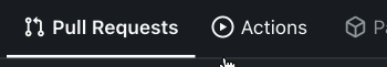
There is a small layout shift in when active tab changes. Notice how the
actions SVG is unstable:
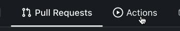
This is because the active item with bold text is wider then the
inactive one. I have applied [this
trick](https://stackoverflow.com/a/32570813/808699 ) to prevent this
layout shift. It's only active inside `<overflow-menu>` because I wanted
to avoid changing HTML and doing it in regular JS would cause a flicker.
I don't expect us to introduce other similar menus without
`<overflow-menu>`, so that place is likely fine.
I also changed the weight from 500 to 600, slightly reduced horizontal
padding, merged some tab-bar related CSS rules and a added a small
margin below repo-header so it does not look so crammed against the
buttons on top.
---------
Co-authored-by: wxiaoguang <wxiaoguang@gmail.com>
2024-03-20 17:00:35 +00:00
silverwind
8cad44f410
Remove the negative margin from .page-content ( #29922 )
...
The negative margin was suboptimal and presents a few unnecessary
challenges while styling the page. Remove it and add custom margin
values, which slightly changes the height a few things near the top of
the page as well:
15px less height of explore and login navbar:
<img width="899" alt="Screenshot 2024-03-20 at 00 52 34"
src="https://github.com/go-gitea/gitea/assets/115237/72a01ca4-5d17-4a0f-b915-61f95054fcb1 ">
15px reduced padding-top height of "user bar" and equal 4px padding
added:
<img width="484" alt="Screenshot 2024-03-20 at 00 52 50"
src="https://github.com/go-gitea/gitea/assets/115237/a8507e6d-372d-4a8b-9048-66fcf8a5facd ">
3px less padding on top of repo:
<img width="552" alt="Screenshot 2024-03-20 at 00 53 49"
src="https://github.com/go-gitea/gitea/assets/115237/dede6e44-7688-440f-a1b6-13532638ae03 ">
2024-03-20 11:21:18 +00:00
silverwind
256a1eeb9a
Add <overflow-menu>, rename webcomponents ( #29400 )
...
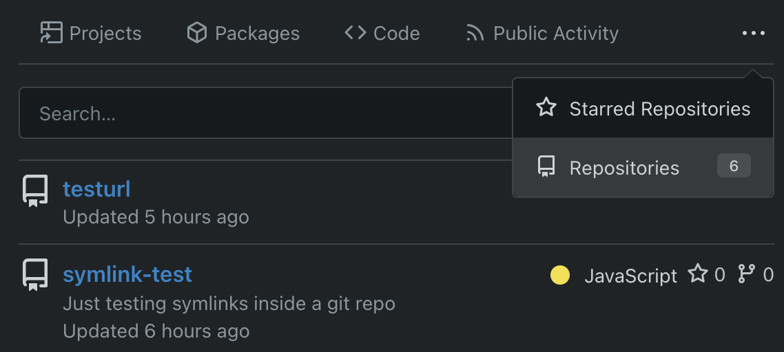
1. Add `<overflow-menu>` web component
2. Rename `<gitea-origin-url>` to `<origin-url>` and make filenames
match.
<img width="439" alt="image"
src="https://github.com/go-gitea/gitea/assets/115237/2fbe4ca4-110b-4ad2-8e17-c1e116ccbd74 ">
<img width="444" alt="Screenshot 2024-03-02 at 21 36 52"
src="https://github.com/go-gitea/gitea/assets/115237/aa8f786e-dc8c-4030-b12d-7cfb74bdfd6e ">
<img width="537" alt="Screenshot 2024-03-03 at 03 05 06"
src="https://github.com/go-gitea/gitea/assets/115237/fddd50aa-adf1-4b4b-bd7f-caf30c7b2245 ">

TODO:
- [x] Check if removal of `requestAnimationFrame` is possible to avoid
flash of content. Likely needs a `MutationObserver`.
- [x] Hide tippy when button is removed from DOM.
- [x] ~~Implement right-aligned items
(https://github.com/go-gitea/gitea/pull/28976 )~~. Not going to do it.
- [x] Clean up CSS so base element has no background and add background
via tailwind instead.
- [x] Use it for org and user page.
---------
Co-authored-by: Giteabot <teabot@gitea.io>
Co-authored-by: wxiaoguang <wxiaoguang@gmail.com>
2024-03-15 02:05:31 +00:00
wxiaoguang
62aa5e2cbd
Refactor star/watch button ( #29576 )
...
1. Use "star/unstart", but not `{{if}}un{{}}star{{}}` (the same to "watch/unwatch")
2. Use "not-mobile" for hiding the elements on mobile
2024-03-04 12:56:34 +00:00
Denys Konovalov
7d62615513
Revamp repo header ( #27760 )
...
Redesign repo header with following new aspects:
- responsive & better-looking repo title
- hide repo button text instead of icons in mobile view
- use same tab style as on explore and org page
<details>
<summary>Before:</summary>


</details>
<details>
<summary>After:</summary>


2024-01-12 03:44:06 +00:00