Commit Graph

209 Commits

Author SHA1 Message Date
wxiaoguang d32af84a10
Refactor hiding-methods, remove jQuery show/hide, remove `.hide` class, remove inline style=display:none (#22950)
Close #22847

This PR:

* introduce Gitea's own `showElem` and related functions
* remove jQuery show/hide
* remove .hide class
* remove inline style=display:none 

From now on:

do not use:
* "[hidden]" attribute: it's too weak, can not be applied to an element
with "display: flex"
* ".hidden" class: it has been polluted by Fomantic UI in many cases
* inline style="display: none": it's difficult to tweak
* jQuery's show/hide/toggle: it can not show/hide elements with
"display: xxx !important"

only use:
* this ".gt-hidden" class
* showElem/hideElem/toggleElem functions in "utils/dom.js"

cc: @silverwind , this is the all-in-one PR
2023-02-19 12:06:14 +08:00
Brecht Van Lommel 6221a6fd54
Scoped labels (#22585)
Add a new "exclusive" option per label. This makes it so that when the
label is named `scope/name`, no other label with the same `scope/`
prefix can be set on an issue.

The scope is determined by the last occurence of `/`, so for example
`scope/alpha/name` and `scope/beta/name` are considered to be in
different scopes and can coexist.

Exclusive scopes are not enforced by any database rules, however they
are enforced when editing labels at the models level, automatically
removing any existing labels in the same scope when either attaching a
new label or replacing all labels.

In menus use a circle instead of checkbox to indicate they function as
radio buttons per scope. Issue filtering by label ensures that only a
single scoped label is selected at a time. Clicking with alt key can be
used to remove a scoped label, both when editing individual issues and
batch editing.

Label rendering refactor for consistency and code simplification:

* Labels now consistently have the same shape, emojis and tooltips
everywhere. This includes the label list and label assignment menus.
* In label list, show description below label same as label menus.
* Don't use exactly black/white text colors to look a bit nicer.
* Simplify text color computation. There is no point computing luminance
in linear color space, as this is a perceptual problem and sRGB is
closer to perceptually linear.
* Increase height of label assignment menus to show more labels. Showing
only 3-4 labels at a time leads to a lot of scrolling.
* Render all labels with a new RenderLabel template helper function.

Label creation and editing in multiline modal menu:

* Change label creation to open a modal menu like label editing.
* Change menu layout to place name, description and colors on separate
lines.
* Don't color cancel button red in label editing modal menu.
* Align text to the left in model menu for better readability and
consistent with settings layout elsewhere.

Custom exclusive scoped label rendering:

* Display scoped label prefix and suffix with slightly darker and
lighter background color respectively, and a slanted edge between them
similar to the `/` symbol.
* In menus exclusive labels are grouped with a divider line.

---------

Co-authored-by: Yarden Shoham <hrsi88@gmail.com>
Co-authored-by: Lauris BH <lauris@nix.lv>
2023-02-18 21:17:39 +02:00
wxiaoguang 2e97a77e12
First step to refactor the `.hide` to `.gt-hidden` (#22916)
A separate PR from #22884 (without touching the jQuery methods)
2023-02-16 20:07:21 +08:00
Zettat123 71ee488098
Fix dark-colored description text in arc-green theme (#22908)
Fix #22873.
2023-02-14 13:05:19 -06:00
Lunny Xiao 00f695da48
Revert "Fix notification and stopwatch empty states" (#22876)
Per https://github.com/go-gitea/gitea/pull/22845#issuecomment-1426950234

Reverts go-gitea/gitea#22845

Let's have a better PR.

@silverwind @zeripath

Co-authored-by: zeripath <art27@cantab.net>
2023-02-12 08:18:07 +00:00
silverwind 8fa54d0fda
Fix notification and stopwatch empty states (#22845)
Previous solution was relying on fomantic selector `.ui.label.hidden` to
hide the elements in their empty state, but this doesn't work any more
with the removal of the `label` class. Instead, introduce a standalone
CSS rule for the `hidden` class, which is universally usable as a single
class.

We can unfortunately not use the existing `hide` class because without
the `!important`, it does not have enough specificity to win against
fomantic's `.ui.menu:not(.vertical) .item {display: flex}` rule.

Followup and fixes regression from
https://github.com/go-gitea/gitea/pull/22169.

Before:

<img width="98" alt="image"
src="https://user-images.githubusercontent.com/115237/217959380-d3279ff3-526a-4ac4-9a18-3ab7c9ae91dd.png">

After:

<img width="77" alt="image"
src="https://user-images.githubusercontent.com/115237/217959463-44852716-cb25-4110-8481-668842ad4454.png">
2023-02-11 21:45:58 +00:00
wxiaoguang affdd40296
Make issue title edit buttons focusable and fix incorrect ajax requests (#22807)
Replace #19922 , which is stale since my last review:
https://github.com/go-gitea/gitea/pull/19922#pullrequestreview-1003546506
and https://github.com/go-gitea/gitea/pull/19922#issuecomment-1153181546

Close #19769

Changes:
1. Use `<button>` instead of `<div>` for buttons
2. Prevent default event handler in `initGlobalButtonClickOnEnter`
3. Fix the incorrect call to `pullrequest_targetbranch_change`
4. Add a slight margin-left to the input element to make UI look better

The logic in repo-issue.js is not ideal, but this PR isn't going to
touch the logic.

This is also an example for future developers to understand how to make
buttons work properly.

### Before


![image](https://user-images.githubusercontent.com/2114189/217262515-ec0462f7-7051-46a5-bfa2-2f6c6a807b7d.png)

### After

* Add a slight margin-left.
* The `Cancel` button is focused.


![image](https://user-images.githubusercontent.com/2114189/217264891-934c9c8d-d190-4866-98b5-666cea57e28d.png)

Co-authored-by: techknowlogick <techknowlogick@gitea.io>
2023-02-09 12:11:16 -05:00
silverwind 90cf07a2c8
Improve notification and stopwatch styles (#22169)
- Add dot-style indicators to notification and time tracker
- Slightly reduce whitespace between right-aligned icons
- Move notification icon to right on mobile
- Switch menu icon to SVG

<img width="270" alt="Screenshot 2022-12-19 at 19 40 32"
src="https://user-images.githubusercontent.com/115237/208496795-ce8734a0-f109-47b7-8eb8-96931e867b23.png">
<img width="607" alt="Screenshot 2022-12-19 at 19 41 04"
src="https://user-images.githubusercontent.com/115237/208496797-2ff68197-f520-4174-927e-ead15addd63e.png">

---------

Co-authored-by: Lunny Xiao <xiaolunwen@gmail.com>
2023-02-09 13:42:18 +08:00
silverwind c2774d9e80
Fix color of tertiary button on dark theme (#22739)
Before:
<img width="266" alt="Screenshot 2023-02-03 at 14 07 34"
src="https://user-images.githubusercontent.com/115237/216611151-92e98305-c4b5-42f3-b2e2-8b1b805fa644.png">

After:
<img width="271" alt="Screenshot 2023-02-03 at 14 07 52"
src="https://user-images.githubusercontent.com/115237/216611156-878a8a75-39a1-415b-9b6d-4f035985444e.png">

This is the only instance of such a button in all templates.

---------

Co-authored-by: Lauris BH <lauris@nix.lv>
Co-authored-by: Lunny Xiao <xiaolunwen@gmail.com>
2023-02-04 11:17:43 +08:00
Jason Song 4011821c94
Implement actions (#21937)
Close #13539.

Co-authored by: @lunny @appleboy @fuxiaohei and others.

Related projects:
- https://gitea.com/gitea/actions-proto-def
- https://gitea.com/gitea/actions-proto-go
- https://gitea.com/gitea/act
- https://gitea.com/gitea/act_runner

### Summary

The target of this PR is to bring a basic implementation of "Actions",
an internal CI/CD system of Gitea. That means even though it has been
merged, the state of the feature is **EXPERIMENTAL**, and please note
that:

- It is disabled by default;
- It shouldn't be used in a production environment currently;
- It shouldn't be used in a public Gitea instance currently;
- Breaking changes may be made before it's stable.

**Please comment on #13539 if you have any different product design
ideas**, all decisions reached there will be adopted here. But in this
PR, we don't talk about **naming, feature-creep or alternatives**.

### ⚠️ Breaking

`gitea-actions` will become a reserved user name. If a user with the
name already exists in the database, it is recommended to rename it.

### Some important reviews

- What is `DEFAULT_ACTIONS_URL` in `app.ini` for?
  - https://github.com/go-gitea/gitea/pull/21937#discussion_r1055954954
- Why the api for runners is not under the normal `/api/v1` prefix?
  - https://github.com/go-gitea/gitea/pull/21937#discussion_r1061173592
- Why DBFS?
  - https://github.com/go-gitea/gitea/pull/21937#discussion_r1061301178
- Why ignore events triggered by `gitea-actions` bot?
  - https://github.com/go-gitea/gitea/pull/21937#discussion_r1063254103
- Why there's no permission control for actions?
  - https://github.com/go-gitea/gitea/pull/21937#discussion_r1090229868

### What it looks like

<details>

#### Manage runners

<img width="1792" alt="image"
src="https://user-images.githubusercontent.com/9418365/205870657-c72f590e-2e08-4cd4-be7f-2e0abb299bbf.png">

#### List runs

<img width="1792" alt="image"
src="https://user-images.githubusercontent.com/9418365/205872794-50fde990-2b45-48c1-a178-908e4ec5b627.png">


#### View logs

<img width="1792" alt="image"
src="https://user-images.githubusercontent.com/9418365/205872501-9b7b9000-9542-4991-8f55-18ccdada77c3.png">


</details>

### How to try it

<details>

#### 1. Start Gitea

Clone this branch and [install from
source](https://docs.gitea.io/en-us/install-from-source).

Add additional configurations in `app.ini` to enable Actions:

```ini
[actions]
ENABLED = true
```

Start it.

If all is well, you'll see the management page of runners:

<img width="1792" alt="image"
src="https://user-images.githubusercontent.com/9418365/205877365-8e30a780-9b10-4154-b3e8-ee6c3cb35a59.png">


#### 2. Start runner

Clone the [act_runner](https://gitea.com/gitea/act_runner), and follow
the
[README](https://gitea.com/gitea/act_runner/src/branch/main/README.md)
to start it.

If all is well, you'll see a new runner has been added:

<img width="1792" alt="image"
src="https://user-images.githubusercontent.com/9418365/205878000-216f5937-e696-470d-b66c-8473987d91c3.png">

#### 3. Enable actions for a repo

Create a new repo or open an existing one, check the `Actions` checkbox
in settings and submit.

<img width="1792" alt="image"
src="https://user-images.githubusercontent.com/9418365/205879705-53e09208-73c0-4b3e-a123-2dcf9aba4b9c.png">
<img width="1792" alt="image"
src="https://user-images.githubusercontent.com/9418365/205879383-23f3d08f-1a85-41dd-a8b3-54e2ee6453e8.png">

If all is well, you'll see a new tab "Actions":

<img width="1792" alt="image"
src="https://user-images.githubusercontent.com/9418365/205881648-a8072d8c-5803-4d76-b8a8-9b2fb49516c1.png">

#### 4. Upload workflow files

Upload some workflow files to `.gitea/workflows/xxx.yaml`, you can
follow the [quickstart](https://docs.github.com/en/actions/quickstart)
of GitHub Actions. Yes, Gitea Actions is compatible with GitHub Actions
in most cases, you can use the same demo:

```yaml
name: GitHub Actions Demo
run-name: ${{ github.actor }} is testing out GitHub Actions 🚀
on: [push]
jobs:
  Explore-GitHub-Actions:
    runs-on: ubuntu-latest
    steps:
      - run: echo "🎉 The job was automatically triggered by a ${{ github.event_name }} event."
      - run: echo "🐧 This job is now running on a ${{ runner.os }} server hosted by GitHub!"
      - run: echo "🔎 The name of your branch is ${{ github.ref }} and your repository is ${{ github.repository }}."
      - name: Check out repository code
        uses: actions/checkout@v3
      - run: echo "💡 The ${{ github.repository }} repository has been cloned to the runner."
      - run: echo "🖥️ The workflow is now ready to test your code on the runner."
      - name: List files in the repository
        run: |
          ls ${{ github.workspace }}
      - run: echo "🍏 This job's status is ${{ job.status }}."
```

If all is well, you'll see a new run in `Actions` tab:

<img width="1792" alt="image"
src="https://user-images.githubusercontent.com/9418365/205884473-79a874bc-171b-4aaf-acd5-0241a45c3b53.png">

#### 5. Check the logs of jobs

Click a run and you'll see the logs:

<img width="1792" alt="image"
src="https://user-images.githubusercontent.com/9418365/205884800-994b0374-67f7-48ff-be9a-4c53f3141547.png">

#### 6. Go on

You can try more examples in [the
documents](https://docs.github.com/en/actions/using-workflows/workflow-syntax-for-github-actions)
of GitHub Actions, then you might find a lot of bugs.

Come on, PRs are welcome.

</details>

See also: [Feature Preview: Gitea
Actions](https://blog.gitea.io/2022/12/feature-preview-gitea-actions/)

---------

Co-authored-by: a1012112796 <1012112796@qq.com>
Co-authored-by: Lunny Xiao <xiaolunwen@gmail.com>
Co-authored-by: delvh <dev.lh@web.de>
Co-authored-by: ChristopherHX <christopher.homberger@web.de>
Co-authored-by: John Olheiser <john.olheiser@gmail.com>
2023-01-31 09:45:19 +08:00
Chongyi Zheng a95247b7df
Fix autofilled text visibility in dark mode (#22088)
Fixes #22087
2022-12-13 19:06:23 +08:00
silverwind e2fa84fddc
Release and Tag List tweaks (#21712)
- Reduce font size on tag list and add muted links
- Move Release tag to right side on release list
- Move Release edit button to far-right and make it icon-only
- Add styles for error dropdowns, seen on release edit page
- Make the release page slightly more mobile-friendly

<img width="468" alt="Screen Shot 2022-11-07 at 22 10 44"
src="https://user-images.githubusercontent.com/115237/200417500-149f40f5-2376-42b4-92a7-d7eba3ac359d.png">

<img width="1015" alt="Screen Shot 2022-11-07 at 22 27 14"
src="https://user-images.githubusercontent.com/115237/200419201-b28f39d6-fe9e-4049-8023-b301c9bae528.png">
<img width="1019" alt="Screen Shot 2022-11-07 at 22 27 27"
src="https://user-images.githubusercontent.com/115237/200419206-3f07d988-42f6-421d-8ba9-303a0d59e711.png">

<img width="709" alt="Screen Shot 2022-11-07 at 22 42 10"
src="https://user-images.githubusercontent.com/115237/200421671-f0393cde-2d8f-4e1f-a788-f1f51fc4807c.png">
<img width="713" alt="Screen Shot 2022-11-07 at 22 42 27"
src="https://user-images.githubusercontent.com/115237/200421676-5797f8cf-dfe8-4dd6-85d4-dc69e31a9912.png">


<img width="406" alt="image"
src="https://user-images.githubusercontent.com/115237/200418220-8c3f7549-61b4-4661-935e-39e1352f7851.png">
<img width="416" alt="Screen Shot 2022-11-07 at 22 21 36"
src="https://user-images.githubusercontent.com/115237/200418107-cdb0eb6f-1292-469c-b89a-2cb13f24173c.png">

Co-authored-by: Lunny Xiao <xiaolunwen@gmail.com>
2022-12-06 21:15:46 +08:00
Percy Ma 9eb9cf5153
fix(web): reduce page jitter on browsers that support overlay scrollbar (#21850)
Reduce jitter caused by the presence or absence of scrollbars in page
switching

---

Ref [scrollbar-gutter |
MDN](https://developer.mozilla.org/en-US/docs/Web/CSS/scrollbar-gutter)


https://user-images.githubusercontent.com/45708948/165972251-7d5a5017-f76d-4ba2-9106-a224b3ee521f.mp4
2022-12-04 08:56:10 +00:00
silverwind ee21d5453f
Move all remaining colors into CSS variables (#21903)
This should eliminate all non-variable color usage in the styles, making
gitea fully themeable via CSS variables. Also, it adds a linter to
enforce variables for colors.
2022-11-23 08:22:27 +08:00
silverwind 1c7496c7a7
Webhook list enhancements (#21893) 2022-11-22 07:10:42 +08:00
silverwind 2e5ac53bdc
Embed Matrix icon as SVG (#21890)
Embed the SVG icon directly, making further invertion unnecessary
because the icon color can now follow text color.

<img width="240" alt="Screenshot 2022-11-21 at 20 16 32"
src="https://user-images.githubusercontent.com/115237/203142189-89f20de9-c0bd-4d05-92c0-44dadf20d78f.png">
<img width="245" alt="Screenshot 2022-11-21 at 20 16 46"
src="https://user-images.githubusercontent.com/115237/203142191-658239ba-1859-49c6-91ad-10ddf14780d0.png">
2022-11-21 20:25:26 +00:00
silverwind fefdb7ffd1
Timeline and color tweaks (#21799)
Followup to https://github.com/go-gitea/gitea/pull/21784.

- Restore muted effect on timeline author and issuelist comment icon
- Remove whitespace inside shared user templates, fixing link hover
underline
- Use shared author link template more
- Use `bold` class instead of CSS
- Fix grey-light color being too dark on arc-green
- Add missing black-light color
- Fix issuelist progress bar color
- Fix various other cases of missing `.muted`

<img width="416" alt="Screenshot 2022-11-13 at 12 15 22"
src="https://user-images.githubusercontent.com/115237/201519497-1d4725c6-bc8b-47b5-9f68-1278ac9a8c92.png">
<img width="324" alt="Screenshot 2022-11-13 at 12 16 52"
src="https://user-images.githubusercontent.com/115237/201519501-c0d03700-f9af-4316-ab46-482f2c7c738b.png">
<img width="79" alt="Screenshot 2022-11-13 at 12 30 55"
src="https://user-images.githubusercontent.com/115237/201519502-46dc2d73-bbdf-4a2e-84d3-d2976f793163.png">
<img width="440" alt="Screenshot 2022-11-13 at 12 41 03"
src="https://user-images.githubusercontent.com/115237/201519876-ada33948-f84a-4aeb-a40d-5c873f9a49e9.png">
<img width="213" alt="Screenshot 2022-11-13 at 12 52 54"
src="https://user-images.githubusercontent.com/115237/201520291-a4d7238e-aeca-46c7-9008-8b644b1b676e.png">
<img width="208" alt="Screenshot 2022-11-13 at 12 56 16"
src="https://user-images.githubusercontent.com/115237/201520436-aa8ba109-b959-42fb-831a-021e806c7082.png">

Co-authored-by: Lauris BH <lauris@nix.lv>
Co-authored-by: techknowlogick <techknowlogick@gitea.io>
Co-authored-by: wxiaoguang <wxiaoguang@gmail.com>
2022-11-19 12:02:30 +08:00
silverwind aed1622766
Simplify text color selectors and tweak arc-green colors (#21784)
Move the text color rules out of the unneeded `.ui` block, add missing
colors, tweak colors on arc-green to be more readable (red was
particulary bad to read).

Also, this removes the previous inheritance of link colors. I think
links should always be in primary color and if they are to be
discolored, the color should be set on them explicitely.

<img width="165" alt="Screenshot 2022-11-12 at 13 28 30"
src="https://user-images.githubusercontent.com/115237/201474098-700d9fed-3133-43c7-b57e-d4cc5c2795cb.png">

<img width="152" alt="Screenshot 2022-11-12 at 13 18 48"
src="https://user-images.githubusercontent.com/115237/201474156-b6de4cb5-bce8-4553-b3d4-8365aff9a3a7.png">

HTML to test with:

```html
<div class="text red">some text with <a href="#foo">a link</a>.</div>
<div class="text orange">some text with <a href="#foo">a link</a>.</div>
<div class="text yellow">some text with <a href="#foo">a link</a>.</div>
<div class="text olive">some text with <a href="#foo">a link</a>.</div>
<div class="text green">some text with <a href="#foo">a link</a>.</div>
<div class="text teal">some text with <a href="#foo">a link</a>.</div>
<div class="text blue">some text with <a href="#foo">a link</a>.</div>
<div class="text violet">some text with <a href="#foo">a link</a>.</div>
<div class="text purple">some text with <a href="#foo">a link</a>.</div>
<div class="text pink">some text with <a href="#foo">a link</a>.</div>
<div class="text brown">some text with <a href="#foo">a link</a>.</div>
<div class="text grey">some text with <a href="#foo">a link</a>.</div>
2022-11-12 16:30:52 +02:00
Yarden Shoham cb83288530
Add attention blocks within quote blocks for `Note` and `Warning` (#21711)
For each quote block, the first `**Note**` or `**Warning**` gets an icon
prepended to it and its text is colored accordingly. GitHub does this
(community/community#16925). [Initially requested on
Discord.](https://discord.com/channels/322538954119184384/322538954119184384/1038816475638661181)

### Before

![image](https://user-images.githubusercontent.com/20454870/200408558-bd318302-6ff9-4d56-996f-9190e89013ec.png)

### After

![image](https://user-images.githubusercontent.com/20454870/200658863-1bac6461-dae7-4bf2-abd2-672d209574e4.png)

Signed-off-by: Yarden Shoham <hrsi88@gmail.com>
Co-authored-by: delvh <dev.lh@web.de>
Co-authored-by: silverwind <me@silverwind.io>
2022-11-09 02:11:26 +02:00
silverwind 07178f4d0c
Use CSS color-scheme instead of invert (#21616)
The
[`color-scheme`](https://developer.mozilla.org/en-US/docs/Web/CSS/color-scheme)
property changes the base color of certain form elements like the
datepicker icon in Chrome. Set it and remove the previous invert hack.

Before with invert removed:
<img width="840" alt="Screen Shot 2022-10-27 at 11 42 54"
src="https://user-images.githubusercontent.com/115237/198251927-b742e14e-0c62-492c-b667-ee6c69de4ad8.png">
<img width="238" alt="Screen Shot 2022-10-27 at 12 23 28"
src="https://user-images.githubusercontent.com/115237/198260413-37c1ca85-c2de-4c09-8b37-6aa8a23ab575.png">

After:
<img width="841" alt="Screen Shot 2022-10-27 at 11 43 05"
src="https://user-images.githubusercontent.com/115237/198251934-568fa291-0d18-4cd4-adec-58ae1ad90ab2.png">
<img width="839" alt="Screen Shot 2022-10-27 at 11 44 36"
src="https://user-images.githubusercontent.com/115237/198251936-a435105e-572b-41f6-8262-a53820f1d364.png">
<img width="243" alt="Screen Shot 2022-10-27 at 12 23 42"
src="https://user-images.githubusercontent.com/115237/198260432-5eaffc82-ffb8-4559-b1c2-08a39e8f4427.png">

Co-authored-by: Lunny Xiao <xiaolunwen@gmail.com>
2022-10-28 13:45:08 +08:00
silverwind 06a7ed4e04
Consolidate remaining colors into variables (#21582)
Remove remaining non-color variables in arc-green, so the theme is now
100% defined from variables (excluding inverts). Adjusted red/green to
match previous overwritten colors.

`--color-gold-light` is removed, it was unused and is not part of
fomantic colors.

<img width="772" alt="Screen Shot 2022-10-24 at 20 22 25"
src="https://user-images.githubusercontent.com/115237/197599339-1d1bf6e3-aa90-4f38-9753-24effd4b178d.png">
<img width="275" alt="Screen Shot 2022-10-24 at 20 25 52"
src="https://user-images.githubusercontent.com/115237/197599344-79c1d3ac-c709-4e30-a60b-4738af672c12.png">
<img width="446" alt="Screen Shot 2022-10-24 at 20 26 46"
src="https://user-images.githubusercontent.com/115237/197599346-f2ef6449-7efd-4f81-bbb6-e7bee4528f50.png">

Co-authored-by: Lunny Xiao <xiaolunwen@gmail.com>
2022-10-25 07:08:54 +03:00
silverwind f982a71997
CSS color enhancements (#21534)
- Add
[`accent-color`](https://developer.mozilla.org/en-US/docs/Web/CSS/accent-color)
which will change the color of various native HTML elements from
OS-color to specified one. Affects unstyled checkbox, radio, range and
progress
- Change `--color-accent` to `--color-primary-light-1`
- Change progress bar color to `--color-accent`
- Add new `--color-primary-contrast` meant to contrast over primary
- Avoid layout shift on clicking `.viewed-file-form`
- Add styles for `input[type=file]` upload button

<img width="301" alt="Screen Shot 2022-10-21 at 18 05 35"
src="https://user-images.githubusercontent.com/115237/197246896-7b3b5591-2934-4436-bf37-6aebcdfecb13.png">
<img width="98" alt="Screen Shot 2022-10-21 at 19 41 27"
src="https://user-images.githubusercontent.com/115237/197256892-c8fc6a0a-5d2f-4757-a98b-a79f9b7fcbc5.png">
<img width="93" alt="image"
src="https://user-images.githubusercontent.com/115237/197257029-293c02e9-ebf9-448a-a58f-ca418cf36953.png">
<img width="204" alt="Screen Shot 2022-10-21 at 18 21 24"
src="https://user-images.githubusercontent.com/115237/197246957-a99f5178-bbd5-4204-bd32-7a6977026f76.png">
<img width="449" alt="Screen Shot 2022-10-21 at 18 56 59"
src="https://user-images.githubusercontent.com/115237/197249305-d481abb7-9f16-4b48-936a-c75ed29f5b04.png">
<img width="449" alt="Screen Shot 2022-10-21 at 18 57 09"
src="https://user-images.githubusercontent.com/115237/197249309-7ab70c3b-325e-41bc-a4ba-07402c6826b6.png">

Co-authored-by: delvh <dev.lh@web.de>
Co-authored-by: Lunny Xiao <xiaolunwen@gmail.com>
2022-10-23 12:05:20 +08:00
Yarden Shoham e828564445
Add color previews in markdown (#21474)
* Resolves #3047

Every time a color code will be in \`backticks`, a cute little color
preview will pop up


[Inspiration](https://docs.github.com/en/get-started/writing-on-github/getting-started-with-writing-and-formatting-on-github/basic-writing-and-formatting-syntax#supported-color-models)

#### Before

![image](https://user-images.githubusercontent.com/20454870/196631524-298afbbf-d2c8-4018-92a5-0393a693d850.png)

#### After

![image](https://user-images.githubusercontent.com/20454870/196631397-36c561e4-08f5-465a-a36e-76084e30b08a.png)

Signed-off-by: Yarden Shoham <hrsi88@gmail.com>
Co-authored-by: KN4CK3R <admin@oldschoolhack.me>
Co-authored-by: silverwind <me@silverwind.io>
Co-authored-by: Lunny Xiao <xiaolunwen@gmail.com>
2022-10-21 20:00:53 +08:00
Lunny Xiao f860a6d2e4
Add system setting table with cache and also add cache supports for user setting (#18058) 2022-10-17 07:29:26 +08:00
Yarden Shoham b9cd6fb703
Add `code` highlighting in issue titles (#21432)
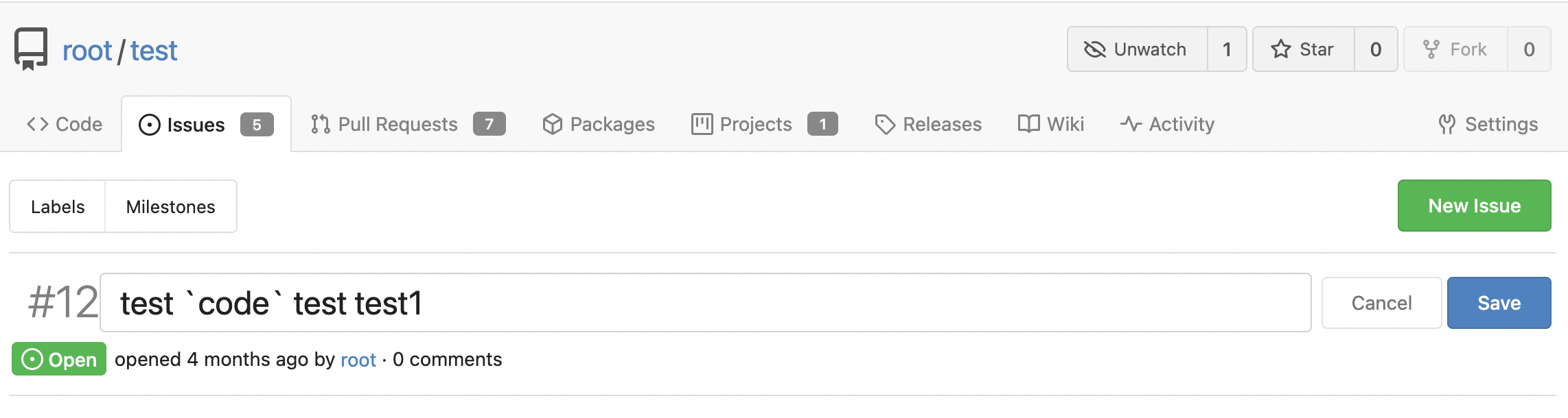
This changes the rendering logic of issue titles. If a substring in an
issue title is enclosed with a pair of backticks, it'll be rendered with
a monospace font (HTML `code` tag).

* Closes #20887

Signed-off-by: Yarden Shoham <hrsi88@gmail.com>
Co-authored-by: Gusted <williamzijl7@hotmail.com>
Co-authored-by: wxiaoguang <wxiaoguang@gmail.com>
Co-authored-by: 6543 <6543@obermui.de>
2022-10-16 02:24:41 +08:00
silverwind ac3a61ea17
Consolidate more CSS colors into variables (#21402)
Move more colors into variables. The only real notable change is the dot
in the release timeline. Also, made the variable comments a bit more
clear.

<img width="279" alt="Screen Shot 2022-10-10 at 21 10 23"
src="https://user-images.githubusercontent.com/115237/194938496-e5a21056-67c4-4219-9c68-134b0edf0e61.png">

<img width="88" alt="Screen Shot 2022-10-10 at 21 31 53"
src="https://user-images.githubusercontent.com/115237/194939712-f666c43e-fb1a-4045-be52-1176391bd8ea.png">

<img width="90" alt="Screen Shot 2022-10-10 at 21 31 44"
src="https://user-images.githubusercontent.com/115237/194939710-2e620c06-75a9-41b7-a3e1-18eab7a57614.png">

Co-authored-by: wxiaoguang <wxiaoguang@gmail.com>
Co-authored-by: techknowlogick <techknowlogick@gitea.io>
2022-10-12 12:26:27 -04:00
qwerty287 a813c9d8f3
Allow creation of OAuth2 applications for orgs (#18084)
Adds the settings pages to create OAuth2 apps also to the org settings
and allows to create apps for orgs.

Refactoring: the oauth2 related templates are shared for
instance-wide/org/user, and the backend code uses `OAuth2CommonHandlers`
to share code for instance-wide/org/user.

Co-authored-by: wxiaoguang <wxiaoguang@gmail.com>
2022-10-09 20:07:41 +08:00
delvh 81d7270cde
Add new CSS variables --color-accent and --color-small-accent (#21305)
At the moment, this is only used to replace the color of the `viewed`
checkbox and of the `has changed` label.
Previously, the used variable accentuated always either darker or
lighter, which meant that one theme looked good while the other didn't.

Co-authored-by: silverwind <me@silverwind.io>
2022-10-07 17:48:03 +08:00
silverwind 677a09eb74
Consolidate more CSS rules, fix inline code on arc-green (#21260)
- Consolidate various CSS rules into base rules
- Fix inline code in Markdown not having enough contrast on arc-green

Adds one new color variable, `--color-label-active-bg` for the
background of active labels.

Co-authored-by: wxiaoguang <wxiaoguang@gmail.com>
2022-09-28 21:19:22 +08:00
silverwind 3f9e323ecd
Various CSS tweaks (#21244)
- Remove arc-green specific rules and instead fix the colors in the base
rules.
- Make file table row border visible on arc-green.
- Remove remnants of fomantic accordeon module that was removed.
2022-09-22 22:00:29 -05:00
silverwind d0e3c53815
Enable fluid page layout on medium size viewports (#21178)
Fomantic has abrupt breakpoints at 991px and 768px which leads to
variable amounts of wasted screen space below those breakpoints.
Instead, enable fluid width for all viewport sizes below 1200px.
2022-09-19 14:50:15 +02:00
silverwind afdab9d8d4
Remove fomantic image module (#21145)
Remove this small, but unnecessary
[module](https://fomantic-ui.com/elements/image.html) and use `img`
selector over previous `.image`. Did a few tests, could not notice any
visual regression.

Co-authored-by: 6543 <6543@obermui.de>
Co-authored-by: Lauris BH <lauris@nix.lv>
2022-09-12 17:08:46 +08:00
Jason Song 84447df4d3
Support Issue forms and PR forms (#20987)
* feat: extend issue template for yaml

* feat: support yaml template

* feat: render form to markdown

* feat: support yaml template for pr

* chore: rename to Fields

* feat: template unmarshal

* feat: split template

* feat: render to markdown

* feat: use full name as template file name

* chore: remove useless file

* feat: use dropdown of fomantic ui

* feat: update input style

* docs: more comments

* fix: render text without render

* chore: fix lint error

* fix: support use description as about in markdown

* fix: add field class in form

* chore: generate swagger

* feat: validate template

* feat: support is_nummber and regex

* test: fix broken unit tests

* fix: ignore empty body of md template

* fix: make multiple easymde editors work in one page

* feat: better UI

* fix: js error in pr form

* chore: generate swagger

* feat: support regex validation

* chore: generate swagger

* fix: refresh each markdown editor

* chore: give up required validation

* fix: correct issue template candidates

* fix: correct checkboxes style

* chore: ignore .hugo_build.lock in docs

* docs: separate out a new doc for merge templates

* docs: introduce syntax of yaml template

* feat: show a alert for invalid templates

* test: add case for a valid template

* fix: correct attributes of required checkbox

* fix: add class not-under-easymde for dropzone

* fix: use more back-quotes

* chore: remove translation in zh-CN

* fix EasyMDE statusbar margin

* fix: remove repeated blocks

* fix: reuse regex for quotes

Co-authored-by: wxiaoguang <wxiaoguang@gmail.com>
2022-09-02 15:58:49 +08:00
silverwind 94549bcd11
Change review buttons to icons to make space for text (#20934)
The layout on the review code view was broken depending on length of the text. Change all three buttons to icons with tooltip to make more space for these long texts.

Fixes: #20922
2022-08-26 18:49:40 +02:00
silverwind d751e35d81
Use separate class for tippy targets (#20742)
Previous solution that re-purposed the 'hide' class by making it
`!important` had various unintended side-effects where jQuery .show() was
not able to outweight it. Use a separate class to prevent these
interactions.
2022-08-10 22:47:28 +08:00
silverwind 1b2cd4c4e1
Replace fomantic popup module with tippy.js (#20428)
- replace fomantic popup module with tippy.js
- fix chaining and add comment
- add 100ms delay to tooltips
- stopwatch improvments, raise default maxWidth
- update web_src/js/features/common-global.js
- use type=submit instead of js
2022-08-09 14:37:34 +02:00
Luke Wyatt fe78d35ef5
Background color of private list-items updated (#20630)
A minor color update on the dashboard. This PR simply changes the background from hard-coded light yellow to the theme colors (var).
2022-08-06 22:25:58 +08:00
Gusted 9691d43101
Fix dashboard switching on Mobile (#20238)
- This is a regression of improving mobile experience on Gitea, currently organization dashboard aren't readable and the popup won't show up when you want to switch between users/organization(as we saw in #19978). 
- This patch fixes that, by allowing the popup to allocate the required pixels(for some absurd reason, z-index doesn't work on the popup, so it's not able to render over the existing elements, we can investigate later of why this is). And also remove the additional dropdown menu for the pages link, so it's one unified list which then can be displayed as rows.
2022-07-28 20:40:23 +02:00
Lucas Azevedo 599ae09a94
Use body text color in repository files table links (#20386)
Use body text color in for links in the repository files table
Issue/PR links (`.ref-issue`) will not be affected, as seen in other git services.

Co-authored-by: silverwind <me@silverwind.io>
Co-authored-by: wxiaoguang <wxiaoguang@gmail.com>
Co-authored-by: Lauris BH <lauris@nix.lv>
2022-07-22 18:49:24 +08:00
silverwind c7fa5cc017
Update JS dependencies (#20423)
- Update all JS dependencies minus vue ones
- Remove workaround for case-insensitive attribute selector
- Add new linter rules and fix issues
- Tested SVG display and swagger
2022-07-20 23:48:06 +08:00
zeripath 1e43a88578
Refix notification bell placement (#20251)
The use of `m-4 text black` for the notification bell results in this
icon being shifted upwards. Instead we should use the `item` class but
adjust `not-mobile` and `mobile-only` to make their `display: none`
settings `!important`.

(As an aside: This is probably one of the only times we should use
`!important` in our less files and the rest should be avoided or
removed.)

Ref #20069
Revert #20236

Signed-off-by: Andrew Thornton <art27@cantab.net>
2022-07-06 18:33:10 +01:00
Gusted 36127a3336
Don't prevent overflow on y-as (#19978)
- Fomantic tries to prevent overflowing on the `y/x`-as by default on
stackable menu's on mobile screens. We already solve this issue by
forcing overflow on x as and hide it on y as(due to some issues with
other menu's), since https://github.com/go-gitea/gitea/pull/19486.
- However this edge case does require a y-overflow to show the dropdown,
because you cannot easily adjust this with CSS, once you're fiddling
with overflow's (https://stackoverflow.com/a/6433475). However
interesting behavior is noted
https://css-tricks.com/popping-hidden-overflow/ when you remove the
position: relative, it will suddenly work again. Well because this is
the only solution without redesigning dropdowns, I think we can live
with the side-effect of the dropdown items being full-width instead
"relative" width to their parent.
- Resolves #19976

Co-authored-by: Lunny Xiao <xiaolunwen@gmail.com>
2022-06-16 22:49:22 +08:00
silverwind b4d420d865
Replace unstyled meter with progress (#19968)
Replace the only `<meter>` element in use with a `<progress>` which is
styled properly. Also slightly adjust colors on it for better contrast.

Co-authored-by: Lunny Xiao <xiaolunwen@gmail.com>
2022-06-15 12:28:24 +08:00
6543 a9cc9c0f7a
Auto merge pull requests when all checks succeeded via WebUI (#19648)
Add WebUI part of Auto merge feature

close #19621

Co-authored-by: wxiaoguang <wxiaoguang@gmail.com>
Co-authored-by: delvh <dev.lh@web.de>
2022-06-11 16:44:20 +02:00
Lauris BH f92b7a6331
Add support for rendering terminal output with colors (#19497) 2022-06-09 00:46:39 +03:00
Martijn de Boer 89a8b3e163
Limit max-height of CodeMirror editors for issue comment and wiki (#18271)
* Make the wiki editor bar sticky for longer wiki edits

On codeberg community it was requested to make the wiki editor toolbar sticky for longer wiki posts, so one wouldn't have to scroll to the top to use it. (Reference; https://codeberg.org/Codeberg/Community/issues/533).

In order to make this happen, the .editor-toolbar class needs to become position: sticky, and we need to fix it's transparent background and border-bottom. Because the bottom disappears, we add it. This makes the border become a double border, because the CodeMirror area defines borders for all. As such I've added a border-top: none, on the wiki write tab for the CodeMirror class.

* Make the issue bar in the issue view sticky for issue #10675

In issue #10675 it's requested to make the issue bar sticky upon scrolling in the issue view. The proposed change changes inline html, which is not desirable. As such I've added the position sticky option to it's container, and fix the background upon scrolling.

* Make linter happy on _repository.less

Fix 0px -> 0 to make the linter happy.

* Make linter happy on _editor.less

Fix 0px -> 0 to make the linter happy.

* Change z-index to the lowest boundary of 1

As per review of @silverwind change the z-index to it's lowest requirement of 1.

* Change z-index to the lowest boundary of 1

As per review of @silverwind change the z-index to it's lowest requirement of 1.

* Revert changes made to wiki editor (unsticky) and add max-height

Fixes the max-height to 85vh, on the proposed 90vh it just came out just slightly too large.
Unstickies the changes from the sticky commits.

* Revert changes for the sticky title editor

Removes the changes as done by the sticky title editor.

* Add max-height definition to CodeMirror-scroll

Add the max-height definition for the CodeMirror-scroll class in order to generalize the changes spoken about in PR #18271

* Remove CodeMirror-scroll definition

Remove the max-height in CodeMirror-scroll definition, in order to generalize it in the CodeMirror less file. As per discussion in #18271.

* fine tune CodeMirror min-height/max-height

Co-authored-by: 6543 <6543@obermui.de>
Co-authored-by: wxiaoguang <wxiaoguang@gmail.com>
Co-authored-by: Lunny Xiao <xiaolunwen@gmail.com>
2022-06-05 09:09:50 +01:00
silverwind ac8bee6aeb
Remove fomantic progress module (#19760)
Replace it with HTML `<progress>` element. The bar won't go green at
100% anymore but I think it's not something that fits stylistically anyways.
2022-05-20 05:04:45 +02:00
silverwind 9da3d78e74
Replace blue button and label classes with primary (#19763)
* make blue really blue

* replace blue button and label classes with primary

* add --color-blue-dark

* add light color variants, tweak a few colors

* fix colors

* add comment

Co-authored-by: wxiaoguang <wxiaoguang@gmail.com>
2022-05-20 00:08:08 +02:00
Gusted 89eec15dd9
By default force vertical tabs on mobile (#19486)
* By default force vertical tabs on mobile

- While experimenting with using vertical tabs instead of horizontal
tabs on gitea for a better mobile experience, I made a recent
PR(https://github.com/go-gitea/gitea/pull/19468) in order to see if
there was any objections to this new behavior for the repo headers(one
of the most annoying horizontal tabs). This PR had no objections and
even a user commenting that this change is brilliant.
- This PR now improves upon the previous PR by making this the de-facto
behavior for all menu's on mobile. The only exemption is the navbar
which also uses the menu but caught some layout errors with the changes.

* Fix organisation

* Fix repo/wiki buttons

Co-authored-by: Lunny Xiao <xiaolunwen@gmail.com>
2022-04-26 16:31:58 -04:00
delvh 4dabc212c7
Disallow selecting the text of buttons (#19330)
Introduce a CSS class `.unselectable`
2022-04-14 16:57:19 +08:00