These settings can allow users to only display the repositories explore page.

Thanks to yp05327 and wxiaoguang !

---------

Co-authored-by: Giteabot <teabot@gitea.io>
Co-authored-by: wxiaoguang <wxiaoguang@gmail.com>
Fixes: https://github.com/go-gitea/gitea/issues/29981. Introduce
`.secondary-nav` as a universal way for styling and margin adjustments
inside `.page-content`.

If the first child of `.page-content` is `.secondary-nav`, we add margin
below it, otherwise we add padding to the first child. Notable changes:

- `--color-header-wrapper` is replaced with `--color-secondary-nav-bg`.
- `navbar` class is removed.

---------

Co-authored-by: Giteabot <teabot@gitea.io>
Co-authored-by: wxiaoguang <wxiaoguang@gmail.com>
Fixes https://github.com/go-gitea/gitea/issues/30005. Regression from
https://github.com/go-gitea/gitea/pull/29945.

There was only once instance of `tw-content-center` before that PR, so I
just ran below command and reverted that one instance.

```sh
perl -p -i -e 's#tw-content-center#tw-items-center#g' web_src/js/**/* templates/**/* models/**/* tests/**/*
```
1. Use general "mobile-only" and "not-mobile" CSS styles, remove some`@media (max-width: 767.98px)` tricks
2. Use `CountFmt` for repo list, just like the repo header (and it matches GitHub, to avoid big numbers bloat the page)
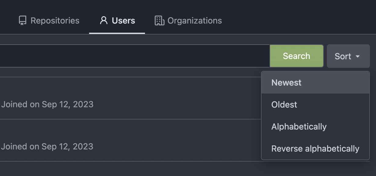
Thanks to inferenceus : some sort orders on the "explore/users" page
could list users by their lastlogintime/updatetime.
It leaks user's activity unintentionally. This PR makes that page only
use "supported" sort orders.
Removing the "sort orders" could also be a good solution, while IMO at
the moment keeping the "create time" and "name" orders is also fine, in
case some users would like to find a target user in the search result,
the "sort order" might help.

Follow #29165

* some of them are incorrect, which would lead to double escaping (eg:
`(print (Escape $.RepoLink)`)
* other of them are not necessary, because `Tr` handles strings&HTML
automatically

Suggest to review by "unified view":
https://github.com/go-gitea/gitea/pull/29394/files?diff=unified&w=0
The `.new-menu` was using a pseudo-element based fade-out effect.
Replace this with a more modern mask-based effect which in this case
required a child element to avoid fading out the background as well, so
I applied it to child `new-menu-inner` which was present on all these
menus except explore where I added it.

There is no visual difference except that the items on the explore page
have no `gap` between them any longer, making it consistent with other
menus. Before and after:

<img width="221" alt="Screenshot 2023-09-21 at 21 13 19"
src="https://github.com/go-gitea/gitea/assets/115237/b4a38ce2-cee1-4c54-84a5-e1d0bfd79e29">
<img width="222" alt="Screenshot 2023-09-21 at 21 32 36"
src="https://github.com/go-gitea/gitea/assets/115237/bb6b1335-d935-4ad4-bb85-3b0fc3027c2b">

Also, this cleans up the related CSS vars:

- `--color-header-wrapper-transparent` is removed, no longer needed
- `--color-header-wrapper` is defined in base theme as well, was
previously unset and therefor transparent.

[no whitespace
diff](https://github.com/go-gitea/gitea/pull/27181/files?diff=unified&w=1)
[demo of mask fade](https://jsfiddle.net/silverwind/tsfadb3u/)
1. There is already `gt-ac`, so no need to introduce `flex-item-center`
2. The `flex-item-baseline` and `.flex-item-icon svg { margin-top: 1px
}` seem to be a tricky patch, they don't resolve the root problem, and
still cause misalignment in some cases.
* The root problem is: the "icon" needs to align with the sibling
"title"
* So, make the "icon" and the "title" both have the same height
3. `flex-text-inline` could only be used if the element is really
"inline", otherwise its `vertical-align` would make the box size change.
In most cases, `flex-text-block` is good enough.

---------
Co-authored-by: silverwind <me@silverwind.io>
Co-authored-by: Giteabot <teabot@gitea.io>
This PR implements a proposal to clean up the admin users table by
moving some information out to a separate user details page (which also
displays some additional information).
Other changes:
- move edit user page from `/admin/users/{id}` to
`/admin/users/{id}/edit` -> `/admin/users/{id}` now shows the user
details page
- show if user is instance administrator as a label instead of a
separate column
- separate explore users template into a page- and a shared one, to make
it possible to use it on the user details page
- fix issue where there was no margin between alert message and
following content on admin pages
<details>
<summary>Screenshots</summary>


</details>
Partially resolves#25939
---------
Co-authored-by: Giteabot <teabot@gitea.io>
- Set
[type=search](https://developer.mozilla.org/en-US/docs/Web/HTML/Element/input/search)
- Disable spellcheck
- Set maxLength 255 that I found in `templates/repo/issue/search.tmpl`
- Remove unnecessary `max-width`, it does nothing

---------

Co-authored-by: delvh <dev.lh@web.de>
Co-authored-by: Giteabot <teabot@gitea.io>
The Repolist contains the Number of Stars and Forks. Now these Numbers
are a Link to the corresponding pages of the Repo.

Co-authored-by: Giteabot <teabot@gitea.io>
The correct thing to do is to translate the entire phrase into a single
string. The previous translation assumed all languages have a space
between the "joined on" and the date (and that "joined on" comes before
the date).

Some languages, like Hebrew, have no space between the "joined on" and
the date. For example:
```ini
joined_on=נרשם ב-%s
```
("joined" becomes נרשם, "on" is ב and when paired with a date we use a
dash to connect ב with the date)
Don't remember why the previous decision that `Code` and `Release` are
non-disable units globally. Since now every unit include `Code` could be
disabled, maybe we should have a new rule that the repo should have at
least one unit. So any unit could be disabled.
Fixes#20960Fixes#7525
---------
Co-authored-by: delvh <dev.lh@web.de>
Co-authored-by: yp05327 <576951401@qq.com>
I am not sure what "new-menu" means, but I think we need to fix these
problems:

1. it shouldn't have "stackable", which makes the items stacked when
width is small. the `new-menu` already has `overflow: auto`
2. `justify-content: center` doesn't work with `overflow: auto` (for
small width), so use `margin: auto`
*
https://bhch.github.io/posts/2021/04/centring-flex-items-and-allowing-overflow-scroll/
3. `runner-new-menu` is dead code (copying & pasting ?)
This refactors the `shared/datetime/short|long|full` templates into a
template helper function, which allows us to render absolute date times
within translatable phrases.
- Follows #23988
- The first attempt was in #24055
- This should help #22664
Changes:
1. Added the `DateTime` template helper that replaces the
`shared/datetime/short|long|full` templates
2. Used find-and-replace with varying regexes to replace the templates
from step 1 (for example, `\{\{template "shared/datetime/(\S+) \(dict
"Datetime" ([^"]+) "Fallback" ([^\)]+\)?) ?\)?\}\}` -> `{{DateTime "$1
$2 $3}}`)
3. Used the new `DateTime` helper in the issue due date timestamp
rendering
# Before

# After

---------
Signed-off-by: Yarden Shoham <git@yardenshoham.com>
Co-authored-by: wxiaoguang <wxiaoguang@gmail.com>