Denys Konovalov
7d62615513
Revamp repo header ( #27760 )
...
Redesign repo header with following new aspects:
- responsive & better-looking repo title
- hide repo button text instead of icons in mobile view
- use same tab style as on explore and org page
<details>
<summary>Before:</summary>


</details>
<details>
<summary>After:</summary>


2024-01-12 03:44:06 +00:00
Lunny Xiao
c65f8623e6
Hide code related setting options in repository when code unit is disabled ( #28631 )
...
Since #20805 , code can be hidden.
However, the related settings are still shown even though they don't
have any meaning then.
https://github.com/go-gitea/gitea/assets/81045/5fdee54d-ac81-418a-82f7-eadff048cedd
2024-01-10 11:55:59 +00:00
JakobDev
a80debc208
Add download attribute to release attachments ( #28739 )
...
Fixes #28736
2024-01-09 16:51:20 +08:00
Kyle D
e522e774ca
Add merge arrow direction and update styling ( #28523 )
...
Close https://github.com/go-gitea/gitea/issues/28522
~Adds some [negative
margin](https://tailwindcss.com/docs/margin#using-negative-values )
helper css classes using tailwind's [prefix
syntax](https://tailwindcss.com/docs/configuration#prefix )~
### Before

### After

2024-01-05 17:38:56 +00:00
wxiaoguang
e743570f65
Refactor timeutil package ( #28623 )
...
1. make names more readable
2. remove unused FormatLong/FormatShort
3. use `FormatDate` instead of `Format "2006-01-02"`
2023-12-28 10:09:57 +00:00
wxiaoguang
04b235d094
Fix 500 error of searching commits ( #28576 )
...
Regression of #28454 . Now the string is escaped HTML, so it doesn't
need `| Safe`.

Fix #28575
2023-12-21 23:09:14 +00:00
David Øvrelid
128eac9e0b
Fix duplicate ID when deleting repo ( #28520 )
...
There is an accessibility issue in the interface when attempting to
delete a repository. When I click on "Delete repository," a dialog box
appears, requiring confirmation to proceed with the repository deletion.
However, when I press the "Repo name" label, the wrong input field gains
focus. The focused field is located behind the dialog and is intended
for renaming the repository.
2023-12-19 04:40:05 +00:00
wxiaoguang
20929edc99
Add option to disable ambiguous unicode characters detection ( #28454 )
...
* Close #24483
* Close #28123
* Close #23682
* Close #23149

(maybe more)
2023-12-17 14:38:54 +00:00
Panagiotis "Ivory" Vasilopoulos
dac7728e9d
Issue fixes for RSS feed improvements ( #28380 )
...
Follow-up for #28368

- Just replace button with an a-element with the button class
- Remove useless link-action class from template/org/home.tmpl
2023-12-07 03:01:32 +00:00
Lauris BH
bfacb5c501
Fix margin in server signed signature verification view ( #28379 )
...
Before:
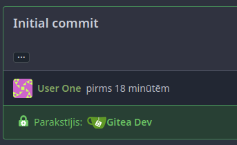
After:

2023-12-07 01:51:39 +00:00
Panagiotis "Ivory" Vasilopoulos
22cb5b0c17
Improve RSS feed icons ( #28368 )
...
- The RSS Feed icons were placed in a proper button, so that it does
  not look "inconsistent". This also makes the problem of the button
  being improperly aligned go away.
- The icon that shows on user profiles has not been modified because
  of a lack of better implementation ideas.
- Where applicable, the RSS Feed icon was put directly next to the
  Follow button (right menu), as both functionalities effectively
  share the same purpose.
- Despite the attempt at achieving less inconsistency, a conscious
  decision to not add any text to those buttons was made, opting for
  tooltips instead. "Make it present, but not too annoying."
- A special exception was made for the Releases pages (which contains
  text, not a tooltip), where an RSS feed would be particularly
  beneficial to users.

The fact that the RSS functionality is explicitly optional was taken
into account, and these improvements were made with public-facing
instances (where the feature works best) in mind.
2023-12-06 20:29:26 +00:00
Lunny Xiao
09d5028442
Fix the runs will not be displayed bug when the main branch have no workflows but other branches have ( #28359 )
2023-12-06 01:13:59 +00:00
KN4CK3R
b3c258828f
Refactor template empty checks ( #28351 )
2023-12-04 15:48:42 -06:00
Denys Konovalov
4d7c063f9e
Use full width for project boards ( #28225 )
...
Inspired by #28182
2023-11-27 17:43:52 +00:00
JakobDev
709a376c51
Fix link to Code tab on wiki commits ( #28041 )
...
Fixes https://codeberg.org/forgejo/forgejo/issues/1759

If you are bowing another branch than the default branch and click n the
Code tab, it will take you to the root of the branch. The `BranchName`
variable is also set when viewing a Wiki commit, so we also need to
check if we are on a Wiki.
2023-11-27 05:59:56 +00:00
Nanguan Lin
7d1933717d
Use full width for PR comparison ( #28182 )
...
Follow-up #22844
close #28142
Before

After

Co-authored-by: Giteabot <teabot@gitea.io>
2023-11-23 15:52:57 +00:00
Nanguan Lin
778d604346
Fix missing buttons ( #28179 )
...
fix #28173
regression #25948
That PR is supposed to only change the style but somehow delete a code
snippet. See the
diff(https://github.com/go-gitea/gitea/pull/25948/files#diff-7c36d66fe058f4ff9f2beaac73cf710dca45b350d0dd98daf806828a4745fe62L125-L129 )
for details.
---------
Co-authored-by: wxiaoguang <wxiaoguang@gmail.com>
2023-11-23 11:36:52 +01:00
Nanguan Lin
37ed92d6fd
Revert "Fix EOL handling in web editor" ( #28101 )
...
Reverts go-gitea/gitea#27141
close #28097
2023-11-22 09:14:16 +00:00
yp05327
a6a674e26a
Add guide page to actions when there's no workflows ( #28145 )
...
Before:
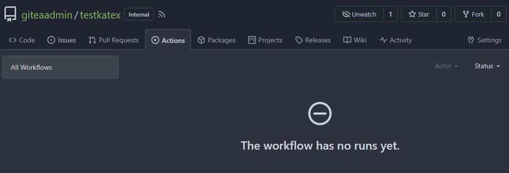
After:

2023-11-21 08:27:33 +00:00
Lunny Xiao
0c0d17f17e
Fix empty action run title ( #28113 )
...
Fix #27901
2023-11-21 03:00:59 +00:00
JakobDev
08552f0076
Add edit option for README.md ( #28071 )
...
Fix #28059

2023-11-20 11:47:55 +00:00
sebastian-sauer
e31c6cfe6e
Fix Show/hide filetree button on small displays ( #27881 )
...
the gt-df's display:flex !important did override the display:none on small displays

---------

Co-authored-by: wxiaoguang <wxiaoguang@gmail.com>
2023-11-17 18:35:51 +00:00
sebastian-sauer
49dddd87b1
Improve PR diff view on mobile ( #27883 )
...
1. Show diff stats only on large screens
these are already shown in tabs, so no need for this duplicate
information on small screens


2. Hide viewed files information on small screens
Github does the same and this gives us more free space on small screens


3. Review bar now doesn't wrap so we don't need the 77px even on very
small screens
(the sticky headers are still working)

2023-11-16 11:58:53 +08:00
yp05327
4a0103fa29
Add word-break to repo description in home page ( #27924 )
...
In #25315 , @denyskon fixed UI on mobile view.
But for the repo description, on desktop view there's no word-break.
So maybe we can just add `gt-word-break` to fix it on both mobile view
and desktop view.
Before:
desktop view:

mobile view:

After:
desktop view:

mobile view(almost same?)

---------
Co-authored-by: silverwind <me@silverwind.io>
2023-11-07 23:52:08 +00:00
Sebastian Brückner
e80f446d3a
Fix rendering assignee changed comments without assignee ( #27927 )
...
When an assignee changed event comment is rendered, most of it is
guarded behind the assignee ID not being 0. However, if it is 0, that
results in quite broken rendering for that comment and the next one.
This can happen, for example, when repository data imported from outside
of Gitea is incomplete.
This PR makes sure comments with an assignee ID of 0 are not rendered at
all.
---
Screenshot before:
<img width="272" alt="Bildschirmfoto 2023-11-05 um 20 12 18"
src="https://github.com/go-gitea/gitea/assets/42910/7d629d76-fee4-4fe5-9e3a-bf524050cead ">
The comments in this screenshot are:
1. A regular text comment
2. A user being unassigned
3. A user being assigned
4. The title of the PR being changed
Comments 2 and 3 are rendered without any text, which indents the next
comment and does not leave enough vertical space.
Co-authored-by: Giteabot <teabot@gitea.io>
2023-11-07 19:45:06 +01:00
yp05327
3a924fdc83
Add word break to release title ( #27942 )
...
Before:

After:

2023-11-07 10:53:04 +00:00
yp05327
7a2ff6c162
Fix edit topic UI ( #27925 )
...
Before:
desktop view:

mobile view:

after click `Save` btn:


refresh the page, you will see that `gt-m-0` is missing after save
topic:

After:
desktop view:

mobile view:

after click `Save` btn:

2023-11-06 09:23:50 +00:00
sebastian-sauer
37a7c551d4
Show correct commit sha when viewing single commit diff ( #27916 )
...
Show the correct sha when viewing a single commit.

2023-11-06 00:39:32 +01:00
Earl Warren
c46080bc9d
Remove "tabindex" from some form buttons ( #27892 )
...
Remove the "tabindex" from some form buttons on the "diff box" / "issue view content" page, let the browser use the default tab order.

---------

Co-authored-by: Gusted <postmaster@gusted.xyz>
Co-authored-by: wxiaoguang <wxiaoguang@gmail.com>
2023-11-03 14:40:48 +00:00
yp05327
dcb648ee71
Add Hide/Show all checks button to commit status check ( #26284 )
...
Step one for a GitHub like commit status check ui:


Step two:


The design now will list all commit status checks which takes too much
space.
This is a pre-improve for #26247
---------
Co-authored-by: delvh <dev.lh@web.de>
Co-authored-by: silverwind <me@silverwind.io>
Co-authored-by: wxiaoguang <wxiaoguang@gmail.com>
2023-11-02 14:49:02 +00:00
KN4CK3R
4776fde9e1
Display issue task list on project cards ( #27865 )
...
Display the issue task list on project cards.
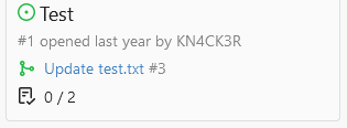
Co-authored-by: Giteabot <teabot@gitea.io>
2023-11-02 11:42:02 +01:00
Brecht Van Lommel
1756e30e10
Allow pull requests Manually Merged option to be used by non-admins ( #27780 )
...
Currently this feature is only available to admins, but there is no
clear reason why. If a user can actually merge pull requests, then this
seems fine as well.

This is useful in situations where direct pushes to the repository are
commonly done by developers.

---------

Co-authored-by: delvh <dev.lh@web.de>
2023-10-30 11:13:06 +08:00
silverwind
05aa91e6da
Add dedicated class for empty placeholders ( #27788 )
...
Fixes: https://github.com/go-gitea/gitea/issues/27784
<img width="1033" alt="Screenshot 2023-10-25 at 19 07 15"
src="https://github.com/go-gitea/gitea/assets/115237/1a363851-1a86-48cb-99ec-0a573371bb6e ">
<img width="1051" alt="Screenshot 2023-10-25 at 19 07 41"
src="https://github.com/go-gitea/gitea/assets/115237/add4b606-2264-430a-af35-249ef005817f ">
Co-authored-by: KN4CK3R <admin@oldschoolhack.me>
2023-10-25 23:42:14 +02:00
Brecht Van Lommel
7a286e4753
Improve pull request command line instructions ( #27778 )
...
* Show checkout instructions also when there is no permission to push,
for anyone who wants to locally test the changes.
* First checkout the branch exactly as is, without immediately having to
solve merge conflicts. Leave this to the merge step, since it's often
convenient to test a change without worrying about this.
* Use `git fetch -u`, so an existing local branch is updated when
re-testing the same pull request. But not the more risky `git fetch -f`
in to handle force pushes, as we don't want to accidentally overwrite
important local changes.
* Show different merge command depending on the chosen merge style,
interactively updated.
2023-10-25 15:01:31 +00:00
silverwind
572f0963ed
Only show diff file tree when more than one file changed ( #27775 )
...
When 0 or 1 files changed in a diff, we don't need to show a file tree.
This behaviour matches GitHub. Single-file diff after this change, note
absence of button:
<img width="1234" alt="image"
src="https://github.com/go-gitea/gitea/assets/115237/3618438b-e655-42a3-989f-f299267b2b8b ">
Co-authored-by: Giteabot <teabot@gitea.io>
2023-10-25 05:09:18 +02:00
silverwind
d8c09c25d1
Enable followCursor for language stats bar ( #27713 )
...
Fixes: https://github.com/go-gitea/gitea/issues/27600

Also tested together with https://github.com/go-gitea/gitea/pull/27704 ,
works well.
2023-10-22 13:06:04 +00:00
6543
adbc995c34
Show total TrackedTime on issue/pull/milestone lists ( #26672 )
...
TODOs:
- [x] write test for `GetIssueTotalTrackedTime`
- [x] frontport kitharas template changes and make them mobile-friendly
---


---
*Sponsored by Kithara Software GmbH*
2023-10-19 14:08:31 +00:00
JakobDev
398eccb322
Fix required checkboxes in issue forms ( #27592 )
...
If you set a checkbox as required in a issue form at the moment, the
checkbox is checked and read only, what does not make much sense. With
this PR, the Checkbox actually needs to be checked. The label supports
now also Markdown. This matches GitHub's behaviour.
And yes, I know the CSS is a ugly workaround. It looks like the given
CSS code is part Fomantic and I don't know how to change that. The
Maintainers are free to change that.

2023-10-19 11:43:15 +00:00
sebastian-sauer
7210f23fa0
Add link for repositories README file ( #27684 )
...
this allows to deep link to the readme section of a repository.
fixes #27641
Screenshots:
No changes on initial display:
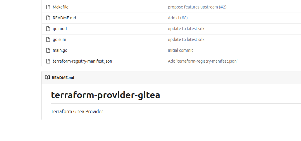
On hover the link is shown:

2023-10-18 17:59:46 -05:00
yp05327
8abc1aae4a
Improve the list header in milestone page ( #27302 )
...
The ui of list header in milestone page is not same as issue and pr list
page.
And they are using different template codes which can be merged into
one.
Before:


After:


---------
Co-authored-by: puni9869 <80308335+puni9869@users.noreply.github.com>
2023-10-18 00:03:42 +00:00
puni9869
4adc2a828d
Hide archived labels by default from the suggestions when assigning labels for an issue ( #27451 )
...
Followup of #27115
Finally closes #25237
## Screenshots
### Issue Sidebar
<img width="513" alt="image"
src="https://github.com/go-gitea/gitea/assets/80308335/9f7fda2f-5a03-4684-8619-fd3498a95b41 ">
### PR sidebar
<img width="367" alt="image"
src="https://github.com/go-gitea/gitea/assets/80308335/53db9b64-faec-4a67-91d6-76945596a469 ">
### PR sidebar with archived labels shown
<img width="352" alt="image"
src="https://github.com/go-gitea/gitea/assets/80308335/9dc5050f-4e69-4f76-bb83-582480a2281e ">
---------
Signed-off-by: puni9869 <punitinani1@hotmail.com>
Co-authored-by: silverwind <me@silverwind.io>
2023-10-17 16:10:45 +02:00
Denys Konovalov
0271114e64
cleanup repo details icons/labels ( #27644 )
...
Fix #27596
Change confusing behavior when showing information about a repo via
labels and icons. Implement changes proposed by @lng2020 in
https://github.com/go-gitea/gitea/pull/27627#pullrequestreview-1678787673 .
2023-10-16 23:06:15 +02:00
Earl Warren
89c9a498fd
Add anchor to review types ( #26894 )
...
- The review type '22' is a general comment type that is attached to
single codecomments, reviews with multiple comments or to simple approve
and request changes comment. This comment can be used to create a link
towards this action on an pull request.
- Adds an anchor to the review comment type, so that when its getting
linked to it, it actually jumps towards that event.
- This also now fixes the behavior that after you created a review you
will be redirected to that review and because this is an general comment
type other mails will also be 'fixed' such as the approved or request
changes.
- Resolves https://codeberg.org/forgejo/forgejo/issues/1248

(cherry picked from commit 1741a5f1fe6adc68bb5f87bdd1c5bdc5bfaa45c7)

---------

Co-authored-by: Gusted <postmaster@gusted.xyz>
Co-authored-by: Caesar Schinas <caesar@caesarschinas.com>
2023-10-14 16:13:59 -05:00
silverwind
73b63d9311
Replace ajax with fetch, improve image diff ( #27267 )
...
1. Dropzone attachment removal, pretty simple replacement
2. Image diff: The previous code fetched every image twice, once via
`img[src]` and once via `$.ajax`. Now it's only fetched once and a
second time only when necessary. The image diff code was partially
rewritten.

---------

Co-authored-by: Giteabot <teabot@gitea.io>
2023-10-11 12:34:21 +00:00
JakobDev
ebe803e514
Penultimate round of db.DefaultContext refactor ( #27414 )
...
Part of #27065

---------

Co-authored-by: Lunny Xiao <xiaolunwen@gmail.com>
2023-10-11 04:24:07 +00:00
Kyle D
ac4ae35542
Remove max-width and add hide text overflow ( #27359 )
...
Closes https://github.com/go-gitea/gitea/issues/27358
2023-10-09 19:04:31 -04:00
wxiaoguang
d1527dac3d
Improve file history UI and fix URL escaping bug ( #27531 )
...
Follow #27354
Major changes:
1. The `right aligned` in `<th class="one wide right aligned">` is a
no-op because it doesn't have any content
2. The `gt-df` in `<td class="sha gt-df">` was wrong, it causes UI
misalignment, a table cell shouldn't be "flex"
3. Use `gt-py-0` for `gt-pt-0 gt-pb-0`
4. Simplify the layout for buttons, because the `text right aligned` is
widely used and good enough, it doesn't make sense to introduce the
`<div class="gt-df gt-je">`
5. Escape the `$.FileName` correctly
Before:
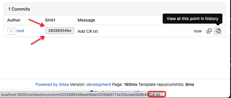
After:

2023-10-09 07:19:23 +00:00
silverwind
5bf367f904
Restore warning commit status ( #27504 )
...
Partial revert of https://github.com/go-gitea/gitea/pull/25839 . This
commit status is used by a number of external integrations, so I think
we should not remove it (See
https://github.com/go-gitea/gitea/pull/25839#issuecomment-1729002077 ).
This is a rare case where an existing migration needed to be alterted to
avoid data loss.
---------
Co-authored-by: delvh <dev.lh@web.de>
Co-authored-by: Giteabot <teabot@gitea.io>
2023-10-08 22:16:06 +00:00
mohammed ahmed
551dc8bb4d
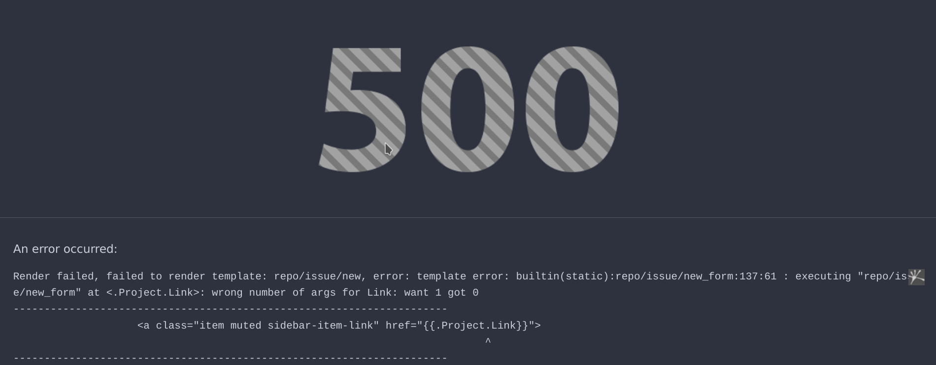
[FIX] missing ctx in new_form ( #27514 )
...
added the ctx for the project link in new_form.tmpl
---
2023-10-08 14:35:20 +08:00
silverwind
0bccf078c9
Update JS and PY dependencies ( #27501 )
...
- Update all JS and PY dependencies
- Enable eslint `prefer-object-has-own` and autofix issue
- Fix styling on citation buttons
- Tested citation, mermaid, monaco, swagger, katex
Citation button issue was that these buttons were not filled:
<img width="136" alt="Screenshot 2023-10-07 at 14 05 08"
src="https://github.com/go-gitea/gitea/assets/115237/435f0c91-28ac-46b3-bae4-dad768b29c05 ">
Co-authored-by: techknowlogick <techknowlogick@gitea.com>
2023-10-08 00:16:20 +00:00
Lunny Xiao
dd221b9aec
Fix pr template ( #27436 )
...
Fix #27431
2023-10-04 12:28:25 +00:00
CaiCandong
df56b1bf92
Fix missing ctx in new_form.tmpl ( #27434 )
...
Fix  #27432
Regression of #27265
2023-10-04 12:12:17 +02:00
silverwind
cbc0b7307d
Use flex-container for repo and org settings ( #27418 )
...
Same as https://github.com/go-gitea/gitea/pull/26046 but for repo and
org settings pages, reducing the margins between the boxes:
<img width="1247" alt="Screenshot 2023-10-03 at 23 25 19"
src="https://github.com/go-gitea/gitea/assets/115237/4e68ad5e-5fdc-4466-aefb-ec71bf411d45 ">
<img width="1255" alt="Screenshot 2023-10-03 at 23 27 12"
src="https://github.com/go-gitea/gitea/assets/115237/9068369b-a75d-401e-8b8d-3bd4bbe097dc ">
Co-authored-by: Giteabot <teabot@gitea.io>
2023-10-04 08:47:54 +02:00
Denys Konovalov
33de64cb21
link to file from its history ( #27354 )
...
Fixes #3852
Fixes https://github.com/go-gitea/gitea/issues/26707

Add a button on file history which directs you to the file at the
selected commit.

Co-authored-by: silverwind <me@silverwind.io>
2023-10-02 04:04:32 +00:00
puni9869
50070550a8
Hide archived labels when filtering by labels on the issue list ( #27115 )
...
Followup https://github.com/go-gitea/gitea/pull/26820
## Archived labels UI for issue filter and issue filter actions for
issues/pull request pages.
Changed:
* Enhanced the Issue filter and Issue filter actions UI page to
seamlessly incorporate a list of archived labels.
* Pagination functionality is same as before. If archived label checkbox
is checked then we are adding a query string`archived=true` in the url
to save the state of page.
* Issue filter actions menu is separated into different template.
* Adding the archived flag in issue url labels.
* Pull Request page is also work the same.
Outsourced:
* Defer the implementation of specialized handling for archived labels
to upcoming pull requests. This step will be undertaken subsequent to
the successful merge of this pull request.
Screenshots
### Issue page
<img width="1360" alt="image"
src="https://github.com/go-gitea/gitea/assets/80308335/d7efb2ef-5b2b-449d-83f0-d430a32ec432 ">
### Issue page with label filter on archived label checkbox when not
checked --> No archived label is there in list
<img width="1249" alt="image"
src="https://github.com/go-gitea/gitea/assets/80308335/ceea68ef-91f2-4693-910f-2e25e236bfc9 ">
### Issue page with label filter on archived label checkbox when checked
--> Show archived label in the list.
<img width="710" alt="image"
src="https://github.com/go-gitea/gitea/assets/80308335/2414d26b-2079-4c3c-bd9e-f2f5411bcabf ">
### Issue page with label filter on issue action menu on archived label
checkbox when checked --> Show archived label in the list.
<img width="409" alt="image"
src="https://github.com/go-gitea/gitea/assets/80308335/259cac87-3e21-4778-99a2-a6a0b8c81178 ">
### Applied the archived=true in Issue labels when archived checkbox is
checked.
<img width="984" alt="image"
src="https://github.com/go-gitea/gitea/assets/80308335/657ce3db-c0ae-402e-b12d-3b580d3c2ed0 ">
---
Part of https://github.com/go-gitea/gitea/issues/25237
---------
Signed-off-by: puni9869 <punitinani1@hotmail.com>
Co-authored-by: delvh <dev.lh@web.de>
Co-authored-by: Giteabot <teabot@gitea.io>
2023-10-01 09:04:39 -04:00
Lunny Xiao
7d14aa062f
Fix template bug ( #27362 )
...
Fix #27361
2023-09-30 17:03:04 +08:00
Lunny Xiao
c3b7231966
Add protected branch name description ( #27257 )
...
Co-authored-by: delvh <dev.lh@web.de>
2023-09-29 14:02:35 +00:00
JakobDev
cf0df023be
More db.DefaultContext refactor ( #27265 )
...
Part of #27065

This PR touches functions used in templates. As templates are not static
typed, errors are harder to find, but I hope I catch it all. I think
some tests from other persons do not hurt.
2023-09-29 12:12:54 +00:00
Dmitry Sharshakov
5e02e3b7ee
Add support for forking single branch ( #25821 )
...
Fixes #25117
Add UI for choosing branch to fork
Change default branch on single-branch forks

---------
Co-authored-by: Denys Konovalov <kontakt@denyskon.de>
Co-authored-by: Lunny Xiao <xiaolunwen@gmail.com>
Co-authored-by: wxiaoguang <wxiaoguang@gmail.com>
2023-09-29 09:48:39 +08:00
wxiaoguang
1f00bc44b2
Fix review UI ( #27322 )
...
Close #26730
1. The `diff-detail-box` was abused, it shouldn't be used for
"DiffFileList/DiffFileTree".
2. Fix the sticky position for various screens.


2023-09-28 10:00:26 +00:00
wxiaoguang
7ea2a910ce
Improve branch list UI ( #27319 )
...
1. Put the `"octicon-shield-lock"` into the flex container, then it
doesn't need a separate flex box
2. Remove some unnecessary `gt-df` helpers
3. Make `btn` button has the same flex behavior as `ui button`


2023-09-28 04:04:32 +00:00
yp05327
e5e1d842c0
Fix protected branch icon location ( #26576 )
2023-09-27 22:21:31 +00:00
wxiaoguang
93bd4351bf
Fix more "locale" usages ( #27259 )
2023-09-25 20:42:40 +08:00
delvh
7960ba7e2b
Always use ctx.Locale.Tr inside templates ( #27231 )
2023-09-25 08:56:50 +00:00
Yarden Shoham
e6d8b14620
Disable Test Delivery and Replay webhook buttons when webhook is inactive ( #27211 )
...
These buttons are now disabled when the webhook is not active.
The buttons were always enabled before this change.
- Fixes #26824
- Replaces #26814
# Before


# After


Signed-off-by: Yarden Shoham <git@yardenshoham.com>
2023-09-25 07:33:00 +00:00
Denys Konovalov
2325fe777d
cleanup locale function usage ( #27227 )
2023-09-24 20:31:58 +00:00
silverwind
3a187eace5
Fix EOL handling in web editor ( #27141 )
...
Fixes https://github.com/go-gitea/gitea/issues/27136 .
This does the following for Monaco's EOL setting:
1. Use editorconfig setting if present
2. Use the file's dominant line ending as detected by monaco, which uses
LF for empty file
2023-09-24 19:51:02 +00:00
JakobDev
5f7388e586
Allow copying issue comment link on archived repos and when not logged in ( #27193 )
...
Fixes https://codeberg.org/Codeberg/Community/issues/1303
2023-09-23 11:31:54 +00:00
metiftikci
6c563a302a
fix: text decorator on issue sidebar menu label ( #27206 )
...
fix underline for label on issue sidebar
2023-09-23 18:51:23 +08:00
wxiaoguang
1f026bcb7e
Fix dropdown icon position ( #27175 )
...
According to https://fomantic-ui.com/modules/dropdown.html and our
"devtest" page, many dropdown elements has incorrect "icon" position.

This PR fixes all of them. Fix #27173
2023-09-21 15:54:26 +00:00
silverwind
8099238618
Change green buttons to primary color ( #27099 )
...
I think it's better if the primary actions have primary color instead of
green which fits better into the overall single-color UI design. This PR
currently replaces every green button with primary:
<img width="141" alt="Screenshot 2023-09-16 at 14 07 59"
src="https://github.com/go-gitea/gitea/assets/115237/843c1e50-4fb2-4ec6-84ba-0efb9472dcbe ">
<img width="161" alt="Screenshot 2023-09-16 at 14 07 51"
src="https://github.com/go-gitea/gitea/assets/115237/9442195a-a3b2-4a42-b262-8377d6f5c0d1 ">
Modal actions now use uncolored/primary instead of previous green/red
colors. I also removed the box-shadow on all basic buttons:
<img width="259" alt="Screenshot 2023-09-16 at 14 16 39"
src="https://github.com/go-gitea/gitea/assets/115237/5beea529-127a-44b0-8d4c-afa7b034a490 ">
<img width="261" alt="Screenshot 2023-09-16 at 14 17 42"
src="https://github.com/go-gitea/gitea/assets/115237/4757f7b2-4d46-49bc-a797-38bb28437b88 ">
The change currently includes the "Merge PR" button, for which we might
want to make an exception to match the icon color there:
<img width="442" alt="Screenshot 2023-09-16 at 14 33 53"
src="https://github.com/go-gitea/gitea/assets/115237/993ac1a5-c94d-4895-b76c-0d872181a70b ">
2023-09-18 22:05:31 +00:00
puni9869
a50d9af876
Display archived labels specially when listing labels ( #26820 )
...
Follow up https://github.com/go-gitea/gitea/pull/26741

Changes:
Added archived label for org labels and added into issue filter list.


Part of https://github.com/go-gitea/gitea/issues/25237

---------

Signed-off-by: puni9869 <punitinani1@hotmail.com>
Co-authored-by: silverwind <me@silverwind.io>
2023-09-18 04:54:05 +00:00
wxiaoguang
e97baed800
Remove a gt-float-right and some unnecessary helpers ( #27110 )
...
Follow Remove polluted .ui.right #26825
Remove more `gt-float-right`, remove unnecessary helpers, remove
negative margin tricks.

2023-09-18 12:25:36 +08:00
Lunny Xiao
47b878858a
Search branches ( #27055 )
...
Resolve #25233
<img width="1315" alt="图片"
src="https://github.com/go-gitea/gitea/assets/81045/3ba59b58-471a-4e1b-985c-87edac2268c0 ">
<img width="1297" alt="图片"
src="https://github.com/go-gitea/gitea/assets/81045/b6caa12f-323b-4f70-9c44-ef91cb71a26c ">
2023-09-17 08:24:40 +00:00
KN4CK3R
ed64f1c2b8
Support .git-blame-ignore-revs file ( #26395 )
...
Closes #26329
This PR adds the ability to ignore revisions specified in the
`.git-blame-ignore-revs` file in the root of the repository.

The banner is displayed in this case. I intentionally did not add a UI
way to bypass the ignore file (same behaviour as Github) but you can add
`?bypass-blame-ignore=true` to the url manually.
---------
Co-authored-by: wxiaoguang <wxiaoguang@gmail.com>
2023-09-16 17:42:34 +00:00
KN4CK3R
c766140dad
Add RemoteAddress to mirrors ( #26952 )
...
This PR adds a new field `RemoteAddress` to both mirror types which
contains the sanitized remote address for easier (database) access to
that information. Will be used in the audit PR if merged.
2023-09-16 16:03:02 +00:00
KN4CK3R
f3f445862e
Use print instead of printf ( #27093 )
...
A bit more performant when we only use it for appending strings.
2023-09-16 03:51:54 +00:00
yp05327
076eca8158
Fix incorrect default branch label while switching between branches ( #27053 )
...
Fix #27008
2023-09-14 03:54:25 +00:00
Kerwin Bryant
a38eca3f52
Fix Fomantic's line-height causing vertical scrollbars to appear ( #26961 )
...
Before:

After:

---
1. **Remove the scroll bar exception that in the a tag**
2. **Reduce the actual width of the a tag to the actual width of the
content**

As shown in the screenshot, the red box area should not be clickable
2023-09-13 09:08:45 +00:00
wxiaoguang
739e47cd80
Improve repo/user/org search ( #27030 )
...
* Fix a regression from #26809 (the `data-org` is missing)
* Remove unnecessary style
Screenshots:


2023-09-12 16:44:48 +00:00
wxiaoguang
1875362383
Fix "delete" modal dialog for issue/PR ( #27015 )
...
Close #27012
By the way, rename the single-word ID to a long ID.


2023-09-11 17:06:05 +00:00
wxiaoguang
dd6e8ab57b
Improve "language stats" UI ( #26968 )
...
Before:
* The layout is quite complex
* The UI flickers when switch the stats (https://try.gitea.io/ )
After:
* Simplify the code
* The UI doesn't flicker
2023-09-10 18:27:23 +08:00
Lunny Xiao
9c0a3532a4
Add a new column schedule_id for action_run to track ( #26975 )
...
Fix #26971
And the UI now will display it's scheduled but not triggered by a push.
<img width="954" alt="图片"
src="https://github.com/go-gitea/gitea/assets/81045/d211845c-457e-4c3e-af1f-a0d654d3f365 ">
2023-09-08 23:01:19 +08:00
wxiaoguang
ffa4949eaa
Improve flex list UI ( #26970 )
...
1. There is already `gt-ac`, so no need to introduce `flex-item-center`
2. The `flex-item-baseline` and `.flex-item-icon svg { margin-top: 1px
}` seem to be a tricky patch, they don't resolve the root problem, and
still cause misalignment in some cases.
* The root problem is: the "icon" needs to align with the sibling
"title"
* So, make the "icon" and the "title" both have the same height
3. `flex-text-inline` could only be used if the element is really
"inline", otherwise its `vertical-align` would make the box size change.
In most cases, `flex-text-block` is good enough.

---------
Co-authored-by: silverwind <me@silverwind.io>
Co-authored-by: Giteabot <teabot@gitea.io>
2023-09-08 13:57:18 +00:00
wxiaoguang
419003adb2
Improve SSH Key / GPG Key / Deploy Key UI ( #26949 )
...
1. In many cases, the `flex-list` has previous and next `gt-hidden`
siblings, so relax the CSS selector to remove all ".segument .flex-list"
paddings.
2. Make the "Add key" button can toggle
3. Move help message into the related segment(panel). Otherwise users
would misread the message, eg: the SSH help seemed for GPG because they
are so near
4. Move modal element into the segment element, otherwise it affects the
layout
2023-09-07 01:13:11 +00:00
Kerwin Bryant
9b0743ae33
Extract common code to new template ( #26933 )
...
Same as #26903
2023-09-06 10:11:06 +00:00
Kerwin Bryant
65588b732c
Extract common code to new template ( #26903 )
...
I noticed that the code of several new webhook pages is highly
repetitive, so I pulled out the common parts to a new template, unified
reference, unified maintenance

---------

Co-authored-by: KN4CK3R <admin@oldschoolhack.me>
2023-09-05 12:00:28 +00:00
wxiaoguang
682552378f
More fixes for the "commit-body" ( #26898 )
...
The changes for "commit-body" in #26877 are not ideal.

The reason is: the "commit-body" is usually a `<pre>`, it has default
margins. In most cases, we do not need that large margin. So, this PR
introduces a general but small margin for all "commit-body" elements.
Then these `gt-m-0` could be removed.

The `:not` selector is not needed, because the `.timeline-item` selector
is already clear enough.
2023-09-04 13:38:59 +00:00
wxiaoguang
51cfe0e7de
Remove CSS has selector and improve various styles ( #26891 )
...
Replace #26850
Major changes:
1. Remove all `has` selectors, it is still not supported by firefox.
Actually there could be some more general and clearer approaches
2. Remove `two-toggle-buttons`, the `.ui.buttons` just works well
3. Rewrite the `.ui.buttons` border styles, see the screenshots
4. Remove the "fine-tuning" paddings from the the flex children, they
could layout themselves well.


2023-09-04 18:22:46 +08:00
wxiaoguang
fba7150ca9
Refactor "shortsha" ( #26877 )
...
The old code used complex `if` blocks and strange HTML layouts.
<details>

</details>
This PR refactors the template code and remove legacy CSS styles. The UI
doesn't change much.


2023-09-03 02:58:52 +00:00
silverwind
a625f3a761
Enable djlint H008 and fix issues ( #26869 )
...
Enable `H008 | Attributes should be double quoted` and fix issues.
2023-09-01 17:32:39 +00:00
silverwind
9b76df53dc
Minor dashboard tweaks, fix flex-list margins ( #26829 )
...
Some small dashboard tweaks:
- Remove margin-bottom from divider so first item does not appear to
have un-equal margins
- Restore previous icon color
- Add slight margin-right to icon
Before:
<img width="783" alt="Screenshot 2023-08-31 at 00 10 28"
src="https://github.com/go-gitea/gitea/assets/115237/b75f70d7-8704-4afb-866d-fea0484c52d4 ">
After:
<img width="783" alt="Screenshot 2023-08-31 at 00 10 08"
src="https://github.com/go-gitea/gitea/assets/115237/50ed0c47-6f7c-449e-a054-13091369d43f ">
---------
Co-authored-by: wxiaoguang <wxiaoguang@gmail.com>
2023-08-31 21:28:45 +00:00
wxiaoguang
d5703d4a1b
Remove "TODO" tasks from CSS file ( #26835 )
...
1. Use `gt-invisible` instead of `invisible`.
2. Use `gt-word-break` instead of `dont-break-out` (there is a slight
different "hyphens", but I think it won't affect too much since it is
only used for the "full name").
3. Remove `.small.button:has(svg)` , now our buttons could layout SVG
correctly, and actually I didn't see this CSS class is used in code.
2023-08-31 10:49:53 +00:00
silverwind
3d109861dd
Render code blocks in repo description ( #26830 )
...
Backtick syntax now works in repo description too. Also, I replaced the
CSS for this was a new single class, making it more flexible and not
dependent on a parent. Also, very slightly reduced font size from 16.8px
to 16px.

---------

Co-authored-by: wxiaoguang <wxiaoguang@gmail.com>
2023-08-31 05:01:01 +00:00
wxiaoguang
19a1e1b20e
Remove polluted .ui.right ( #26825 )
...
Each change is tested manually line by line. There are too many changes
so I can't share dozens of screenshots.

In short:

1. `ui right` could be still used in `ui top attached header`, because
there is a special case.
2. A lot of `ui right` are just no-op, so they can be removed safely.
3. Some of the `ui right` should be replaced by `gt-float-right` (to
avoid breaking, leave them to the future).
4. A few of the `ui right` could be rewritten by flex.
2023-08-31 02:29:59 +00:00
wxiaoguang
1bb9b1c4d9
Remove polluted ".ui.left" style ( #26809 )
2023-08-30 21:46:24 +08:00
yp05327
008f5d8cf1
Add default label in branch select list ( #26697 )
2023-08-29 12:15:19 +00:00
CaiCandong
c576b50441
Fix being unable to use a repo that prohibits accepting PRs as a PR source. ( #26785 )
...
## Description
Sometimes, we need to use an upstream mirror repository to update the
current development repository, but mirror repositories are prohibited
from PR. It should not appear in `merge to,` but it can appear in `pull
from.`
Fix #24585 #26193 #26781
Related #24183
Many thanks to @apnote for assisting me in reproducing this bug!
## ScreenShot
---
### Before
<img
src="https://github.com/go-gitea/gitea/assets/50507092/3d76c376-1f54-45b9-80c9-6ba8319d6a9a "
width="400px">
<img
src="https://github.com/go-gitea/gitea/assets/50507092/fbfd9f7f-421f-4a2e-9a3e-f2958bbf3312 "
width="400px">
### After
<img
src="https://github.com/go-gitea/gitea/assets/50507092/e6984524-4f61-4310-b795-4d8598bd8963 "
width="400px">
<img
src="https://github.com/go-gitea/gitea/assets/50507092/04065b44-78d7-4721-bf31-0f1674150727 "
width="400px">
2023-08-29 12:07:15 +03:00
wxiaoguang
4803766f7a
Refactor some CSS styles and simplify code ( #26771 )
...
Refactor some CSS styles and simplify code.

Some styles are not in use, remove them.
2023-08-28 22:14:51 +08:00
wxiaoguang
67daa7bcb0
Remove some transition related code ( #26755 )
...
Remove transition related code because the transition module has been
removed by #26469
2023-08-28 01:26:23 +00:00