Lunny Xiao
a303c973e0
Fix various problems around projects board view ( #30696 )
...
# The problem
The previous implementation will start multiple POST requests from the
frontend when moving a column and another bug is moving the default
column will never be remembered in fact.

# What's changed

- [x] This PR will allow the default column to move to a non-first
position
- [x] And it also uses one request instead of multiple requests when
moving the columns
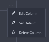
- [x] Use a star instead of a pin as the icon for setting the default
column action
- [x] Inserted new column will be append to the end
- [x] Fix #30701 the newly added issue will be append to the end of the
default column
- [x] Fix when deleting a column, all issues in it will be displayed
from UI but database records exist.
- [x] Add a limitation for columns in a project to 20. So the sorting
will not be overflow because it's int8.

---------

Co-authored-by: silverwind <me@silverwind.io>
Co-authored-by: wxiaoguang <wxiaoguang@gmail.com>
2024-05-08 13:44:57 +00:00
silverwind
370b1bdb37
Fix project name wrapping, remove horizontal margin on header ( #30631 )
...
Enable wrapping of unbroken lines:
<img width="1308" alt="Screenshot 2024-04-22 at 00 31 33"
src="https://github.com/go-gitea/gitea/assets/115237/1a28ade1-d708-4260-96a3-cf508b6dcb79 ">
Remove extra margin added by nested `.ui.container` on certain
viewports:
Before:
<img width="1305" alt="Screenshot 2024-04-22 at 00 40 23"
src="https://github.com/go-gitea/gitea/assets/115237/d3d8c0d1-380c-4867-b95c-4d53d70d4a93 ">
After:
<img width="1310" alt="Screenshot 2024-04-22 at 00 40 33"
src="https://github.com/go-gitea/gitea/assets/115237/2ba7b9f2-db2f-4bcc-8cce-5c415625ddea ">
2024-04-23 04:17:51 +00:00
silverwind
36887ed392
Fix and rewrite contrast color calculation, fix project-related bugs ( #30237 )
...
1. The previous color contrast calculation function was incorrect at
least for the `#84b6eb` where it output low-contrast white instead of
black. I've rewritten these functions now to accept hex colors and to
match GitHub's calculation and to output pure white/black for maximum
contrast. Before and after:
<img width="94" alt="Screenshot 2024-04-02 at 01 53 46"
src="https://github.com/go-gitea/gitea/assets/115237/00b39e15-a377-4458-95cf-ceec74b78228 "><img
width="90" alt="Screenshot 2024-04-02 at 01 51 30"
src="https://github.com/go-gitea/gitea/assets/115237/1677067a-8d8f-47eb-82c0-76330deeb775 ">
2. Fix project-related issues:
- Expose the new `ContrastColor` function as template helper and use it
for project cards, replacing the previous JS solution which eliminates a
flash of wrong color on page load.
- Fix a bug where if editing a project title, the counter would get
lost.
- Move `rgbToHex` function to color utils.
@HesterG fyi
---------
Co-authored-by: delvh <dev.lh@web.de>
Co-authored-by: Giteabot <teabot@gitea.io>
2024-04-07 16:19:25 +00:00
silverwind
dd8dde2be8
replace jquery-minicolors with coloris ( #30055 )
...
Get rid of one more jQuery dependant and have a nicer color picker as
well.
Now there is only a single global color picker init because that is all
that's necessary because the elements are present on the page when the
init code runs. The init is slightly weird because the module only takes
a selector instead of DOM elements directly.
The label modals now also perform form validation because previously it
was possible to trigger a 500 error `Color cannot be empty.` by clearing
out the color value on labels.
<img width="867" alt="Screenshot 2024-03-25 at 00 21 05"
src="https://github.com/go-gitea/gitea/assets/115237/71215c39-abb1-4881-b5c1-9954b4a89adb ">
<img width="860" alt="Screenshot 2024-03-25 at 00 20 48"
src="https://github.com/go-gitea/gitea/assets/115237/a12cb68f-c38b-4433-ba05-53bbb4b1023e ">
2024-03-29 04:00:07 +01:00
silverwind
7fda109aba
Drag-and-drop improvements for projects and issue pins ( #29875 )
...
1. Add "grabbing" cursor while dragging items:

2. Make project board only drag via their header, not via their whole
body.

3. Fix some cursor problems in projects
4. Move shared options into `createSortable`.
2024-03-28 00:20:38 +01:00
Denys Konovalov
e5160185ed
Add default board to new projects, remove uncategorized pseudo-board ( #29874 )
...
On creation of an empty project (no template) a default board will be
created instead of falling back to the uneditable pseudo-board.

Every project now has to have exactly one default boards. As a
consequence, you cannot unset a board as default, instead you have to
set another board as default. Existing projects will be modified using a
cron job, additionally this check will run every midnight by default.

Deleting the default board is not allowed, you have to set another board
as default to do it.

Fixes #29873
Fixes #14679 along the way
Fixes #29853

Co-authored-by: delvh <dev.lh@web.de>
2024-03-27 20:54:32 +00:00
silverwind
68ec9b4859
Migrate margin and padding helpers to tailwind ( #30043 )
...
This will conclude the refactor of 1:1 class replacements to tailwind,
except `gt-hidden`. Commands ran:

```bash
perl -p -i -e 's#gt-(p|m)([lrtbxy])?-0#tw-$1$2-0#g'   {web_src/js,templates,routers,services}/**/*
perl -p -i -e 's#gt-(p|m)([lrtbxy])?-1#tw-$1$2-0.5#g' {web_src/js,templates,routers,services}/**/*
perl -p -i -e 's#gt-(p|m)([lrtbxy])?-2#tw-$1$2-1#g'   {web_src/js,templates,routers,services}/**/*
perl -p -i -e 's#gt-(p|m)([lrtbxy])?-3#tw-$1$2-2#g'   {web_src/js,templates,routers,services}/**/*
perl -p -i -e 's#gt-(p|m)([lrtbxy])?-4#tw-$1$2-4#g'   {web_src/js,templates,routers,services}/**/*
perl -p -i -e 's#gt-(p|m)([lrtbxy])?-5#tw-$1$2-8#g'   {web_src/js,templates,routers,services}/**/*
```
2024-03-24 17:42:49 +01:00
silverwind
04f9ad0568
Fix incorrect tailwind migration ( #30007 )
...
Fixes https://github.com/go-gitea/gitea/issues/30005 . Regression from
https://github.com/go-gitea/gitea/pull/29945 .
There was only once instance of `tw-content-center` before that PR, so I
just ran below command and reverted that one instance.
```sh
perl -p -i -e 's#tw-content-center#tw-items-center#g' web_src/js/**/* templates/**/* models/**/* tests/**/*
```
2024-03-22 20:51:29 +01:00
silverwind
f88ad5424f
Replace 10 more gt- classes with tw- ( #29945 )
...
Likely the biggest change of the tailwind refactors. Only thing of note
is that `tw-flex-1` resolves to `flex: 1 1 0%` while our `gt-f1` was
`flex: 1 1 0`, I don't think it will make any difference. Commands I've
ran:

```sh
perl -p -i -e 's#gt-vm#tw-align-middle#g' web_src/js/**/* templates/**/* models/**/*
perl -p -i -e 's#gt-fw#tw-flex-wrap#g' web_src/js/**/* templates/**/* models/**/*
perl -p -i -e 's#gt-f1#tw-flex-1#g' web_src/js/**/* templates/**/* models/**/*
perl -p -i -e 's#gt-fc#tw-flex-col#g' web_src/js/**/* templates/**/* models/**/*
perl -p -i -e 's#gt-sb#tw-justify-between#g' web_src/js/**/* templates/**/* models/**/*
perl -p -i -e 's#gt-je#tw-justify-end#g' web_src/js/**/* templates/**/* models/**/*
perl -p -i -e 's#gt-jc#tw-justify-center#g' web_src/js/**/* templates/**/* models/**/*
perl -p -i -e 's#gt-ac#tw-content-center#g' web_src/js/**/* templates/**/* models/**/* tests/**/*
perl -p -i -e 's#gt-df#tw-flex#g' web_src/js/**/* templates/**/* models/**/* tests/**/*
perl -p -i -e 's#gt-dib#tw-inline-block#g' web_src/js/**/* templates/**/* models/**/* tests/**/*

Co-authored-by: wxiaoguang <wxiaoguang@gmail.com>
2024-03-22 13:45:10 +00:00
wxiaoguang
4c476fa41d
Remove unnecessary ".Link" usages ( #29909 )
...
In HTML, `?key=val` already means "use the current link with new query parameters"
2024-03-20 13:56:42 +08:00
Yarden Shoham
3b6e57273a
Fix for attribute not pointing to the ID of the color picker ( #29813 )
...
It didn't include the word picker.

Signed-off-by: Yarden Shoham <git@yardenshoham.com>
2024-03-15 13:12:08 +00:00
Denys Konovalov
e0b002a4a8
Unify search boxes ( #29530 )
...
Unify all but a few search boxes to use uniform style, uniform
translations and shared templates where possible.
Remove a few duplicated search templates, e. g. code search.
<details><summary>Example after screenshots:</summary>


</details>
Also includes #29700
Co-authored-by: 6543 <6543@obermui.de>
---------
Co-authored-by: 6543 <m.huber@kithara.com>
Co-authored-by: 6543 <6543@obermui.de>
Co-authored-by: silverwind <me@silverwind.io>
Co-authored-by: Giteabot <teabot@gitea.io>
2024-03-14 23:24:59 +00:00
silverwind
a2e90014ec
Replace some gt- classes with tw- ( #29570 )
...
Replace 18 `gt-` prefixes with `tw-` with perl replacement. I manually
checked them all with `rg` afterwards.
2024-03-04 03:33:20 +00:00
wxiaoguang
e71eb8930a
Refactor some Str2html code ( #29397 )
...
This PR touches the most interesting part of the "template refactoring".

1. Unclear variable type. Especially for "web/feed/convert.go":
sometimes it uses text, sometimes it uses HTML.
2. Assign text content to "RenderedContent" field, for example: `
project.RenderedContent = project.Description` in web/org/projects.go
3. Assign rendered content to text field, for example: `r.Note =
rendered content` in web/repo/release.go
4. (possible) Incorrectly calling `{{Str2html
.PackageDescriptor.Metadata.ReleaseNotes}}` in
package/content/nuget.tmpl, I guess the name Str2html misleads
developers to use it to "render string to html", but it only sanitizes.
if ReleaseNotes really contains HTML, then this is not a problem.
2024-03-01 07:11:51 +00:00
Denys Konovalov
4d7c063f9e
Use full width for project boards ( #28225 )
...
Inspired by #28182
2023-11-27 17:43:52 +00:00
JakobDev
cf0df023be
More db.DefaultContext refactor ( #27265 )
...
Part of #27065

This PR touches functions used in templates. As templates are not static
typed, errors are harder to find, but I hope I catch it all. I think
some tests from other persons do not hurt.
2023-09-29 12:12:54 +00:00
delvh
1f89a45926
Fix incorrect change from #27231 ( #27275 )
2023-09-26 13:10:29 +00:00
wxiaoguang
93bd4351bf
Fix more "locale" usages ( #27259 )
2023-09-25 20:42:40 +08:00
delvh
7960ba7e2b
Always use ctx.Locale.Tr inside templates ( #27231 )
2023-09-25 08:56:50 +00:00
Denys Konovalov
2325fe777d
cleanup locale function usage ( #27227 )
2023-09-24 20:31:58 +00:00
wxiaoguang
1f026bcb7e
Fix dropdown icon position ( #27175 )
...
According to https://fomantic-ui.com/modules/dropdown.html and our
"devtest" page, many dropdown elements has incorrect "icon" position.

This PR fixes all of them. Fix #27173
2023-09-21 15:54:26 +00:00
silverwind
8099238618
Change green buttons to primary color ( #27099 )
...
I think it's better if the primary actions have primary color instead of
green which fits better into the overall single-color UI design. This PR
currently replaces every green button with primary:
<img width="141" alt="Screenshot 2023-09-16 at 14 07 59"
src="https://github.com/go-gitea/gitea/assets/115237/843c1e50-4fb2-4ec6-84ba-0efb9472dcbe ">
<img width="161" alt="Screenshot 2023-09-16 at 14 07 51"
src="https://github.com/go-gitea/gitea/assets/115237/9442195a-a3b2-4a42-b262-8377d6f5c0d1 ">
Modal actions now use uncolored/primary instead of previous green/red
colors. I also removed the box-shadow on all basic buttons:
<img width="259" alt="Screenshot 2023-09-16 at 14 16 39"
src="https://github.com/go-gitea/gitea/assets/115237/5beea529-127a-44b0-8d4c-afa7b034a490 ">
<img width="261" alt="Screenshot 2023-09-16 at 14 17 42"
src="https://github.com/go-gitea/gitea/assets/115237/4757f7b2-4d46-49bc-a797-38bb28437b88 ">
The change currently includes the "Merge PR" button, for which we might
want to make an exception to match the icon color there:
<img width="442" alt="Screenshot 2023-09-16 at 14 33 53"
src="https://github.com/go-gitea/gitea/assets/115237/993ac1a5-c94d-4895-b76c-0d872181a70b ">
2023-09-18 22:05:31 +00:00
wxiaoguang
4803766f7a
Refactor some CSS styles and simplify code ( #26771 )
...
Refactor some CSS styles and simplify code.

Some styles are not in use, remove them.
2023-08-28 22:14:51 +08:00
wxiaoguang
4fdb09de58
Fix incorrect "tabindex" attributes ( #26733 )
...
Fix #26731

Almost all "tabindex" in code are incorrect.

1. All "input/button" by default are focusable, so no need to use "tabindex=0"
2. All "div/span" by default are not focusable, so no need to use "tabindex=-1"
3. All "dropdown" are focusable by framework, so no need to use "tabindex"
4. Some tabindex values are incorrect (eg: `new_form.tmpl`), so remove them

Co-authored-by: Giteabot <teabot@gitea.io>
2023-08-26 10:44:00 +08:00
Denys Konovalov
7456573541
fix grab cursor on default column ( #26476 )
...
Fix https://github.com/go-gitea/gitea/pull/26448#issuecomment-1676194200

I accidentally set grab cursor for project columns instead of issue
cards, which actually turned out not to be a problem - with proper check
for the default column, which can't be moved.

---------

Co-authored-by: delvh <dev.lh@web.de>
Co-authored-by: Giteabot <teabot@gitea.io>
2023-08-14 09:15:16 +08:00
Denys Konovalov
ab78c39e41
Refactor project templates ( #26448 )
...
This PR refactors a bunch of projects-related code, mostly the
templates.
The following things were done:
- rename boards to columns in frontend code
- use the new `ctx.Locale.Tr` method
- cleanup template, remove useless newlines, classes, comments
- merge org-/user and repo level project template together
- move "new column" button into project toolbar
- move issue card (shared by projects and pinned issues) to shared
template, remove useless duplicated styles
- add search function to projects (to make the layout more similar to
milestones list where it is inherited from 😆 )
- maybe more changes I forgot I've done 😆
Closes #24893
After:


---------
Co-authored-by: silverwind <me@silverwind.io>
2023-08-12 10:30:28 +00:00
wxiaoguang
a370efc13f
Use template context function for avatar rendering ( #26385 )
...
Introduce `AvatarUtils`, no need to pass `$.Context` to every
sub-template, and simplify the template helper functions.
2023-08-10 11:19:39 +08:00
Earl Warren
6ed4626ed5
Merge templates/projects/list.tmpl and templates/repo/projects/list.tmpl together ( #26265 )
...
(cherry picked from commit 473862a1d599382ca022482e2e044025872d240b)

Refs: https://codeberg.org/forgejo/forgejo/pulls/1126

Co-authored-by: Louis Seubert <louis.seubert.ls@gmail.com>
Co-authored-by: Giteabot <teabot@gitea.io>
2023-08-01 16:54:54 +00:00
puni9869
8fc4774e5a
Fix margin on the new/edit project page. ( #25885 )
...
New/Edit Project page consistent layout. Fix margin on the new/edit
page.
Before:
<img width="1381" alt="image"
src="https://github.com/go-gitea/gitea/assets/80308335/303e128c-0bd0-4289-a395-ff077e33b1c8 ">
<img width="1392" alt="image"
src="https://github.com/go-gitea/gitea/assets/80308335/d11f7a42-ddf4-4c0a-a1b1-b8cefca9dfa1 ">
After
<img width="1390" alt="image"
src="https://github.com/go-gitea/gitea/assets/80308335/8ae1a979-9050-4d68-8f5d-9dfaa620c0e8 ">
<img width="1391" alt="image"
src="https://github.com/go-gitea/gitea/assets/80308335/24a62711-dc0a-4425-bf84-7c1896b9a005 ">
Co-authored-by: silverwind <me@silverwind.io>
2023-07-16 14:53:54 +00:00
wxiaoguang
cc00fd50f3
Clarify "text-align" CSS helpers, fix clone button padding ( #25763 )
...
Changes:
* Rename gt-tl/gt-tc/gt-tr to gt-text-left/gt-text-center/gt-text-right
* The gt-ab and gt-br-0 are removed because they are not needed anymore
* Fix the clone dropdown button padding by ":not(.icon)"
Before:
<details>

</details>
After:
<details>

</details>
Fixes #25758
Co-authored-by: Giteabot <teabot@gitea.io>
2023-07-08 11:53:56 +02:00
wxiaoguang
3780795b93
Reformat some templates ( #25756 )
...
Only: indent/dedent/newline
2023-07-07 18:06:49 +00:00
wxiaoguang
128d77a3a0
Following up fixes for "Fix inconsistent user profile layout across tabs" ( #25739 )
...
Follow
https://github.com/go-gitea/gitea/pull/25625#issuecomment-1621577816
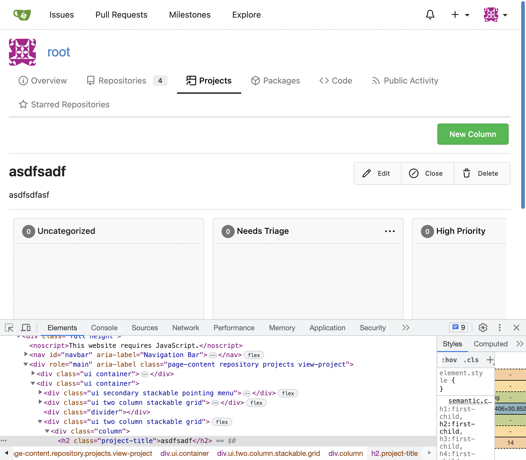
1. Fix the incorrect "project view" layout
2. Fix the "follow/unfollow" link on "packages" and "projects" tab
Before:

After:
---------
Co-authored-by: Giteabot <teabot@gitea.io>
2023-07-07 17:27:12 +02:00
puni9869
2af30f715e
Fix inconsistent user profile layout across tabs ( #25625 )
...
Fix ::User Profile Page Project Tab Have Inconsistent Layout and Style
Added the big_avator for consistency in the all header_items tabs.
Fixes : #24871
> ### Description
> in the user profile page the `Packages` and `Projects` tab have small
icons for user but other tabs have bigger profile picture with user
info:
>
> ### Screenshots
> ### **For Packages And Projects:**
>

>
> ### **For Other Tabs:**
>

>
## Before

## After changes
Project View
<img width="1394" alt="image"
src="https://github.com/go-gitea/gitea/assets/80308335/95d181d7-8e61-496d-9899-7b825c91ad56 ">
Packages View
<img width="1378" alt="image"
src="https://github.com/go-gitea/gitea/assets/80308335/7f5fd60f-6b18-4fa8-8c56-7b0d45d1a610 ">
## Org view for projects page
<img width="1385" alt="image"
src="https://github.com/go-gitea/gitea/assets/80308335/6400dc89-a5ae-4f0a-831b-5b6efa020d89 ">
## Org view for packages page
<img width="1387" alt="image"
src="https://github.com/go-gitea/gitea/assets/80308335/4e1e9ffe-1e4b-4334-8657-de11b5fd31d0 ">
---------
Co-authored-by: wxiaoguang <wxiaoguang@gmail.com>
Co-authored-by: Giteabot <teabot@gitea.io>
Co-authored-by: silverwind <me@silverwind.io>
2023-07-06 18:59:24 +00:00
silverwind
64f2d70262
Replace fomantic divider module with our own ( #25539 )
...
Should look exactly like before for normal dividers. "Horizontal" ones
look better because they no longer use image backgrounds.
<img width="917" alt="Screenshot 2023-06-27 at 19 07 56"
src="https://github.com/go-gitea/gitea/assets/115237/d97d8dec-6859-44a8-85ba-e4549b4dd9df ">
<img width="914" alt="Screenshot 2023-06-27 at 19 05 58"
src="https://github.com/go-gitea/gitea/assets/115237/8bf98544-2d82-4ebf-ac68-d6dc237bd6b2 ">
<img width="1246" alt="Screenshot 2023-06-27 at 19 00 42"
src="https://github.com/go-gitea/gitea/assets/115237/36a6bb21-6029-4f53-8bee-535f55c66fed ">
<img width="344" alt="Screenshot 2023-06-27 at 18 58 15"
src="https://github.com/go-gitea/gitea/assets/115237/a9e70aee-8e6b-4ea1-9e93-19c9f96aec6e ">
<img width="823" alt="Screenshot 2023-06-27 at 18 56 22"
src="https://github.com/go-gitea/gitea/assets/115237/e7a497cd-f262-4683-8872-23c3c8cce32f ">
<img width="330" alt="Screenshot 2023-06-27 at 19 21 11"
src="https://github.com/go-gitea/gitea/assets/115237/42f24149-a655-4c7e-bd26-8ab52db6446b ">
2023-06-29 20:24:22 +08:00
Denys Konovalov
bb31f36415
Remove test string ( #25447 )
...
Remove test string on delete project button, I overlooked it in a
previous PR 😄
2023-06-22 10:29:57 -05:00
silverwind
656d3cc719
Various UI fixes ( #25264 )
...
Numerous small UI fixes:

- Fix double border in collaborator list
- Fix system notice table background
- Mute links in repo and org lists
- Downsize projects edit buttons
- Improve milestones and project list rendering
- Condense milestone list entry to a single line of "metas"
- Mute ".." button in repo files list
2023-06-21 21:59:49 -04:00
Denys Konovalov
9e74063498
Fix UI on mobile view ( #25315 )
...
Various fixes to pages or elements which were looking ugly on mobile.
<details>
<summary>Screenshots</summary>


</details>
Co-authored by @silverwind
---------
Co-authored-by: silverwind <me@silverwind.io>
2023-06-18 10:31:42 +00:00
delvh
bf27fc3596
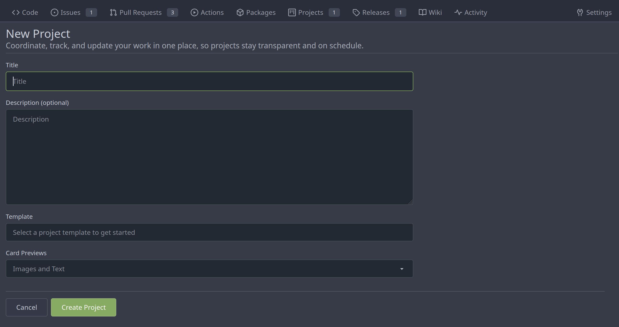
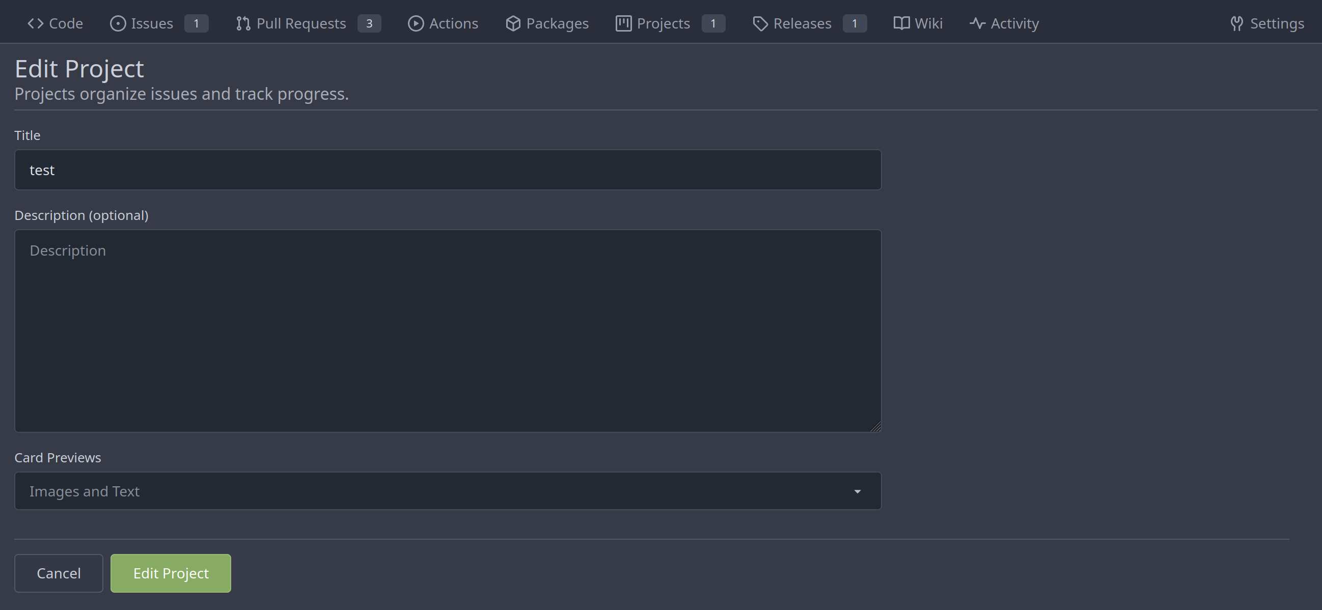
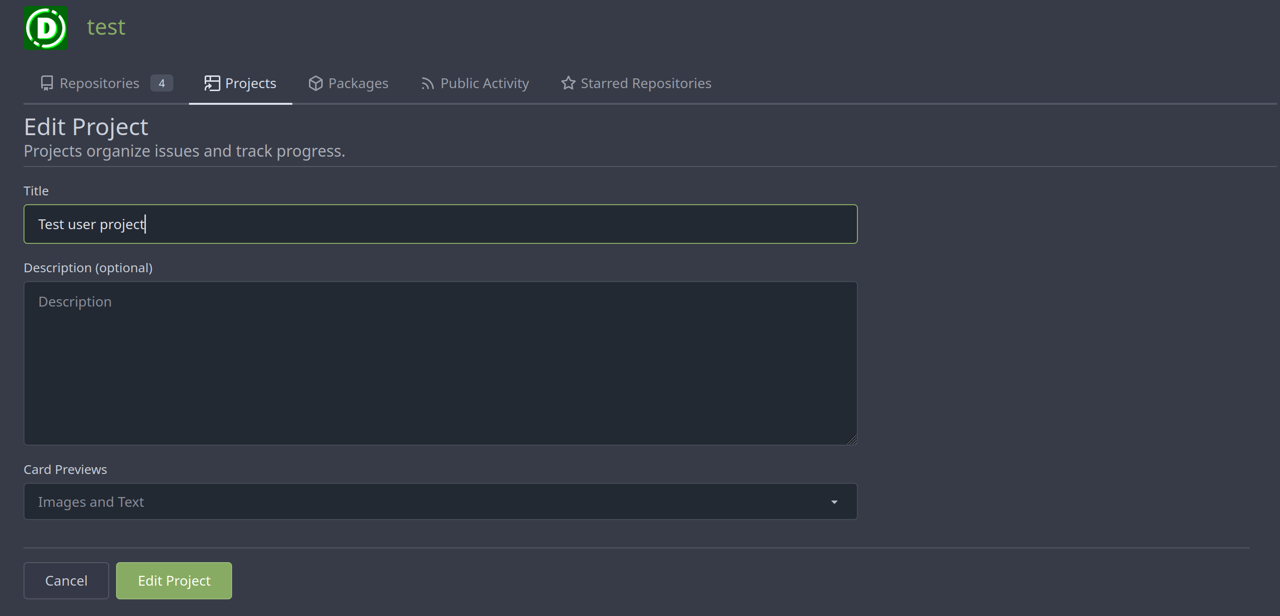
Merge new project templates into one ( #24985 )
...
Additionally simplify the `new project` template slightly.
Review hint: Disable whitespace changes.
<details><summary>Before</summary>
## New repo project

## Edit repo project

## New user/org project

## Edit user/org project

</details>
<details><summary>After</summary>
## New repo project
## Edit repo project
## New user/org project

## Edit user/org project
</details>
---------
Co-authored-by: Giteabot <teabot@gitea.io>
2023-05-31 08:50:18 +02:00
silverwind
79087bdb26
Use shared/issueicon template in projects ( #24922 )
...
We can reuse the recently created subtemplate here. I also checked the
whole templates for similar constructs, these appear to be the only one.

Co-authored-by: Giteabot <teabot@gitea.io>
2023-05-25 14:25:31 +02:00
yp05327
bc719f549e
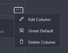
Update pin and add pin-slash ( #24669 )
...
Continue #23531
Thanks for the update in https://github.com/primer/octicons/issues/940 ,
@CameronFoxly
2023-05-12 14:38:59 +08:00
yp05327
2ee72d011f
Add permission check for moving issue action in project view page ( #24589 )
...
Fix #22954
Only users who have write permission can move issues in the project view page.
2023-05-09 00:50:16 -04:00
silverwind
4a722c9a45
Make Issue/PR/projects more compact, misc CSS tweaks ( #24459 )
...
- Remove various horizontal dividers on repo pages that didn't provide
visual benefit
- Remove label/milestone pills on single issue/pr page
- Remove issue-related pill buttons on projects page
- Increase contrast of color-secondary on arc-green
- Improve notifications icon, make circle bigger
- Remove some inline styles
- Fix focus in issue/pr title edit and select all text on button click
### Issue and PR before and after
<img width="1249" alt="Screenshot 2023-05-01 at 11 44 22"
src="https://user-images.githubusercontent.com/115237/235436662-a708288e-84fb-4b2e-a5a2-3a1c17d28f6c.png ">
<img width="1248" alt="Screenshot 2023-05-01 at 11 58 51"
src="https://user-images.githubusercontent.com/115237/235437992-f863e483-f3cc-4cc1-8204-fd223647a0c9.png ">
### Projects before and after
<img width="1255" alt="Screenshot 2023-05-01 at 11 41 02"
src="https://user-images.githubusercontent.com/115237/235436433-0deb85d6-4e7d-4e74-847f-254cc70a0cf9.png ">
<img width="1267" alt="Screenshot 2023-05-01 at 11 40 03"
src="https://user-images.githubusercontent.com/115237/235436431-715b13cb-f78c-4d86-b27a-9229f9738c5b.png ">
### Releases before and after
<img width="1243" alt="Screenshot 2023-05-01 at 11 41 12"
src="https://user-images.githubusercontent.com/115237/235436457-b655ee6f-03b8-4595-8d8c-b15ea469e988.png ">
<img width="1240" alt="Screenshot 2023-05-01 at 11 40 10"
src="https://user-images.githubusercontent.com/115237/235436456-05a2a0dd-7cbb-4f26-b0d3-4f667df4bb95.png ">
### Misc
<img width="58" alt="Screenshot 2023-05-01 at 10 49 13"
src="https://user-images.githubusercontent.com/115237/235432494-936ce995-6e22-47bc-ab2d-c9e93d31987d.png ">
<img width="57" alt="Screenshot 2023-05-01 at 18 57 08"
src="https://user-images.githubusercontent.com/115237/235492430-1d32cfe0-0f2c-467c-b2fa-925b27e30e0e.png ">
Issue title edit and wrap:
<img width="1238" alt="Screenshot 2023-05-01 at 12 34 40"
src="https://user-images.githubusercontent.com/115237/235441407-d5067a57-e586-4865-a652-282e5944abb4.png ">
<img width="1232" alt="Screenshot 2023-05-01 at 12 06 24"
src="https://user-images.githubusercontent.com/115237/235438710-1a543dda-220f-4d87-8f93-f1710c0695f0.png ">
---------
Co-authored-by: wxiaoguang <wxiaoguang@gmail.com>
2023-05-03 17:58:59 -04:00
silverwind
8f4dafcd4e
Rework header bar on issue, pull requests and milestone ( #24420 )
...
- Make search bar dynamic full width via flexbox
- Make all buttons `small` so font size is the same for all elements in
the header
- Remove primary color from search field, add SVG icon like on Code tab
- Fix button vertical padding being enlarged by SVG icons
[View diff without
whitespace](https://github.com/go-gitea/gitea/pull/24420/files?diff=unified&w=1 )
<img width="1226" alt="Screenshot 2023-04-29 at 11 58 53"
src="https://user-images.githubusercontent.com/115237/235296851-74848267-664f-4c1f-b94c-a1b94196ff75.png ">
<img width="1219" alt="Screenshot 2023-04-29 at 11 59 39"
src="https://user-images.githubusercontent.com/115237/235296852-bcfde5ed-8658-43c2-b7e5-3ad84611e76f.png ">
Mobile:
<img width="437" alt="Screenshot 2023-04-29 at 11 59 52"
src="https://user-images.githubusercontent.com/115237/235296860-99263373-7b27-4540-868c-a93e70f281ca.png ">
<img width="433" alt="Screenshot 2023-04-29 at 12 00 00"
src="https://user-images.githubusercontent.com/115237/235296862-6cf64317-a864-405a-a00f-b5ab620349f5.png ">
2023-04-29 23:33:25 -04:00
wxiaoguang
75c62054a6
Improve some modal action buttons ( #24289 )
...
Follow #24097 and #24285
And add a devtest page for modal action button testing.
http://localhost:3000/devtest/fomantic-modal
Now the `modal_actions_confirm.tmpl` could support: green / blue /
yellow positive buttons, the negative button is "secondary".
ps: this PR is only a small improvement, there are still a lot of
buttons not having proper colors. In the future these buttons could be
improved by this approach.
These buttons could also be improved according to the conclusion of
#24285 in the future.

And add GitHub-like single danger button (context:
https://github.com/go-gitea/gitea/issues/24285#issuecomment-1519100312 )

---------
Co-authored-by: silverwind <me@silverwind.io>
2023-04-24 07:08:59 -04:00
Hester Gong
476a043a5f
Refactor delete_modal_actions template and use it for project column related actions ( #24097 )
...
Co-Author: @wxiaoguang
This PR is to fix
https://github.com/go-gitea/gitea/issues/23318#issuecomment-1506275446 .
The way to fix this in this PR is to use `delete_modal_actions.tmpl`
here both to fix this issue and keep ui consistency (as suggested by
[TODO
here](4299c3b7db/templates/projects/view.tmpl (L161)https://user-images.githubusercontent.com/17645053/233825650-76307e65-9255-44bb-80e8-7062f58ead1b.png ">
<img width="786" alt="Screen Shot 2023-04-23 at 15 17 21"
src="https://user-images.githubusercontent.com/17645053/233825652-4dc6f7d1-a180-49fb-a468-d60950eaee0d.png ">
Test for functionalities:
https://user-images.githubusercontent.com/17645053/233826857-76376fda-022c-42d0-b0f3-339c17ca4e59.mov
---------
Co-authored-by: wxiaoguang <wxiaoguang@gmail.com>
2023-04-23 17:24:19 +08:00
yp05327
f30cc9faa9
Add unset default project column ( #23531 )
...
Close: https://github.com/go-gitea/gitea/issues/23401
2023-04-19 10:28:28 -04:00
wxiaoguang
7681d582cd
Refactor locale number ( #24134 )
...
Before, the `GiteaLocaleNumber.js` was just written as a a drop-in
replacement for old `js-pretty-number`.
Actually, we can use Golang's `text` package to format.
This PR partially completes the TODOs in `GiteaLocaleNumber.js`:
> if we have complete backend locale support (eg: Golang "x/text"
package), we can drop this component.
> tooltip: only 2 usages of this, we can replace it with Golang's
"x/text/number" package in the future.
This PR also helps #24131
Screenshots:
<details>


</details>
2023-04-17 11:37:23 +08:00
Hester Gong
6a4be2cb6a
Add cardtype to org/user level project on creation, edit and view ( #24043 )
...
Part of #23318
The way to fix the missing cardtype for user/org level projects in this
PR is to port the cardtype related part from #22112 to org/user level
projects' template and router functions.
Before:
<img width="1135" alt="截屏2023-04-11 13 55 49"
src="https://user-images.githubusercontent.com/17645053/231069068-ba897129-ae90-4aa0-9b0f-468bf5c65375.png ">
<img width="1131" alt="截屏2023-04-11 13 55 59"
src="https://user-images.githubusercontent.com/17645053/231069084-279f6681-5a10-42da-b5a8-2b0ba47c7078.png ">
After:
Create
<img width="835" alt="截屏2023-04-11 13 27 16"
src="https://user-images.githubusercontent.com/17645053/231064445-0d6e12bd-5725-48db-a102-80e7472757c2.png ">
Edit
<img width="852" alt="截屏2023-04-11 13 27 05"
src="https://user-images.githubusercontent.com/17645053/231064503-c70525cd-1038-43ec-8d93-8b8d95d183d4.png ">
View
<img width="1329" alt="截屏2023-04-11 13 26 56"
src="https://user-images.githubusercontent.com/17645053/231064529-26023c85-698b-4b2e-af02-45f9820c77ec.png ">
Co-authored-by: Giteabot <teabot@gitea.io>
2023-04-11 14:28:40 -04:00
wxiaoguang
25faee3c5f
Fix date display bug ( #24047 )
...
Follow
https://github.com/go-gitea/gitea/pull/23988#pullrequestreview-1377696819
Many template helper functions are not good enough and cause various
problems, that's why I am cleaning them.
## Before


## After

2023-04-11 17:48:13 +08:00
wxiaoguang
19de52e0f4
Introduce GiteaLocaleNumber custom element to handle number localization on pages. ( #23861 )
...
Follow #21429 & #22861
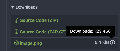
Use `<gitea-locale-number>` instead of backend `PrettyNumber`. All old
`PrettyNumber` related functions are removed. A lot of code could be
simplified.
And some functions haven't been used for long time (dead code), so they
are also removed by the way (eg: `SplitStringAtRuneN`, `Dedent`)
This PR only tries to improve the `PrettyNumber` rendering problem, it
doesn't touch the "plural" problem.
Screenshot:

2023-04-03 12:58:09 -04:00