wxiaoguang
ee99cf6313
Refactor diffFileInfo / DiffTreeStore ( #24998 )
...
Follow #21012 , #22399
Replace #24983 , fix #24938
Help #24956
Now, the `window.config.pageData.diffFileInfo` itself is a reactive
store, so it's quite easy to sync values/states by it, no need to do
"doLoadMoreFiles" or "callback".
Screenshot: these two buttons both work. After complete loading, the UI
is also right.
<details>


</details>
2023-05-30 18:53:15 +08:00
Yevhen Pavlov
a36c620583
Display file mode for new file and file mode changes ( #24966 )
...
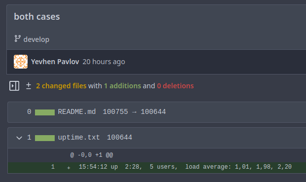
This MR introduces the addition of file mode display support for both
new file creation and file mode changes, following a similar approach as
GitLab.
GitLab:

Gitea:

Replaces: https://github.com/go-gitea/gitea/pull/23159
Closes: https://github.com/go-gitea/gitea/issues/23021
---------
Co-authored-by: silverwind <me@silverwind.io>
Co-authored-by: delvh <dev.lh@web.de>
Co-authored-by: Giteabot <teabot@gitea.io>
2023-05-29 19:56:08 +02:00
HesterG
085a8857f9
Fix repo level project - edit column ( #24982 )
...
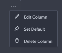
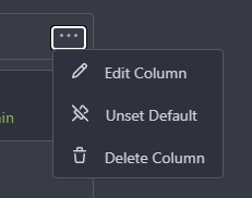
Right now edit column of repo level project is not working, because edit
button does not have the `edit-column-button` class, which is used in
the [js
selector](28077e66c0/web_src/js/features/repo-projects.js (L106)https://github.com/go-gitea/gitea/assets/17645053/e1fba190-477d-4814-87f2-0fd979376840
Co-authored-by: Giteabot <teabot@gitea.io>
2023-05-29 16:32:15 +00:00
silverwind
73b57c2992
Improve dropdown menus, remove inline styles ( #24954 )
...
Before:
<img width="190" alt="Screenshot 2023-05-27 at 10 46 43"
src="https://github.com/go-gitea/gitea/assets/115237/b9331fcd-db1d-476e-87f0-f79bae48b1a5 ">
After:
<img width="154" alt="Screenshot 2023-05-28 at 19 29 03"
src="https://github.com/go-gitea/gitea/assets/115237/8b7f99a2-01a8-4665-9342-a6201b51d30f ">
---------
Co-authored-by: Giteabot <teabot@gitea.io>
2023-05-29 14:10:06 +00:00
silverwind
79a4c80f8d
Rework button coloring, add focus and active colors ( #24507 )
...
We were missing overrides for `:focus` and `:active` styles which I've
added here along with two new color variants `dark-1` and `dark-2` for
them. Fomantic UI has 4 different colors but I think 3 are sufficient. I
also changed it on arc-green so button goes darker when pressed.
<img width="129" alt="Screenshot 2023-05-04 at 01 21 43"
src="https://user-images.githubusercontent.com/115237/236072060-7389276a-275b-4d3e-aa52-20b37c6e6d92.png ">
<img width="130" alt="Screenshot 2023-05-04 at 01 17 59"
src="https://user-images.githubusercontent.com/115237/236071818-0e46414a-33db-4bb2-a3bd-35b514a8a2d0.png ">
<img width="129" alt="Screenshot 2023-05-04 at 01 18 07"
src="https://user-images.githubusercontent.com/115237/236071819-562b1e38-541f-432b-b3b6-48e6d7594d00.png ">
<img width="131" alt="Screenshot 2023-05-04 at 01 18 13"
src="https://user-images.githubusercontent.com/115237/236071820-89b7dba9-ce6c-48e5-a075-9053063e6ad3.png ">
<img width="133" alt="Screenshot 2023-05-04 at 01 18 30"
src="https://user-images.githubusercontent.com/115237/236071823-b6fe2df4-b3f0-4dc8-97a8-f90ba6d19bec.png ">
<img width="133" alt="Screenshot 2023-05-04 at 01 18 40"
src="https://user-images.githubusercontent.com/115237/236071824-b02ce61a-2367-4c29-8a25-45f231f5e5ee.png ">
One misc change includes some fixes to editor and slightly darker
selection.
<img width="1245" alt="Screenshot 2023-05-28 at 19 16 19"
src="https://github.com/go-gitea/gitea/assets/115237/1ea4a4b6-26ba-45af-9cbc-5b8c476c2338 ">
2023-05-29 12:45:22 +00:00
silverwind
e4e98979ff
Add PDF rendering via PDFObject ( #24086 )
...
Use [PDFObject](https://pdfobject.com/ ) to embed PDFs, replacing our
outdated PDF.js copy we vendor (the last non-webpack vendoring).
[Commit
1](673e0263da9336f5769dhttps://github.com/go-gitea/gitea/assets/115237/169ce50c-bd1d-4bb0-86e5-1710bd0400a9 ">
<img width="1257" alt="Screenshot 2023-05-27 at 10 12 50"
src="https://github.com/go-gitea/gitea/assets/115237/318f7ee9-fb11-4093-83e7-17475aa70629 ">
Fallback for unsupporting browsers (most mobile ones, except Firefox
Mobile):
<img width="358" alt="Screenshot 2023-05-27 at 09 43 34"
src="https://github.com/go-gitea/gitea/assets/115237/8c12d7ba-57d6-4228-89a0-5fef9fad0cbb ">
---------
Co-authored-by: Giteabot <teabot@gitea.io>
2023-05-29 12:10:00 +00:00
Panagiotis "Ivory" Vasilopoulos
35ce7ca25b
Hide 'Mirror Settings' when unneeded, improve hints ( #24433 )
...
Co-authored-by: silverwind <me@silverwind.io>
Co-authored-by: Giteabot <teabot@gitea.io>
2023-05-29 11:32:52 +00:00
silverwind
a70d853d06
Consolidate the two review boxes into one ( #24738 )
...
View diff:
https://github.com/go-gitea/gitea/pull/24738/files?diff=unified&w=1
Improve layout and functionality in review area:
<img width="439" alt="Screenshot 2023-05-15 at 20 10 01"
src="https://github.com/go-gitea/gitea/assets/115237/be10452b-5829-4927-8801-7b26a57b3dbd ">
Remove the "Reviewers" timeline box that appears before the merge box.
it's a duplicate of the top-right review area and all functionality of
it has been moved to the other box:
<img width="868" alt="Screenshot 2023-05-15 at 19 39 31"
src="https://github.com/go-gitea/gitea/assets/115237/35489445-e54b-40d3-b3cf-38d029478f96 ">
Increase timeline item vertical padding from 12px to 16px:
<img width="449" alt="Screenshot 2023-05-15 at 19 43 50"
src="https://github.com/go-gitea/gitea/assets/115237/919c4f9d-a485-4f51-b08c-2c0fc714a413 ">
---------
Co-authored-by: Giteabot <teabot@gitea.io>
2023-05-29 12:44:03 +02:00
silverwind
595e8abd68
Improve and fix bugs surrounding reactions ( #24760 )
...
- Slightly decrease size of reaction buttons
- Remove tooltip inside menu, it's obvious by the picture alone
- Fix top menu triangle
- Use `display: grid` to align icons in menu
- Use regular tooltip for reaction users
- Fix bug that deleted the reaction bar on clicking already reacted
reaction in dropdown
<img width="490" alt="Screenshot 2023-05-17 at 00 03 42"
src="https://github.com/go-gitea/gitea/assets/115237/61588b37-facb-4829-b75b-e1cb5dda8ca4 ">
<img width="67" alt="Screenshot 2023-05-17 at 00 11 14"
src="https://github.com/go-gitea/gitea/assets/115237/29605589-3b5f-40c6-8ad4-09923094bb8e ">
<img width="211" alt="Screenshot 2023-05-17 at 00 29 30"
src="https://github.com/go-gitea/gitea/assets/115237/7d2725da-6a3d-4e42-a351-53647f79f762 ">
<img width="210" alt="Screenshot 2023-05-17 at 00 29 54"
src="https://github.com/go-gitea/gitea/assets/115237/b50f8364-033c-4445-ba25-61a814bb2d92 ">
<img width="892" alt="Screenshot 2023-05-17 at 00 12 20"
src="https://github.com/go-gitea/gitea/assets/115237/30a46424-406a-46e5-b4de-47172eb8679d ">
---------
Co-authored-by: wxiaoguang <wxiaoguang@gmail.com>
Co-authored-by: Giteabot <teabot@gitea.io>
2023-05-28 01:34:18 +00:00
JakobDev
85fa954a38
Improve some Forms ( #24878 )
...
Don't really know a better name for this. I've gone through some Forms
and added missing HTML attributes (mostly `maxlength`). I tried to fill
the Forms with dummy Data and see if Gitea throws a Error (e.g. maximum
length). If yes, I added the missing HTML attribute.

While working on this, I discovered that the Form to add OAuth2 Apps
just silently fails when filled with invalid data, so I fixed that too.
2023-05-26 09:42:54 +00:00
JakobDev
aaa1094663
Add the ability to pin Issues ( #24406 )
...
This adds the ability to pin important Issues and Pull Requests. You can
also move pinned Issues around to change their Position. Resolves #2175 .
## Screenshots


The Design was mostly copied from the Projects Board.
## Implementation
This uses a new `pin_order` Column in the `issue` table. If the value is
set to 0, the Issue is not pinned. If it's set to a bigger value, the
value is the Position. 1 means it's the first pinned Issue, 2 means it's
the second one etc. This is dived into Issues and Pull requests for each
Repo.
## TODO
- [x] You can currently pin as many Issues as you want. Maybe we should
add a Limit, which is configurable. GitHub uses 3, but I prefer 6, as
this is better for bigger Projects, but I'm open for suggestions.
- [x] Pin and Unpin events need to be added to the Issue history.
- [x] Tests
- [x] Migration
**The feature itself is currently fully working, so tester who may find
weird edge cases are very welcome!**
---------
Co-authored-by: silverwind <me@silverwind.io>
Co-authored-by: Giteabot <teabot@gitea.io>
2023-05-25 15:17:19 +02:00
silverwind
79087bdb26
Use shared/issueicon template in projects ( #24922 )
...
We can reuse the recently created subtemplate here. I also checked the
whole templates for similar constructs, these appear to be the only one.

Co-authored-by: Giteabot <teabot@gitea.io>
2023-05-25 14:25:31 +02:00
silverwind
27c221aa5d
Rework notifications list ( #24812 )
...
- Replace `<table>` with flexbox
- Add issue modification time and issue number
- Remove big title
- Replace tabs with menu items
- Add clicked item deletion on back button cache restoration

---------

Co-authored-by: wxiaoguang <wxiaoguang@gmail.com>
2023-05-25 02:31:26 +00:00
谈笑风生间
309354c70e
New webhook trigger for receiving Pull Request review requests ( #24481 )
...
close https://github.com/go-gitea/gitea/issues/16321

Provided a webhook trigger for requesting someone to review the Pull
Request.

Some modifications have been made to the returned `PullRequestPayload`
based on the GitHub webhook settings, including:
- add a description of the current reviewer object as
`RequestedReviewer` .
- setting the action to either **review_requested** or
**review_request_removed** based on the operation.
- adding the `RequestedReviewers` field to the issues_model.PullRequest.
This field will be loaded into the PullRequest through
`LoadRequestedReviewers()` when `ToAPIPullRequest` is called.

After the Pull Request is merged, I will supplement the relevant
documentation.
2023-05-24 22:06:27 -04:00
Brecht Van Lommel
1bfa37ada2
Create pull request for base after editing file, if not enabled on fork ( #24841 )
...
Currently if pull requests are disabled on a fork but enabled on a base
repo, creating/editing/deleting files does not offer the option to
create a pull request. This change enables creating a pull request for
the base repo in that case.

---------

Co-authored-by: wxiaoguang <wxiaoguang@gmail.com>
Co-authored-by: Giteabot <teabot@gitea.io>
2023-05-24 21:36:02 +00:00
yp05327
fd1967c3a4
Fix can’t move anymore items in repo project boards ( #24892 )
...
Fix #24879
Related to #24589
In #24589 , I changed the css, but didn't reflect the changes in
repo-level projects template.
2023-05-24 14:05:50 +08:00
yp05327
5c0745c034
Add validations.required check to dropdown field ( #24849 )
...
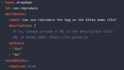
If dropdown is marked as required, we should not provide the `remove`
button.
This will cause user may post empty value which seems like a bug.
Definition:

Post request form:

Result:

2023-05-22 21:26:48 +00:00
yp05327
f4ef7eed00
Fix missing yes/no in delete time log modal ( #24851 )
...
Before:

After:

Co-authored-by: Giteabot <teabot@gitea.io>
2023-05-22 09:46:50 +00:00
Brecht Van Lommel
32ec2540cc
Show new pull request button also on subdirectories and files ( #24842 )
...
Instead of only on the repository home page. Saves a click and makes
this functionality a bit easier to find when editing files in a
subdirectory.
2023-05-22 07:57:00 +00:00
HesterG
da461b5a08
Improvements for action detail page ( #24718 )
...
Close #24625
Main changes:
1. For the left panel, show rerun icon only on hover, and add style when
the job is selected, and removed icon on the "rerun all" button and
modify the text on the button
https://github.com/go-gitea/gitea/assets/17645053/cc437a17-d2e9-4f1b-a8cf-f56e53962767
2. Adjust fonts, and add on hover effects to the log lines. And add
loading effect when the job is done and the job step log is expanded for
the first time. (With reference to github)
https://github.com/go-gitea/gitea/assets/17645053/2808d77d-f402-4fb0-8819-7aa0a018cf0c
3. Add `gt-ellipsis` to `step-summary-msg` and `job-brief-name`
<img width="898" alt="ellipsis"
src="https://github.com/go-gitea/gitea/assets/17645053/e2fb7049-3125-4252-970d-15b0751febc7 ">
4. Fixed
https://github.com/go-gitea/gitea/issues/24625#issuecomment-1541380010
by adding explicit conditions to `ActionRunStatus.vue` and `status.tmpl`
5. Adjust some css styles
---------
Co-authored-by: silverwind <me@silverwind.io>
2023-05-22 12:17:24 +08:00
silverwind
19993d8814
Change --font-weight-bold to --font-weight-semibold and 600 value, introduce new font weight variables ( #24827 )
...
There was some recent discussion about this in Discord `ui-design`
channel and the conclusion was that
https://github.com/go-gitea/gitea/issues/24305 should have fixed their
OS font installation to have semibold weights.

I have now tested this 601 weight on a Windows 10 machine on Firefox
myself, and I immediately noticed that bold was excessivly bold and
rendering as 700 because browsers are biased towards bolder fonts. So
revert this back to the previous value.
2023-05-21 23:37:32 +00:00
delvh
e95b42e187
Improve accessibility when (re-)viewing files ( #24817 )
...
Visually, nothing should have changed.
Changes include
- Convert most `<a [no href]>` to `<button>` when (re-)viewing files:
- `<a [no href]>` are, by HTML definition, not a link and hence cannot
be focused
- `<a class="ui button">` can now be clicked (again?) using
<kbd>Enter</kbd>
- Previously, the installed keypress handler on `.ui.button` elements
disabled it for links somehow
- The `(un)escape file`, the `expand section` and the `expand/collapse
file` buttons can now be focused (and subsequently clicked using only
the keyboard)
- You can now press <kbd>Space</kbd> on a focused `View file` checkbox
to mark the file as viewed.
- previously, this was impossible as this checkbox listened on the wrong
event listener

The `add code comment` button has been left inaccessible for now as it
requires quite a bit of extra logic so that it is unhidden when it is
focused (you can otherwise focus it without seeing it as you are not
hovering on the corresponding line).

---------

Co-authored-by: silverwind <me@silverwind.io>
2023-05-21 20:47:41 +00:00
FuXiaoHei
c757765a9e
Implement actions artifacts ( #22738 )
...
Implement action artifacts server api.
This change is used for supporting
https://github.com/actions/upload-artifact and
https://github.com/actions/download-artifact in gitea actions. It can
run sample workflow from doc
https://docs.github.com/en/actions/using-workflows/storing-workflow-data-as-artifacts .
The api design is inspired by
https://github.com/nektos/act/blob/master/pkg/artifacts/server.go and
includes some changes from gitea internal structs and methods.
Actions artifacts contains two parts:
- Gitea server api and storage (this pr implement basic design without
some complex cases supports)
- Runner communicate with gitea server api (in comming)
Old pr https://github.com/go-gitea/gitea/pull/22345 is outdated after
actions merged. I create new pr from main branch.

Add artifacts list in actions workflow page.
2023-05-19 21:37:57 +08:00
Lunny Xiao
b807d2f620
Support no label/assignee filter and batch clearing labels/assignees ( #24707 )
...
Since milestones has been implemented, this PR will fix #3407

---------

Co-authored-by: Jason Song <i@wolfogre.com>
2023-05-17 17:21:35 +08:00
Zettat123
e7c2231dee
Support for status check pattern ( #24633 )
...
This PR is to allow users to specify status checks by patterns. Users
can enter patterns in the "Status Check Pattern" `textarea` to match
status checks and each line specifies a pattern. If "Status Check" is
enabled, patterns cannot be empty and user must enter at least one
pattern.
Users will no longer be able to choose status checks from the table. But
a __*`Matched`*__ mark will be added to the matched checks to help users
enter patterns.
Benefits:
- Even if no status checks have been completed, users can specify
necessary status checks in advance.
- More flexible. Users can specify a series of status checks by one
pattern.
Before:

After:

---------
Co-authored-by: silverwind <me@silverwind.io>
2023-05-17 16:11:13 +08:00
silverwind
a7e18b9fb7
Rework Oauth login buttons, swap github logo to monocolor ( #24740 )
...
Diff without whitespace:
https://github.com/go-gitea/gitea/pull/24740/files?diff=unified&w=1
- Use SVGs for GitHub and GitLab oauth providers
- Replace section wrapping with a divider
- Rework icon rendering, increase size from 32px to 40px
Before:
<img width="853" alt="Screenshot 2023-05-15 at 21 54 23"
src="https://github.com/go-gitea/gitea/assets/115237/6ab5cfb4-46ff-469a-bd1f-06780d4a6a0b ">
After (more providers):
<img width="849" alt="Screenshot 2023-05-15 at 21 51 21"
src="https://github.com/go-gitea/gitea/assets/115237/fa84f92f-98e0-4aed-9357-5d62ddd98195 ">
<img width="856" alt="Screenshot 2023-05-15 at 21 56 45"
src="https://github.com/go-gitea/gitea/assets/115237/d3edd7ed-dadd-4302-aca7-08f20adc220e ">
Ref: https://codeberg.org/Codeberg/Community/issues/1023
---------
Co-authored-by: Giteabot <teabot@gitea.io>
2023-05-15 22:46:51 +00:00
wxiaoguang
99283415bc
Refactor Pull Mirror and fix out-of-sync bugs ( #24732 )
...
The "mirror" table and "repository" table might be out-of-sync in some
cases.
It means that "IsMirror=true" but "Mirror=nil"
This PR removes unnecessary "Mirror" field, rename "Mirror" to
"PullMirror" and fix nil panic bug.
Screenshot of changed templates:


2023-05-15 19:02:10 +00:00
Yarden Shoham
6d2c63f6ff
Don't filter action runs based on state ( #24711 )
...
We should just show all runs. This removes the filtering altogether.
- Replaces https://github.com/go-gitea/gitea/pull/24553
# Before


# After

---------
Signed-off-by: Yarden Shoham <git@yardenshoham.com>
2023-05-14 16:04:24 +00:00
silverwind
b92c142c97
Clean up various avatar dimensions ( #24701 )
...
Clean up a few cases where avatar dimensions were overwritten via CSS,
which were no longer needed or were possible to set via HTML width.
Also included are two small fixes:
- Fix one more case of incorrect avatar offset on review timeline
- Vertically center avatars in review sidebar
There is more to be done here, but some of the work depends on Fomantic
`comment` module removal, or in the case of org member lists, a refactor
of the `avatarlink` template to accept a size.
<img width="371" alt="image"
src="https://github.com/go-gitea/gitea/assets/115237/9c5902fb-2b89-4a7d-a152-60e74c3b2c56 ">
<img width="306" alt="image"
src="https://github.com/go-gitea/gitea/assets/115237/c8d92e2a-91c9-4f4a-a7de-6ae1a6bc0479 ">
---------
Co-authored-by: Giteabot <teabot@gitea.io>
2023-05-14 14:15:59 +00:00
wxiaoguang
8a8b753647
Improve button-ghost, remove tertiary button ( #24692 )
...
<img width="474" alt="image"
src="https://github.com/go-gitea/gitea/assets/2114189/7fd231f9-71c3-4769-ba96-37a5b77cf224 ">
<img width="557" alt="image"
src="https://github.com/go-gitea/gitea/assets/2114189/c9945f61-39b4-4711-aea8-c34ef1d714c5 ">
<img width="641" alt="image"
src="https://github.com/go-gitea/gitea/assets/2114189/691be76e-74fd-420d-9b9e-ba1f3b08e0b4 ">
And a page to test buttons:
<details>
<img width="451" alt="image"
src="https://github.com/go-gitea/gitea/assets/2114189/5f61da24-2f36-40ad-a9bb-2205da5f5f04 ">
</details>
---------
Co-authored-by: Giteabot <teabot@gitea.io>
Co-authored-by: silverwind <me@silverwind.io>
2023-05-13 20:38:22 +00:00
yp05327
b5c26fa825
Add markdown preview to Submit Review Textarea ( #24672 )
...
Before:

After:

---------
Co-authored-by: wxiaoguang <wxiaoguang@gmail.com>
Co-authored-by: Giteabot <teabot@gitea.io>
2023-05-12 10:53:41 +00:00
silverwind
a96c73f979
Remove svg.svg class, restore .rss-icon ( #24667 )
...
Fix regression from https://github.com/go-gitea/gitea/pull/24476 where
the `svg.svg` class misaligns SVG icons across the site and streched
buttons unintentionally in vertical height.
Before (button 30.3px):
<img width="157" alt="Screenshot 2023-05-11 at 22 09 42"
src="https://github.com/go-gitea/gitea/assets/115237/0fd137ab-ab52-4cf8-afca-c45776d526d0 ">
After (button 30px):
<img width="160" alt="Screenshot 2023-05-11 at 22 09 59"
src="https://github.com/go-gitea/gitea/assets/115237/4b741f4b-0fd2-4fae-9bee-16a7deb098e8 ">
[vertical-align:
middle](https://developer.mozilla.org/en-US/docs/Web/CSS/vertical-align )
is not suitable to align icons to text because
> Aligns the middle of the element with the baseline plus half the
x-height of the parent.
Example of `vertical-align: middle` from MDN:
<img width="232" alt="Screenshot 2023-05-11 at 22 29 28"
src="https://github.com/go-gitea/gitea/assets/115237/179fb756-85a1-4cab-8219-1a4958f333e2 ">
So I think the
[existing](365bb77a54/web_src/css/svg.css (L3)https://github.com/go-gitea/gitea/assets/115237/0cd6edf5-12c0-4bdb-8771-a900f5ba2d35 ">
Co-authored-by: Giteabot <teabot@gitea.io>
2023-05-12 10:23:53 +00:00
yp05327
bc719f549e
Update pin and add pin-slash ( #24669 )
...
Continue #23531
Thanks for the update in https://github.com/primer/octicons/issues/940 ,
@CameronFoxly


2023-05-12 14:38:59 +08:00
Lunny Xiao
365bb77a54
Fix issues list page multiple selection update milestones ( #24660 )
...
Fix #24651
2023-05-11 21:19:42 +08:00
wxiaoguang
f6e029e6c7
Make repo migration cancelable and fix various bugs ( #24605 )
...
Replace #12917
Close #24601
Close #12845


---------
Co-authored-by: Yarden Shoham <git@yardenshoham.com>
Co-authored-by: silverwind <me@silverwind.io>
Co-authored-by: Giteabot <teabot@gitea.io>
2023-05-11 08:25:46 +00:00
silverwind
67db6b6976
RSS icon fixes ( #24476 )
...
Fix regression from https://github.com/go-gitea/gitea/pull/24471 where
CSS rules for `.icon.grey` were removed which were in use by the RSS
icons.
Gave them their own class instead, removed a wrapper and also fixed
vertical alignment on them. Additionally, did a few related fixes on the
org header for alignment.
Fixes: https://github.com/go-gitea/gitea/issues/24584
<img width="196" alt="Screenshot 2023-05-01 at 22 39 40"
src="https://user-images.githubusercontent.com/115237/235528228-959e2385-c1d2-4d5c-baec-e3784d459653.png ">
<img width="216" alt="Screenshot 2023-05-01 at 22 44 20"
src="https://user-images.githubusercontent.com/115237/235528231-95cbff86-5672-48eb-b214-8bdcefa1612c.png ">
<img width="120" alt="Screenshot 2023-05-01 at 22 56 36"
src="https://user-images.githubusercontent.com/115237/235529844-b94ab554-3259-4d0c-b040-82aed7d1a111.png ">
<img width="372" alt="Screenshot 2023-05-01 at 22 54 25"
src="https://user-images.githubusercontent.com/115237/235529744-1a9c201b-5692-4122-9765-2f201a322a9e.png ">
<img width="477" alt="Screenshot 2023-05-01 at 22 55 28"
src="https://user-images.githubusercontent.com/115237/235529748-62188554-9927-42ef-bc94-7052bce266e2.png ">
---------
Co-authored-by: wxiaoguang <wxiaoguang@gmail.com>
2023-05-10 22:27:02 +00:00
silverwind
f7ede92f82
Notification list enhancements, fix striped tables on dark theme ( #24639 )
...
- Make code block rendering via backticks work
- Remove link color unless hovered
- Remove table stripes and fix stripes rendering on dark theme for other
tables
- Introduce new `button-link` class discussed previously for buttons
that look and act like links and apply it to the two right-side buttons
- Reduce box padding by 8px on each side
- Fix "Mark all read" button margin-right
- brighten `--color-markup-code-block` on arc-green
### Before
<img width="1216" alt="Screenshot 2023-05-10 at 20 00 30"
src="https://github.com/go-gitea/gitea/assets/115237/66da9ec2-dd09-4ef0-8f1d-1822a18b6b43 ">
<img width="1211" alt="Screenshot 2023-05-10 at 20 00 48"
src="https://github.com/go-gitea/gitea/assets/115237/f48e30a2-9a00-4723-93aa-79b97ca0ba0c ">
### After
<img width="1222" alt="Screenshot 2023-05-10 at 20 09 59"
src="https://github.com/go-gitea/gitea/assets/115237/c956e0d0-b3d9-42a4-a3ed-f0431c22bf3f ">
<img width="1218" alt="Screenshot 2023-05-10 at 20 05 34"
src="https://github.com/go-gitea/gitea/assets/115237/f72c1628-3961-4c28-9263-07cdf7531316 ">
2023-05-10 21:59:58 +00:00
wxiaoguang
23ae939ef3
Improve "goto issue by number" button ( #24577 )
...
Follow #24479


---------
Co-authored-by: silverwind <me@silverwind.io>
Co-authored-by: Giteabot <teabot@gitea.io>
2023-05-10 15:50:58 +00:00
silverwind
ae0fa64ef6
Review fixes and enhancements ( #24526 )
...
- Fix regression with icons wrapping from
https://github.com/go-gitea/gitea/pull/24459
- Fix box misalignment on small screen
- Fix avatar misalignment on review comment
- Fix incorrect underline hover effect on review icons
- Move status icon to left side in review box
- Enhance review icon colors, add helper function for it
- Add missing inline avatars in review comments
- Tweak icon sizes because some octicons have inconsistent sizing
### Before
<img width="655" alt="Screenshot 2023-05-04 at 20 50 28"
src="https://user-images.githubusercontent.com/115237/236301230-92325507-6e03-47ac-bfb4-c9ddde310571.png ">
<img width="260" alt="Screenshot 2023-05-04 at 20 50 42"
src="https://user-images.githubusercontent.com/115237/236301236-0dfa50e7-b8fc-4179-ae68-d872bc90f1f3.png ">
### After
<img width="498" alt="Screenshot 2023-05-04 at 20 55 08"
src="https://user-images.githubusercontent.com/115237/236301810-23862c2c-c0a9-43a4-a3eb-ee611c14a7f4.png ">
<img width="219" alt="Screenshot 2023-05-04 at 20 55 16"
src="https://user-images.githubusercontent.com/115237/236301817-d0de02ea-6ab5-43e1-9183-6b3848b72995.png ">
---------
Co-authored-by: Giteabot <teabot@gitea.io>
2023-05-10 09:16:44 +00:00
Hester Gong
8bbbf7e6b8
Remove fluid on compare diff page ( #24627 )
...
As discuessed in
https://github.com/go-gitea/gitea/pull/24598/files#r1189290462
After:
Diff Page
<img width="1426" alt="Screen Shot 2023-05-10 at 10 44 48"
src="https://github.com/go-gitea/gitea/assets/17645053/bc1a5f78-ec17-4ac2-8390-081a5fc059d1 ">
New PR Page
<img width="1428" alt="Screen Shot 2023-05-10 at 10 45 17"
src="https://github.com/go-gitea/gitea/assets/17645053/ce94a28e-39d5-4534-9e78-c0edd4c7a339 ">
<img width="1432" alt="Screen Shot 2023-05-10 at 10 45 27"
src="https://github.com/go-gitea/gitea/assets/17645053/047809e1-abb2-4c16-ae62-63b71094c1c7 ">
2023-05-10 08:46:17 +00:00
oliverpool
8030614386
fix: release page for empty or non-existing target ( #24470 )
...
Fixes #24145

To solve the bug, I added a "computed" `TargetBehind` field to the
`Release` model, which indicates the target branch of a release.
This is particularly useful if the target branch was deleted in the
meantime (or is empty).

I also did a micro-optimization in `calReleaseNumCommitsBehind`. Instead
of checking that a branch exists and then call `GetBranchCommit`, I
immediately call `GetBranchCommit` and handle the `git.ErrNotExist`
error.

This optimization is covered by the added unit test.
2023-05-10 11:43:55 +08:00
Yarden Shoham
9a0652f0b2
Attach a tooltip to the action status icon ( #24614 )
...
To clearly communicate the current state of the action


---------
Signed-off-by: Yarden Shoham <git@yardenshoham.com>
2023-05-09 21:39:16 +02:00
wxiaoguang
b6fc2cdf82
Make diff view full width again ( #24598 )
...
Regression of #24459 , [the related
line](https://github.com/go-gitea/gitea/pull/24459/files#diff-f255004de8d715ff40852710390429bf2a06e7e33a4e3f8ad568af636557ac71L8 )
The PR file diff view needs to be full-screen width.
2023-05-09 05:21:03 +00:00
Yarden Shoham
46e97986f5
Attach a tooltip to the action control button ( #24595 )
...
The first time I saw the big red X button I thought something failed but
apparently, it was just a "Cancel" button
# Before


# After


---------
Signed-off-by: Yarden Shoham <git@yardenshoham.com>
Co-authored-by: Giteabot <teabot@gitea.io>
Co-authored-by: silverwind <me@silverwind.io>
2023-05-08 23:59:59 +00:00
yp05327
c4303efc23
Support markdown editor for issue template ( #24400 )
...
Fixes #24398
Task:
- [x] Reusing "textarea" like GitHub seems more friendly to users.
- [x] ^V image pasting and file uploading handling.
<details><summary>screenshots</summary>


Display only one markdown editor:

Support file upload and ^V image pasting

</details>
---------
Co-authored-by: wxiaoguang <wxiaoguang@gmail.com>
Co-authored-by: silverwind <me@silverwind.io>
2023-05-08 22:22:52 +00:00
Tyrone Yeh
1144b1d129
Add goto issue id function ( #24479 )
...
for
https://github.com/go-gitea/gitea/issues/4109#issuecomment-1527104992

Supports format:
`#1234`
`Org/Repo#1234`

---------

Co-authored-by: techknowlogick <techknowlogick@gitea.io>
2023-05-07 23:44:16 +08:00
wxiaoguang
56ae853ca0
Simplify template helper functions ( #24570 )
...
To avoid bloating the template helper functions, some functions could be
provided by type methods.
And the new code `data-line-type="{{.GetHTMLDiffLineType}}"` reads
better than `data-line-type="{{DiffLineTypeToStr .GetType}}"`
After the fix, screenshots (the same as before):
<details>


</details>
2023-05-07 09:49:46 +00:00
Yarden Shoham
46679554d0
Change add_on translation to added_on and include placeholder for the date ( #24562 )
...
- Very similar to #24550

The correct thing to do is to translate the entire phrase into a single
string. The previous translation assumed all languages have a space
between the "added on" and the date (and that "added on" comes before
the date).

Some languages, like Hebrew, have no space between the "added on" and
the date. For example:
```ini
added_on=נוסף ב-%s
```
("added" becomes נוסף, "on" is ב and when paired with a date we use a
dash to connect ב with the date)

---------

Signed-off-by: Yarden Shoham <git@yardenshoham.com>
Co-authored-by: delvh <dev.lh@web.de>
2023-05-06 21:11:27 +08:00
Yarden Shoham
291c868046
Change join_on translation to joined_on and include placeholder for the date ( #24550 )
...
The correct thing to do is to translate the entire phrase into a single
string. The previous translation assumed all languages have a space
between the "joined on" and the date (and that "joined on" comes before
the date).

Some languages, like Hebrew, have no space between the "joined on" and
the date. For example:
```ini
joined_on=נרשם ב-%s
```
("joined" becomes נרשם, "on" is ב and when paired with a date we use a
dash to connect ב with the date)
2023-05-06 18:10:30 +08:00
wxiaoguang
421840486f
Fix form method/class ( #24535 )
...
Fix #24534
2023-05-05 05:14:22 +00:00