mirror of
https://github.com/go-gitea/gitea
synced 2024-11-05 09:44:26 +00:00
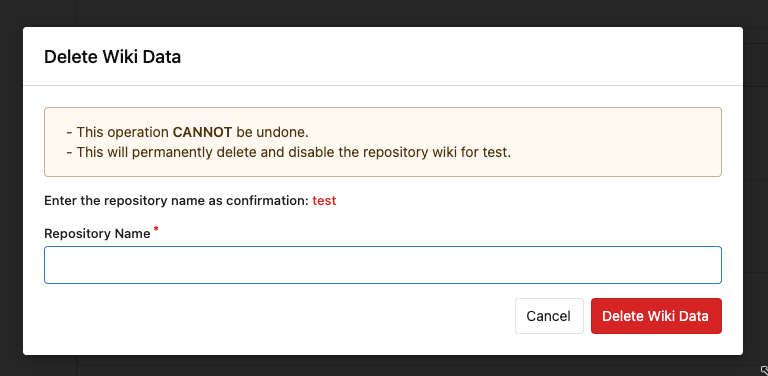
Follow #24393 The funny history: * At the beginning, `.ui.message` was polluted by `text-align: center` * Then people do `<div class="ui ... message text left">` * But `.ui.left` is polluted by `float: left` * Then people do `#xxx .ui.message { width: 100% !important;}` The code just becomes more and more hacky. After removing the pollution, everything becomes clear and straight. And, this PR also does: 1. Remove the `package.css`, its styles could be provided by `top aligned` 2. Remove `#avatar-arrow`, dead code Screenshot:   Co-authored-by: Giteabot <teabot@gitea.io>
21 lines
564 B
Handlebars
21 lines
564 B
Handlebars
{{if .Flash.ErrorMsg}}
|
|
<div class="ui negative message flash-message flash-error">
|
|
<p>{{.Flash.ErrorMsg | Str2html}}</p>
|
|
</div>
|
|
{{end}}
|
|
{{if .Flash.SuccessMsg}}
|
|
<div class="ui positive message flash-message flash-success">
|
|
<p>{{.Flash.SuccessMsg | Str2html}}</p>
|
|
</div>
|
|
{{end}}
|
|
{{if .Flash.InfoMsg}}
|
|
<div class="ui info message flash-message flash-info">
|
|
<p>{{.Flash.InfoMsg | Str2html}}</p>
|
|
</div>
|
|
{{end}}
|
|
{{if .Flash.WarningMsg}}
|
|
<div class="ui warning message flash-message flash-warning">
|
|
<p>{{.Flash.WarningMsg | Str2html}}</p>
|
|
</div>
|
|
{{end}}
|