mirror of
https://github.com/go-gitea/gitea
synced 2024-11-05 17:54:26 +00:00
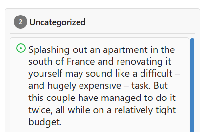
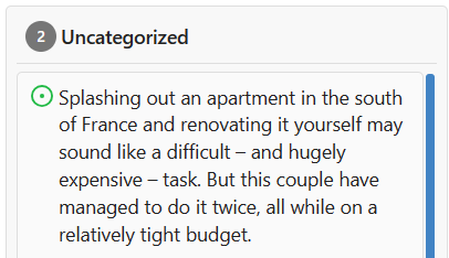
I propose to decrease font size. 18 is too big and looks ugly, on windows. 14 is on par with other elements and save a bit of space.   Co-authored-by: Nikolay Kobzarev <n.kobzarev@aeronavigator.ru>
22 lines
369 B
CSS
22 lines
369 B
CSS
.issue-card {
|
|
display: flex;
|
|
flex-direction: column;
|
|
align-items: start;
|
|
border-radius: var(--border-radius);
|
|
padding: 8px 10px;
|
|
border: 1px solid var(--color-secondary);
|
|
background: var(--color-card);
|
|
}
|
|
|
|
.issue-card-icon,
|
|
.issue-card-unpin {
|
|
margin-top: 1px;
|
|
flex-shrink: 0;
|
|
}
|
|
|
|
.issue-card-title {
|
|
flex: 1;
|
|
font-size: 14px;
|
|
margin-left: 4px;
|
|
}
|