mirror of
https://github.com/go-gitea/gitea
synced 2024-11-14 06:04:25 +00:00
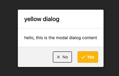
Follow #24097 and #24285 And add a devtest page for modal action button testing. http://localhost:3000/devtest/fomantic-modal Now the `modal_actions_confirm.tmpl` could support: green / blue / yellow positive buttons, the negative button is "secondary". ps: this PR is only a small improvement, there are still a lot of buttons not having proper colors. In the future these buttons could be improved by this approach. These buttons could also be improved according to the conclusion of #24285 in the future.  And add GitHub-like single danger button (context: https://github.com/go-gitea/gitea/issues/24285#issuecomment-1519100312)  --------- Co-authored-by: silverwind <me@silverwind.io>
11 lines
297 B
Handlebars
11 lines
297 B
Handlebars
<div class="ui g-modal-confirm delete modal">
|
|
<div class="header">
|
|
{{svg "octicon-trash"}}
|
|
{{.locale.Tr "repo.settings.webhook_deletion"}}
|
|
</div>
|
|
<div class="content">
|
|
<p>{{.locale.Tr "repo.settings.webhook_deletion_desc"}}</p>
|
|
</div>
|
|
{{template "base/modal_actions_confirm" .}}
|
|
</div>
|