mirror of
https://github.com/go-gitea/gitea
synced 2024-11-08 11:14:26 +00:00
 1fcf96ad01
This PR follows: * #22950 ### Before The Review Box has many problems: * It doesn't work for small screens. * It has an anonying animation which makes the UI laggy. * It uses "custom dropdown menu" which is very difficult to fine tune. * `$().toggle('visible')` is not a correct call * jQuery just accepts any invalid `duration` argument: `$().toggle('anyting')` * The button is not a button. <details> 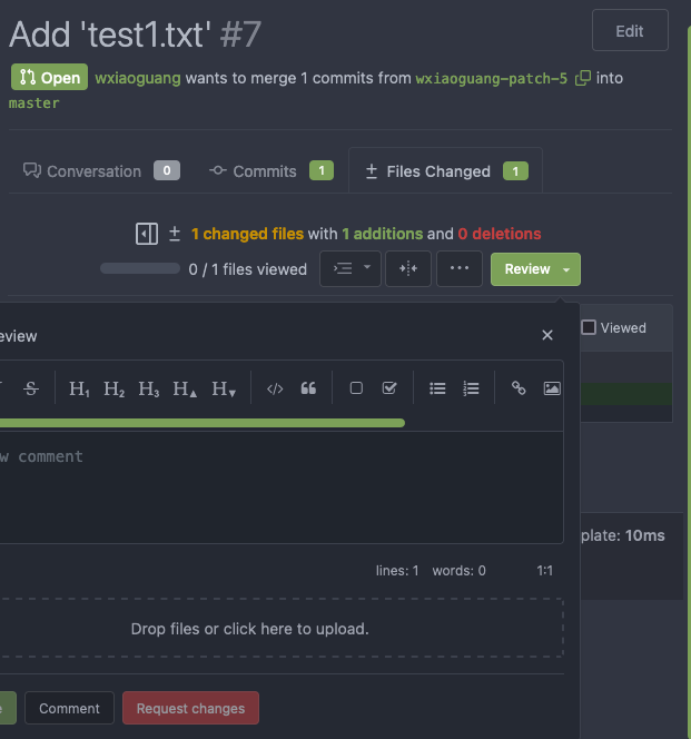 </details> ### After These problems are fixed, and eliminate many `!important` games. <details> 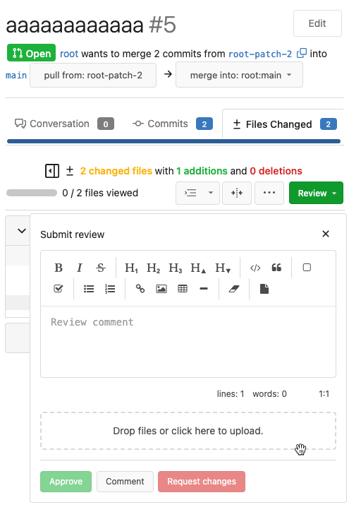 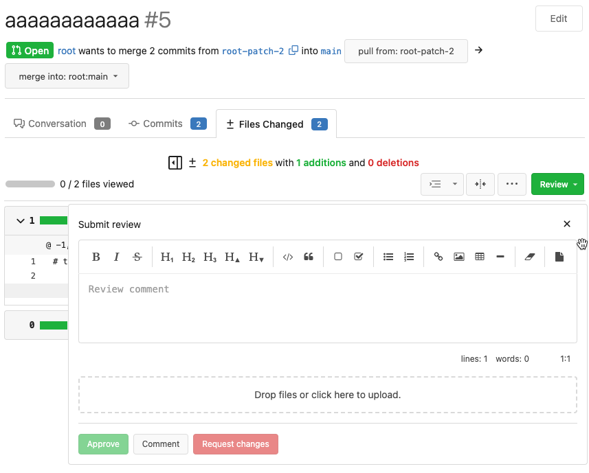 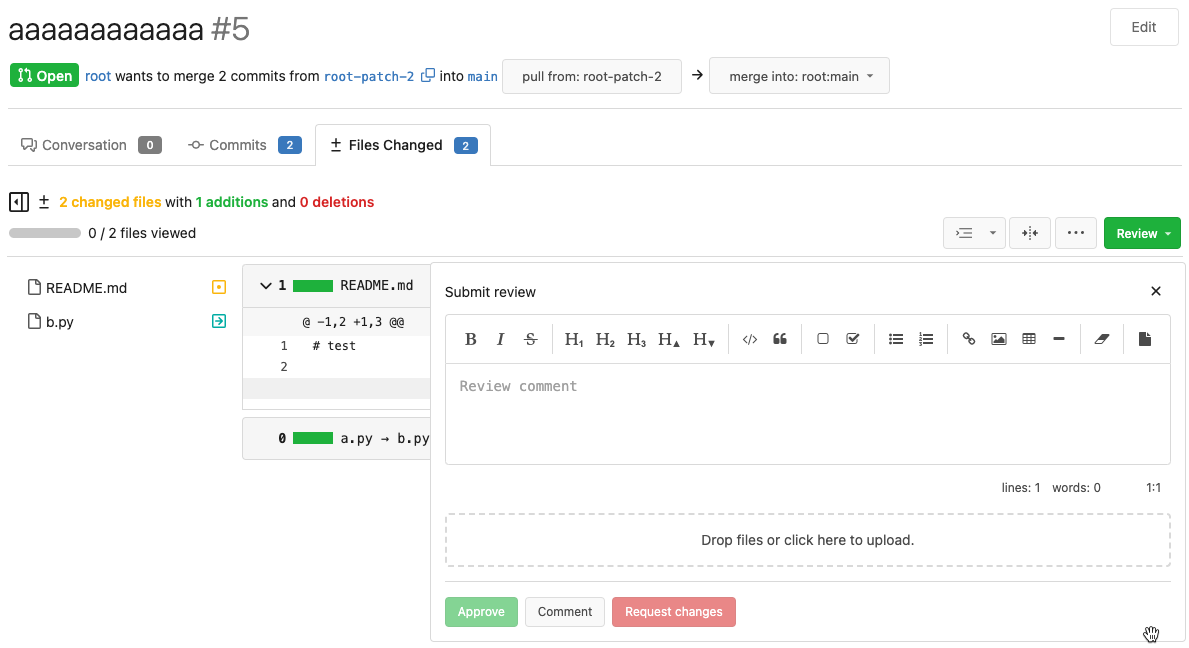 </details> And most dropdown icons still looks good: <details>   </details> Co-authored-by: delvh <leon@kske.dev>
325 lines
5.8 KiB
Plaintext
325 lines
5.8 KiB
Plaintext
@import "variables.less";
|
|
|
|
.ui.button.add-code-comment {
|
|
padding: 2px;
|
|
position: absolute;
|
|
margin-left: -22px;
|
|
z-index: 5;
|
|
opacity: 0;
|
|
transition: transform .1s ease-in-out;
|
|
transform: scale(1);
|
|
box-shadow: none !important;
|
|
border: none !important;
|
|
|
|
&:hover {
|
|
transform: scale(1.1);
|
|
}
|
|
}
|
|
|
|
.lines-escape a.toggle-escape-button::before {
|
|
visibility: visible;
|
|
content: '⚠️';
|
|
font-family: var(--fonts-emoji);
|
|
color: var(--color-red);
|
|
}
|
|
|
|
.repository .diff-file-box .code-diff td.lines-escape {
|
|
padding-left: 0 !important;
|
|
}
|
|
|
|
.diff-file-box .lines-code:hover .ui.button.add-code-comment {
|
|
opacity: 1;
|
|
}
|
|
|
|
.repository .diff-file-box .code-diff .add-comment-left,
|
|
.repository .diff-file-box .code-diff .add-comment-right,
|
|
.repository .diff-file-box .code-diff .add-code-comment .add-comment-left,
|
|
.repository .diff-file-box .code-diff .add-code-comment .add-comment-right,
|
|
.repository .diff-file-box .code-diff .add-code-comment .lines-type-marker {
|
|
padding-left: 0 !important;
|
|
padding-right: 0 !important;
|
|
}
|
|
|
|
.add-comment-left.add-comment-right .ui.attached.header {
|
|
border: 1px solid var(--color-secondary);
|
|
|
|
&:not(.top) {
|
|
margin-bottom: .5em;
|
|
}
|
|
}
|
|
|
|
.add-comment .lines-num,
|
|
.add-comment .lines-escape,
|
|
.add-comment .lines-type-marker {
|
|
display: none;
|
|
}
|
|
|
|
.show-outdated,
|
|
.hide-outdated {
|
|
&:extend(.unselectable);
|
|
|
|
&:hover {
|
|
text-decoration: underline;
|
|
}
|
|
}
|
|
|
|
.comment-code-cloud {
|
|
padding: .5rem 1rem !important;
|
|
position: relative;
|
|
margin: 0 auto;
|
|
max-width: 1000px;
|
|
|
|
@media @mediaSm {
|
|
max-width: auto;
|
|
padding: .75rem !important;
|
|
|
|
.code-comment-buttons {
|
|
margin: .5rem 0 .25rem !important;
|
|
|
|
.code-comment-buttons-buttons {
|
|
width: 100%;
|
|
}
|
|
}
|
|
|
|
.ui.buttons {
|
|
width: 100%;
|
|
margin: 0 !important;
|
|
|
|
.button {
|
|
flex: 1;
|
|
}
|
|
}
|
|
}
|
|
|
|
.comments .comment {
|
|
padding: 0;
|
|
|
|
@media @mediaSm {
|
|
display: flex;
|
|
|
|
.comment-header-right.actions .ui.basic.label {
|
|
display: none;
|
|
}
|
|
|
|
.avatar {
|
|
width: auto;
|
|
float: none;
|
|
margin: 0 .5rem 0 0;
|
|
flex-shrink: 0;
|
|
|
|
~ .content {
|
|
margin-left: 1em;
|
|
}
|
|
}
|
|
|
|
img.avatar {
|
|
margin: 0 !important;
|
|
}
|
|
|
|
.comment-content {
|
|
margin-left: 0 !important;
|
|
}
|
|
|
|
.comment-container {
|
|
width: 100%;
|
|
}
|
|
|
|
&.code-comment {
|
|
padding: 0 0 .5rem !important;
|
|
}
|
|
}
|
|
}
|
|
|
|
.attached {
|
|
&.tab {
|
|
border: 0;
|
|
padding: 0;
|
|
margin: 0;
|
|
}
|
|
|
|
&.header {
|
|
padding: .1rem 1rem;
|
|
|
|
.text {
|
|
margin: 0;
|
|
}
|
|
}
|
|
}
|
|
|
|
.right.menu.options .item {
|
|
padding: .85714286em .442857em;
|
|
cursor: pointer;
|
|
}
|
|
|
|
.ui.active.tab {
|
|
padding: .5em;
|
|
|
|
&.markup {
|
|
padding: 1em;
|
|
min-height: 168px;
|
|
}
|
|
}
|
|
|
|
.ui.tabular.menu {
|
|
margin: .5em;
|
|
}
|
|
|
|
.footer {
|
|
border-top: 1px solid var(--color-secondary);
|
|
padding: 10px 0;
|
|
|
|
.markup-info {
|
|
display: inline-block;
|
|
margin: 5px 0;
|
|
font-size: 12px;
|
|
color: var(--color-text-light);
|
|
}
|
|
|
|
.ui.right.floated {
|
|
padding-top: 6px;
|
|
}
|
|
|
|
&::after {
|
|
clear: both;
|
|
content: "";
|
|
display: block;
|
|
}
|
|
}
|
|
|
|
@media @mediaSm {
|
|
.button {
|
|
width: 100%;
|
|
margin: 0 !important;
|
|
margin-bottom: .75rem !important;
|
|
}
|
|
}
|
|
}
|
|
|
|
.diff-file-body .comment-form {
|
|
margin: 0 0 0 3em;
|
|
}
|
|
|
|
.file-comment {
|
|
color: var(--color-text);
|
|
}
|
|
|
|
a.blob-excerpt {
|
|
color: var(--color-text-light);
|
|
height: 28px;
|
|
display: flex;
|
|
justify-content: center;
|
|
align-items: center;
|
|
width: 100%;
|
|
background: var(--color-expand-button);
|
|
}
|
|
|
|
a.blob-excerpt:hover {
|
|
background: var(--color-primary);
|
|
color: var(--color-primary-contrast);
|
|
}
|
|
|
|
// See the comment of createCommentEasyMDE() for the review editor
|
|
// EasyMDE's options can not handle minHeight & maxHeight together correctly, we have to set minHeight in JS code
|
|
.review-box-panel .CodeMirror-scroll {
|
|
min-height: 80px;
|
|
max-height: calc(100vh - 360px);
|
|
}
|
|
|
|
@media @mediaSm {
|
|
.review-box-panel .CodeMirror-scroll {
|
|
max-width: calc(100vw - 70px);
|
|
}
|
|
}
|
|
|
|
@media @mediaMd {
|
|
.review-box-panel .CodeMirror-scroll {
|
|
max-width: 700px;
|
|
}
|
|
}
|
|
|
|
@media @mediaLg {
|
|
.review-box-panel .CodeMirror-scroll {
|
|
max-width: 800px;
|
|
}
|
|
}
|
|
|
|
@media @mediaXl {
|
|
.review-box-panel .CodeMirror-scroll {
|
|
max-width: 900px;
|
|
}
|
|
}
|
|
|
|
#review-box {
|
|
position: relative;
|
|
}
|
|
|
|
.review-box-panel {
|
|
position: absolute;
|
|
min-width: max-content;
|
|
top: 45px;
|
|
right: -5px;
|
|
z-index: 2;
|
|
}
|
|
|
|
#review-box .review-comments-counter {
|
|
background-color: var(--color-primary-light-4);
|
|
color: var(--color-primary-contrast);
|
|
}
|
|
|
|
#review-box:hover .review-comments-counter {
|
|
background-color: var(--color-primary-light-5);
|
|
}
|
|
|
|
#review-box .review-comments-counter[data-pending-comment-number="0"] {
|
|
display: none;
|
|
}
|
|
|
|
.pull.files.diff [id] {
|
|
scroll-margin-top: 99px;
|
|
|
|
@media @mediaMdAndDown {
|
|
scroll-margin-top: 130px;
|
|
}
|
|
}
|
|
|
|
.changed-since-last-review {
|
|
border: 1px var(--color-accent) solid;
|
|
background-color: var(--color-small-accent);
|
|
border-radius: 15px;
|
|
padding: 4px 8px;
|
|
margin: -8px 0; // just like other buttons in the diff box header
|
|
font-size: .857rem; // just like .ui.tiny.button
|
|
}
|
|
|
|
.viewed-file-form {
|
|
display: flex;
|
|
align-items: center;
|
|
border: 1px solid transparent;
|
|
padding: 4px 8px;
|
|
margin: -8px 0; // just like other buttons in the diff box header
|
|
border-radius: .285rem; // just like .ui.tiny.button
|
|
font-size: .857rem; // just like .ui.tiny.button
|
|
}
|
|
|
|
.viewed-file-form input {
|
|
margin-right: 4px;
|
|
}
|
|
|
|
.viewed-file-checked-form {
|
|
background-color: var(--color-small-accent);
|
|
border-color: var(--color-accent);
|
|
}
|
|
|
|
#viewed-files-summary {
|
|
width: 72px;
|
|
height: 10px;
|
|
}
|
|
|
|
.diff-file-box {
|
|
border-radius: .285rem; // Just like ui.top.attached.header
|
|
}
|
|
|
|
.diff-file-box:target {
|
|
box-shadow: 0 0 0 3px var(--color-accent);
|
|
}
|