mirror of
https://github.com/go-gitea/gitea
synced 2025-03-04 09:44:20 +00:00
 b9baed2c74
This PR introduces a new UI element type for Gitea called `flex-item`. It consists of a horizontal card with a leading, main and trailing part:  The idea behind it is that in Gitea UI, we have many cases where we use this kind of layout, but it is achieved in many different ways: - grid layout - `.ui.list` with additional hacky flexbox - `.ui.key.list` - looks to me like a style set originally created for ssh/gpg key list, was used in many other places - `.issue.list` - created for issue cards, used in many other places - ... This new style is based on `.issue.list`, specifically the refactoring of it done in #25750. In this PR, the new element is introduced and lots of templates are being refactored to use that style. This allows to remove a lot of page-specific css, makes many of the elements responsive or simply provides a cleaner/better-looking way to present information. A devtest section with the new style is also available. <details> <summary>Screenshots (left: before, right: after)</summary> 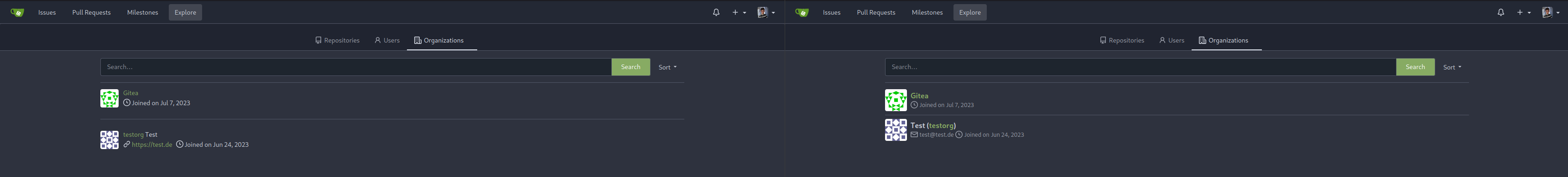  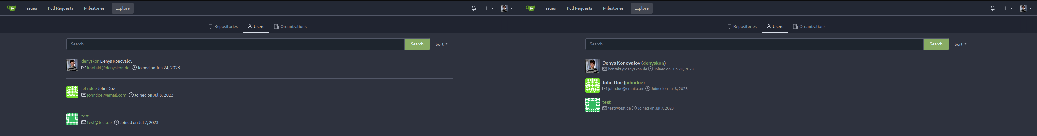  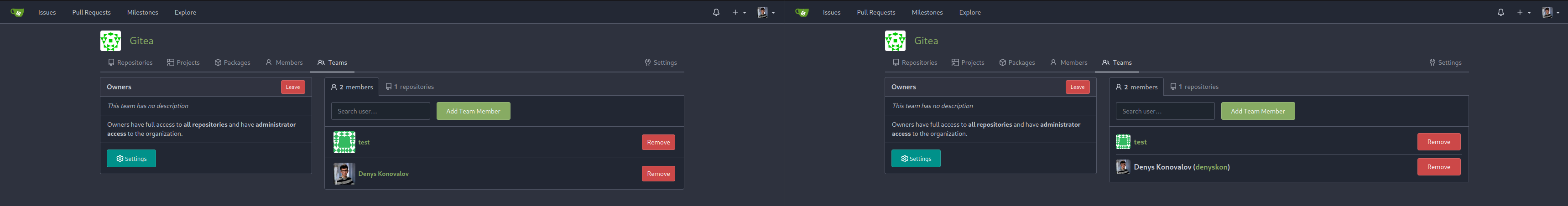          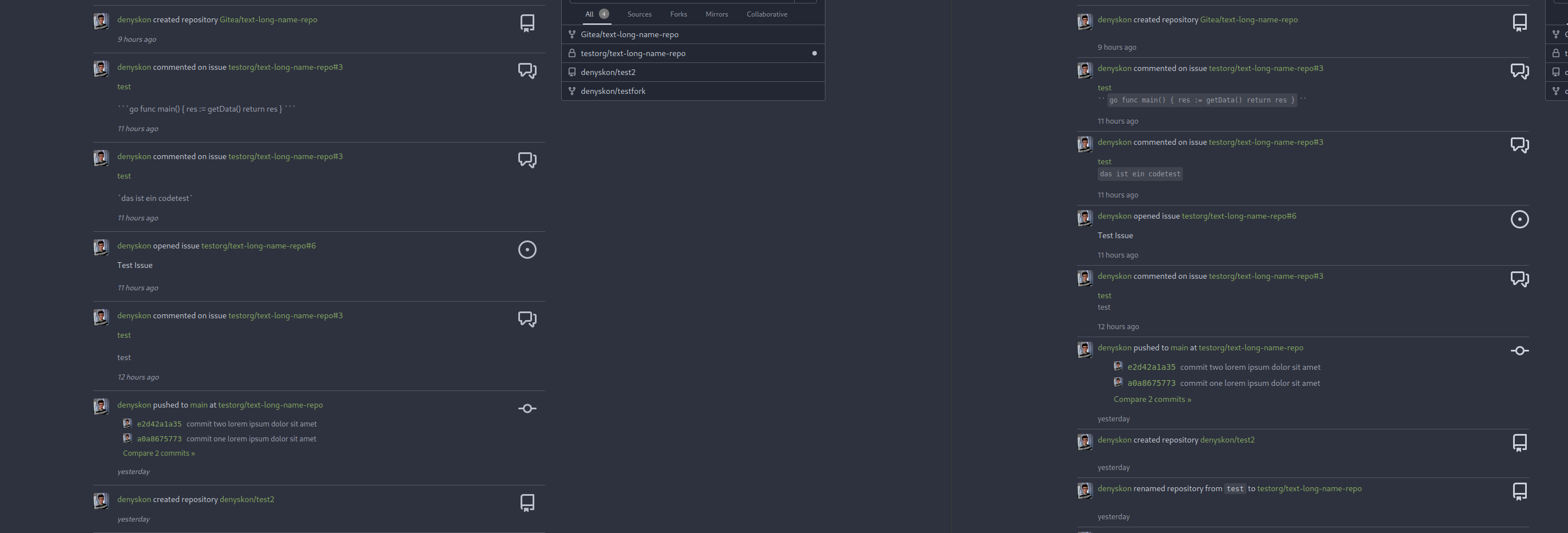  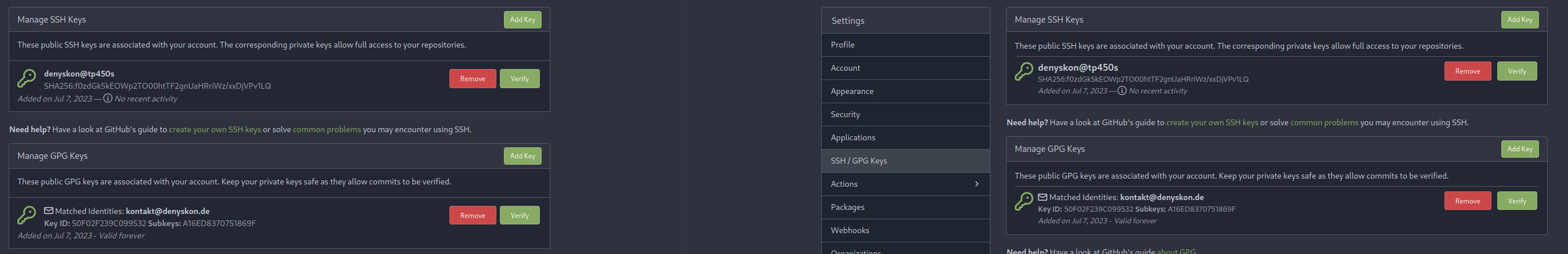  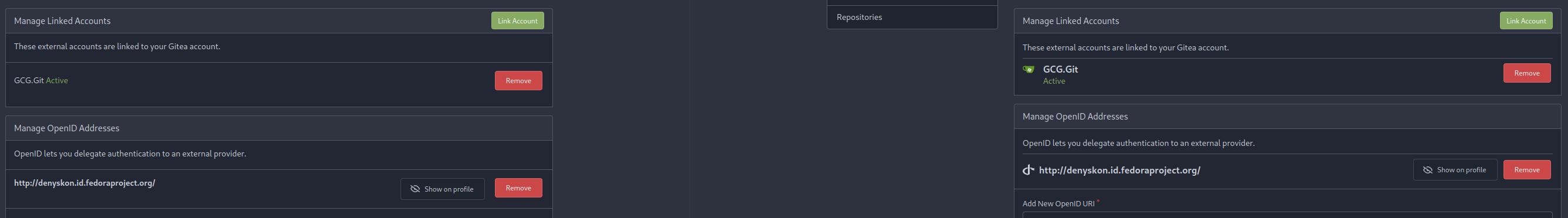 </details> --------- Co-authored-by: Giteabot <teabot@gitea.io>
34 lines
657 B
CSS
34 lines
657 B
CSS
.explore .navbar {
|
|
margin-bottom: 15px !important;
|
|
background-color: var(--color-header-wrapper) !important;
|
|
border-width: 1px !important;
|
|
}
|
|
|
|
.explore .navbar .svg {
|
|
width: 16px;
|
|
text-align: center;
|
|
margin-right: 5px;
|
|
}
|
|
|
|
.ui.repository.branches .info {
|
|
font-size: 12px;
|
|
color: var(--color-text-light);
|
|
display: flex;
|
|
white-space: pre;
|
|
}
|
|
|
|
.ui.repository.branches .info .commit-message {
|
|
max-width: 72em;
|
|
overflow: hidden;
|
|
text-overflow: ellipsis;
|
|
}
|
|
|
|
.ui.repository.branches .overflow-visible {
|
|
overflow: visible;
|
|
}
|
|
|
|
/* fix alignment of PR popup in branches table */
|
|
.ui.repository.branches table .ui.popup {
|
|
text-align: left;
|
|
}
|