mirror of
https://github.com/go-gitea/gitea
synced 2024-06-02 17:35:49 +00:00
 dcb648ee71
Step one for a GitHub like commit status check ui: 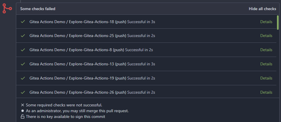  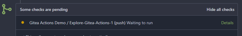 Step two:  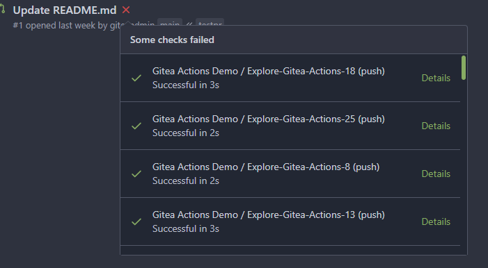 The design now will list all commit status checks which takes too much space. This is a pre-improve for #26247 --------- Co-authored-by: delvh <dev.lh@web.de> Co-authored-by: silverwind <me@silverwind.io> Co-authored-by: wxiaoguang <wxiaoguang@gmail.com>
132 lines
2.8 KiB
CSS
132 lines
2.8 KiB
CSS
/* styles are based on node_modules/tippy.js/dist/tippy.css */
|
|
|
|
/* class to hide tippy target elements on page load */
|
|
.tippy-target {
|
|
display: none !important;
|
|
}
|
|
|
|
[data-tippy-root] {
|
|
max-width: calc(100vw - 32px);
|
|
}
|
|
|
|
.tippy-box {
|
|
position: relative;
|
|
background-color: var(--color-body);
|
|
color: var(--color-secondary-dark-6);
|
|
border: 1px solid var(--color-secondary);
|
|
border-radius: var(--border-radius);
|
|
font-size: 1rem;
|
|
}
|
|
|
|
.tippy-content {
|
|
position: relative;
|
|
padding: 1rem; /* if you need different padding, use different data-theme */
|
|
z-index: 1;
|
|
}
|
|
|
|
/* tooltip theme for text tooltips */
|
|
|
|
.tippy-box[data-theme="tooltip"] {
|
|
background-color: var(--color-tooltip-bg);
|
|
color: var(--color-tooltip-text);
|
|
border: none;
|
|
}
|
|
|
|
.tippy-box[data-theme="tooltip"] .tippy-content {
|
|
padding: 0.5rem 1rem;
|
|
}
|
|
|
|
.tippy-box[data-theme="tooltip"] .tippy-svg-arrow-inner,
|
|
.tippy-box[data-theme="tooltip"] .tippy-svg-arrow-outer {
|
|
fill: var(--color-tooltip-bg);
|
|
}
|
|
|
|
/* menu theme for .ui.menu */
|
|
|
|
.tippy-box[data-theme="menu"] {
|
|
background-color: var(--color-menu);
|
|
color: var(--color-text);
|
|
}
|
|
|
|
.tippy-box[data-theme="menu"] .tippy-content {
|
|
padding: 0;
|
|
}
|
|
|
|
.tippy-box[data-theme="menu"] .tippy-svg-arrow-inner {
|
|
fill: var(--color-menu);
|
|
}
|
|
|
|
/* box-with-header theme to look like .ui.attached.segment. can contain .ui.attached.header */
|
|
|
|
.tippy-box[data-theme="box-with-header"] .tippy-content {
|
|
background: var(--color-box-body);
|
|
padding: 0;
|
|
}
|
|
|
|
.tippy-box[data-theme="box-with-header"][data-placement^="top"] .tippy-svg-arrow-inner {
|
|
fill: var(--color-box-body);
|
|
}
|
|
|
|
.tippy-box[data-theme="box-with-header"][data-placement^="bottom"] .tippy-svg-arrow-inner {
|
|
fill: var(--color-box-header);
|
|
}
|
|
|
|
.tippy-box[data-placement^="top"] > .tippy-svg-arrow {
|
|
bottom: 0;
|
|
}
|
|
|
|
.tippy-box[data-placement^="top"] > .tippy-svg-arrow::after,
|
|
.tippy-box[data-placement^="top"] > .tippy-svg-arrow > svg {
|
|
top: 16px;
|
|
transform: rotate(180deg);
|
|
}
|
|
|
|
.tippy-box[data-placement^="bottom"] > .tippy-svg-arrow {
|
|
top: 0;
|
|
}
|
|
|
|
.tippy-box[data-placement^="bottom"] > .tippy-svg-arrow > svg {
|
|
bottom: 16px;
|
|
}
|
|
|
|
.tippy-box[data-placement^="left"] > .tippy-svg-arrow {
|
|
right: 0;
|
|
}
|
|
|
|
.tippy-box[data-placement^="left"] > .tippy-svg-arrow::after,
|
|
.tippy-box[data-placement^="left"] > .tippy-svg-arrow > svg {
|
|
transform: rotate(90deg);
|
|
top: calc(50% - 3px);
|
|
left: 11px;
|
|
}
|
|
|
|
.tippy-box[data-placement^="right"] > .tippy-svg-arrow {
|
|
left: 0;
|
|
}
|
|
|
|
.tippy-box[data-placement^="right"] > .tippy-svg-arrow::after,
|
|
.tippy-box[data-placement^="right"] > .tippy-svg-arrow > svg {
|
|
transform: rotate(-90deg);
|
|
top: calc(50% - 3px);
|
|
right: 11px;
|
|
}
|
|
|
|
.tippy-svg-arrow {
|
|
width: 16px;
|
|
height: 16px;
|
|
text-align: initial;
|
|
}
|
|
|
|
.tippy-svg-arrow,
|
|
.tippy-svg-arrow > svg {
|
|
position: absolute;
|
|
}
|
|
|
|
.tippy-svg-arrow-outer {
|
|
fill: var(--color-secondary);
|
|
}
|
|
|
|
.tippy-svg-arrow-inner {
|
|
fill: var(--color-body);
|
|
}
|