HesterG and GitHub
24c3bb95ac
Categorize admin settings sidebar panel ( #26030 )
...
This PR reorganize and categorize the admin settings sidebar panel into
groups:
- User Accounts, User Emails, Organizations, Authentication Sources ->
Identity & Access
- Repositories, Packages -> Code Assets
- Webhooks, Applications -> Integrations
Before:
<img width="1346" alt="Screen Shot 2023-07-21 at 10 30 28"
src="https://github.com/go-gitea/gitea/assets/17645053/e0c5ae83-464f-4aaa-8bab-2c5258c9278d ">
After:
all configurable settings enabled (package, oauth, webhook)
<img width="1153" alt="Screen Shot 2023-07-21 at 10 27 30"
src="https://github.com/go-gitea/gitea/assets/17645053/88acf3f5-0623-4307-8654-69c654d80874 ">
all configurable settings disabled (package, oauth, webhook)
<img width="1391" alt="Screen Shot 2023-07-21 at 10 25 19"
src="https://github.com/go-gitea/gitea/assets/17645053/9e13aa60-e75c-4077-afd6-3da9e0ae18dd ">
only oauth enabled
<img width="1323" alt="Screen Shot 2023-07-21 at 10 26 23"
src="https://github.com/go-gitea/gitea/assets/17645053/ce4f9ec0-b141-4d5e-ac13-46d001724dc5 ">
only webhook enabled
<img width="1350" alt="Screen Shot 2023-07-21 at 10 26 55"
src="https://github.com/go-gitea/gitea/assets/17645053/702491bd-083e-44fa-82bc-52c4571e54ac ">
2023-07-24 09:05:16 +08:00
2f0e79e639
Use frontend fetch for branch dropdown component ( #25719 )
...
- Send request to get branch/tag list, use loading icon when waiting for
response.
- Only fetch when the first time branch/tag list shows.
- For backend, removed assignment to `ctx.Data["Branches"]` and
`ctx.Data["Tags"]` from `context/repo.go` and passed these data wherever
needed.
- Changed some `v-if` to `v-show` and used native `svg` as mentioned in
https://github.com/go-gitea/gitea/pull/25719#issuecomment-1631712757 to
improve perfomance when there are a lot of branches.
- Places Used the dropdown component:
Repo Home Page
<img width="1429" alt="Screen Shot 2023-07-06 at 12 17 51"
src="https://github.com/go-gitea/gitea/assets/17645053/6accc7b6-8d37-4e88-ae1a-bd2b3b927ea0 ">
Commits Page
<img width="1431" alt="Screen Shot 2023-07-06 at 12 18 34"
src="https://github.com/go-gitea/gitea/assets/17645053/2d0bf306-d1e2-45a8-a784-bc424879f537 ">
Specific commit -> operations -> cherry-pick
<img width="758" alt="Screen Shot 2023-07-06 at 12 23 28"
src="https://github.com/go-gitea/gitea/assets/17645053/1e557948-3881-4e45-a625-8ef36d45ae2d ">
Release Page
<img width="1433" alt="Screen Shot 2023-07-06 at 12 25 05"
src="https://github.com/go-gitea/gitea/assets/17645053/3ec82af1-15a4-4162-a50b-04a9502161bb ">
- Demo
https://github.com/go-gitea/gitea/assets/17645053/d45d266b-3eb0-465a-82f9-57f78dc5f9f3
- Note:
UI of dropdown menu could be improved in another PR as it should apply
to more dropdown menus.
Fix #14180
---------
Co-authored-by: silverwind <me@silverwind.io >
Co-authored-by: wxiaoguang <wxiaoguang@gmail.com >
2023-07-21 11:20:04 +00:00
b137a03297
Update blog links ( #25843 )
...
As title. Permalinks for lastest version of blog has changed, update the
blog links.
---------
Co-authored-by: Giteabot <teabot@gitea.io >
2023-07-12 11:35:07 +00:00
HesterG and GitHub
dae022ab2a
Fix show more for image on diff page ( #25672 )
...
Right now when clicking on loadmore on files change page, if the loaded
content is image, it will be always in load status:


https://github.com/go-gitea/gitea/assets/17645053/39e449b6-067a-474c-9443-9dd98d5bbfe2

This PR fixes this by adding `initImageDiff ` to `onShowMoreFiles `

After:


https://github.com/go-gitea/gitea/assets/17645053/87bbb13e-0064-4a6e-a7ad-0f0060eb8bff
2023-07-04 10:36:27 +02:00
640a88fa09
Add log line anchor for action logs ( #25532 )
...
Close #24593
Some behavior:
- If log step line in hash exists, expand the step and scroll to the log
line.
- If step exists but line not exists, the step will be expanded.
- If step not exists, stays on the job's page.
Some Notes:
- Changed mounted to async because need to await for first `loadJob` so
`currentJobStepsStates` can be initialized and used in
`hashChangeListener `.
---------
Co-authored-by: silverwind <me@silverwind.io >
Co-authored-by: wxiaoguang <wxiaoguang@gmail.com >
2023-07-03 01:08:49 +00:00
HesterG and GitHub
5a871932f0
Fix milestones deletion ( #25583 )
...
Close #25557
Fix regression from #25315

`data-id` is still needed for deleting milestone.
2023-06-29 10:17:18 +02:00
c6f1fb1c6d
Use fetch form action for lock/unlock/pin/unpin on sidebar ( #25380 )
...
Before:
<img width="364" alt="Screen Shot 2023-06-20 at 11 59 11"
src="https://github.com/go-gitea/gitea/assets/17645053/ad284b7e-8d21-43be-b178-bbcfd37cb5bd ">
Might trigger many posts when keep clicking the buttons above.
<img width="448" alt="Screen Shot 2023-06-20 at 11 52 28"
src="https://github.com/go-gitea/gitea/assets/17645053/a60aa6ac-af74-45e4-b13a-512b436b81b0 ">
<img width="678" alt="Screen Shot 2023-06-20 at 11 52 37"
src="https://github.com/go-gitea/gitea/assets/17645053/d6662700-3643-4cc7-a2ec-64e1c0f5fbdb ">
After (PR sidebar, Same for issue):
https://github.com/go-gitea/gitea/assets/17645053/9df3ad1f-e29c-439b-8bde-e6b917d63cc6
For delete, it is using `base/modal_actions_confirm` subtemplate, and we
might need another general solution for this (maybe add another
attribute to the subtemplate or something)
---------
Co-authored-by: silverwind <me@silverwind.io >
Co-authored-by: Giteabot <teabot@gitea.io >
Co-authored-by: wxiaoguang <wxiaoguang@gmail.com >
2023-06-29 04:16:04 +00:00
HesterG and GitHub
c082689471
Use flex instead of float for sort button and search input ( #25519 )
...
Right now some sort buttons beside search input are unclickable because
#25338 removed `max-width` and the sort button is using float, sort
button is then covered by the `input`.
The way to fix this in this PR is changing the layout to `flex` and put
`input form` and sort `button` into `secondary menu`.
After:
<img width="1411" alt="Screen Shot 2023-06-26 at 16 40 52"
src="https://github.com/go-gitea/gitea/assets/17645053/63c12b17-793a-4ae7-bbda-f67b13b87212 ">
<img width="1428" alt="Screen Shot 2023-06-26 at 16 34 06"
src="https://github.com/go-gitea/gitea/assets/17645053/cb7d967e-355d-4cb0-955c-6139580fc17a ">
<img width="716" alt="Screen Shot 2023-06-26 at 16 34 22"
src="https://github.com/go-gitea/gitea/assets/17645053/c74b5ef2-d46e-4487-8794-28bec984bb36 ">
<img width="1424" alt="Screen Shot 2023-06-26 at 16 34 32"
src="https://github.com/go-gitea/gitea/assets/17645053/8a5fdc05-a2c5-4ec4-979d-15a21501fe14 ">
<img width="1425" alt="Screen Shot 2023-06-26 at 16 35 21"
src="https://github.com/go-gitea/gitea/assets/17645053/eb73cd31-3914-4bc9-92ab-aba56f25128b ">
<img width="1437" alt="Screen Shot 2023-06-26 at 16 36 14"
src="https://github.com/go-gitea/gitea/assets/17645053/1c3b4595-bb26-491f-aa68-60dc9ab22b84 ">
2023-06-28 20:10:36 +08:00
HesterG and GitHub
00b98bc8e0
Fix rerun icon on action view component ( #25531 )
...
Right now rerun icon on action view component will not be seen when
duration text length is long, because the wrapper `job-brief-info` has a
fixed width, and the svg is squeezed. The way to fix this in this PR is
to change width to `fit-content` and exchange position of duration text
and rerun svg.
Before (rerun svg not shown on hover):
<img width="1401" alt="Screen Shot 2023-06-27 at 12 53 41"
src="https://github.com/go-gitea/gitea/assets/17645053/bb3f62ec-8c56-4dbc-96f1-718b50426d91 ">
After:
<img width="1409" alt="Screen Shot 2023-06-27 at 12 50 59"
src="https://github.com/go-gitea/gitea/assets/17645053/620aa02c-2326-408d-a763-453f48f42c40 ">
2023-06-27 16:34:33 +02:00
HesterG and GitHub
457946d595
Allow change line of admin-dl-horizontal dt ( #25508 )
...
Close #25389
After:
<img width="915" alt="Screen Shot 2023-06-26 at 11 00 12"
src="https://github.com/go-gitea/gitea/assets/17645053/45026447-cf50-4603-ade3-7b80a9023c20 ">
admin/dashboard:
<img width="957" alt="Screen Shot 2023-06-26 at 10 59 51"
src="https://github.com/go-gitea/gitea/assets/17645053/f4f95bbe-f747-46f1-8fbd-5778a19ebef7 ">
2023-06-26 11:49:14 +08:00
HesterG and GitHub
dfd19fa38c
Fine tune project board label colors and modal content background ( #25419 )
...
- The label text color on project board is not contrasting enough,
changed to colors that are same as places that also used
`useLightTextOnBackground` function
([util_render.go](https://github.com/go-gitea/gitea/blob/2cdf260f42d178d23a8db70db35664511aeab31e/modules/templates/util_render.go#L136-L141 ),
[Context
Popup](https://github.com/go-gitea/gitea/blob/2cdf260f42d178d23a8db70db35664511aeab31e/web_src/js/components/ContextPopup.vue#L81-L84 ))
- background of modal `content` is `#ffffff` (from fomantic) right now,
which does not look good on dark mode, so changed to `var(--color-body)`
Before:
<img width="1378" alt="Screen Shot 2023-06-21 at 14 24 13"
src="https://github.com/go-gitea/gitea/assets/17645053/1527ca28-c884-4ca9-a4be-7a72ad1a093a ">
<img width="900" alt="Screen Shot 2023-06-21 at 14 25 52"
src="https://github.com/go-gitea/gitea/assets/17645053/fab82116-7376-4027-a0a4-9eedf9fb0a30 ">
After:
<img width="1383" alt="Screen Shot 2023-06-21 at 14 19 33"
src="https://github.com/go-gitea/gitea/assets/17645053/fe0997e7-fee6-4522-bc4e-545088ec1cc8 ">
<img width="797" alt="Screen Shot 2023-06-21 at 14 32 42"
src="https://github.com/go-gitea/gitea/assets/17645053/b0591af0-950c-4448-9430-34d6c7215971 ">
2023-06-21 18:15:51 +08:00
HesterG and GitHub
1454f9dafc
Add actor and status dropdowns to run list ( #25118 )
...
Part of #25042
1. Added actor and status dropdowns first in case something is offtrack
and PR is too large.
2. Also added "No results matched." and "The workflow has no runs yet.",
and "No results matched." will show if there is no filter results and
there is no workflows (with [reference to github
action](https://github.com/go-gitea/gitea/actions/workflows/files-changed.yml?query=actor%3AGiteaBot ))
Demo:
https://github.com/go-gitea/gitea/assets/17645053/6e76292c-4c1f-450d-8b48-99944cfc920c
TODOs:
- [x] Get available status (same as those in `aggregateJobStatus`)
instead of getting from database
- [x] Use `JOIN` to get actors, actors order by name
- [x] Make self on top
2023-06-21 04:25:14 +00:00
HesterG and GitHub
49a77e37ba
Fix sidebar label dropdown divider ( #25359 )
...
Follow #25312
Also fix the label dropdown on sidebar
Before:
<img width="1345" alt="Screen Shot 2023-06-19 at 08 55 05"
src="https://github.com/go-gitea/gitea/assets/17645053/3a98e871-b482-4ecb-8ce2-74df67fb65a7 ">
After:
<img width="1408" alt="Screen Shot 2023-06-19 at 08 57 17"
src="https://github.com/go-gitea/gitea/assets/17645053/09af15cc-1250-49b3-98b6-5b1a2b9021cb ">
2023-06-19 17:49:50 +00:00
a43ea22479
Change form actions to fetch for submit review box ( #25219 )
...
Co-author: @wxiaoguang
Close #25096
The way to fix it in this PR is to change form submit to fetch using
formData, and add flags to avoid post repeatedly.
Should be able to apply to more forms that have the same issue after
this PR.
In the demo below, 'approve' is clicked several times, and then
'comment' is clicked several time after 'request changes' clicked.
After:
https://github.com/go-gitea/gitea/assets/17645053/beabeb1d-fe66-4b76-b048-4f022b4e83a0
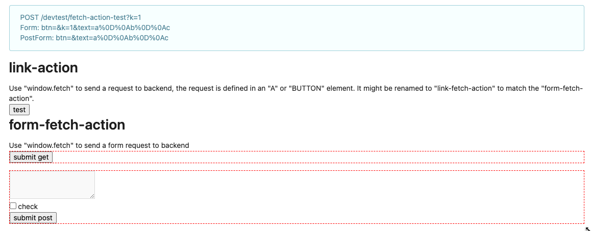
Update: screenshots from /devtest
>

>
>

>
>

---------
Co-authored-by: wxiaoguang <wxiaoguang@gmail.com >
2023-06-14 16:01:37 +08:00
HesterG and GitHub
3318001880
Fix fullscreen for action ( #25200 )
...
An error occurs when clicking on `show full screen` on action page.
<img width="1440" alt="Screen Shot 2023-06-12 at 13 06 52"
src="https://github.com/go-gitea/gitea/assets/17645053/1d4ded3c-fb77-4dd8-9201-24d0696f96eb ">
class name has changed in #25134 , so the selector is not working.
Enhance the selectors to fix this.
2023-06-12 10:18:01 +00:00
HesterG and GitHub
06557a75db
Adjust style for action run list (align icons, adjust padding) ( #25170 )
...
Main changes:
- Moved the icon into `action-item-main`, and make it `position:
absolute` to allow add margin it to align with `issue-item-top-row`.
- Adjusted padding and color of texts.
# Before
<img width="721" alt="Screen Shot 2023-06-09 at 17 04 38"
src="https://github.com/go-gitea/gitea/assets/17645053/3fc00e94-bcd4-4e06-b1d8-93be0576dbc3 ">
# After
<img width="1421" alt="Screen Shot 2023-06-09 at 18 32 47"
src="https://github.com/go-gitea/gitea/assets/17645053/c2a0f9df-cac4-4197-9cbd-6c16dfef215b ">
On hover:
<img width="1431" alt="Screen Shot 2023-06-09 at 18 32 54"
src="https://github.com/go-gitea/gitea/assets/17645053/d0ab6fde-9722-4d76-831b-163fd6a1f560 ">
2023-06-12 09:36:08 +00:00
63a429581c
Modify OAuth login ui and fix display name, iconurl related logic ( #25030 )
...
Close #24808
Co-Authour @wxiaoguang @silverwind
1. Most svgs are found from https://worldvectorlogo.com/ , and some are
from conversion of png to svg. (facebook and nextcloud). And also
changed `templates/user/settings/security/accountlinks.tmpl`.
2. Fixed display name and iconurl related logic
# After
<img width="1436" alt="Screen Shot 2023-06-05 at 14 09 05"
src="https://github.com/go-gitea/gitea/assets/17645053/a5db39d8-1ab0-4676-82a4-fba60a1d1f84 ">
On mobile
<img width="378" alt="Screen Shot 2023-06-05 at 14 09 46"
src="https://github.com/go-gitea/gitea/assets/17645053/71d0f51b-baac-4f48-8ca2-ae0e013bd62e ">
user/settings/security/accountlinks (The dropdown might be improved
later)
<img width="973" alt="Screen Shot 2023-06-01 at 10 01 44"
src="https://github.com/go-gitea/gitea/assets/17645053/27010e7e-2785-4fc5-8c49-b06621898f37 ">
---------
Co-authored-by: silverwind <me@silverwind.io >
Co-authored-by: wxiaoguang <wxiaoguang@gmail.com >
2023-06-08 16:35:29 +00:00
HesterG and GitHub
206d3fbae9
Change branch name from master to main in some documents' links ( #25126 )
...
As title. And needs to backport to 1.19
2023-06-08 07:35:55 +00:00
58536093b3
Add details summary for vertical menus in settings to allow toggling ( #25098 )
...
Close #25051
[referenced
answer](https://stackoverflow.com/questions/10813581/can-i-replace-the-expand-icon-of-the-details-element/69722686#69722686 )
for marker overwrite. One limitation is that fomantic does not have
hover and active effects for the vertical submenu
([reference](https://fomantic-ui.com/collections/menu.html#sub-menu )).
And we might need to overwrite some styles if hover and active effects
are needed.
Update:
Used `data:image/svg` instead of `marker` content. And adjusted styles
for hover effect.
Take admin settings as an example:
https://github.com/go-gitea/gitea/assets/17645053/63f69823-ef43-47d5-a518-544b5ea35ba6
---------
Co-authored-by: silverwind <me@silverwind.io >
2023-06-07 10:49:48 +08:00
HesterG and GitHub
28a89e360f
Add user level action runners ( #24995 )
...
Used similar logic to organization.
<img width="1437" alt="Screen Shot 2023-05-30 at 10 18 06"
src="https://github.com/go-gitea/gitea/assets/17645053/49f3800a-44ae-4188-b1e6-91d49e3d7868 ">
<img width="1331" alt="Screen Shot 2023-05-30 at 10 31 18"
src="https://github.com/go-gitea/gitea/assets/17645053/221b2068-e9b9-4e34-bb4a-d390594b2f35 ">
2023-05-31 09:39:54 +08:00
1ea5c8b0ff
Add show timestamp/seconds and fullscreen options to action page ( #24876 )
...
Part of #24728
- The timestamp shows local time and is parsed by `date.toLocaleString`;
- "show seconds" and "show timestamps" are mutually exclusive, and they
can be both hidden.
https://github.com/go-gitea/gitea/assets/17645053/89531e54-37b7-4400-a6a0-bb3cc69eb6f5
Update for timestamp format:
<img width="306" alt="Screen Shot 2023-05-25 at 09 07 47"
src="https://github.com/go-gitea/gitea/assets/17645053/2d99768d-d39c-4c9e-81a2-7bc7470399dd ">
---------
Co-authored-by: silverwind <me@silverwind.io >
Co-authored-by: wxiaoguang <wxiaoguang@gmail.com >
2023-05-30 20:38:55 +00:00
HesterG and GitHub
32185efc14
Fix delete user account modal ( #25004 )
...
Before:
<img width="953" alt="Screen Shot 2023-05-30 at 17 08 57"
src="https://github.com/go-gitea/gitea/assets/17645053/f379b2c9-7d9a-492e-b0e4-5a8be1c3a025 ">
After:
<img width="875" alt="Screen Shot 2023-05-30 at 17 06 17"
src="https://github.com/go-gitea/gitea/assets/17645053/75d3c9b5-201b-4001-a27e-64c932e2e34a ">
2023-05-30 18:08:09 +08:00
085a8857f9
Fix repo level project - edit column ( #24982 )
...
Right now edit column of repo level project is not working, because edit
button does not have the `edit-column-button` class, which is used in
the [js
selector](https://github.com/go-gitea/gitea/blob/28077e66c0a5593f001e89ef1ff02627dbe029a1/web_src/js/features/repo-projects.js#L106 )
After:
https://github.com/go-gitea/gitea/assets/17645053/e1fba190-477d-4814-87f2-0fd979376840
Co-authored-by: Giteabot <teabot@gitea.io >
2023-05-29 16:32:15 +00:00
HesterG and GitHub
0018b0a15e
Unify doc links to use paths relative to doc folder ( #24979 )
...
Changes:
1. Use uniform links types relative to doc folder (start with `doc/`)
2. According to [docusaurus
links](https://docusaurus.io/docs/markdown-features/links ), if `<a>` is
used, the `href` is resolved as URL location, but not file location. So
need to use `[text]({{< relref "path" >}})` instead.
2023-05-29 13:27:16 +00:00
HesterG and GitHub
aa2b317e08
Add Chinese docs for help, contribution and development ( #24925 )
2023-05-25 16:01:01 +00:00
HesterG and GitHub
cff4e37d43
Add Chinese documentations for Actions ( #24902 )
2023-05-25 13:52:12 +08:00
HesterG and GitHub
9ad5cadc07
Fix <empty> in administration/config-cheat-sheet.en-us.md ( #24905 )
...
Before
<img width="206" alt="Screen Shot 2023-05-24 at 15 54 02"
src="https://github.com/go-gitea/gitea/assets/17645053/3493180e-e7a8-466d-b418-641c39d7788c ">
<img width="272" alt="Screen Shot 2023-05-24 at 15 50 05"
src="https://github.com/go-gitea/gitea/assets/17645053/b1c80313-5b2c-41d8-aad3-4099c912c173 ">
<img width="264" alt="Screen Shot 2023-05-24 at 15 50 16"
src="https://github.com/go-gitea/gitea/assets/17645053/9a4b4223-ce67-40b3-a44e-03219694a37d ">
After
<img width="295" alt="Screen Shot 2023-05-24 at 15 52 53"
src="https://github.com/go-gitea/gitea/assets/17645053/fbc8ef6e-2b9b-44f5-ba4f-6002cf2f19fe ">
<img width="334" alt="Screen Shot 2023-05-24 at 15 53 03"
src="https://github.com/go-gitea/gitea/assets/17645053/6ebe45bf-b986-4afc-9b5c-d0c0134650c2 ">
<img width="282" alt="Screen Shot 2023-05-24 at 15 53 13"
src="https://github.com/go-gitea/gitea/assets/17645053/90ccc1ae-69f5-4730-8191-5e86ed0f6d49 ">
2023-05-24 16:29:44 +08:00
HesterG and GitHub
0e84bd2514
Fix double border and adjust width for user profile page ( #24870 )
...
Close #24848
2023-05-23 17:55:51 +00:00
da461b5a08
Improvements for action detail page ( #24718 )
...
Close #24625
Main changes:
1. For the left panel, show rerun icon only on hover, and add style when
the job is selected, and removed icon on the "rerun all" button and
modify the text on the button
https://github.com/go-gitea/gitea/assets/17645053/cc437a17-d2e9-4f1b-a8cf-f56e53962767
2. Adjust fonts, and add on hover effects to the log lines. And add
loading effect when the job is done and the job step log is expanded for
the first time. (With reference to github)
https://github.com/go-gitea/gitea/assets/17645053/2808d77d-f402-4fb0-8819-7aa0a018cf0c
3. Add `gt-ellipsis` to `step-summary-msg` and `job-brief-name`
<img width="898" alt="ellipsis"
src="https://github.com/go-gitea/gitea/assets/17645053/e2fb7049-3125-4252-970d-15b0751febc7 ">
4. Fixed
https://github.com/go-gitea/gitea/issues/24625#issuecomment-1541380010
by adding explicit conditions to `ActionRunStatus.vue` and `status.tmpl`
5. Adjust some css styles
---------
Co-authored-by: silverwind <me@silverwind.io >
2023-05-22 12:17:24 +08:00
acde12a8a2
Fix max width and margin of comment box on conversation page ( #24809 )
...
Fix regression from #23937
The changes should only be limited to `.conversation-holder
.comment-code-cloud`, otherwise it will affect the `.comment-code-cloud`
in conversation tab
Before:
<img width="962" alt="Screen Shot 2023-05-19 at 18 22 25"
src="https://github.com/go-gitea/gitea/assets/17645053/0db01d04-2581-48f9-b46c-497836b1f12b ">
After:
<img width="997" alt="Screen Shot 2023-05-19 at 18 35 01"
src="https://github.com/go-gitea/gitea/assets/17645053/5d14b67b-88c1-46c6-b859-fd41752b3ebb ">
---------
Co-authored-by: Giteabot <teabot@gitea.io >
2023-05-19 16:02:34 +00:00
ea7954f069
Modify luminance calculation and extract related functions into single files ( #24586 )
...
Close #24508
Main changes:
As discussed in the issue
1. Change luminance calculation function to use [Relative
Luminance](https://www.w3.org/WAI/GL/wiki/Relative_luminance )
2. Move the luminance related functions into color.go/color.js
3. Add tests for both the files (Not sure if test cases are too many
now)
Before (tests included by `UseLightTextOnBackground` are labels started
with `##`):
https://try.gitea.io/HesterG/testrepo/labels
After:
<img width="1307" alt="Screen Shot 2023-05-08 at 13 37 55"
src="https://user-images.githubusercontent.com/17645053/236742562-fdfc3a4d-2fab-466b-9613-96f2bf96b4bc.png ">
<img width="1289" alt="Screen Shot 2023-05-08 at 13 38 06"
src="https://user-images.githubusercontent.com/17645053/236742570-022db68e-cec0-43bb-888a-fc54f5332cc3.png ">
<img width="1299" alt="Screen Shot 2023-05-08 at 13 38 20"
src="https://user-images.githubusercontent.com/17645053/236742572-9af1de45-fb7f-460b-828d-ba25fae20f51.png ">
---------
Co-authored-by: silverwind <me@silverwind.io >
Co-authored-by: Giteabot <teabot@gitea.io >
2023-05-10 11:19:03 +00:00
Hester Gong and GitHub
8bbbf7e6b8
Remove fluid on compare diff page ( #24627 )
...
As discuessed in
https://github.com/go-gitea/gitea/pull/24598/files#r1189290462
After:
Diff Page
<img width="1426" alt="Screen Shot 2023-05-10 at 10 44 48"
src="https://github.com/go-gitea/gitea/assets/17645053/bc1a5f78-ec17-4ac2-8390-081a5fc059d1 ">
New PR Page
<img width="1428" alt="Screen Shot 2023-05-10 at 10 45 17"
src="https://github.com/go-gitea/gitea/assets/17645053/ce94a28e-39d5-4534-9e78-c0edd4c7a339 ">
<img width="1432" alt="Screen Shot 2023-05-10 at 10 45 27"
src="https://github.com/go-gitea/gitea/assets/17645053/047809e1-abb2-4c16-ae62-63b71094c1c7 ">
2023-05-10 08:46:17 +00:00
Hester Gong and GitHub
97b70a0cd4
Add org visibility label to non-organization's dashboard ( #24558 )
2023-05-07 08:33:43 +08:00
7abe958f5b
Fix color for transfer related buttons when having no permission to act ( #24510 )
...
Before:
<img width="1410" alt="Screen Shot 2023-05-04 at 09 28 23"
src="https://user-images.githubusercontent.com/17645053/236100146-2b64d274-2d79-4b4c-827c-3906a2a9dbb7.png ">
<img width="1413" alt="Screen Shot 2023-05-04 at 09 28 30"
src="https://user-images.githubusercontent.com/17645053/236100157-15c12e83-a4f5-4b4e-b26b-73a8ce8bc0db.png ">
After:
With no permission:
<img width="1409" alt="Screen Shot 2023-05-04 at 12 17 12"
src="https://user-images.githubusercontent.com/17645053/236144666-c2bb6ca2-59e1-45ae-93cd-d43545500d06.png ">
<img width="1402" alt="Screen Shot 2023-05-04 at 12 17 17"
src="https://user-images.githubusercontent.com/17645053/236144677-c51a65cf-8aef-4566-b265-14b2ebb46d0b.png ">
With permission:
<img width="1412" alt="Screen Shot 2023-05-04 at 12 16 45"
src="https://user-images.githubusercontent.com/17645053/236144565-9c5aa9a6-1424-49e3-a2b2-a129fecb856c.png ">
<img width="1420" alt="Screen Shot 2023-05-04 at 12 16 51"
src="https://user-images.githubusercontent.com/17645053/236144573-a4064136-80d9-4c41-8f98-f51b4352bdf7.png ">
---------
Co-authored-by: Giteabot <teabot@gitea.io >
2023-05-04 13:21:30 +00:00
72e956b79a
Improve protected branch setting page ( #24379 )
...
Main changes:
1. Change html structure of protected branch page, use [`grouped
fields`](https://fomantic-ui.com/collections/form.html#grouped-fields )
instead of `fields` for better margin, and wrap `grouped fields` around
related `field`s, remove unnecessary `<div id="protection_box"
class="fields">` outer div
2. Changed some order of field to make them more categorized, used `ui
dividing header` for categorization and fine tune css.
Before:
<img width="1907" alt="Screen Shot 2023-04-27 at 14 56 19"
src="https://user-images.githubusercontent.com/17645053/234783731-bce8a7ce-dfc9-4d47-a3a8-b962ebea9467.png ">
<img width="1849" alt="Screen Shot 2023-04-27 at 14 56 30"
src="https://user-images.githubusercontent.com/17645053/234783740-c47d314e-5e2d-4854-98fd-c88f85ef3584.png ">
<img width="1872" alt="Screen Shot 2023-04-27 at 14 56 36"
src="https://user-images.githubusercontent.com/17645053/234783745-18e35a75-07e8-451d-b001-f9bcf16fcab5.png ">
After:
https://user-images.githubusercontent.com/17645053/235114568-da010aad-7654-4410-ab8c-5d0fce7edadb.mov
3. Changed "Enable Merge Whitelist" to radio checkbox, and added "Enable
Merge" radio checkbox, which are exclusive
Before:
<img width="926" alt="Screen Shot 2023-04-28 at 13 08 29"
src="https://user-images.githubusercontent.com/17645053/235059233-75790f7a-e5ea-4e1c-82c6-509fef8b84b3.png ">
After:
<img width="942" alt="Screen Shot 2023-04-28 at 13 09 28"
src="https://user-images.githubusercontent.com/17645053/235059367-852d1f61-8407-4126-8c79-315b9c1ffada.png ">
4. Add a link to set default branch on branch list page (with reference
to github)
https://user-images.githubusercontent.com/17645053/234787404-61c1c7b6-aabf-429f-a109-5b690e4e0b5a.mov
5. Removed dead codes.
---------
Co-authored-by: wxiaoguang <wxiaoguang@gmail.com >
Co-authored-by: silverwind <me@silverwind.io >
Co-authored-by: Giteabot <teabot@gitea.io >
2023-04-29 06:44:52 -04:00
63a401ac40
Move secrets and runners settings to actions settings ( #24200 )
...
This PR moves the secrets and runners settings to actions settings on
all settings(repo,org,user,admin) levels.
After this PR, if
[ENABLED](https://github.com/go-gitea/gitea/blob/5e7543fcf441afb30aba6188edac754ef32b9ac3/custom/conf/app.example.ini#L2604 )
inside `app.ini` under `[actions]` is set to `false`, the "Actions" tab
(including runners management and secrets management) will not be shown.
After, the settings under actions settings for each level:
1. Admin Level
"Runners Management"
<img width="1437" alt="Screen Shot 2023-04-26 at 14 34 20"
src="https://user-images.githubusercontent.com/17645053/234489731-15822d21-38e1-4560-8bbe-69f122376abc.png ">
2. User Level
"Secrets Management"
<img width="1427" alt="Screen Shot 2023-04-26 at 14 34 30"
src="https://user-images.githubusercontent.com/17645053/234489795-68c9c0cb-24f8-4f09-95c6-458ab914c313.png ">
3. Repo and Organization Levels
"Runners Management" and "Secrets Management"
Org:
<img width="1437" alt="Screen Shot 2023-04-26 at 14 35 07"
src="https://user-images.githubusercontent.com/17645053/234489996-f3af5ebb-d354-46ca-9087-a0b586845281.png ">
<img width="1433" alt="Screen Shot 2023-04-26 at 14 35 14"
src="https://user-images.githubusercontent.com/17645053/234490004-3abf8fed-81fd-4ce2-837a-935dade1793d.png ">
Repo:
<img width="1419" alt="Screen Shot 2023-04-26 at 14 34 50"
src="https://user-images.githubusercontent.com/17645053/234489904-80c11038-4b58-462c-9d0b-8b7cf70bc2b3.png ">
<img width="1430" alt="Screen Shot 2023-04-26 at 14 34 57"
src="https://user-images.githubusercontent.com/17645053/234489918-4e8d1fe2-9bcd-4d8a-96c1-238a8088d92e.png ">
It also finished these tasks :
- [x] rename routers function "runners" to "actions", and refactor
related file names
- [x] check and modify part of the runners related functions to match
their name
- [x] Fix backend check caused by fmt check
---------
Co-authored-by: wxiaoguang <wxiaoguang@gmail.com >
2023-04-27 20:08:47 -04:00
f1a4330306
Modify width of ui container, fine tune css for settings pages and org header ( #24315 )
...
Close #24302
Part of #24229 , Follows #24246
This PR focused on CSS style fine-tune, main changes:
1. Give `.ui.ui.ui.container` a width of `1280px` with a max-width of
`calc(100vw - 64px)`, so the main contents looks better on large
devices.
2. Share styles for table elements in all levels settings pages to fix
overflow of runners table on mobile and for consistency (The headers on
mobile can be further improved, but haven't found a proper way yet).
3. Use [stackable
grid](https://fomantic-ui.com/collections/grid.html#stackable ) and
[device column width](https://fomantic-ui.com/examples/responsive.html )
for responsiveness for some pages (repo/org collaborators settings
pages, org teams related page)
4. Fixed #24302 by sharing label related CSS in reporg.css
5. Fine tune repo tags settings page
---------
Co-authored-by: wxiaoguang <wxiaoguang@gmail.com >
2023-04-26 11:59:08 -04:00
44e0cfa96e
Change to vertical navbar layout for secondary navbar for repo/user/admin settings ( #24246 )
...
Co-Author: @wxiaoguang
This is the first step of #24229 . And this PR will only includes html
changes, and followed by other PRs that fine tune css and change to
submenus.
After:
Admin Level
<img width="1400" alt="Screen Shot 2023-04-21 at 10 07 16"
src="https://user-images.githubusercontent.com/17645053/233523870-f848b61d-056a-4b41-9760-a9a49fea1fe8.png ">
User Level
<img width="1422" alt="Screen Shot 2023-04-21 at 10 07 23"
src="https://user-images.githubusercontent.com/17645053/233523878-979adb20-a657-43d9-99a6-ad414010c0ef.png ">
Repo Level
<img width="1404" alt="Screen Shot 2023-04-21 at 10 07 07"
src="https://user-images.githubusercontent.com/17645053/233523863-337440bd-c03a-4dfd-87fa-cef40300bfe0.png ">
---------
Co-authored-by: wxiaoguang <wxiaoguang@gmail.com >
2023-04-23 18:21:21 +08:00
476a043a5f
Refactor delete_modal_actions template and use it for project column related actions ( #24097 )
...
Co-Author: @wxiaoguang
This PR is to fix
https://github.com/go-gitea/gitea/issues/23318#issuecomment-1506275446 .
The way to fix this in this PR is to use `delete_modal_actions.tmpl`
here both to fix this issue and keep ui consistency (as suggested by
[TODO
here](https://github.com/go-gitea/gitea/blob/4299c3b7db61f8741eca0ba3d663bb65745a4acc/templates/projects/view.tmpl#L161 ))
And this PR also refactors `delete_modal_actions.tmpl` and its related
styles, and use the template for more modal actions:
1. Added template attributes:
* locale
* ModalButtonStyle: "yes" (default) or "confirm"
* ModalButtonCancelText
* ModalButtonOkText
2. Rename `delete_modal_actions.tmpl` template to
`modal_actions_confirm.tmpl` because it is not only used for action
modals deletion now.
3. Refactored css related to modals into `web_src/css/modules/modal.css`
and improved the styles.
4. Also use the template for PR deletion modal and remove issue
dependency modal.
5. Some modals should also use the template, but not sure how to open
them, so mark these modal actions by `{{/* TODO: Convert to
base/modal_actions_confirm */}}`
After (Also tested on arc green):
Hovering on the left buttons
<img width="711" alt="Screen Shot 2023-04-23 at 15 17 12"
src="https://user-images.githubusercontent.com/17645053/233825650-76307e65-9255-44bb-80e8-7062f58ead1b.png ">
<img width="786" alt="Screen Shot 2023-04-23 at 15 17 21"
src="https://user-images.githubusercontent.com/17645053/233825652-4dc6f7d1-a180-49fb-a468-d60950eaee0d.png ">
Test for functionalities:
https://user-images.githubusercontent.com/17645053/233826857-76376fda-022c-42d0-b0f3-339c17ca4e59.mov
---------
Co-authored-by: wxiaoguang <wxiaoguang@gmail.com >
2023-04-23 17:24:19 +08:00
6793ef0069
Use secondary pointing menu for tabs on user/organization home page ( #24162 )
...
Close #24108
Use secondary pointing menu for tabs on user/organization home page so
the tabs look the same.
Main changes:
1. modified a part of dom structure in
`templates/user/overview/header.tmpl` to make it the same as
`templates/org/header.tmpl` in order to produce the same ui.
2. Move some css to `web_src/css/shared/repoorgshared.css` to make them
shareable between `templates/user/overview/header.tmpl` and
`templates/org/header.tmpl`
After:
https://user-images.githubusercontent.com/17645053/232400617-2add5bec-d483-4ab1-b48d-eaee157f7b09.mov
For further improvements. Need some thoughts:
For [this
TODO](https://github.com/HesterG/gitea/blob/729ad294cbec7a77623b2e3eab750ea7a20e8ee0/templates/user/overview/header.tmpl#L1 ),
it is viable to make it a shared template for [this
part](https://github.com/HesterG/gitea/blob/729ad294cbec7a77623b2e3eab750ea7a20e8ee0/templates/user/overview/header.tmpl#L2-L17 )
and [this
part](https://github.com/HesterG/gitea/blob/729ad294cbec7a77623b2e3eab750ea7a20e8ee0/templates/org/header.tmpl#L1-L16 )
because they are the same except for the variable. But for the menu
parts, they are quite different so might not be suitable to use a shared
template. So need some thoughts and advice about extracting the shared
template from these two headers.
---------
Co-authored-by: Giteabot <teabot@gitea.io >
2023-04-20 04:58:26 -04:00
5e7543fcf4
Use same action status svg icons on actions list as on action page ( #24178 )
...
Close #24020
After:
These icons are the same now:
<img width="1287" alt="截屏2023-04-18 13 52 11"
src="https://user-images.githubusercontent.com/17645053/232684252-05ddc101-dc5b-41b5-b374-132c3d853a41.png ">
<img width="1141" alt="截屏2023-04-18 13 54 48"
src="https://user-images.githubusercontent.com/17645053/232684261-6ebd864a-a9aa-4982-af32-2cea91c35be8.png ">
In this PR, didn't use `ActionRunStatus.vue` because the mounting of the
component will cause flash of the icons like below:
https://user-images.githubusercontent.com/17645053/232682646-713202dc-9023-4b9c-a849-c3a1ae6dd155.mov
Instead, modified and used `status.tmpl` to make it the same as
`ActionRunStatus.vue` to avoid the ui flash (Welcomed to show how to use
`ActionRunStatus.vue` without flashing if there is a way).
Added comments to both of them for reminding synchronization of these
two files.
---------
Co-authored-by: Jason Song <i@wolfogre.com >
2023-04-19 13:42:53 +08:00
Hester Gong and GitHub
7ca7590c39
Fix duplicate modals when clicking on "remove all" repository button ( #24129 )
...
Under Team tab of an organization, click on "remove all" repositories
button will trigger two modals. Because `data-modal-id` is not proerly
added.

Before:

https://user-images.githubusercontent.com/17645053/231988545-ac690b86-e3fe-4bf5-81c6-5ef09302e849.mov

After:

https://user-images.githubusercontent.com/17645053/231989678-53be4f91-fdc9-4bc5-ba11-a08aa4548e37.mov
2023-04-19 00:49:49 +08:00
Hester Gong and GitHub
6f3c162f48
Fix wrong scopes of locale.PrettyNumber ( #24181 )
2023-04-18 19:26:57 +08:00
b43ad51a3d
Add popup to hashed comments/pull requests/issues in file editing/adding preview tab ( #24040 )
...
#23734 didn't add popups(tippy) to ref issues for the preview tab when
adding/editing a file
The location of the preview tab:
<img width="1214" alt="截屏2023-04-10 13 55 38"
src="https://user-images.githubusercontent.com/17645053/230836213-a73f0cee-378c-4a21-93db-583ba2c72f77.png ">
This PR resues the logic in `ComboMarkdownEditor.js` to also add popup
to hashed comments/pull requests/issues in file editing/adding preview
tab.
After - On hover:
<img width="1222" alt="截屏2023-04-10 13 55 42"
src="https://user-images.githubusercontent.com/17645053/230836250-527ca7d0-6ec4-4c68-89ab-4f1b57b09239.png ">
---------
Co-authored-by: Lunny Xiao <xiaolunwen@gmail.com >
Co-authored-by: silverwind <me@silverwind.io >
2023-04-11 23:03:23 -04:00
6a4be2cb6a
Add cardtype to org/user level project on creation, edit and view ( #24043 )
...
Part of #23318
The way to fix the missing cardtype for user/org level projects in this
PR is to port the cardtype related part from #22112 to org/user level
projects' template and router functions.
Before:
<img width="1135" alt="截屏2023-04-11 13 55 49"
src="https://user-images.githubusercontent.com/17645053/231069068-ba897129-ae90-4aa0-9b0f-468bf5c65375.png ">
<img width="1131" alt="截屏2023-04-11 13 55 59"
src="https://user-images.githubusercontent.com/17645053/231069084-279f6681-5a10-42da-b5a8-2b0ba47c7078.png ">
After:
Create
<img width="835" alt="截屏2023-04-11 13 27 16"
src="https://user-images.githubusercontent.com/17645053/231064445-0d6e12bd-5725-48db-a102-80e7472757c2.png ">
Edit
<img width="852" alt="截屏2023-04-11 13 27 05"
src="https://user-images.githubusercontent.com/17645053/231064503-c70525cd-1038-43ec-8d93-8b8d95d183d4.png ">
View
<img width="1329" alt="截屏2023-04-11 13 26 56"
src="https://user-images.githubusercontent.com/17645053/231064529-26023c85-698b-4b2e-af02-45f9820c77ec.png ">
Co-authored-by: Giteabot <teabot@gitea.io >
2023-04-11 14:28:40 -04:00
Hester Gong and GitHub
f9d6092cfe
Remove "inverted" class on creating new label and cancel buttons ( #24030 )
...
"inverted" class might not be needed because background of these two
buttons is light color.
inverted related rule from `semantic.css`:
```css
.ui.inverted.green.basic.buttons .button,
.ui.inverted.green.buttons .basic.button,
.ui.inverted.green.basic.button {
background-color: transparent;
box-shadow: 0 0 0 2px rgba(255, 255, 255, 0.5) inset;
color: #FFFFFF;
}
```
Before:
<img width="771" alt="截屏2023-04-10 17 21 22"
src="https://user-images.githubusercontent.com/17645053/230873878-cc64b3d6-ffa9-4cae-9280-07b06f7829b2.png ">
After:
<img width="765" alt="截屏2023-04-10 17 22 14"
src="https://user-images.githubusercontent.com/17645053/230873956-9412054f-b739-4878-9ee9-57ff65eb7910.png ">
2023-04-10 20:00:30 +08:00
a519aac6d5
Show protected branch rule names again ( #23907 )
...
`!important`s for one of the primary label selectors are removed by
#23774 , so the repository branch protection settings ui will not have
the demanding css. This PR modifies `.ui.primary.label` to fix it.
Before:
<img width="1408" alt="飞书20230404-115410"
src="https://user-images.githubusercontent.com/17645053/229683221-ef9c7d5c-68a8-42b0-ba19-ef2d5dfce5f9.png ">
After:
<img width="1419" alt="截屏2023-04-04 11 56 32"
src="https://user-images.githubusercontent.com/17645053/229683469-70cfc92d-d7ef-4323-a7f5-2247810fabce.png ">
---------
Co-authored-by: delvh <dev.lh@web.de >
Co-authored-by: Lunny Xiao <xiaolunwen@gmail.com >
2023-04-09 06:15:43 -04:00
6eb678374b
Refactor authors dropdown (send get request from frontend to avoid long wait time) ( #23890 )
...
Right now the authors search dropdown might take a long time to load if
amount of authors is huge.
Example: (In the video below, there are about 10000 authors, and it
takes about 10 seconds to open the author dropdown)
https://user-images.githubusercontent.com/17645053/229422229-98aa9656-3439-4f8c-9f4e-83bd8e2a2557.mov
Possible improvements can be made, which will take 2 steps (Thanks to
@wolfogre for advice):
Step 1:
Backend: Add a new api, which returns a limit of 30 posters with matched
prefix.
Frontend: Change the search behavior from frontend search(fomantic
search) to backend search(when input is changed, send a request to get
authors matching the current search prefix)
Step 2:
Backend: Optimize the api in step 1 using indexer to support fuzzy
search.
This PR is implements the first step. The main changes:
1. Added api: `GET /{type:issues|pulls}/posters` , which return a limit
of 30 users with matched prefix (prefix sent as query). If
`DEFAULT_SHOW_FULL_NAME` in `custom/conf/app.ini` is set to true, will
also include fullnames fuzzy search.
2. Added a tooltip saying "Shows a maximum of 30 users" to the author
search dropdown
3. Change the search behavior from frontend search to backend search
After:
https://user-images.githubusercontent.com/17645053/229430960-f88fafd8-fd5d-4f84-9df2-2677539d5d08.mov
Fixes: https://github.com/go-gitea/gitea/issues/22586
---------
Co-authored-by: wxiaoguang <wxiaoguang@gmail.com >
Co-authored-by: silverwind <me@silverwind.io >
2023-04-07 08:11:02 +08:00
Hester Gong and GitHub
ca905b82df
Append (comment) when a link points at a comment rather than the whole issue ( #23734 )
...
Close #23671
For the feature mentioned above, this PR append ' (comment)' to the
rendered html if it is a hashcomment.
After the PR, type in the following
```
pull request from other repo:
http://localhost:3000/testOrg/testOrgRepo/pulls/2
pull request from this repo:
http://localhost:3000/aaa/testA/pulls/2
issue comment from this repo:
http://localhost:3000/aaa/testA/issues/1#issuecomment-18
http://localhost:3000/aaa/testA/pulls/2#issue-9
issue comment from other repo:
http://localhost:3000/testOrg/testOrgRepo/pulls/2#issuecomment-24
http://localhost:3000/testOrg/testOrgRepo/pulls/2#issue
```
Gives:
<img width="687" alt="截屏2023-03-27 13 53 06"
src="https://user-images.githubusercontent.com/17645053/227852387-2b218e0d-3468-4d90-ad81-d702ddd17fd2.png ">
Other than the above feature, this PR also includes two other changes:
1 Right now, the render of links from file changed tab in pull request
might not be very proper, for example, if type in the following. (not
sure if this is an issue or design, if not an issue, I will revert the
changes). example on
[try.gitea.io](https://try.gitea.io/HesterG/testrepo/pulls/1 )
```
https://try.gitea.io/HesterG/testrepo/pulls/1/files#issuecomment-162725
https://try.gitea.io/HesterG/testrepo/pulls/1/files
```
it will render the following
<img width="899" alt="截屏2023-03-24 15 41 37"
src="https://user-images.githubusercontent.com/17645053/227456117-5eccedb7-9118-4540-929d-aee9a76de852.png ">
In this PR, skip processing the link into a ref issue if it is a link
from files changed tab in pull request
After:
type in following
```
hash comment on files changed tab:
http://localhost:3000/testOrg/testOrgRepo/pulls/2/files#issuecomment-24
files changed link:
http://localhost:3000/testOrg/testOrgRepo/pulls/2/files
```
Gives
<img width="708" alt="截屏2023-03-27 22 09 02"
src="https://user-images.githubusercontent.com/17645053/227964273-5dc06c50-3713-489c-b05d-d95367d0ab0f.png ">
2 Right now, after editing the comment area, there will not be tippys
attached to `ref-issue`; and no tippy attached on preview as well.
example:
https://user-images.githubusercontent.com/17645053/227850540-5ae34e2d-b1d7-4d0d-9726-7701bf825d1f.mov
In this PR, in frontend, make sure tippy is added after editing the
comment, and to the comment on preview tab
After:
https://user-images.githubusercontent.com/17645053/227853777-06f56b4c-1148-467c-b6f7-f79418e67504.mov
2023-04-03 16:02:57 +08:00
Hester Gong and GitHub
7df036f1a5
Use different SVG for pending and running actions ( #23836 )
...
Before:
<img width="641" alt="截屏2023-03-31 11 12 17"
src="https://user-images.githubusercontent.com/17645053/229013472-237701db-2c30-4477-a7b5-d40640361b14.png ">
<img width="576" alt="截屏2023-03-31 11 10 48"
src="https://user-images.githubusercontent.com/17645053/229013535-571aa8be-8e58-4d93-8641-9b8b5fd90108.png ">
After:
<img width="709" alt="截屏2023-03-31 11 05 44"
src="https://user-images.githubusercontent.com/17645053/229012963-ccd1e9a7-8bea-4197-aa36-865eafbf8858.png ">
<img width="528" alt="截屏2023-03-31 11 06 56"
src="https://user-images.githubusercontent.com/17645053/229012971-a7313eb6-ecd2-4da3-89a7-c20be33f4611.png ">
2023-03-31 17:24:39 +08:00
f401337f64
fix br display for packages curls ( #23737 )
...
Before:
<img width="1403" alt="截屏2023-03-27 15 48 23"
src="https://user-images.githubusercontent.com/17645053/227875392-399debf7-db75-4d9a-9436-409f75447c65.png ">
This happens because the `<br>` matches this
[rule](https://github.com/go-gitea/gitea/blob/e6e602fd8d35471f1e2f4a42669a1f17e76e0176/web_src/css/markup/content.css#L428 ),
which is not necessary here (This is introduced by #22861 , did a quick
check, and this is the only place used `<br>` inside `<code>` from the
PR):
```css
.markup code br,
.markup tt br {
display: none;
}
```
After:
<img width="1398" alt="截屏2023-03-27 15 46 50"
src="https://user-images.githubusercontent.com/17645053/227875244-b7fba432-b32c-42f7-9517-4e05bb2e64ea.png ">
---------
Co-authored-by: wxiaoguang <wxiaoguang@gmail.com >
2023-03-28 01:18:01 -04:00
ac64c82974
Allow new file and edit file preview if it has editable extension ( #23624 )
...
Close #23579
Inspired by
[idea](https://github.com/go-gitea/gitea/issues/23579#issuecomment-1475429247 )
from @brechtvl
In this PR, the behavior is when extension switches from writatble to
not, preview will hide, and vice versa.
demo:
https://user-images.githubusercontent.com/17645053/226786119-d20063da-8763-41ce-9b00-ae34929120e1.mov
---------
Co-authored-by: silverwind <me@silverwind.io >
2023-03-26 13:25:41 +08:00
Hester Gong and GitHub
a9cceb0597
Fix long project name display in issue list and in related dropdown ( #23653 )
...
This PR is to fix the second problem mentioned in #23625 , along with the
long texts problem in `issue-item-bottom-row` of `issuelist.tmpl`
Main changes are:
1. Add `max-width` to the search dropdowns in issue list and make the
possible long texts inside to show ellipsis if texts are long
2. Adjust the conditions in
[issuelist.tmpl](https://github.com/go-gitea/gitea/blob/1d35fa0e784dffcadacb2322a3d7ac3ec2ff89b2/templates/shared/issuelist.tmpl#L146-L167 )
to fix the problem as mentioned by the
[comment](https://github.com/go-gitea/gitea/issues/23625#issuecomment-1479281060 )
3. Use `word-break: break-word;` in `issue-item-bottom-row` to break the
possible long texts.
After the PR
issuelist in repo (similar for pr list):
<img width="366" alt="截屏2023-03-23 17 42 40"
src="https://user-images.githubusercontent.com/17645053/227163953-93e9adbd-5785-4c16-b538-9db901787775.png ">
dropdowns with long name (Here take reference from github to deal with
the long names cases: show ellipsis with no title, because all these
options are clickable, and it might not be necessary to add titles to
them ):
<img width="370" alt="截屏2023-03-23 17 43 50"
src="https://user-images.githubusercontent.com/17645053/227164215-df6fcaaa-9fee-4256-a57c-053fbcffafbb.png ">
<img width="365" alt="截屏2023-03-23 17 43 56"
src="https://user-images.githubusercontent.com/17645053/227164227-9c99abcd-f410-4e07-b5b8-cbce764eedcd.png ">
issue page (similar for pr page):
<img width="374" alt="截屏2023-03-23 17 45 37"
src="https://user-images.githubusercontent.com/17645053/227164668-654a8188-dac8-4bbf-a6e3-f3768a644a1b.png ">
on PC:
<img width="1412" alt="截屏2023-03-23 17 47 20"
src="https://user-images.githubusercontent.com/17645053/227166694-e7bcc6e5-9667-4cef-9fbf-db85640a2c6c.png ">
<img width="1433" alt="截屏2023-03-23 17 46 40"
src="https://user-images.githubusercontent.com/17645053/227165182-4e2a5d19-74bc-4c66-b73c-23cbca176ffe.png ">
2023-03-24 15:11:23 +08:00
Hester Gong and GitHub
9cefb7be73
Fix new issue/pull request btn margin when it is next to sort ( #23647 )
...
Close #23627
Added margin left to the button when it is next to the svg, which has a
margin-right of `-0.5rem`
And here it might be better if `white-space: nowrap;` is added because
otherwise it might look like below on pull requests page on smaller
screen
<img width="945" alt="截屏2023-03-23 09 57 41"
src="https://user-images.githubusercontent.com/17645053/227079613-71c696ab-55ec-4641-acb9-622a8baebb31.png ">
After:
<img width="936" alt="截屏2023-03-23 10 08 27"
src="https://user-images.githubusercontent.com/17645053/227080971-6bf2588e-40dd-4770-b0d1-45d7c63e0f48.png ">
Pull Request on smaller screen
<img width="922" alt="截屏2023-03-23 10 25 16"
src="https://user-images.githubusercontent.com/17645053/227084144-0c2ed3e6-5c11-4252-bba2-b5f971b70f4a.png ">
2023-03-23 14:07:04 -04:00
Hester Gong and GitHub
d42015e6eb
Fix long name ui issues and label ui issue ( #23541 )
...
This PR fixes some ui problems as mentioned in the two issues below.
1. Long file path has no word break
## Before
<img width="1357" alt="截屏2023-03-17 17 49 43"
src="https://user-images.githubusercontent.com/17645053/225873491-27c7bf9a-d5d5-4065-9e4a-ff228e935abf.png ">
## After
<img width="1248" alt="截屏2023-03-17 17 51 22"
src="https://user-images.githubusercontent.com/17645053/225873562-93b87af7-9c83-43f8-aa0d-36a9174d25ac.png ">
on mobile
<img width="408" alt="截屏2023-03-17 17 51 15"
src="https://user-images.githubusercontent.com/17645053/225873554-1b8c8999-1dfc-4251-a7fc-20ecd3444cb0.png ">
2. Texts in labels
## Before
<img width="1219" alt="截屏2023-03-17 17 49 24"
src="https://user-images.githubusercontent.com/17645053/225873369-812b1b52-c104-4e32-988f-c3e55ad2f844.png ">
## After
<img width="1259" alt="截屏2023-03-17 17 51 31"
src="https://user-images.githubusercontent.com/17645053/225873317-9717fd2c-e9e1-4a00-a27d-6bdc5933c3ca.png ">
with two labels
<img width="1258" alt="截屏2023-03-17 17 51 53"
src="https://user-images.githubusercontent.com/17645053/225873323-13198192-71de-472d-8e78-6fd86ddba3d9.png ">
In explore and star pages
<img width="896" alt="截屏2023-03-17 18 25 00"
src="https://user-images.githubusercontent.com/17645053/225878962-9e26e3aa-cff0-451c-9133-19f4ad1507a4.png ">
<img width="913" alt="截屏2023-03-17 18 25 09"
src="https://user-images.githubusercontent.com/17645053/225878967-6adaa414-136e-43c2-87d0-7e46a0da112e.png ">
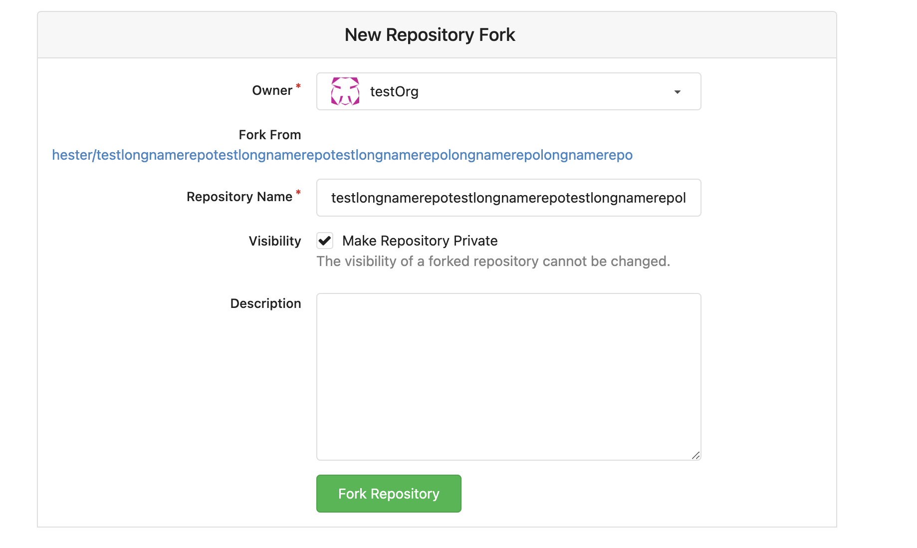
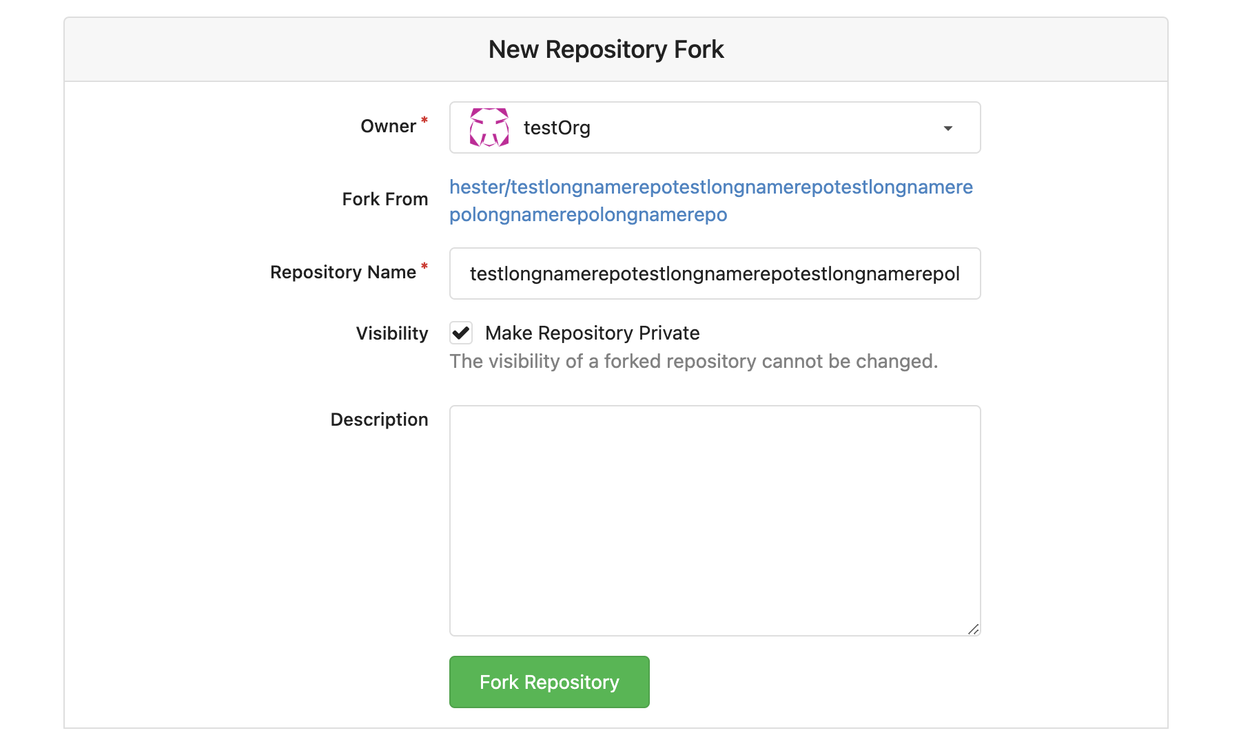
3. Long name repository on creating new fork page
## Before
<img width="919" alt="截屏2023-03-17 17 50 01"
src="https://user-images.githubusercontent.com/17645053/225873723-5c4ea137-3b51-4074-a458-ef442e330ddf.png ">
## After
<img width="907" alt="截屏2023-03-17 17 50 37"
src="https://user-images.githubusercontent.com/17645053/225873772-fc4a52c3-49c6-4ca6-903d-a13707f2a98b.png ">
<img width="383" alt="截屏2023-03-17 17 50 48"
src="https://user-images.githubusercontent.com/17645053/225873779-6de1dfde-5c05-4ae9-89e1-85c25b3a1682.png ">
Closes #23535
Closes #23534
2023-03-18 17:07:59 +01:00
Hester Gong and GitHub
8120c0c20c
Imrove scroll behavior to hash issuecomment(scroll position, auto expand if file is folded, and on refreshing) ( #23513 )
...
Close #23466

Right now on pull request "files Changed" tab, if a file is viewed, when
the comments' links are visited, the comment will not be shown as the
file is folded after viewed. This PR is to improve the behavior, to make
the comment seen even the related file is folded, like on github.

And right now scroll position will be remembered and hence it won’t
scroll to hashed comment after refreshing, this PR also adjust the
scroll position remembering behavior: When there is hash comment in url,
do not remember the scroll position.

Before:

https://user-images.githubusercontent.com/17645053/225512079-6cf79581-9346-44cf-95d6-06919642e6a8.mov

After:

https://user-images.githubusercontent.com/17645053/225523753-3f6728f2-977b-4ed0-a65c-63dcef2ace80.mov

Update - long comment's behavior after using `scrollTop ` (Comment div
scroll to the position which is 30px below the diff header, or 30px
below top on conversation tab):

https://user-images.githubusercontent.com/17645053/225614460-0602c1a6-229c-41f4-84d2-334e78251486.mov
2023-03-17 18:24:18 +08:00
Hester Gong and GitHub
8d9f8e10b1
Fix tags sort by creation time (descending) on branch/tag dropdowns ( #23491 )
...
This PR fixes the tags sort issue mentioned in #23432
The tags on dropdown shoud be sorted in descending order of time but are
not. Because when getting tags, it execeutes `git tag sort
--sort=-taggerdate`. Git supports two types of tags: lightweight and
annotated, and `git tag sort --sort=-taggerdate` dosen't work with
lightweight tags, which will not give correct result. This PR add
`GetTagNamesByRepoID ` to get tags from the database so the tags are
sorted.
Also adapt this change to the droplist when comparing branches.
Dropdown places:
<img width="369" alt="截屏2023-03-15 14 25 39"
src="https://user-images.githubusercontent.com/17645053/225224506-65a72e50-4c11-41d7-8187-a7e9c7dab2cb.png ">
<img width="675" alt="截屏2023-03-15 14 25 27"
src="https://user-images.githubusercontent.com/17645053/225224526-65ce8008-340c-43f6-aa65-b6bd9e1a1bf1.png ">
2023-03-16 12:01:10 -05:00
Hester Gong and GitHub
661e78bed5
Allow both fullname and username search when DEFAULT_SHOW_FULL_NAME is true ( #23463 )
...
This PR adds the ability to search both fullname and username for
assignees, reviewers and author search boxes when the config
[`DEFAULT_SHOW_FULL_NAME`](https://github.com/go-gitea/gitea/blob/6ff5400af91aefb02cbc7dd59f6be23cc2bf7865/custom/conf/app.example.ini#L1238 )
in `app.ini` is set to `true`. Which is originally raised
[here](https://projects.blender.org/infrastructure/blender-projects-platform/issues/14 )
And if `DEFAULT_SHOW_FULL_NAME` is set to `false`(default value), these
search boxes will only show username.
Example:
When `DEFAULT_SHOW_FULL_NAME = true`
<img width="1220" alt="截屏2023-03-14 14 28 06"
src="https://user-images.githubusercontent.com/17645053/224914546-80ef2837-ab72-4d66-9f00-6eb77ed4baaa.png ">
When `DEFAULT_SHOW_FULL_NAME = false` (default value)
<img width="1243" alt="截屏2023-03-14 14 29 37"
src="https://user-images.githubusercontent.com/17645053/224914798-f69ec8a2-0929-4330-827c-3e30188f9b47.png ">
The specific search boxes that adapts these changes include:
1. Author, Assignee search boxes in pull requests tab and issues tab in
repository
<img width="1283" alt="截屏2023-03-14 14 35 01"
src="https://user-images.githubusercontent.com/17645053/224916250-8e452525-71d6-4b48-bf1c-bf7a176abaaa.png ">
2. Assigee and Author on milestones issue page (Added missing search box
for author here)
<img width="1261" alt="截屏2023-03-14 14 38 20"
src="https://user-images.githubusercontent.com/17645053/224916569-d3105619-7824-4bb8-a6d0-1a600eaa9963.png ">
3. Assignee on issues and PR Sidebar, Reviewer on PR Sidebar
<img width="976" alt="截屏2023-03-14 14 41 06"
src="https://user-images.githubusercontent.com/17645053/224917431-c45d821e-9660-4f58-a196-5979a0bb64ce.png ">
<img width="1027" alt="截屏2023-03-14 14 41 58"
src="https://user-images.githubusercontent.com/17645053/224917290-ad4dbc52-0c20-45c4-9fce-9dcd59ad7d47.png ">
4. Assignee when creating new issue
<img width="961" alt="截屏2023-03-14 14 44 33"
src="https://user-images.githubusercontent.com/17645053/224917694-34bee5a7-e975-4f37-8862-56ebc2556808.png ">
5. Whitelisted users for pushing, Whitelisted users for merging and
Whitelisted reviewers in Protected branch settings
<img width="920" alt="截屏2023-03-14 14 48 56"
src="https://user-images.githubusercontent.com/17645053/224918551-9b46b44e-b075-4895-8d33-1aafc7d3c8e5.png ">
<img width="901" alt="截屏2023-03-14 14 49 02"
src="https://user-images.githubusercontent.com/17645053/224918584-efa66f23-a593-4e26-a3eb-bb1fbc5516ae.png ">
<img width="944" alt="截屏2023-03-14 14 49 21"
src="https://user-images.githubusercontent.com/17645053/224918591-be60455d-0513-4f66-84f6-b5e1bc40ff91.png ">
6. "Allowed users" in tags settings
<img width="935" alt="截屏2023-03-14 14 50 11"
src="https://user-images.githubusercontent.com/17645053/224918701-797699aa-c7e5-4290-b3fe-27dcead1c6c7.png ">
2023-03-16 11:32:25 -05:00
f521e88240
Fix actions frontend bugs (pagination, long name alignment) and small simplify ( #23370 )
...
1 Right now on actions page, the action list will not be aligned if
commit message is long. In this PR, the changes are:
- The branch tag is moved to bottom row
- Width percentage is given to make them aligned
- Show "..." if commit is longer than two lines.
- Align the status icon with the commit message with baseline
Before:
<img width="1068" alt="截屏2023-03-08 12 23 22"
src="https://user-images.githubusercontent.com/17645053/223628534-6b9472cb-29f5-40a3-9714-c5152553049e.png ">
After:
<img width="756" alt="截屏2023-03-08 13 34 28"
src="https://user-images.githubusercontent.com/17645053/223628571-da94698b-0e0a-43e3-ae82-34d8c780e5ba.png ">
2 Right now the actions list's pagination is not working properly
because Param is not passed to pagination template, in this PR Param
Strings are passed to the pager
Before:
<img width="1176" alt="截屏2023-03-08 12 23 50"
src="https://user-images.githubusercontent.com/17645053/223629207-8b67ce74-2342-4259-bc81-036e37752716.png ">
After:
<img width="1343" alt="截屏2023-03-08 13 11 54"
src="https://user-images.githubusercontent.com/17645053/223629321-4f538f8a-45dc-4d6f-ae60-2c82680ae3e7.png ">
3 A small simplify in `RepoActionView.vue` .
---------
Co-authored-by: wxiaoguang <wxiaoguang@gmail.com >
Co-authored-by: Lunny Xiao <xiaolunwen@gmail.com >
2023-03-13 13:31:06 +08:00
a2f44463f0
Fix adding of empty class name ( #23352 )
...
This PR is to fix the error shown below. The reason is because
[`class-name`
prop](https://github.com/go-gitea/gitea/blob/main/web_src/js/components/ActionRunStatus.vue#L6 )
given to `svg` component has a space, and classList cannot add empty
string.
https://user-images.githubusercontent.com/17645053/223346720-c7f9de43-5e69-4ecf-93c0-90bf04090693.mov
---------
Co-authored-by: Lunny Xiao <xiaolunwen@gmail.com >
2023-03-07 23:08:22 +08:00
Hester Gong and GitHub
471b6d24b4
Fix PR view misalignment caused by long name file ( #23321 )
...
Close #23248

The UI after this PR:


https://user-images.githubusercontent.com/17645053/223009758-7f0c9f12-d346-4cb2-a605-729fddce732f.mov
2023-03-06 09:44:04 -06:00
ea7f0d6fcf
Change interactiveBorder to fix popup preview ( #23169 )
...
Close #23073 .
Used the solution as reference to the reply:
https://github.com/go-gitea/gitea/issues/23073#issuecomment-1440124609
Here made the change inside the `contextpopup.js` because this is where
the popup component is created and tippy configuration is given.
Co-authored-by: Lunny Xiao <xiaolunwen@gmail.com >
2023-03-05 23:40:50 +08:00
7f9d58fab8
Support paste treepath when creating a new file or updating the file name ( #23209 )
...
Close #23204
Quick Demo:
https://user-images.githubusercontent.com/17645053/222058727-ad30a37c-f0ac-4184-9946-a71fcee473b5.mov
---------
Co-authored-by: delvh <leon@kske.dev >
2023-03-03 17:28:20 -05:00
HesterG and GitHub
ffce336f18
Use async await to fix empty quote reply at first time ( #23168 )
...
The reason why quote reply is empty is when quote reply is clicked, it
triggers the click function on `.comment-form-reply` button, and when
the first time this function is triggered, easyMDE for the reply has not
yet initialized, so that click handler of `.quote-reply` button in
`repo-legacy.js` got an `undefined` as easyMDE, and the following lines
which put quoted reply into the easyMDE is not executed.
The workaround in this PR is to pass the replied content to
'.comment-form-reply' button if easyMDE is not yet initialized (quote
reply first clicked) and put the replied content into it the after
easyMDE is created.
Now quote reply on first click:
https://user-images.githubusercontent.com/17645053/221452823-fc699d50-1649-4af1-952e-f04fc8d2978e.mov
<br />
Update:
The above change is not appropriate as stated in the
[comment](https://github.com/go-gitea/gitea/pull/23168#issuecomment-1445562284 )
Use await instead
Close #22075 .
Close #23247 .
2023-03-02 13:53:22 -06:00
HesterG and GitHub
d20b29d7ce
Fix height for sticky head on large screen on PR page ( #23111 )
...
Right now on the PR 'File Change' Tab, the file title header sticky to
the top on large screens has wrong height, resulting in wrong ui
behavior when scrolling down. This PR is to fix this.
Before:
<img width="964" alt="截屏2023-02-24 17 12 29"
src="https://user-images.githubusercontent.com/17645053/221140409-025c4a84-6bbe-4b5b-a13f-bd2b79063522.png ">
After:
<img width="1430" alt="截屏2023-02-24 21 10 12"
src="https://user-images.githubusercontent.com/17645053/221186750-0344d652-4610-4a90-a4c0-7f6269f950d6.png ">
2023-02-24 14:29:49 +00:00
HesterG and GitHub
045becf9aa
Add HesterG to maintainers ( #23104 )
...
[List of mine merged
PR](https://github.com/go-gitea/gitea/pulls?q=is%3Apr+author%3AHesterG+is%3Amerged+ )
2023-02-24 14:31:02 +08:00
HesterG and GitHub
8ed6096158
Add wrapper to author to avoid long name ui problem ( #23030 )
...
This PR is a possible solution for issue #22866 . Main change is to add a
`author-wrapper` class around author name, like the wrapper added to
message. The `max-width` is set to 200px on PC, and 100px on mobile
device for now.
2023-02-23 14:28:18 -06:00
HesterG and GitHub
3adfc0f02d
Change style to improve whitespaces trimming inside inline markdown code ( #23093 )
...
Given mardown source
```
x ` a` y
x `a ` y
x ` a ` y
```
Render
<img width="1421" alt="2023-02-23 15 33 14"
src="https://user-images.githubusercontent.com/17645053/220844280-a304c788-ac79-4a26-a55a-0db00f2fb3f3.png ">
Fixes #23080 .
2023-02-23 20:57:03 +08:00
HesterG and GitHub
a78e0b7dad
Add accessibility to the menu on the navbar ( #23059 )
...
This PR is trying to add accessibility to the menu as mentioned in
#23053 so the menu can be accessed using keyboard (A quick demo is added
below), with a reference to
[PR2612](https://github.com/go-gitea/gitea/pull/22612 ). The goal is to
make the menu accessible merely using keyboard like shown below. And
this PR might need confirmation from developers using screen readers.
2023-02-22 15:58:07 -06:00
9ebf6424ee
Remove dashes between organization member avatars on hover ( #23034 )
...
On the home page of an organization, there are unexpected dashes between
the avatars of the members when hovering over the avatars, as shown in
below:


This is because in `fomantic/build/semantic.css` there is a
rule `text-decoration: underline;` when hovering over the `<a>` tag.
Here, the `<a>` tag has width and height because of the avatar image inside,
leading to the unexpected underlines.
This PR overrides the `a:hover` rule so the underline does not exist anymore.
Co-authored-by: delvh <leon@kske.dev >
2023-02-21 12:28:31 +01:00
e3cffa70f9
add margin top to the top of branches ( #23002 )
...
add margin top as mentioned in #22973
---------
Co-authored-by: jidi <jidi@jidideMacBook-Pro.local >
Co-authored-by: Lunny Xiao <xiaolunwen@gmail.com >
2023-02-21 13:03:44 +08:00

 HesterGandGitHub